
Database for Databases
This study aimed to test the site’s effectiveness in making information easy to find and discover by new users, facilitating simple user interactions, and providing a satisfactory experience for students.
What’s the purpose of this website?
We tried to answer this question using the insights we gathered and the designs we recommended to the Pratt Libraries. It started when the Pratt Libraries approached us with a brief about conducting usability studies on their beta version of A-Z Databases.
Duration:
6 weeks
(Spring 2024)
Role:
UX Consultant
Usability Studies,
UX Research
Tools:
Figma, Figjam,
Google Workspace,
Zoom
Team:
Indrani Thool,
Navya Thakkar,
Marko Stanisic,
Smridhi Gupta
We recruited participants based on their interactivity with library websites and involvement in academic research. We narrowed it down to graduate students and divided them into two separate groups: Expert Users (library science students) and Novice Users (design students).
User Behaviour
The process involved defining the scope of the usability test after the kickoff meeting. The team analyzed the website and streamed a scenario-based script for moderated usability testing. Overall insights were gathered, and issues were prioritized based on frequency, task completion, and success metrics. Throughout, we identified user behavior and brainstormed on developing design solutions that would best assist students in ease of navigation.
“For learning the system – I think it really depends on who you are and what your prior experience with research and databases is”
Novice User
Both user groups employed varied searching techniques and showcased unique behavioral tendencies based on the scenarios that we presented.
Needs improvement!!!
“It’s really easy but I can imagine someone else can get overwhelmed”
Expert Users
Although most users thought the A-Z Databases was a beneficial resource, the System Usability Scale defined our client’s needs. Interestingly, the score varied from good (80.6%) to needs improvement (57.5%) for expert vs. novice users, respectively. The average score (69.1%) lay on the borderline of needs improvement and good. The massive difference clearly states that the website should be worked on to aid Novice users.

Usability Recommendations
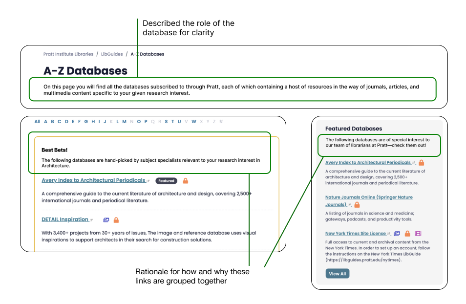
1. Descriptions for Clarity
“I just think that it could more clearly guide you… using it is complex, which makes it a bit difficult to use as beginner”
Novice User
Problem:
Novice users were unsure what the website was specifically. They treated the A-Z Database the same as the library website, and not until the second task did they realize the purpose of this website.

Proposed Recommendation:
We recommend adding short descriptions to make users aware of the purpose and functionality of the resource provided. This will provide clarity and purpose to the student as they start their research.
2. Search & Navigation
“I’m not too confident using the system because I was frustrated that it was hard to go beyond general search terms or whittle them down.”
Expert User
Problem:
Search and navigation are a student’s first interactions with the A-Z Databases website, and it is essential to understand its functionality. Most novice users used the first search bar. Although novice users eventually understood the functionality moving forward, they still faced difficulty applying the filter categories and the lack of visibility of the ‘Clear Filter’ button.

Proposed Recommendation:
Firstly, we propose dividing the search into two search bars: one for keyword-based searching and the other for applying filters. Additionally, providing descriptions on top of each input entry would be beneficial to make it easy for new users to navigate.
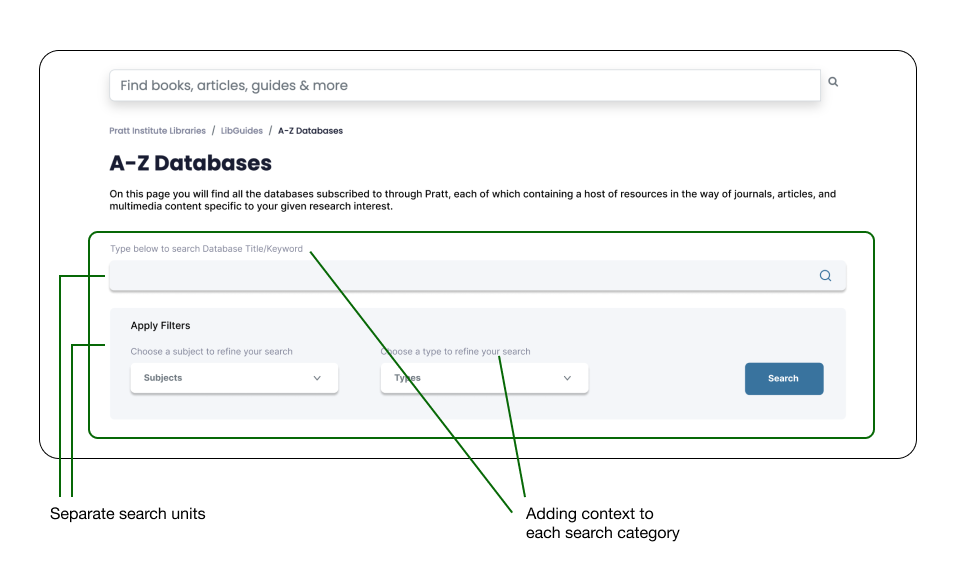
Secondly, checkboxes should be added to indicate multiple selections, and the title entry should indicate the fields selected. Introducing a ‘Clear Filters’ secondary CTA right beside the ‘Search’ CTA with ample white space.

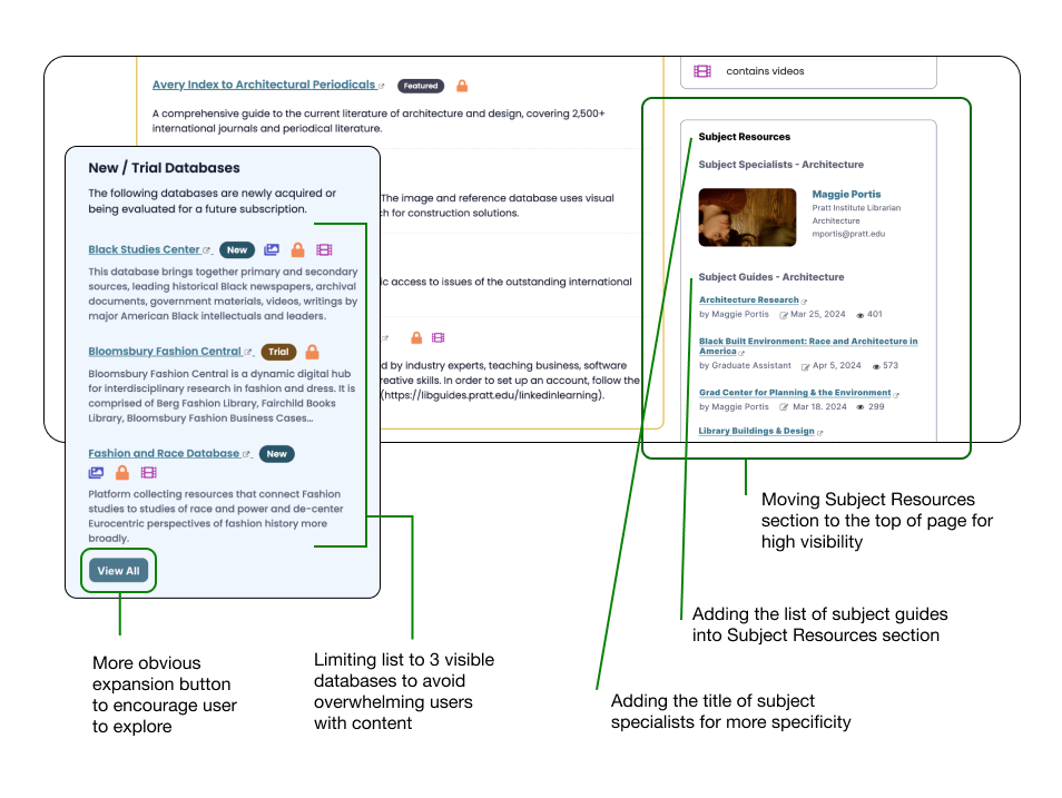
3. Content Reorganization
“Great that there is a point person to go to directly who is an expert on the field you want to learn about & the link to subject guides is really helpful as well – I just wish it was more visible”
Novice User
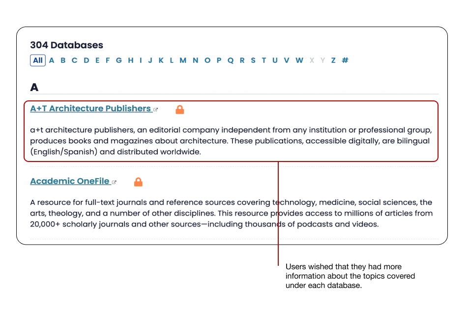
Problem:
We tested the ‘Subject Resources’ discoverability to understand its impact and usability. Our study showed that users found Subject Resources one of the most important and helpful features. However, almost all users mentioned that the content under subject resources was hard to find and could be easily missed, especially because of the content-heavy side panel sections.
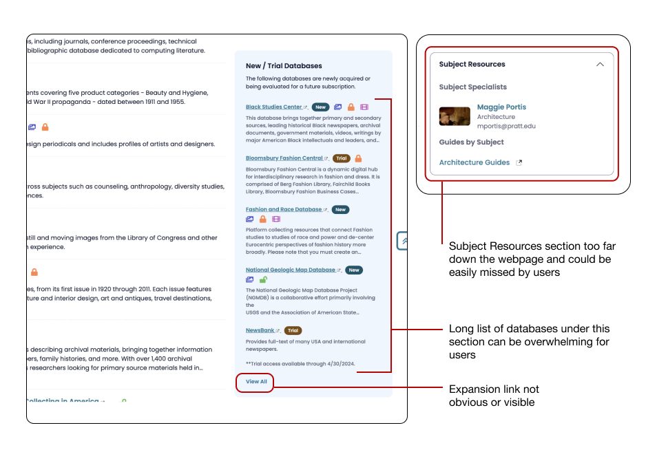
Proposed Recommendation:
We propose restructuring the side panel by moving the ‘Subject Resources’ section to the top to increase its discoverability. Additionally, we recommend reducing the number of databases in the ‘New/Trial Databases’ section to three so that it doesn’t create an excessively long scroll.
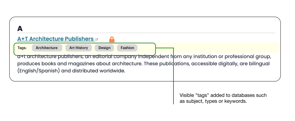
4. Tags & Keywords
“It would be nice to have something to lead you to more narrow and niche subjects – especially if your user doesn’t know exactly what they are looking for.”
Expert User
Problem:
Users employed a set of keywords that didn’t provide them any results. The database filters have a limited search category, restricting users from attaining the most accurate database.
Proposed Recommendation:
Streamlining the search by adding relevant tags will greatly benefit users by indicating the related areas for each database.
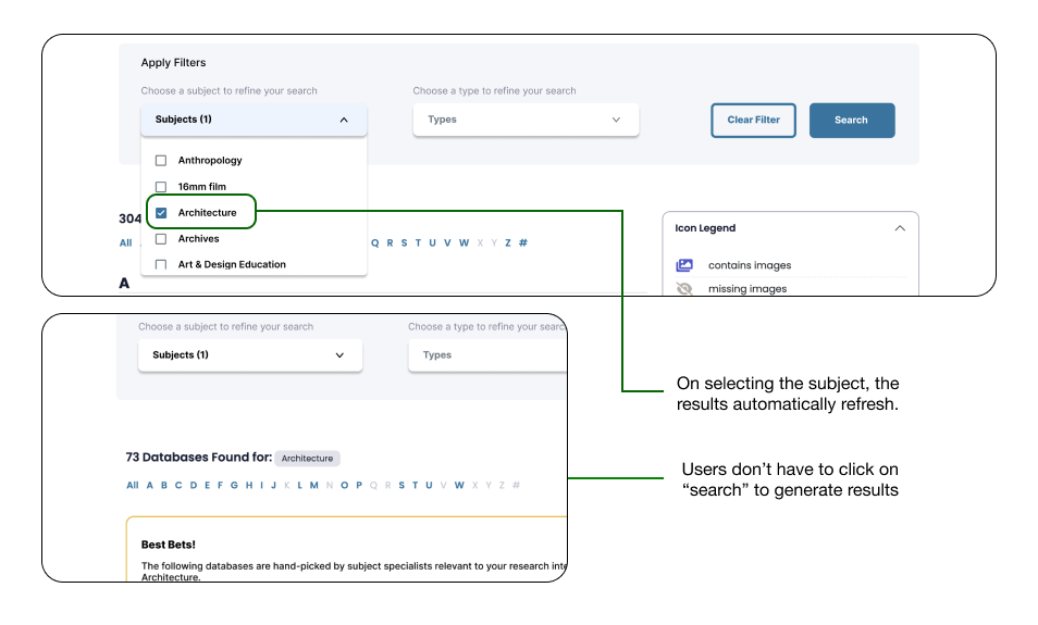
5. Continuous Update
“I assumed the search results will refresh (on selecting a filter) on their own but they don’t”
Novice User
Problem:
There were instances when users wondered why the filter wasn’t applied; it was because they hadn’t clicked on ‘Search’ CTA. It wasn’t very obvious that the ‘Search’ CTA needs to be pressed, and many users are used to continuous updates.

Proposed Recommendation:
We recommend adapting to the continuous updates with each applied category. This feature is currently available on the existing website and should be implemented in the beta version.
6. Additional Recommendations
#1: Recommendation – Additional Keywords/Tags in the Backend
Users felt they needed some help finding relevant information. They were confused and felt the options available were limited. Therefore, we propose adding additional tags on the backend to provide a broader search result.
#2: Recommendation – Reimplementing the Live Chat Option
Users find emailing about a simple search process tedious; getting a response would take time and hinder the research process. Therefore, they believe ‘Live Chat’ is a quick and easy option. We propose bringing the ‘Live Chat’ option back.
#3: Recommendation – Option for Dark Mode on the Website
Expert Users mentioned advanced features that are focused more on ease of use. We believe this could be implemented in the future, allowing users to customize settings according to their preferences.
Client’s Thoughts
“So many of the recommendations are things that could easily be implemented… I was taking notes to hop right in and make these changes now… This is really helpful especially as we transition to the new site.”
Matthew Garklavs (Electronic Resources Librarian)
The recommendations presented received positive feedback and our clients were curious about the implementation of a few features. They were glad they reached out to DX Center for this study. Moving ahead Pratt Libraries would be conducting an internal meeting to further discuss the scope of implementation.
Reflection
Complex infrastructures can be overwhelming, so reducing the cognitive load was our key goal. Incorporating the recommendations will greatly benefit usage and increase engagement overall. Moreover, it will make it easy for new users to fully utilize the A-Z Database as a resource to conduct research.