Team: Anyelina Wu, Eleanor Cunningham-Rothwell, Shreedhar Verma and Yu-Jung Cheng
Project Overview
Who was our Client?
Over the course of five months, our team worked with the NYC-based non-profit glassworks studio Urban Glass to re-design their website by establishing a more intuitive information architecture, and a visually engaging design layout.
View the Current Urban Glass website
We redesigned key flows across Urban Glass’ key sections: Education, Studio, Magazine, and the Home Page.
The new design layouts were made with aim of making the content relevant and catered to the different requirements for both new and returning visitors.
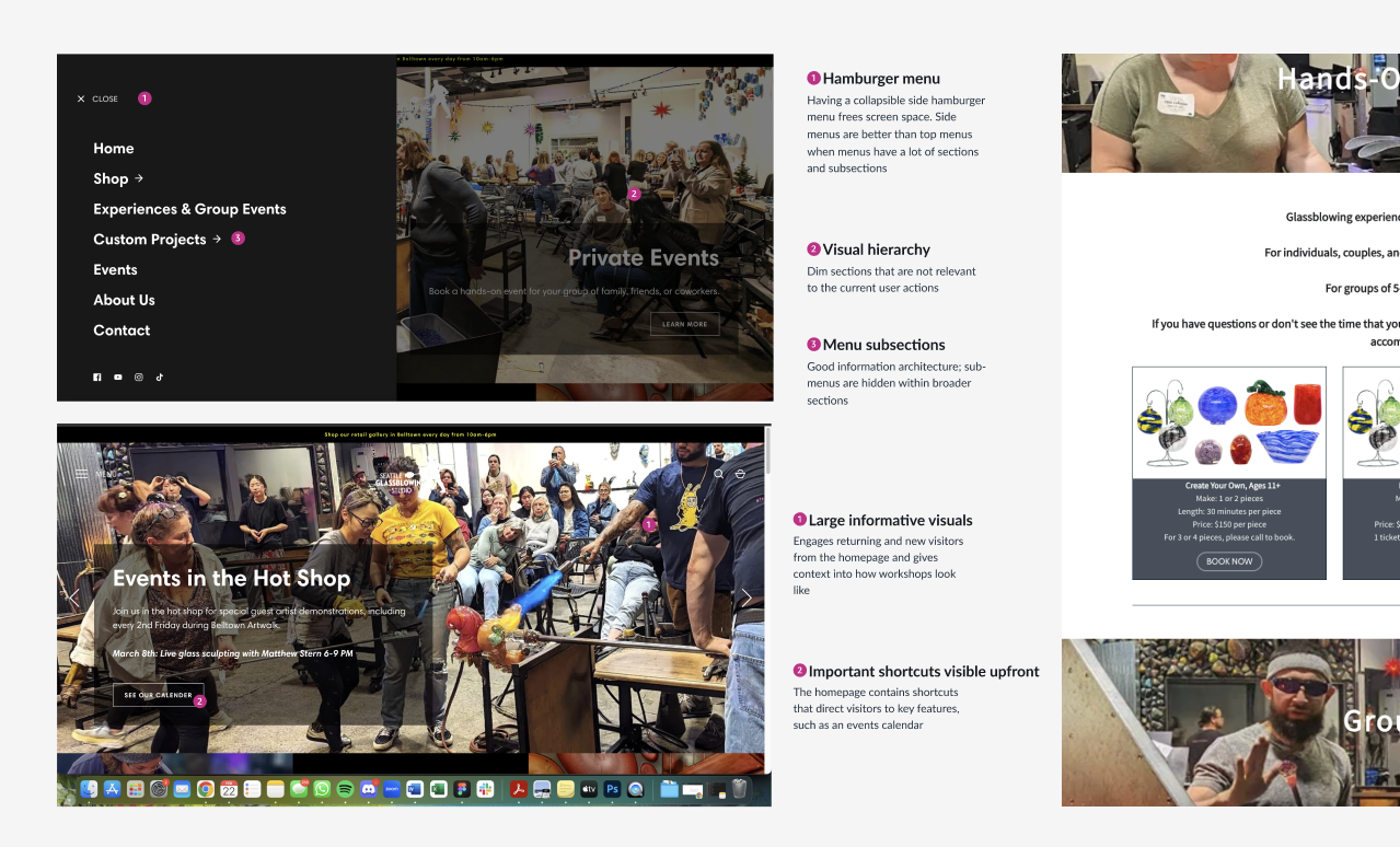
Highlight promoted content and enable content scanning

Visual aids for matching user expectations and reality
How did we get there?
Based on our initial discussion with the director of Urban Glass, our project goal was to ensure that visitors of Urban Glass’ website understood the value of the organization and are aware of all that it has to offer. To do so, we decided to visually redesign the Urban Glass website and reorganize content to improve navigation and relevancy for both new and returning visitors.
Key Design Questions at this stage:
- How might we more effectively convey Urban Glass’s mission and offerings to new and existing users?
- How might we create a site map that is more intuitive for visitors to Urban Glass’ website?
- How might we design page content that allows users to more easily navigate and digest information?
Stage I: Research
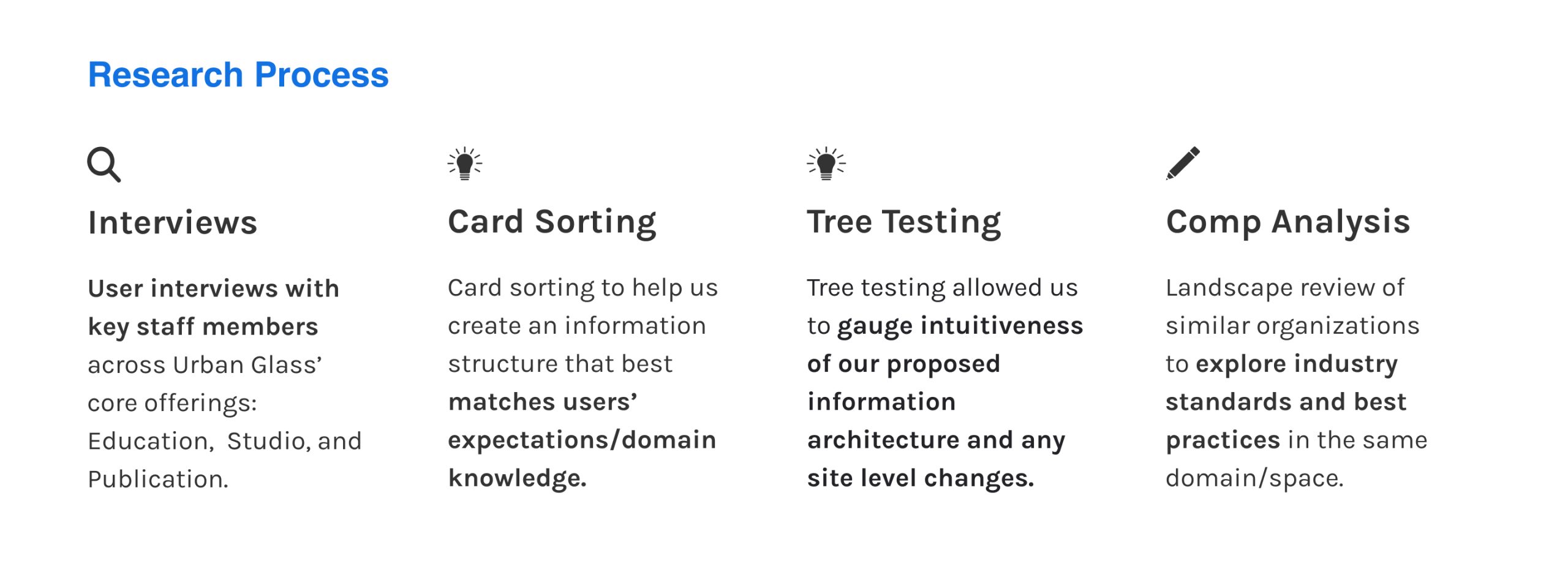
Key findings from User interviews:
A common goal expressed by the UG staff was to make sure visitors have a clearer understanding of the services UG provides. We should aim to use clear language and show pictures or videos to help them imagine what they’ll be doing.
There is a need for a content layout that does not overwhelm the user with too much information.
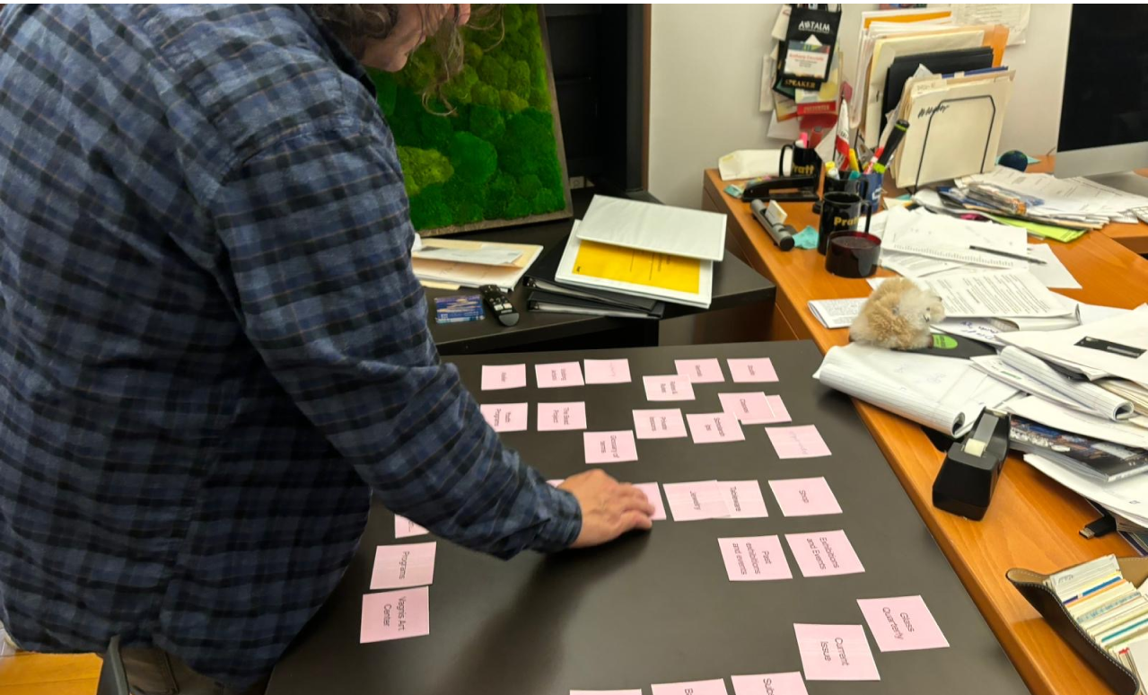
Key findings from Card Sorting:
Our participants had difficulty grouping categories that were titled using jargon (in the glassblowing field or those that were specific to Urban glass).
Users found it difficult to organize the volume of categories, especially since they were unclear on what certain categories and sub categories represented.
Key findings from Tree Testing:
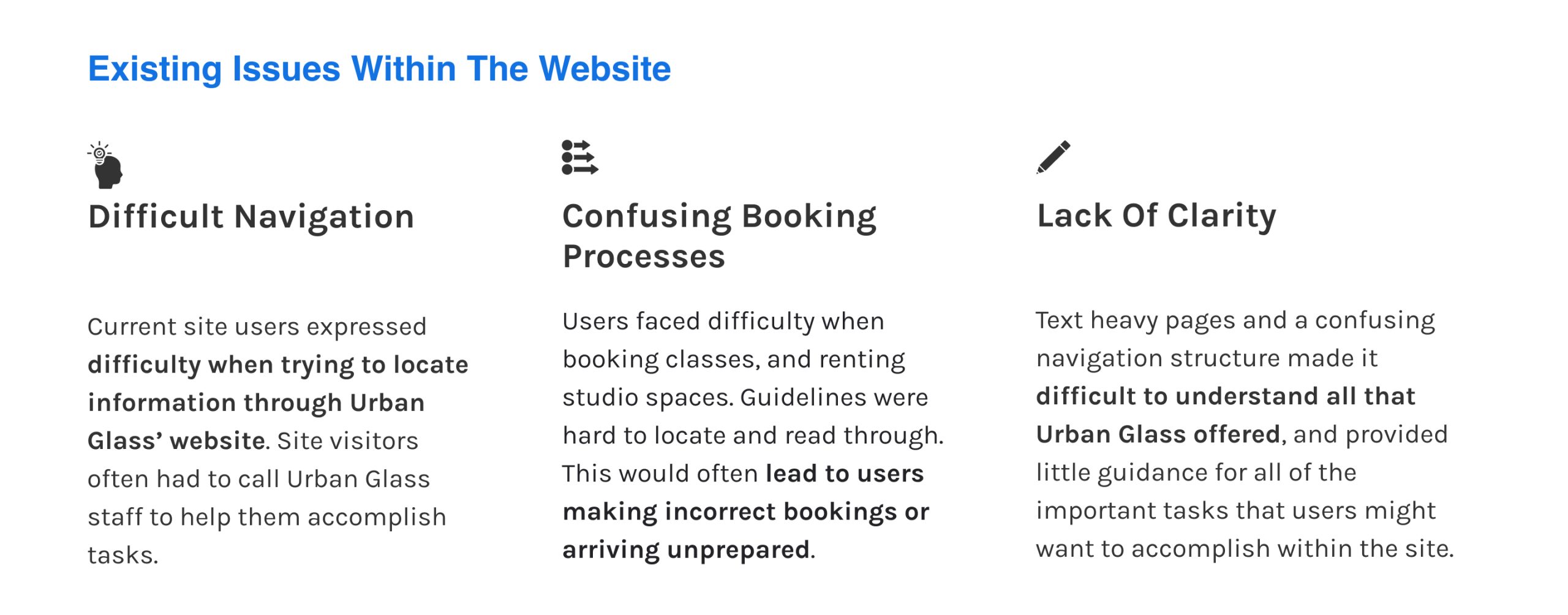
Tree testing allowed us to test the current website content structure to see if visitors could easily locate relevant information/pages. It showed a general lack of intuitiveness in the way the content was structured.
Only 38% of users located the “Atelier” correctly. The majority of users didn’t associate commissions with “Atelier”.
Key findings from Competitive Analysis:
Competitor organizations like Artshack and Clayworks on Colombia’s promote important content, while also making information easily accessible for visitors through a streamlined navigation.
The Seattle Glassblowing Studio presents a simple interface that engages in efficient navigation by only showing necessary key information at a time, despite requiring more steps in the user journey
Research Takeaway 1
Desired content is not promoted enough and lacks catering to visitors with different motives. Purpose of each section is unclear.
Research Takeaway 2
Lacks previews, course prerequisites, and summaries, causing misaligned expectations of Urban Glass’s mission and offerings
Stage II: Defining a Design Strategy

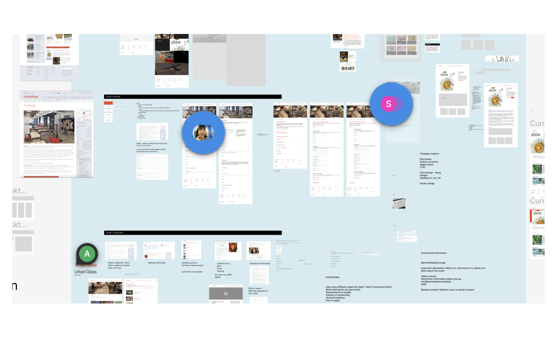
Stage III: Design Development
Design Process
01
Revise Information Architecture

02
Wireframes and lofi prototypes
03
High fidelity prototypes

01
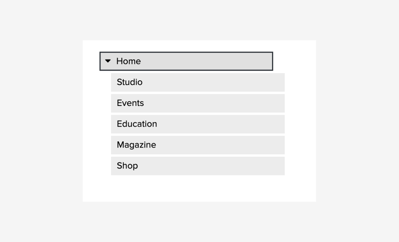
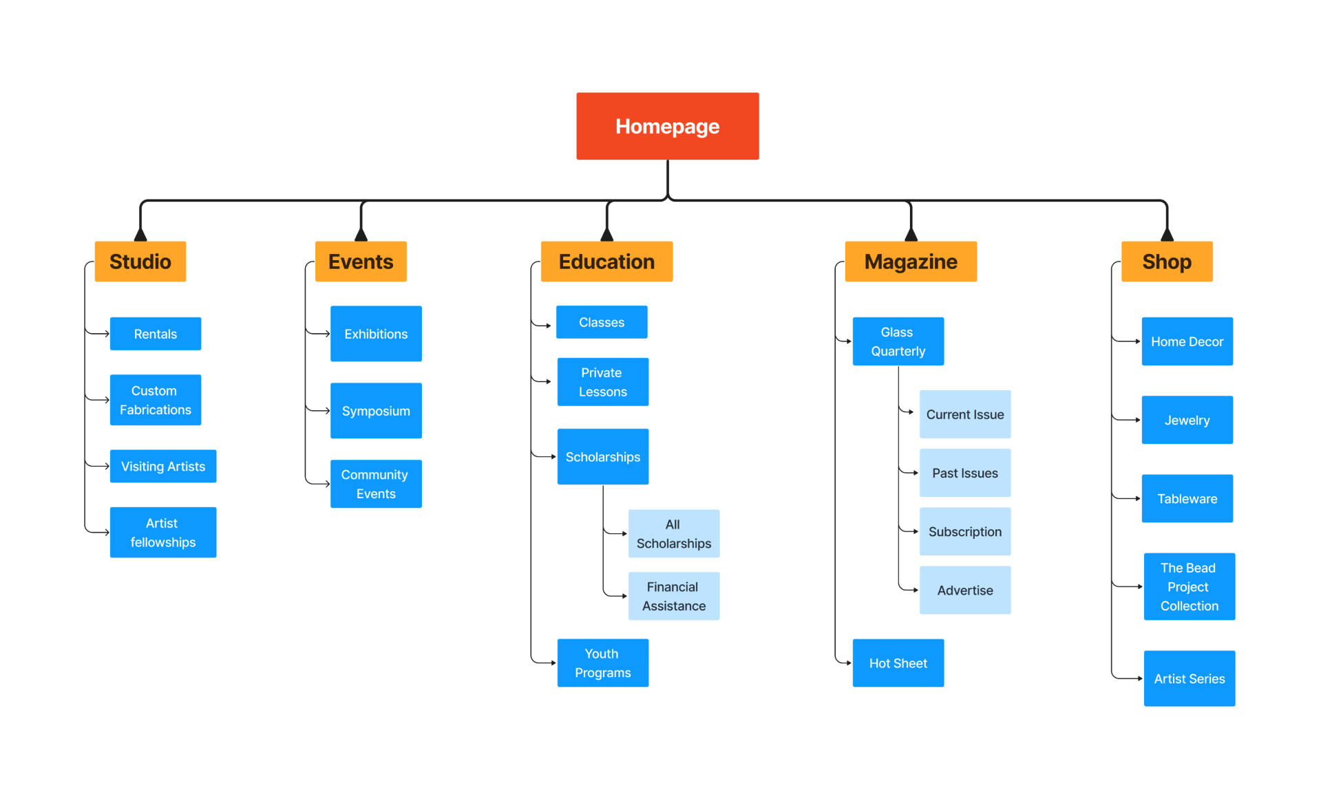
Redesigning the Site Map
Final site map consists of a more intuitive and concise content structure, with labels that are familiar even to a new user.
02
Identifying Key user flows
Based on the typical user actions on the website – Exploration of services, renting studio spaces and accessing their online publication material, we identified the key user flows and subsequent pages that needed to be redesigned.

03
Final Design Screens
Our goals for the final design pages were to make the content more relevant and easy to access, and to enable content scanning and improved visibility.
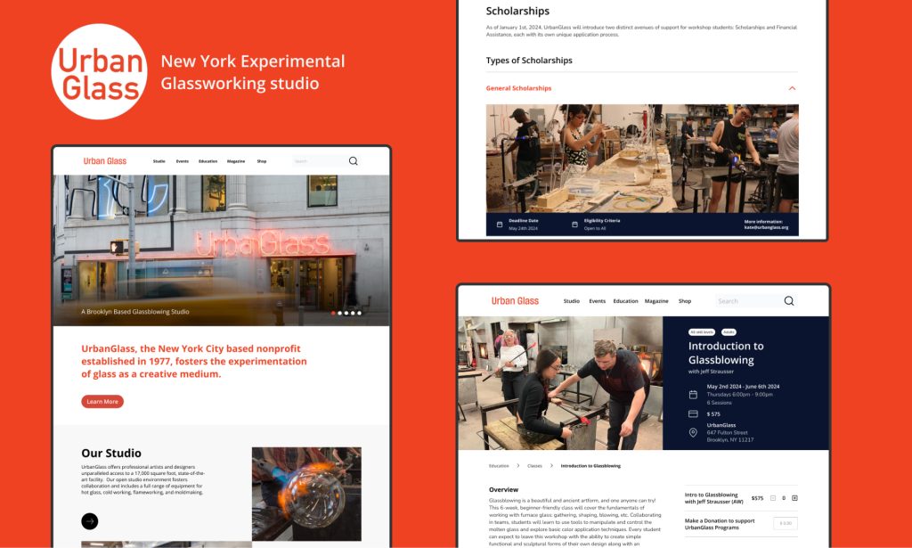
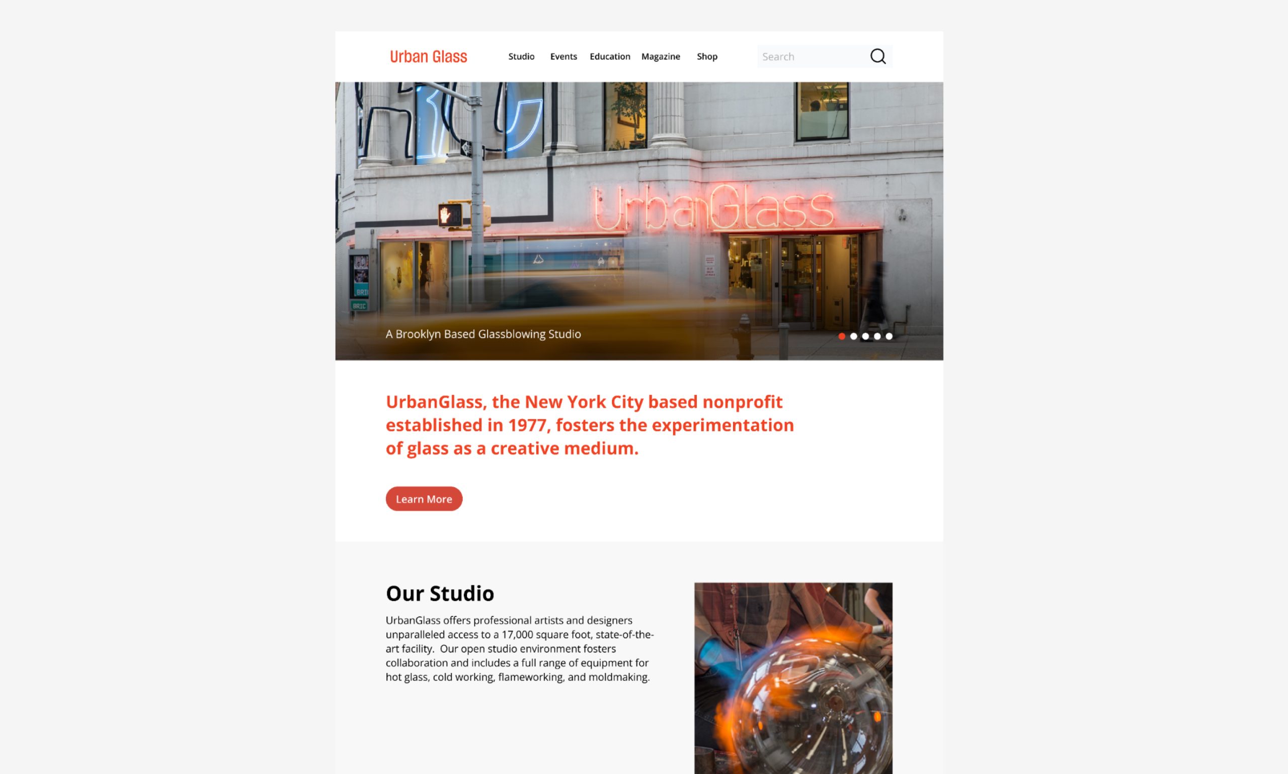
Home Page:
Strategy and Design decisions taken:
The redesigned home page page allows users to easily understand what Urban Glass is, and what it offers. Our goal was for this page to be a visually engaging and easily digestible introduction to Urban Glass. We also chose to promote different key offerings such as the studio, current events, exhibits, as well as the magazine in order to engage visitors with Urban Glass’ offerings.
View Annotated Final design screens
Education Section:
Strategy and Design decisions taken:
The redesigned Education pages focused on the classes landing page, the individual class page, and scholarships. Our goal for these pages was to allow users to easily explore the wide variety of courses offered by UrbanGlass and provide guided support when needed. We chose to highlight upcoming and promoted content, provide broad categories, as well as multiple ways for people to search for classes, and allow for users to sort and filter options with visual tags. For the scholarships page, we streamlined content through drop-down accordions to let users focus on information that’s most relevant to them.

View Annotated Final design screens
Studio Section:
Strategy and Design decisions taken:
Our Studio pages redesign focused on rental rates and rules, and custom fabrication. Our goal for these pages was to increase users’ awareness of Urban Glass’ studio offerings, provide clarity on equipment and rental rules and guidelines, as well as promote special services such as custom fabrication. To do so, we added images and short description of rentals to provide added context, included a drop down accordion to make rules and FAQ easier to read through, and provided a “commonly rented together” section to help guide users through the equipment rental process.
For Custom Fabrication, we added examples of past projects to provide context for what this service has produced in the past, and created a separate page for the request form to guide users through the process and help them track their progress.
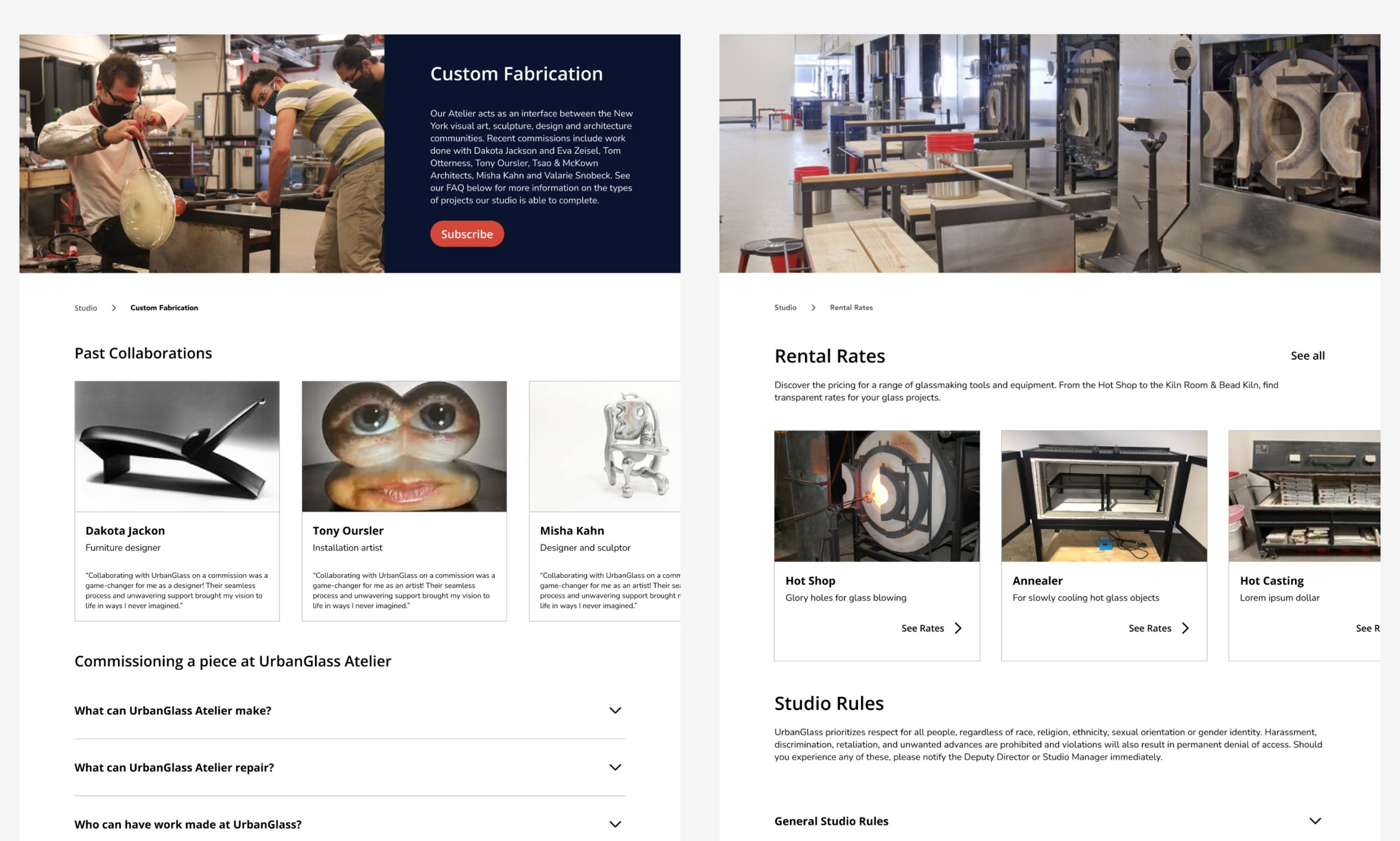
View Annotated Final design screens
Magazine Section:
Strategy and Design decisions taken:
Our goal for the Magazine pages was to clarify the context of the Hot Sheet, and establish this page as an extension of the print Magazine while also making the presentation articles easier to digest. Previously, users weren’t aware that Glass Quarterly is a physical magazine. So we redesigned the layout to resemble a product page, emphasizing that the magazine can’t be read entirely online.
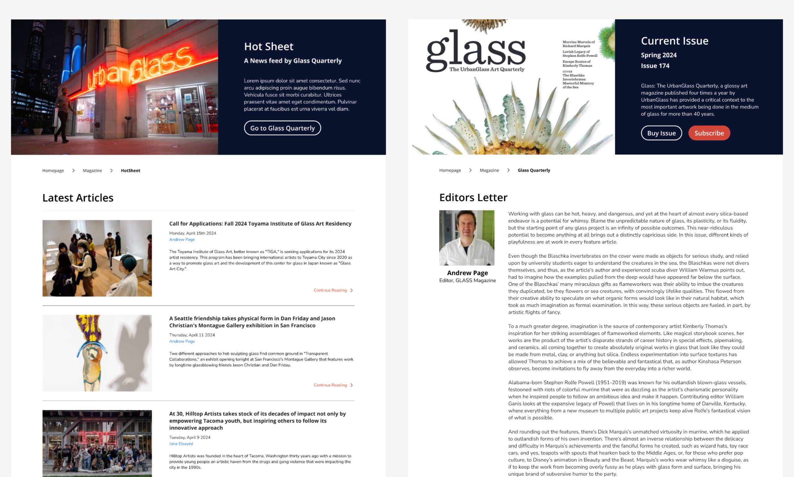
View Annotated Final design screens
Next Steps
Next steps
Test final designs with more users and gather their feedback to validate their performance and usability
Success metrics
Observe fewer inquiries, more sign ups and conversion for services
A more intuitive and discoverable system should allow users to effectively perform more tasks on their own