Targeting and unfolding commonly occurred student pain points by revamping the Cooper Union Library website.

Role
UX Researcher
UX Designer
Team
Minh Nguyen
Chu Yuan Chiu
Qiaochu Zhang
Pujan Thaker
Shikha Mehta
Duration
6 weeks
(03/20 – 04/29)
Tools
Figma, Google Meets, Google Slides, Google Form, Tableau.
Before we get started, here are some quick notes!
Our Clients
Lisa, Dale, and James from the Cooper Union Library team.
Client Goals
Enhance the student experience while using the library website.
Target Users
Cooper Union students in Engineering, Art, and Architecture.
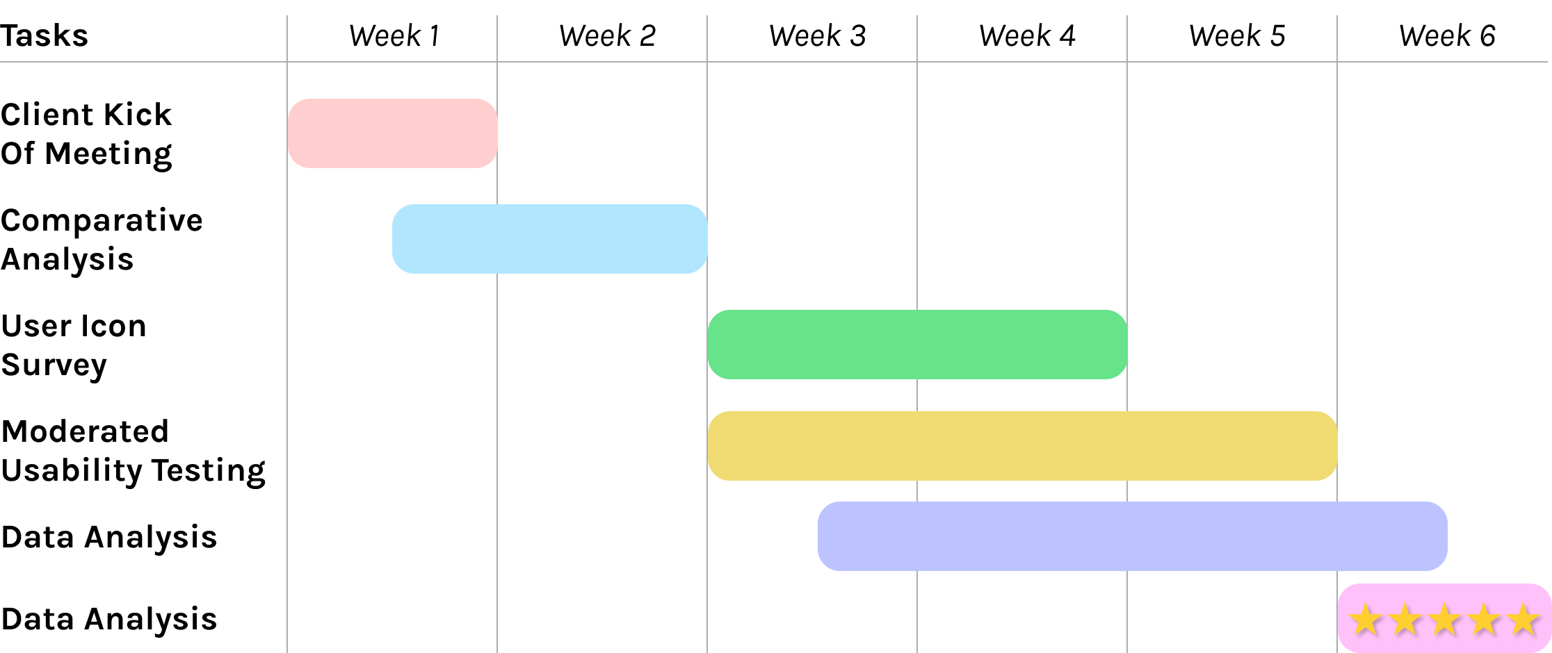
Timeline
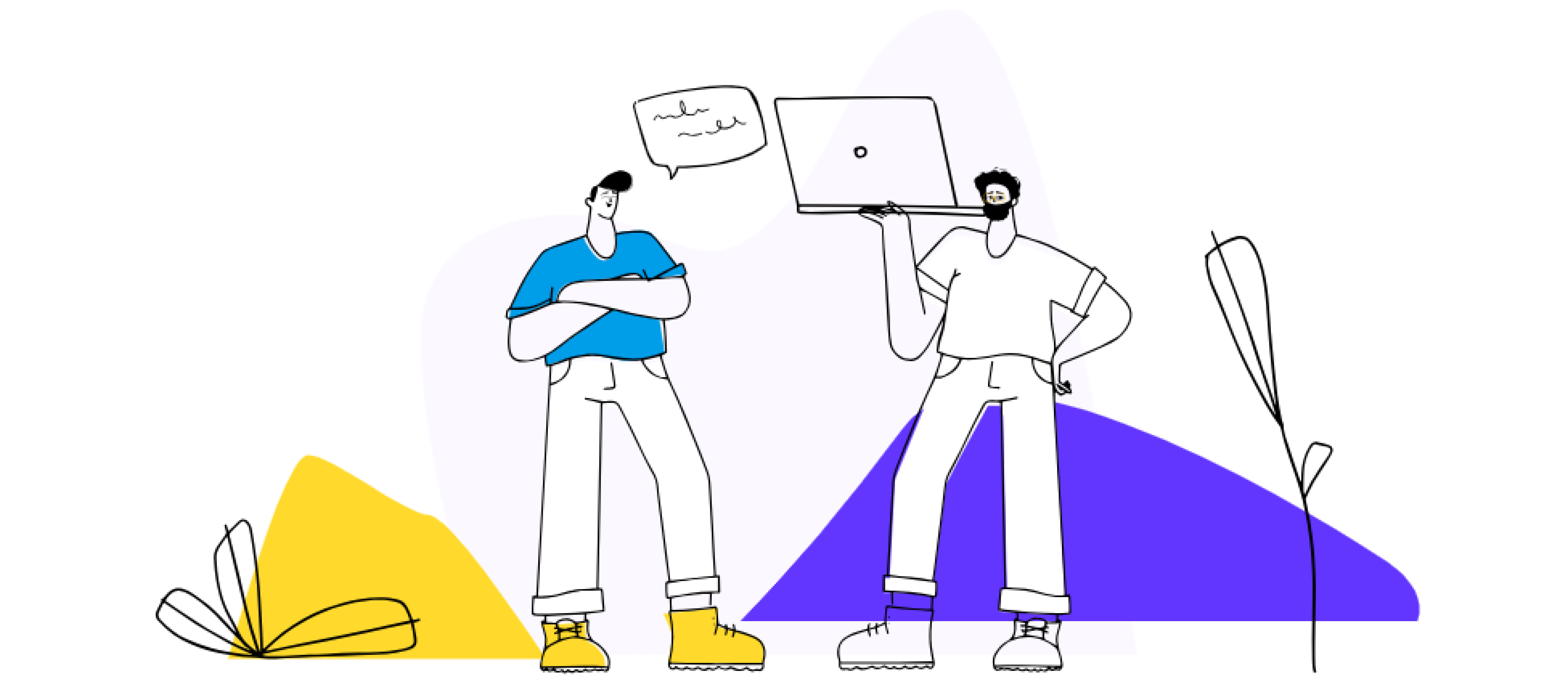
Our Goal
Explore students’ understanding and expectations of the search navigation flow on the Home Page and Search Result page.
Phase 1. The preparation
1.1 Comparative Analysis
Learning how 5 competitors solve common needs
We first examined the two libraries within the Cooper Union consortium (NYU and the New School).

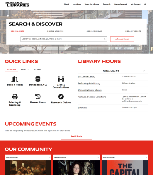
The home page utilizes many quick links, allowing students to navigate through the flow of information easily. Both sites were text-heavy, however there was a clear hierarchy of information. The brand identity also shines through the color choice.

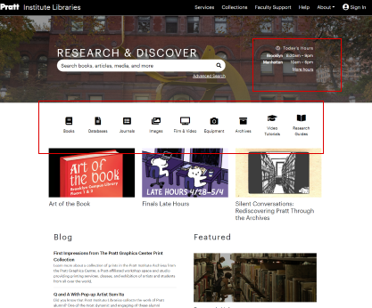
We loved that upon entering the Pratt Library page, the students can see library hours. The icons are simple yet clear and effective. The search bar is prominent, it did not take up the majority of the space.
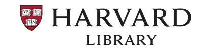

The “How to” section located near the top of the page of the Harvard Library stood out to us. This is perfect for assisting new and novice users through the complicated structure of the library website.
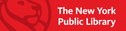

While the school libraries preferred traditional image-typographic pairing, the NYPL had a more graphical approach to the home page. The staff picks portion was personable and effective, with the use of quotes.
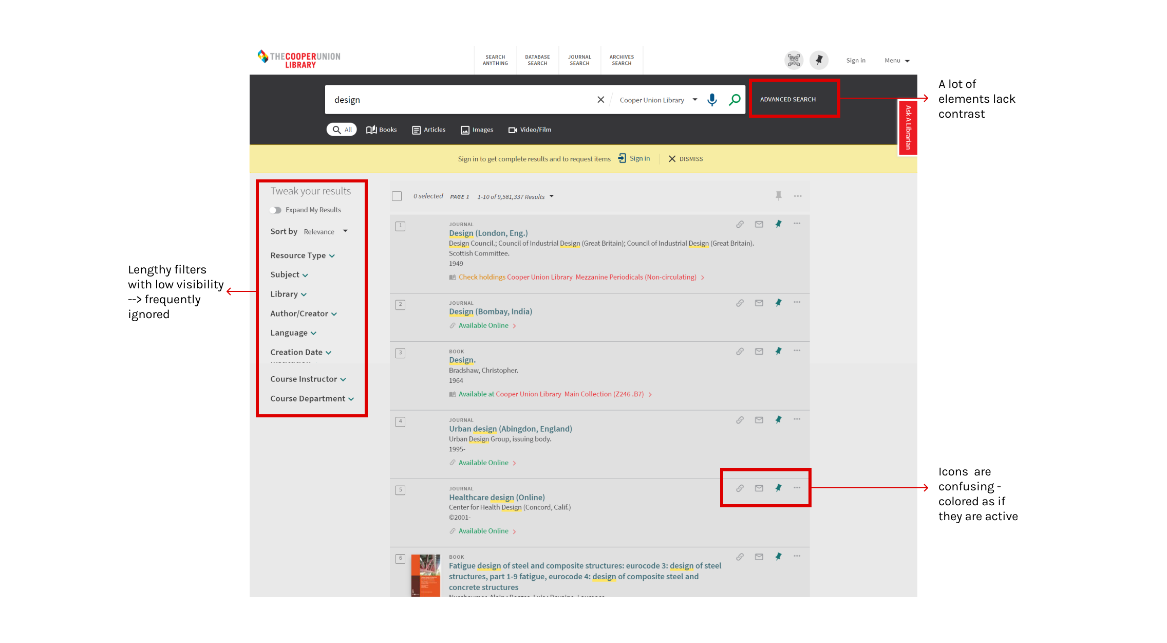
1.2 User Icon Survey
We created a survey regarding CU’s usage of icons and language.

Our clients were interested in updating the iconographic system of the search result page. Additionally, many students and faculty members were confused by the language used throughout the page.
We created an icon survey of 13 questions. The questions were framed in two ways.
- The first group included multiple-choice questions asking users to interpret the icons in the context of the library search site.
- The second group of questions asked users to choose multiple options to perform a specified task.
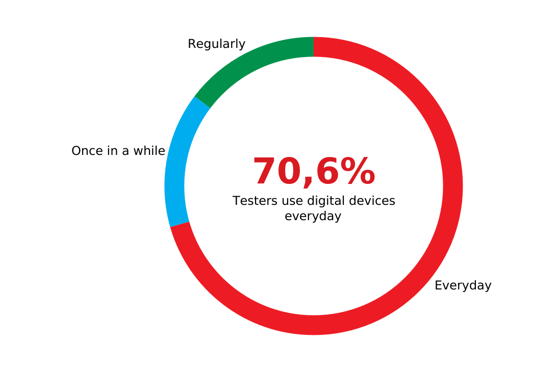
70.6 % use digital devices every day.
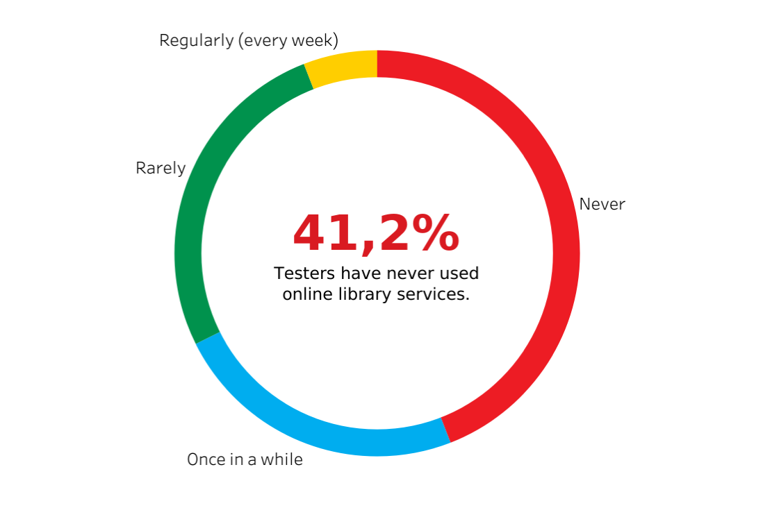
More than 41.2% have never used an online library service.

Insight 1
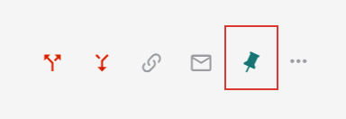
61.8% of users were confused by how the pin icon functions
When shown the image of the pin icon, the majority of users assumed that the article they pinned would be “pinned to top”. However the icon works similarly to a save button.
Insight 2
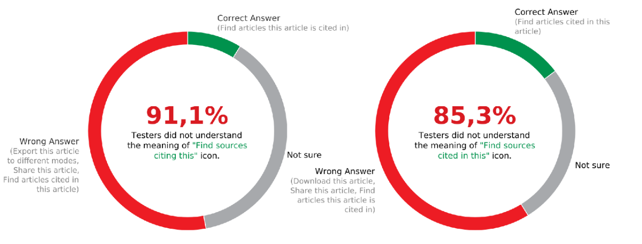
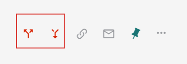
Over 85% of users were confused by the two citation icons.
While the two functions are very useful, the ambiguous look was confusing to most users. The arrows implied either “export” or “import”.
We concluded that aside from maximizing the usability of the search function, we need to revamp the homepage as well to fit with the bright, modern, and energetic feel of the Cooper Union brand.
Phase 2. Recruitment
With our clients, we decided to focus on the student body.
We first examined the two libraries within the Cooper Union consortium (NYU and the New School).
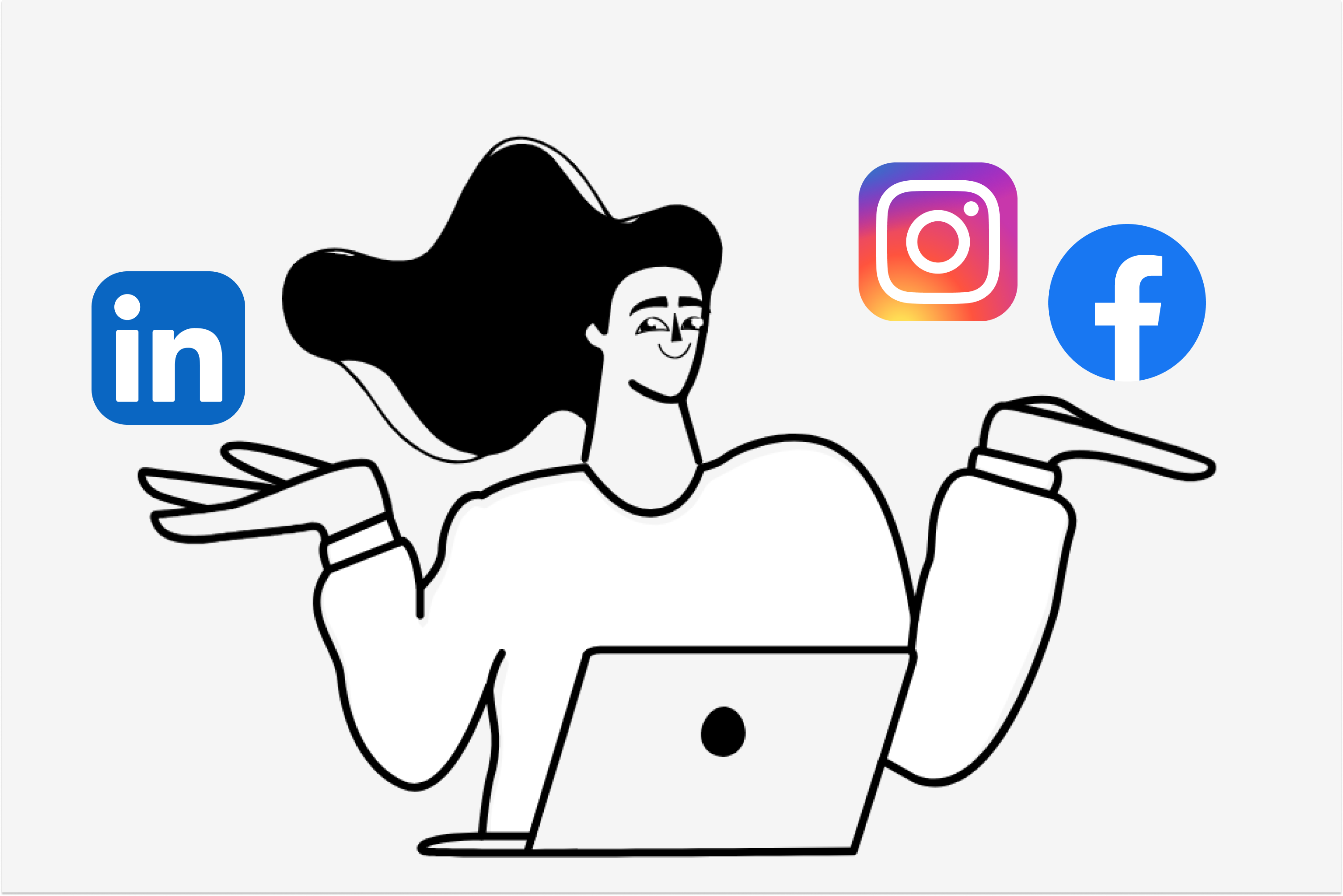
Cooper Union Library Social Platforms
With the help of our client, we provided them with a template for our social media post. Then they sent out a chain email to the Cooper Union student body.
In-Person Recruitment
My teammate and I visited Cooper Union to recruit students in the library. We were lucky to meet a lot of friendly students, that agreed without hesitation.
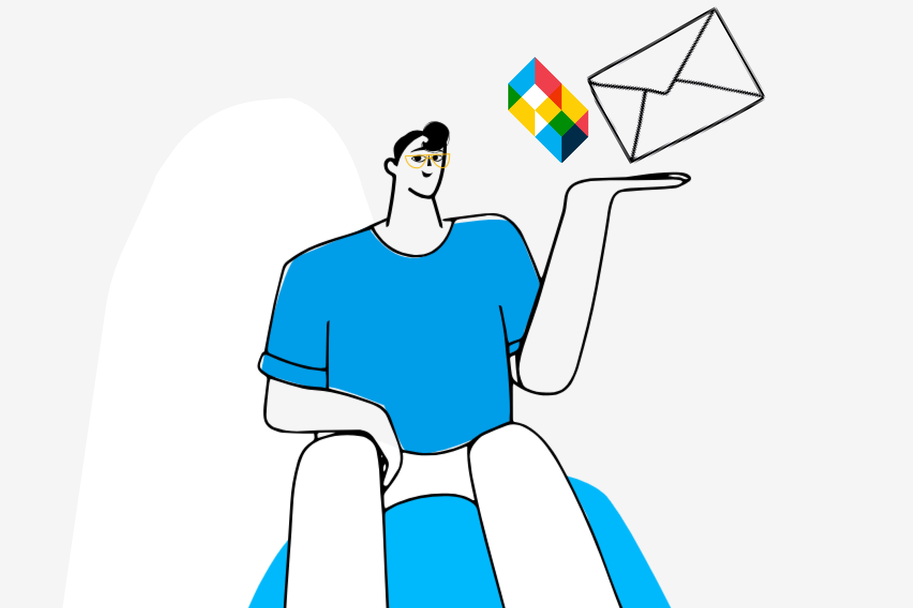
Social Media Scouting
While we were able to gather the majority of the tester group from social media (primarily from Linked In, it was the most tedious process.
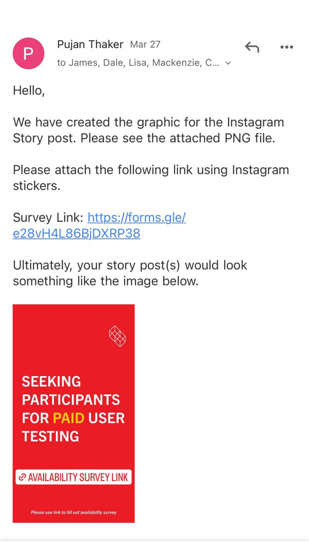


(1. Our Email to Cooper Union.) (2. Our Visit to the Cooper Union Library.) (3. A snipped of scouting through Linked In.)
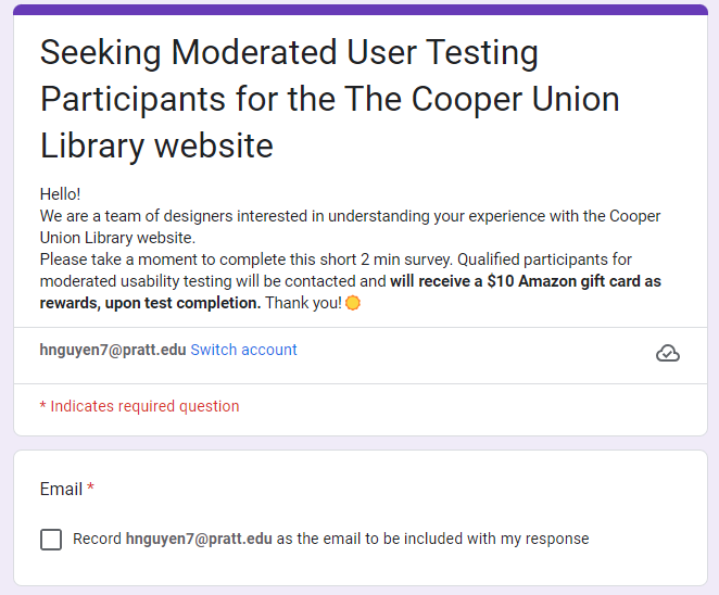
Recruitment Survey
Gathered user consent, availability, degree, and preferred device usage.
Amazon Giftcard
As a reward for their time and insights, we offered a $10 Amazon gift card as compensation.


Reaching out through social media and through school resulted in a lot of “ghosting”.

In-person recruitment had the highest % of acceptance at the promise of a gift card.
We recruited 15 users, 13 from Cooper Union, and 2 from The New School. All were students, a mix of undergraduate and graduate students.
Phase 3. User Testing
3.1 Methodology
We decided on the Moderated User Testing technique.
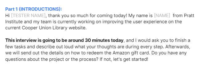
To have full control over any obstacles that might occur, we chose moderated user testing as our primary methodology. We conducted 15 interviews, both over Zoom and in person. Users were presented with a controlled task list.
Breaking the ice!
We were hoping that our testers would be in an environment as comfortable as ever. We started out by casually chatting and getting to know each other.
3.2 Tasks
Our task list is based on which portion of the page is most used by students.
01/ (HOMEPAGE):
Take a look at the current home page.
- Scroll down the page and describe out loud things that you notice.
- What information do you usually look for on the homepage?
02A/ (LIBRARY SEARCH):
Search for a resource under the topic of your choice. Voice your process of searching for the resource.
- What do you think of the aesthetic of the website?
- Are you usually able to find resources that you need on your own?
02B/ (LIBRARY SEARCH):
Find articles on Design that are available to read online.
- Access a digital copy of the article of your choice.
- Acquire a MLA version of the book’s citation
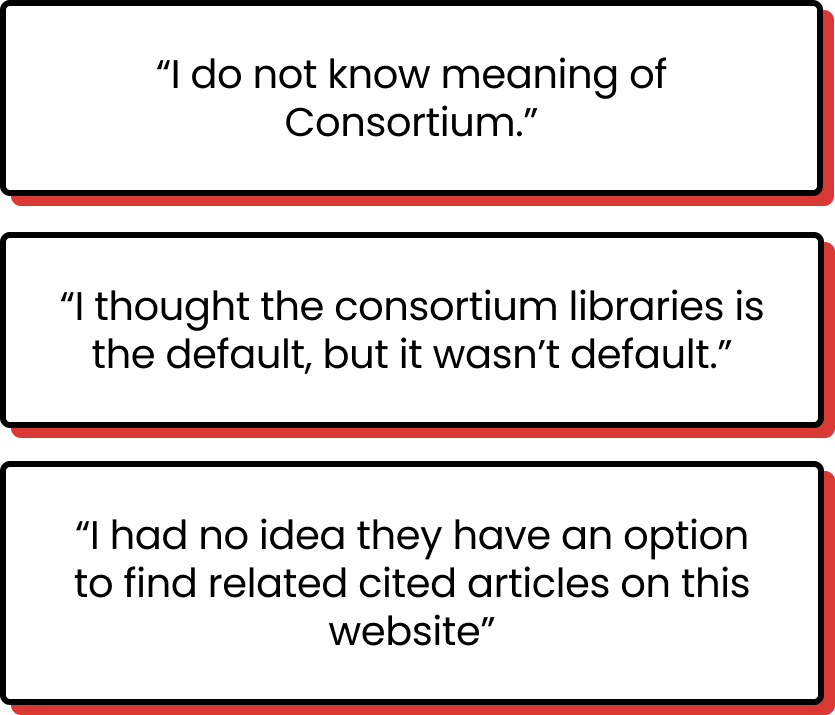
03/ (CONSORTIUM FILTER)
So Cooper Union, NYU, and The New School actually have a partnership where students would be able to access each other’s databases. Can you find an ‘NYU Report’ from the NYU Press Office in 1983 under the joint collection?
- What do you think about the wording or the placement?
03/ (ASK A LIBRARIAN):
You want to seek further assistance on your research project, find a way to approach a librarian to receive guidance.
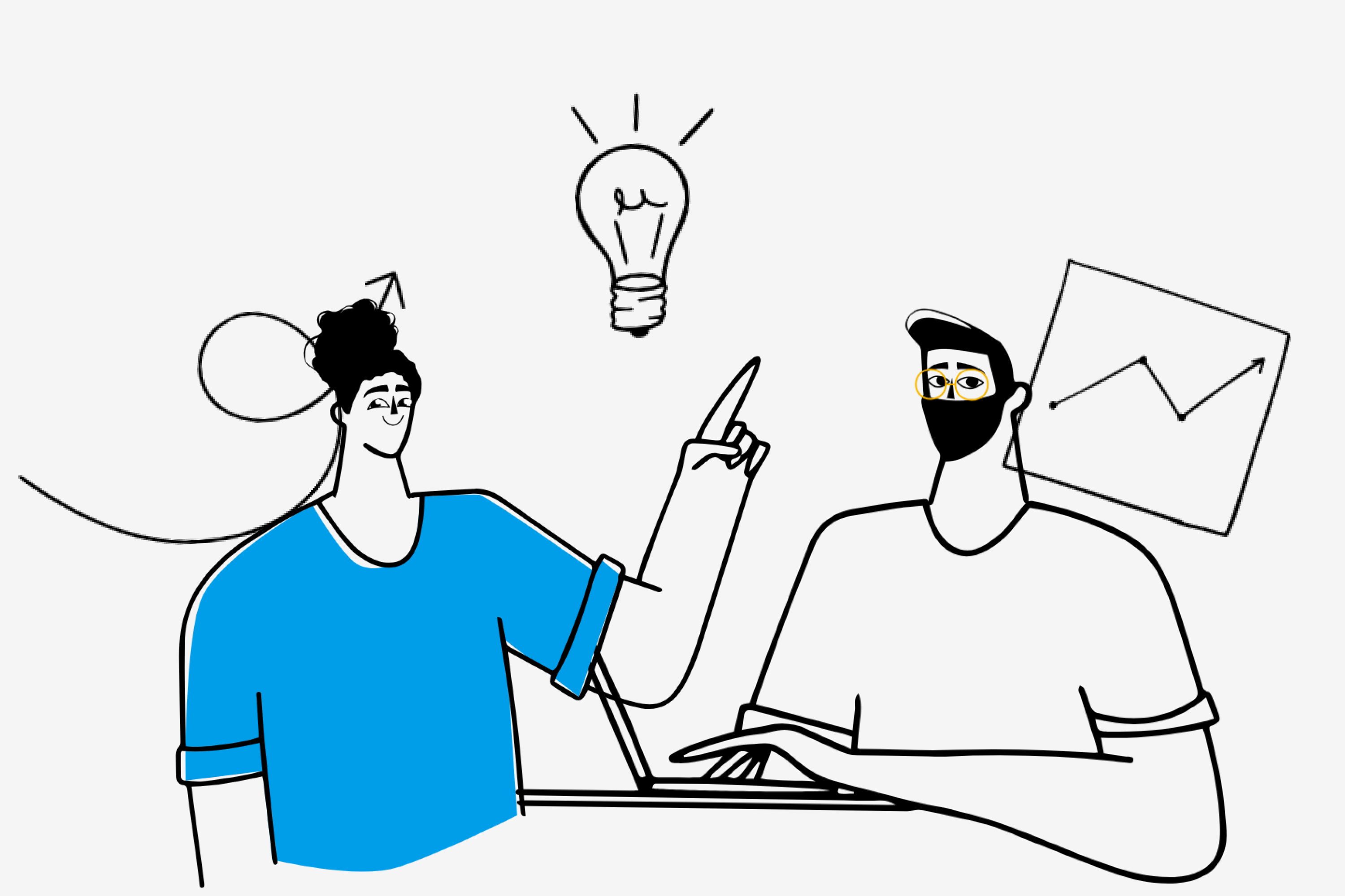
The initial interviews helped us narrow down our focus, to the homepage and search result page. As we were interviewing users, we started developing and creating iterations of our prototype.
Phase 4. Key Findings and Recommendations
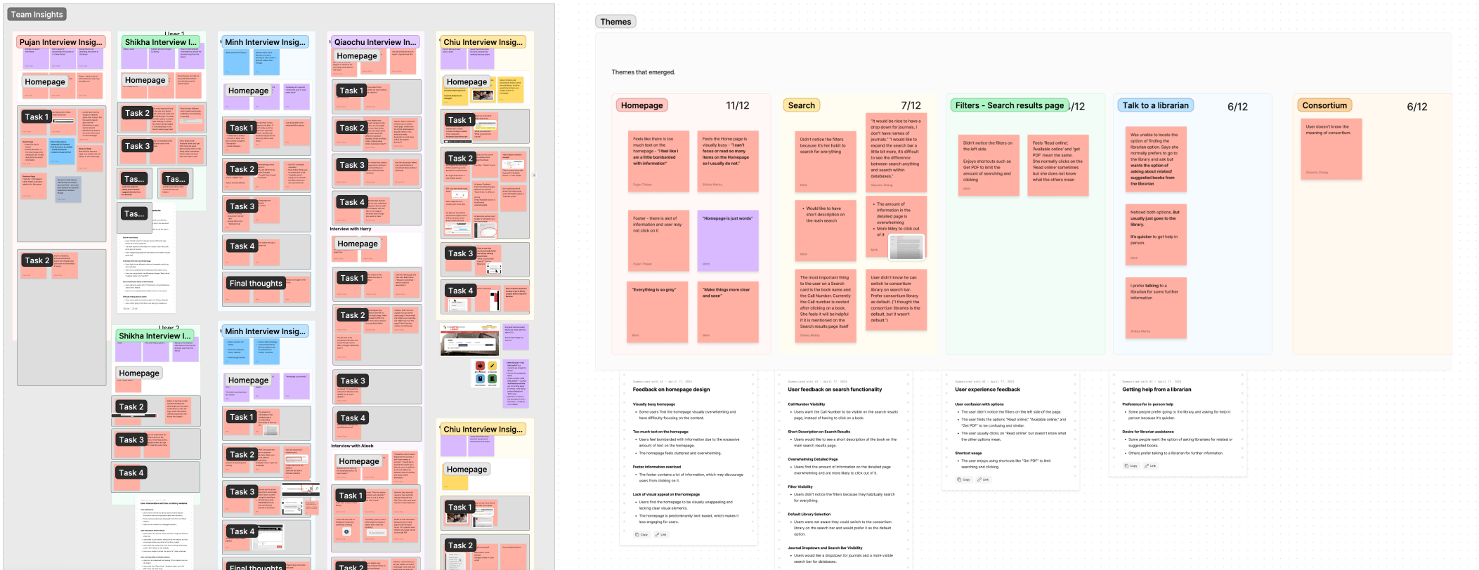
We finalized our research goal by prioritizing and seeking for patterns in our Research findings.
We found that:
87%
of users found the Home page text heavy and dense.
100%
of users found site elements & wording to be confusing.
80%
of users ignored “Ask a Librarian” box.
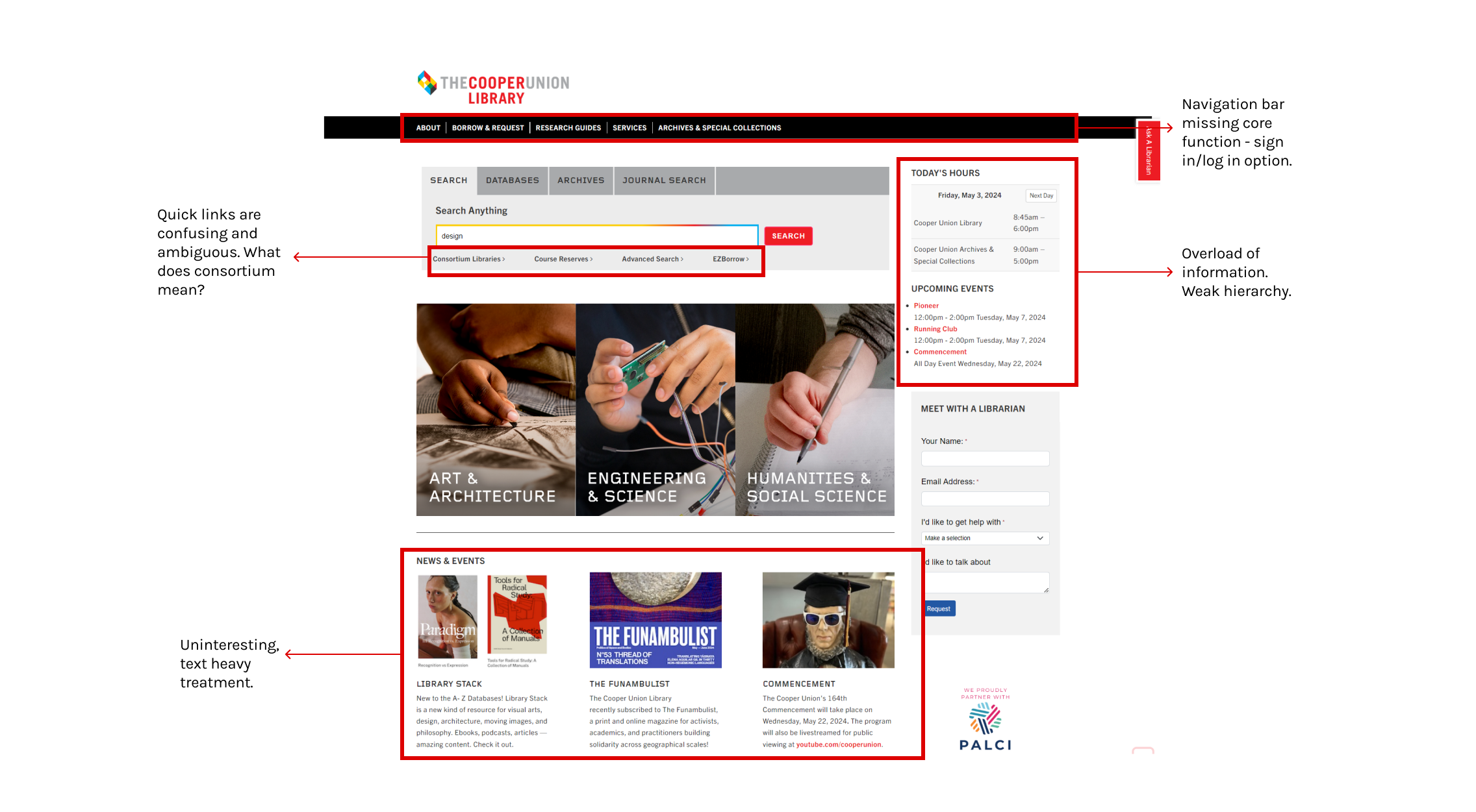
Issue 1
Text-heavy and uncommunicative homepage turns students away from the website.
Users commented that while there are a lot of important resources available on the library website, they felt like they were overloaded with information. The color scheme is grey and dull, it’s hard to distinguish useful information.

Recommendation 1
A fresh new look!
Our team did a complete redesign of the homepages, introducing several new functions such as quick links, “Track Your Due Dates”, and Featured collections.
Modern, bright, and energetic feel.
Cooper Union’s vibrant color palette was infused into various elements on the page – emphasizing key information.
A new and improved visual hierarchy.
Optimizing the userflow – guiding users’ eyes to important information and shortcuts.
Introducing brand new features.
New features such as “Quick Resources”, “Track Your Due Dates”, and “Featured Collection”. Designed elements create a more personable feel.
Issue 2
Site elements (icons, language) are confusing.
The Cooper Union Search has a lot of unique features that are uncommon in other library websites. However, the choice in styling and in language confuses users. Many of them tend to overlook these features, leading to an inefficient search flow.
Recommendation 2
Easily digestible visual and language system
By reducing the visual weight of text-heavy blocks and paragraphs, we have emphasized important information that is relevant to the student’s research journey.
Minimizing cognitive load
Hiding unimportant and irrelevant features creates a quicker search flow.
Align elements with users’ expectations
Changing confusing icons to match their function.
Simplifying complicated language
Reducing the possibility of error and a limited search scope.
Issue 3
Users frequently overlooked/ignored the “Ask a Librarian’ box.
The placement, color treatment, and rotation of the “Ask A Librarian” makes it illegible.


Recommendation 3A
Making the Chat Feature more prominent.
By moving the Chat Feature into a more intuitive position, we reduce the frequency of users needing in-person assistance.
Aligned with the natural visual flow of users.
Users expect to locate chat boxes at the bottom right corner.
Online? Or Not?
A signifier of activity status enhances user experience and reduces the chances of misleading students.
A friendly face, ready to help.
The addition of the “avatar” creates a more personable and credible experience.
Recommendation 3B
Surprise! Say “Hi” to our buddy “COOP”!
As there is a limitation in resources, librarians aren’t able to assist students around the clock. We are introducing COOP as a possible future implementation.
Trendsetters in the library scene?
AI is now involved in almost every aspect of our lives, however, has yet to be seen in the library context!
Around the clock – Assisting 24/7
Finals approaching?Research paper due at 8 am tomorrow morning? Worry not, since Coop is only one click away!
Answers anything and Everything!
While librarians are open to answering any questions, this would lessen the librarian workload.
Phase 5: Presentation
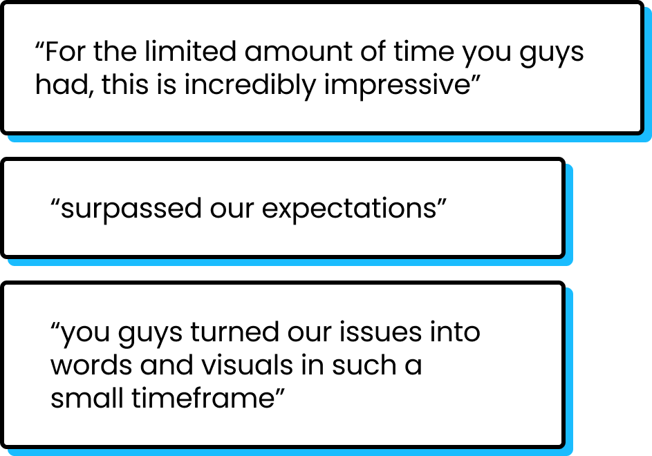
We received extremely positive feedback.
The Cooper team were excited to announce that they would implement our recommendation in the future!

Final takeaways
Practice thinking outside the box.
It is really important to target clients’ requirements early on in the project. But as we were diving in deeper into the project, we were able to uncover insights that the clients weren’t expecting.
It is really rewarding to see our client’s feedback after we have pushed ourselves to the max!
As much data as possible!
I learned the importance of having solid quantitative data backing up my design solutions. No matter how aesthetically pleasing a website is, if the users are unable to navigate through it with ease, then the results are invalid.
People love numbers! It is easily digestible and understood by everyone!
People love talking to those they like!
This was my first time conducting moderated user testing. As uncomfortable as I was, speaking to a stranger, I am sure that my testers were even more nervous!
I learned that people tend to open up more and provide better insights if they are comfortable in an environment.