
Project Members
Esha Mohol
Venkateswara Rao Appalabattula
Sebastian Hunt
Contents
- Introduction
- Project Goal, Research, and Design Objective
- Methodology
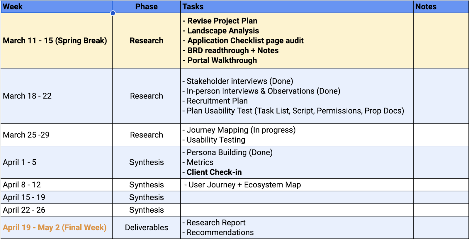
- Project Timeline
- Research Findings, Strategies & Recommendations:
- Conclusion
1. Introduction
The New York City Department of Consumer and Worker Protection (DCWP) works to enhance the economic lives of New Yorkers. It regulates over 45,000 businesses across 40 industries and enforces consumer protection, licensing, and workplace laws. The DCWP’s goal was to foster a fair marketplace by supporting businesses, resolving complaints, and guarding against predatory practices. It also empowers consumers and families through resources and education promoting financial health and work-life balance. The department conducts research and advocates for policies that benefit New York City’s communities.
In May 2023, while in-person registrations were still ongoing, the License Registration Portal was launched on the DCWP website. This online portal utilized web-based forms to make license registration more accessible. The website has received ADA approval. Our project aimed to enhance this portal’s user experience for preparing and completing their license registration online. We identified issues and opportunities to improve the portal’s discoverability and usability. The findings and design solutions from our study were utilized by the IT, Communications, and Marketing departments, as well as the Deputy Commissioner, to improve outreach and development.
The project was executed keeping in DCWP’s business objective to increase online licensing registrations. Our research indicated that this would, in turn, reduce the time it took new and renewing licensees to obtain a license. The project identified problems, researched user preferences, and developed recommendations to increase online licensing transactions. This was accomplished by addressing user needs and improving user satisfaction.
Link to the DCWP license application portal – https://www.nyc.gov/site/dca/businesses/licenses-apply.page
2. Project Goal, Research, and Design Objective
Goal: To evaluate the overall experience of applying and / or renewing a DWCP license via the license registration portal and propose design recommendations for improved usability and streamline the application process.
Research Opportunity
- Uncover pain points in current portal
- Research user mental models
- Identify information needs
- Evaluate feedback mechanisms of the current portal
Design Questions
- How might we streamline user flows for a simpler license application process, minimizing potential frustrations?
- How might we align the portal with users’ mental models to facilitate more successful online license applications?
- How might we enhance users’ comprehension of the license application process and improve visibility of portal functionalities for easy information access when needed?
3. Methodology
Enhancing portal discoverability and usability was the primary focus of our research objectives. These objectives aligned with DCWP’s core business goals of increasing online applications for business licenses and improving the portal’s performance in enabling users to submit their applications online.
Our project heavily relied on user research and usability evaluation methods to ensure information clarity and ease of navigation. The project timeline was broadly divided into three key phases: Research, Strategy, and Design. Several user experience (UX) research methodologies were deployed to gain a comprehensive understanding of the user experience:
Stakeholder Interviews: These were conducted to comprehend the benefits of in-person visits when applying or renewing business licenses, and to identify potential areas for design improvements. Additionally, we sought to understand the holistic experience of License Officers in order to better grasp common challenges and issues they face.
Observational Study: This method was employed to gain insights on how in-person visits influence the user experience during the license application or renewal process. We also compared the in-person application process with the online application to identify disparities in the customer experience.
Content Audit: This was conducted to evaluate the information hierarchy for easy navigation, assess the content flow for clarity, and review category-specific registration requirements. This comprehensive audit aimed to ensure that the content was user-friendly and effectively communicated the necessary information.
Cognitive Walkthrough: This methodology was used to evaluate the system’s learnability for new users. It involved experts assessing the interface from a user’s perspective in a structured manner, providing insights into potential usability issues and areas for improvement.Usability Testing: This involved getting participants to perform specific tasks to test out user flows. The aim was to uncover user mental models, information gaps, and pain points. As this methodology is largely qualitative, we found that conducting up to 5 tests helped to uncover approximately 85% of usability issues, after which the patterns tend to repeat.
4. Project Timeline
5. Research Findings, Strategies & Recommendations
Discoverability
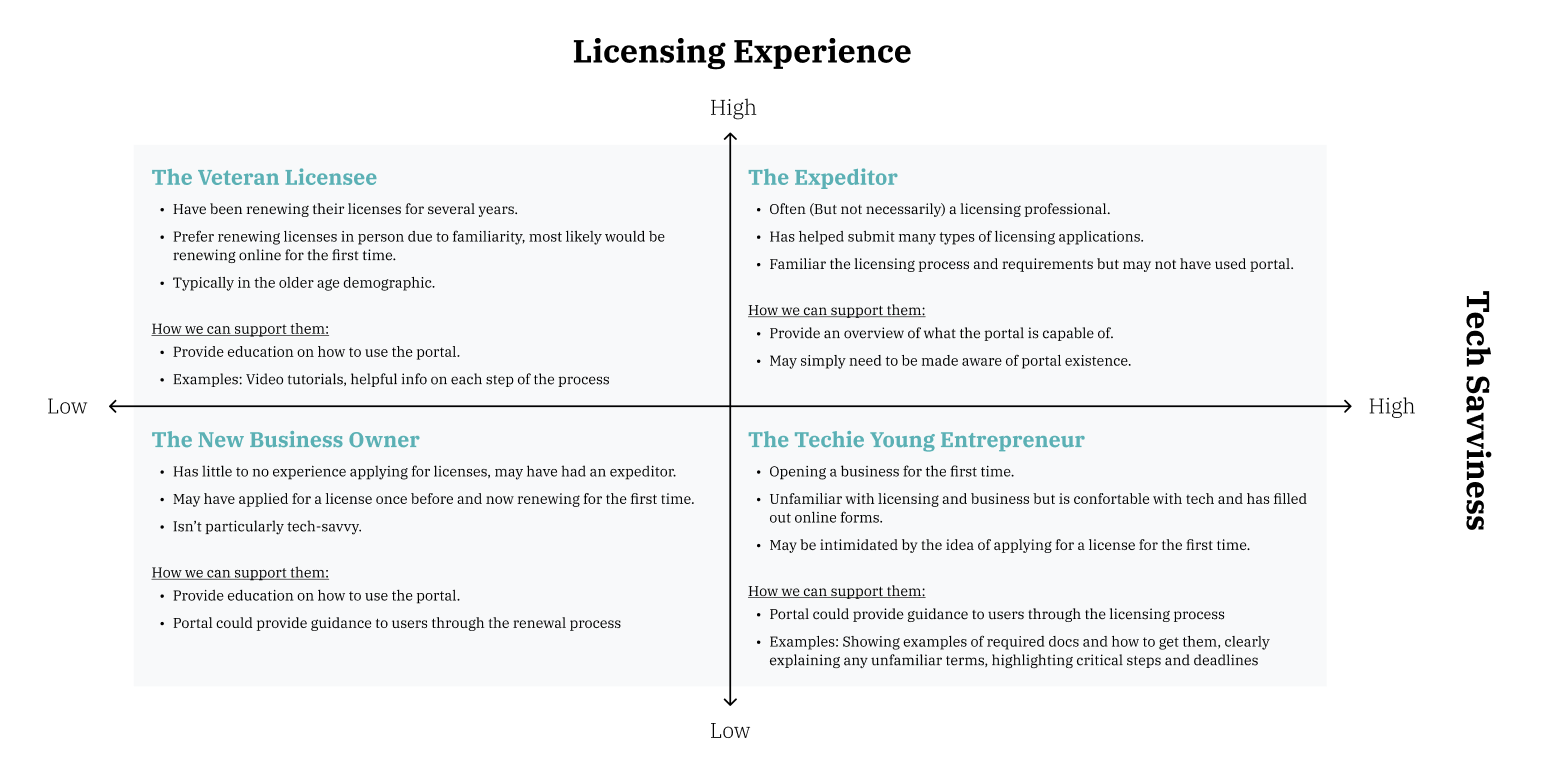
- Need for customer segmentation
- Based on user and staff interviews, we recognized the need for customer segmentation based on their licensing experiences as well as their tech savviness to identify how to serve each group best.
- The following matrix illustrates how we identified user archetypes based on their licensing expertise and tech savviness and notes how having guidance available on the platform would support each group.
2. Preparing to apply is the hard part.
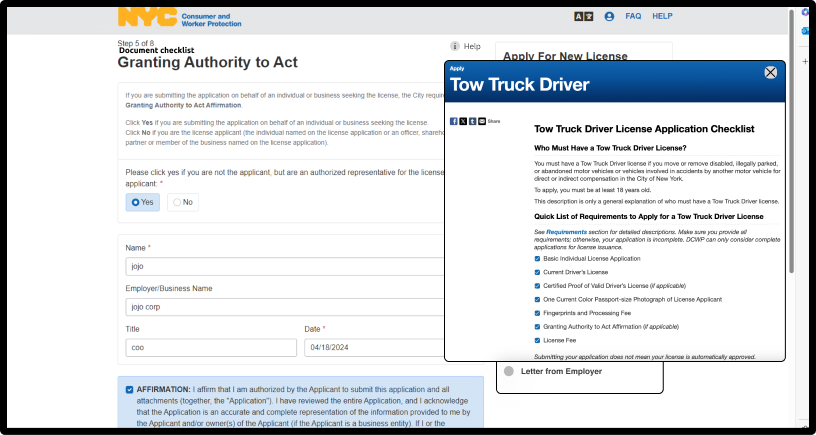
During the stakeholder interviews with the licensees, all of them claimed that preparing the documentation and onboarding was the most difficult aspect of the online application/ renewal process. While the current portal aims to prepare users for the online application using a “requirements checklist” page, we noticed certain pain-points in this experience where uses can discover the functionality of the portal in order to effectively utilize it to their advantage:
- Errors signing up/in
- Ensuring that their form-filling progress can be saved
- Overwhelmed by instructions and information on the Requirements Checklist page
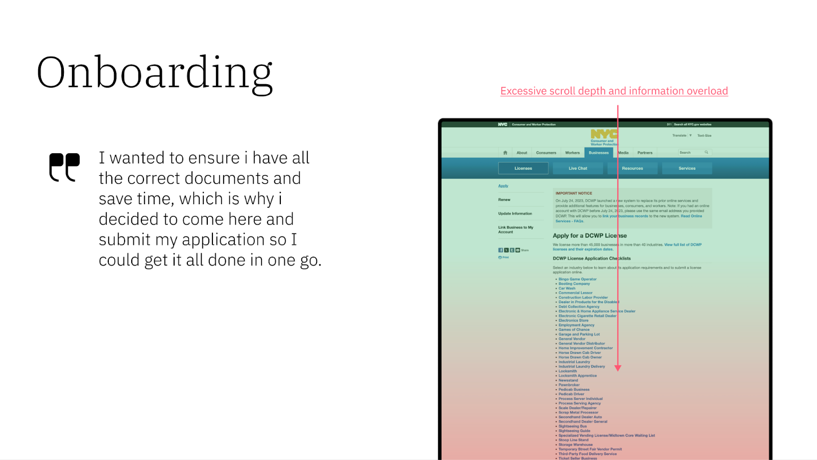
“I am applying for someone else but I don’t know where to begin, I have all these documents. I decided to come (make a visit) because at least someone would be there to guide me.” – A Licensee
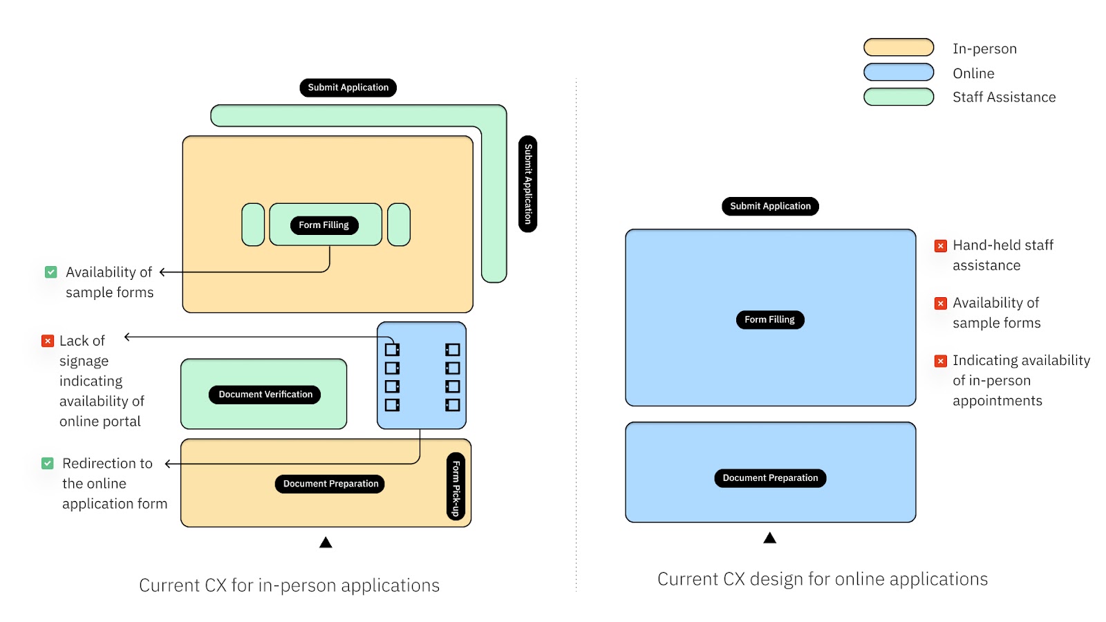
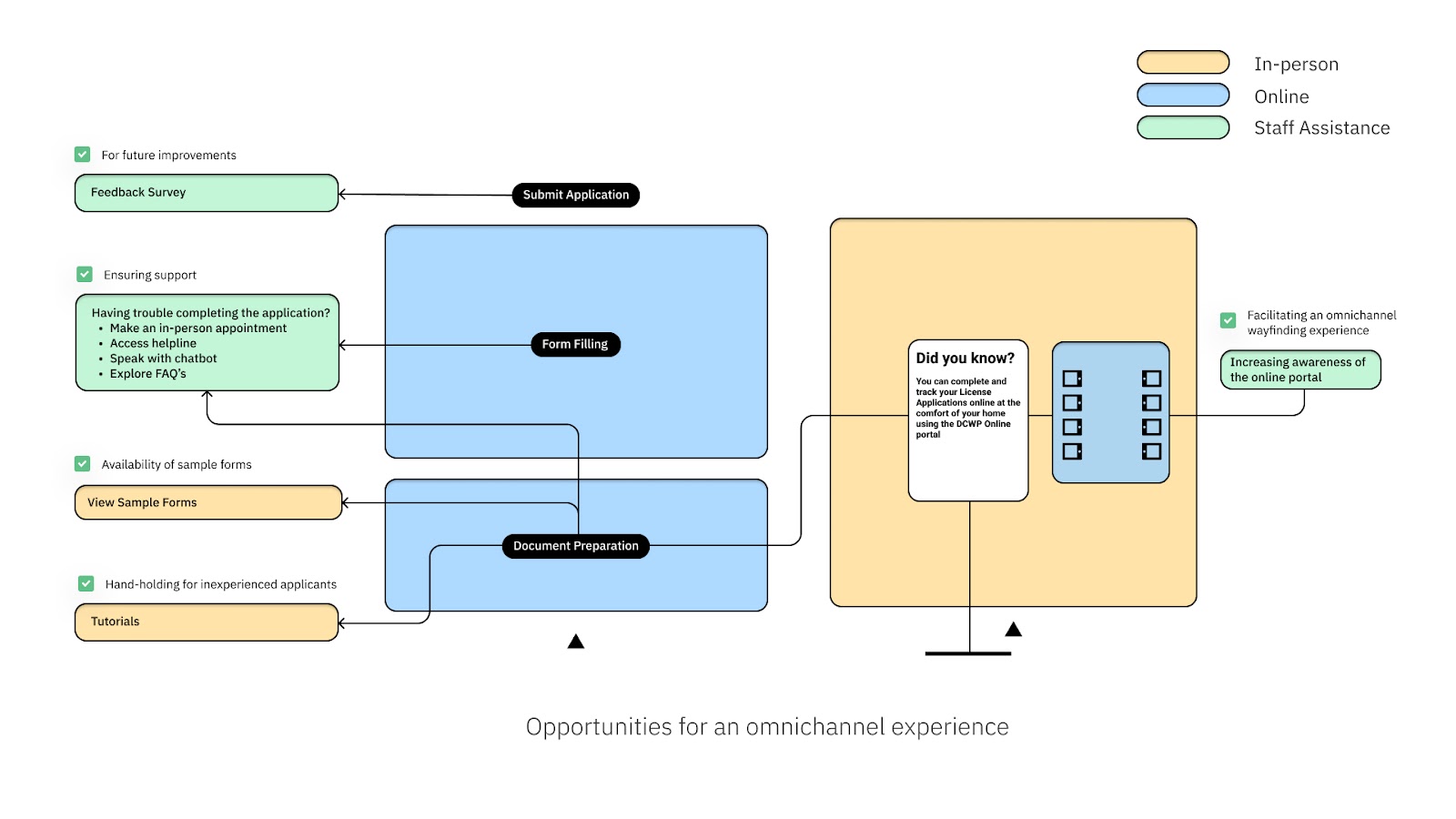
3. Omnichannel Thinking
We found that the in-person application process mirrored the online portal but noticed differences in customer experience between the two. Different customer segments required varying levels of guidance, indicating a need for a unified customer journey. We proposed a design strategy to streamline the experience across all channels, helping us pinpoint opportunities for users to find different pathways to finish and submit their application. We’ve compared the current gaps and our proposed strategies in the figures below.
Usability
- Process onboarding
The current website lacks an intuitive on-boarding process, causing confusion, especially for new users. Feedback indicates this issue leads users to book in-person appointments.
Pages in the on-boarding process are text-heavy, requiring excessive scrolling and making it difficult to find relevant information.
The process doesn’t have a clear ‘Start Application’ button.
Reselecting the license category is problematic. Users select a category from a list, then have to scroll and click ‘next’, making it hard to confirm their choice.
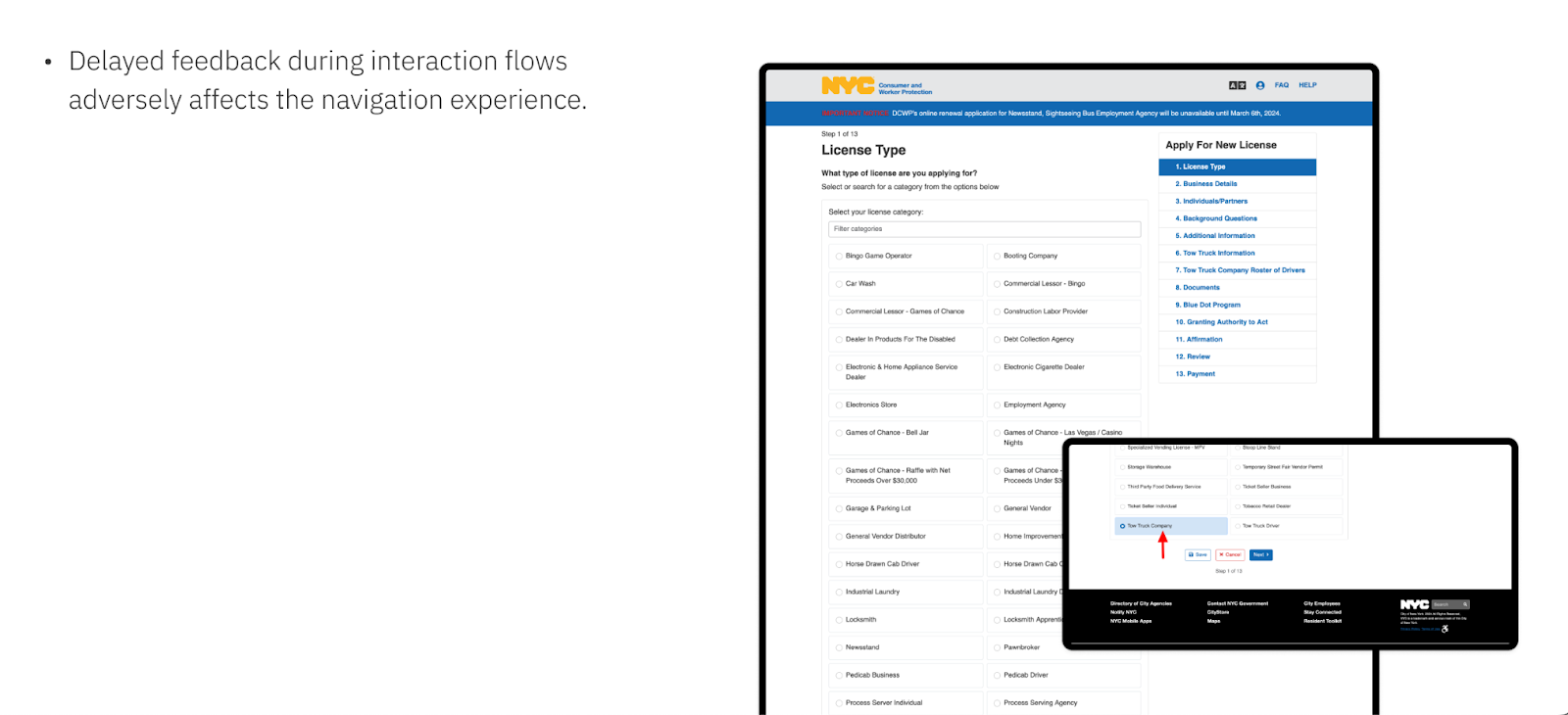
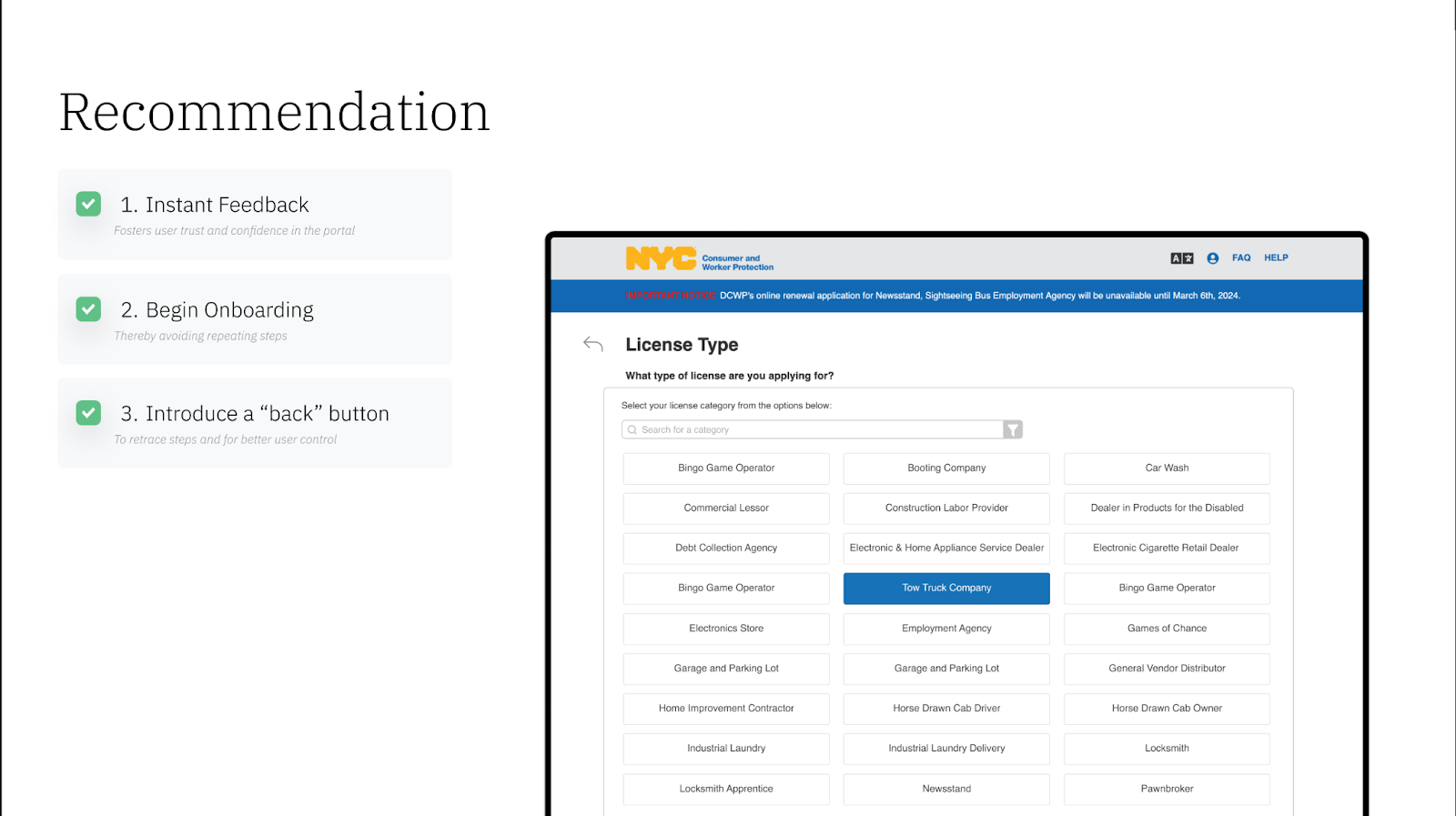
The application portal lacks a ‘back’ button, meaning users must use their browser’s back button and risk losing progress if they haven’t saved.
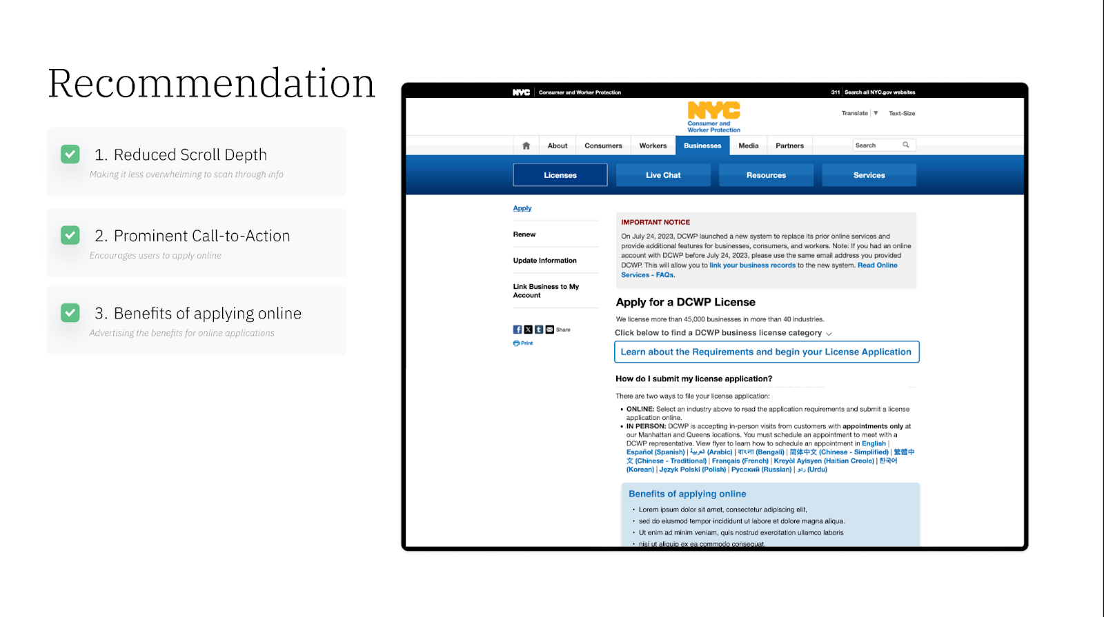
Recommendation:
- Reducing Scroll Depth: This will make information easier to scan.
- Adding a Prominent Call-to-Action: This will motivate users to learn more and apply online.
- Highlighting the Benefits of Applying Online: This will promote the advantages of online application.
- Including Video Tutorials: Provide users with media preferences to learn about the application process
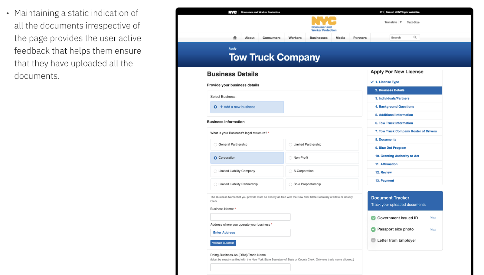
- Tracking Documents
- Though the portal has compartmentalized the application process as sections, users seem to forget about documents, or generally are not reminded of all the required documents before reaching the documents upload page.
- Recommendation:
Maintaining a static indication of all the documents irrespective of the page provides the user active feedback that helps them ensure that they have uploaded all the documents.
- Recommendation:
- Though the portal has compartmentalized the application process as sections, users seem to forget about documents, or generally are not reminded of all the required documents before reaching the documents upload page.
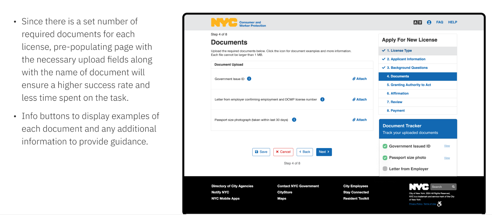
- Document Upload
- Forcing users to manually add an upload field for each required document creates unnecessary complexity and potential confusion and frustration.
- During usability testing, test participants were observed struggling to understand how to use this interface, requiring several tries to complete the task successfully.
- Recommendation:
Since there is a set number of required documents for each license, pre-populating the page with the necessary upload fields along with the name of each required document will ensure a higher success rate and less time spent on the task. - Info buttons to display examples of each document and any additional information to provide guidance and clarification when needed.
- Recommendation:
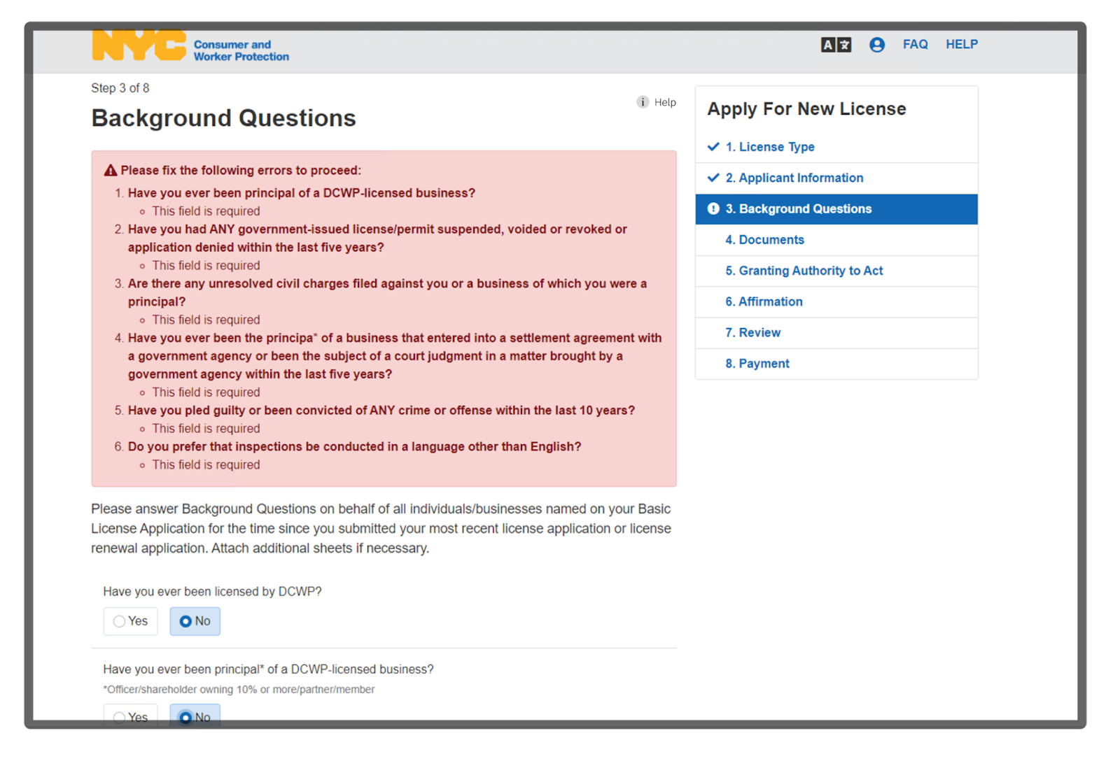
- Error Messages:
- Long list of errors in a large red text field may create a false impression of errors seeming more serious than they really are and could potentially overwhelm users, possibly prompting them to abandon the portal and seek help in person.
- Input fields with errors are already highlighted in the form, users can scan the form for errors.
- Long list of errors may create a false impression of errors seeming more serious than they really are and overwhelm users, possibly prompting them to abandon the portal and seek help in person.
- Recommendations:
- Users are prompted to quickly scan page for any errors and correct them, enabling them to more quickly and efficiently complete the task.
- More visually distinct marking of error fields allows for faster scanning and identification of errors.
- Error highlights disactivated as user reenters information to avoid giving the impression that their input is still incorrect.
Problem:
- Information Description
When interviewing participants, it was observed that participants often would not be able to recall parts of information mentioned in the required documents section of the specific License type.
A more specific observation was when a participant applying for a Debt Collection Agency (DCA) License was stuck at a multiple choice question regarding specifics of bond documents. This confusion led the user to visit the Department of Consumer and Worker protection (DCWP) office in-person. After visiting the office in person, the user had a printed copy of the License requirements, and kept it by the side, and started referencing it to fill out all the forms required on the online portal.
From these observations, the need for easy access, and an option to refer the License requirements page proved important. Improvising on this concept , adding the option to reference the requirements page on all stages of the application proved to be an effective solution that could help applicants with pre-documented information.
Mobile Focus:
Mobile phones being the most used devices by applicants across demographics, the lack of mobile optimisation was evident in user research.
In particular, one applicant could not show the progress of an incomplete online application on the mobile phone, when visiting the DCWP office in person.
The lack of a responsible, and usable mobile website for DCWP puts a large part of the demographic at a disadvantage
6. Reflection (Limitations, scopes, feedback)
In conclusion, our study provided valuable insights into the existing gaps in the DCWP online registration portal. Our project expanded to provide a more comprehensive user experience around the portal, bridging the divide between the in-person and online application process.
Our design recommendations, aimed at improving portal discoverability and usability, aligned with the existing user interface for easy implementation.
The project was a rewarding challenge that will positively impact thousands of New York City business owners. With enthusiastic feedback from the DCWP team, we look forward to seeing our recommendations incorporated into the portal.
As a future direction, DCWP can further enhance the portal’s effectiveness by optimizing for mobile users, establishing success metrics, setting up web analytics, and leveraging the omnichannel framework for better customer segmentation strategies.