About the Client:
Happy N’ Beyond is a small woman and indigenous owned Canadian gift store brand that sells independently designed stickers. The owners, Meaghan and Taylor, previously operated their business by selling on various e-commerce platforms like Etsy, Shopify and Faire, and at in-person events. They recently tried to take their business further by opening their own website and redirecting their traffic there. However, Happy N’ Beyond’s current website is made from a generic Shopify template, it suffers from low visits and even lower customer conversion, where almost no visitors ended up making a purchase at the site.
About the Team:
Alison, Lori, Lena, Kefan, Emily.
We are a five person team from Pratt Institute with combined experience in UI design, UX research and Digital Marketing.
Defining the Objective
After our initial meeting with Happy N’ Beyond, we’ve identified the key-areas where our client is struggling with:
- Client has limited reach to gain new visitors to their website;
- Client’s products are under-developed;
- Client’s brand identity lacks focus and does not translate through their website nor their product design.
Narrowing it down:
The team came together and discussed how we could best utilize our skillset and user testing resources to help our client solve their problems.
- Client has limited reach:
Improving our client’s website visit is outside our scope. However, our client has expressed their willingness to invest in social media ads and google ads in the future. What we could help with is to make sure that these purchased visits will effectively turn into buys.
- Client has limited product &
- Client lacks a brand identity.
While we cannot redesign Happy N’ Beyond’s line of products, with the UI design skills of our team members, we can help our client find a focused brand identity by redesigning their website that will have a higher conversion rate than before.
From there, we are able to develop our research objective: Re-design the UI and content organization to increase conversion rates for Happy N’ Beyond’s website.
Methodology:
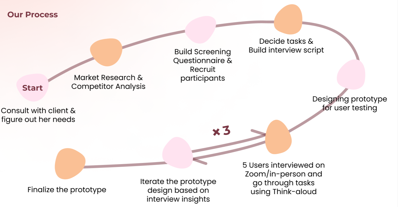
Ideation:
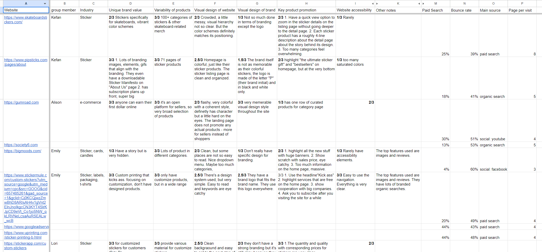
To create the initial prototype design, we analyzed 9 competitor websites that sell similar products to our client and 7 comparators of successful e-commerce websites to gather three key common denominators that we will incorporate into our website design:
- Clear content organization for easy navigation
- A compelling and personal brand story
- Consistency in visual elements
Additionally, to get a better sense of what our client’s brand stands for, we summarized the key information of our client’s brand identity based on the information they provided.
Brand: Women and Indigenous owned, birthed out of love, rooted in community, eco-conscious
Philosophy: Create joy, creativity, good vibes, good quality and dedication
Target Customers: Creative, fun-loving millennial women, younger individuals, people who love to have cute things to decorate their lives and have a sense of humor.
Rapid Iterative Testing:
To test on our prototype for our client’s website, we adopted the process of Rapid Iterative Testing where we split up 15 user tests into three rounds of 45min user tests, gathered their feedback and improved the design incrementally.
User Test Participants:
Age: 18-30
Occupation: Student, Office lady, Mom(buy for themselves and their kids)
Gender: Female
Key Areas of Questions asked:
MAIN QUESTION: Will user make a purchase? What are the product, design, and branding related reasons for their decision?
- Is our intended brand perception aligned with that of our users?
- How do users feel about our branding? Is our branding attractive?
- Are users noticing the right things we wish to highlight?
- Is navigation clear and have all information user want to see?
- Are there any obstructions to the current purchase flow?
Our Findings (in stages)
First Prototype:
Issues identified with the first prototype’s overall design
- The current design system makes the brand seem childish and un-professional
- The visual assests used for sample products are inconsistent
- The homepage lacks visual hierarchy
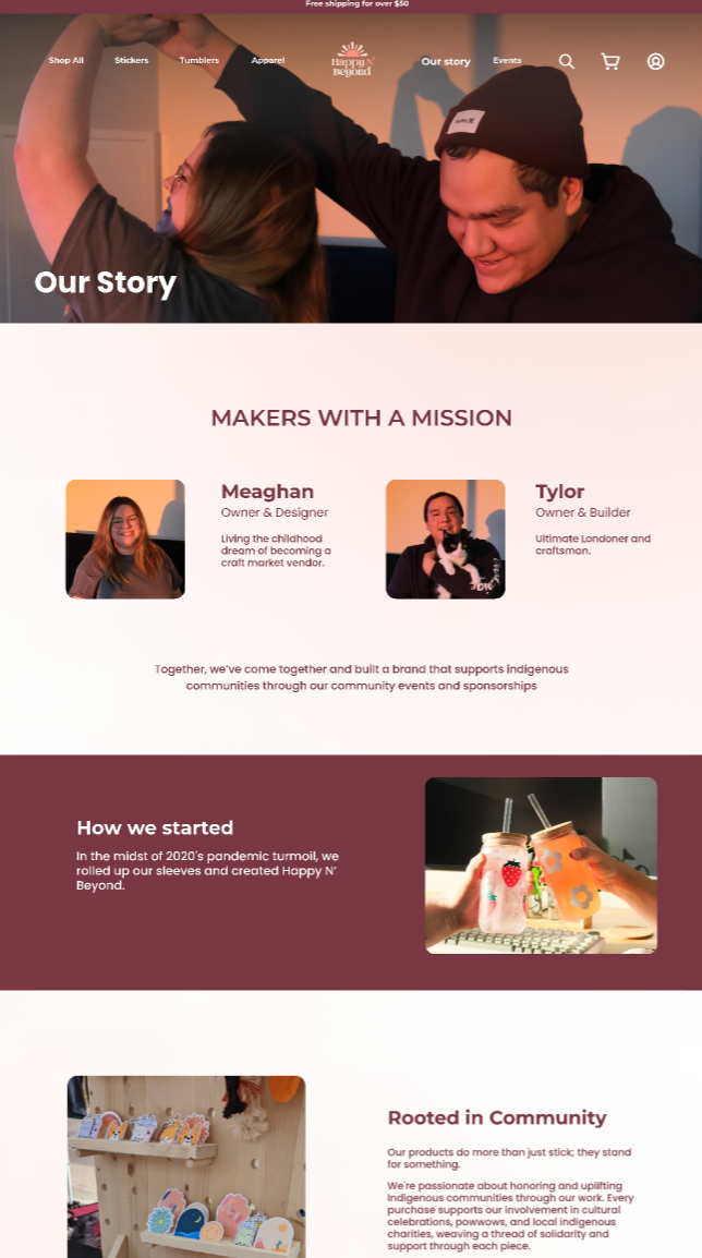
Additionally, as we payed great focus on the users’ impression of the “Our Story” page, we also gathered detailed feedback on the individual page and included the recommended changes for prototype 1.
Feedback for Our Story page content:
- “How exactly does the brand support indigenous communities? You can’t just say that and not elaborate.”
- “I want to read less about this product stuff and more about the people. The title of this page says ‘Our Story’, but I don’t see much of a story, just the brand description.”
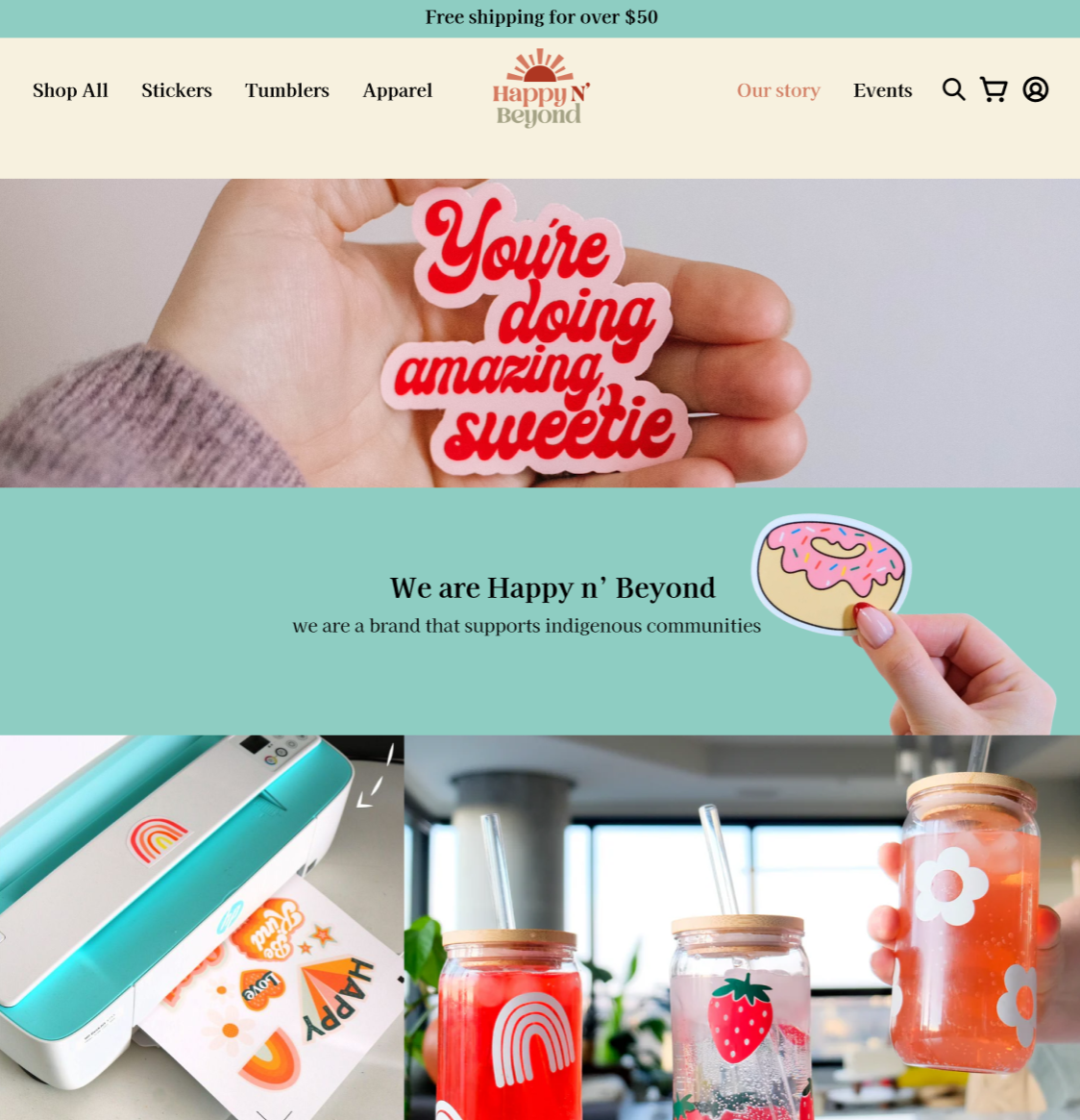
- “The texts are too long and the images don’t correspond to the content. I don’t want to see stickers coming out of a printer.”
Revisions needed:
- Content:
- Go more personal and humanize the content. Focus more on the story of the people behind the brand instead of generic brand statements.
- Include more details about the business’s involvement in the community.
- Formatting: Keep the text short and concise, break up the content. Use the bolded paragraph title to convey information.
- Visuals: Include images of owners, behind the scenes… use genuine pictures.
- A nice example to follow: https://www.blanktag.co/pages/about-blank-tag-co
Second Prototype:
Issues identified with the first prototype’s overall design
- Minor mistakes with usibility; such as the fixed headline over-lapping with page content, header text on the home page is not easy to read, elements not correctly linked
- Current product listing pages need more emphasis andvisual elements that ‘pop’
Feedback and Revisions needed for the “Our Story” Page
Feedback for Our Story page content:
- “Does a part of the profit go to charities? If so I feel like you should write that out somewhere.”
- “(Question: did any part of this page catch your attention or pique your interest?) –Not really. I don’t usually read ‘About Us’ pages, and now that you ask me to read it, there is nothing too exciting about it. I like the pictures, though.”
Positive Feedback:
- “The picture is so cute. I love the cat. The owners seem like really genuinely nice and chill people. They love each other and they’re just having fun with what they do.”
- “It’s nice that they are indigenous owned. I will consider buying something from them because you have to give back in small ways, you know? ”
- “They go to Powwows, that’s nice!”
Revisions needed:
- Content:
- Users are still confused about the brand story when it comes to indigenous community involvement. Consider telling a narrative instead of facts. (In V3, we try to start with Meaghan’s story as an example)
- Formatting + visuals
- Catchier headlines, more pictures.
- The current linear page structure is too formal. Consider displaying the components in a less boxed-in way or adding interactions.
Final Result:
Based on feedback from our final user tests, our prototype provided the following fixes for the client that will contribute to a higher conversion rate from visitors to buyers
- Developed a clear and engaging brand identity that highlights the owner’s wholesome personality.
- Created a unique and consistent visual impression that evokes warmth and professionalism.
- Improved the information structure that allows user to browse and look for products more efficiently.
- Provided a infrastructure for client’s future plans of expanding their products and using the website as a information hub for their in-person events and activities.