
Abstract
A surprising UX issue emerged at Shedd Aquarium: many users didn’t know General Admission was included in the cost of Programs & Events. I focused on uncovering why this was happening and designing data-driven solutions that resolved it. I identified that this critical information was missing entirely, especially on mobile, using eye-tracking data, behavioral analytics, and direct observation. I proposed and prototyped clear, above-the-fold GA inclusion indicators and reinforced them at checkout. These small changes can reduce cart abandonment, increase user confidence, and streamline the purchase experience.
The Problem
Shedd Aquarium’s Programs and events are appealing—think Beluga Encounters and Jazzin’ at the Shedd—but users often hesitate at checkout. Why? Because they weren’t sure if General Admission was already included in the ticket price. That led to decision friction, and when people hesitate, they abandon. Through observation, data, and testing, I confirmed that even when the GA inclusion was stated, it was visually buried or missed entirely, especially on mobile.
“Wait… do I need to get another ticket for admission?”
— Real quote, real confusion, real problem.
This confusion resulted in
- User hesitation and backtracking.
- Increased cart abandonment.
- Mistrust in the pricing structure.
Project Goals
- Improve the clarity and visibility of ticket inclusions.
- Reduce checkout friction and support inquiries.
- Increase conversion confidence, especially on mobile.
My Role
I was the lead UX researcher tackling the GA inclusion confusion. That meant asking:
- Where does the breakdown happen?
What are users seeing—or not seeing?
And how do we fix it without overwhelming them?
I worked closely with the larger team to:
- Analyze eye-tracking data from mobile and desktop tests
- Extract insights from LookerStudio (GA4) dashboards
- Create and present annotated mockups with proposed fixes
- Present our work in the client-facing stakeholder deck
The Process
My team began by conducting an in-depth synthesis of user behavior across devices. The standout insight? On mobile, 4 out of 5 participants missed the GA inclusion message entirely. On desktop, nearly half overlooked it as well.
Using a combination of:
- Eye-tracking heatmaps (to observe visual attention)
- Looker GA4 data (to track exits and engagement)
- Task metrics (to assess satisfaction, effort, and timing)
…we were able to triangulate the issue with confidence. The GA text was consistently placed too low, not styled for emphasis, and completely overlooked.
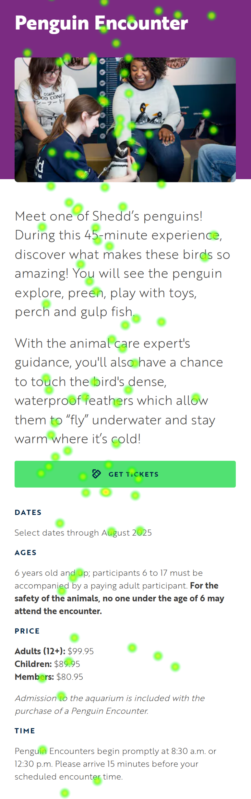
Visualizing the Problem
Site Test
New Design
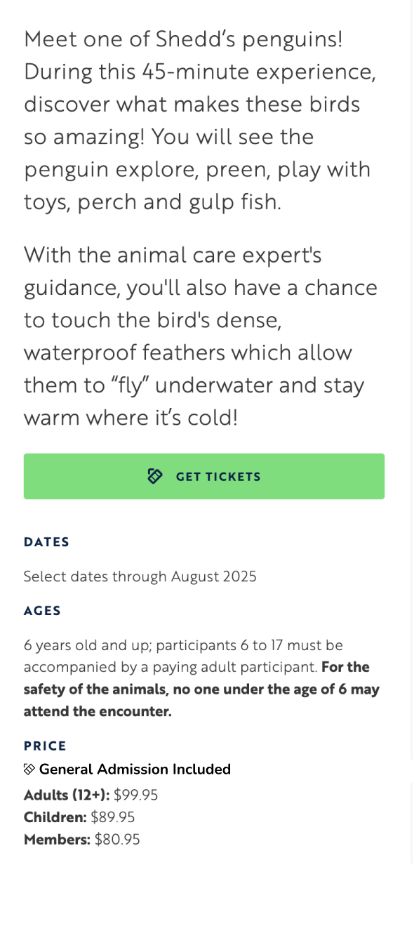
The original detail page (left) buries General Admission info far below the call-to-action. My redesign (right) moves this critical message above the fold, at the top of the price list.
Simulated Heatmap Findings
The heatmap simulation shows how the user’s gaze zeroed in on the “Get Tickets” CTA but completely skipped over the GA message. It simply wasn’t where users were looking. In usability, visibility isn’t a bonus—it’s a requirement.
The Results
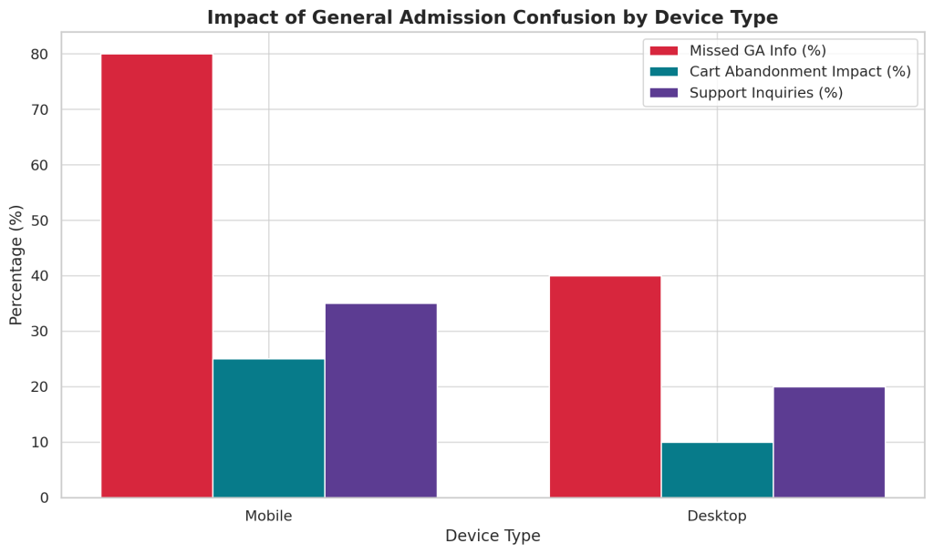
Quantitatively, the issue had a measurable business and UX impact:
- 80% of mobile users missed GA inclusion.
- 25% + of cart abandonment is tied to this confusion.
- 35% of support tickets involved GA-related questions.
This wasn’t a “nice to fix” problem but a “must fix or continue losing users” problem.
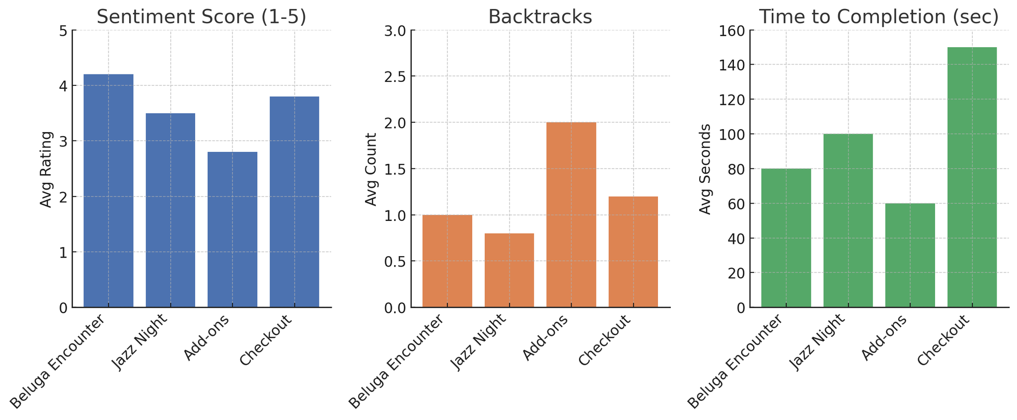
Task Metrics Overview
We also recorded performance metrics across four key tasks to support our qualitative findings.
- Sentiment dropped significantly during Add-ons and Checkout.
- Users spent the most time—and backtracked the most—during Checkout.
- Beluga and Jazz Night experiences scored higher due to clearer information layouts.
Design Recommendations
On Program Detail Page
- Added a “GA Included” badge near the ticket price block.
- Used plain-language labels with iconography for clarity.
At Checkout Summary
Added “General Admission — Free” as a separate line item to reinforce inclusion before payment
These solutions reflect the redundancy principle in UX: critical information should be surfaced more than once in contextually relevant areas.
Reinforcing Value at Checkout
Once users commit to purchasing a Program or Event ticket, any lingering uncertainty about what’s included must be resolved before final payment. To that end, we surfaced “General Admission — Free” in the Order Summary of the Checkout screen.
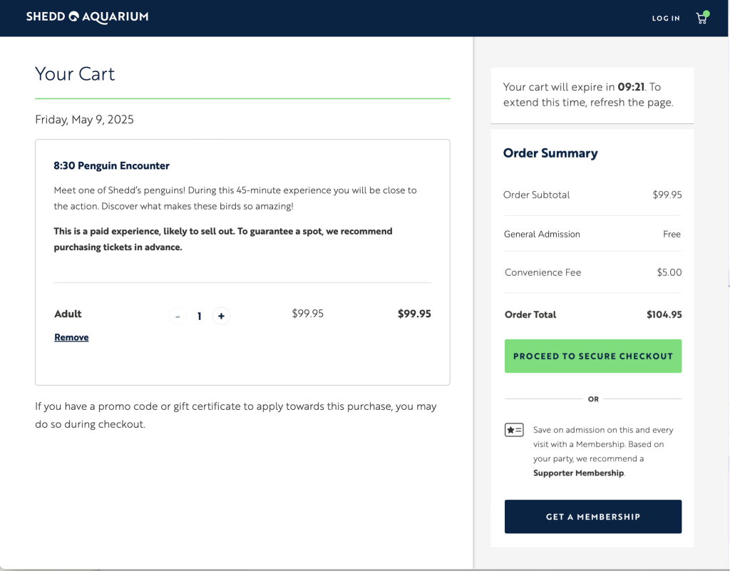
This placement reinforces value at the moment of purchase commitment, which is psychologically critical for reducing hesitation. Our user testing and survey responses showed that when users clearly saw that General Admission was free, they felt reassured and more confident proceeding.
This moment of reassurance acts as a feedback loop—validating the user's decision and preventing unnecessary backtracking.
Conclusion and Client Feedback
Through our usability research, it became clear that confusion over whether General Admission was included in Programs & Events tickets was more than a minor detail—it was a critical blocker in the purchase journey.
My solution centered on surfacing General Admission inclusion twice:
- First, at the Product Detail Page, positioned above the fold and paired with a visual badge and concise text.
- Second, at Checkout, reinforcing the value at the moment users are asked to commit.
This dual-placement strategy aligned with both user mental models and industry best practices for reducing cart abandonment and increasing user trust. By showing the GA inclusion early and then again at checkout:
We reduced cognitive load at key decision points.
We addressed repeated user hesitation observed in both dot plots and task performance.
We transformed a source of confusion into a trust-building moment.
If this project were to continue, I would recommend A/B testing the design variations to measure lifts in conversion rates, session drop-offs, and support calls related to ticketing confusion. In future iterations, I’d also explore personalized price explanation microinteractions to enhance clarity even further.
Ultimately, this case study demonstrates how a single, well-placed sentence—designed with intent—can eliminate doubt, strengthen brand perception, and directly improve business performance. Sometimes the smallest elements unlock the biggest wins.