
Introduction
Chase is one of the largest banks in the United States, serving millions of customers through its online and mobile banking services. Having personally used the app for everyday banking, I have noticed both strengths and shortcomings in its usability. Using Don Norman’s concepts from The Design of Everyday Things, I will analyze a few attributes of the Chase app that impact the user experience, highlighting good design practices while pointing out areas for improvement.
Home Screen
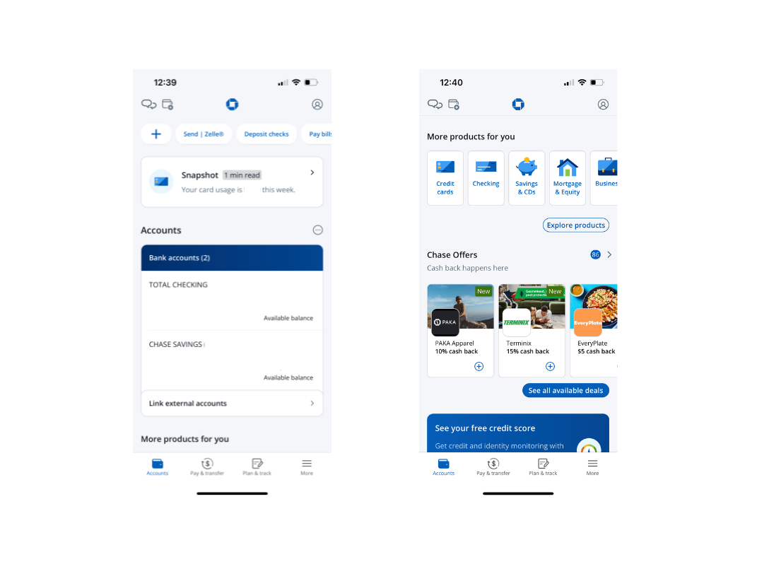
As soon as you land on the Chase home screen, your total checking and savings balances are immediately displayed. This reflects visibility in design, helping to close the gulf of evaluation by giving users clear, instant feedback on their financial status without extra navigation. However, the app could improve by allowing users to customize what’s visible on the home screen—for instance, showing recent transactions or credit card due dates—so the signifiers better match each user’s mental model of what financial overview means.
Debit Card Section
Scrolling down to the “More Products for You” section, it’s not immediately clear where to find information about your debit card. This is surprising, since a large portion of Chase customers primarily use the app for everyday debit transactions. Options for credit cards, mortgages, equity, and investments are much easier to locate, even though they may be less relevant for many users. This misalignment highlights a gap between the app’s structure and the user’s mental model, forcing customers to rely on knowledge in the head to hunt for information that should be easily discoverable. To improve discoverability and reduce the gulf of execution, debit card information should be made more visible on the home screen or placed within the “Accounts” section, aligning navigation with the most common user goals.
Navigation Bar
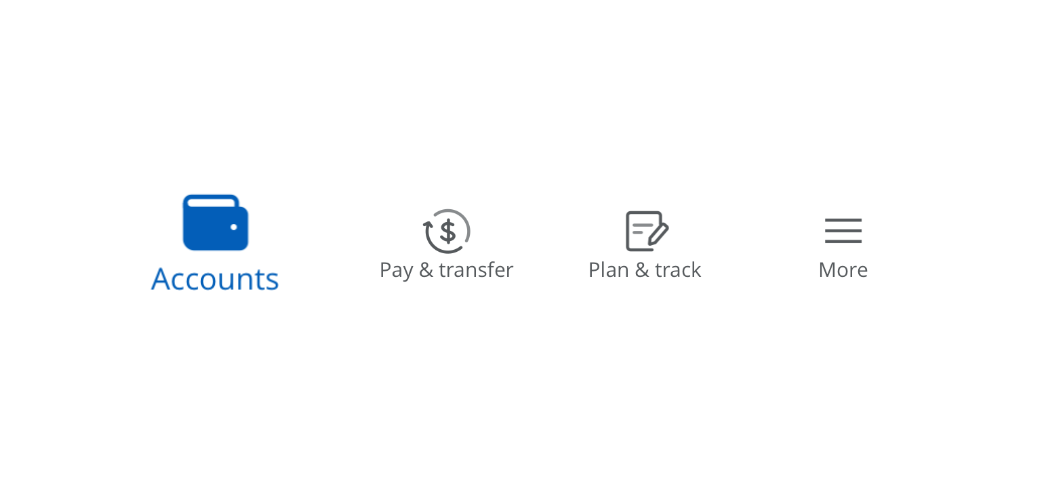
At the bottom of the screen, the navigation bar raises issues with natural mapping. Instead of a clear “Home” icon, users are presented with an “Accounts” icon. While this might seem useful, tapping it actually leads to the home page, which contains far more than just account information. This creates a mismatch between the signifier and the system’s actual behavior, breaking the principle of natural mapping and potentially confusing users. To reduce this gulf of execution, Chase could introduce a distinct “Home” icon to represent the broader dashboard, while keeping “Accounts” as a separate, more specific navigation option. This adjustment would align the interface with user expectations and mental models, making navigation more intuitive.
Conclusion
Overall, the Chase app demonstrates both strong and weak applications of Norman’s design principles. Its clear visibility of account balances provides users with immediate feedback, but issues such as poor discoverability of debit card information and the confusing navigation bar highlight gaps between user expectations and the system’s design. By aligning signifiers more closely with user mental models and improving natural mapping in navigation, Chase could create a more intuitive banking experience. This critique highlights the importance of designing digital interfaces that not only function but also match how users think, act, and understand their everyday tasks.