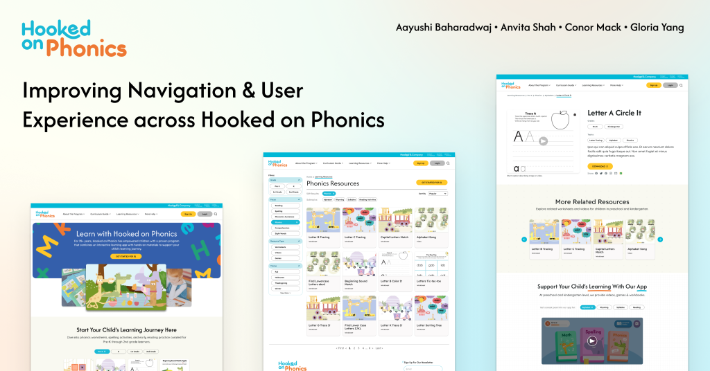
Team
Account Manager: Aayushi Baharadwaj
Project Manager: Gloria Yang
Design Lead: Anvita Shah
Strategy Lead: Conor Mack
Timeline
Oct – Dec 2025
Client
Hooked on Phonics
Focus
Information Architecture on Learning Resources
Setting the Context
Introducing Hooked on Phonics
Hooked on Phonics is a learn-to-read program designed to help children ages 3-8 develop foundational literacy skills. The platform offers a combination of physical learning kits (workbooks, storybooks, and hands-on materials) and digital resources (a mobile app with interactive games and activities).
Their website serves as both a marketing platform and a resource hub, offering:
- Free Learning Resources: Worksheets, videos, and educational games organized by grade level (Preschool through 2nd Grade)
- Paid Subscription: Access to the full Hooked on Phonics app and physical learning kits delivered monthly
- Educational Content: Articles and guides for parents on reading fundamentals and learning strategies
The Challenge
Hooked on Phonics recently underwent a major website redesign, but the Learning Resources section was deprioritized and fell out of scope. As a result, this critical area, meant to support parent discovery and ongoing learning, became difficult to navigate and underutilized.
Our team focused on redesigning the information architecture (IA) and user experience of the Learning Resources to address low discoverability, unclear navigation, and weak connections between free resources and paid offerings. Over three months, we focused on creating a continuous, exploration-based experience that helps parents confidently guide their child’s learning journey.
After three months of in-depth research, design, and iteration,
we are proud to present the redesigned Hooked on Phonics Learning Resources experience
How did we get here exactly?
Uncovering pain points & building design direction
Exploratory Research Process
Insights from Client & Stakeholder Conversations
Through conversations with stakeholders and internal teams, we identified several core issues impacting the effectiveness of the Learning Resources experience.
Key Problems
- Learning Resources section is buried and confusing.
- Navigation lacks clarity and hierarchy
- Filters and breadcrumbs feel inconsistent and unreliable
- Main product and offerings are not clearly articulated
Design Priorities
- Providing guidance to users as they navigate through the site
- User experience of the learning resources
- Balancing usability with SEO
Project Goals
- Make Learning resources easy to find and use
- Increase exposure and conversions across physical & digital offerings
- Reach and exceed product parity with competitors
Our Approach

Through our research, we wanted to understand:
- How do users navigate to and within the learning resources section?
- How does the current information architecture support or disrupt users’ finding the resources they need?
What We Learned from Competitors
We analyzed four leading educational platforms to understand best practices in educational content navigation: Mindly Games, Education.com, SplashLearn, and K5 Learning.

Educational IA Principles
Our literature review revealed four core principles that educational sites must follow to serve parents effectively:
- Navigation must account for multiple user goals – Parents come with different needs and mental models
- Multiple entry points improve discovery – Give users different ways to find what they need
- Structure resources around learning progression – Help parents understand what’s relevant to their child’s stage
- Labels must be clear and intuitive – Content organization needs to be easy to understand and navigate
Three Critical Insights that informed our Design
After synthesizing our research, three major problems emerged that were preventing parents from successfully using the Learning Resources section.
Learning resources are hard to find
- Top navigation lacks clarity & hierarchy: with lack of clear entry points, unclear language, and overlapping labels
- Search functionality goes unnoticed and there is inconsistency in how the search functionality works across the site
- Filters are unpredictable: content filters resemble a side nav, the filter results aren’t properly communicated with the user
Individual resource pages limit continued engagement and learning progression
- Breadcrumb structure is inconsistent & doesn’t allow easy backtracking
- Users miss links while scrolling
- Users misunderstand sneak peak videos of the app as playable games on the website
- Users expect guidance to the next relevant resource
Users do not know what the core product is
- Users don’t know the overall product offering
- The homepage does not define the product
- “Get Started for $1” creates confusion rather than entice users to pay
- Users want to experience the product before subscribing
Strategic Direction
Based on these key insights, we established following strategic direction to guide our design decisions.
Design a continuous, exploration-based user experience that helps parents guide their children’s learning journey, while clearly communicating the extent of free and paid product offerings.

Bringing Ideas to Life
Design and Iteration Process
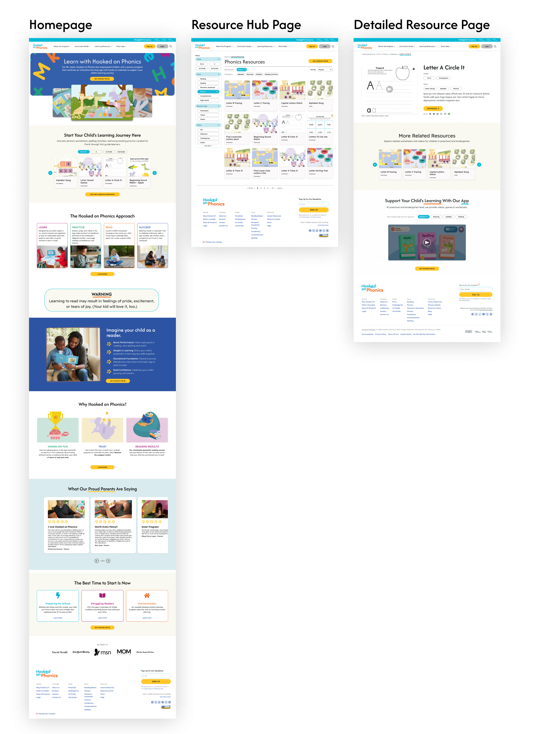
For our site redesign we focused on 3 core pages that would tackle our research insights:
- Resource Hub: To improve resource discoverability and usability
- Resource Detail Page: To help users have a progressive learning journey
- Home Page: To clearly convey the product offering to users
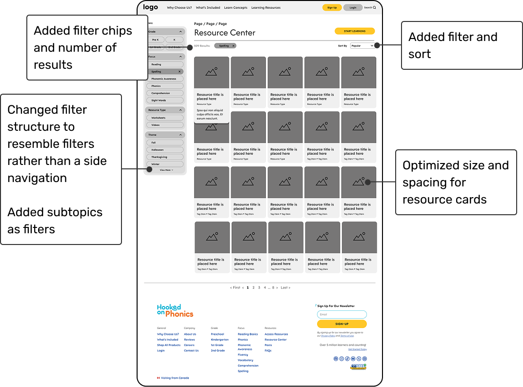
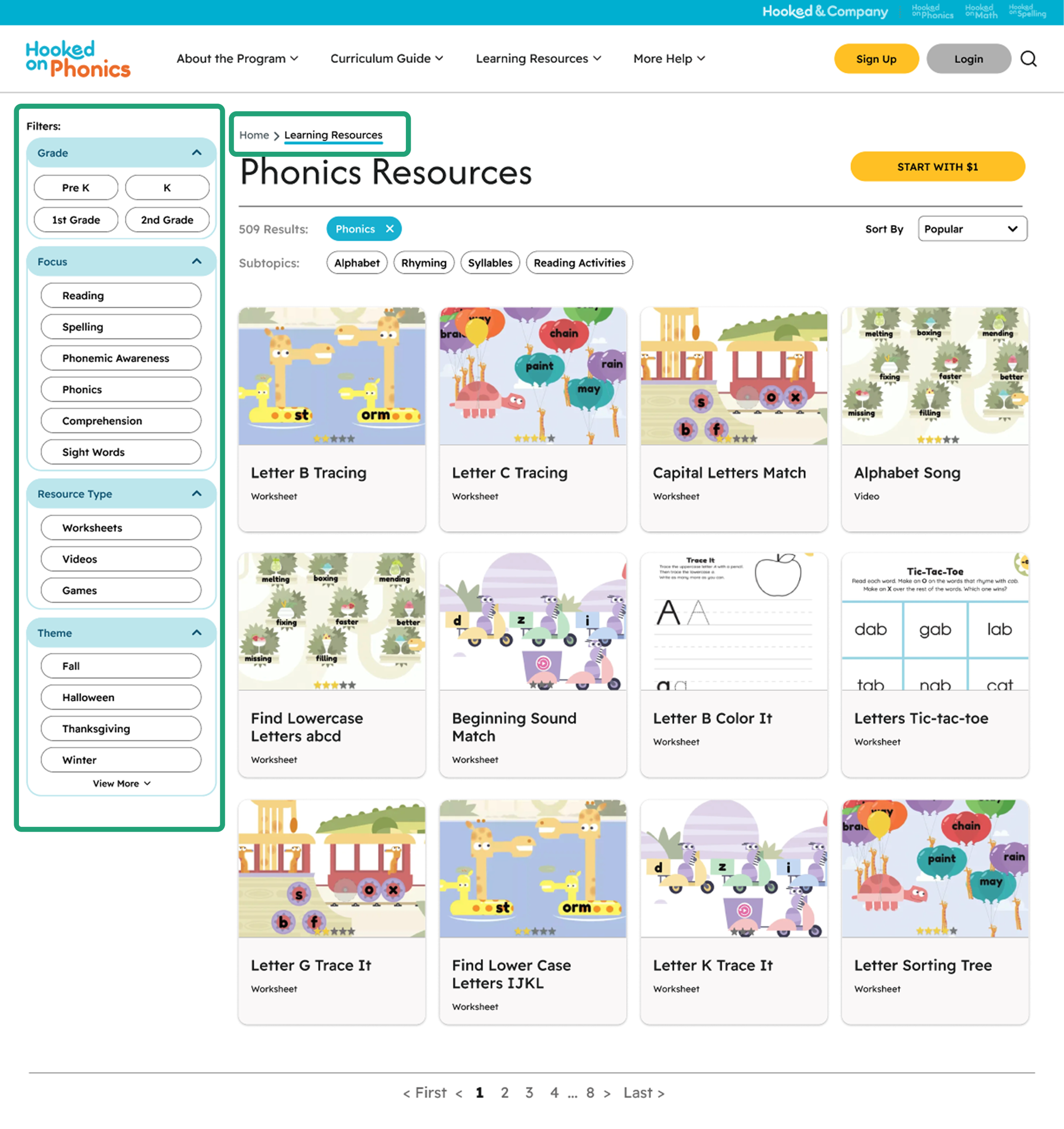
Resource Hub Page
For the learning resources hub, we focused on:
- Using clear titles, labels, and breadcrumb structure at the top to let users know what type of resources are being displayed and topics being covered
- How resources are displayed within the different cards to give the users a brief overview of what they can expect on a detailed resource page
- Usability of the filters to help guide users in finding the resources they need.
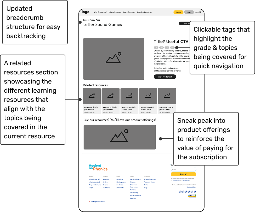
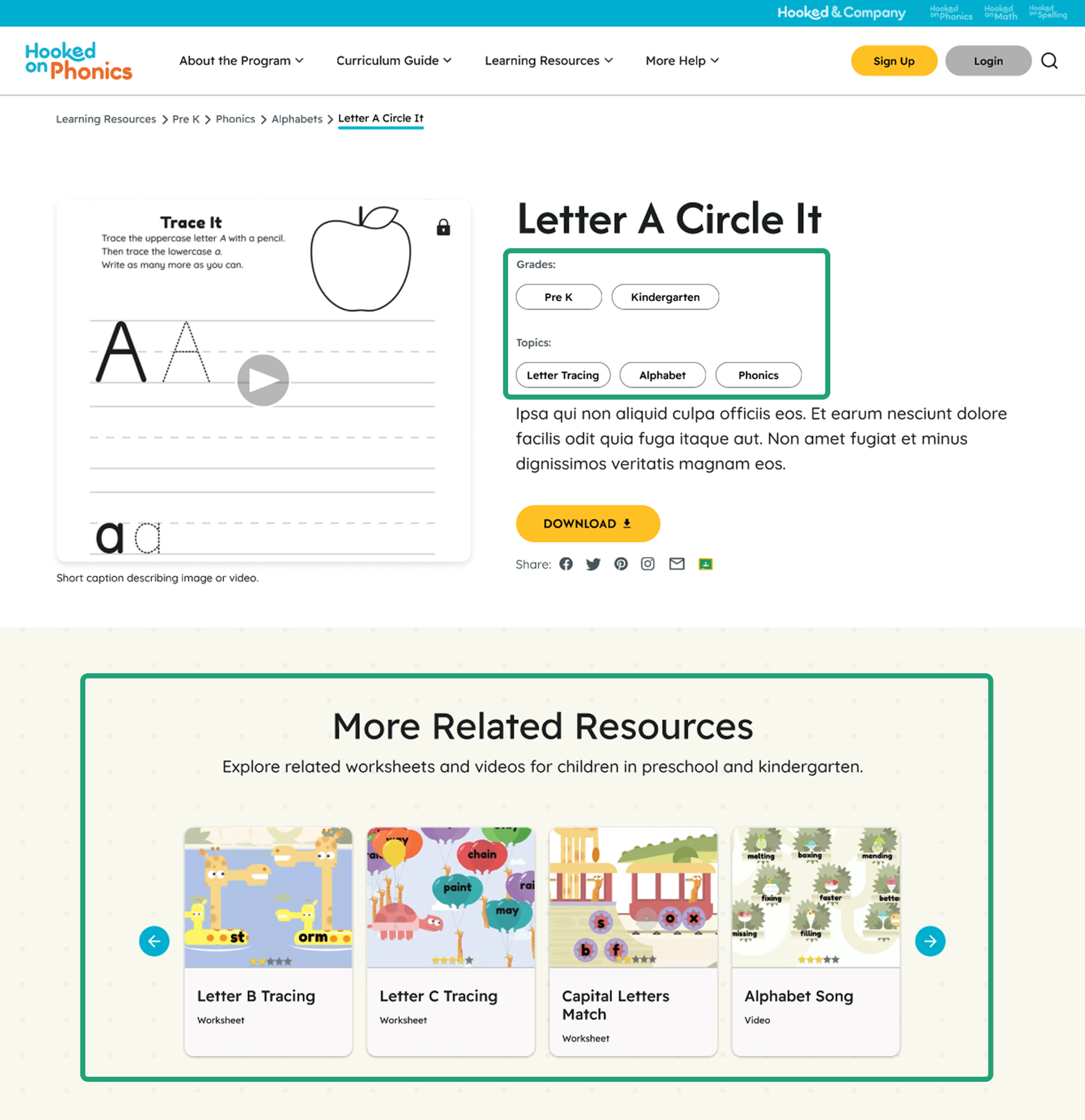
Detailed Resource Page
For the detailed learning resources page, we focused on:
- Using clear breadcrumb structure & clickable tags to provide opportunities of quick navigation as users browse for resources
- Displaying related resources to give users a guided pathway to discover resources they might need after the current one
- Communicating product offerings in relation to the resource that users are looking at to re-emphasize how they can benefit from the subscription
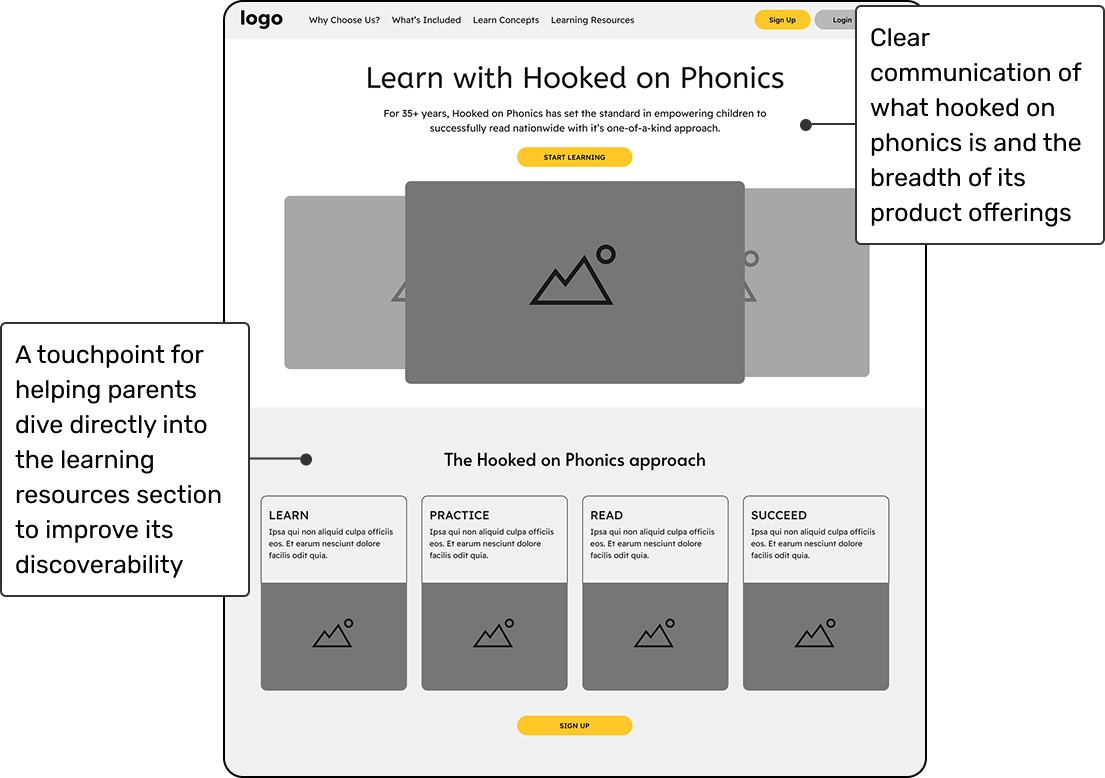
Home Page
To enhance discoverability of the learning resources and bring clarity of the core product offering on the home page –
We added:
- A statement right in the beginning to define the HoP product
- A supplementary image carousel for users to have a visual understanding of what HoP offers
- A clear learning resource touchpoint within the home page
High Fidelity Designs
Validating Our Redesign with HoP Users
Usability Testing on Redesigns
To validate our redesign, we conducted 5 moderated usability sessions with parents of preschool and early-elementary children. Each 30–45 minute session evaluated whether the updated navigation, information architecture, and resource-discovery patterns aligned with parents’ mental models.
Our usability study focused on four key questions:
- Can parents intuitively navigate the redesigned site?
- Does the improved filtering system reduce friction when finding materials?
- Does the redesign clearly communicate the HoP product offering?
- Does the experience guide parents toward what to use next for their child?
Key Insights Summary
Overall, the redesigned experience performed very well. Parents navigated the site confidently, found resources quickly, and understood how to continue their child’s learning. While the core structure and interactions felt intuitive, some label terminology and CTA messaging still created moments of uncertainty, revealing targeted areas for refinement.
What’s Working Well
1. Filters, Breadcrumbs & Hierarchy Supported Quick Discovery
What We Observed
- All participants successfully used filters to narrow content by grade level and skill focus.
- Breadcrumbs consistently helped users confirm they were in the right place.
- The site hierarchy was perceived as clean, predictable, and “logical.”
“Everything was where I expected it to be. This feels really intuitive.” — participant
Why This Matter
These patterns reduce cognitive load and give parents a sense of control as they navigate a large resource library.
2. Clickable Tags & Related Resources Built Stronger Learning Pathways
What We Observed
- Parents loved the clickable tags for jumping between related topics.
- The “Related Resources” module allowed users to find similar resources for their child to continue learning
- Parents expressed that these elements helped them understand how materials fit into a larger learning sequence.
“The tags and related resources section are super helpful for me. I immediately get if this fits my child, and what are next ones to use.” — participant
Why This Matter
Parents want confidence, direction, and reassurance about “what to do next.” These features directly support that need.
Where Users Struggled and Why
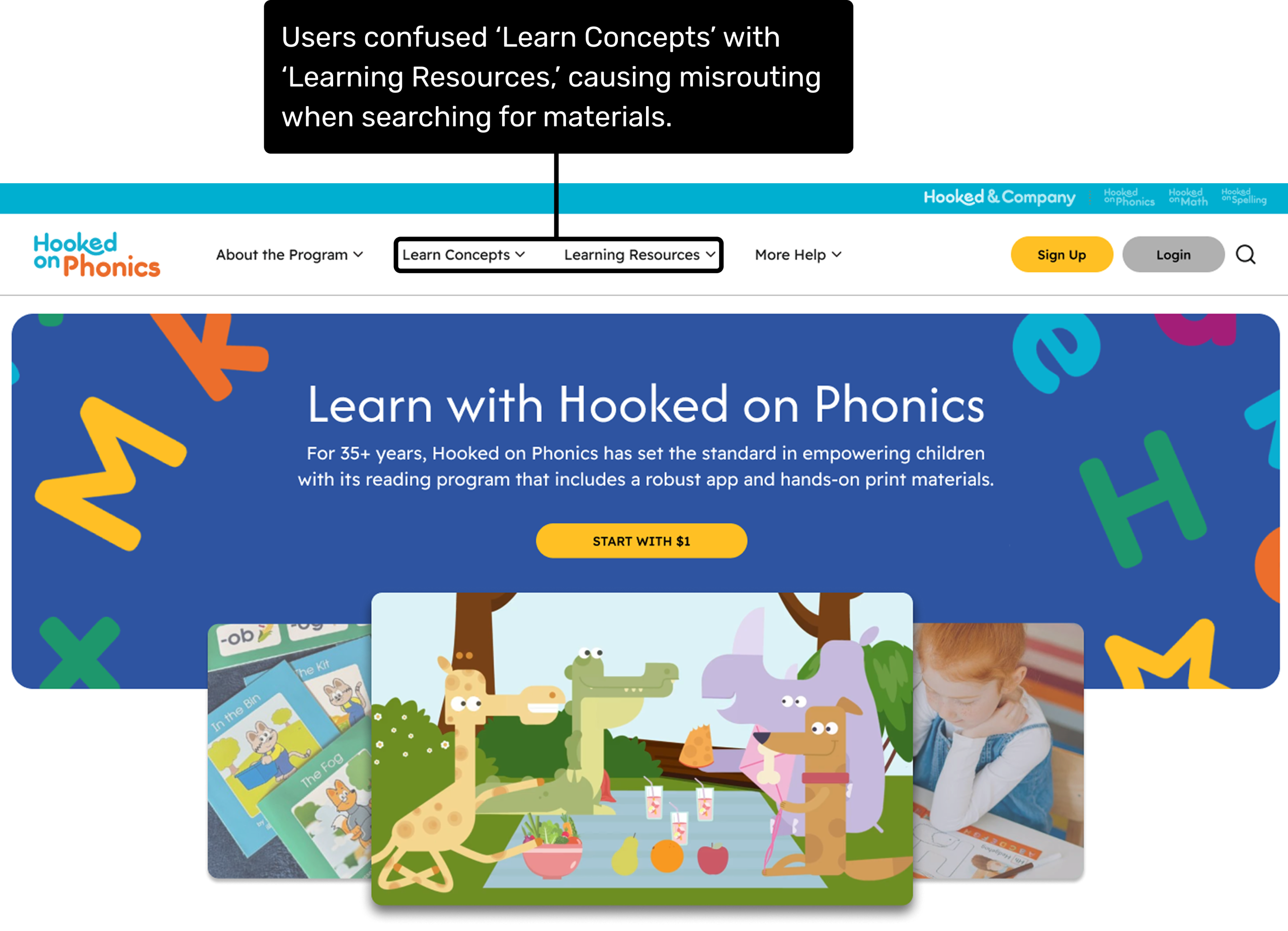
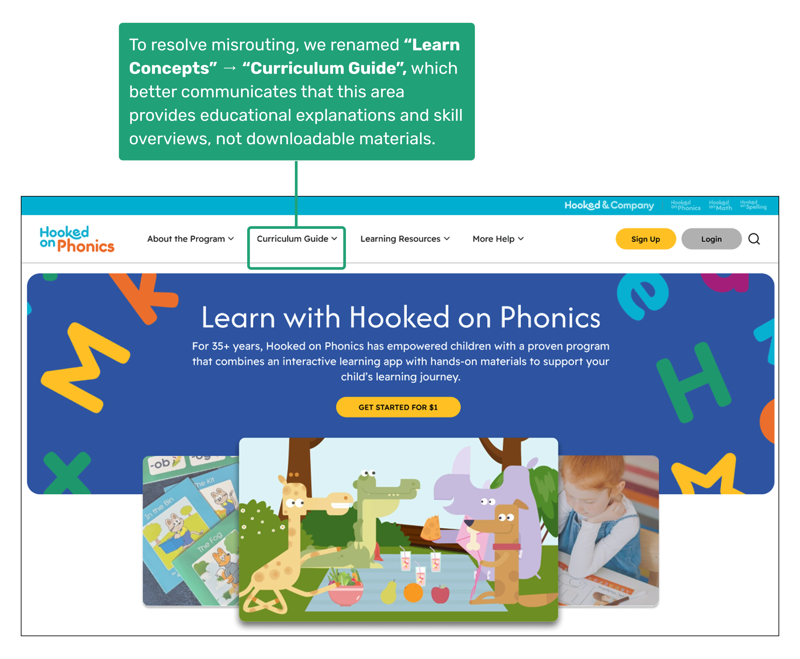
1. Confusing Navigation Labels Led to Misrouting
What We Observed
- 3 out of 5 participants clicked “Learn Concepts” expecting worksheets or practice materials.
- The label suggested student-facing learning activities instead of explanations for parents.
“I thought Learn Concepts was where the worksheets would be. It sounds like the place where kids learn.” — participant
Underlying Issue
The label activated the wrong mental model—“learn” implied learning materials rather than explanations of information or skills.
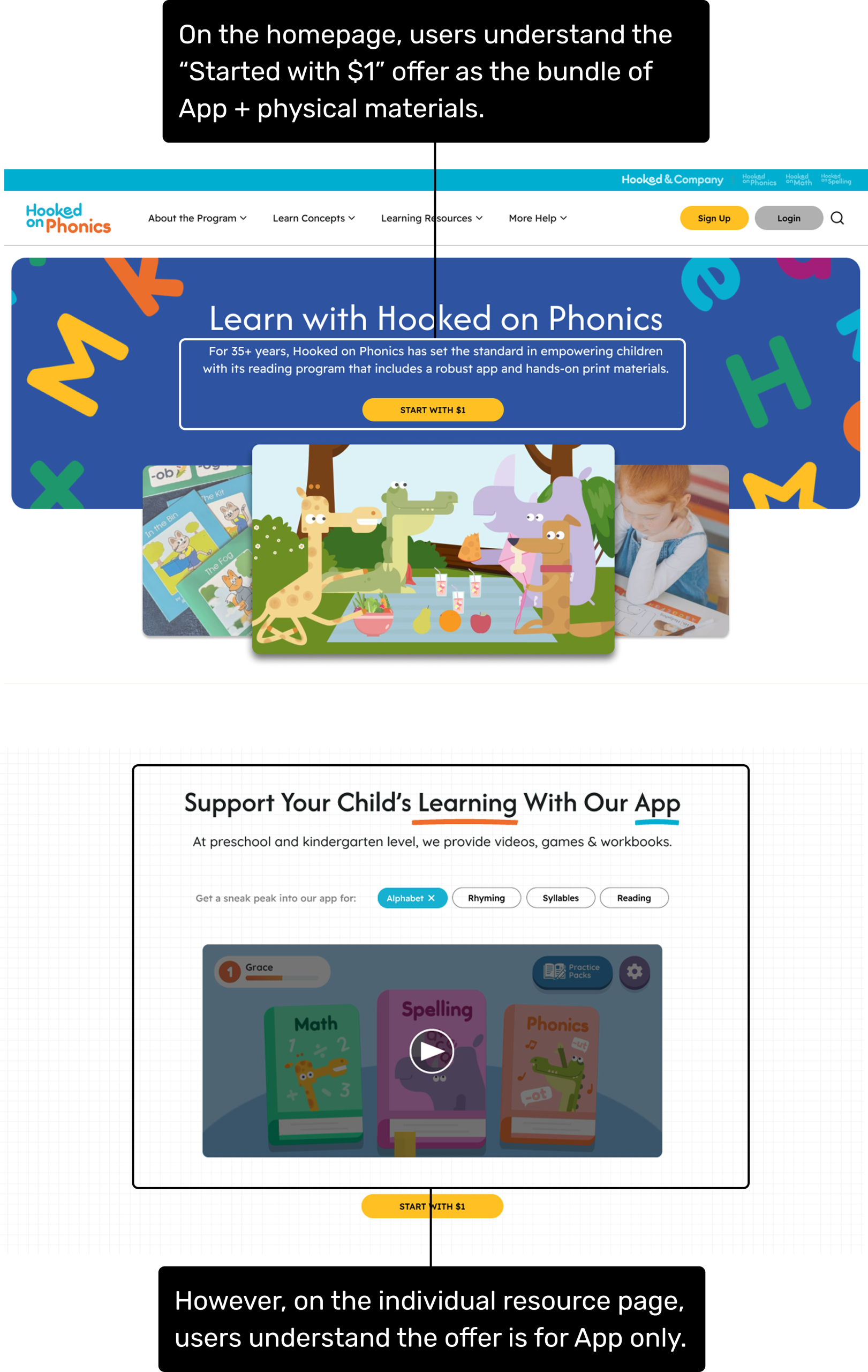
2. Inconsistent CTA Messaging Created Confusion About the Product Offering
What We Observed
- On the homepage, parents interpreted “Start for $1” as access to the full program—app + physical materials.
- On the detailed resource page, the same offer was interpreted as app-only.
- This inconsistency caused hesitations around value, expectations, and trust.
Underlying Issue
Mismatch in framing across pages made the offering feel ambiguous.
How We Updated the Designs
Based on insights, we refined our hi-fi designs with two targeted interventions:
1. Renamed the Misleading Navigation Label
To better support clarity and prevent misrouting, we changed:
“Learn Concepts” → “Curriculum Guide”
This more accurately communicates that this section contains educational explanations, skill breakdowns, and parent-facing context—not downloadable learning materials.
Impact
Parents immediately understood this area as an informational guide, not a resource hub.
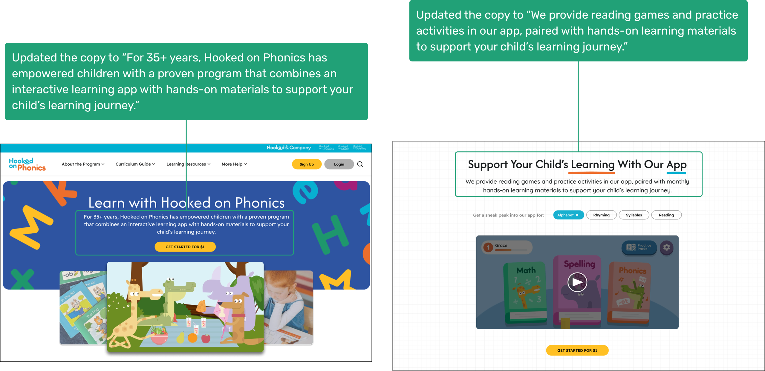
2. Rewrote Copy Across Pages to Clarify the HoP Product Offering
We unified the product offering message across pages to reinforce that the “Get Started with $1” is the combination of the app and hands-on materials.
Impact
Parents now understood the offering consistently across pages, improving trust and reducing uncertainty around pricing and value.
Bringing Clarity to Learning Discovery
Final Designs
The final designs present a clearer, more intuitive Learning Resources experience for parents.
What’s Next?
To continue strengthening the user experience, we recommend the following next steps to ensure the redesigned Learning Resources experience scales effectively, remains intuitive for parents, and clearly communicates Hooked on Phonics’ product offerings.
- Continue Iterative User Validation
Conduct additional usability testing with a broader group of parents to further validate information architecture clarity, filtering pathways, and understanding of what to explore next for different learning stages. - Technical Enablement & Backend Configuration
Implement backend logic to support enhanced filtering and sorting. Establish database relationships that enable “related resources” recommendations on individual resource detail pages to encourage continued exploration. - Strengthen the Product Narrative
Redesign the subscription page to align visually and structurally with the updated site experience. Ensure consistent messaging around the $1 trial, bundles, and value proposition across all relevant touchpoints.
Outcomes
Our redesign of the Hooked on Phonics Learning Resources experience received strong, positive feedback from the client team. The presentation validated that our research-driven approach successfully clarified the product offering, improved resource discoverability, and supported a more intuitive, exploration-based experience for parents.
“The redesign opens up a lot of opportunities and really helps us think through what we should prioritize next.”
— Our Client, Tatum
Once again, thank you all for a splendid presentation. It’s obvious you understood our site and our various needs. I’m so impressed by the depth of your suggested solutions. I know we’ll be spending a lot of time poring over your IA diagram.
– HoP Stakeholder, Donna
The client shared that the redesigned information architecture and navigation made the Learning Resources section feel more intentional and easier to understand, especially in how free content, paid offerings, and next steps were communicated to parents. The team expressed interest in using our recommendations to guide their next round of updates and noted plans to share the work with additional internal stakeholders.
Throughout the final discussion, client questions focused on implementation priorities, content strategy, and how the redesigned experience could scale across future product updates—demonstrating strong engagement and alignment with the proposed direction.
Overall, the project helped reframe the Learning Resources section as a core part of the Hooked on Phonics ecosystem, reinforcing its role in both parent discovery and long-term engagement.