Passport Parking is a mobile application that enables users to pay for their parking spots directly from their mobile devices. The application functions as a convenient digital alternative to physical pay stations. In this article, I will offer a critique of the Passport Parking application through the lens of Don Norman’s design principles and ideas from his book, The Design of Everyday Things.
Space and Zone Selection
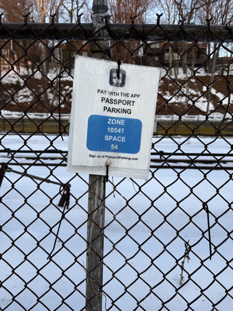
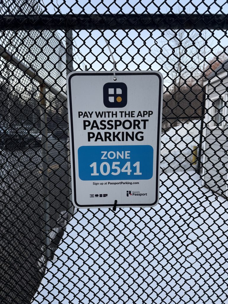
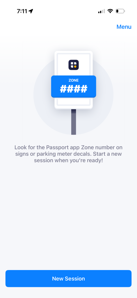
In order for a user to utilize Passport Parking there are two pieces of information they must gather from their physical environment: a parking space number and a zone number. While the Passport Parking application’s first screen prompts a user to look around their environment for their zone/lot number, if these pieces of information are not clearly labeled and visible, it can cause frustration to a user and prevent them from beginning the process of using the app, stopping their ability to discover. To resolve this the application could include a geolocation feature to enable discovery of the correct zones/spaces and to act as a feedback mechanism to ensure they are on the right track.
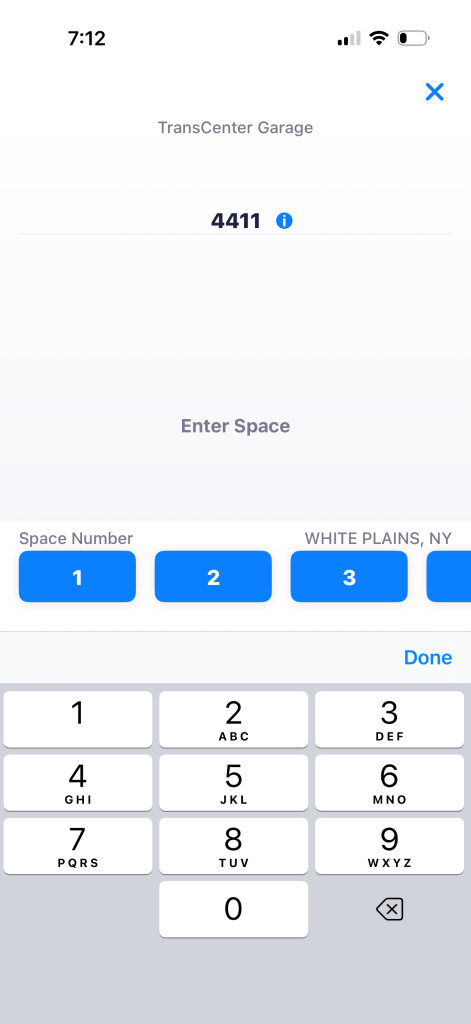
The traditional conceptual model of paying for parking may include remembering a space number and using it as an identifier when paying at a physical machine. The Passport Parking app works within this model by keeping the space number, but requiring a zone number. While the zone number is a novel idea for a first time user, the application clearly signifies to the user through descriptive text to look for this information in their environment.
One strong design choice of the application is its constraints. Users are only able to view one screen at a time and are required to complete the steps to select their slot and pay for their parking in a strict sequential order, ensuring users input all the required information to pay correctly. Not only does this ensure that the required information is collected, but simplifies the process for the user.
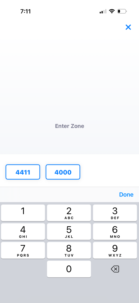
Another strong design choice of the application is its use of buttons and number pads. Buttons afford clicking and number pads are like a special set of buttons that afford pushing to type a specific set of numbers. Combined with strong written prompts like “Enter Zone” and “Enter Space,” which act as signifiers of what to do, the application does a strong job directing the user towards the correct next steps.
One flaw of this design is the lack of feedback about the name of the parking lot. Although on the third screen of this flow there is a label stating “Trans Center garage” and “White Plains, NY” at the top and side of the screen, the size and font make this easy to miss. Additionally, the user has to enter the zone number before they can even access this information. To make the feedback stronger, designers could include labels on the second screen of this flow where the name of the lot shows up next to the zone number to inform users they are selecting the desired lot.
Payment
To pay for parking the application employs a dynamic horizontal scrolling bar at the bottom of the screen where moving the bar to the right adds to the time and increases cost and moving the bar to the left does the opposite.
In some ways the design of the dynamic bar is strong: the green line is visually striking which draws a user’s attention and makes it discoverable, the price inside the line signifies that interacting with it will impact payment, and the vertical lines in between the labeled hours indicate that they represent points in time. Additionally, the design of the bar takes advantage of natural mappings in the world, where moving something to the right can increase something and moving something to the left can decrease it like the volume knob in a car radio or the x-axis on a graph.
Nevertheless, this dynamic bar is a tool that is unique to this application. If a user were to encounter this for the first time, there is no written signifier alerting the user that they need to swipe on the tool to select how long they want to park for. To resolve this, designers could include a small written label to prompt a user to interact with the tool like “Swipe to Edit.”
Receipt
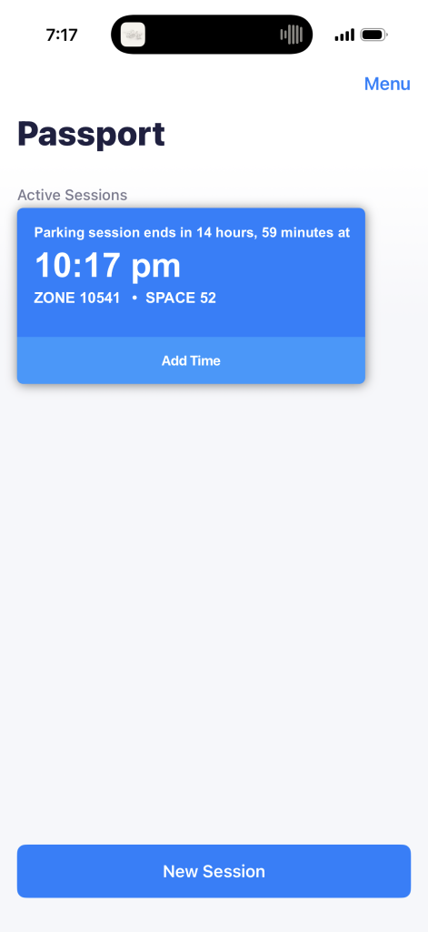
After payment is collected the user’s parking session is displayed within the app and acts similarly to a receipt you may receive in a parking garage. This is both a strong signifier and feedback that the task has been completed. At this point we could say the user has crossed the Gulf of Evaluation as they now have the confidence that they successfully achieved their goal of paying for their parking spot.

