Spotify’s iOS app enables users to discover, organize, and listen to music and podcasts through personalized playlists and libraries. The app emphasizes ongoing discovery through recommendations based on listening behavior, while supporting common tasks such as searching, saving, downloading, and sharing audio.
Login Page

When initially opening the app, Spotify prompts users to create an account. The login interface is simple and focused, using large buttons and a single primary action that function as strong signifiers for what to do next. This design reduces friction for new users and helps them easily begin using the app.
The Home Screen

Once logged in, the Home screen becomes the primary interface through which users interpret Spotify’s available actions. The screen is dominated by large content tiles such as “Liked Songs”, recently played albums, and yearly summaries, which act as clear signifiers that invite interaction. Category labels such as “All”, “Music”, “Podcasts”, and “Audiobooks” along with bottom navigation labels like “Home”, “Search” and “Your Library” further improve discoverability by making core functions and navigation explicit rather than implied.
These elements communicate a system image centered on listening, encouraging users to quickly press play rather than actively manage content. This layout helps users form a mental model in which Spotify functions as a recommendation-driven service prioritized over organization. Also, navigation options are labeled with text instead of relying solely on icons, which make key actions obvious, placing important information in the world rather than relying on knowledge in the head.
However, this emphasis on immediate playback prioritized over organization does increase the gulf of execution for users looking to complete organizational tasks. While the clearly labeled “Your Library” tab functions as a strong signifier for where saved content and playlist editing functions are located, these abilities remain visually secondary on the Home screen itself. This gap could be reduced by introducing a labeled organizational shortcut on the Home screen, such as a “Manage Playlists” tile that directly links to editing and sorting tools. This change would place additional organizational functions in the world rather than relying on users to remember where they are located or navigate to second or third pages.
The Library


The Library screen (see Figure 1) is where users expect to find and manage saved content, which is supported through clearly labeled filters such as “Playlists”, “Podcasts”, “Albums”, and “Artists”. These labels function as strong signifiers, improving discoverability by making organizational categories explicit rather than relying on memory or icons. When categories like “Playlists” is selected, additional filters such as “By you”, “By Spotify” and “Downloaded” further clarify Spotify’s conceptual model by distinguishing between user-created and system-generated content (see Figure 2).
However, these secondary filters only appear after initial engagement with the labels, making deeper organization and accessibility options not immediately visible. This increases the gulf of evaluation for users who are unaware that additional sorting tools exist. Introducing a small icon or visual cue, like an arrow, next to the “Podcast”, “Albums” and “Artists” tabs could indicate that once these filters are selected, they will lead to more specific filtering options.
Playback Screen
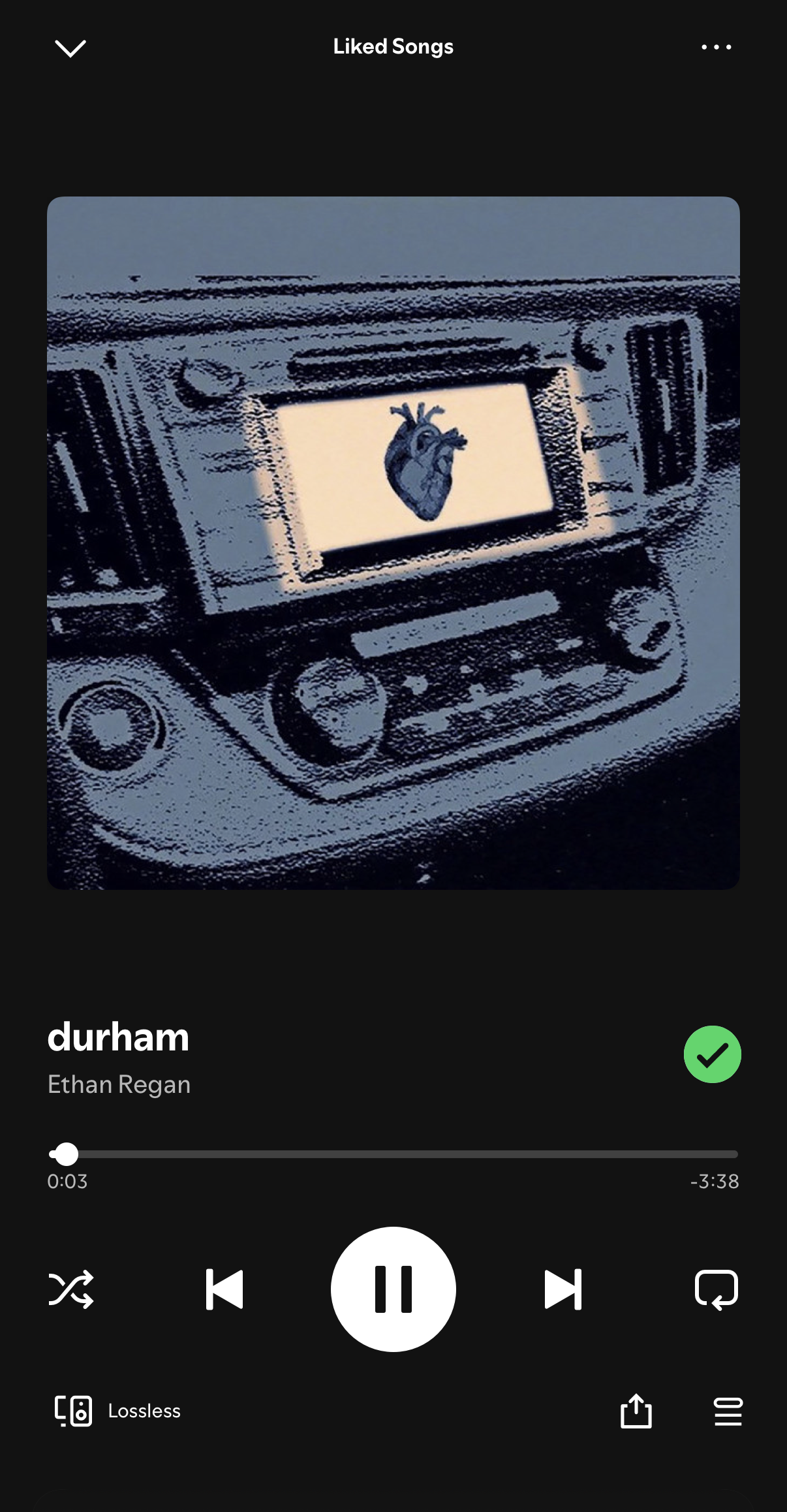
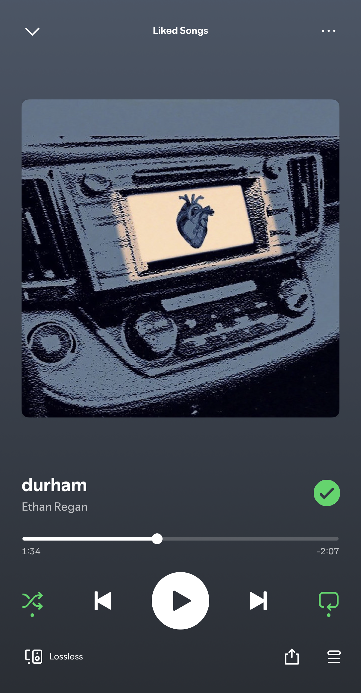
The playback screen is one of Spotify’s strongest interfaces, clearly communicating how to control audio. Core actions such as play, pause, skipping tracks, and scrubbing through a song are presented as large, centrally placed controls that offer clear affordances for interaction.
Playback actions provide immediate visual feedback, reinforcing a good sense of control over the system. Tapping play produces an instant change in icon state, the progress bar advances in real time, and the shuffle and repeat buttons update with color as soon as they are selected (see Figure 4). These responses let users easily confirm that their intended actions have been successfully executed.
Much of this interface relies on learned convention that align with widely established media controls. Icons for play, pause, skip, and shuffle behave in ways that would match users’ prior experience with audio players. These design choices reduce the gulf of evaluation by making it easy for users to interpret the system’s current state. However, secondary actions such as queue access, sharing, or playback settings are represented only by small icons in the corners of the screen, making them less immediately legible. This issue could be solved by adding brief text labels indicating that these icons reveal addition playback options.
Conclusion
Spotify’s iOS app effectively supports everyday listening through clear controls, familiar interactions, and consistent visual feedback. While organizational tools are slightly less prominent than playback features, navigation remains predictable and easy to learn. Overall, the interface prioritizes usability in a way that feels natural for regular use.