WEBTOON is a mobile-first serialized comic platform built around vertical scrolling storytelling. Its original conceptual model resembled a digital library of episodic stories updated weekly. Today, the system image presented to users is far more complex. It blends characteristics of: a streaming platform (ranks, trending), a social media feed (comments, algorithmic recommendations), a freemium game (coins, daily passes, timed unlocks). This critique applies Don Norman’s The Design of Everyday Things and concepts from How Artifacts Afford by Jenny L. Davis to evaluate how the app supports or constrains user goals across onboarding, discovery and reading.
I have used WEBTOON for over a decade. A typical user approaches it with one of two goals: to catch up on an ongoing series (The Devoted Serial Reader) or to discover and binge something new (The Exploratory Binge Reader). In both cases, the primary task is simple: read continuously with minimal friction.
Fragmented Conceptual Model (Home & Onboarding)
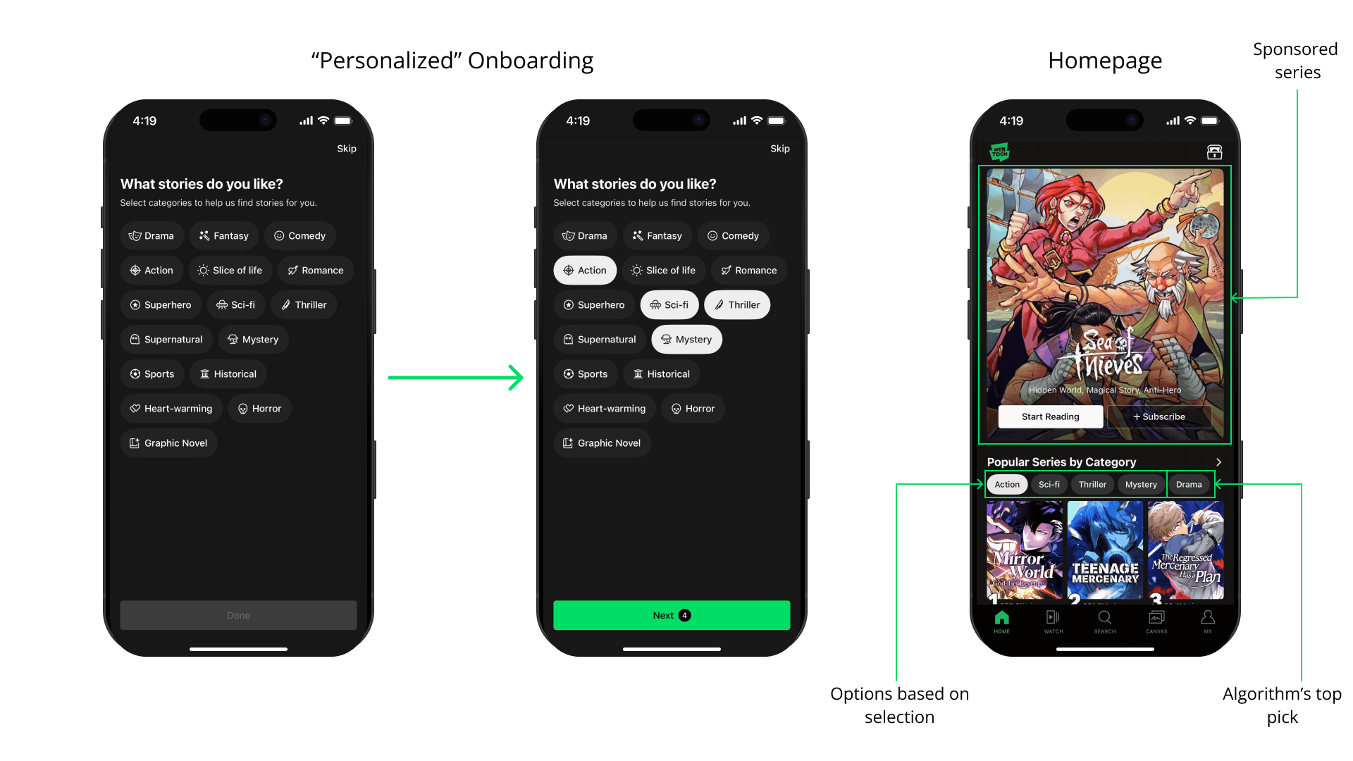
Norman argues that good design depends on a clear conceptual model supported by a coherent system image. WEBTOON’s onboarding asks users to select genres, implying that content will be personalized. However, once inside the home feed, algorithmic recommendations, trending lists, editor picks and promotional banners coexist without explanation. The mapping between user input (genre selection) and system output (feed content) is opaque. This widens the gulf of evaluation: users cannot easily determine why certain content appears. This moment reveals the app making a request for preference data without clearly demonstrating how those data structures result. The artifact initiates a relationship that privileges algorithmic sorting over user comprehension.
Competing Affordances in Discovery
Norman distinguishes between affordances and signifiers. In WEBTOON’s discovery page, nearly every element signals interactivity, rankings, limited-time events, and coin promotions. The issue is not hidden affordances; it is excessive competing signifiers. The Devoted Serial Reader, entering with the goal “What updated today?” must filter through promotional content. The structure fails to support goal-directed action, increasing cognitive load and widening the gulf of execution. In How Artifacts Afford, artifacts can move from making requests to making demands. Limited-time banners and countdowns function as demands. They structure urgency and attempt to redirect attention away from intrinsic reading goals. Rather than employing progressive disclosure, revealing complexity gradually as users become more invested, the interface surfaces rankings, events, monetization, and personalization systems simultaneously. This increases cognitive load before the user has even established a stable reading rhythm.
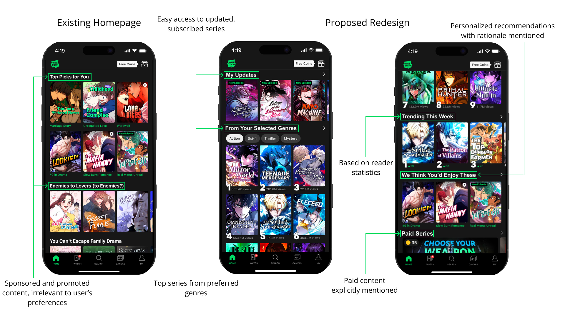
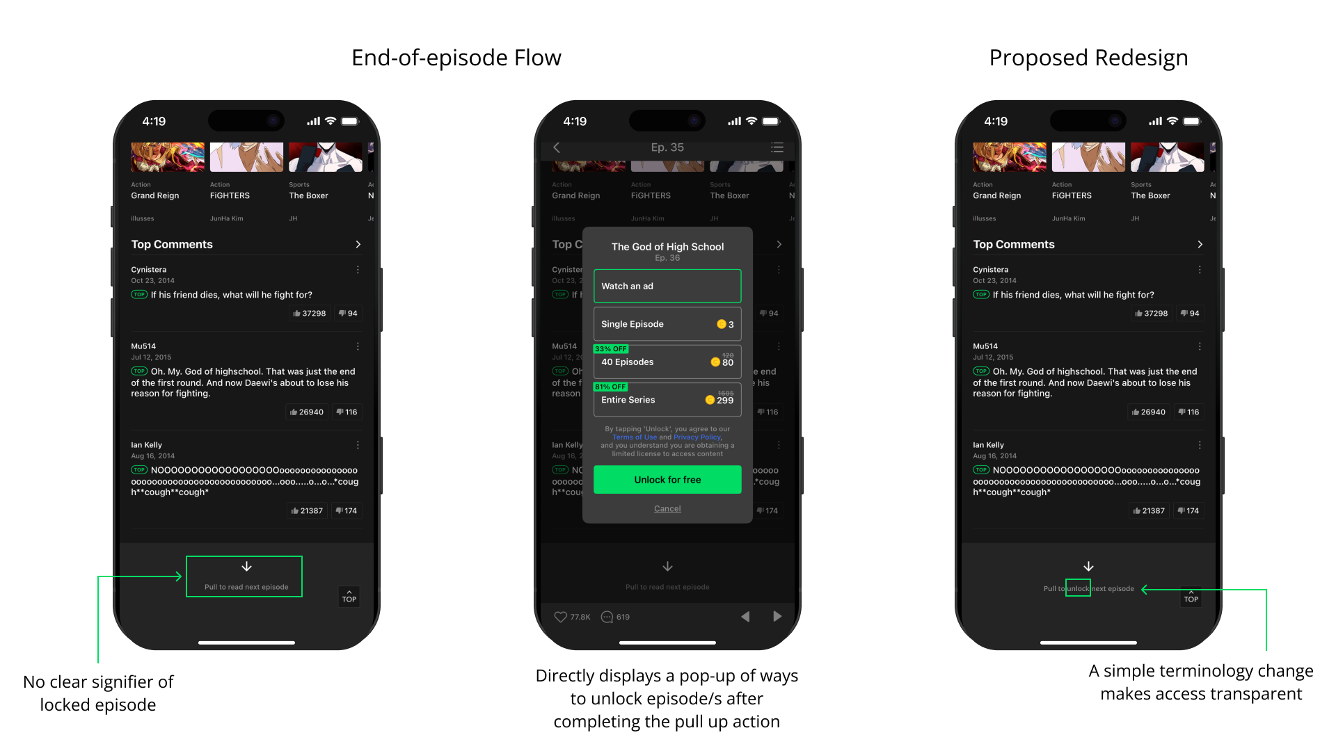
This redesign externalizes the platform’s logic by clearly separating “My Updates,” personalized recommendations, and promotional content. By making the system image visible, it reduces the gulf of evaluation and shifts necessary knowledge from the head into the world.
Ads and Coins as Behavioral Constraints
Norman describes constraints as design features that limit possible actions. While constraints often prevent error, they can also be used to regulate behavior. In WEBTOON’s current model, episodes beyond a certain point require either spending coins or watching an advertisement to unlock access. For the Exploratory Binge Reader, this interrupts the task flow. The user’s goal (continuous narrative immersion) is paused and replaced with a transactional decision: pay, watch, or stop. The conceptual model shifts mid-use from “library” to “gated economy.” Instead of simply progressing through a story, the reader must interpret lock icons, coin symbols, and ad prompts to understand what actions are available. This widens both the Gulf of Execution (What can I do next?) and the Gulf of Evaluation (Why is this episode inaccessible?). From a How Artifacts Afford perspective, this is more than a constraint; it is a structured refusal. The system denies access unless specific conditions are met. The artifact does not merely afford reading; it negotiates it.
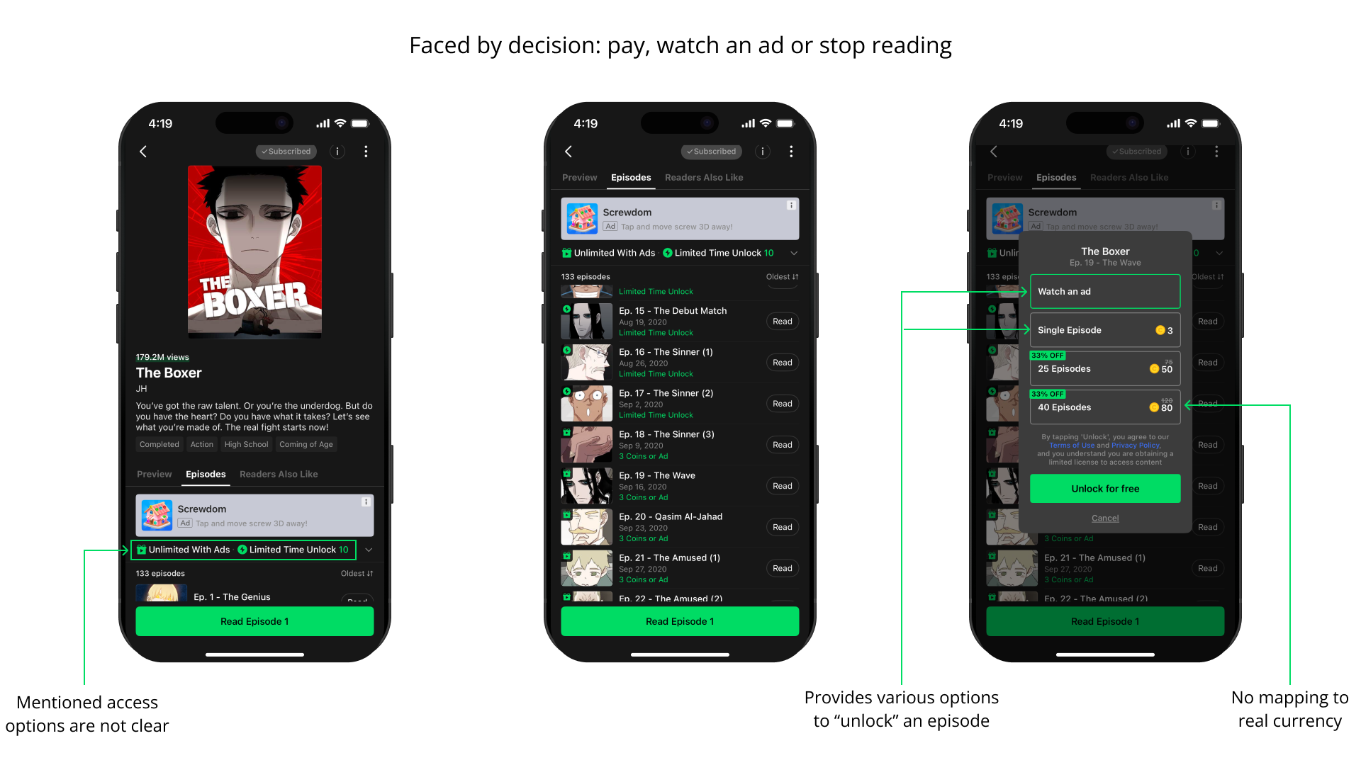
The coin system further complicates this interaction because its mapping to real currency is indirect. Users purchase coin bundles rather than episodes in dollars, and the interface does not clearly translate coin cost into real monetary value at the moment of decision. This arbitrary symbolic mapping requires mental conversion (knowledge in the head) rather than making cost visible in the world. The added cognitive step increases friction at precisely the moment immersion is already disrupted. A simple improvement would be to display the real-dollar equivalent alongside the coin price at the point of purchase to reduce cognitive load and increase cost transparency.
Strong Mapping in the Reading Interface
The vertical scroll reading interface exemplifies good design. The gesture-to-progress mapping is direct and culturally familiar. Feedback is immediate. Minimal signifiers are competing for attention. Here, the gulf of execution is small: scroll to read. The gulf of evaluation is minimal: progress is visible through movement. This is the strongest design moment in the app. The artifact recedes and supports immersion.
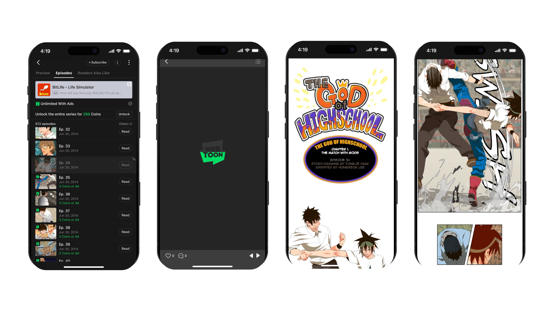
However, at the end of an episode, abrupt coin prompts interrupt narrative closure. Emotional pacing shifts from immersion to transactional decision-making at precisely the moment of heightened engagement. There is no clear signifier indicating that a paywall is approaching; instead, the interface creates a strong pull to continue reading through cliffhangers and visual cues of the “next episode.” Yet when users attempt to proceed, they are immediately met with a modal pop-up offering only two options: watch an ad or unlock with coins. The absence of advance signaling, combined with this sudden constraint, reframes what felt like narrative flow into a monetized gate, making the system’s demand feel reactive rather than anticipated. A simple fix would be to signal locked episodes in advance and preview the unlock options before the cliffhanger to better align expectations with system constraints.
Conclusion
WEBTOON demonstrates both strong and problematic design characteristics. Its reading interface shows excellent mapping, feedback, and minimal cognitive friction. However, its discovery structure and monetization systems fragment the conceptual model and impose behavioral demands that conflict with user goals. Using concepts from The Design of Everyday Things and How Artifacts Afford reveals that the primary issue is not visual polish but structural clarity. When the system image does not align with user expectations, gulfs widen and friction increases. WEBTOON succeeds most when it simply affords reading. It struggles when it attempts to regulate it.