The National Gallery of Art draws nearly four million visitors a year to its stretch of the National Mall in Washington, D.C. Most of those visitors are not art experts. They’re tourists, families, curious travellers passing through the capital, people who might visit once, who have a few hours, and who would really just want to experience as much as they can in a short span. As part of my Usability Theory and Practice class, I had the opportunity to work with them to improve the overall usability and experience of their website, which had been recently updated.
Problem
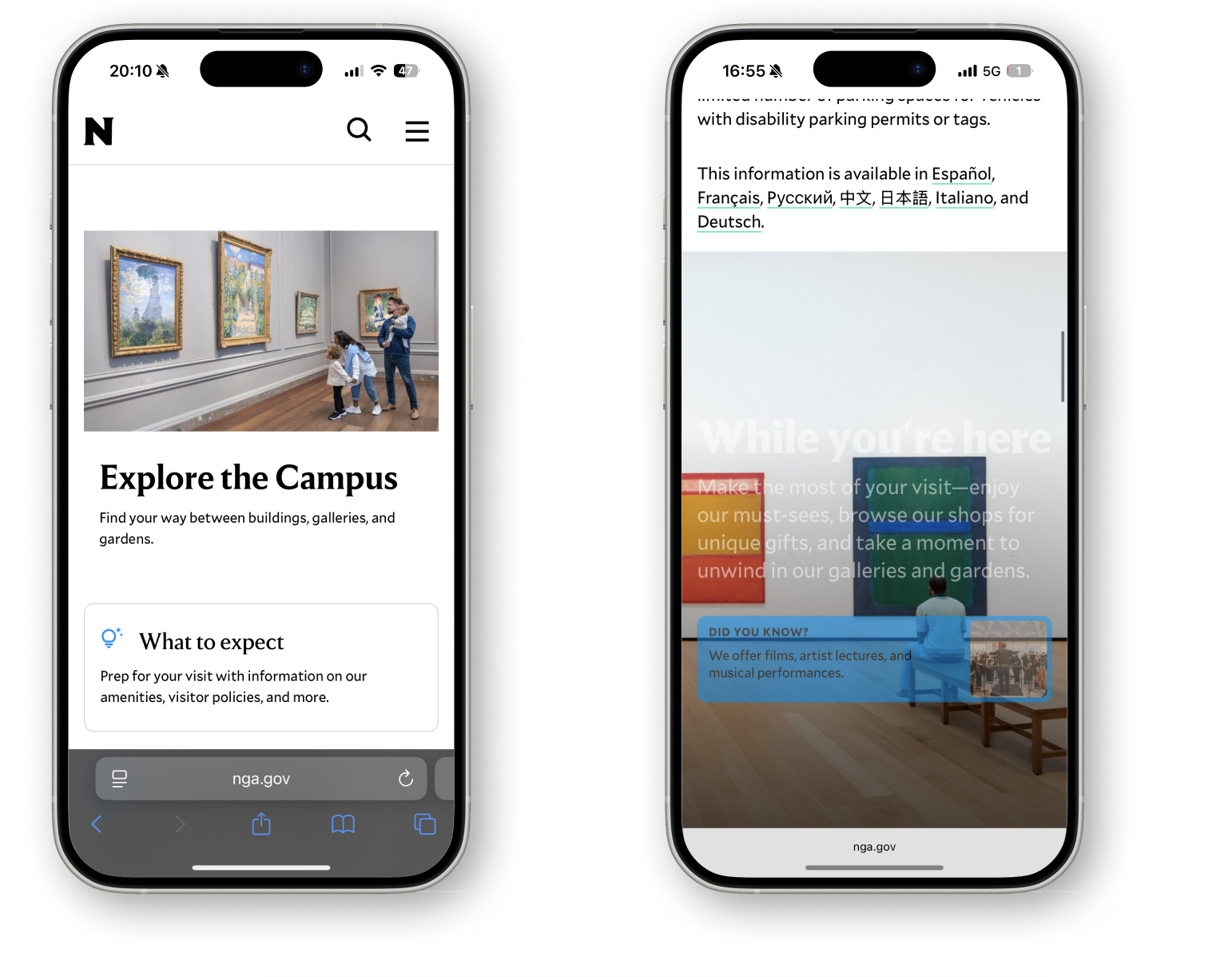
Before getting into the study, it is helpful to understand the National Gallery of Art and what visitors are expected to navigate. Unlike most museums, NGA is not a single building, but a campus consisting of three different spaces. The Sculpture Garden houses large scale works within the landscape, the West Building contains artworks from the early 12th century through the 20th century, and the East Building focuses on modern and contemporary pieces. To help users understand this distinction, NGA designed an “Explore the Campus” page on their website, to help visitors get a better understanding of what each space contains and detailed breakdowns of what they can expect.
The goal of this study was validate whether recent changes had reduced the previously identified pain points, improved navigation efficiency and increased the user’s confidence to plan a visit. Additionally, we wanted to identify any friction points, uncover new usability challenges introduced through recent updates, and generate clear, prioritized insights to further improve the visit experience. The study focused on the Sightseer archetype- someone who may only visit the NGA once, has no insider knowledge of the campus, and might reply on the website to plan and orient themselves before arriving- and how they interact with the “Plan Your Visit” and “Explore the Campus” pages specifically.
In the spring of 2026, our team of four UX researchers- Esha Ahluwalia, Marianne Benyamin, Emma Stephen, and me- tested the platform on both mobile and desktop devices, and analyzed the insights to make suitable recommendations to improve the user’s experience.
Through our study, we were able to make 13 recommendations in 4 key finding areas.
Process
Methodology Overview
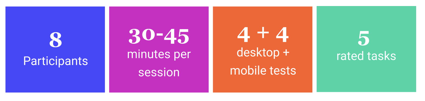
Our team conducted eight moderated usability sessions with participants matching the Sightseer archetype and their experience with the two pages: the “Plan Your Visit” page with updated navigation and information blocks, and the newly launched “Explore the Campus” page which was designed to help visitors understand the museum’s three-building layout. We had between the ages of 18 and 65, 4 using mobile devices and 4 on desktop, with each session lasting between 30 and 45 minutes. We designed a user test comprising of five tasks which were a variety of goal oriented, scenario based and open-ended exploratory tasks.
Research Objectives
The task structure was built around a three-level framework developed by the NGA previously, and indicated that visitors access information at various depths depending on their needs: Skim, Swim, and Dive.

Additionally, we looked at whether users were able to find the “Explore the Campus” page and through what entry point.
Test Script
Our test script combined a set of goal-oriented tasks, directed tasks to locate specific information, and more open-ended exploratory tasks to evaluate browsing, navigation and success rate. Participants were also surveyed before the tasks to get a general idea of their museum going habits, and after the test to give them an opportunity to recall moments that stood out or fell short to them. We encouraged them to think out loud during the process, so we could get a better idea of how they felt about the experience in the moment and give us insight into their mental model.

Recruitment
We recruited participants through Private Panels, and had them answer a screener beforehand to see if they qualified. Qualified participants were then contacted to schedule a time to conduct the test.

The test included one moderator and one note-taker from the research team, and was conducted over Zoom using screen-capture technology to record their movements and paths taken. Our team then looked over the recordings and notes to analyse and determine key-findings to inform our recommendations.
Results

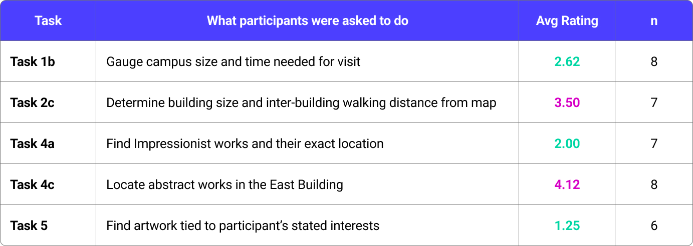
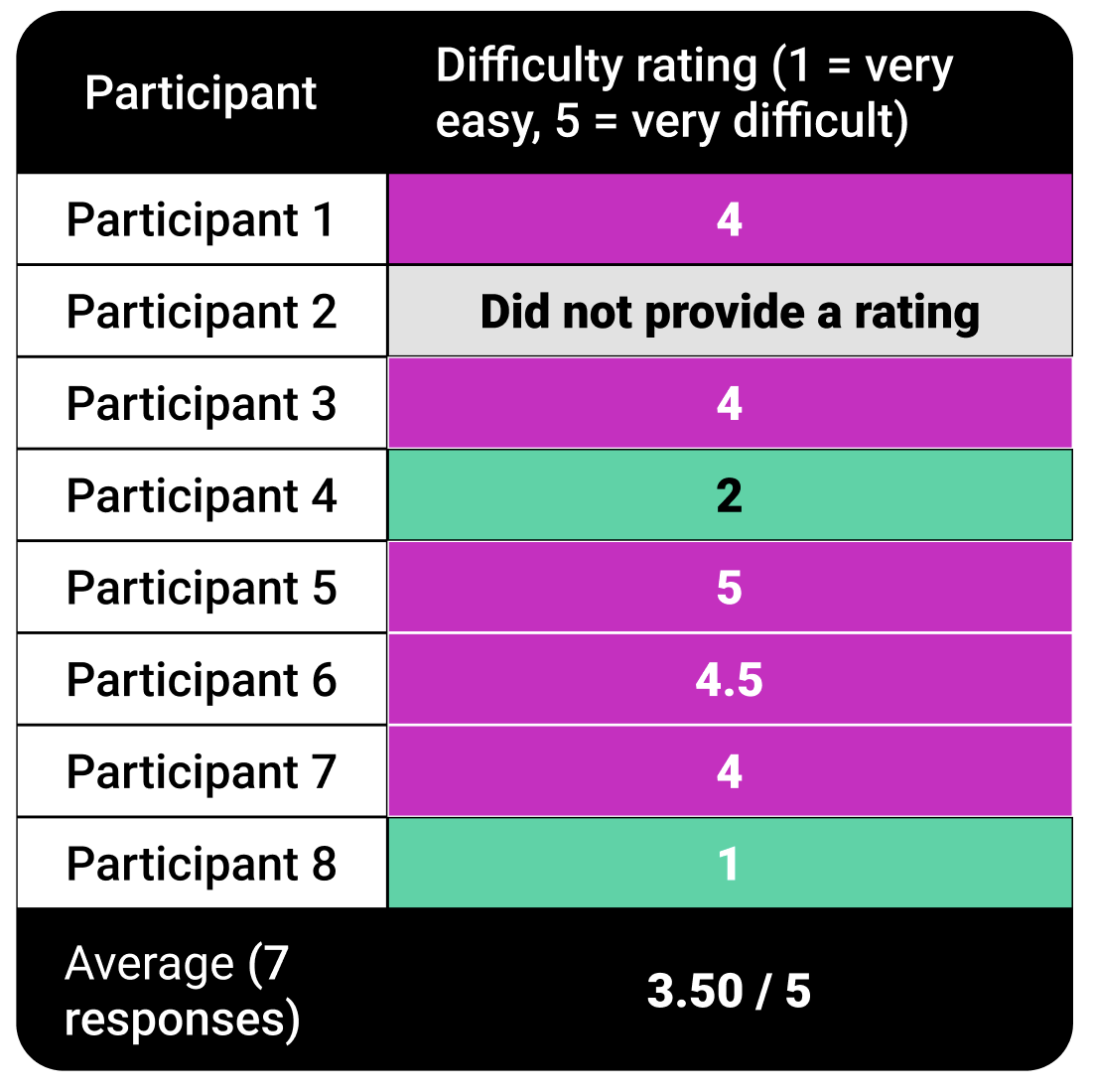
Participants were also asked to rate certain goal-oriented tasks on a scale of 1 to 5 (1 being the easiest and 5 being most difficult) so we could gauge how intuitive users felt the experience was. This revealed that the greatest point of friction was when it came to using the map related tasks.
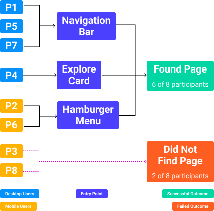
We also wanted to track users path to the “Explore the Campus” page, whether they were able to find it and if so, how did they get there. We found that 2 of the 8 users were unable to navigate to the page organically and had to be guided there, both mobile users. We also found that 5 of the 8 users found the page from the main menu- the navigation bar on desktop and hamburger menu on mobile. Only 1 user navigated to the page through the Explore card on the “Plan Your Visit” page.
Key Insights
We synthesised our overall findings to 4 key insights:
- The site has all the information users seek, but the way it is currently structured makes it hard to reach the desired content.
- The maps on the “Plan Your Visit” page convey a general idea of the campus layout, but visitors are unable to tell much else like distance, scale or entrances.
- Sightseers are unable to get a sense of each building’s identity and need something quicker, easier and more scannable.
- The individual building maps function as static layouts rather than planning tools, and do not contextualise the information they should be able to.
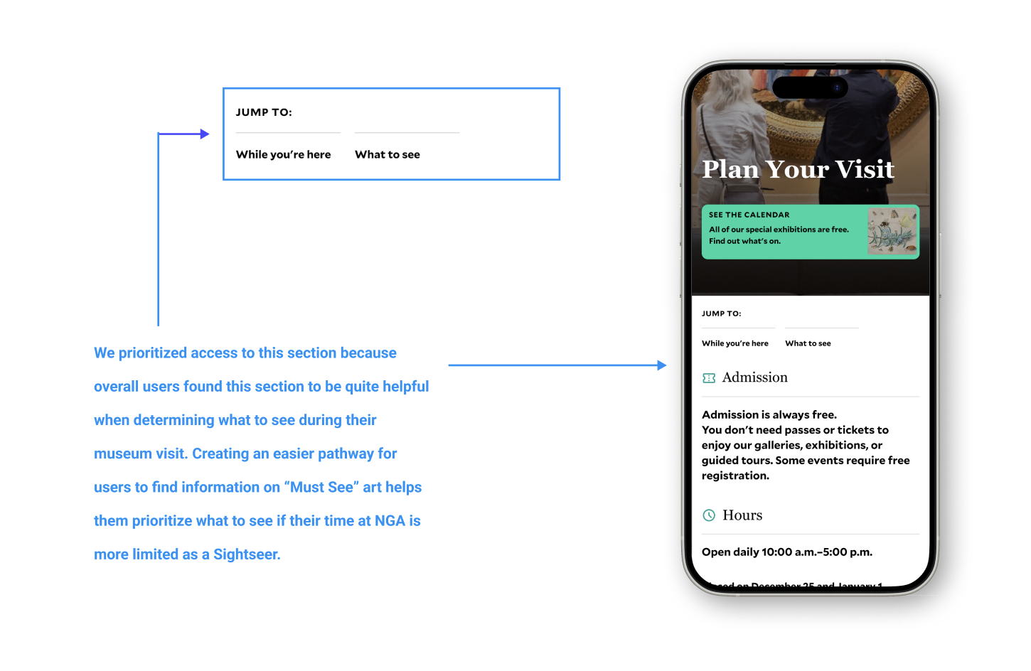
Finding 1: The “Plan Your Visit” page contains the information Sightseers need, but its structure makes that information difficult to access.
Problem
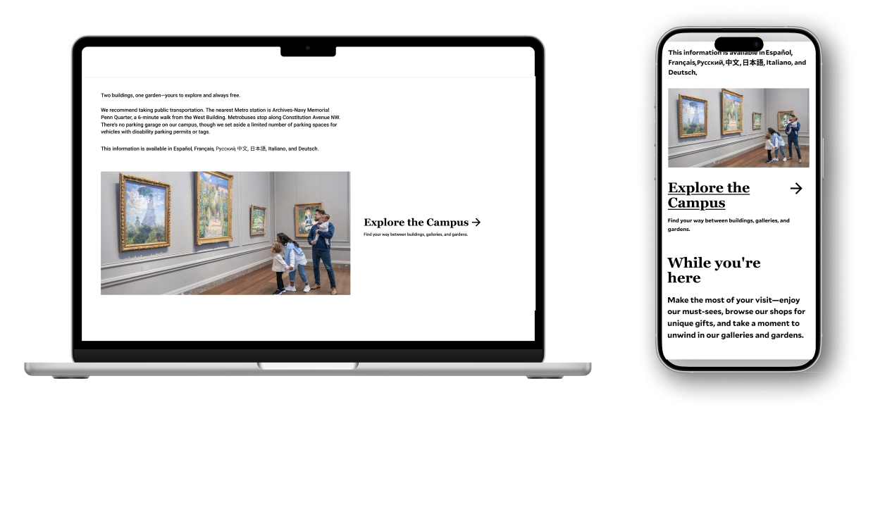
All participants noted that this page has useful information when planning a visit, from timings and address to the calendar of events. However, sections like “While You’re Here” and “What to See” were buried far below, requiring a lot of scrolling. All four mobile participants failed to recognise that the “Explore the Campus” section was a link, as it didn’t look like clickable and had no additional interaction, and mistook it for a static label. Additionally, the image behind this section raised accessibility issues as users found it was hard to read and also confused its identity as a content area.
Recommendation
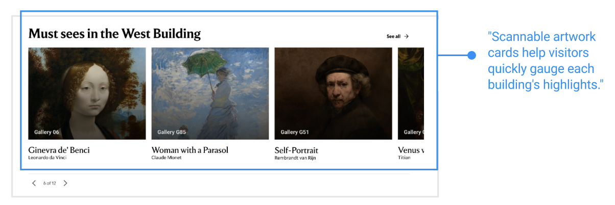
Adding a few additional details here helps the usability of this page tremendously. With the addition of a jump link near the top of the page to the “What to See” section would let users skip to this content without having to scroll through information they might not need. Participants mentioned liking the “Must Sees” section, with one of them saying “I do love these must sees like that’s calling out to me just because I feel like there can be a lot of information on these websites. So getting like a synopsis of what’s going on in like a shorter view, like that’s helpful right off the bat for sure.” Removing the image from the “While You’re Here” section would also be less distracting and avoid any readability issues for users. Adding a visible arrow to the “Explore the Campus” card would immediately resolve the discoverability failure and would help guide users to the “Explore the Campus” page. Although simple changes, adding these signifiers greatly help users navigate the website.
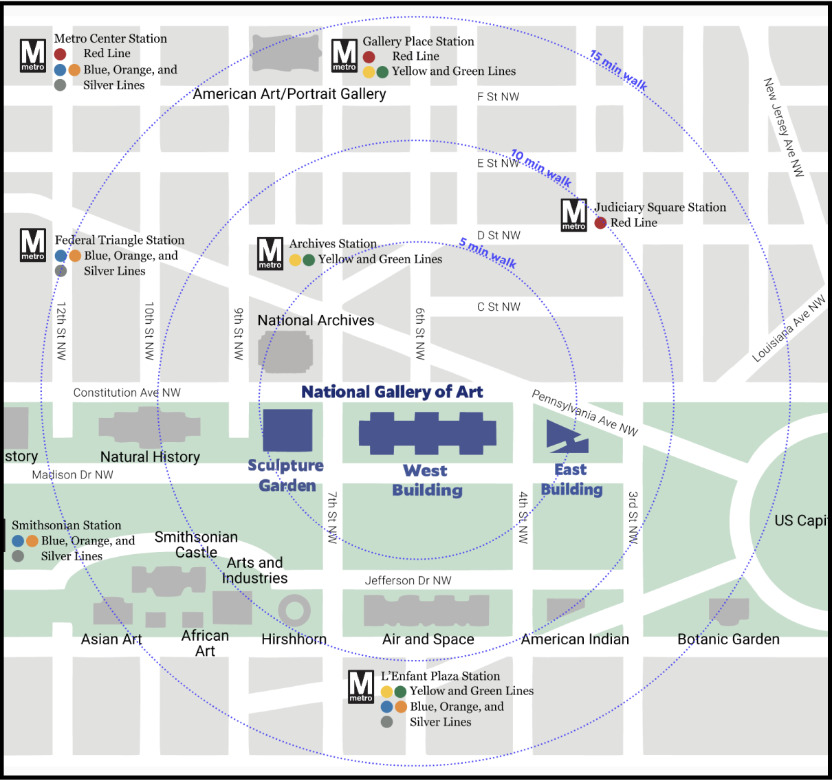
Finding 2: The “Where We Are” map conveys campus structure, but not scale, distance or entrances.
Problem
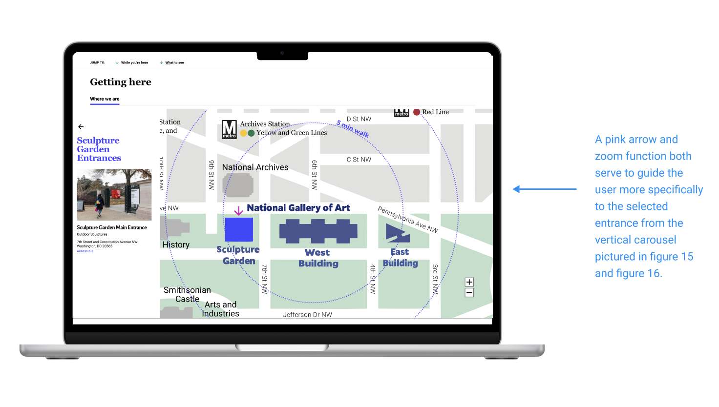
While participants were able to identify the different buildings from the map, they did not have any context for how big the buildings were or estimate how long it would take to walk from one end of the campus to the other. They appreciated the radius circles around the campus that showed walking time and the public transportation close by but said the lack of a reference point made it hard to determine anything else, especially since they were not familiar with the area. Participants also entirely missed the secondary map marking entrances, because it existed under another tab. When asked to rate the task asking them to determine how big the buildings are and how long it would take to navigate between them, users averaged a 3.5 out of 5.
A participant from New York said, “I don’t know DC walking. Like if I was in New York and I could tell that it’s between like two blocks, that could be a more rough idea.”
Recommendation
Adding a third, smaller, radius circle around the 3 buildings would inform visitors of the total campus scale, without users having to do mental math to find that information, reducing the cognitive load on them. Additionally, the entrances tab could be replaced with an interactive map that surfaces entrance information for each building when clicked, instead of living under a tab that users do not look at.
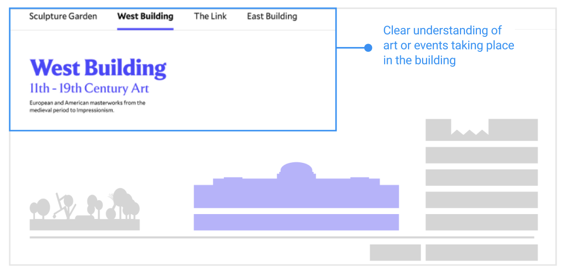
Finding 3: Sightseers need a fast, scannable sense of each building’s identity before committing time to it
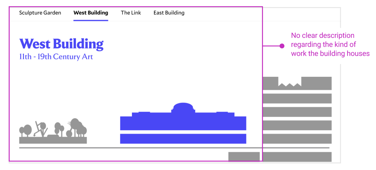
Problem
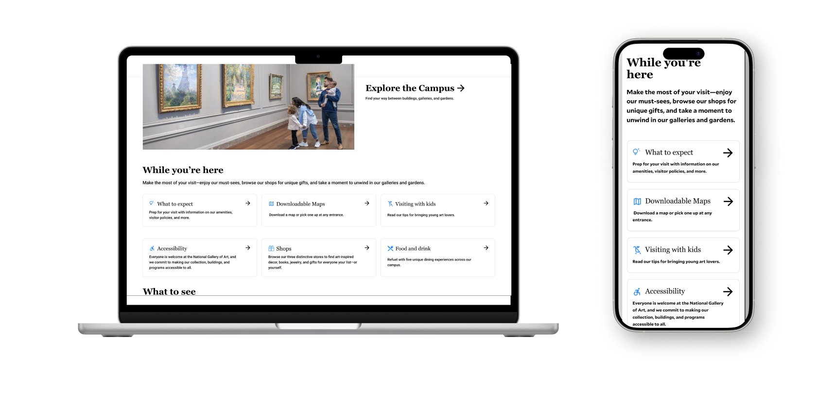
When participants got the the “Explore the Campus” page, their first decision was which building they would want to prioritise given the vastness of the campus. The current labels, like “West Building, 11th-19th Century Art” only gave a date range and not a experiential preview. A casual visitor like the Sightseer might not be able to understand what this meant. Participants had to click through each building page and piece together clues from carousels and collection tiles to form their own rough picture. Visitors also wanted to see more building specific information, like the tours and guides and where they could stop for food. The Must Sees section was especially well received by participants, but was missed by many as it was not surfaced well.
“One thing that would be nice would be like some sort of like quick sub-header. So like East Building and it gives like a summary. Whereas like I sort of had to infer by clicking on each like page to see what’s there in a more detailed view, a sum up might be helpful,” said one participant.
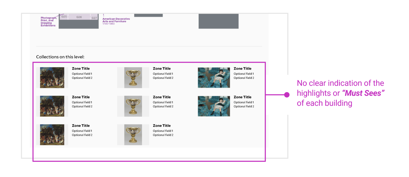
Recommendation
A single sentences under each building name in plain language would be helpful for users to determine what is contained in each building. This would also ensure that users are able to see this immediately, upon first clicking on to the page. The Must-sees section was deemed very useful by many participants and gave them the kind of preview they were looking for when planning their visit. Adding this to each building page also gave visitors the context for where on campus they could find these pieces. Adding more building-specific information, like tours and cafes would also be helpful when planning their day around the museum.
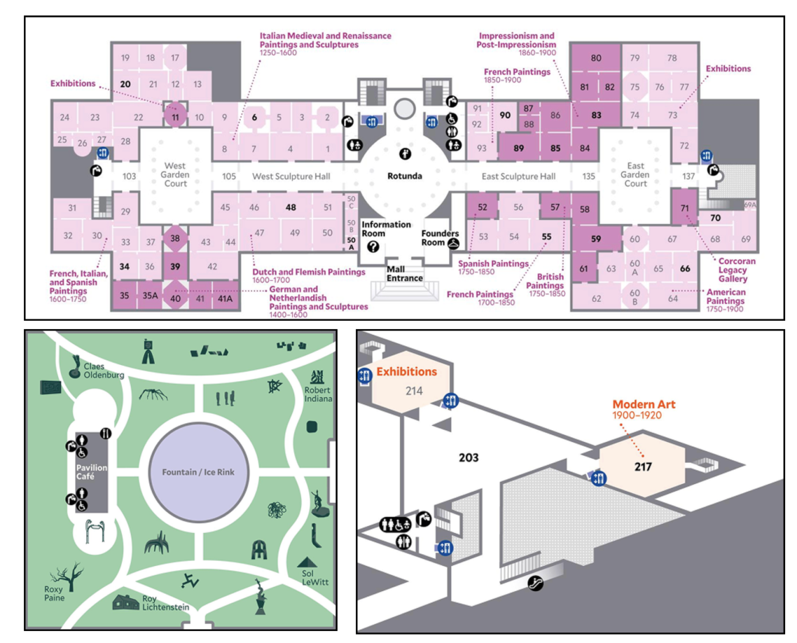
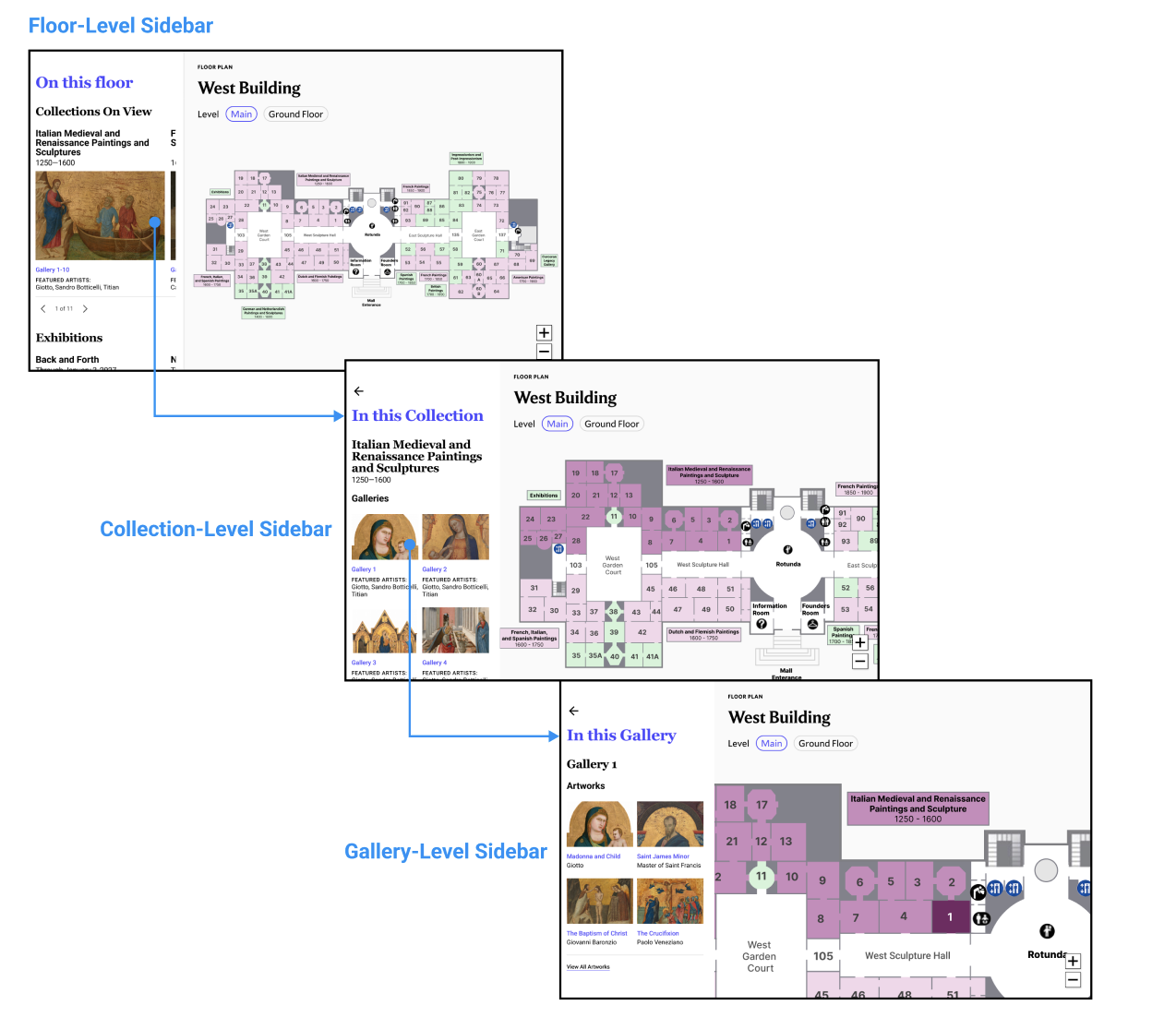
Finding 4: The building floor maps function as static layout rather than planning tools, and do not contextualise the information they should be able to
Problem
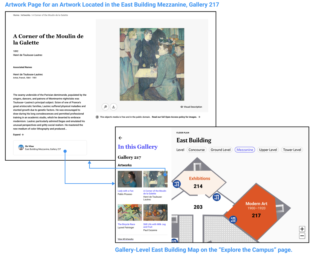
The deepest friction emerged from participants trying to understand what was actually inside each building’s galleries. Our study showed that first-time visitors found the maps without showing what was actually inside each gallery unhelpful to their planning process. Participants who found the sculpture map responded positively because it included icons of the actual works on display within the map, so visitors were able to immediately get a sense of what they would be encountering. The East and West Building maps functioned more like diagrams- users could see the gallery numbers and rough locations, but not what was in each gallery. Task 4c, which asked them to locate abstract art in the East Building, averaged a rating of 4.12 out of 5, the highest of any rated task. Participants who weren’t familiar with art terms and movements did not know what to look for or which labels to follow. The East Building’s map was even more confusing, as it looked like a 3D rendering, instead of the 2D style that the other maps used.* We also discovered that on individual artwork pages, the “On View” location was perceived as a link. Participants clicked on it, expecting it to open a map but nothing happened. But, users mentioned liking the Popular Artists carousel, as it gave them something they were familiar with to anchor to when planning their visit.
“I wouldn’t ever search for a specific artwork in a museum so I really like this artist carousel because I can see some artists I’ve heard of before so that helped me make my decision to visit this building.”
*When we presented this to the NGA team, they informed us that the map was not 3D, but 2D, the building was just structured differently. We adjusted our recommendation to them to instead rethink the style of illustration of the map as users perceived it to be a 3D map, and use the same iconography used across other maps, for e.g., the stair icon caused some confusion for users in the East Building map.
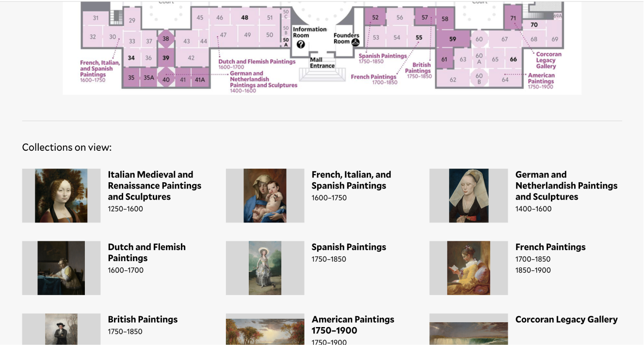
Recommendation
We propose that these maps be redesigned to be a more interactive experience with a connected sidebar. Selecting a floor would surface the collection, exhibitions and food options are available on that floor. Selecting a collection would show the galleries it occupies with featured and popular artists names and previews of the artwork within them. Selecting a specific gallery card would show each individual work within that gallery. The structure mirrors the skim-swim-dive framework, giving visitors the opportunity to see out the depth of information they want.
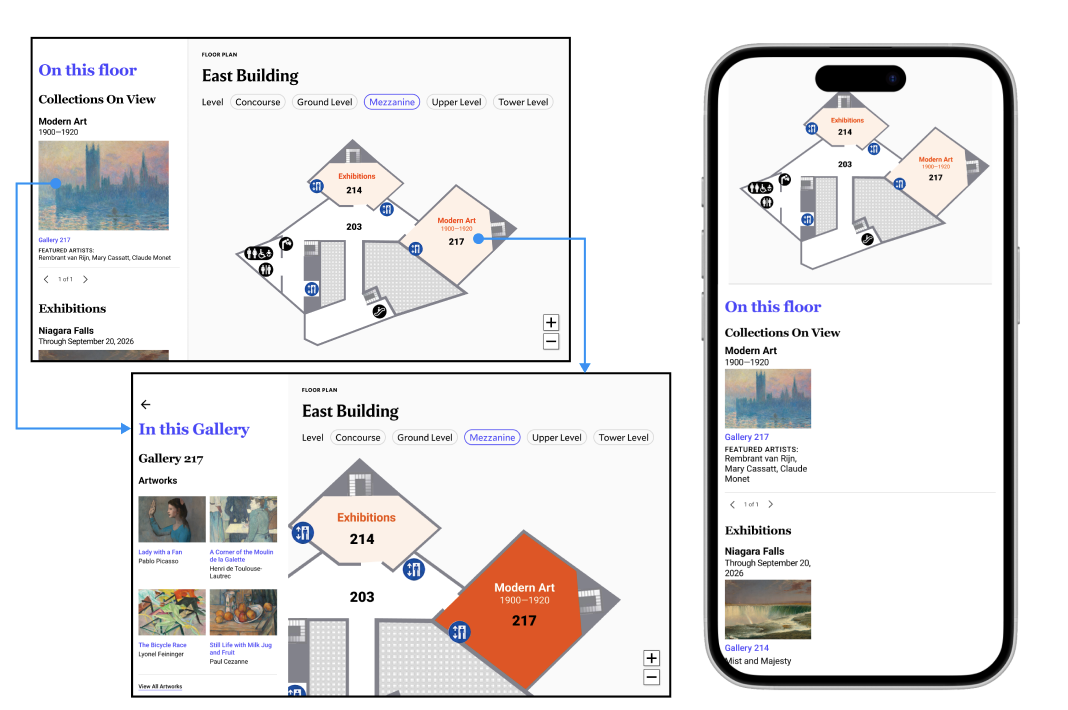
To address the missed connection on the individual artwork page, we recommend making the “On View” a button, linking the user back to the map where they can see the exact physical location of a piece. This would also help close the gap between artwork discovery and physical navigation. Putting this information in context helps users feel more confident about their visit.
Conclusion
The challenges that National Gallery of Art face show the tension that cultural institutions like it face constantly- trying to find the balance between catering to repeat, knowledgable visitors and first-time, casual visitors. The adjustments required to surface content effectively for both groups are refinements rather than redesigns. The friction that exists across the varied levels of information that users want, can be addressed by creating a layers of information, and give users a more intuitive experience moving from discover to detail. Implementing these recommendations reduce the friction across their journey and help boost overall usability of the site, leaving visitors feeling excited but also prepared.
My Takeaways
- Users like to have context: without the proper context, information is not useful to them, and they are left feeling lost.
- The smallest changes can make a big difference: users were missing out on critical information, like the “Explore the Campus” page, because it did not look clickbale to them. Changing this to look more interactive and clickable helps users navigate the website more fluidly.