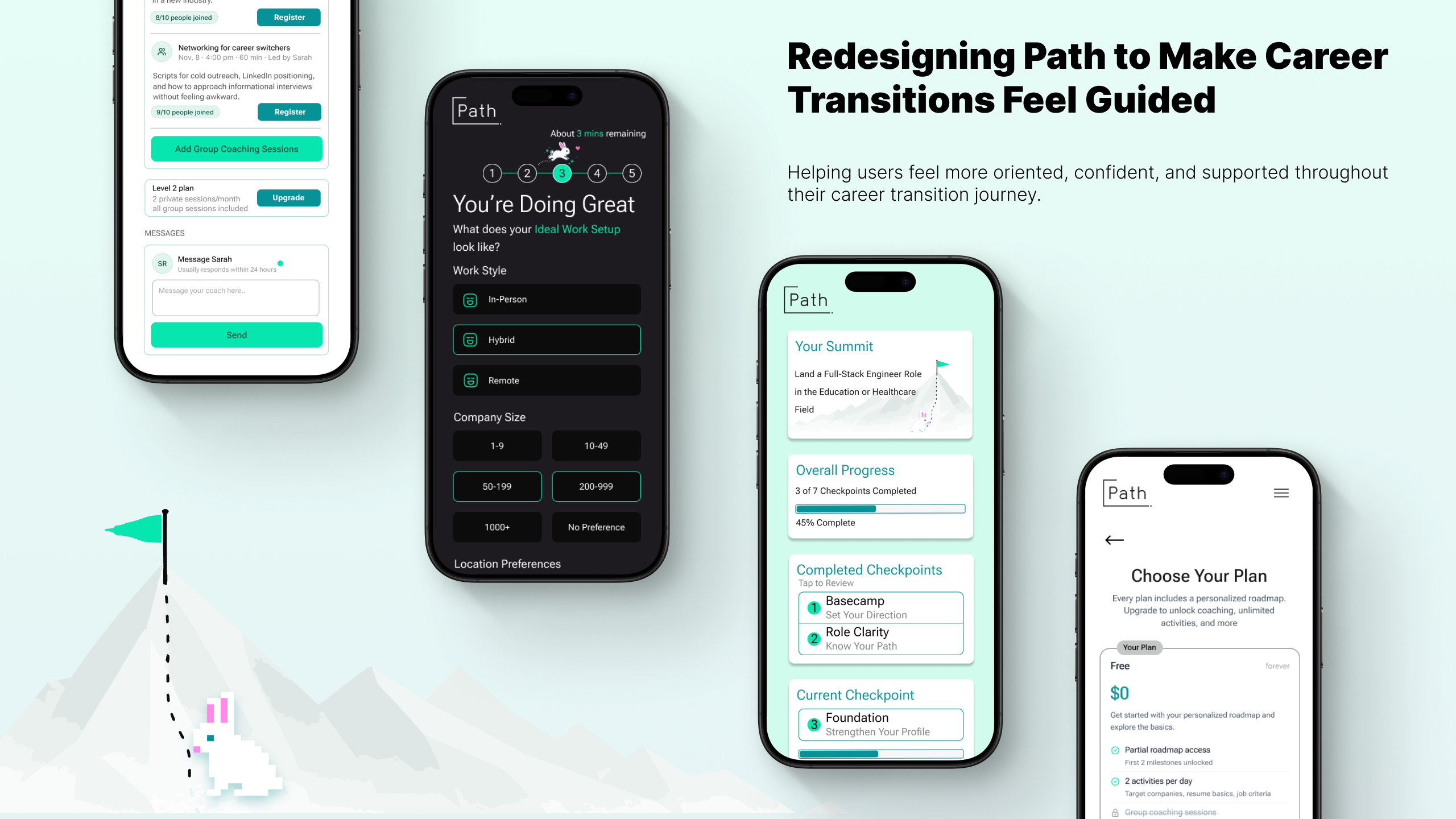
Users understood the promise of personalization — but struggled to understand how Path was guiding them toward their goals. Through moderated usability testing and a redesign focused on onboarding, roadmap clarity, coaching trust and navigation, we reimagined Path as a more structured and confidence-building career journey.
Basecamp
A platform designed to guide career transitions often felt overwhelming instead.
Path is a startup concept built to help early-career users transition into software development through guided activities, personalized roadmaps, and coaching support. The platform aimed to simplify career transitions by breaking the process into structured milestones and actionable next steps. However, during usability testing, participants consistently struggled to understand how recommendations were generated, where to focus, and how the system was guiding them toward their goals. Instead of feeling supported through a journey, many interactions felt repetitive, unclear, or disconnected.
The platform already had strong ideas around personalization and progression — but the experience lacked clarity, orientation, and trust.
The Climb
Understanding where users lost confidence.
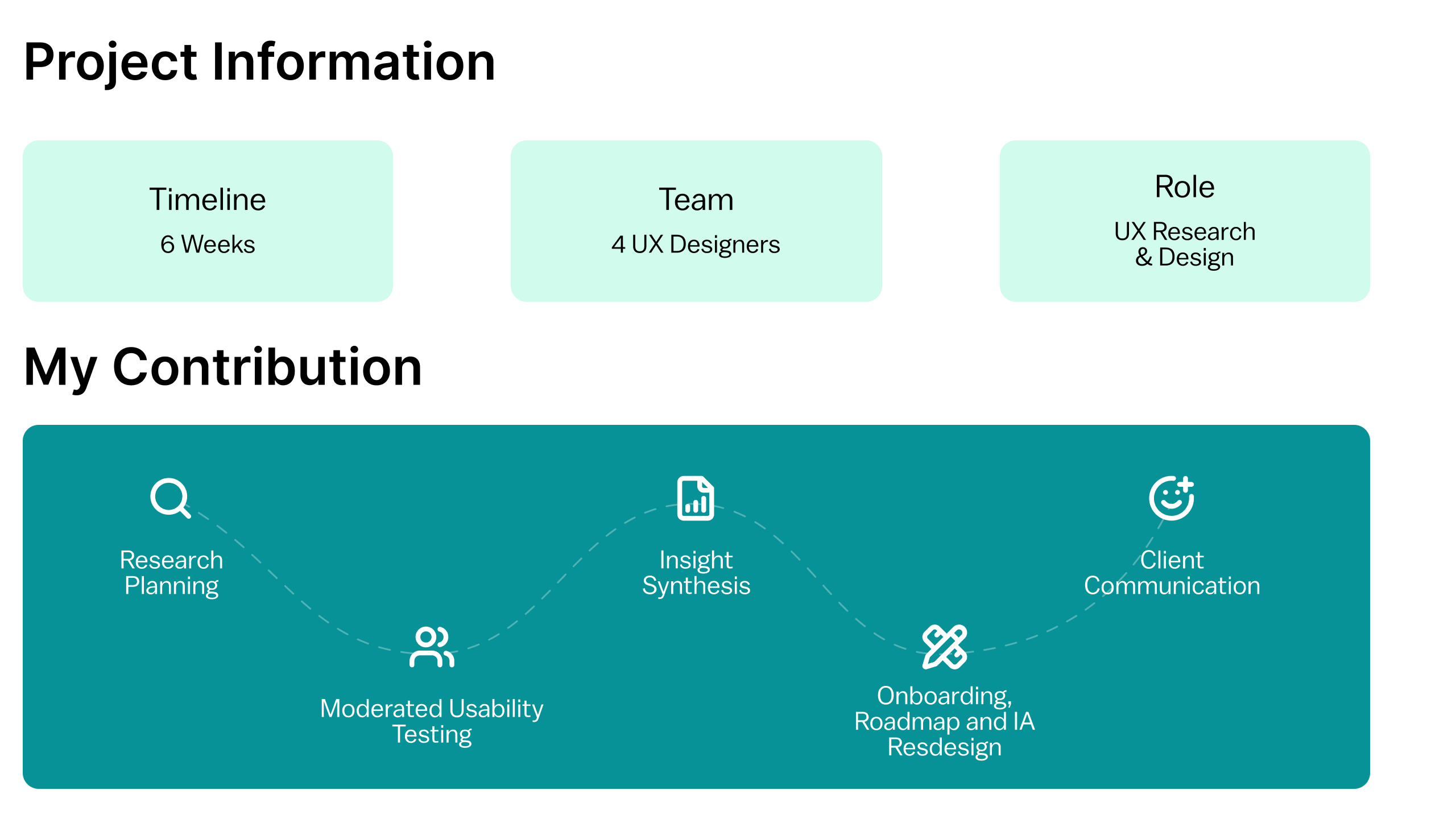
We conducted moderated in-person usability testing with 8 participants currently transitioning into software development roles from both technical and non-technical backgrounds. Sessions lasted approximately 30–40 minutes using a high-fidelity interactive prototype. Participants completed onboarding flows, explored roadmap progression, interacted with coaching features, and navigated activities across the platform. The goal was to understand how effectively Path communicated progression, personalization, and support throughout the experience. Participants were recruited through a screener survey targeting individuals actively transitioning into software development roles, aligning closely with Path’s intended audience.
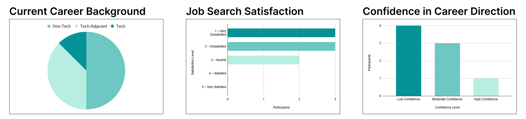
Participants represented users actively navigating career uncertainty — including self-taught developers, students, career switchers, and users transitioning from non-technical fields into software engineering roles.
Mapping The Trail
Turning observations into actionable redesign opportunities.
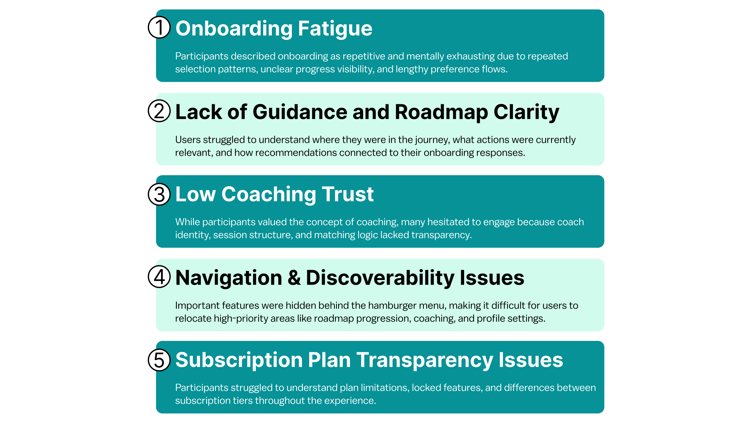
After testing sessions, we synthesized observations across all 8 participants using affinity mapping and behavioral pattern analysis. Repeated friction points were grouped into larger usability themes related to onboarding fatigue, roadmap clarity, coaching trust, and navigation discoverability. From these findings, recommendations were prioritized based on frequency across sessions, impact on user confidence, effect on progression clarity and alignment with Path’s personalization goals.
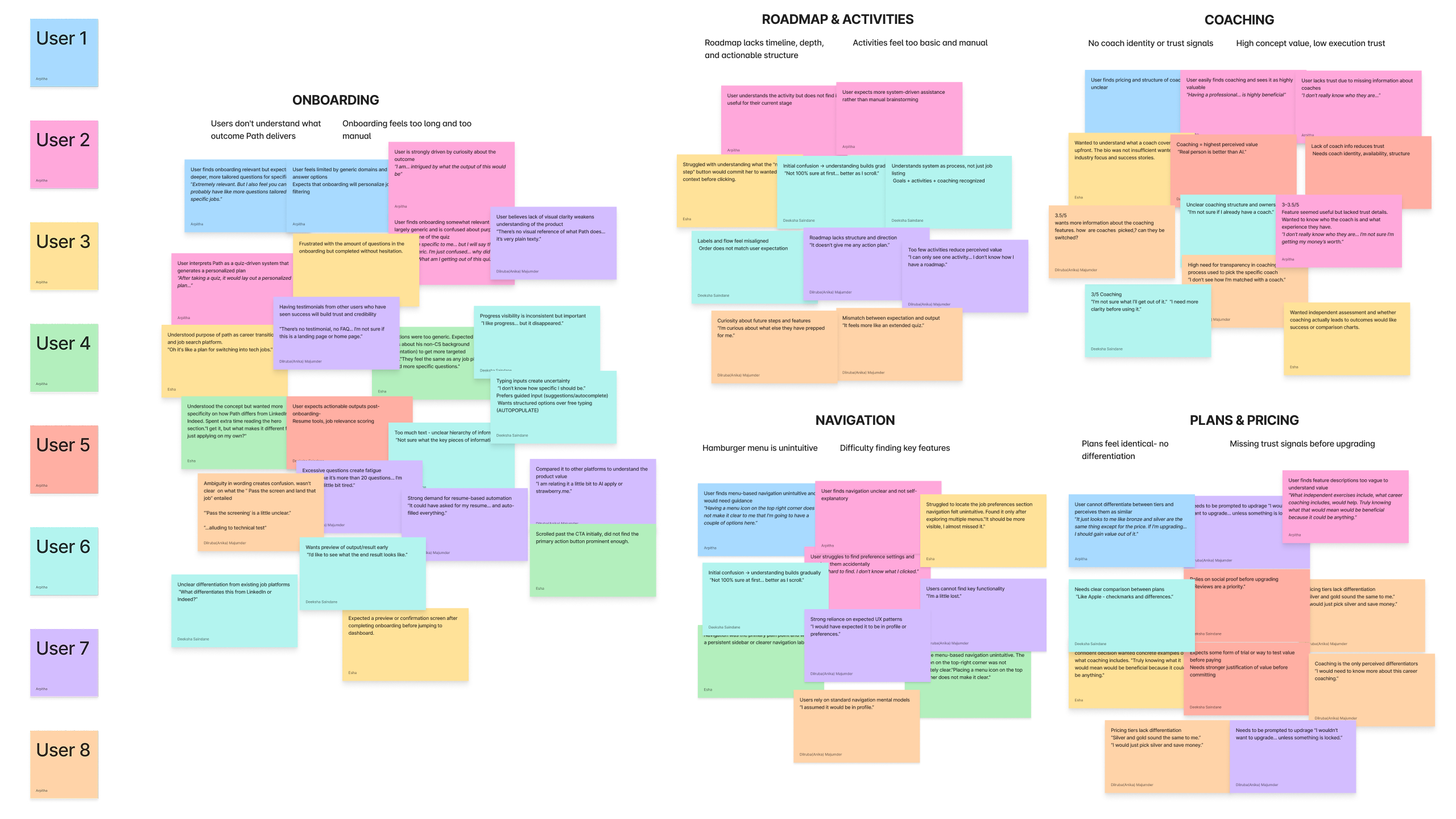
Lost On The Trail
Users understood the vision — but struggled with clarity, orientation, and trust throughout the experience.
Overall, participants responded positively to Path’s core idea and appreciated the platform’s focus on guided career growth. However, usability testing consistently revealed friction across onboarding, roadmap progression, coaching transparency, and platform navigation. Across multiple sessions, five broader usability patterns repeatedly emerged:
Redesigning The Journey
Transforming Path into a clearer and more confidence-building experience.
- Simplifying onboarding and reducing cognitive fatigue
1a. Setting Expectations and Building Transparency
The original onboarding flow provided little visibility into how long the process would take or how user responses influenced roadmap recommendations. Participants frequently described the experience as longer and more mentally demanding than expected.
“It felt random. I didn’t know how the roadmap was actually being generated.”
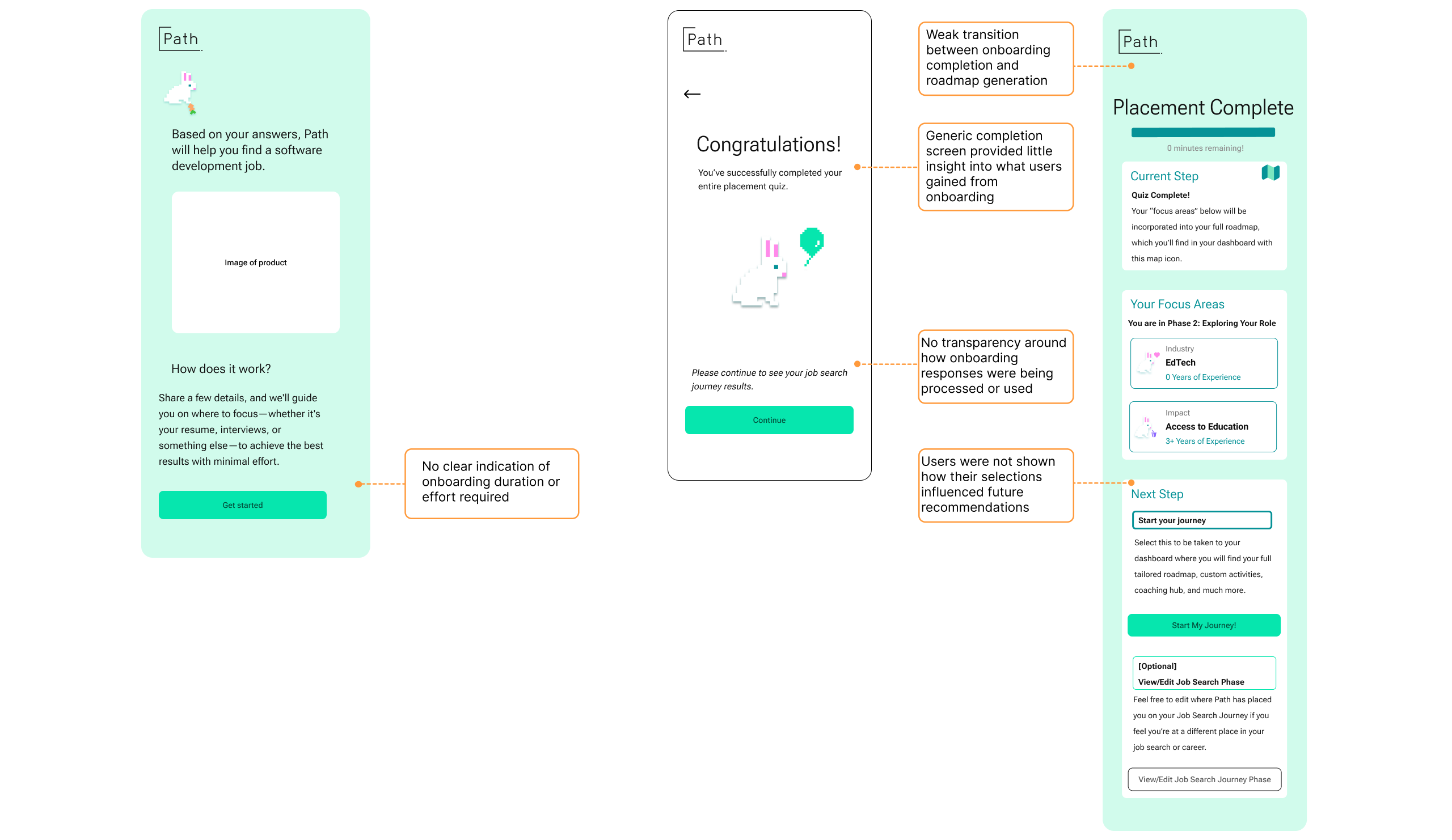
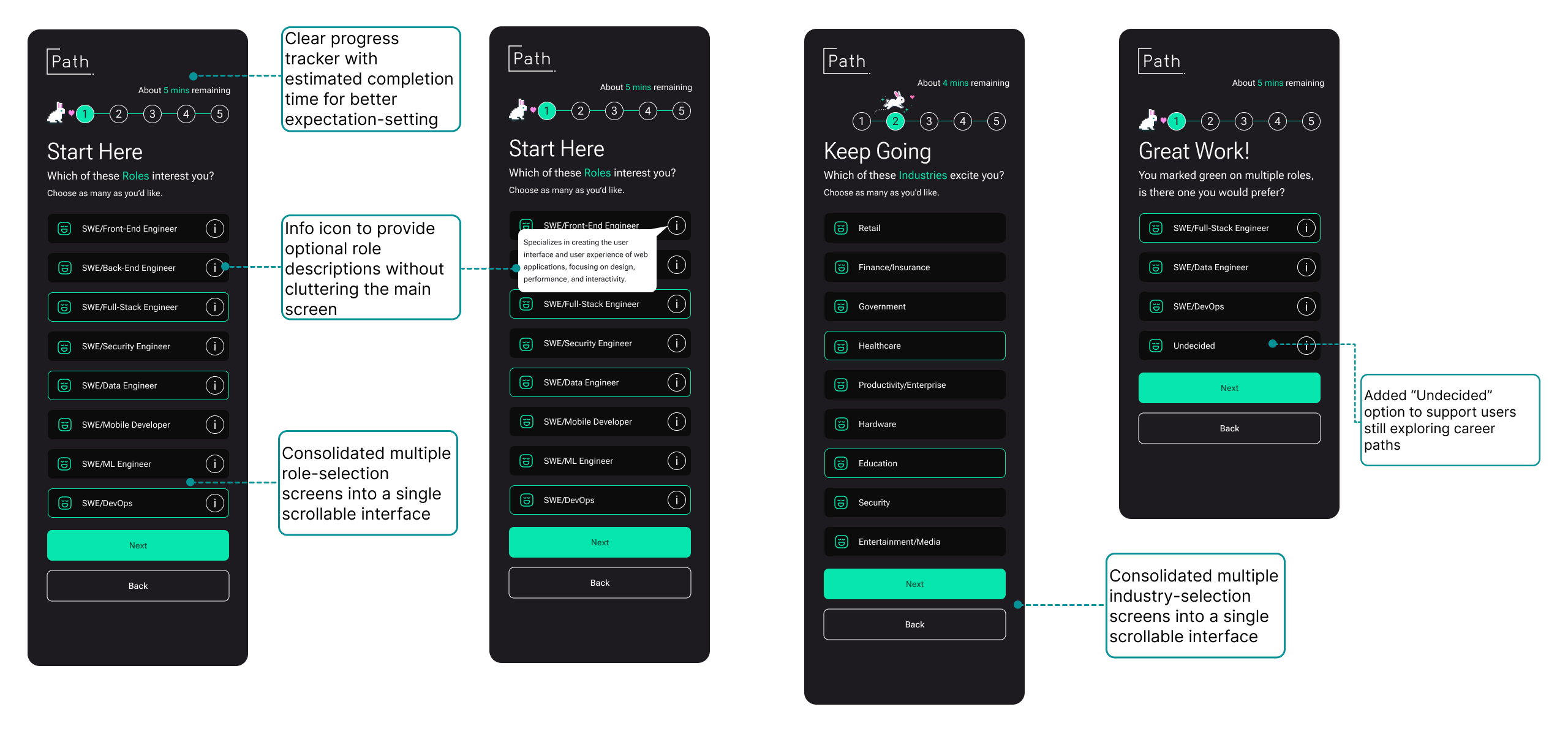
The redesigned flow introduced estimated completion times, persistent progress indicators, onboarding summaries, and roadmap generation explanations to improve transparency and reduce uncertainty throughout the experience.

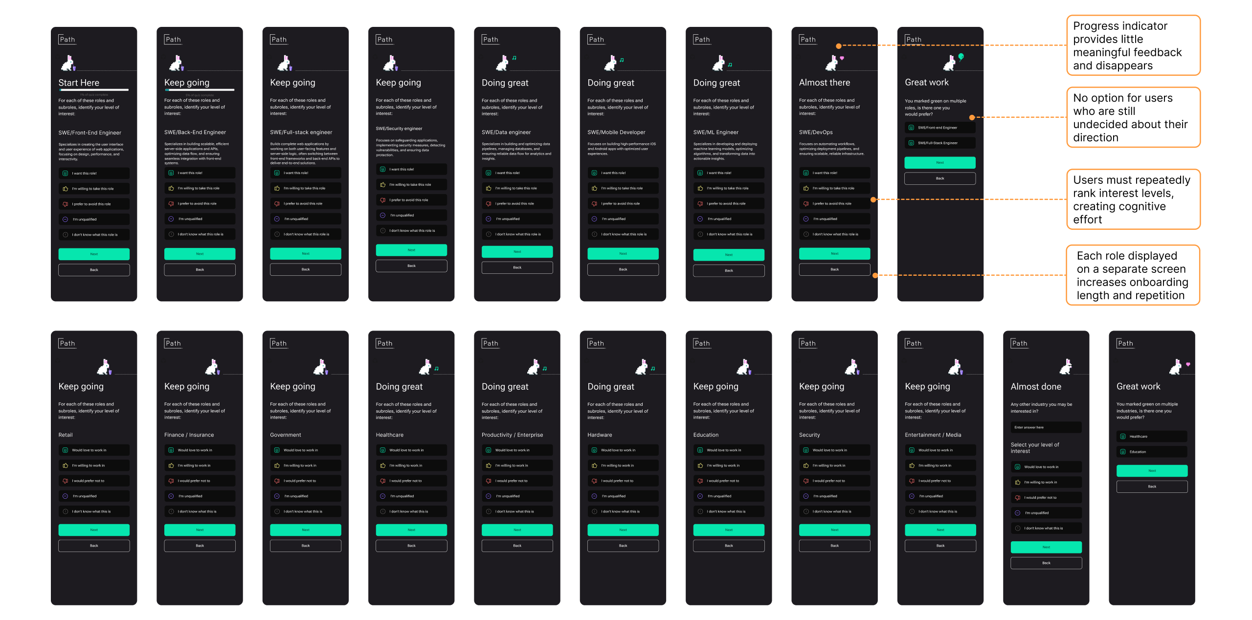
1b. Reducing Repetitive Selection Flows
Participants repeatedly expressed fatigue from moving through multiple nearly identical onboarding screens to rank roles and industries individually. The repetitive interaction pattern increased cognitive effort and made onboarding feel unnecessarily long.
“It feels like it’s more than 20 questions… I’m getting a little bit tired.”
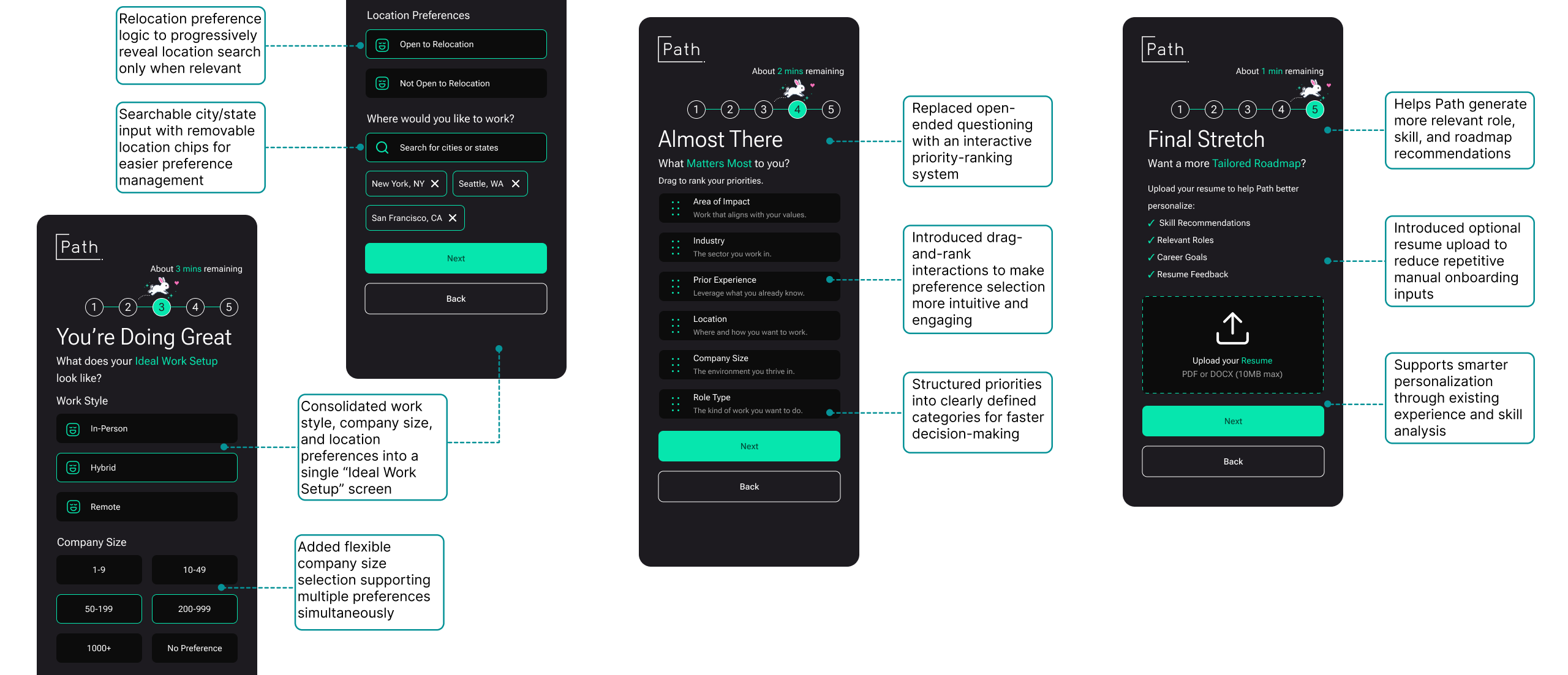
The redesigned flow consolidated role and industry selection into scrollable multi-select interfaces, allowing users to make decisions more efficiently while maintaining personalization depth. Additional support features such as optional role descriptions and “Undecided” states were also introduced to better support users still exploring career paths.
1c. Making personalization feel more adaptive and flexible
Several onboarding questions relied on fragmented preference screens and open-ended responses that required users to manually articulate priorities without much structure or guidance.
“It could have asked for my resume… and auto-filled everything.”
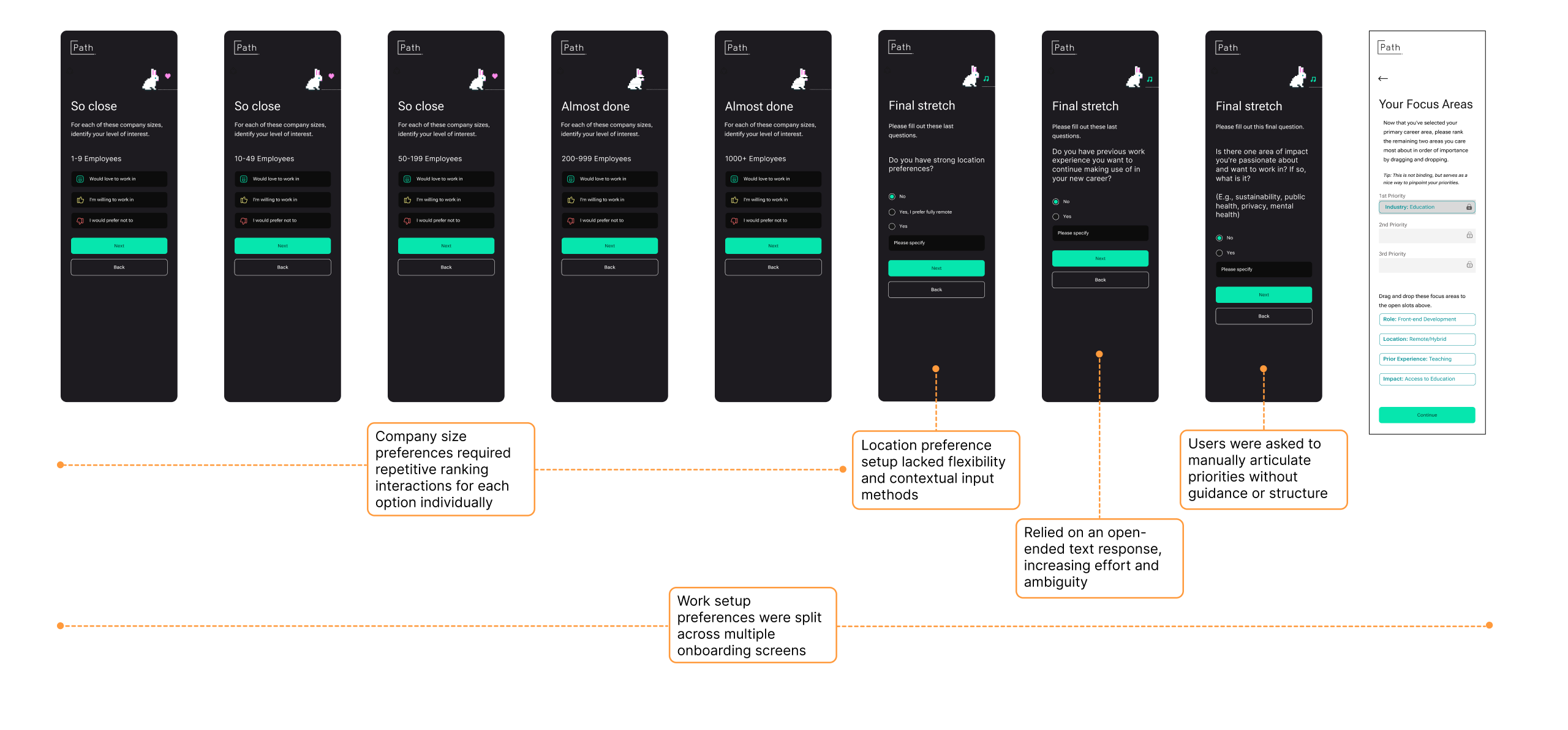
The redesigned onboarding experience grouped related work preferences into a unified “Ideal Work Setup” flow, introduced drag-and-rank prioritization interactions, and added optional resume uploads to support smarter recommendation generation while reducing repetitive manual input.
2. Reframing progression through a checkpoint-based roadmap
Participants consistently struggled to understand where they currently were within the roadmap, what activities were immediately relevant, and how the system connected progress to larger career goals.
“It doesn’t give me any action plan.”
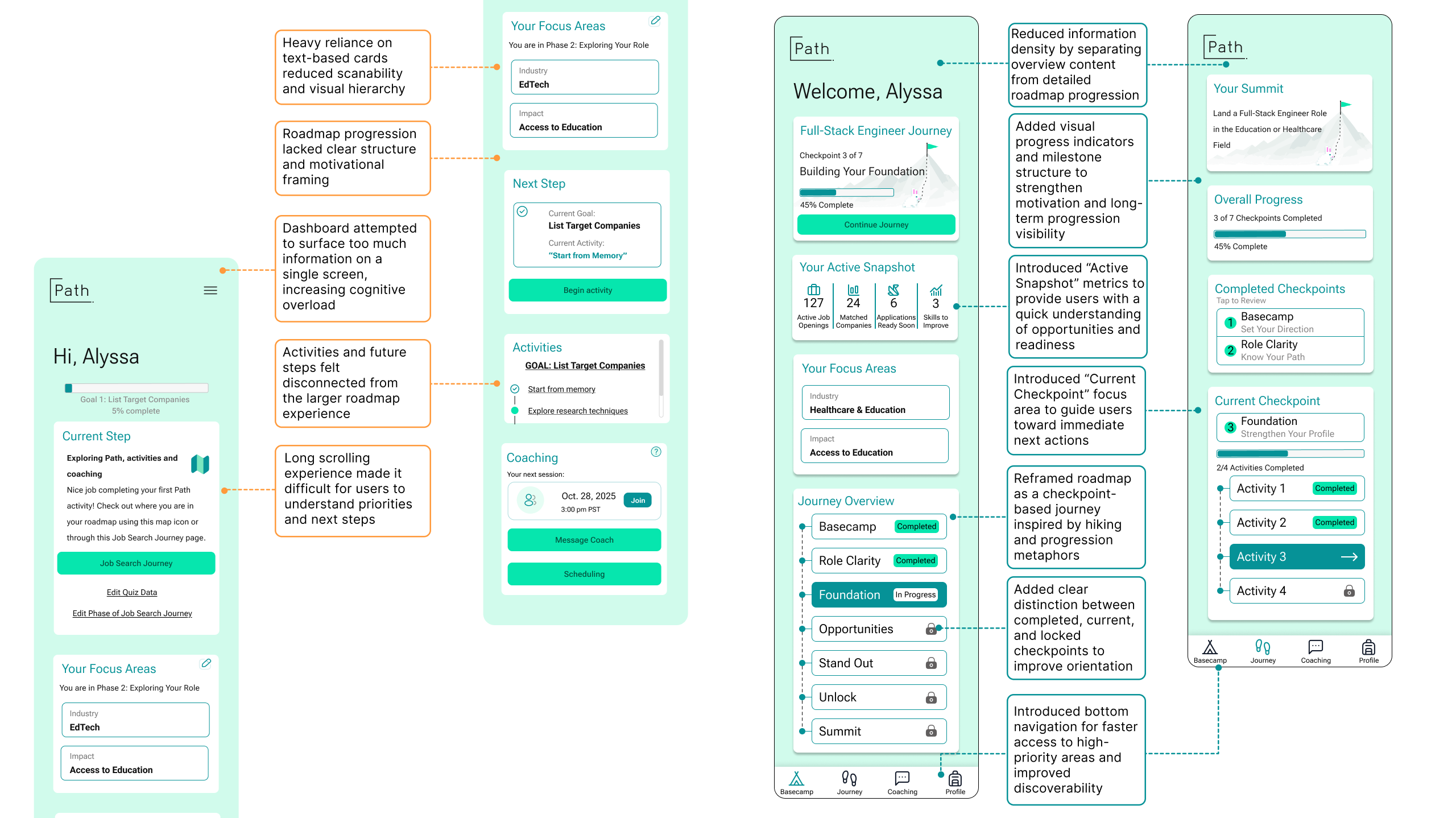
The redesigned roadmap reframed the experience as a checkpoint-based journey inspired by hiking and progression metaphors. Information-heavy dashboard content was separated into focused sections, allowing users to prioritize immediate next steps without losing visibility into long-term progression. New progress indicators, checkpoint states, milestone visibility, and activity grouping systems helped users better understand completed work, current focus areas, and locked future stages.
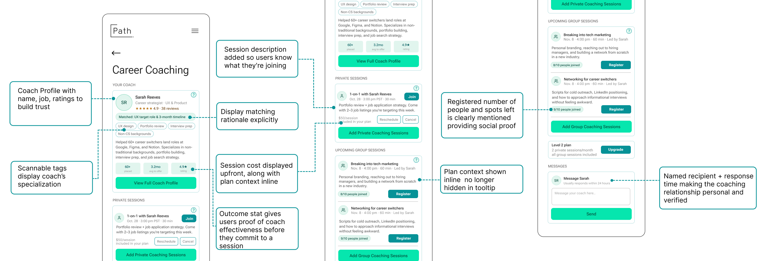
3. Building trust in coaching before asking for commitment
Although coaching scored highest conceptually across all tested features, participants consistently expressed skepticism when interacting with it directly. Users lacked context around coach identity, session structure, matching rationale, and subscription limitations.
“I don’t really know who my coach is… I’m not sure I’m getting my money’s worth.”
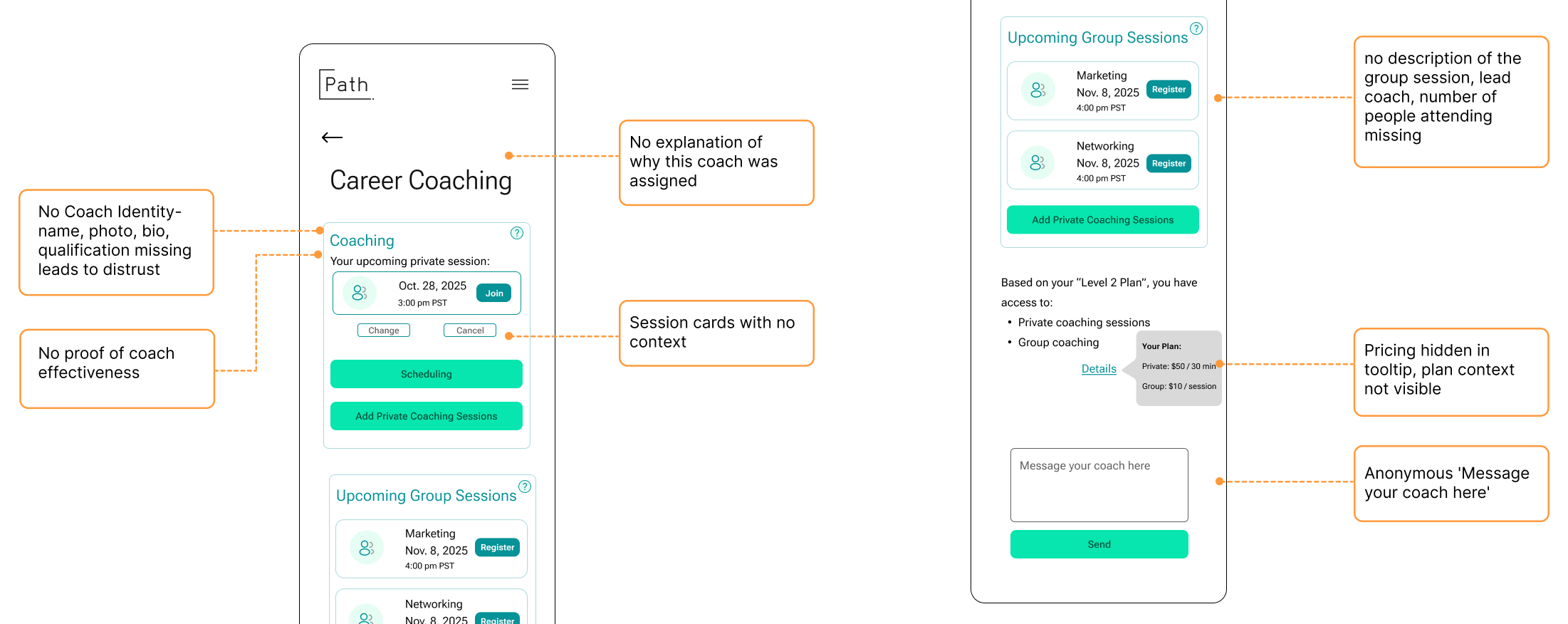
The redesign introduced visible coach profiles, matching explanations, clearer session descriptions, and transparent plan context throughout the experience. These changes aimed to establish credibility before asking users to schedule, message, or pay for coaching support.
4. Improving discoverability through navigation restructuring
The previous hamburger navigation created friction by hiding high-priority features behind additional interactions. Participants frequently overlooked roadmap progression, coaching access, and profile-related functionality throughout testing.
“Placing a menu icon on the top right corner does not make it clear.”
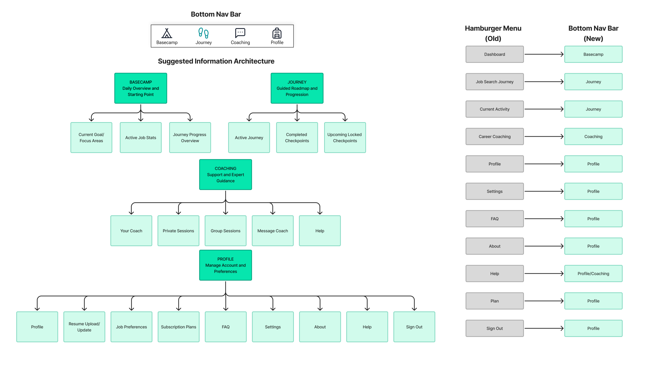
The redesigned information architecture introduced persistent bottom navigation to surface core platform areas directly within the primary interface. This improved orientation, reduced navigation friction, and created clearer separation between onboarding, progression, coaching, and profile management systems.
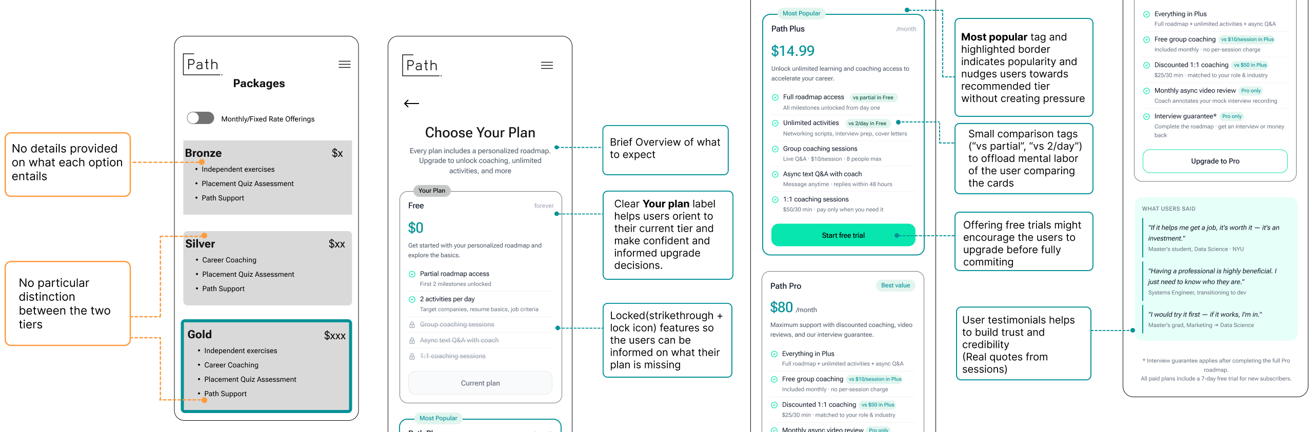
5. Making subscription tiers and locked features easier to understand
Participants consistently struggled to understand the differences between subscription tiers, what features were included in each plan, and whether upgrading would meaningfully improve their experience. Coaching access, roadmap limitations, and locked features often appeared without enough context, making premium plans feel unclear and difficult to evaluate.
”It just looks to me like bronze and silver are the same thing except for the price. If I’m upgrading… I should gain value out of it.”
Together, these redesigns transformed Path from a feature-heavy experience into a more structured and confidence-building journey. By improving clarity, progression visibility, and recommendation transparency, the platform better supported users through the uncertainty of career transitions.
Reaching The Summit
Designing for confidence, not just personalization.
This project reinforced how strongly users rely on clarity, reassurance, and transparency during high-stress experiences like career transitions. Most usability issues were not caused by isolated screens, but by the cumulative mental effort created across the experience. Through redesigning onboarding, roadmap progression, coaching trust, navigation, and recommendation transparency, Path evolved into a more structured and confidence-building journey. The final deliverables included a detailed usability report and presentation shared directly with the client. The client responded positively to the clarity and depth of the findings, particularly the focus on trust-building, onboarding simplification, and roadmap restructuring. Future iterations could further expand Path through community-driven support systems, networking features, and collaborative accountability tools requested by participants during testing.
Beyond the Summit
One of my biggest takeaways from this project was learning how much trust influences perceived usability. Users were not only evaluating whether features worked, they were evaluating whether the system understood them, supported them, and could realistically guide them toward their goals. Designing for that emotional layer became just as important as improving the interface itself. This project also strengthened my understanding of how usability testing can uncover broader behavioral patterns beyond isolated interaction issues. Instead of focusing only on screen-level friction, I learned how cumulative cognitive effort, unclear system behavior, and lack of orientation can gradually reduce user confidence across an entire experience.