OVERVIEW
A career-transition platform with strong vision but friction in execution.
Path is a career-transition platform built to support individuals pursuing roles in software engineering, computer engineering, and related technology fields. It provides structured guidance, personalized learning roadmaps, coaching support, and job-search resources for aspiring tech professionals from students and self-taught learners to professionals switching industries.
The platform combines four core areas: an onboarding and personalization flow, a roadmap-based learning journey, career coaching and support features, and subscription plan management. This case study focuses on uncovering the friction users experienced across all four areas through moderated remote usability testing, and offering actionable design recommendations to close those gaps.
RESEARCH
Six questions we set out to answer.
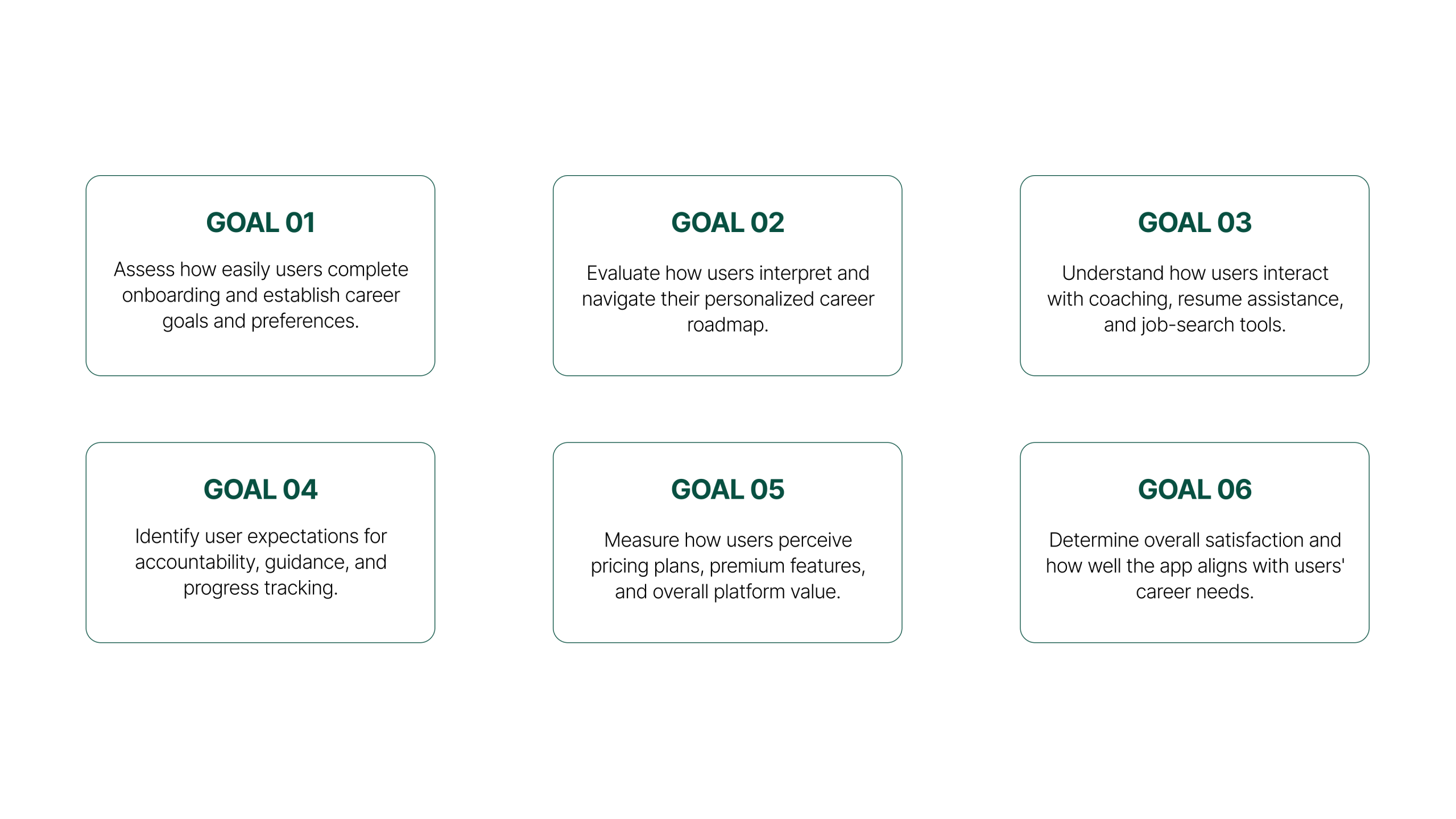
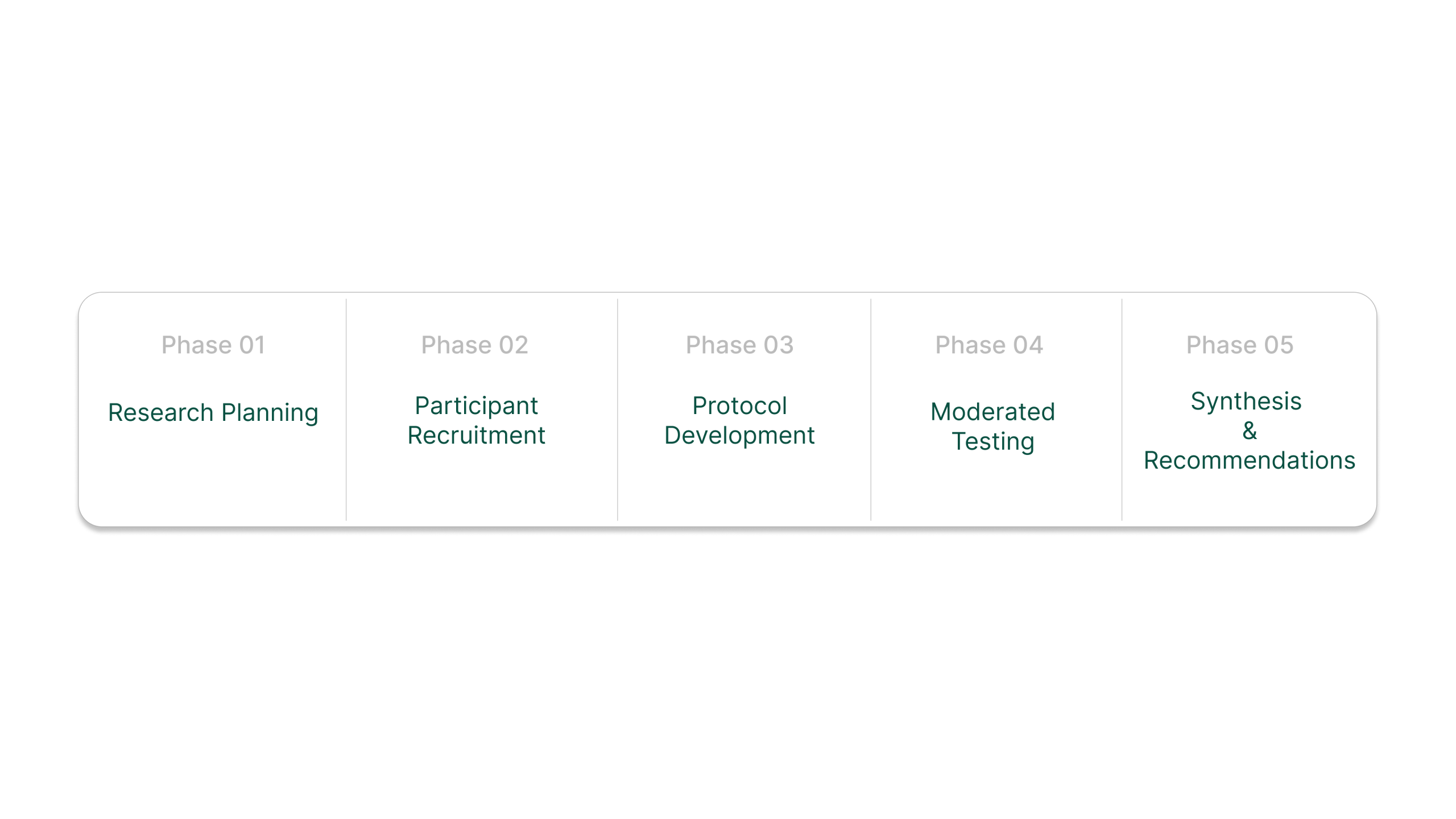
METHODOLOGY
Moderated remote usability testing
We conducted moderated remote usability testing via Zoom with individuals actively interested in transitioning into technology careers. Sessions were structured around task-based activities, observational note-taking, and post-test interview questions. One team member moderated while another documented observations, behavioral patterns, and verbal feedback in real time.
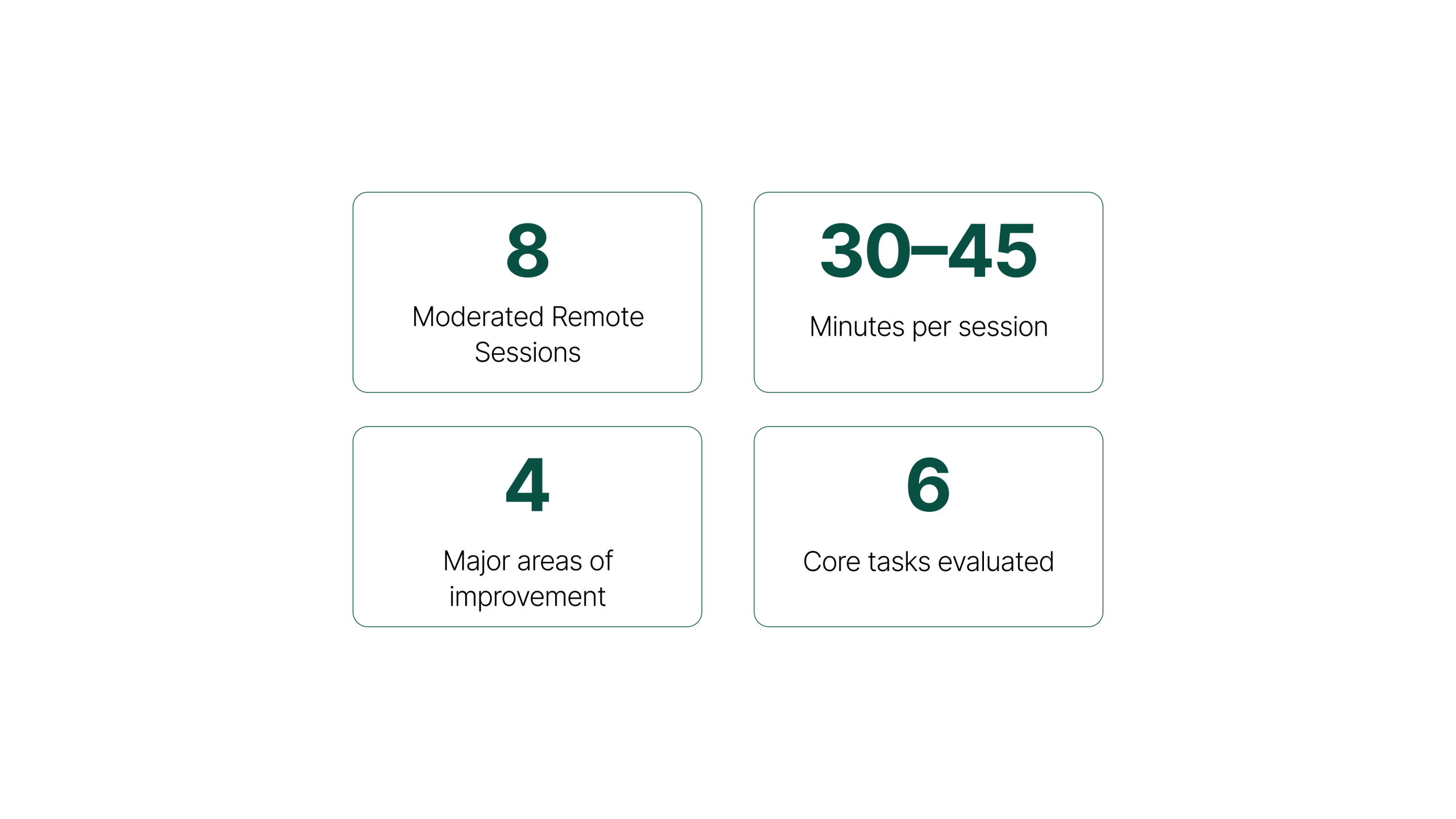
Participants were screened for active interest in switching into tech, current job-search frustration, and varying levels of technical experience — ranging from beginners who had just started self-learning, to intermediate learners who had completed courses, to professionals looking to change industries. Think-aloud protocol was used throughout every session.
FINDINGS & RECOMMENDATIONS
Four findings, two underlying challenges.
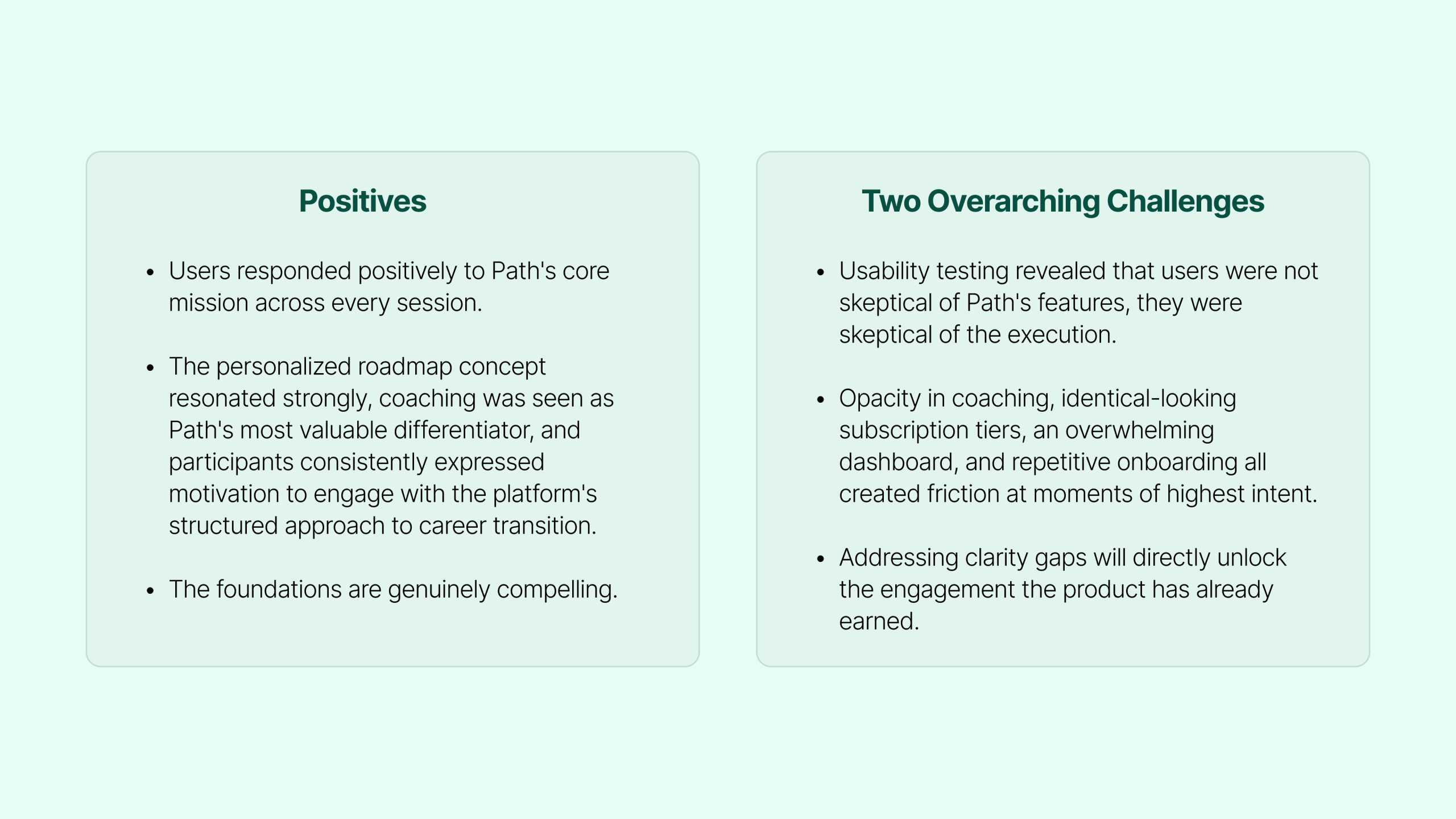
All findings fell under two overarching challenges: a gap between user expectations and platform communication, and a current experience that did not fully support user needs. Each finding includes the evidence observed across all 8 participants and the specific recommendations we developed in response.
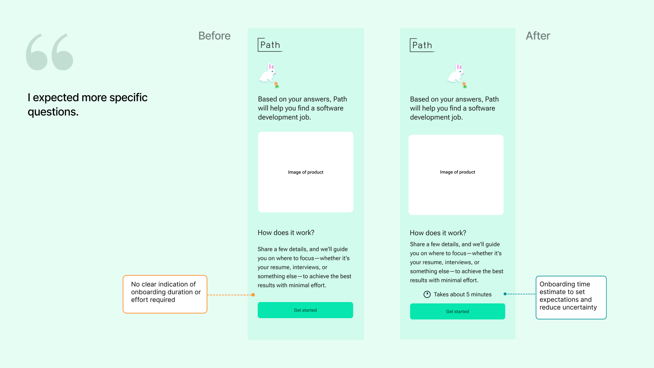
Finding 01
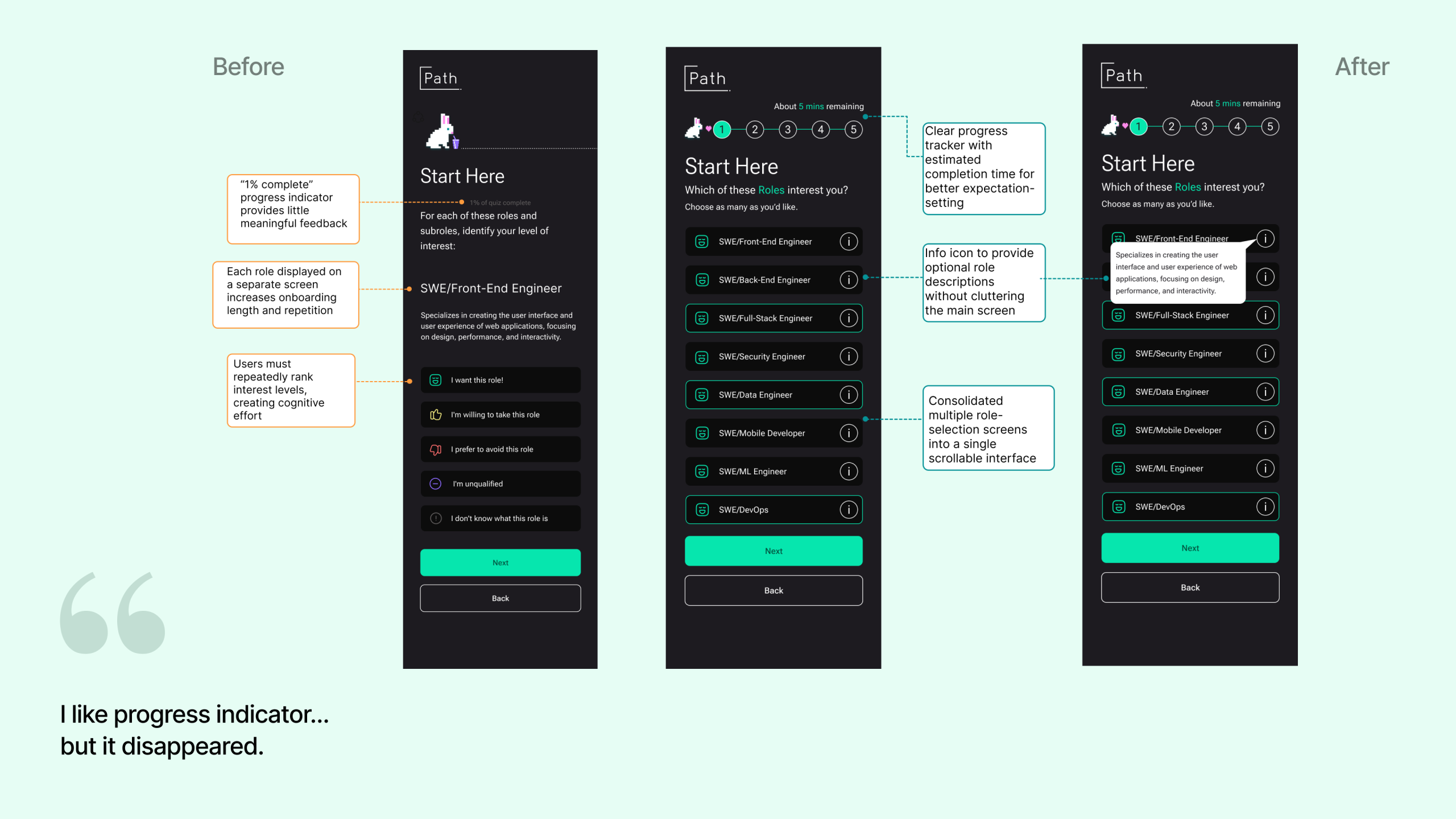
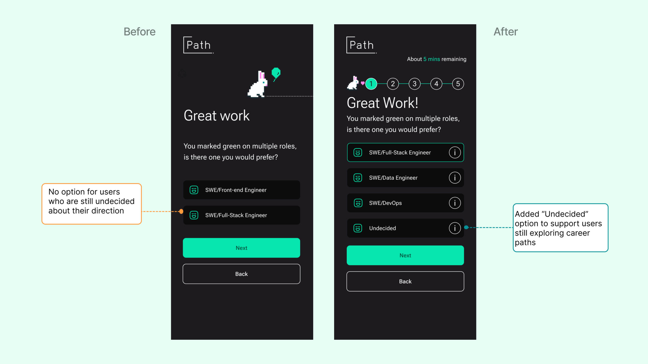
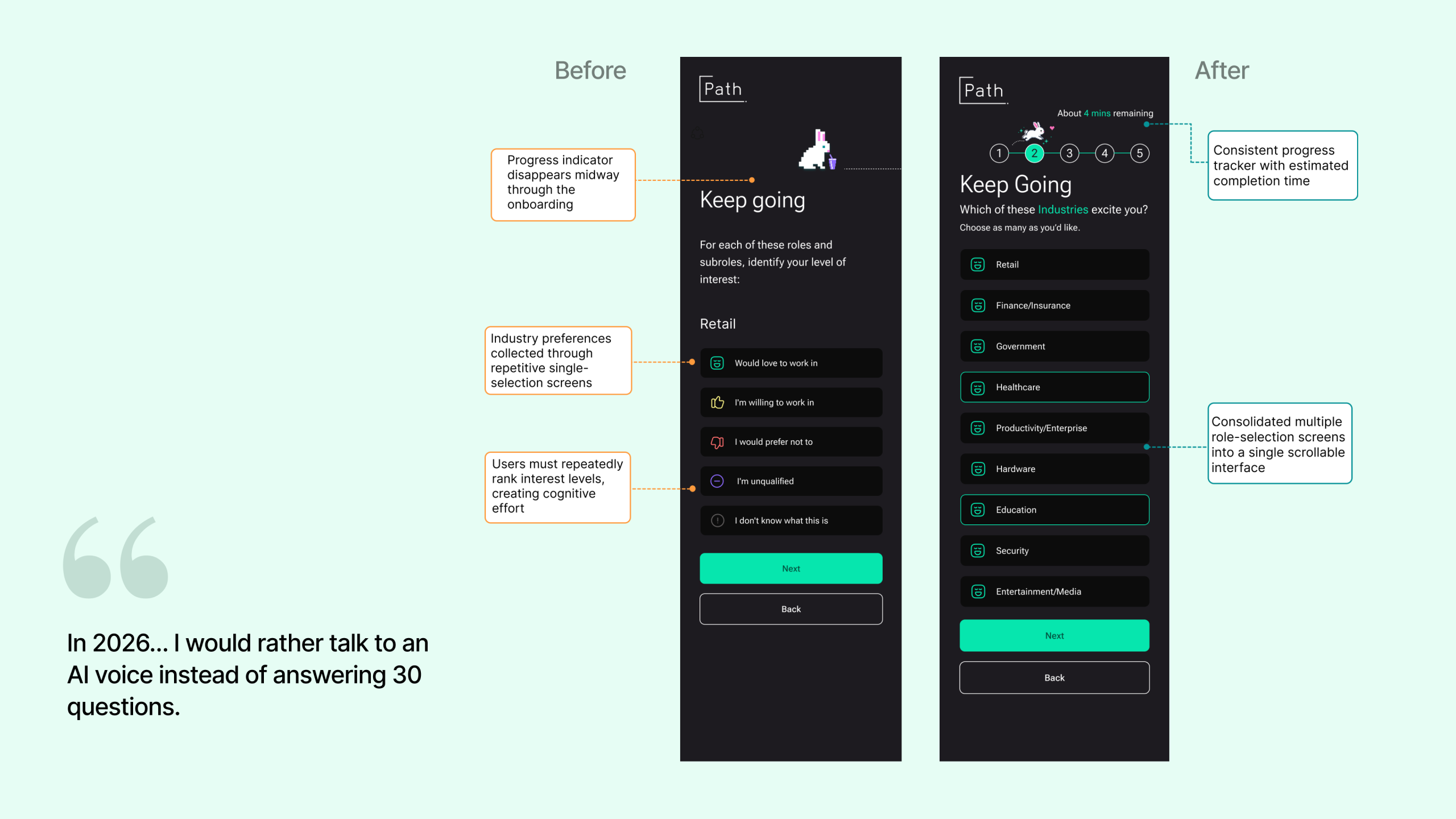
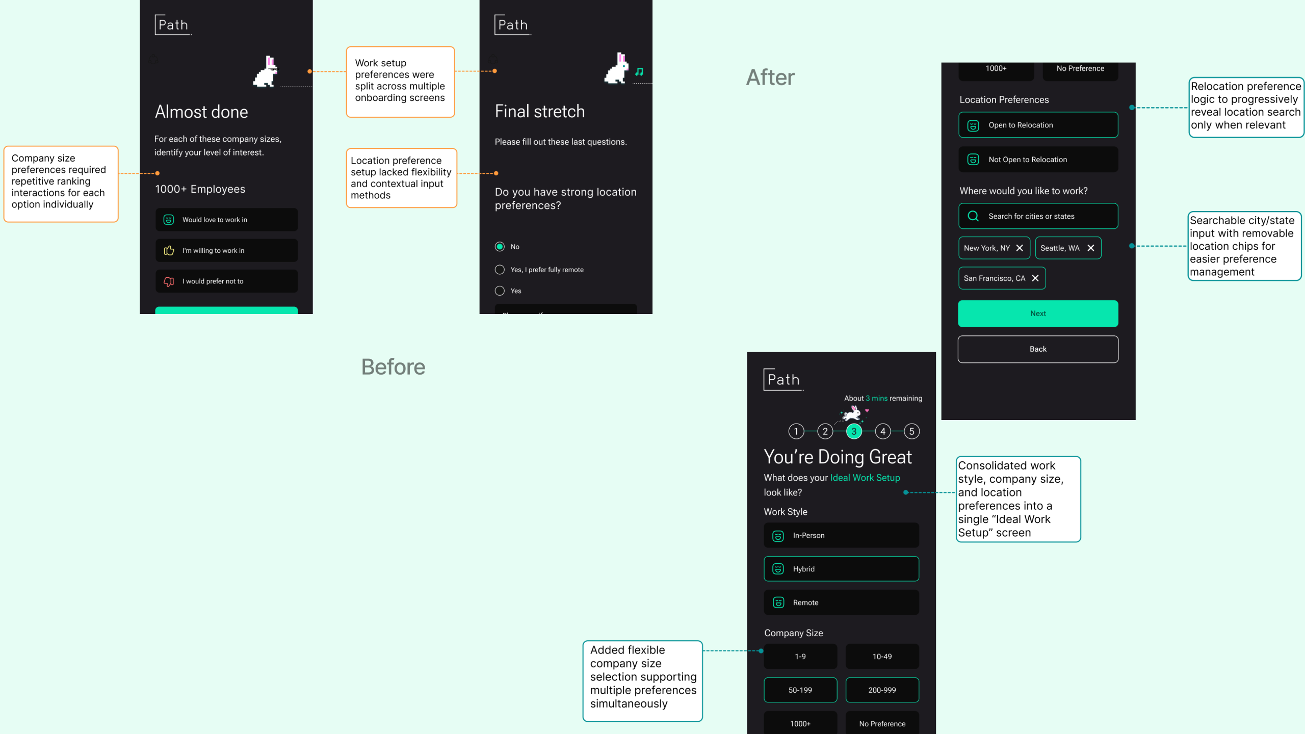
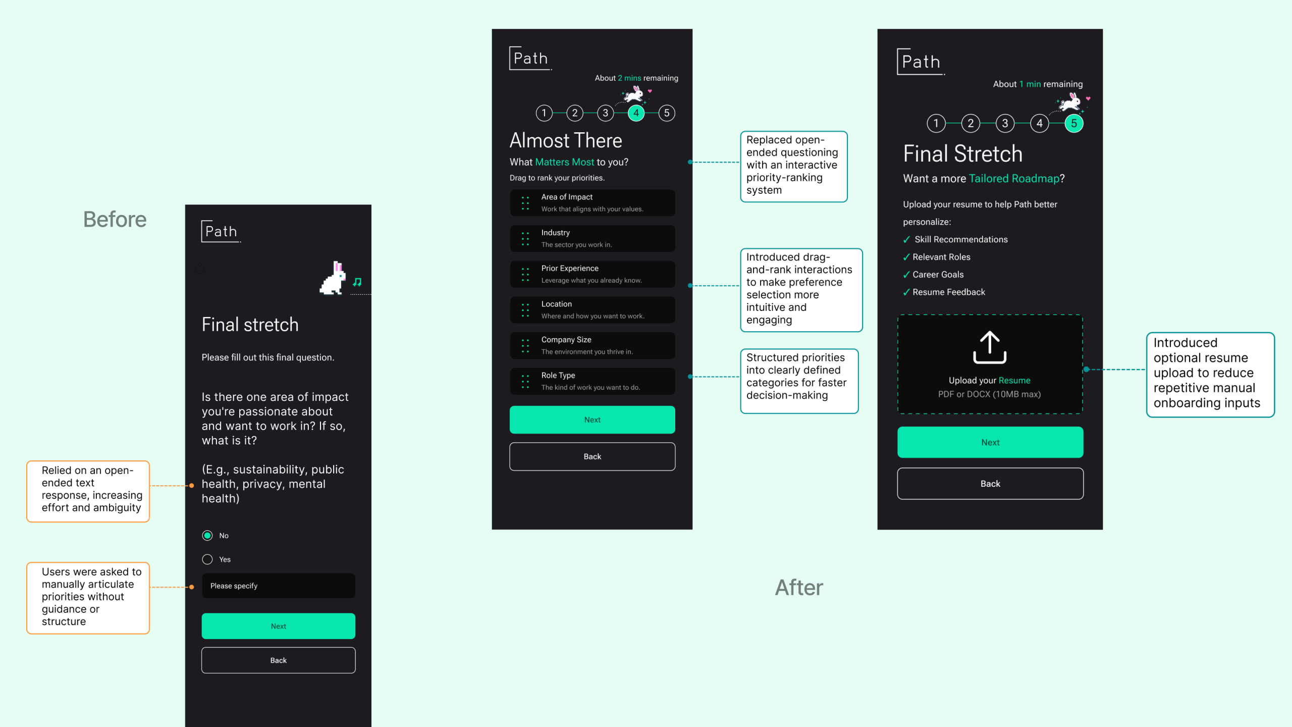
Onboarding felt repetitive, exhausting and longer than expected
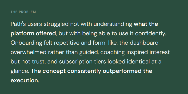
Users understood the value of personalization in theory, but the actual flow created friction through repetitive screens, excessive manual inputs, and no clarity on how long setup would take. The interaction cost was the problem. Not the concept.
Finding 02
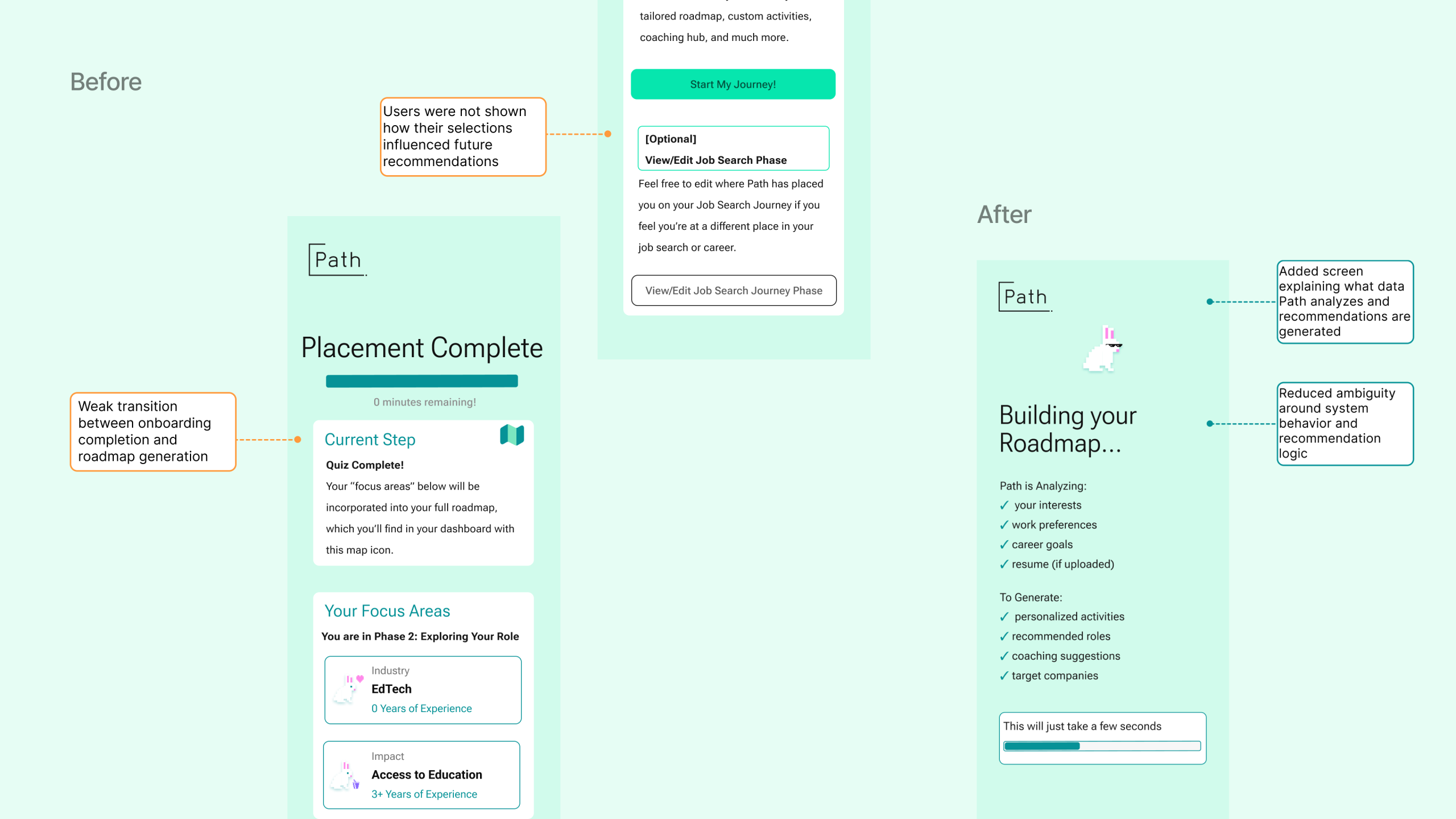
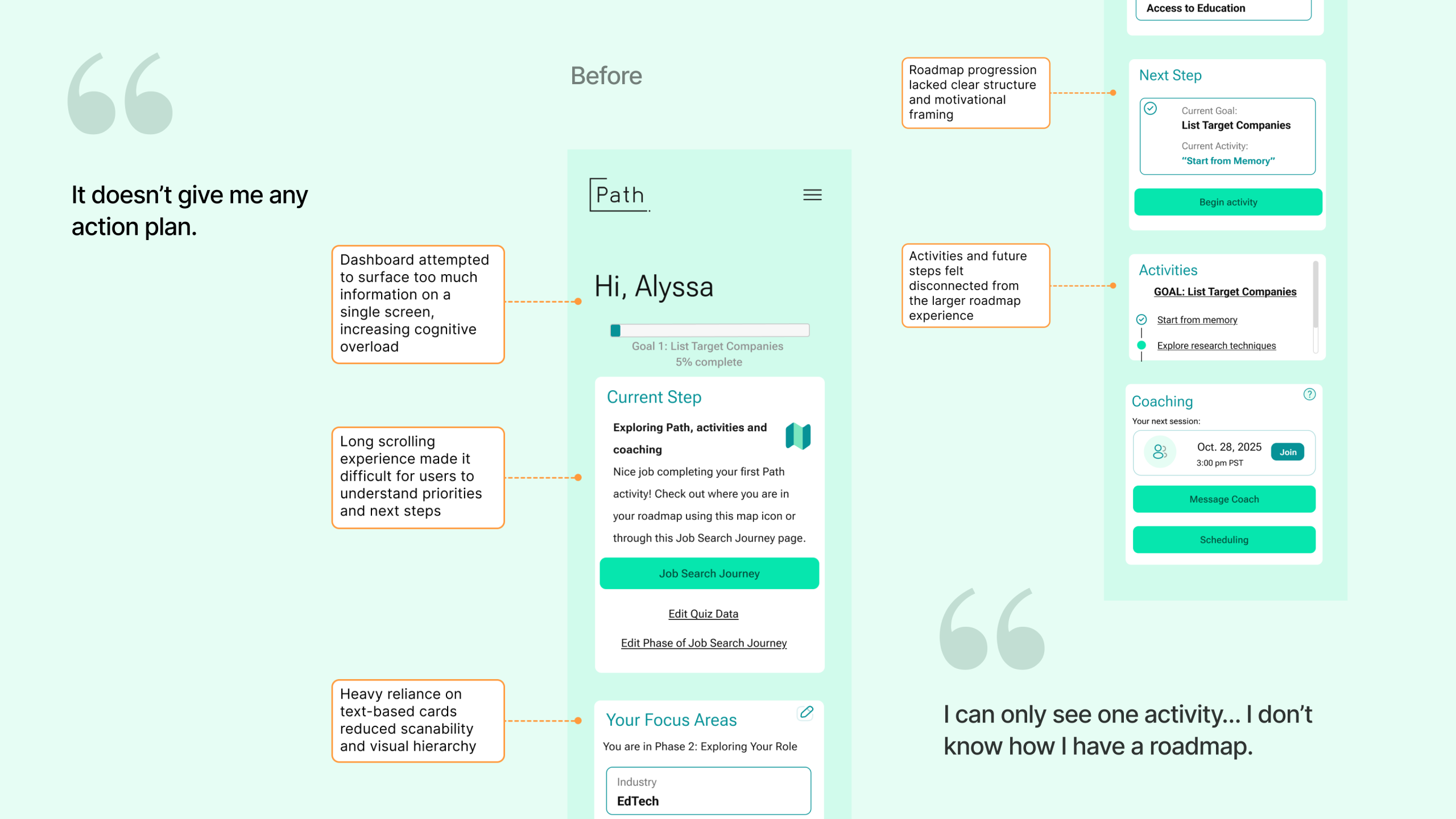
The dashboard overwhelmed rather than guided. Users couldn’t find their next step.
Participants understood the idea behind Path’s roadmap and valued structured career guidance. But the dashboard tried to surface everything at once onboarding data, coaching, activities and progression details competing for attention equally and making it impossible to know what to do next.
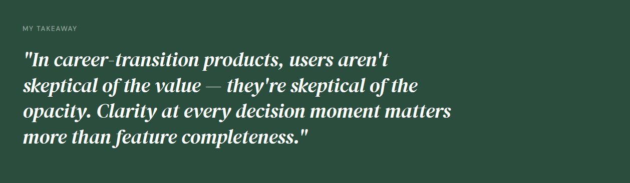
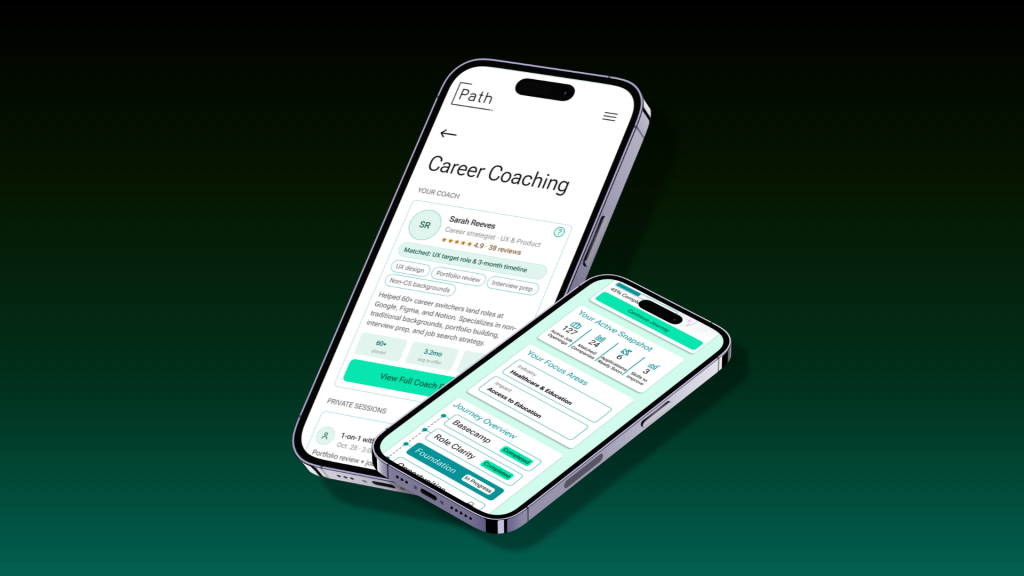
Finding 03
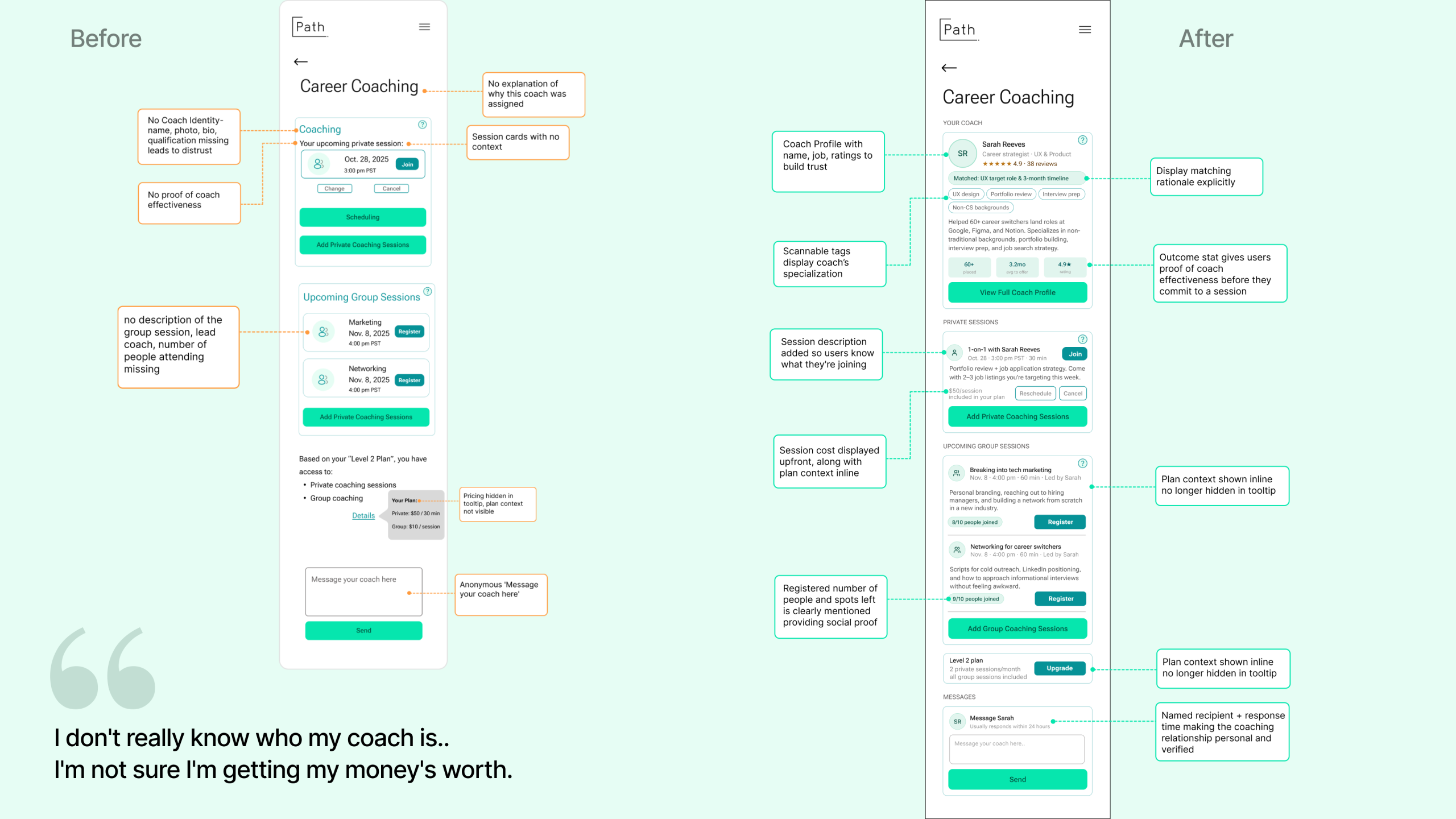
Coaching was Path’s most-trusted concept and least-trusted execution.
Every participant expressed genuine enthusiasm for career coaching. Every participant also expressed doubt once they actually encountered it. Coaching scored 3.5/5, highest of all features tested yet no participant took action on the screen. Users were not skeptical of coaching; they were skeptical of opacity.
Finding 04
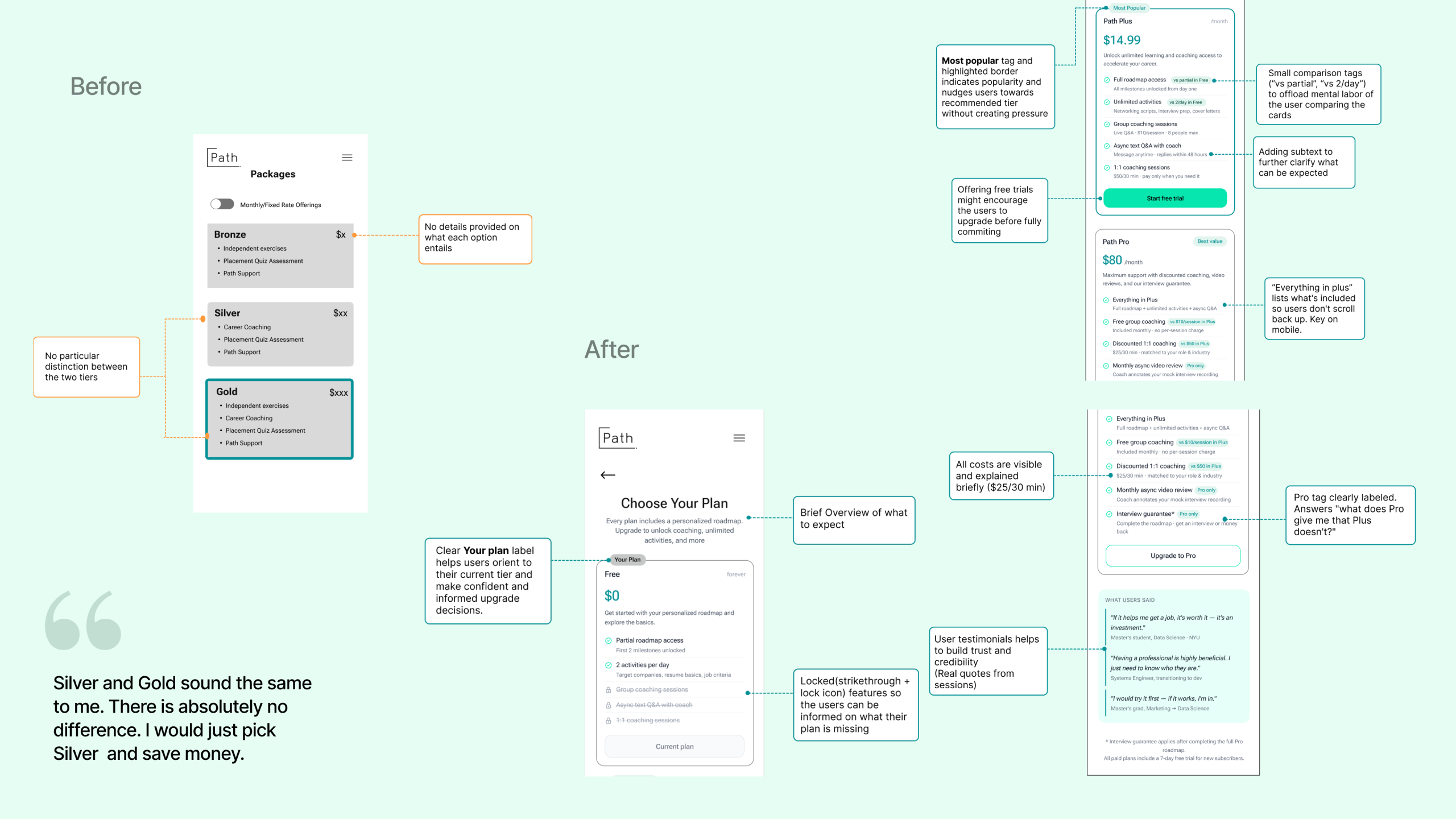
Subscription tiers looked identical. Users defaulted to the cheapest plan without understanding the difference.
The plans screen was one of the most consistently misread screens across all 8 participants. Users who arrived motivated to upgrade left uncertain about what they were paying for. Path Plus and Path Pro appeared nearly identical, and no participant selected the highest tier without being prompted. The intent to upgrade was present, the information to act on it was not.
Result
Path has strong foundations. The gap was between concept and clarity.