Overview
A platform built to guide career transitions
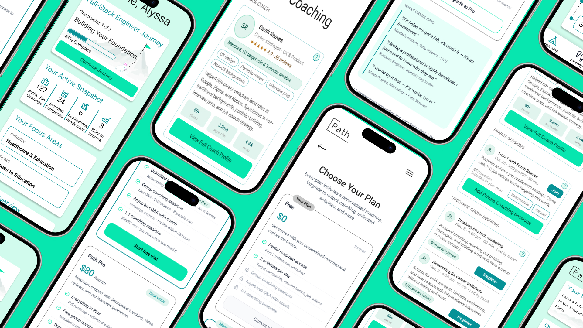
Path is a platform designed to support users’ journeys from different stages of their career transition to tech roles. It promises a personalized roadmap, structured activities, and access to career coaching, all tailored to the user’s background, goals, and job search stage. Since the product is still at an early stage, our study focused on the first-time understanding of the users’ experience with the product. We wanted to know: can a non-technical career changer land on Path, complete onboarding, interpret their roadmap, and feel confident enough to take action?
The Problem
Path’s core features: onboarding, roadmap, coaching, and pricing, each carries significant friction that prevents users from moving forward with trust and confidence in the product. Users understand the concept but struggle to act on it.
Our goal was to understand and uncover opportunities that would bridge the gap
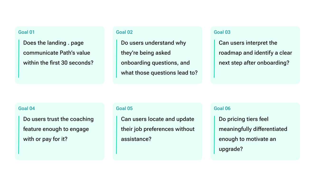
Research Goals
What we set out to learn
We wanted to understand whether a first-time user could land on Path, complete onboarding, and feel confident enough to take a meaningful next step, without any confusion or assistance.
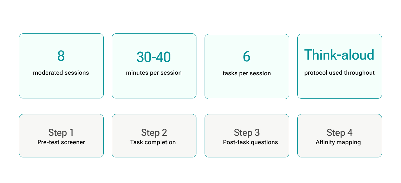
Methodology
How we conducted the study
We ran moderated usability testing using a think-aloud protocol. Sessions were conducted remotely, with one researcher moderating and one observing. Participants worked through six tasks covering the full product flow, from landing page to pricing exploration.
Participants
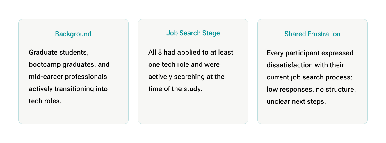
Who we tested with
All participants were actively transitioning into tech roles, had applied to at least one job, and were dissatisfied with their current job search experience. They ranged from bootcamp graduates, working professionals, to master’s students, representing the exact users Path is built for.
Findings and Recommendations
Four problems across the core experience
Across 8 sessions and 6 tasks, the same friction points surfaced repeatedly. We grouped them into four distinct problem areas, each with a clear finding and concrete recommendation.
Problem 1
Onboarding
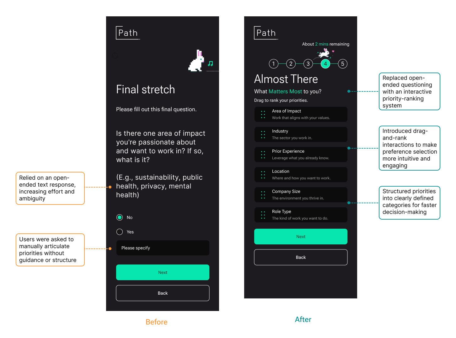
The onboarding flow was repetitive, mentally exhausting, and gave users no sense of where they were or where their answers were going.
Finding
Users understood the point of onboarding but the interaction cost was the problem
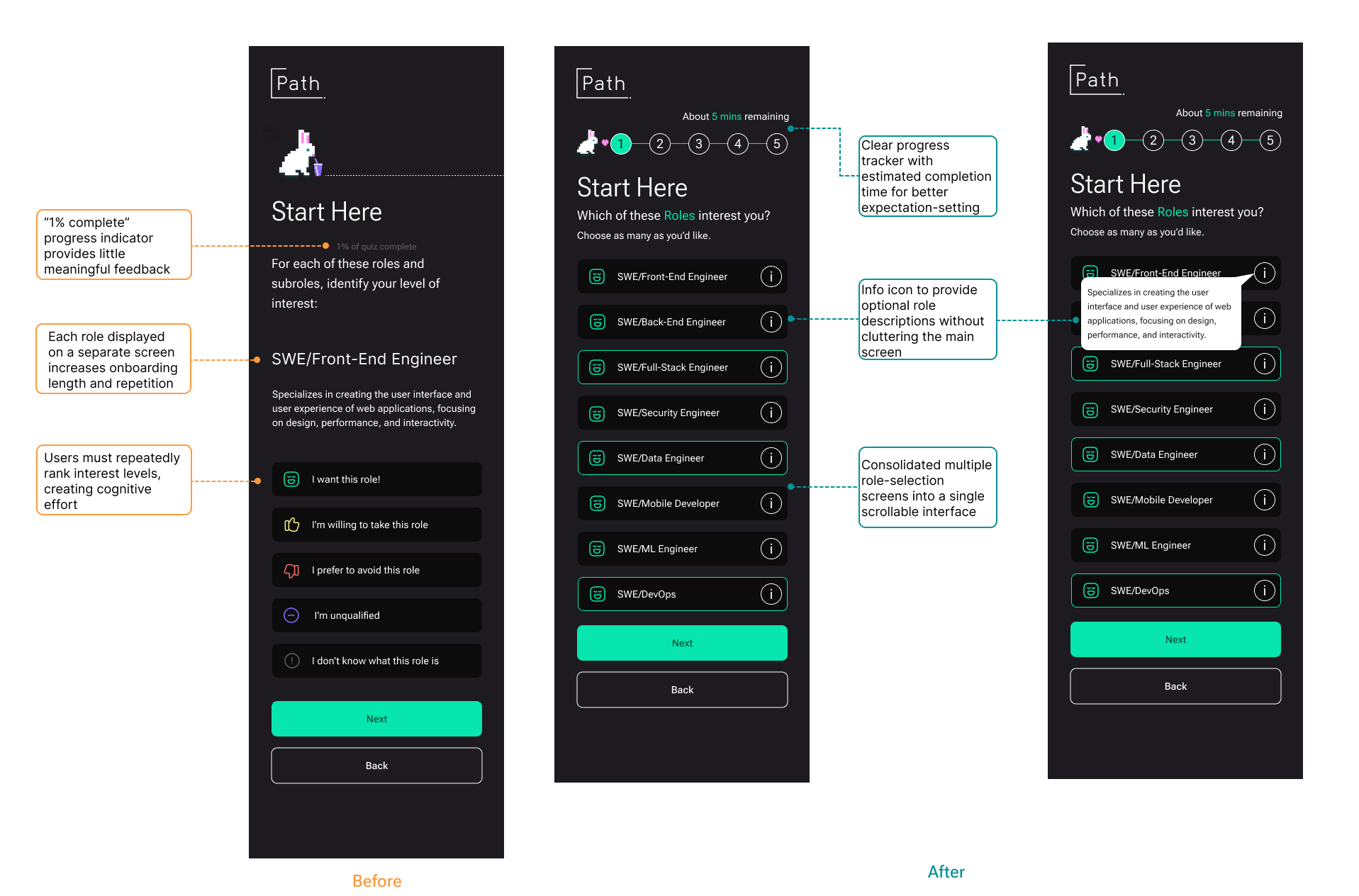
Participants completed onboarding, but with growing fatigue. Similar questions appeared across multiple isolated screens, progress indicators disappeared, and nothing explained how their answers would shape the roadmap.
“It feels like more than 20 questions… I’m getting a little bit tired.”
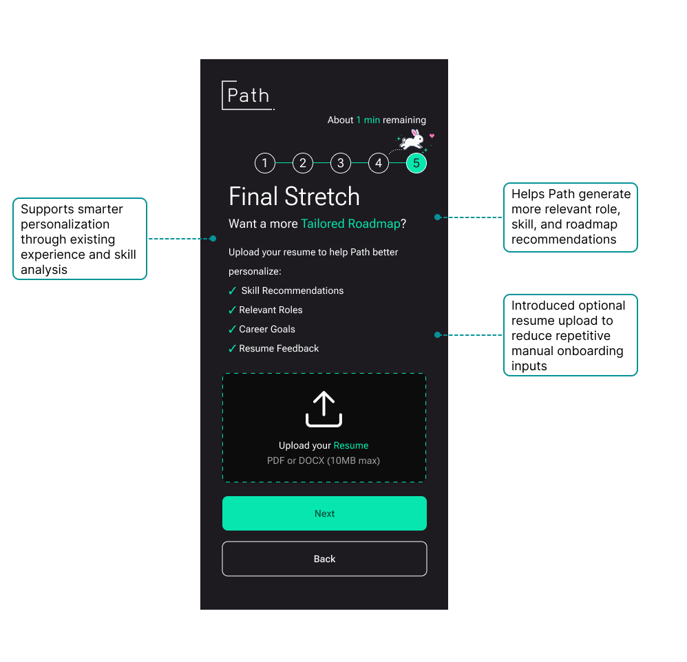
“It could have asked for my resume and auto-filled everything.”
“I like the progress indicator… but it disappeared.”
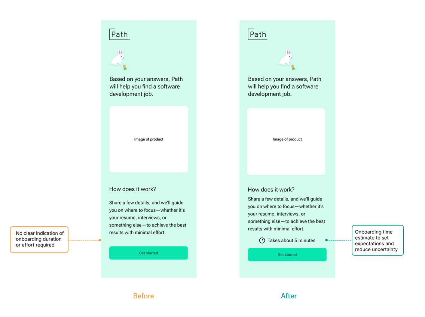
Recommendation A
Add a persistent progress tracker and time estimate
A time estimate on the entry screen plus a persistent step counter throughout the flow gives users scope before they begin and orientation as they go.
Recommendation B
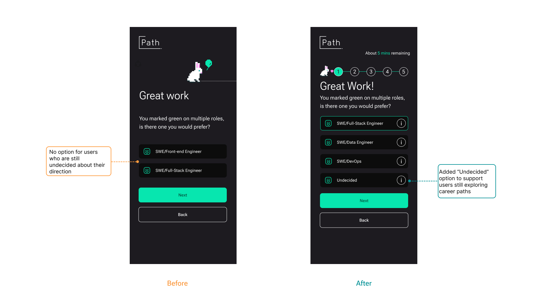
Consolidate repetitive screens into single multi-select interfaces
One scrollable multi-select per category with an “Undecided” option and info tooltips cuts the interaction count significantly.
Recommendation c
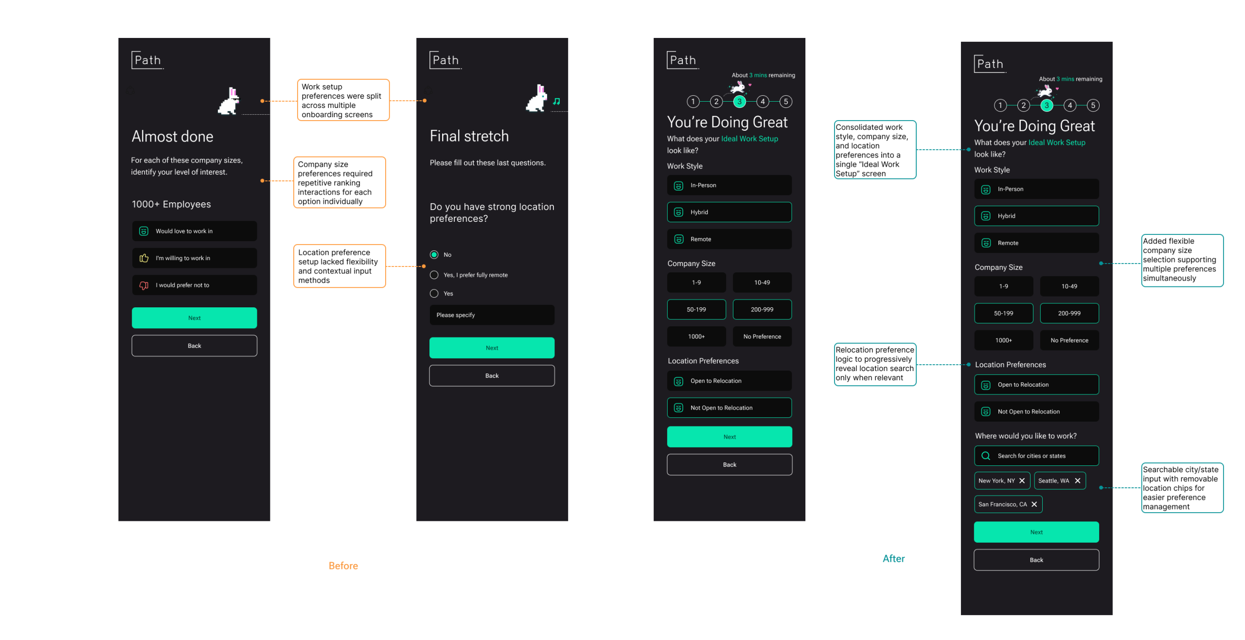
Combine work preferences into one screen with progressive disclosure
Work style, company size, and location are consolidated into a single screen. Location search only appears when users indicate they’re open to relocation.
Recommendation D
Replace open-ended text with a drag-and-rank priority system
The “Area of Impact” free text field was replaced with a drag-to-rank interface where users reorder predefined categories, making abstract preference setting concrete and interactive.
Recommendation E
Add optional resume upload to reduce manual input
An optional resume upload near the end of onboarding lets Path infer skills, roles, and goals from existing experience, reducing repetitive questioning and making the roadmap more relevant from the start.
Problem 2
Roadmap & Activities
The roadmap lacks a timeline and depth. Activities feel too basic and too manual to justify the platform
Findings
The roadmap existed, but couldn’t be acted on and activities didn’t help
The dashboard overwhelmed users with information before they knew where to start. The roadmap showed a single goal with no timeline or order, and activities felt like tasks users could manage in a spreadsheet; the platform wasn’t adding clarity, just structure.
“I feel like I did most of the work. I need more assistance.”
“One goal is not a roadmap.”
“I understand the roadmap, but I don’t know how to act on it.”
Recommendation
Restructure around progress and let the platform do the thinking
Redesign the dashboard to lead with journey progress, break the roadmap into named checkpoints with clear order, and pre-populate activities with suggestions tied to the user’s onboarding data so Path feels like more guided.
- Replace dense dashboard with a focused journey overview
- Structure roadmap as named checkpoints with a summit goal
- Show completed, current, and locked steps to orient users
- Pre-populate activities with AI suggestions based on onboarding inputs
Problem 3
Coaching
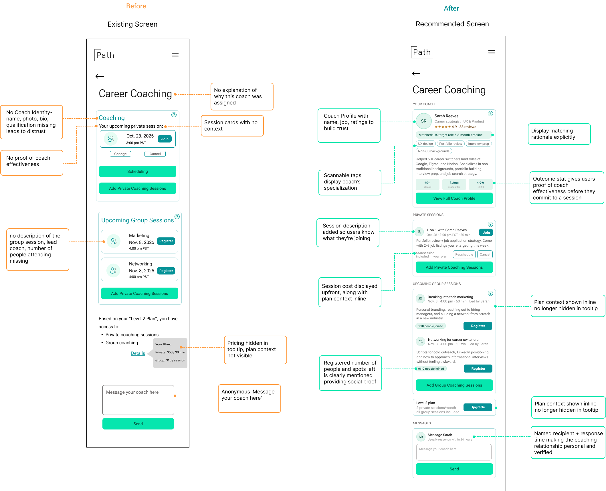
Coaching was unanimously rated the strongest feature, yet users couldn’t figure out who their coach was, how to reach them, or whether coaching was even available on their plan.
Findings
No coach identity, no matching rationale, no plan clarity
Every participant expressed genuine enthusiasm for the idea of career coaching. Every participant also expressed doubt when they encountered it. Users were shown a generic icon with no name, photo, or credentials. They couldn’t tell if coaching was included in their plan, and they had no idea why a particular coach was assigned to them.
“I don’t really know who they are… I’m not sure I’m getting my money’s worth.”
“I don’t see how I’m matched with a coach.”
“Is coaching only for higher plans? I’d want that info clearly mentioned.”
Recommendation
Introduce the coach before asking users to engage with them
Trust in coaching follows the same logic as trust in therapy or mentorship: users need to know who they’re working with, why they were matched, and what a session involves before they’ll commit.
- Add a coach profile card with name, photo, title, specializations, and outcome stats
- Include a visible matching rationale (e.g. “Matched: UX target role & 3-month timeline”)
- Show session descriptions on each private and group coaching card
- Surface plan access clearly inline — what’s included, what costs extra
- Replace the anonymous message box with a named, response-time-aware CTA
Problem 4
Plans & Pricing
Pricing tiers appeared identical, removing all incentive to upgrade, and users had no way to evaluate what they were actually paying for.
Findings
Tiers looked the same users defaulted to the cheapest option
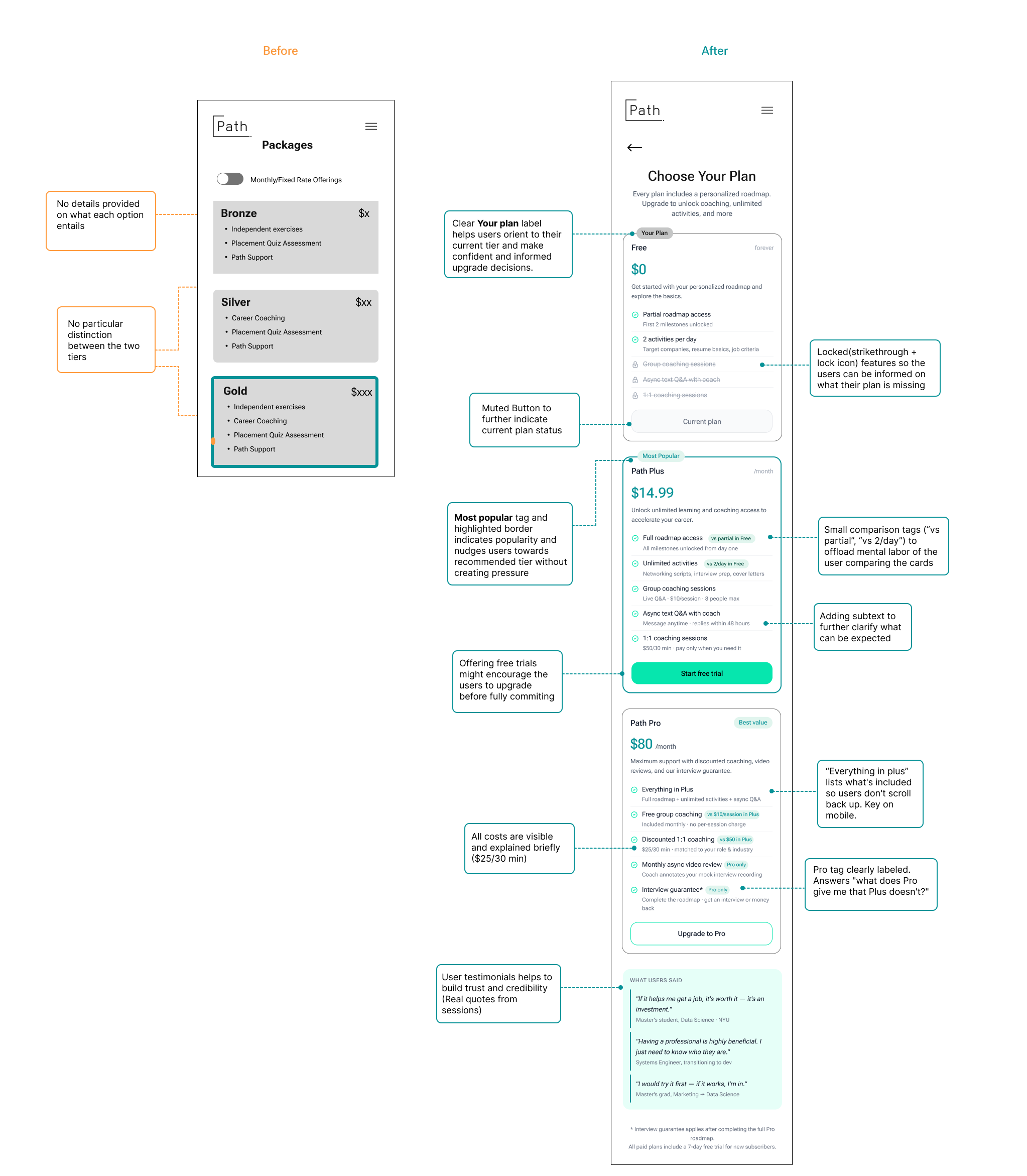
The existing pricing page listed features without context or comparison. Bronze, Silver, and Gold shared the same bullet structure with no visual hierarchy, no inline contrast, and no explanation of what each tier unlocked in practice. Users evaluated the page rationally and found no compelling reason to pay more.
“Silver and gold sound the same to me. There is absolutely no difference.”
“I wouldn’t proactively upgrade — only if something is locked.”
“Having a professional is highly beneficial. I just need to know who they are.”
Recommendation
Make differentiation in tiers visible
The redesigned pricing page does the comparison work for the user, locked features show what each tier is missing, inline tags contrast tiers directly, and testimonials from sessions build trust for users to make their decision seamlessly
- Locked features (strikethrough + lock icon) show exactly what’s missing per tier
- Inline comparison tags (“vs partial in Free”) offload the mental labor of comparing plans
- “Most Popular” and “Best Value” tags nudge without pressure
- Free trial CTA lowers the commitment barrier before users pay
- User testimonials drawn from real sessions build credibility at the decision point
Result
What testing reveled about Path’s opportunity
Participants consistently responded well to Path’s mission. The job search frustrations it addresses are real, urgent, and felt by everyone we tested, as it is many people’s current story. As someone who went into a full-stack engineering bootcamp and struggled for guidance afterwards, I can also relate to the issues faced by users who transition careers. The concept of a structured, personalized career roadmap with access to human coaching resonated deeply, especially with users who had been applying for months without results.
The gap was not in concept but in execution. Users could see what Path was trying to do; they just couldn’t exactly get there. Onboarding felt disconnected from its own output, the roadmap didn’t tell users what to do next, coaching couldn’t be trusted without more context, and core features were too hard to find.
Positives and strengths
The platform’s tone and design created positive first impressions. Onboarding questions were perceived as thoughtful and relevant. Coaching was unanimously identified as the strongest differentiators which users rated it highest across all features tested
My Takeaway
Path was well liked across all participants, as well as our team, as it aims to solve an issue or fill a gap that we all are familiar with. With clarity and transparency it can help user feel at ease while they can focus on their job search journey.