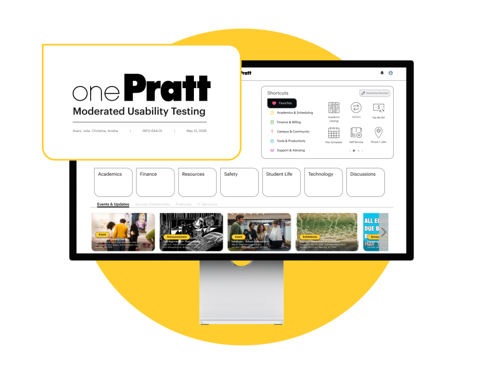
Made for OnePratt: A centralized digital portal created for students, staff, and faculty members of Pratt Institute to access various academic and administrative resources.
Teammates: Avani Chandorkar, Christina Lu, Anisha Vonna, Julie Vo (me)
My role: Research Planning, Moderated Usability Testing, UX Design
Duration: 6 weeks
Context about OnePratt ℹ️️
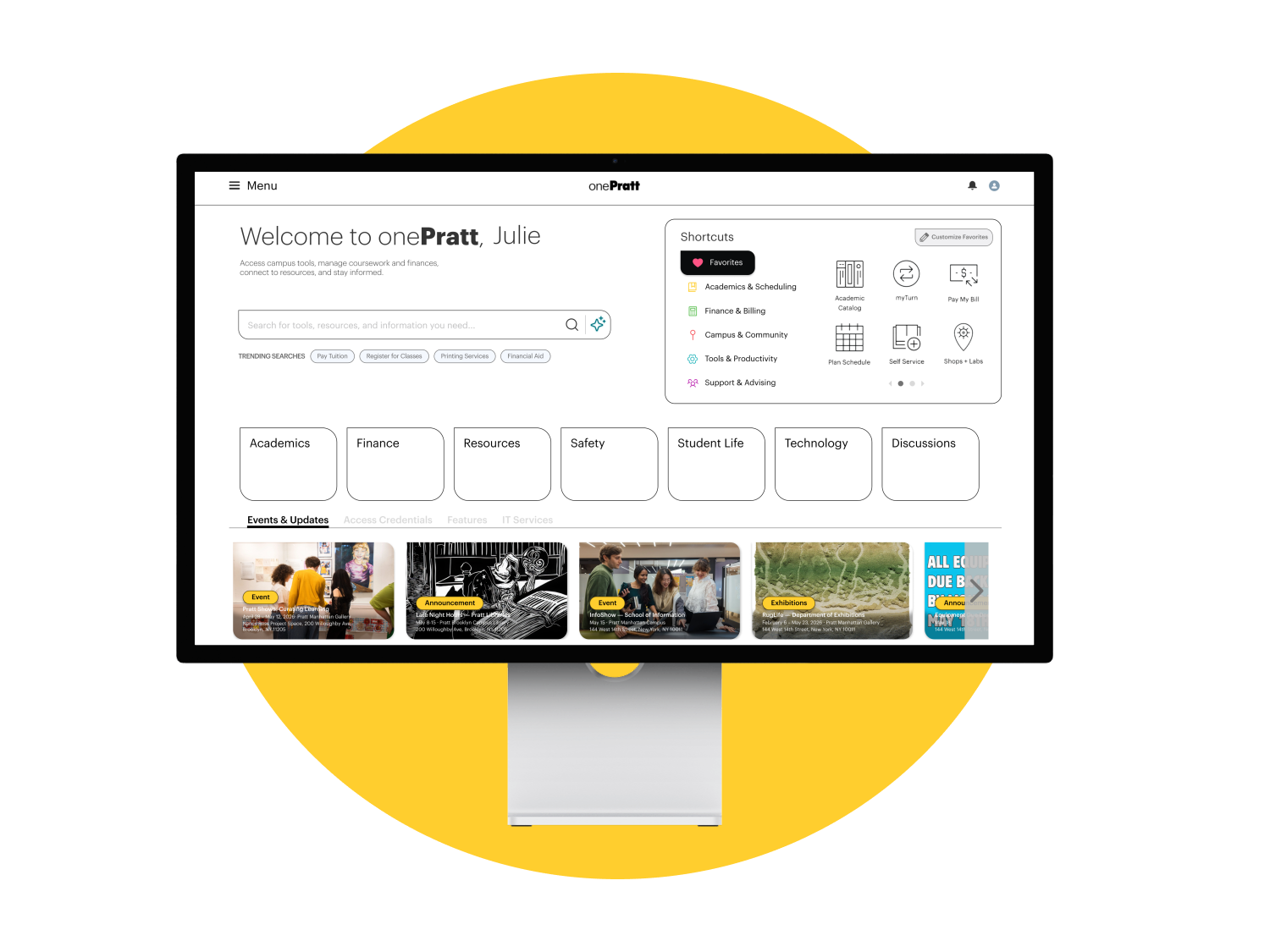
OnePratt is Pratt Institute’s central campus portal — the single digital front door through which students and staff access everything from financial aid to campus maps. With over 62,000 page visits recorded between March and April 2026 (data gathered from the client’s data), the homepage is the most trafficked destination on the entire platform.
Yet despite this volume of use, the interface offered users very little guidance on where to go or what to do. Our team was tasked with evaluating OnePratt’s usability and proposing evidence-based design solutions that would reduce friction, improve navigation, and make the portal more legible for all users.
Understanding Our Client’s Objectives 📝
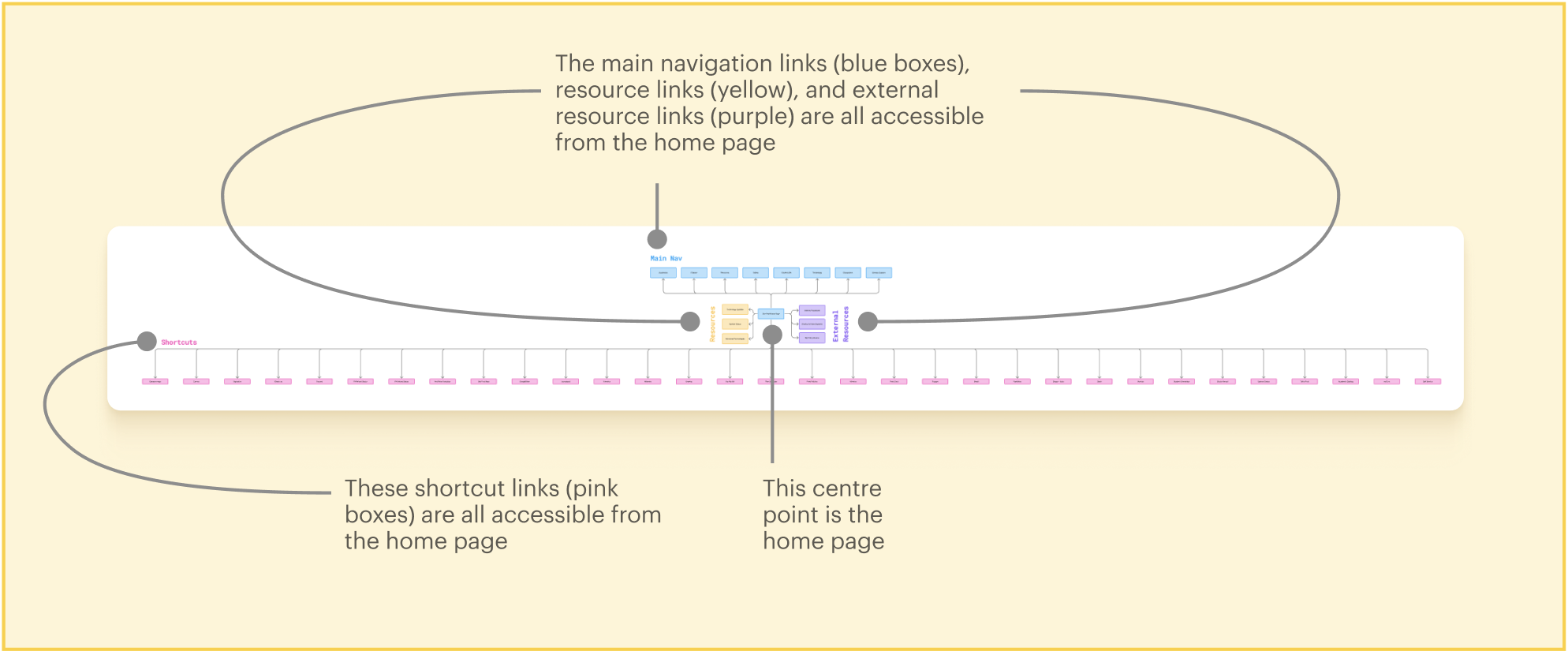
In our initial conversations with the client, we learned that the primary goal of this project is to redesign onePratt’s information architecture. The current homepage follows a largely flat structure, meaning most of its content and navigation options are visible all at once — so the moment users land on the page, they’re immediately met with a dense collection of links and pathways to sort through.
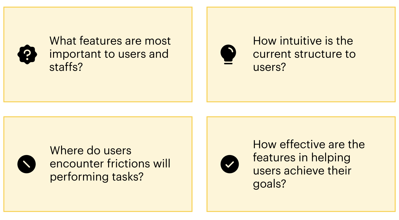
To better understand the usability issues related to OnePratt’s information architecture, we began our research with 4 guiding questions ╰┈➤ˎˊ˗
We conducted remote, moderated usability testing of the OnePratt website to garner user insights 🔍
To capture the full scope of usability issues across both student and staff experiences, we wanted to create space for participants to ask questions in real time while allowing us to probe for deeper insight beyond surface-level responses.
↳ Screener surveys were sent to students and staff members across Pratt Institute via Private Panels and direct outreach.
↳ We hoped to capture a range of perspectives from users of varying experiences and use cases.
↳ We selected 8 students and 3 staff members to conduct moderated usability testing with.
↳ We interviewed 11 users (1 incoming student, 7 grad students, 3 staff members).
↳ Our pool of users possessed a wide range of confidence levels and familiarity with the OnePratt platform.
↳ Every interview took between 30 and 45 minutes over Zoom.
↳ Identify the core tasks users come to OnePratt to complete
↳ Understand how users navigate to and use key features (common paths, most-used features, number of steps to reach a destination)
↳ Pinpoint friction points across task flows and explore potential improvements: where are users getting stuck, and why?
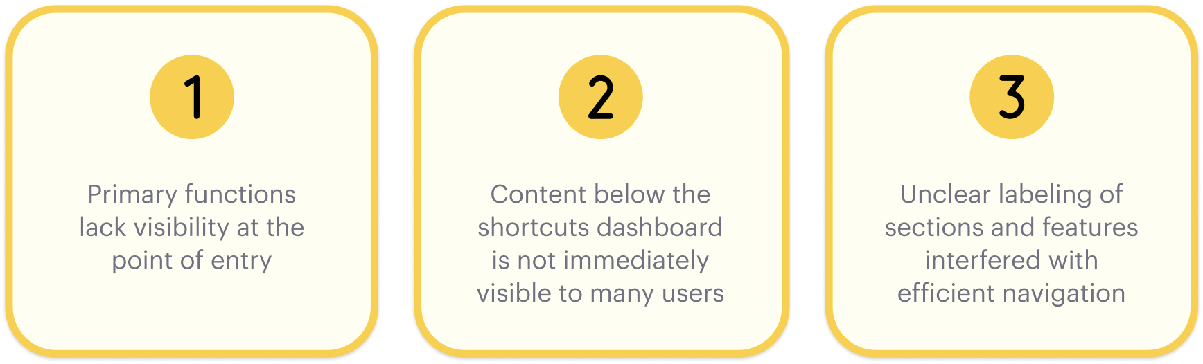
We arrived at 3 key findings from our moderated interview sessions 💡
As the primary entry point for students and staff, the onePratt homepage plays a critical role in supporting efficient task completion. A clear content hierarchy and precise feature labeling directly reduce the navigation effort required to reach common destinations. However, OnePratt is facing some difficulty in delivering an optimal user experience:
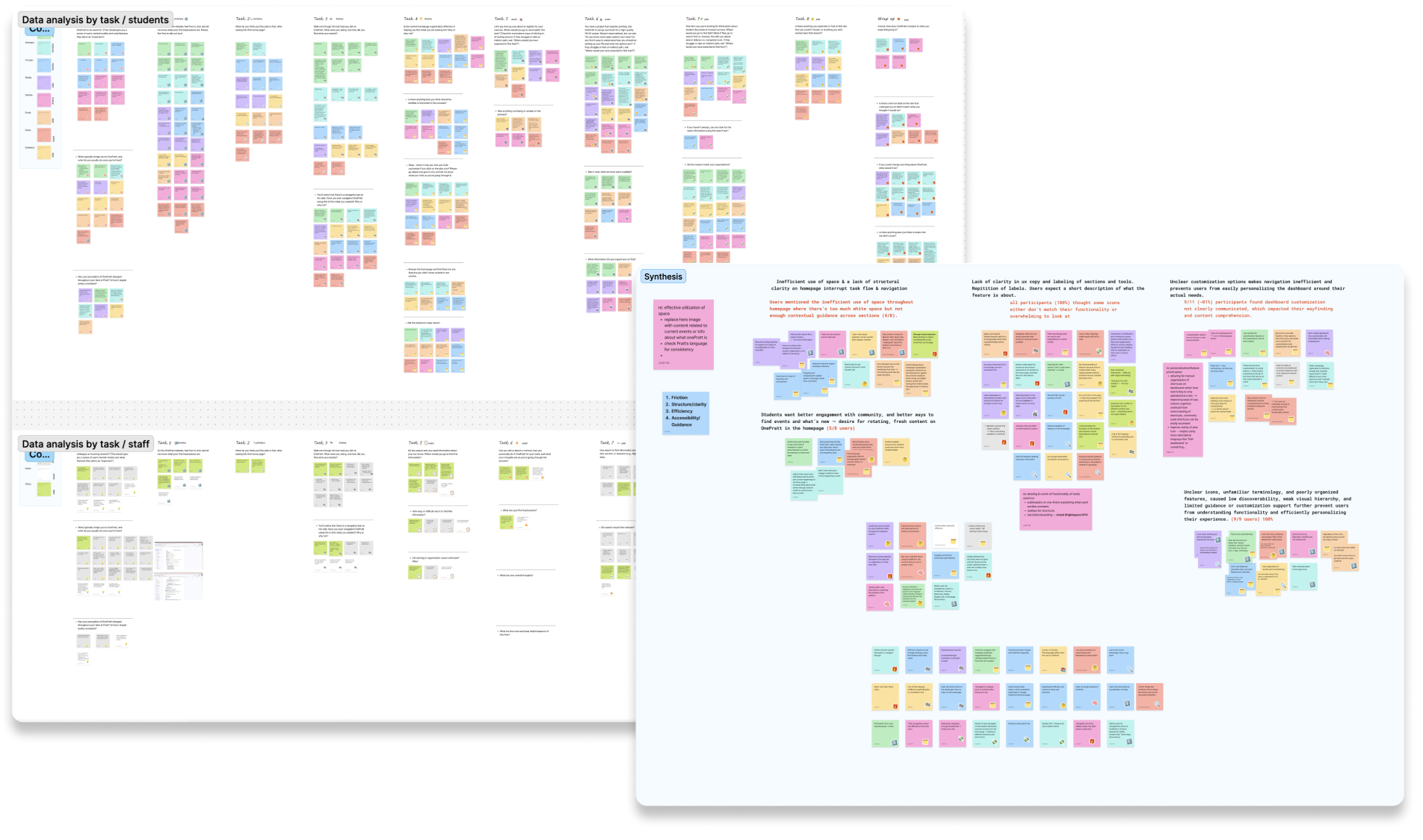
↳ Student and staff findings were synthesized through affinity mapping and thematic clustering to surface recurring patterns and identify usability barriers shared across both user groups.
“I have no idea what these icons mean. Usually I would bookmark the pages I need and just go from there.”
– Graduate Student User
Upon analyzing our findings, here are some frictions we observed with our users 🚩
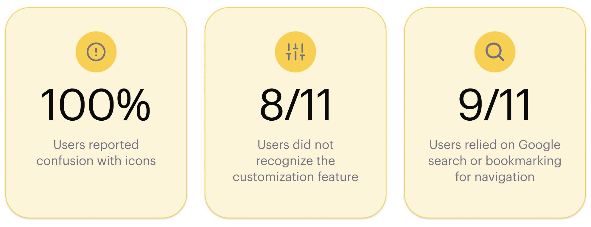
With these issues in place, users are forced to “link hop” between browser tabs and links — a pattern observed across key tasks, including search, course registration via Self-Service, and campus printing, none of which were adequately surfaced or supported by the existing homepage layout.
When the Entry Point Fails, Everything Else Does Too ⚠️
The OnePratt homepage is where nearly every user interaction begins, making it the most consequential page on the platform for wayfinding. When its content hierarchy is unclear and features are poorly labeled, users struggle to find their footing. This is not because the tools don’t exist, but because the homepage fails to point them there.
This was evident across tasks involving search, course registration via Self-Service, and campus printing, all of which are available on the platform but were consistently difficult to locate from the homepage, leading users to abandon their course of action or navigate via trial and error instead.
Recommendation #1: Improving Visibility and Immediate Access to Core Functions
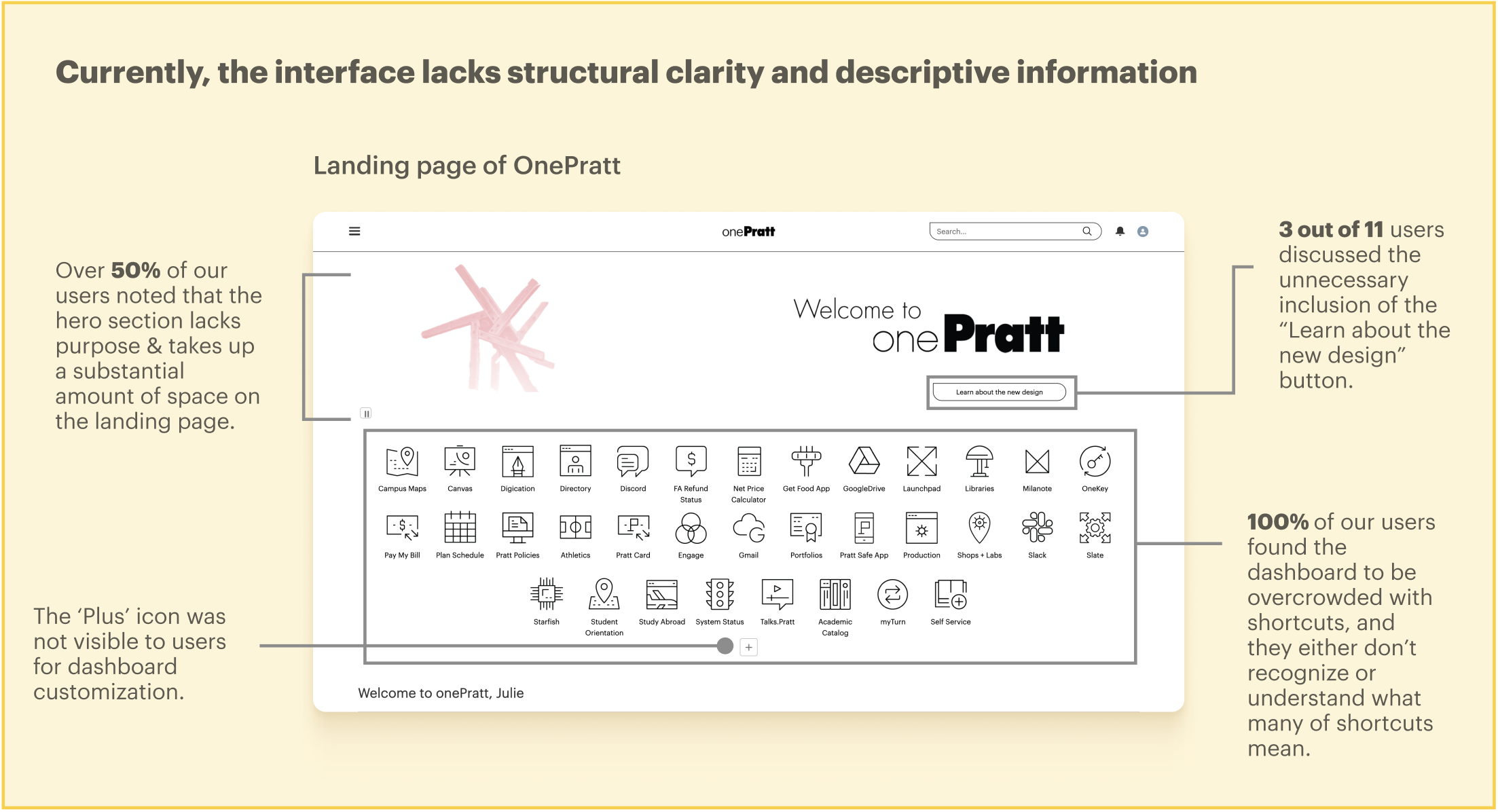
What works: Presenting all the shortcuts upfront gives users an idea of what is available to them on the OnePratt platform while reducing scrolls accordingly.
What can improve: The interface’s minimalistic design lacks sufficient contextual guidance for user navigation and requires additional time to comprehend the content and functionality displayed on the screen. Shortcuts are organized alphabetically, not by category.
Proposed Solution
To account for these usability issues, the hero section is restructured to prioritize utility over decoration. The hero image is retained for continuity, and a brief portal description is added beneath it to communicate OnePratt’s purpose to new and returning users. Shortcuts are consolidated to the right of the hero section, grouping features by category rather than alphabetically to promote stronger clarity of their functionality.
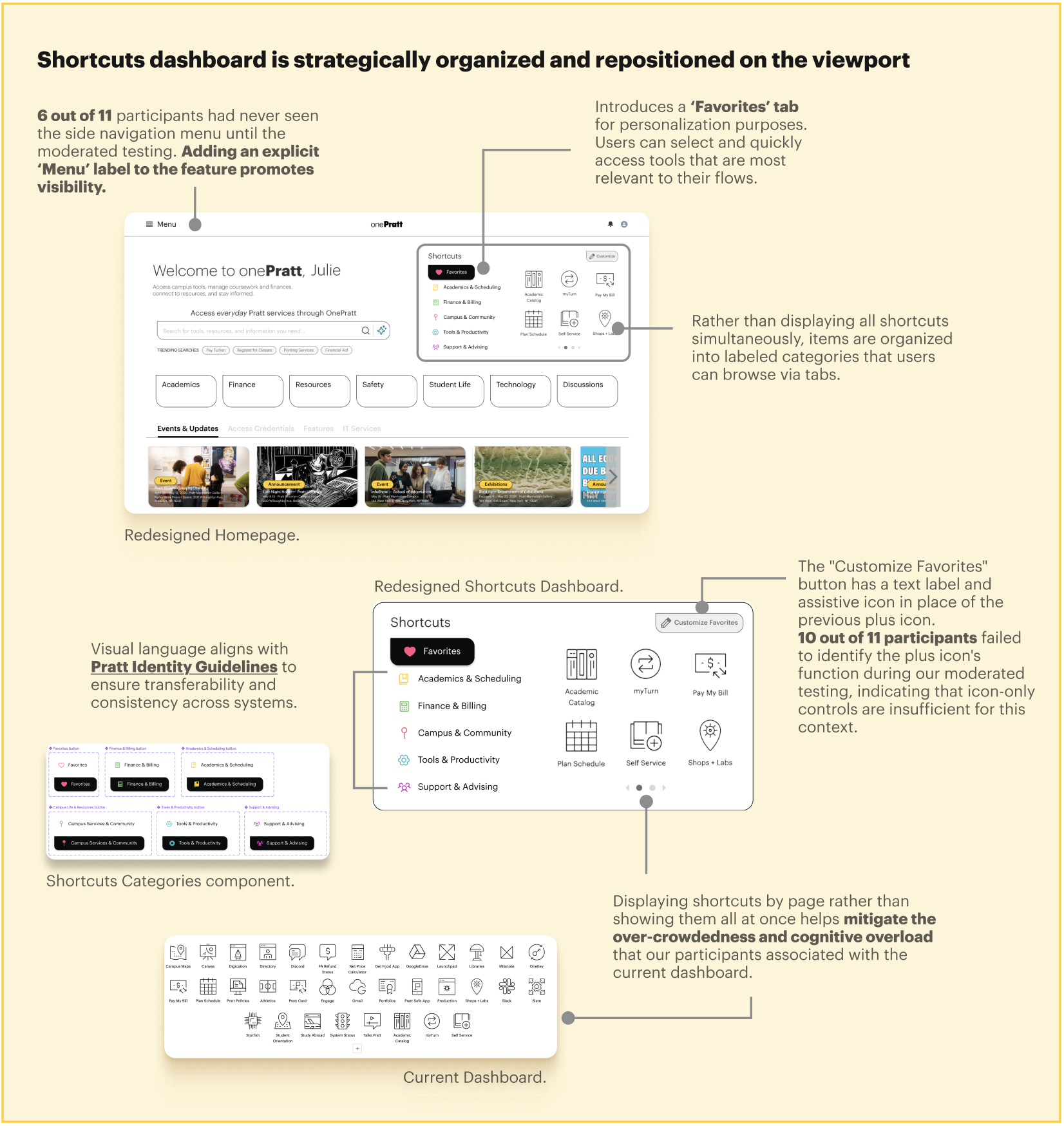
The proposed Favorites tab offers users a persistent space to save and quickly return to their most-used tools, therefore minimizing reliance on workarounds such as bookmarking or link-hopping. This directly addresses the cognitive overload reported across user interviews, allowing users to focus on one category at a time and better understand what each feature offers. Adding contextual information to the Shortcuts categories and clearly labeling the customization button also supports different user mental models and improves content clarity.
Recommendation #2: Addressing Low Discoverability of Content Below Hero Section Through Structural Reorganization
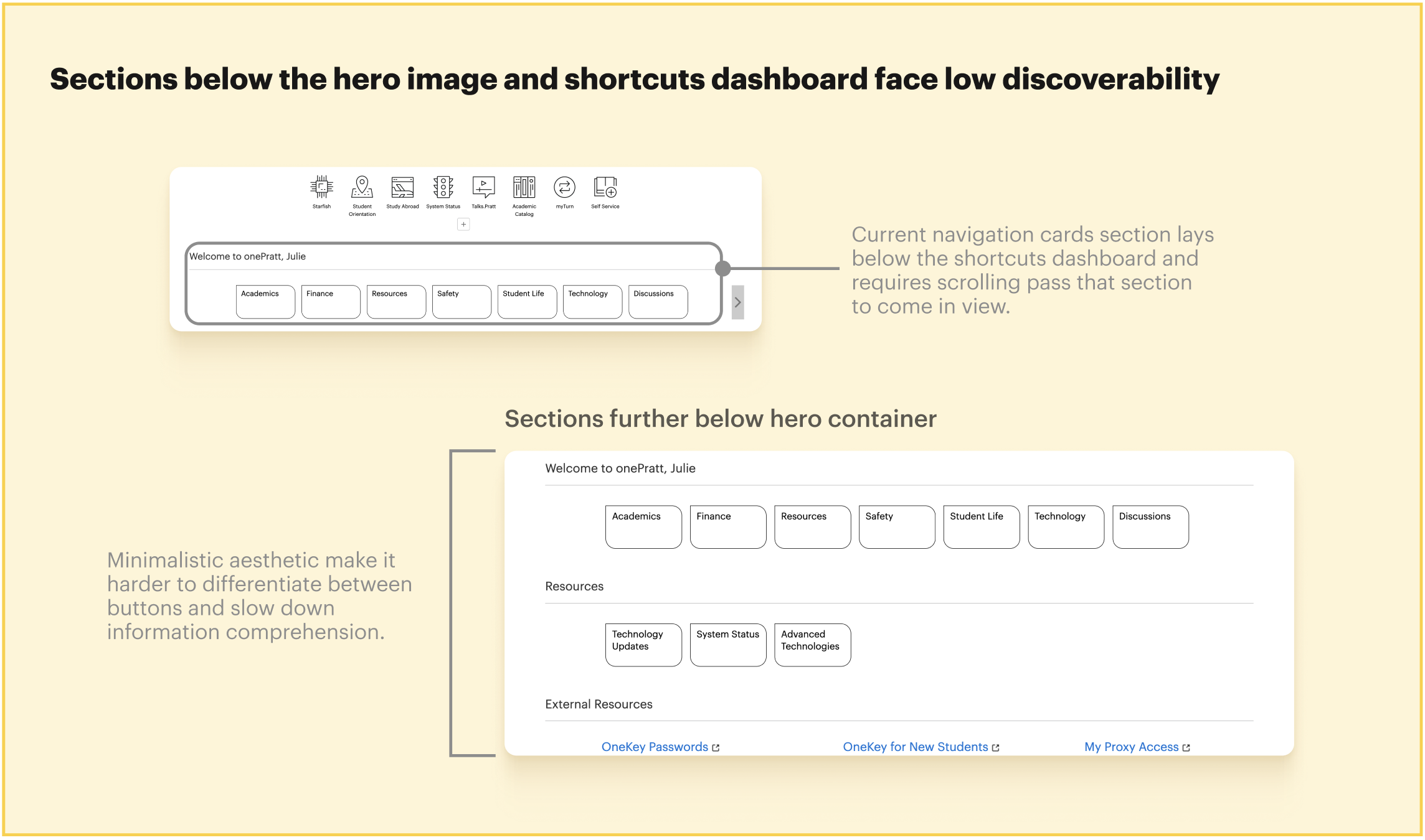
What works: Some users appreciated the simple aesthetics of the buttons in contrast to the busy shortcuts dashboard at the beginning of the page.
What can improve: There is a lack of context for each section and its nested features, leading users to either skim past them or spend extra time understanding the functionality.
Our interviews revealed that a significant portion of participants did not scroll past the main navigation cards, leaving all content below that threshold minimally interacted with during typical flows. This illuminates a structural problem: many features and information were positioned in areas that users were unlikely to reach, not because they were uninterested, but because the layout did not give them sufficient reason or signal to continue.
Proposed Solutions
The navigation redesign directly targets users’ tendency not to scroll past the dashboard section by bringing key elements forward and collapsing dispersed content into a single, accessible layer. The tabbing section houses all sections in a single frame, eliminating the need for extended scrolling and surfacing content that users would otherwise overlook while ensuring that no section of the portal remains effectively hidden due to its position on the page.
Other considerations that surfaced…
Currently on OnePratt: Due to limited contextual guidance and unclear icons, users struggled to identify the correct destination for their tasks, leading to excessive navigation between features and repeated switching between OnePratt and external pages.
Proposed Solution: To further enhance content clarity throughout the portal, tooltips are introduced to improve clarity for users while reducing unnecessary link-hopping and screen switching when searching for information on OnePratt.
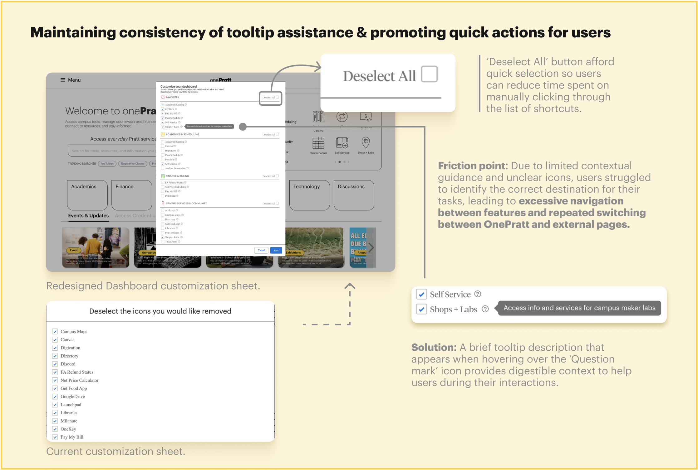
Ultimately, providing tooltips for shortcuts and additional descriptions for each navigation card in the hover state augments efficiency and task completion rates for users. This directly addresses the cognitive overload we observed during our moderated testing sessions and reduces the need for users to default to Google as a navigation supplement, which eliminates the need to jump between links or screens.
Recommendation #3: Resolving Nomenclature Conflicts to Support Recognition Over Recall
Currently, the word “Resources” appears across three separate locations on the homepage:
- A top-level navigation card,
- A section heading for technology tools, and
- A part of a heading for account management links.
Because each instance uses the same term to describe different content, users have no reliable way to predict what they will find before clicking. We noticed during our moderated testing that participants skipped these sections and barely interacted with them because of the lack of distinction between these 3 instances, further obscuring their functionality. More detailed annotation can be found below.
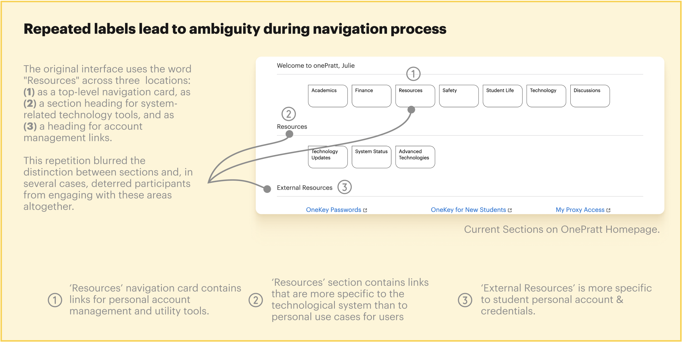
Proposed Solution
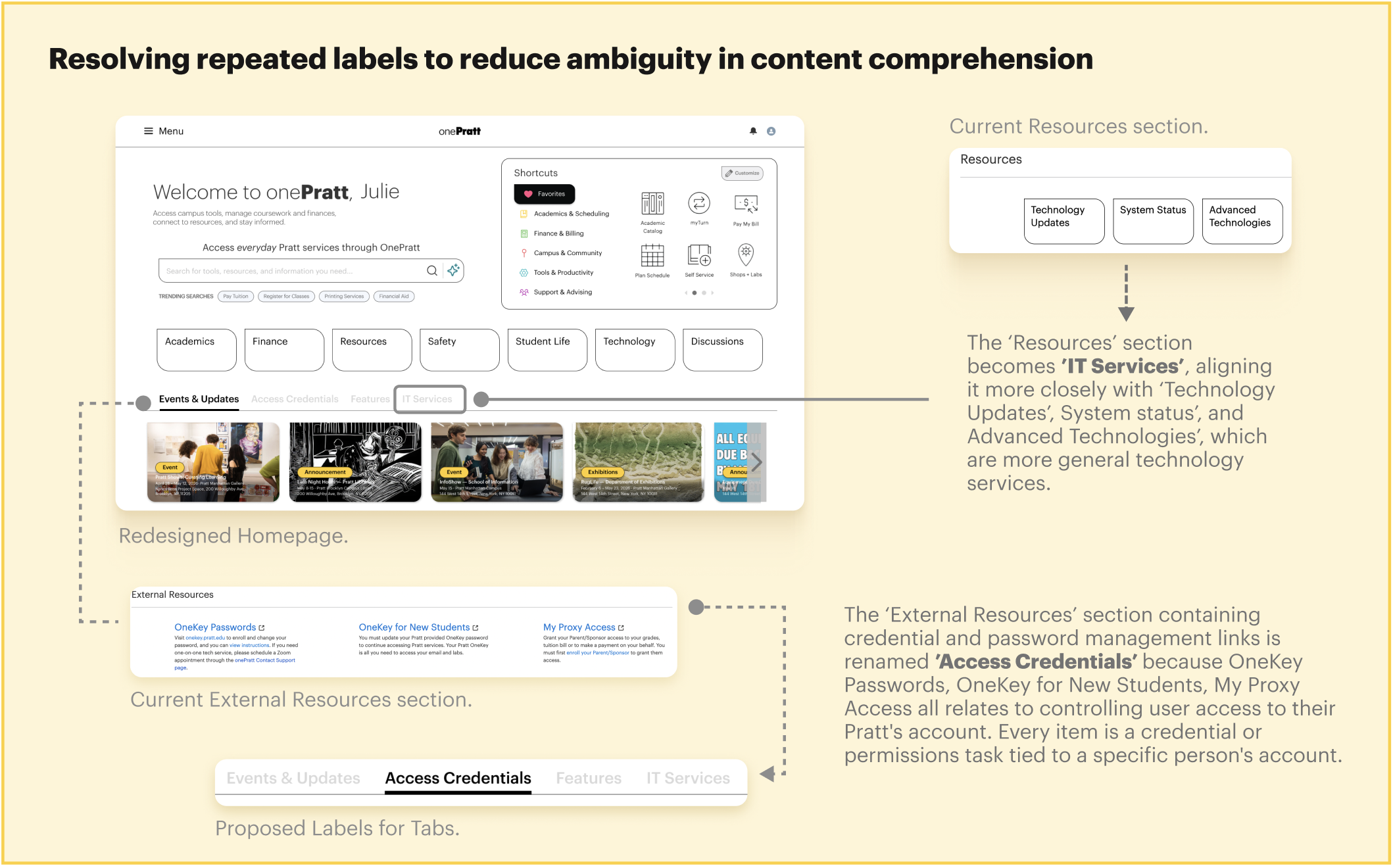
With the current interface and labeling system, users are required to recall prior knowledge or learn through trial and error rather than understanding features at a glance. Effective interface labeling eliminates this burden by ensuring that every element clearly and distinctly communicates its function at the point of interaction.
Our Client Weighed In…
“What you guys did exceeded my expectations!”
Matt Martin, Director of Technology Engagement & Outreach, Visiting Assistant Professor
Our client loved our work! Following our pitch, our client emphasized how crucial our design solutions are to the services that OnePratt strives to offer to all students and staff members. From the initial objective of understanding the portal’s information architecture, we uncovered usability issues that hinder users from fully utilizing the tools and resources on the platform and proposed designs that not only validate concerns that our client had communicated but also provide redesign proposals grounded in Pratt’s Identity Guidelines to ensure implementation-readiness and consistency with existing brand systems.
What I learned throughout the process 🎯
Taken together, these findings point to a homepage that was organized around the structure of its content rather than the needs of its users. The interface’s visual simplicity masked a navigation system that placed a disproportionate burden on memory, familiarity, and persistence — qualities that cannot be assumed across a diverse student population.
Addressing these issues requires a fundamental reorientation toward task-based design, which means 1) layouts that guide users toward their goals, 2) labels that communicate function unambiguously, and 3) a visual hierarchy that reflects how users actually move through the page.
There is always room for improvement with every design that materializes 🌱📚
During our final presentation, our client flagged a potential accessibility concern with the tooltip component, specifically how it behaves on hover. This was an oversight on my part, and one that prompted a broader reflection: usability and accessibility are not separate considerations but interdependent ones, and a solution that improves one should never come at the expense of the other. Moving forward, this feedback has pushed me to revisit my design decisions with a more holistic lens, ensuring that future iterations better reflect best practices for inclusive and effective user experience.
To learn more about our process, please give our report and slide deck a view! 📌 (ദ്ദി˙ᗜ˙)