Tools Figma, Figjam, Private Panels, Google workspace
OnePratt – A platform built for everyone
Introduction
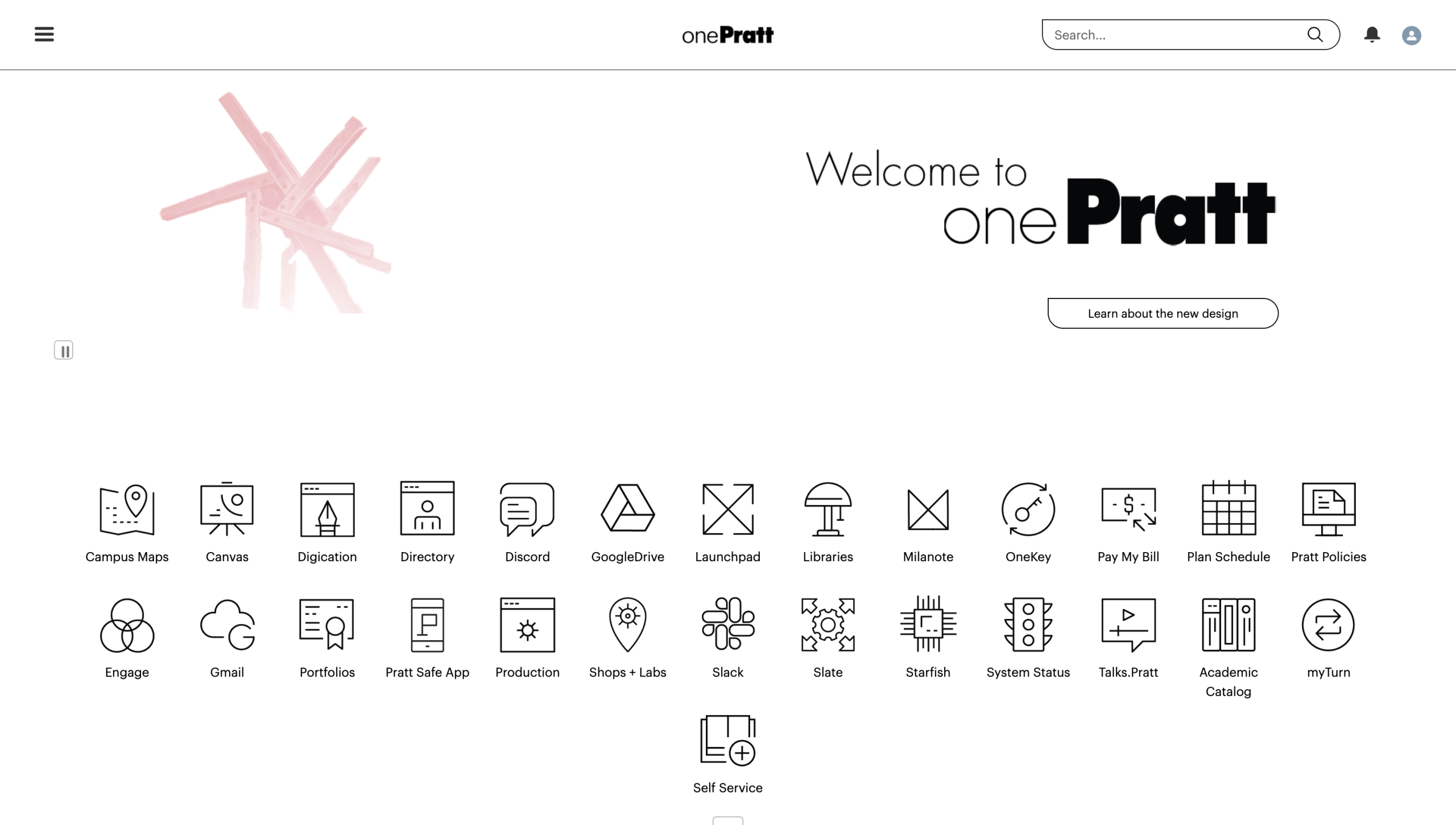
OnePratt is Pratt Institute’s centralized digital portal designed to connect students, faculty, and staff with academic, financial, and operational resources through a single platform. Originally envisioned as a cohesive ecosystem that simplifies access to campus tools and everyday workflows, OnePratt supports a wide range of tasks including course registration, financial aid, printing services, scheduling, production workflows, and institutional communication.
Managed by Matt Martin, Director of Technology Engagement & Outreach at Pratt Institute, the platform recently underwent a redesign focused on improving the student experience and restructuring its information architecture to create a more unified and modern digital environment.
My Role
In this project, I contributed across both the research and design process. I helped develop the research plan and usability testing tasks, recruited participants, and moderated usability sessions with two students and two staff members. During synthesis, I led the affinity mapping and analysis for the search-related findings, identifying recurring usability issues. I also designed the mockups and interaction flows for Recommendation 2, focusing on improving the search experience through clearer organization, predictive suggestions, and more task-oriented navigation.
Get a sneak peek
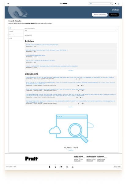
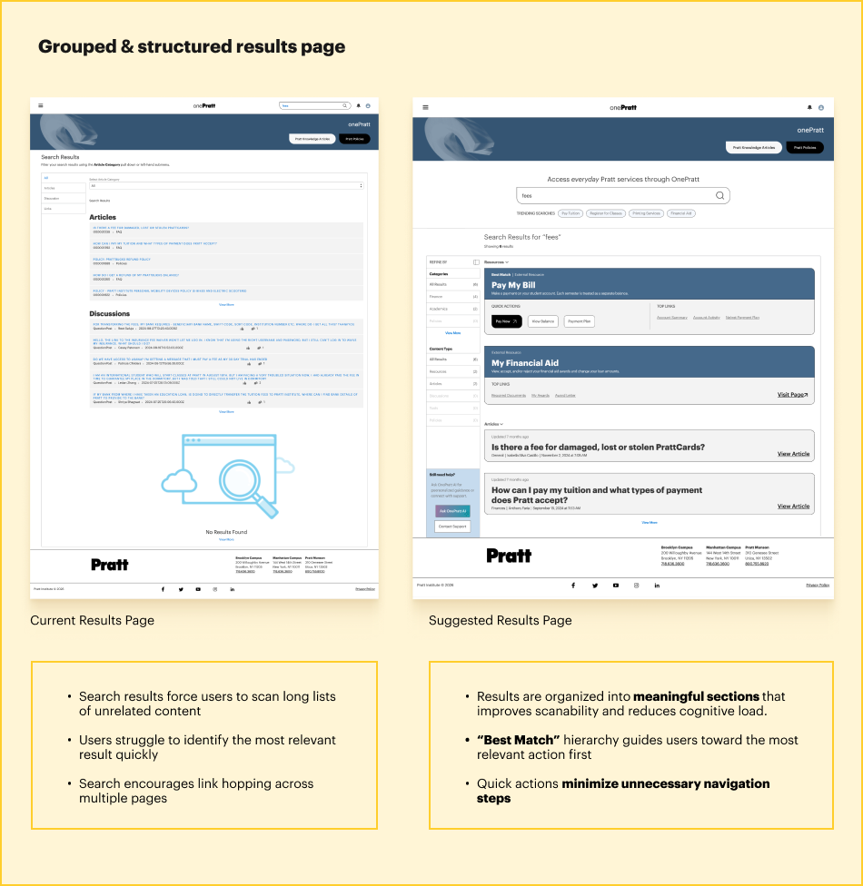
Current Page
Search results force users to scan long lists of unrelated content
Users struggle to identify the most relevant result quickly
Search encourages link hopping across multiple pages
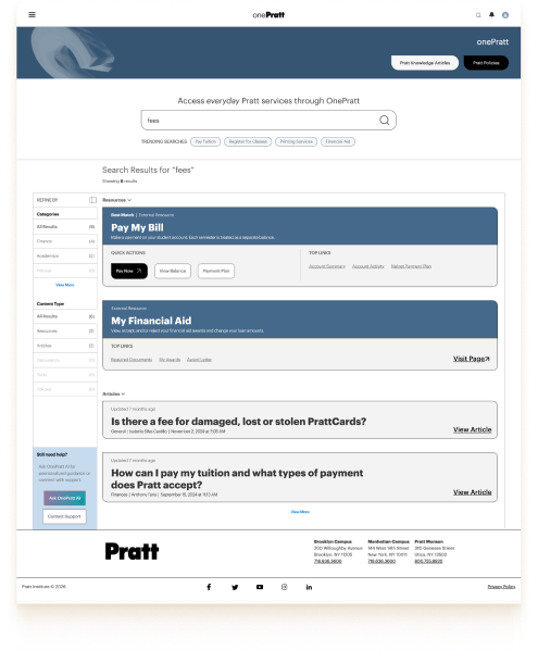
Redesigned Page
Results are organized into meaningful sections that improves scanability and reduces cognitive load.
“Best Match” hierarchy guides users toward the most relevant action first
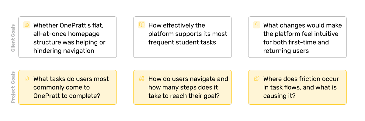
Matt Martin’s primary objective for the project was to improve the overall student experience by restructuring OnePratt’s information architecture. The platform was originally envisioned as a centralized hub for academic and administrative resources, but users struggled to build a clear mental model of where information lived or how systems connected together.
Through the test, the client and our team specifically wanted to understand:
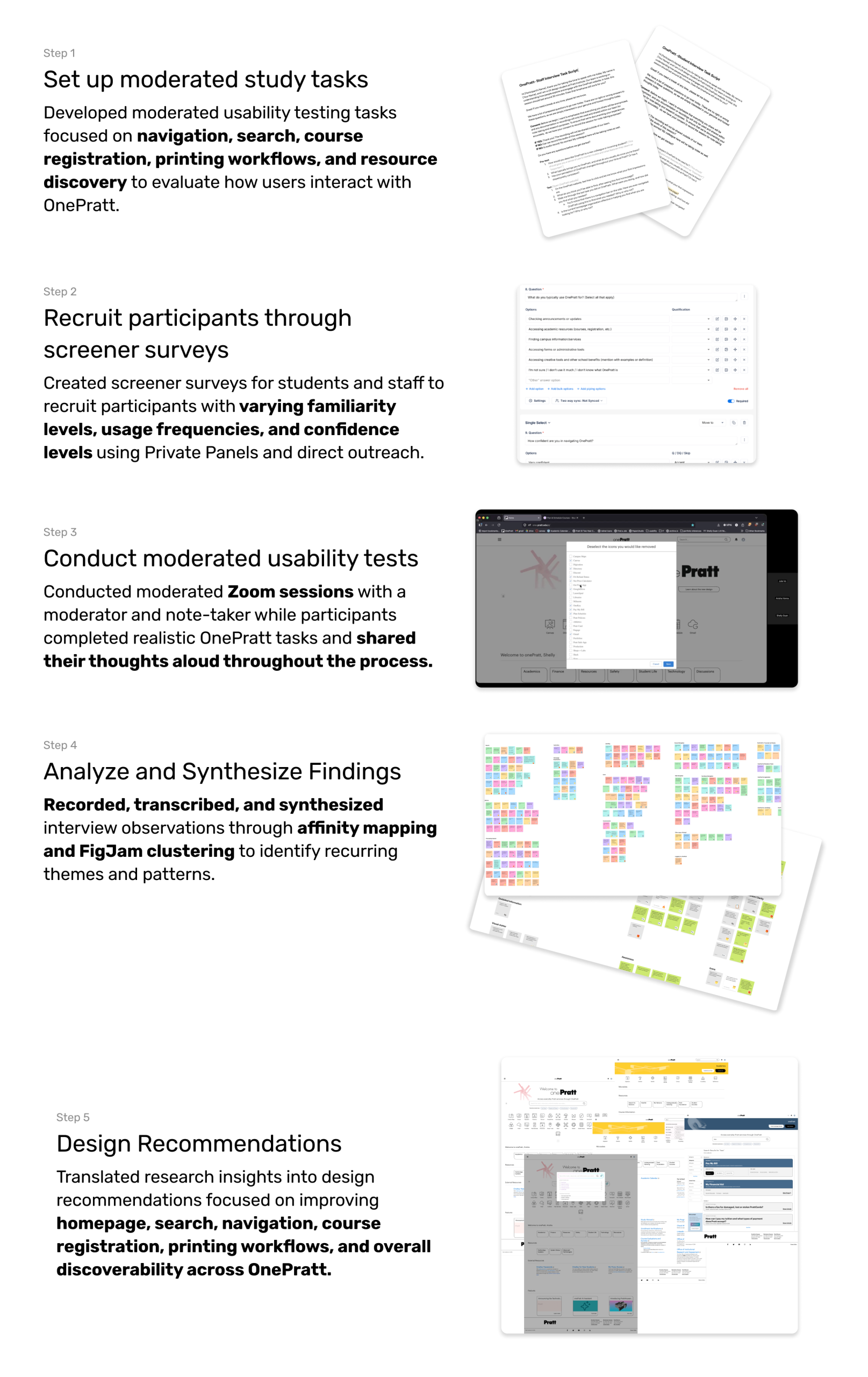
Methodology
Initially, we explored methods like card sorting and tree testing for the study and redesign. But we realized the challenge wasn’t only about structure, it was about understanding how people actually experienced the system. Moderated usability testing helped us observe real workflows, understand user expectations and mental models, as well as capture confusion, hesitation, and behavioral patterns.
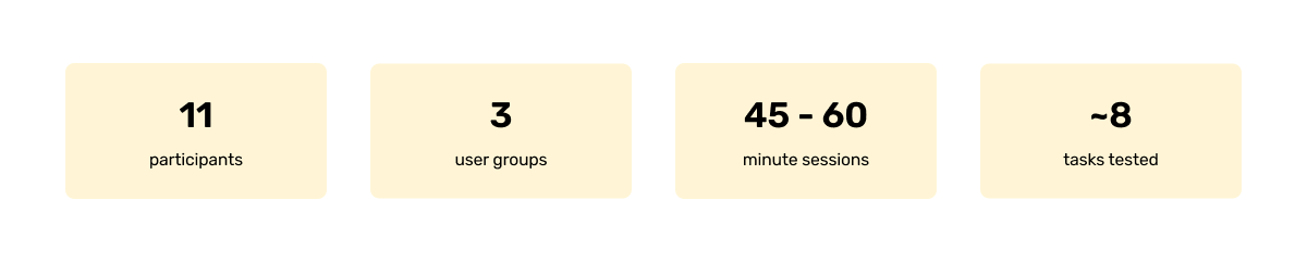
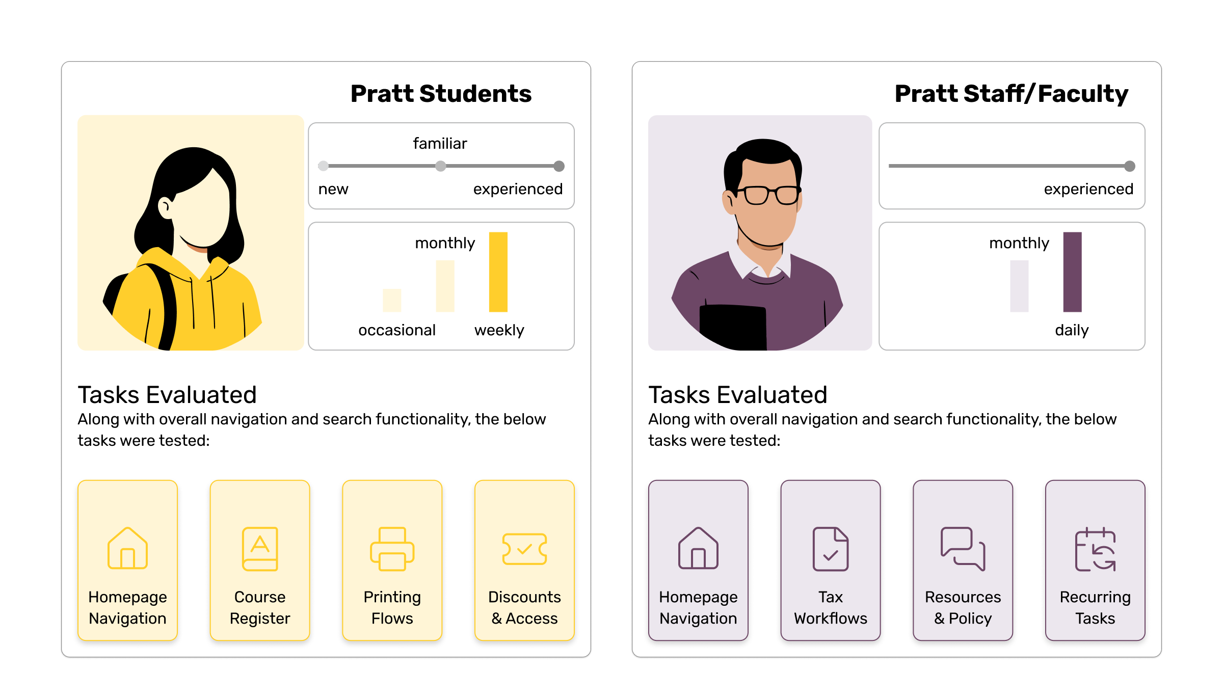
Participants
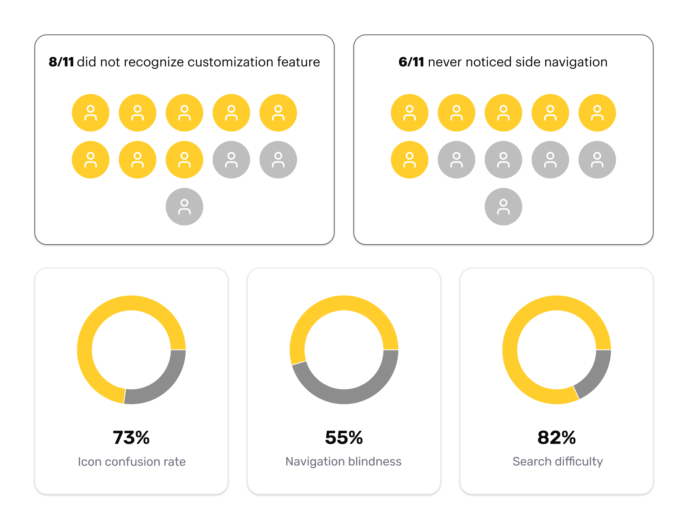
We intentionally recruited across confidence levels- neutral, not very confident, somewhat confident- and across usage frequency (daily to occasional). The goal was to capture both first-time friction and habituated workarounds. Staff recruitment was harder so low response rates meant we moved forward with three volunteers, which the team felt was sufficient given the client’s student-first priority.
What we found
Behavioral Findings
Open-ended tasks were designed to uncover navigation friction, usability barriers, and the underlying causes of user confusion throughout the platform. Task-specific activities focused on observing how participants interacted with the tools, features, and workflows available to them within OnePratt.
Key Insights
Problem Statement
How might we redesign OnePratt’s search experience to guide users toward task completion, helping them find the right resource with confidence and minimal effort?
How could the experience be improved
Search Experience: The search experience consistently failed to guide users toward relevant actions, forcing them to rely on trial and error, workarounds, and external tools.
What worked well
Search was highly discoverable and frequently used Users naturally turned to search when looking for information or resources.
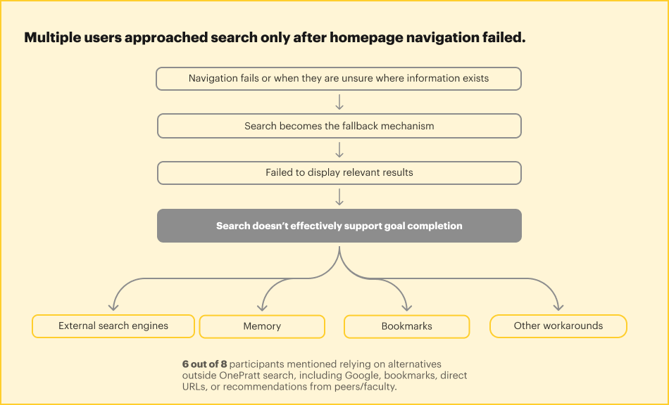
Search acted as a safety net when navigation failed Participants relied on search whenever they were unsure where information existed within OnePratt.
What can be improved upon
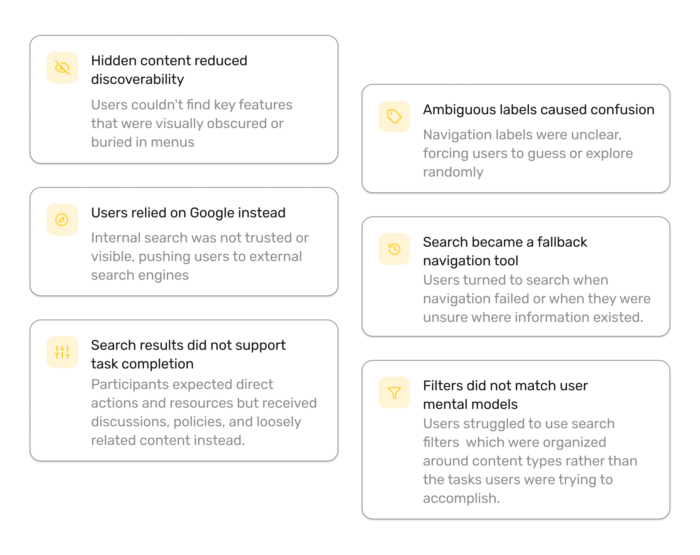
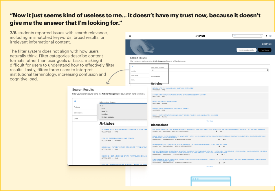
Search results lacked relevance Results often did not match users’ keywords, intent, or goals, reducing trust in the system.
Results lacked hierarchy and prioritization Discussions, resources, policies, and tools looked similar, making scanning difficult.
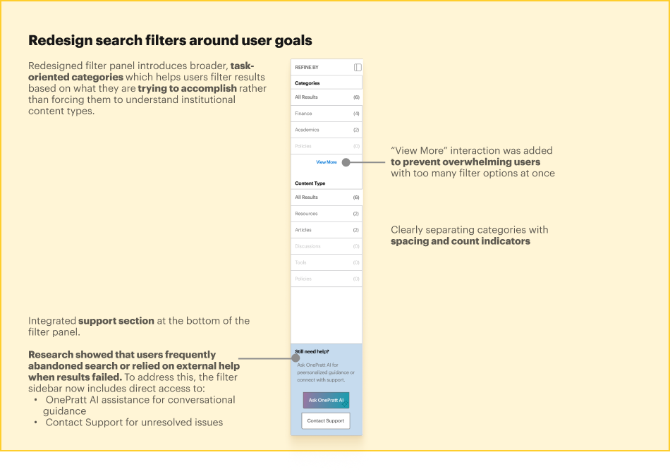
Filters did not align with user mental models Filter categories reflected institutional content types and terminology rather than user goals and tasks.
Users struggled with institutional terminology Many participants did not know the exact names of systems, departments, or services to search for.
Search offered little guidance There were no predictive suggestions, recent searches, or contextual prompts to help users formulate queries.
Finding 1 : Search Became a Fallback Navigation Tool
Users relied heavily on search because they were unsure where information existed within OnePratt and could not confidently navigate through the platform.
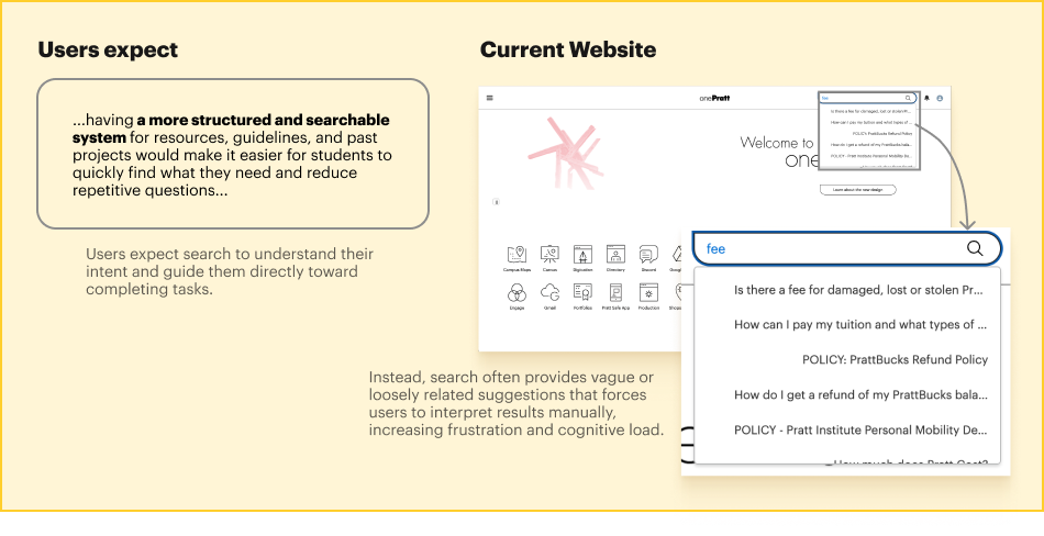
Finding 2 : Search Failed to Support Task Completion
Users approached search with clear goals such as registering for classes, paying tuition, or finding printing resources, but were often shown discussions, policies, or unrelated content instead.
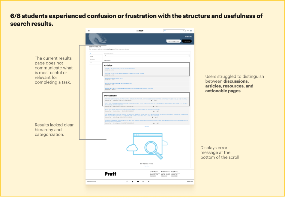
Finding 3 : Search Results Lacked Clarity, Relevance, and Trust
Results were difficult to scan, lacked hierarchy, used unfamiliar terminology, and did not help users identify the most relevant next action, leading many users to rely on Google, bookmarks, or peer guidance.
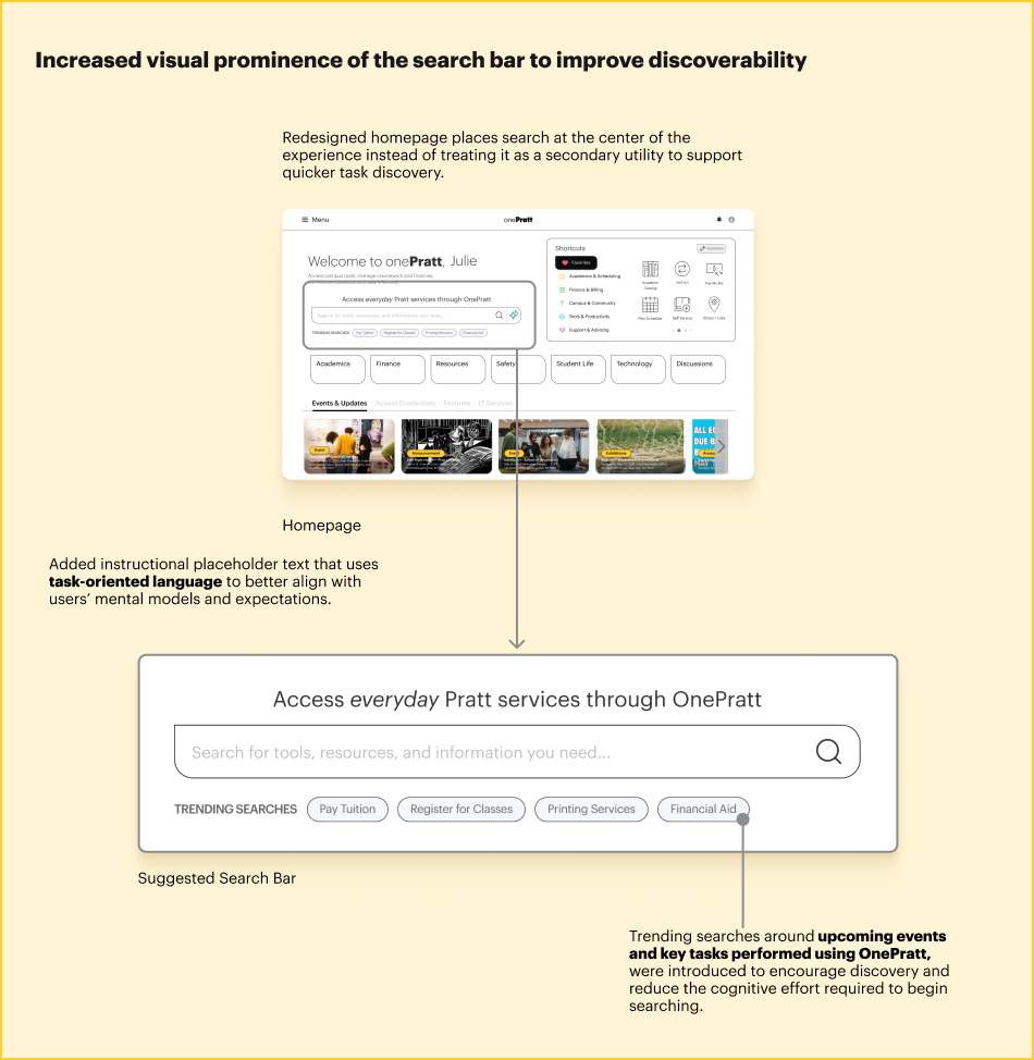
Recommendation 1 : Reposition Search as a Task Completion Tool
Make search a primary navigation and discovery mechanism by increasing its visibility, surfacing trending tasks, and helping users start common workflows directly from search.
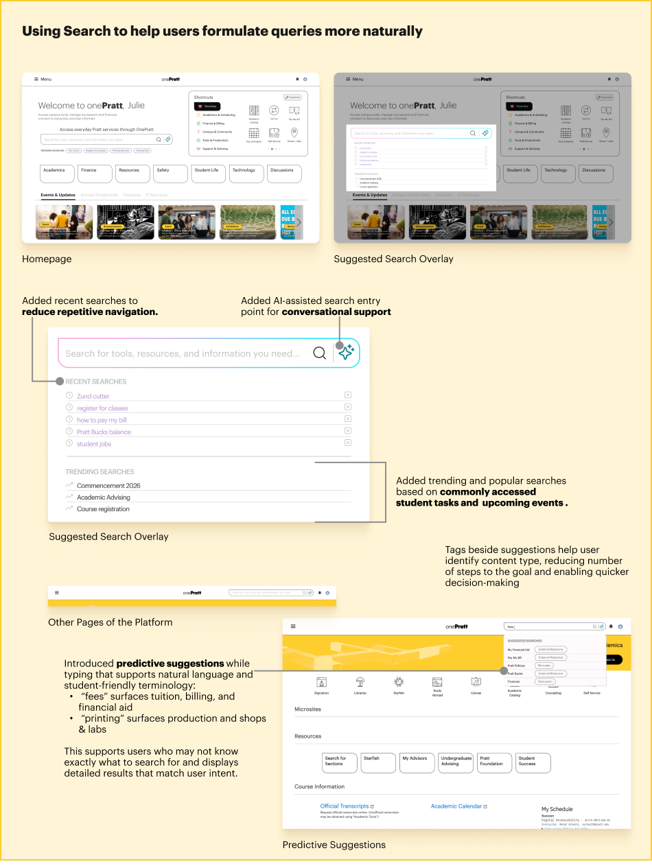
Recommendation 2 : Introduce Guided and Predictive Search Assistance
Support natural language queries through predictive suggestions, recent searches, trending searches, AI assistance, and student-friendly terminology that helps users formulate searches more effectively.
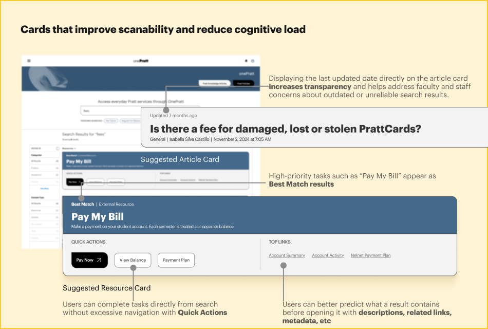
Recommendation 3 : Redesign Search Results Around User Goals
Organize results into meaningful categories, highlight best matches, introduce quick actions, improve filtering, and provide richer result previews to help users complete tasks faster and with greater confidence.
Users searched for goals such as registering for classes, paying tuition, finding printing services, or accessing student resources, but the existing filters required them to understand institutional content types like FAQs, discussions, or policies. The redesigned categories therefore group results around user goals (Academics, Finance, Printing & Labs, Campus Resources, etc.), making the filtering experience more intuitive, reducing cognitive load, and aligning more closely with users’ mental models.
What we’d do next
Client Feedback
“I loved the design recommendations. I would love to look into the depth of it.”
Next Steps
1. Validate the proposed redesigns We would like to further conduct another round of usability testing on the redesigned homepage, search experience, course registration flow, and printing workflows to confirm that the recommendations successfully address user pain points.
2. Monitor search performance (specific to my redesign) Track search analytics after implementation to evaluate improvements in search relevance, task completion rates, and user reliance on external tools such as Google and bookmarks.
3. Improve Information Architecture We identified a lot of space for improvement. We want to improve OnePratt as a whole by refining content organization, labels, and navigation pathways so users can build a stronger mental model of where resources without any guidance.
Takeaways
Although the project began with a narrow focus on improving information architecture, the research uncovered much broader opportunities. I particularly enjoyed moving back and forth between user behaviors and design solutions, using real user insights to create recommendations that make the platform feel more connected and supportive of everyday workflows.