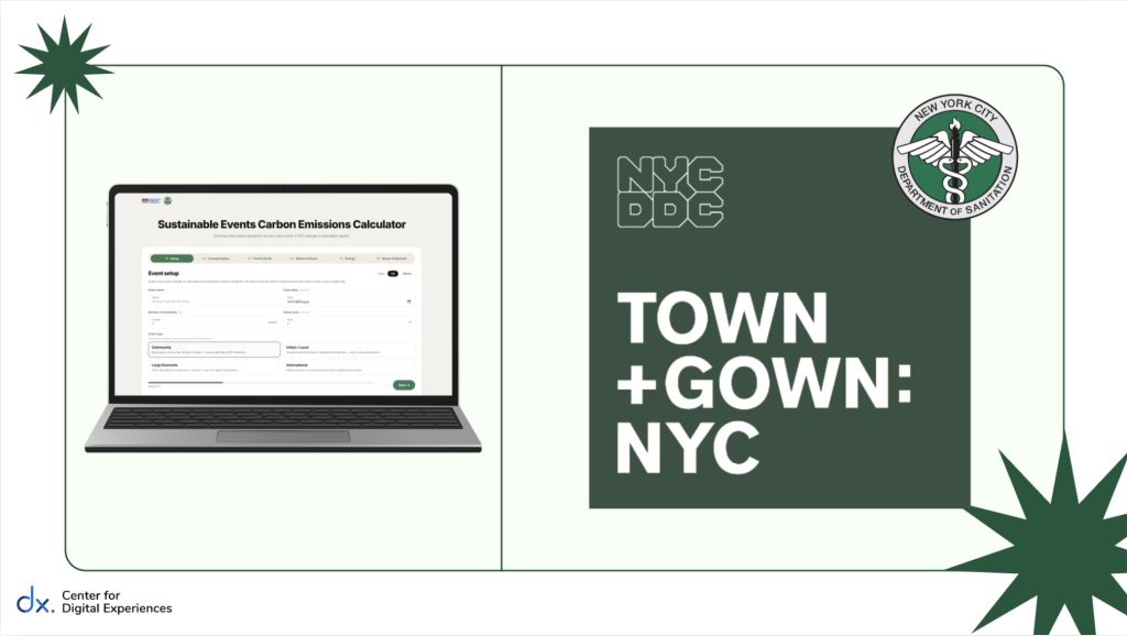
Transforming a technical carbon calculator into a more usable sustainability planning tool through usability research and product redesign
As sustainability becomes increasingly relevant in our changing climate, tools that help organizers measure environmental impact are becoming more important.
Through the Pratt Center for Digital Experiences (DX Center), our team partnered with Town+Gown: NYC. the NYC Mayor’s Office of Operations, and the NYC Department of Sanitation to evaluate a spreadsheet-based carbon emissions calculator created to help New York City event organizers estimate the environmental impact of their events across transportation, materials, food, energy, and waste.
While the calculator was technically robust, it had never been usability tested. What initially seemed like a straightforward evaluation quickly became a broader design question: how do you make a technically complex sustainability tool usable for people navigating the realities of event planning?
Client: Town+Gown: NYC, NYC Mayor’s Office of Operations, NYC Department of Sanitation
Timeline: 6 weeks
Team: 4 UX Design Consultants
My role: UX Design Consultant
Deliverables/Skills: UX research, moderated usability testing, synthesis, design recommendations
The Problem
A technically robust carbon emissions calculator was difficult for event organizers to use in practice. Complex spreadsheet layouts, technical terminology, and unrealistic data assumptions created friction from the moment users opened the tool.
The Solution
Our team conducted usability testing with NYC event organizers and developed design recommendations to improve onboarding, simplify the experience, and transform raw emissions data into clearer, more actionable insights.
A spreadsheet built for sustainability, not necessarily usability
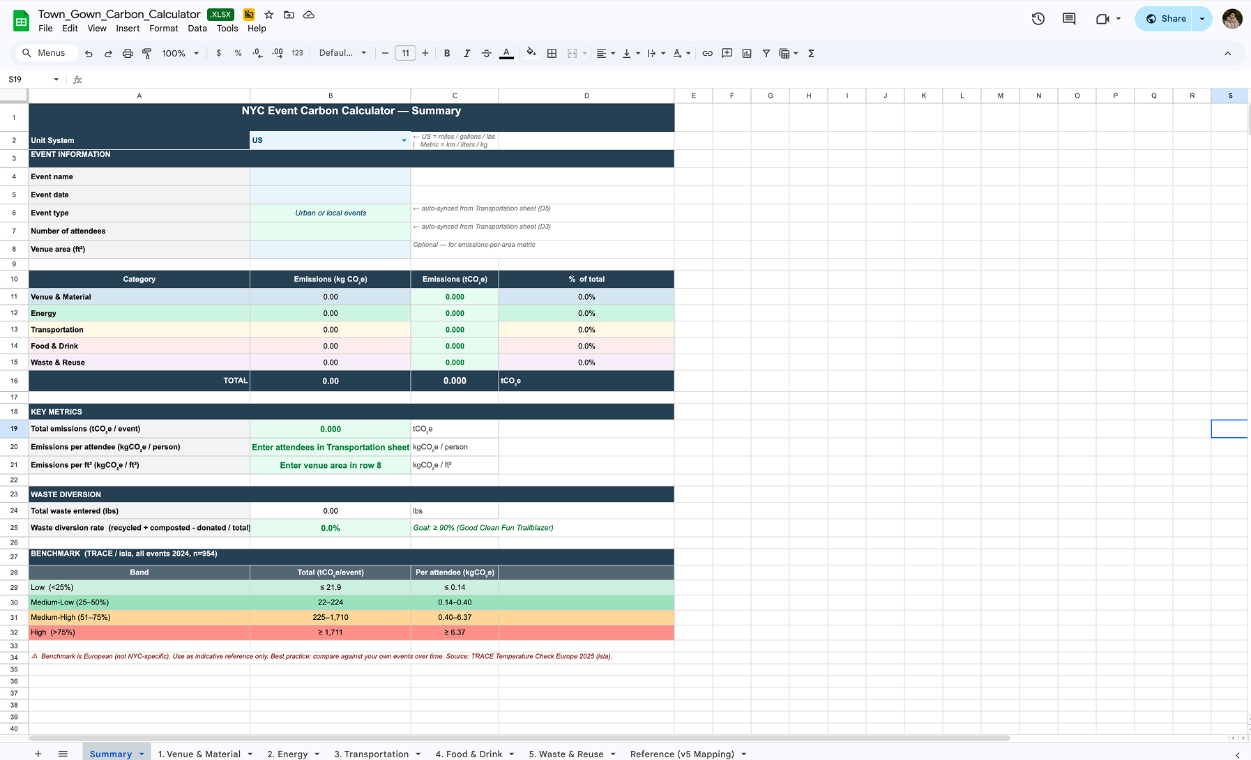
Initial landing page of the Carbon Emissions Calculator
At a high level, the calculator offered a compelling value proposition. It consolidated sustainability tracking into one place, automated emissions calculations, and gave organizers a way to benchmark the environmental impact of their events. However, the experience of using the tool suggested a different set of challenges.
Users were dropped directly into dense spreadsheet tabs filled with technical terminology, detailed calculations, and assumptions about data they may not realistically have access to. Even during our own initial walkthroughs, questions surfaced quickly: Who is this designed for? How much of this applies to smaller events? Where would users begin?
Our challenge was not just improving the spreadsheet itself, but understanding whether the tool matched how event organizers think and work.
Designing the usability test: Why ideal testing conditions would have missed the real problem

Conducting a remote moderated usability test with an NYC event organizer, starting with warm up questions
One of the most important decisions in this project emerged before testing even began.
Initially, we considered using a fictional event scenario with pre-filled data to create a more controlled study, but that approach quickly felt unrealistic as we researched that option. We found that event planning workflows and data sheets vary dramatically across different organizers and event types; real users would never be handed a clean dataset to work from.
Instead, we decided that participants would use a recent event from their own experience and completed the calculator using whatever information they would realistically have access to.
This decision surfaced one of our most important findings: much of the friction came not just from the interface, but from a mismatch between what the calculator expected users to know and how event information is actually tracked.
After designing the premise of the usability test around this constraint, we designed the rest of the study to reflect real-world use as closely as possible, moving from first impressions to hands-on use. Participants explored the calculator independently, completed tasks using a recent event they had worked on, and interpreted the final outputs, helping us evaluate both usability and how well the tool fit existing event planning workflows.
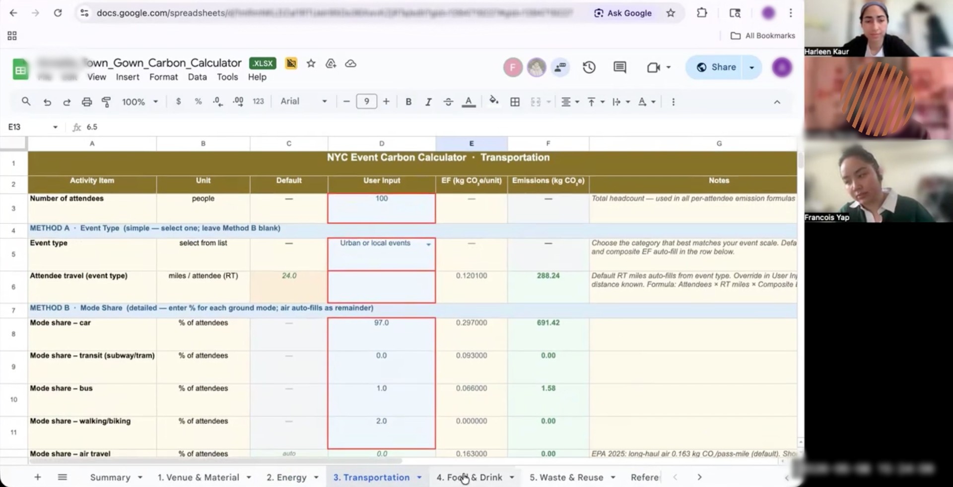
NYC event organizer inputting tab information during the usability test
To reflect the intended audience, we recruited eight NYC-based event organizers with experience ranging from community programming to larger-scale production to conduct the usability test with. We then synthesized the information through affinity mapping to identify the most important issues and our recommended solutions.
Where complexity broke down: Contextual issues and our recommendations
- Users were asked to act before they understood the tool
Participants were dropped directly into a dense spreadsheet with little explanation of what the calculator measured, who it was for, or which sections applied to their event. Many, especially smaller organizers, felt overwhelmed before they even began.
In response, we proposed a dedicated onboarding experience to introduce the tool, clarify expectations, and help users quickly identify relevant sections.
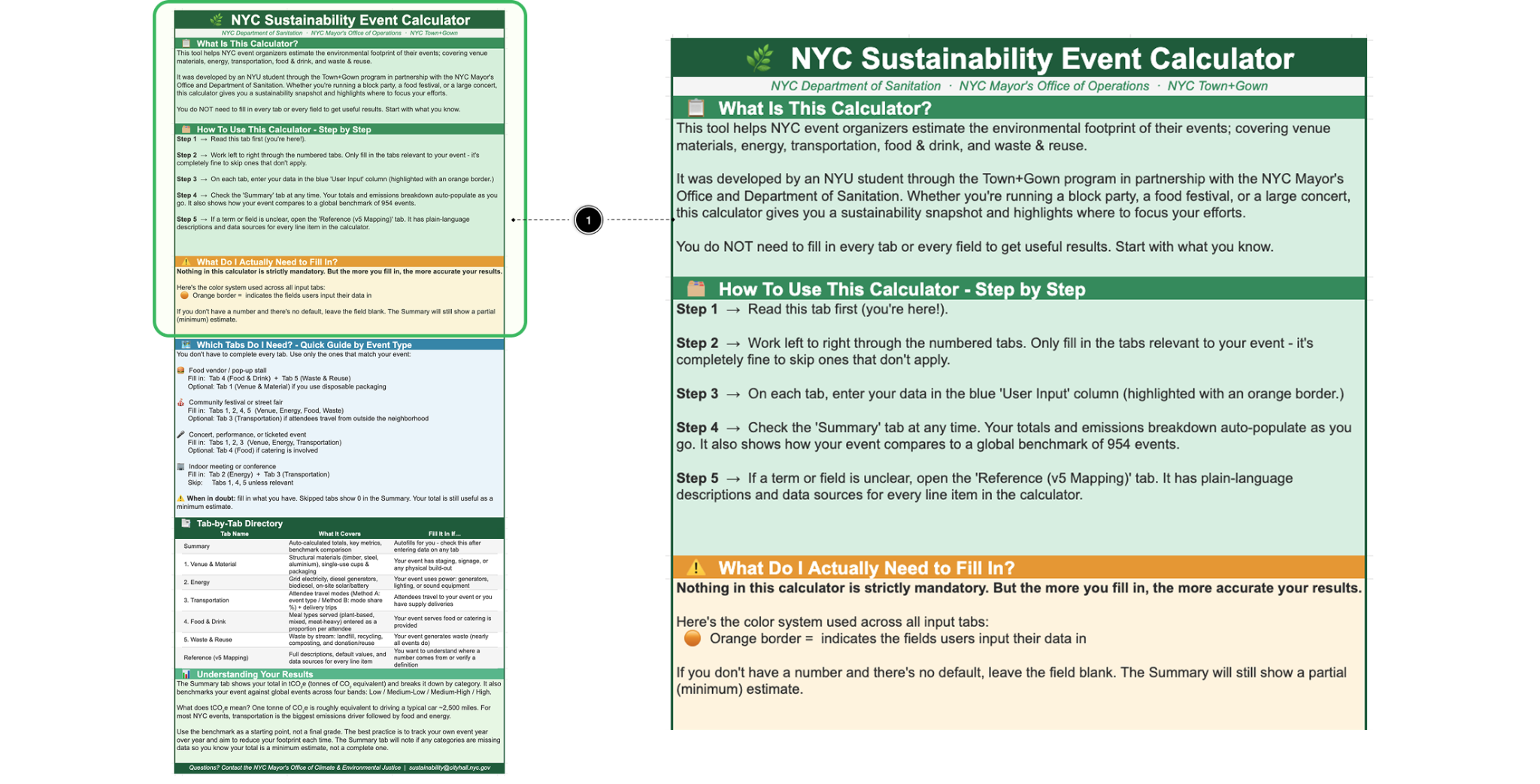
A proposed onboarding experience designed to reduce early confusion and help users navigate the calculator with greater confidence
2. Users were left to interpret each section on their own
Even after getting started, many participants lacked enough context to understand what individual tabs were measuring, what information they needed, or whether a section applied to their event at all. For instance, one participant noted that waste is often tracked in bags or vendor pickups rather than by weight, highlighting how users sometimes needed clearer guidance on what to prepare before entering data.
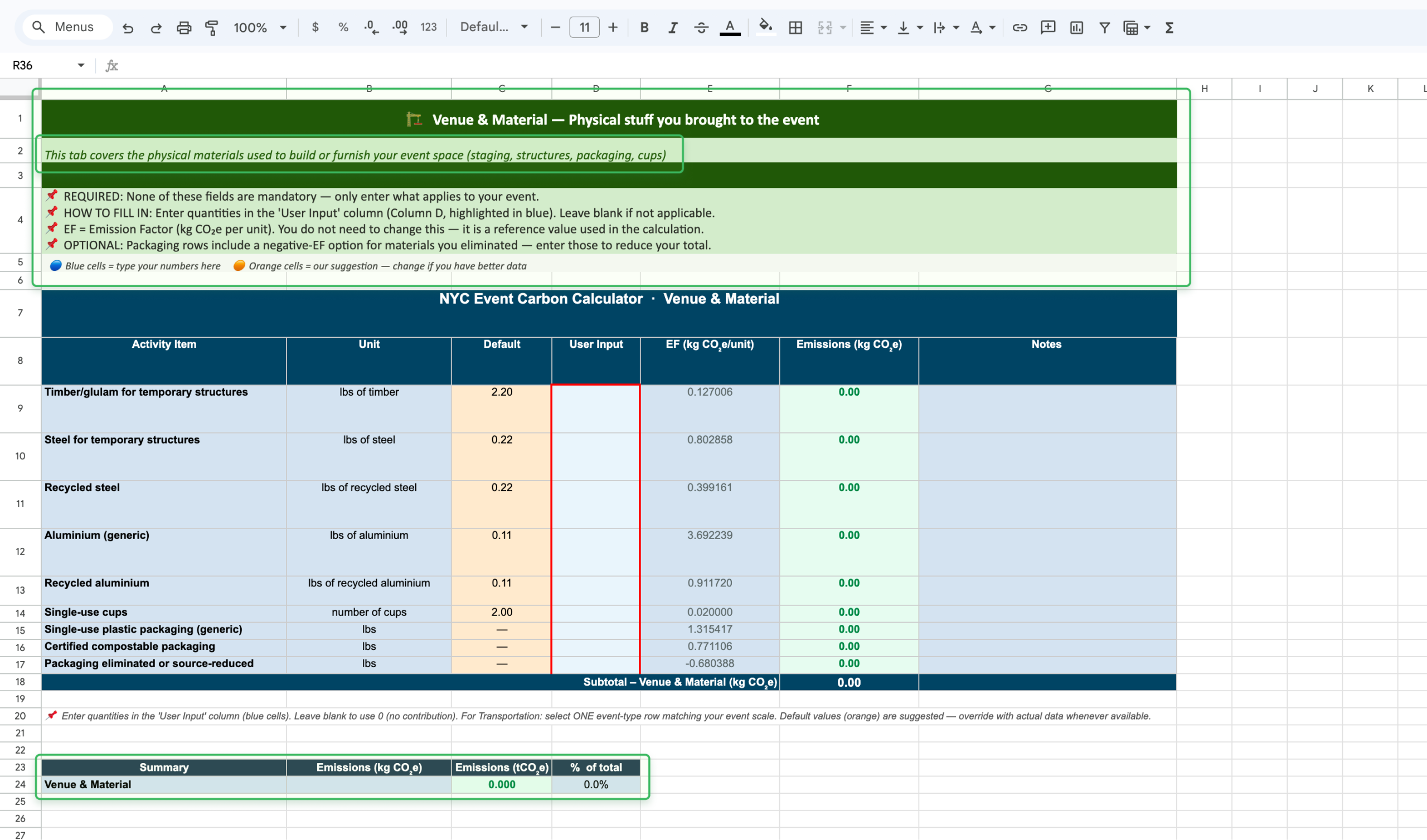
Proposed lightweight in-tab guidance that clarifies what each section covers, how to enter data, and how inputs contribute to overall emissions
To better support users at the moment of use, we proposed lightweight guidance within each section, including plain-language summaries, quick instructions, clearer expectations around inputs, and section-level emissions feedback.
3. Technical complexity created unnecessary friction
Some friction came not from the calculator’s structure, but from the amount of technical detail exposed within the interface. Fields like emissions factors, unclear defaults, and specialized terminology made the spreadsheet feel more intimidating than informative, while some participants even interpreted editable cells as error states.
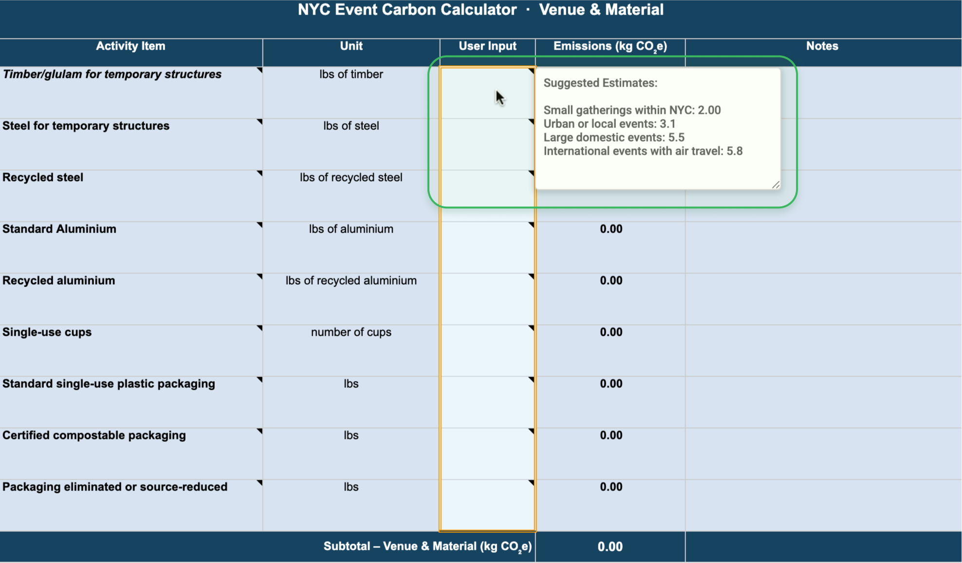
Proposing using native hover note feature on Google Sheets and Excel to provide context at the point of need
To simplify the experience without sacrificing trust, we proposed clearer suggested estimates, contextual hover guidance, and a cleaner interface that surfaced technical detail only when needed.
4. Raw outputs did not support action
Even when participants successfully completed the calculator, many struggled to interpret the results. The tool generated emissions totals, but without enough context for users to understand whether their event was performing well, how they compared to similar events, or what actions to take next.
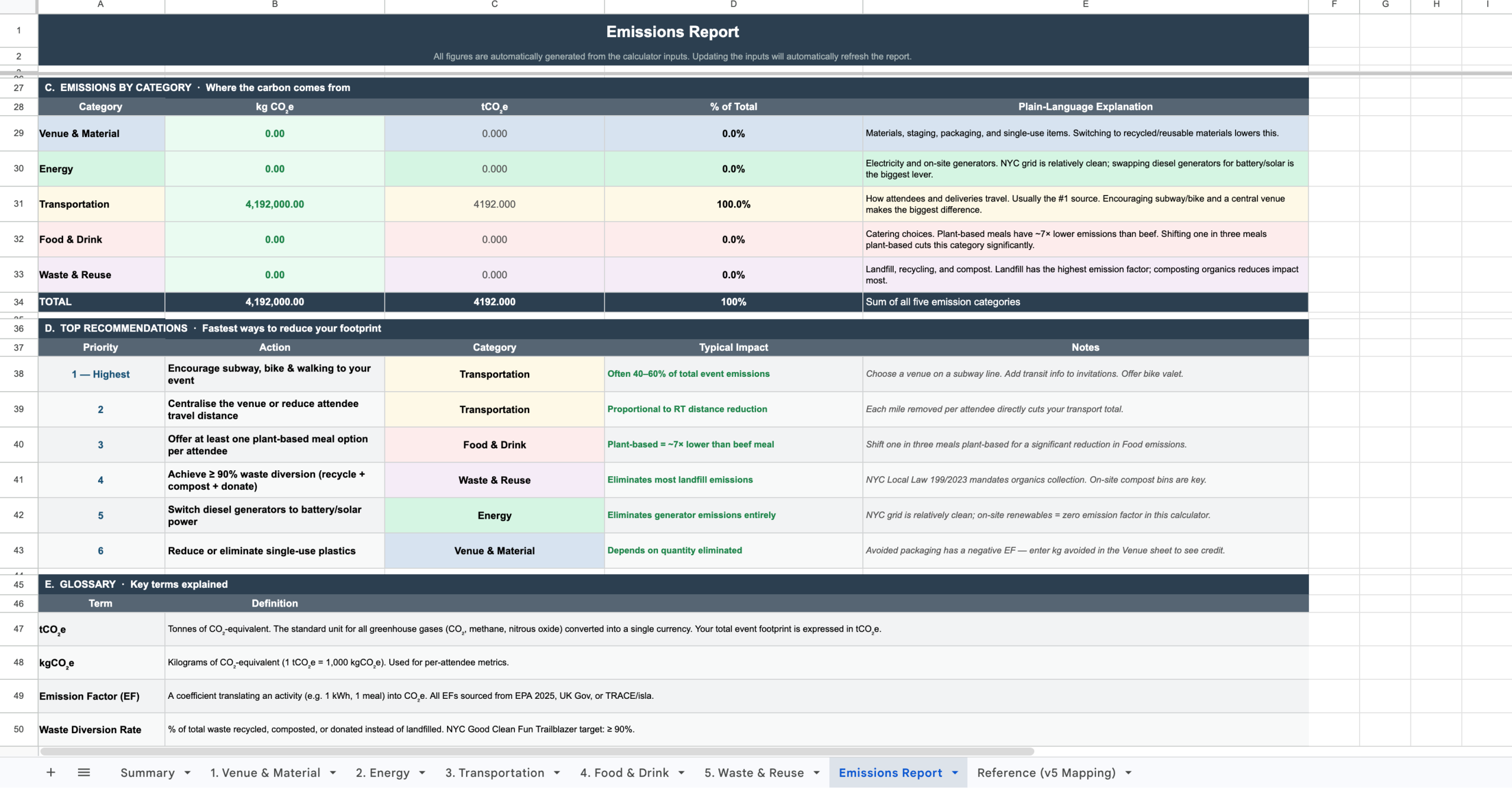
A proposed report page that help users understand results and identify next steps
To make the outputs more actionable, we reimagined the results experience as a strategic emissions report with clearer benchmarks, category breakdowns, plain-language explanations, and prioritized sustainability opportunities.
Turning research into product opportunity
We presented our findings and recommendation concepts back to stakeholders as actionable opportunities rather than simply a list of usability issues. This helped shift the conversation from critique to possibility, reframing the calculator as a product with strong potential that needed better alignment with real user workflows.
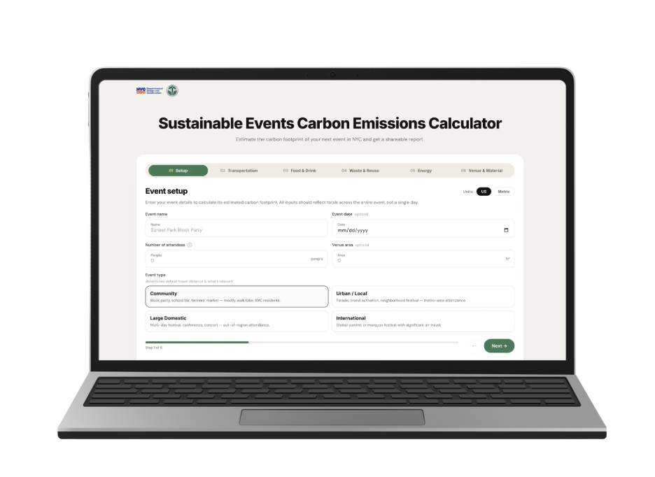
To explore a longer-term product direction, we prototyped how the calculator might live as a more intuitive web-based experience
Beyond improving the existing spreadsheet, we also explored a longer-term vision for the tool. Because many of the usability challenges stemmed from the spreadsheet format itself, we prototyped how the calculator might evolve into a guided web-based experience integrated directly into the existing website.
Presenting our final results and recommendations to our clients
This concept was especially well received, with our clients excited both by the easily implementable changes in the existing spreadsheet and the possibility of transforming the calculator from a standalone spreadsheet into a more intuitive digital product.
Some quotes from our clients:
“This was really really awesome. This was very thorough, I am impressed with how thoughtful you all were at not just getting the feedback from the event producers and getting an idea of where they were at, but also implementing it in very clear and understandable recommendations. I can already tell this will make the product so much better in the end.”
“This is perfect. Once again, proving you guys know user experience.”
“I really appreciate the depth of work…this was magnificent visually.”
What this project taught me about designing for complexity
This project expanded how I think about usability. I initially approached the work as an evaluation of interface clarity, but left thinking much more broadly about how products fit, or fail to fit, into real workflows.
Testing with real participant experiences rather than idealized scenarios surfaced friction we likely would have missed otherwise. More broadly, the project reinforced something I continue to find compelling in design work: some of the most meaningful usability challenges are not visual design problems at all, but mismatches between systems and human behavior.
Because many of those tensions stemmed from the spreadsheet format itself, given more time, I would like to have tested our future web-based prototype and explore how a more guided digital experience might reshape the experience.