
Why LEGO?
Because we want to make the experience of exploring LEGO’s website as fun and intuitive as when we were kids, and that’s for the designers who use the Design System as well
LEGO taught a generation of kids that complex things are easier when you break them into reusable parts. That’s also the core insight behind a design system. So when we picked a brand to redesign, we picked the one that’s been teaching kids how to use their imagination to build modular sets for more than 90 years.
Have you been living under a brik?
The word LEGO comes from the Danish words “leg got”, which translates to play well. The company has spent years turning that idea into a universal language of bricks. By providing a modular toy, which allows kids to use their imaginations to play. Klods is named after the Danish word for “brick” for the same reason, allowing product teams to use their imagination.
The team
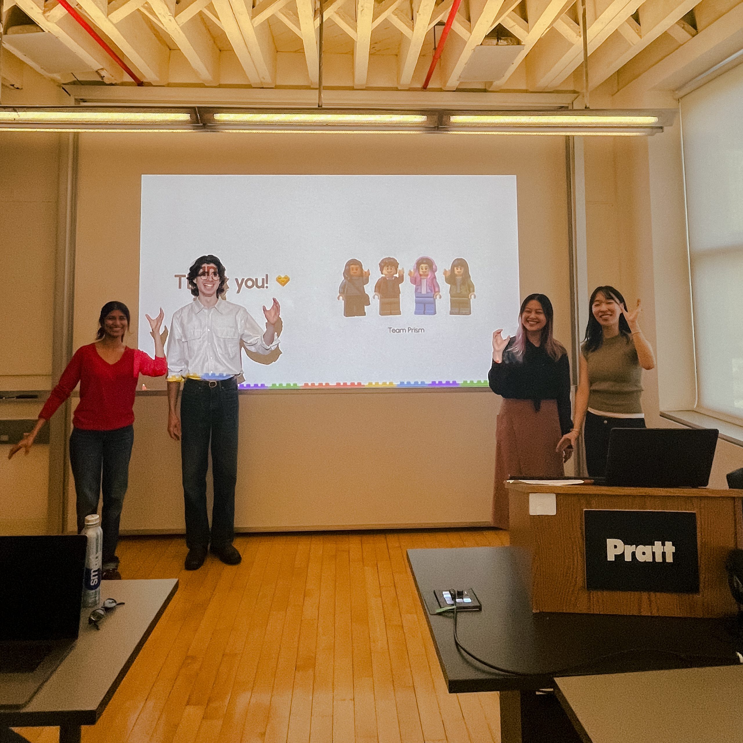
Before we begin, I want to shout out Aswathi Thilak, Grace Ho, and Rae Kim for teaming up with me on this project. As a team, we split responsibilities and worked simultaneously on all the parts of the project. However, my focus is on the definition of the system’s design principle, the foundational components of the UI kit, as well as their documentation. Cards and other components were owned by teammates, but the system’s principle of modularity runs through everything we built. In the later stages of the project, I took on the responsibility to tackle the business side of a possible implementation of Klods in the LEGO ecosystem.
These bricks don’t match
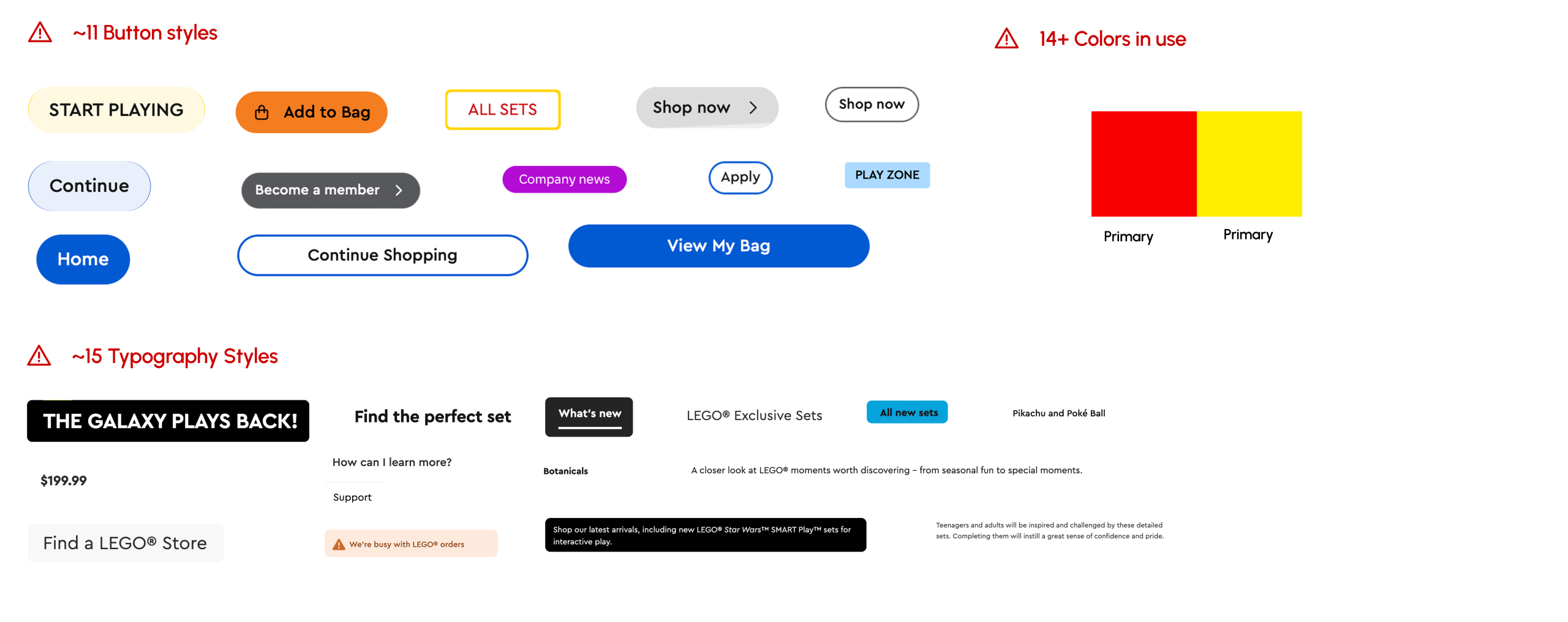
We conducted a usability audit to understand how the current LEGO website works. Turns out, there are a lot of issues
LEGO.com is huge, and in order to stay within the scope of the project, we focused on the main website and its core pages (home, product, search, checkout). As we audited these pages, the same pattern kept surfacing. We noted how some components doing the same job looked different from page to page. We catalogued 11 different types of buttons, more than 15 typography styles, and a wide variety of colors that were placed seemingly without a logic behind them. The takeaway was clear: design teams are likely not to be working with a shared visual language.
Let’s create a shared playground
We created Klods to tackle the problems found and to foster culture change through a tailored design system
In order to achieve our goal, we need a shared infrastructure that teams could build on independently without drifting apart.
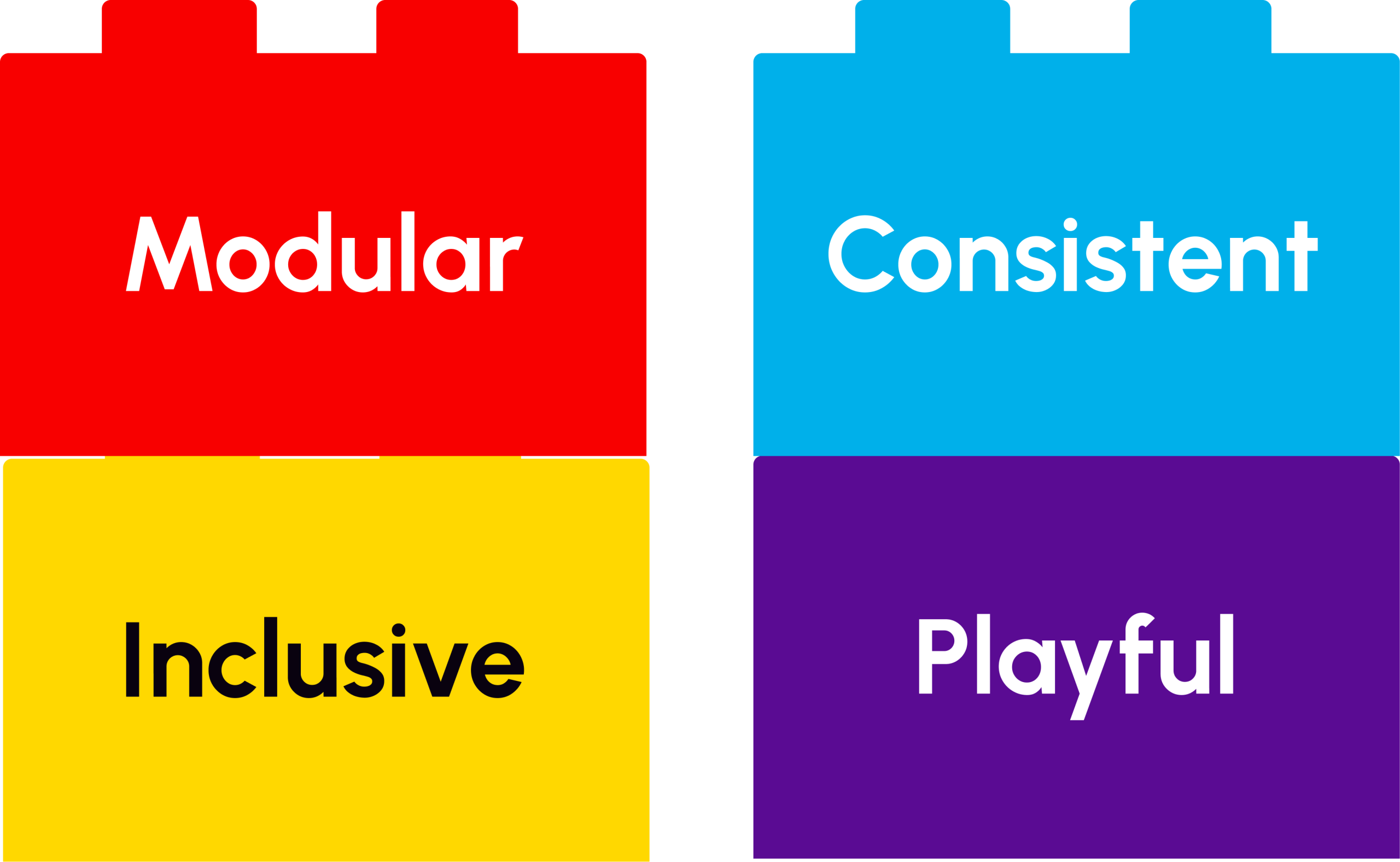
The four principles shaped the decisions we made:
We set the foundations
As a first step into the creation of Klods, we built a comprehensive UI kit
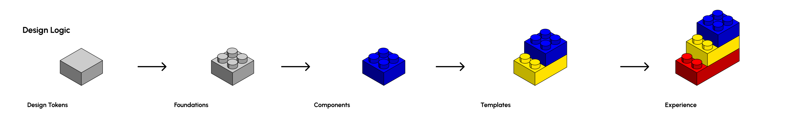
Tokens are what set the tone for any design system. We started by making sure that the colors and typography complied with WCAG 2.1. We then built the rest of the components, spacing, iconography, and a grid system to do so as well.
Components as bricks
Buttons became my most-reused, most-stackable component of our system
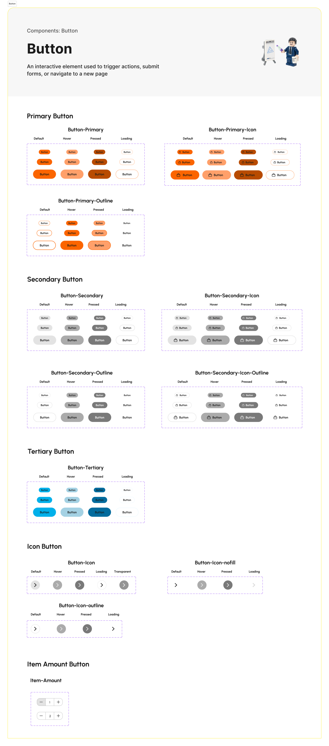
Buttons sound trivial until you try to standardize them across a site that has to sell to someone who just opened a computer for the first time and one who was in his 20’s when the first PC came to market. Therefore, we standardized five types of buttons and their variants to allow this wide range of users to easily navigate the website. Banners followed the same logic, every variant a brick that snaps cleanly into the page. Cards, which were developed by teammates, are the most visible example of the stacking principle in action, composing into carousels, grids, and product layouts across the system.
Can others leg godt?
We conducted 4 moderated user tests with fellow designers, which helped us understand what others needed out of the system to better implement it in a workflow
A design system is only as good as the people who can pick it up and use it. To test our first version of Klods, we watched four designers attempt to build a product page and a checkout page. The outcomes of the test were mixed, the components held up, but the onboarding did not. The designers were mostly appreciative of the components, but confusion arose when understanding how to use them. The clear next step was the creation of a documentation site.
Klods instruction pamphlet
Developed a documentation site to allow every member of the product team to understand how Klods work
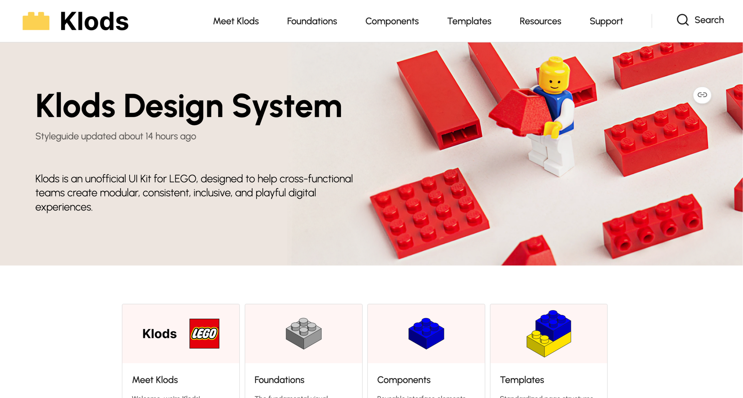
If a designer can’t onboard without a teammate explaining things, the system has failed. We built a documentation site that pairs every component with anatomy, variants, usage, and clear best practice guidance. We also opened a support channel, because systems don’t just ship, but they get maintained and expanded over time.
The business case for Klods
The investment that can double net income
We made the case to LEGO product leadership across three benefits teams would feel immediately, plus one bet on where the brand is headed. Studies of companies that have adopted design systems consistently show double-digit efficiency gains for designers and developers[1]. Banco Sabadell’s Galatea system cut delivery time by 50% across 56 projects and saved €2.5M in its first year[2]. Klods is built on the same principle of reuse over rebuild. New hires would feel it just as quickly. Instead of spending weeks reverse-engineering 11 button styles, they open the docs and start solving real problems much faster. And on the growth side, 95.9% of the top million homepages fail WCAG 2[3]. However, the companies that lead on accessibility report 2.6× more net income than their peers[4]. Klods bakes accessibility into the foundation, so it scales with the system instead of being patched on top. This is just the beginning of a long journey, and the system is designed to grow with the teams that use it.
1- Speicher & Baena Wehrmann, “One Formula To Rule Them All: The ROI Of A Design System,” Smashing Magazine, 2022.
2- Accenture, “Banco Sabadell: Digital Efficiency by Design,” 2023
3- WebAIM, “The WebAIM Million: The 2026 Report on the Accessibility of the Top 1,000,000 Home Pages,” 2026.
4- Accenture & Disability:IN, “The Disability Inclusion Imperative,” 2023
Now we can all play well!
We pitched Klods and got the response every design system hopes for! “I would use this.”
The presentation landed. Fellow designers pointed to the clarity of the tokens, the cohesion across components, and the playfulness embedded in the system. As the strongest part of the project, several flagged the stackability of the components as the idea they’d want to carry into their own work.
You can explore the live UI kit, documentation, and presentation deck here: https://zeroheight.com/klods-design-system
What I’d do differently
I believe I spent too much of the project complying with what LEGO.com already was. Next time, I’ll give myself permission to start from the system the brand deserves and not the site it currently has.