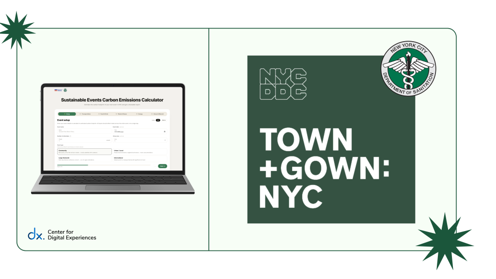
Designing an intuitive Sustainability Calculator for NYC Event Planners.
The Partnership Behind the Project
Town+Gown: NYC is a city-wide initiative that connects researchers with New York City agencies to tackle civic challenges.
For this project, Town+Gown partnered with the New York City Department of Sanitation and the Mayor’s Office of Operations to support more sustainable event planning.
Client Goals
Our team at the Pratt Center for Digital Experiences (DX Center) partnered with Town+Gown: NYC and the NYC Department of Sanitation to serve as usability consultants on the project.
We evaluated how easily NYC event planners could navigate the tool, input event data, and understand their emissions results.
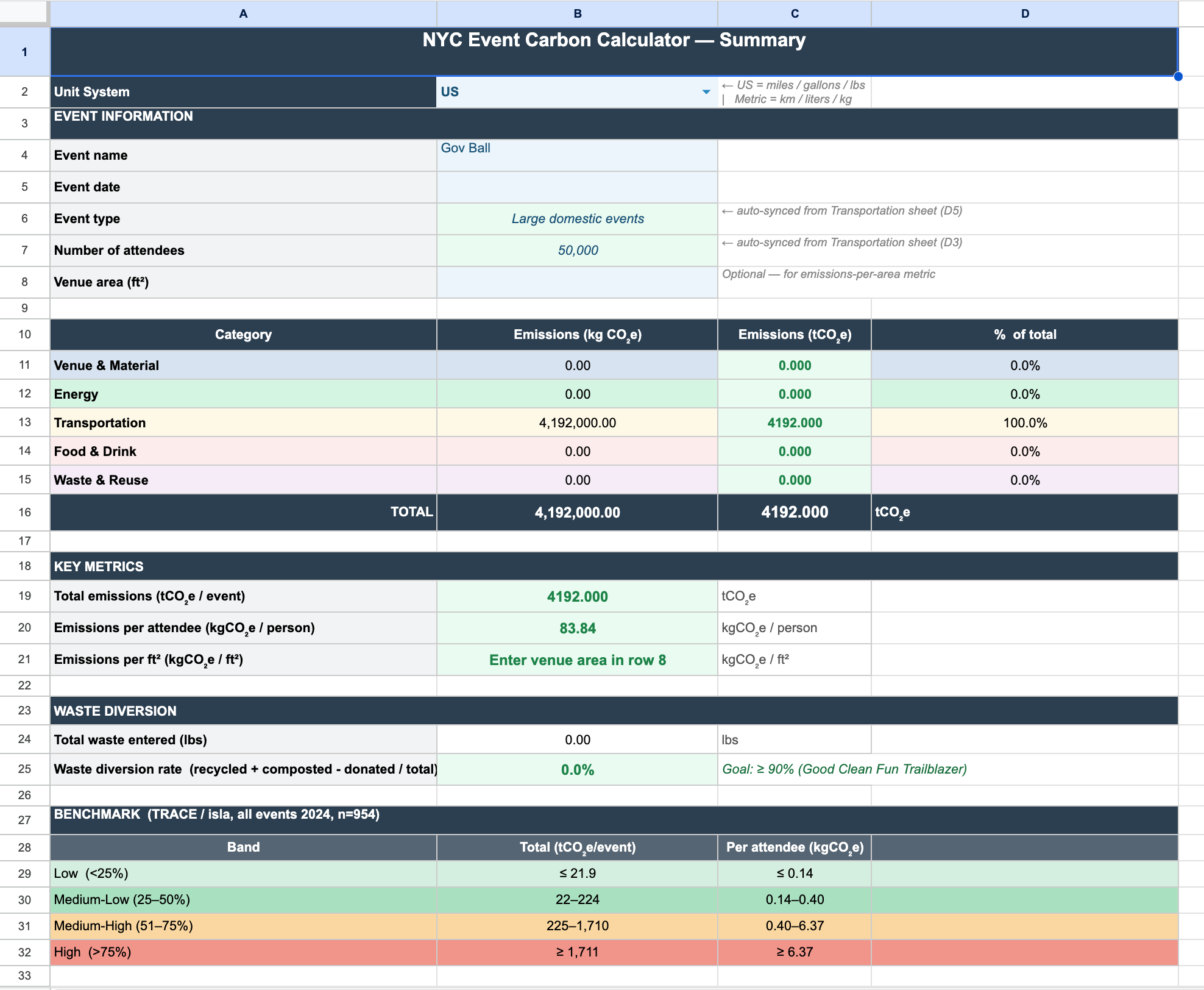
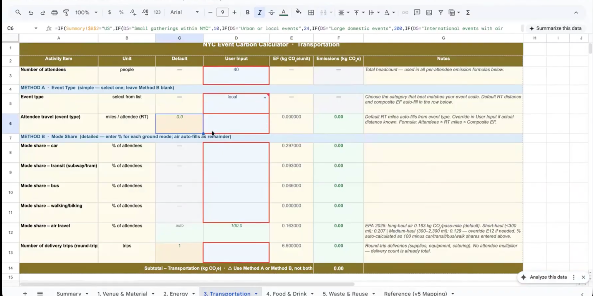
Starting point: Original spreadsheet calculator file shared by client
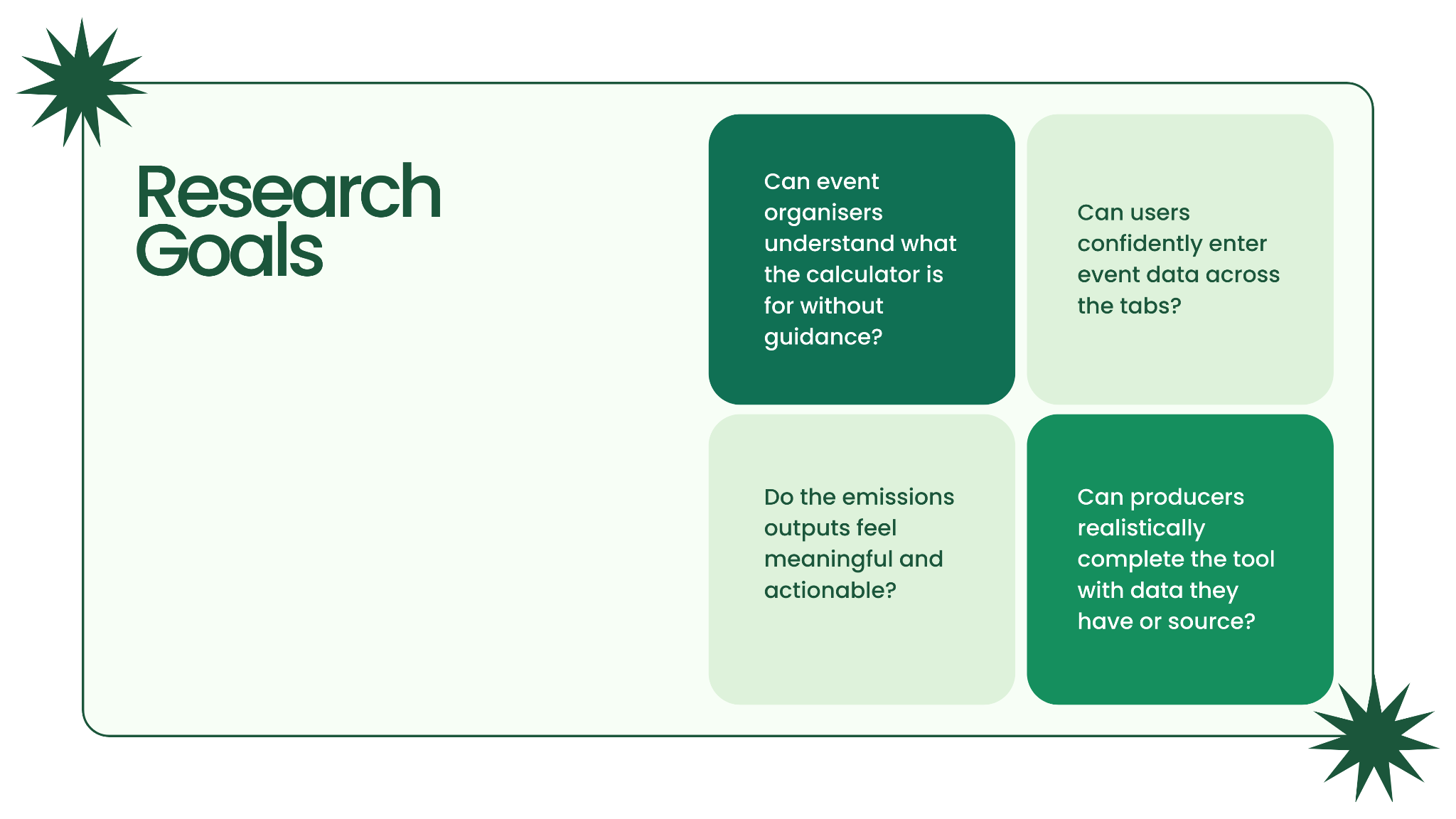
We started with a client kickoff meeting to align on stakeholder goals. Together, we aligned on our research goals focused on understanding…
1. Ease of Use
How easily users can complete the calculator.
2. Tool Understanding
Whether users understand the calculator’s inputs and results.
3. Adoption Potential
Whether users would realistically use and share the tool during event planning.
To summarize…
User Goal
Track and measure their event’s environmental impact with a tool that feels easy to use.
Business Goal
Evaluate whether the sustainability calculator is easy to use before rolling it out as part of the city of NYC’s sustainability toolkit.
Designing a Remote User Test
We designed moderated usability tasks around realistic event-planning workflows to evaluate how easily participants could understand and complete the sustainability calculator. We also integrated a think-aloud approach in our framework to capture participants’ immediate reactions.
Key Task flows & Evaluation Areas
- Exploring the tool independently
- Entering event planning data
- Interpreting emissions results
- Reflecting on real-world use cases
We reviewed these tasks with stakeholders during a second client meeting to ensure the usability test aligned with project goals and priorities.
Participant Recruitment
We recruited 8 NYC event planners, from independent organizers to large-scale production managers, to better understand how the sustainability calculator fit into different event planning workflows.
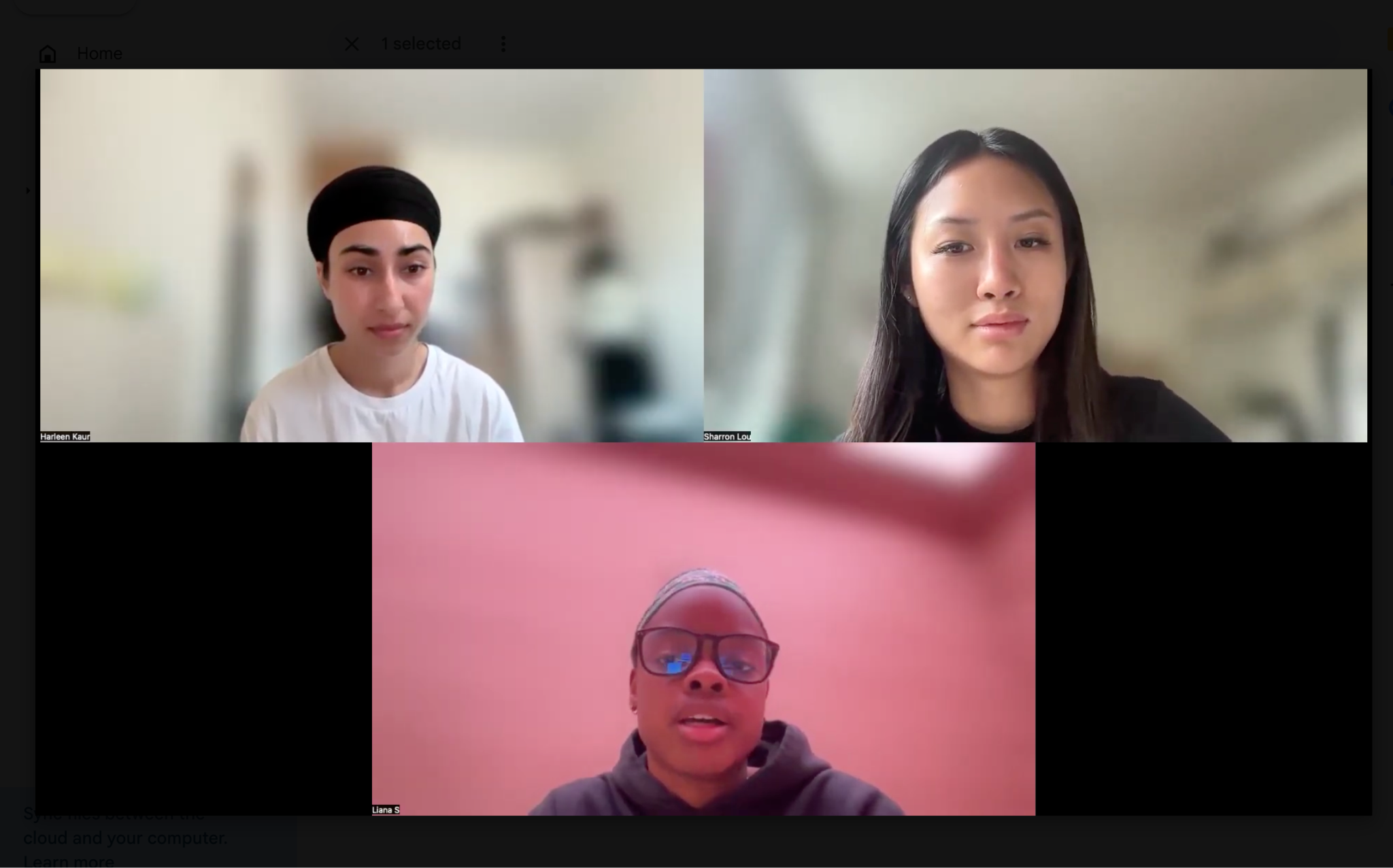
Pictured: Remote usability testing session with an NYC event planner evaluating the sustainability calculator.
The insights we gathered helped validate our design decisions and ensured our recommendations stayed aligned with the client’s goals.
To recruit participants, we created screeners through DSCOUT Private Panels to find qualified event planners across different event sizes.

I also leveraged my own network of local event organizers through my experiences as an event and festival photographer.
Summarizing our findings
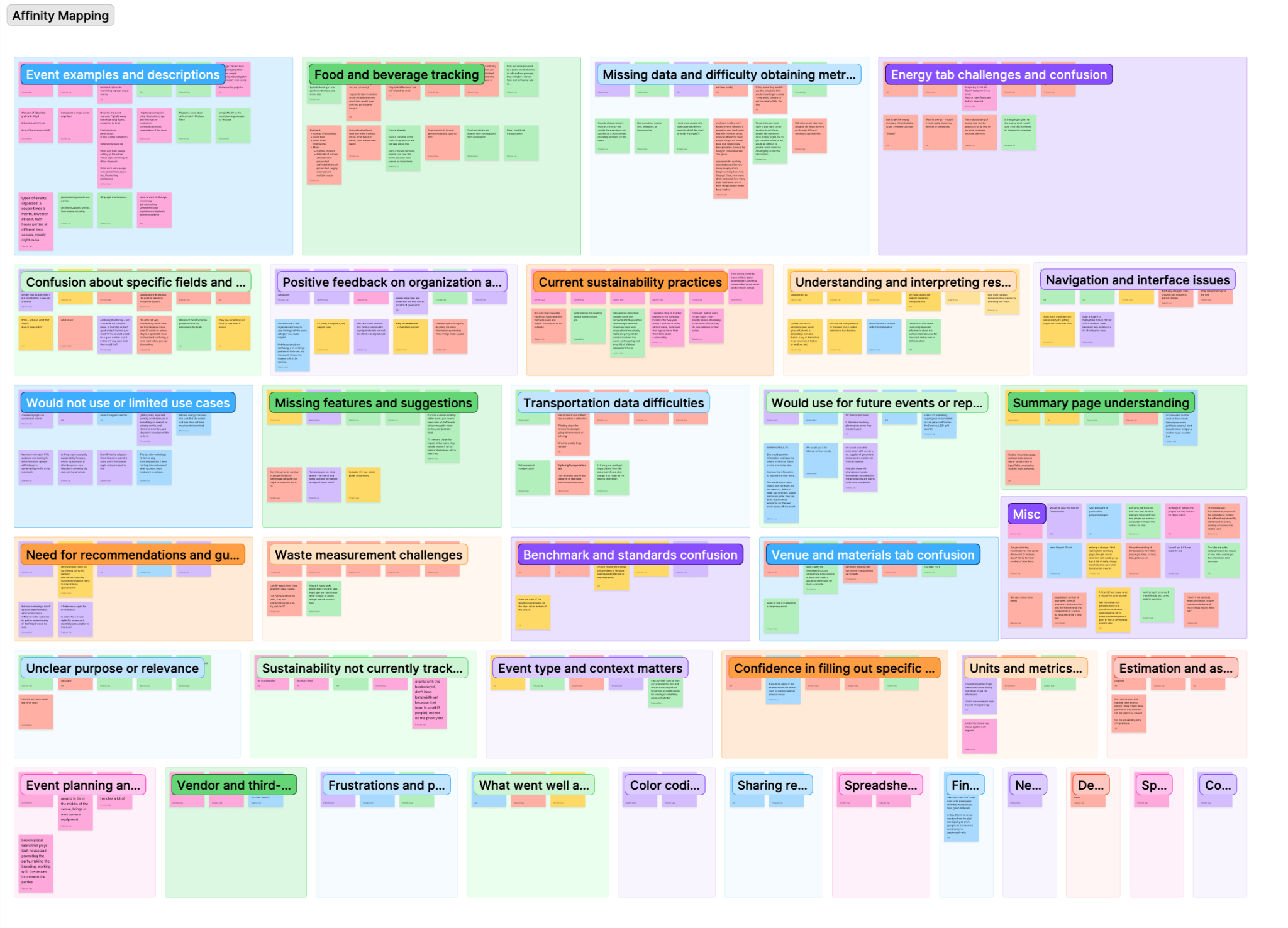
We conducted affinity mapping to identify recurring pain points across participant sessions. Many of the issues users encountered were related to unclear or irrelevant inputs and difficulty interpreting the results. This chart highlights how usability challenges were distributed across tasks.
Participants Understood the Value, but Struggled with the Workflow
Overall, participants understood the value of the sustainability calculator, but many found the experience difficult to navigate without additional guidance. Users struggled with visual overload, unclear inputs, technical terminology, and interpreting their final emissions results.
Simplifying a Confusing Sustainability Tracking Experience
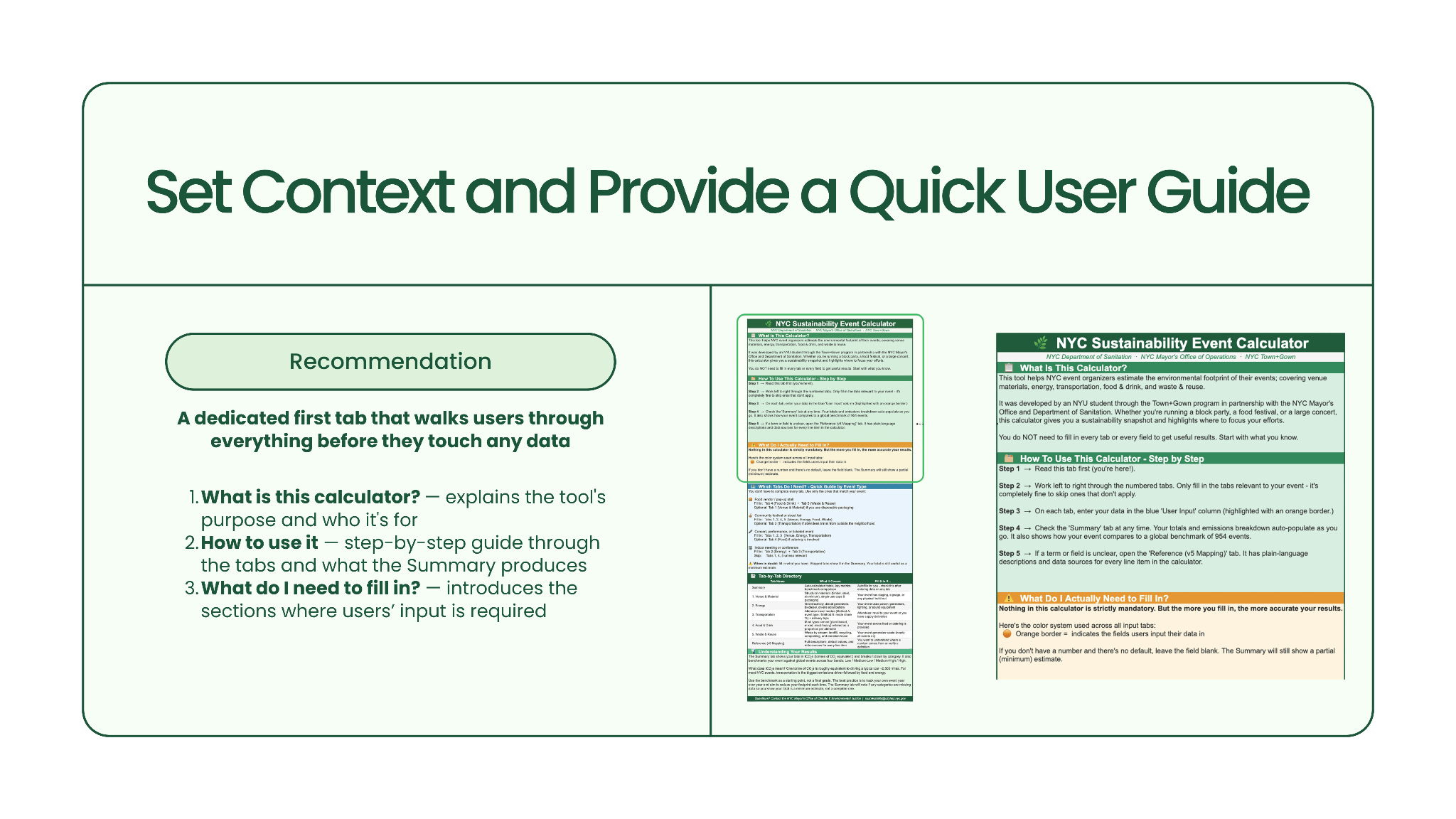
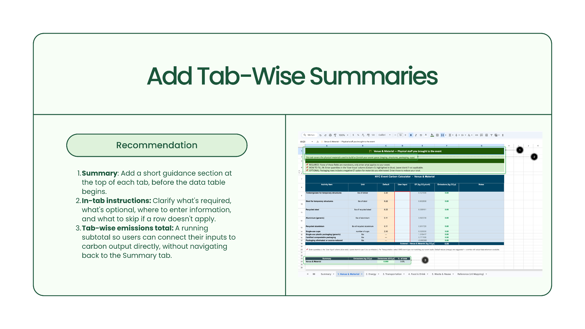
Problem 1: Users struggled to get started
Participants were unsure where to begin, which tabs applied to their event, and what information they needed to prepare beforehand. They lacked important context on how to use the calculator.
Solution:
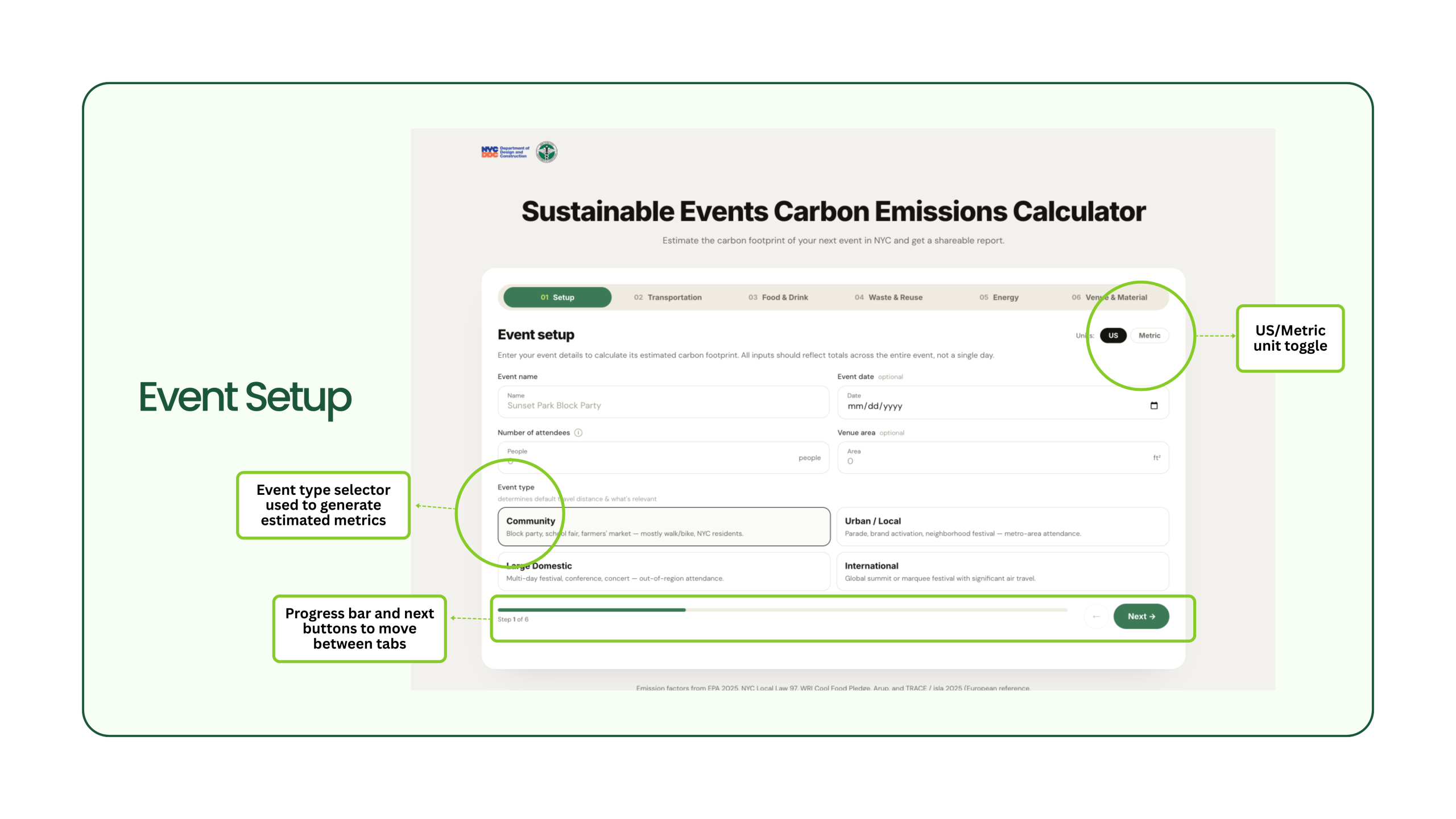
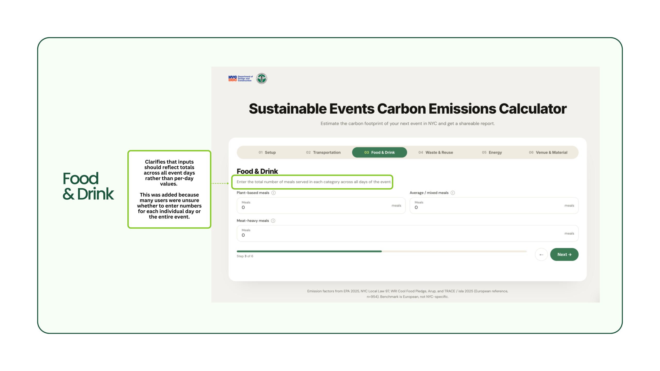
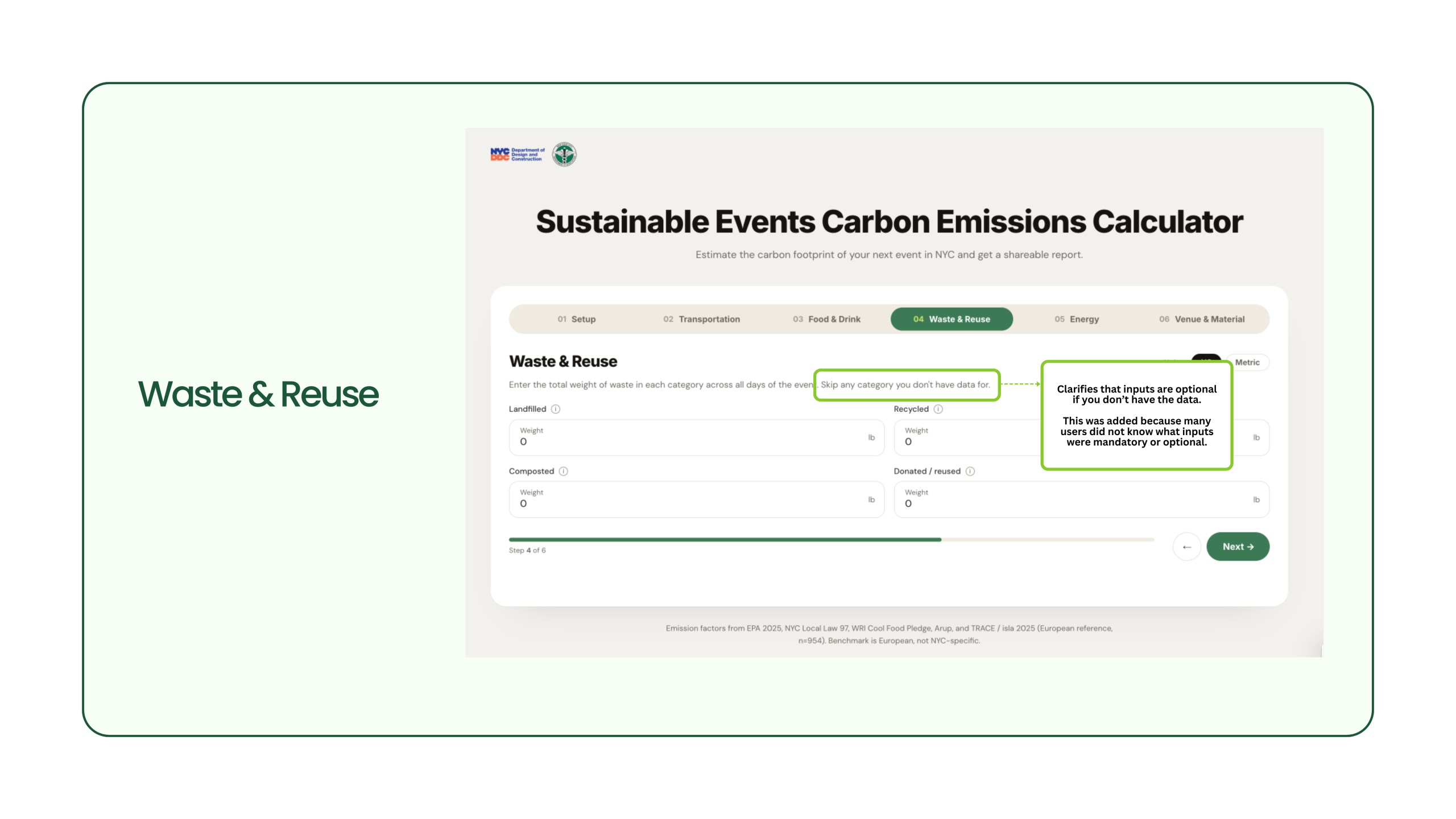
Problem 2: Inputs lacked context and guidance
Users entered sections without understanding what each tab measured, what inputs were required, or how to complete the section correctly.
Solution
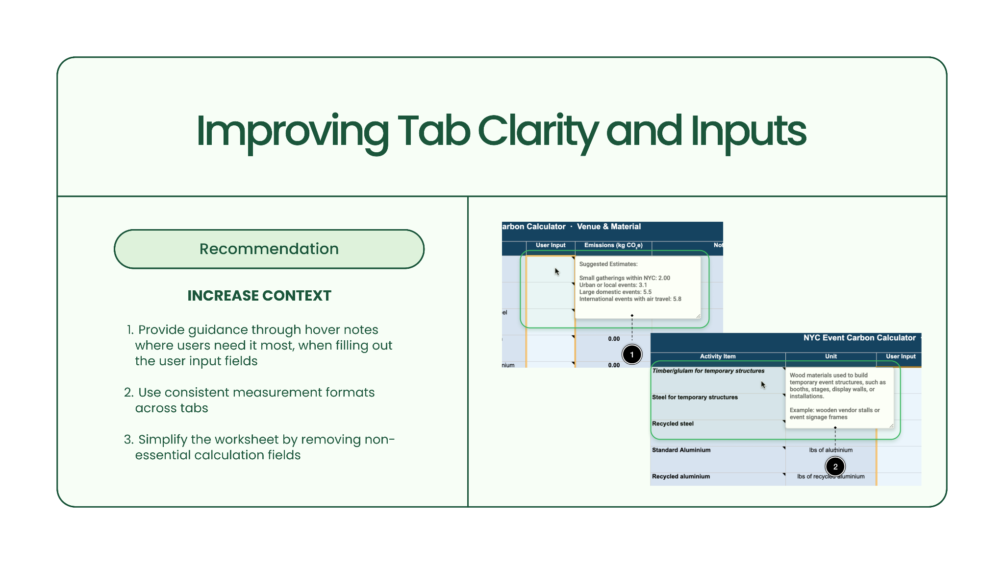
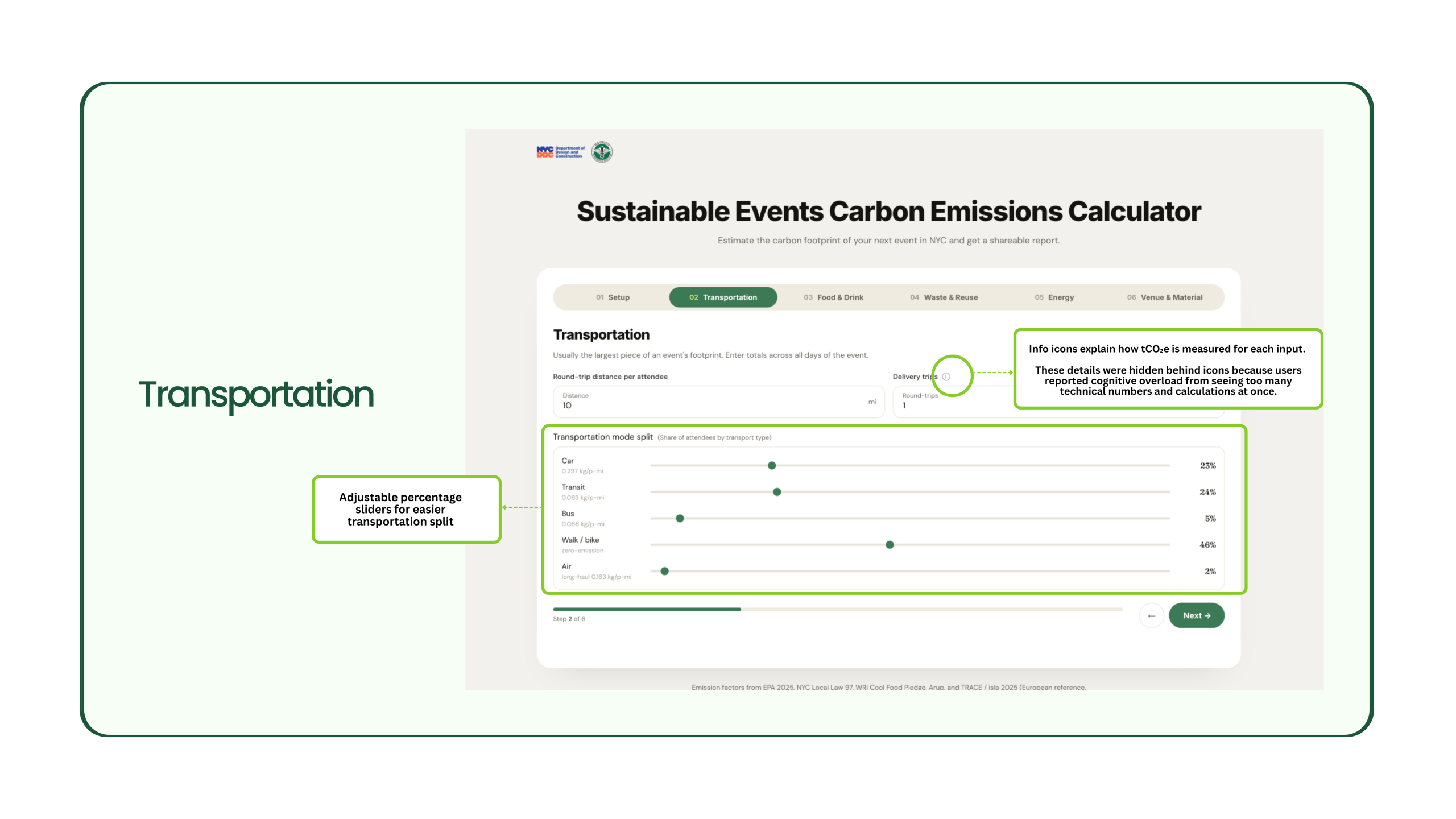
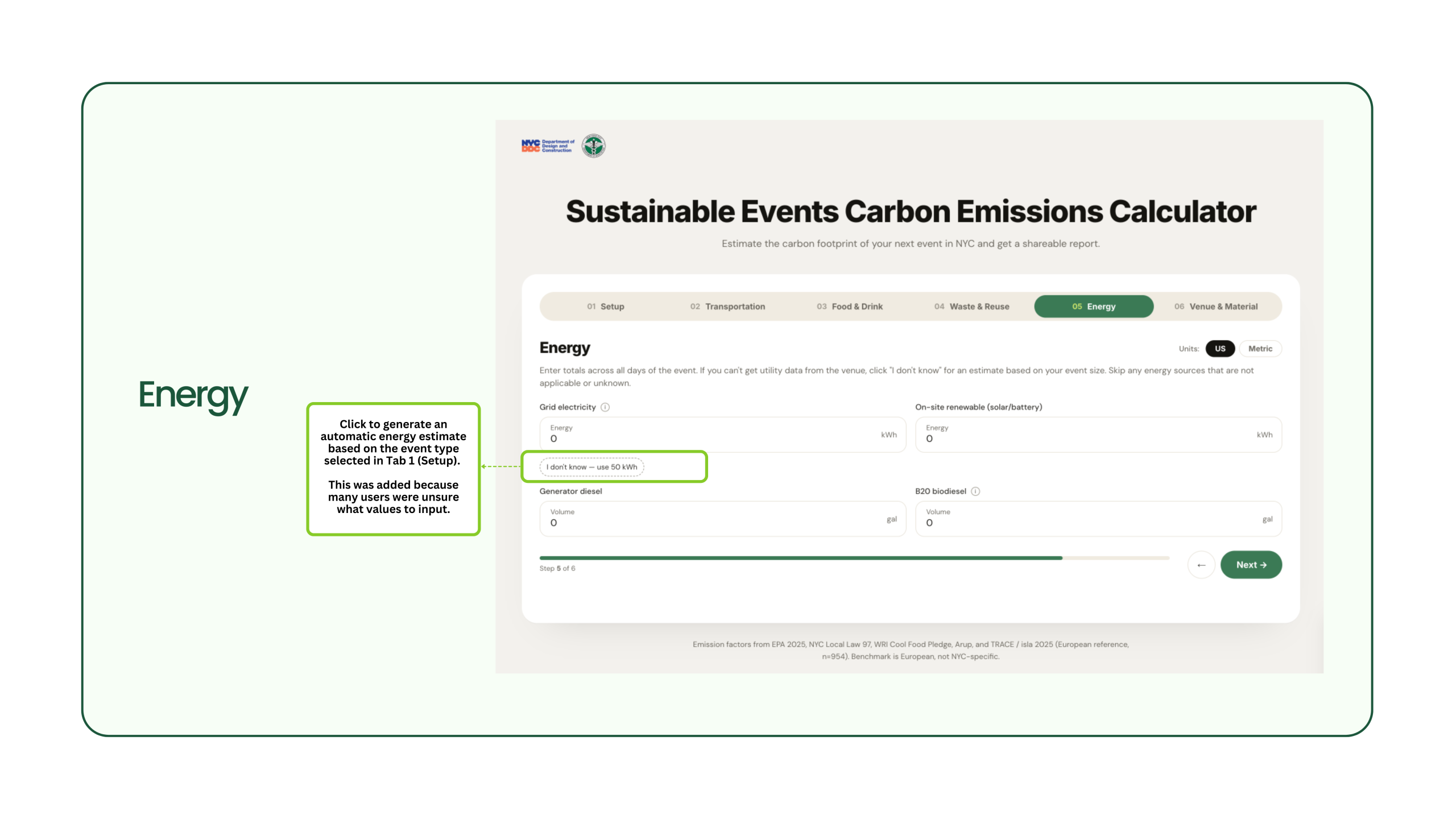
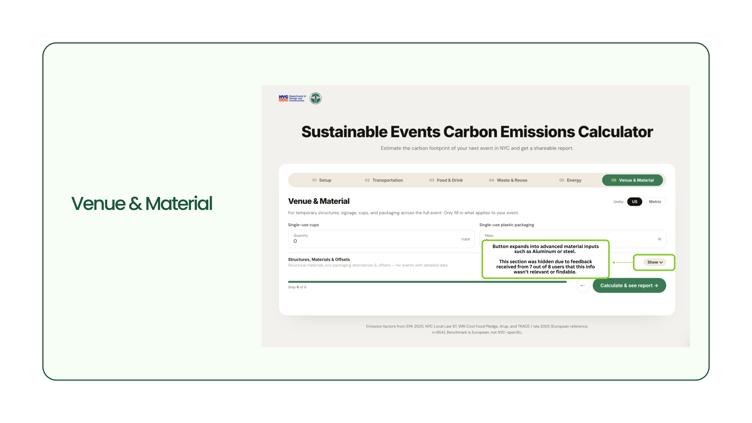
Problem 3: Technical inputs created cognitive overload
Participants struggled with technical sustainability terminology and difficult-to-estimate inputs such as steel and aluminium sections.
Solution
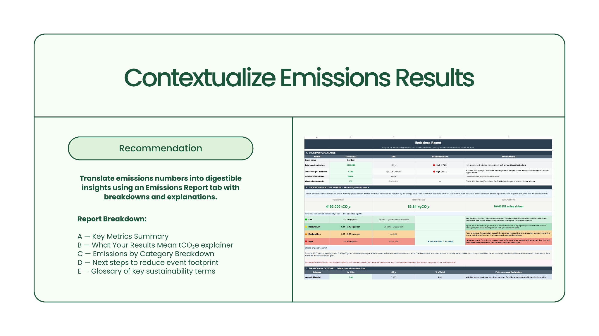
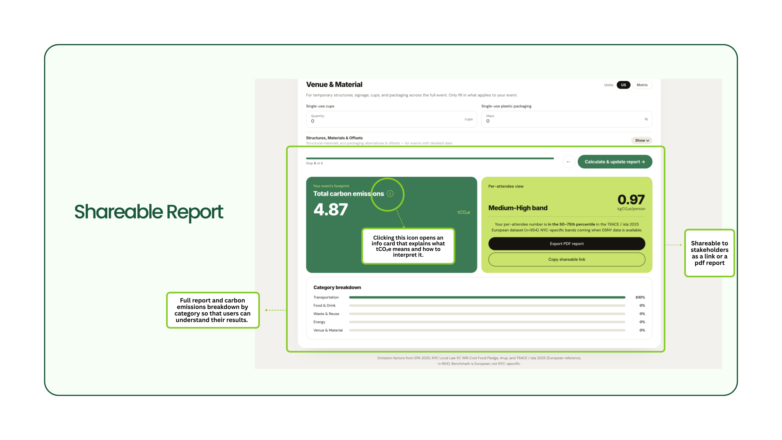
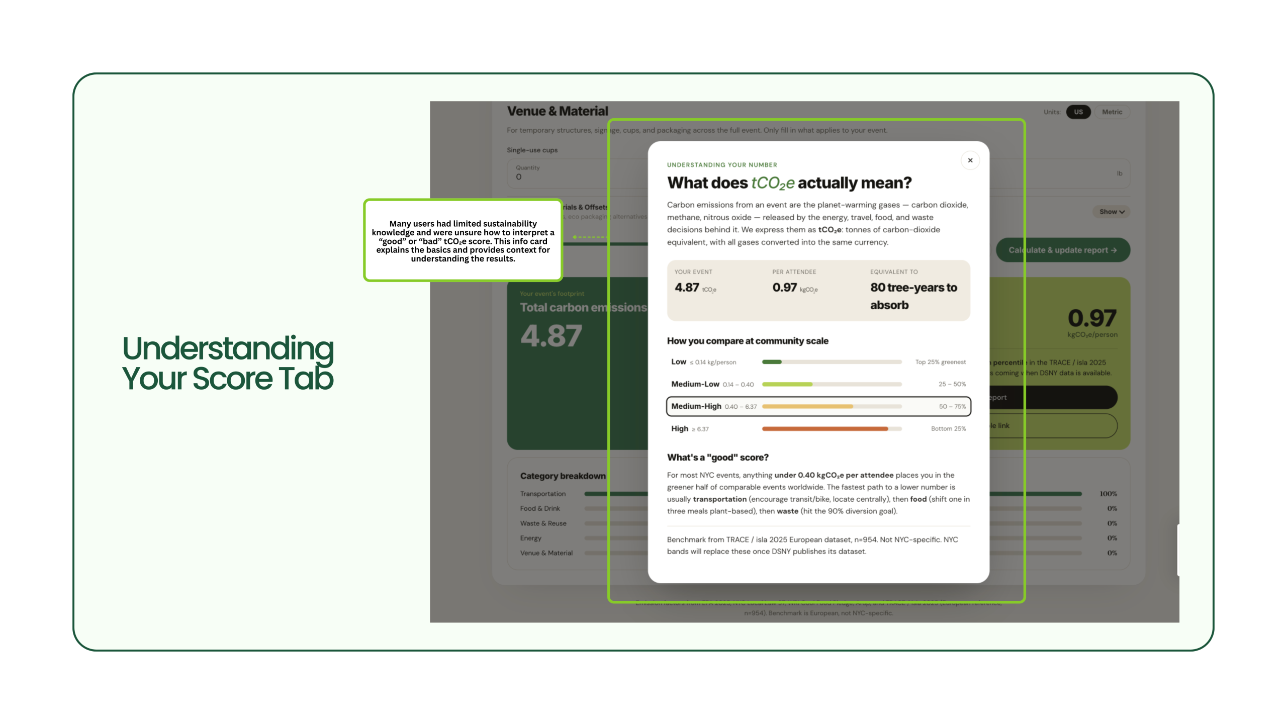
Problem 4: Results lacked actionable insights
Participants could see their emissions totals, but many did not understand what the results meant or what actions to take next.
Solution
Designing a Web-Based Future for the Sustainability Calculator
Using Claude Code and Figma MCP workflows, I was able to redesign the sustainability calculator based on our key usability problems and solutions, transforming the experience from a complex spreadsheet into a more intuitive web-based tool.
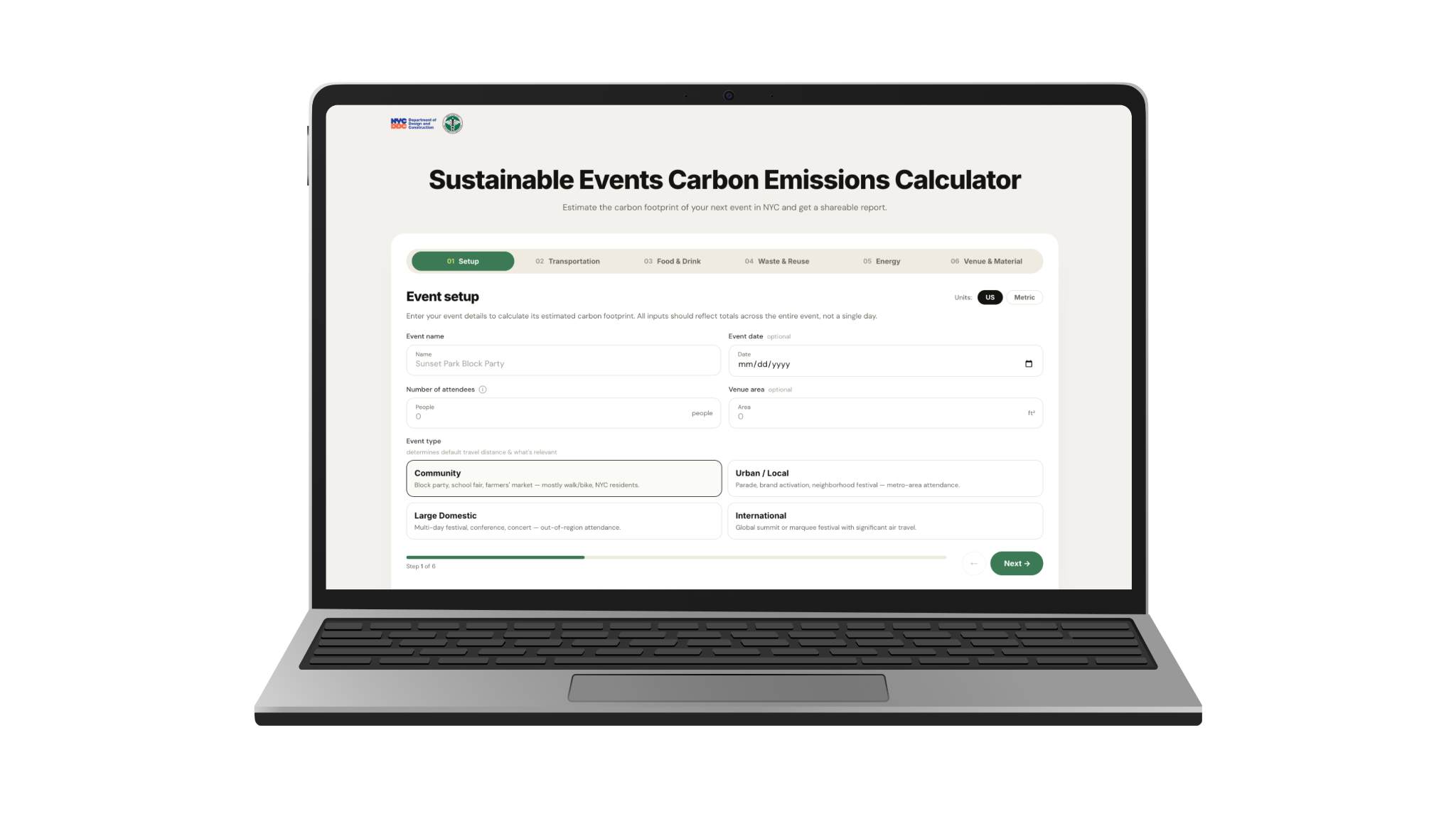
Explore the prototype here
Key improvements
Some feedback from our clients…
“This is real. This is actionable. This is perfect.”
“I’m very impressed by how thoughtful you were about getting feedback from event producers and implementing it in clear and understandable recommendations, which made the product SO much better for our users.”
At the end of the project, we presented our process and deliverables to the client. They were receptive to our research findings and appreciated how grounded our recommendations were in real user feedback.
Reflection
Overall, this project strengthened my ability to turn insights into product decisions while balancing both user and stakeholder needs.
Given more time, I would have conducted a second round of usability testing on the redesigned web experience to validate the effectiveness of our recommendations and measure improvements.
Throughout the process, I’ve learned that even the best intentions behind a tool can fall short if the experience doesn’t match the reality of how people access information.