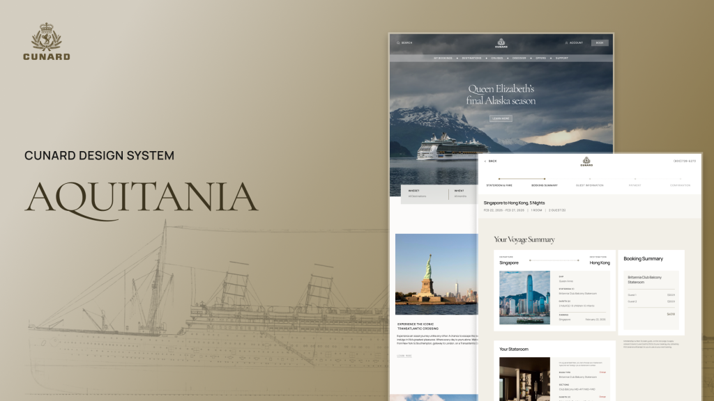
What is Cunard and the Aquitania?: Luxury Cruises & A System for Improved Digital Experiences
Cunard: A Premium Ocean Liner Company
Cunard is a luxury ocean liner that offers high-end services such as cruises and trips to various destinations. Cunard has a rich and lengthy history and was founded in 1839 by Sir Samuel Cunard. It has had many ships throughout the company’s lifetime, such as the RMS Aquitania, a British ocean liner, which served during both World Wars.
Aquitania: Cunard’s Unofficial Design System Based on the “Ship Beautiful”
The Aquitania was made as an unofficial design system for the Cunard brand to help promote the luxury experience within their digital interfaces. Its name derives from Cunard’s British ocean liner, the RMS Aquitania. This ship was designed particularly for luxury and comfort, which is the standard this design system aims to provide to its users. The name Aquitania also translates to “the Ship Beautiful,” which also applies to this design system as it aims to provide consistency, clarity and beauty to all. We found and named the system after this ship, as this ship embodies the Aquitania’s luxuriousness and robustness.
Project overview: A Sea Brief of the Aquitania Design System
Project:
Cunard (Desktop)
Timeline:
10 weeks
Goal:
To create a design system that elevates Cunard’s digital experience, making it look more luxurious and accessible to all users.
Team:
Jasmin Rose Guerrera, Jane Hsieh, Atharva Nayak and Zach Hojibeine
Role:
UX Designer and Researcher
Tools:
Figma, ZeroHeight
The Main Problems: Too Many Inconsistencies & Visibility Stowaways!
How might we create a design system that elevates Cunard’s digital experience, making it look more consistent, luxurious and accessible to all users?
The overarching problem within Cunard’s digital experience is that it is made up of various design elements that are inconsistent and inaccessible. It also has an overwhelming amount of information, resulting in an overcrowded experience, which does not match the premium experience Cunard continuously promotes. We faced many challenges along the way, such as hidden accessibility issues, struggling to balance lengthy but necessary information within cards and researching strategies for designing a more premium digital experience. We targeted three main issues to get to the source and see why Cunard’s digital interfaces needed a design system.
Issue 1: Layout Inconsistencies within Tabs and Cards
Many of the inconsistencies within the tabs and cards include a mix of typefaces, styles, font sizes and interactive states. The layout within the cards is also structured differently, with text being aligned on the left or in the center, with no clear hierarchy.
Issue 2: Accessibility and Transparency Issues within Buttons and Carousels
Accessibility issues, on the other hand, were found within a multitude of buttons. Many buttons within Cunard are not fully visible due to transparency and opacity issues. These issues can often be found within Cunard’s carousels as well, with a lack of icon and navigation visibility that do not pass WCAG Guidelines.
Issue 3: Non-Premium and Overcrowded Experiences Within Webpages
Many webpages within Cunard leave very little breathing room while also having an overwhelming amount of travel information. This includes cards being extremely close together, users being unable to distinguish between different areas of the interface and a multitude of lengthy lists of links and text.
My Role as an Auditor, Researcher and Designer
My roles consisted of deconstructing the system, redesigning cards, buttons, sections and doing an accessibility audit of the UI kit. I also organized the system, went over the naming conventions of each component within the UI kit, and organized the information architecture. I was then responsible for the documentation of the colors, shadows, border, spacing, grids, Z-index, icons, graphics, cards, sections, images, navigation bars, tabs and inputs. I also worked on the documentation resource and tools pages, design principles, part of the getting started pages and part of the contribution page. I then read over the full documentation, edited it and did a final pass over each page. I then worked on and pitched the design system with my team.
The Travel Process: How did we Deconstruct Cunard and prep it for a More Luxurious Voyage for all Passengers?
The Travel Process Consists of 8 Steps
- Deconstructing & Analyzing Cunard: Taking it Apart Piece by Piece
- Determining our Four Design Principles for the Cunard Design System
- An Accessibility Audit & A Competitive Analysis: Ensuring Luxury, Consistency and Reliability on the Aquitania
- Every Man overboard!: Realizing a Redesign for the Design System was Imperative to Meet Cunard’s Principles
- The Creation & Publishing of the UI Kit: Determining the Ship’s Foundation and Components
- Making Users Physically Walk the Plank: User Testing Reveals a Lack of Sections and a Card Naming Issue
- Documentation: The Captains Ship Log for How to Use the Aquitania
- Pitching to Cunard: Why Should we all Set Sail on the Aquitania?
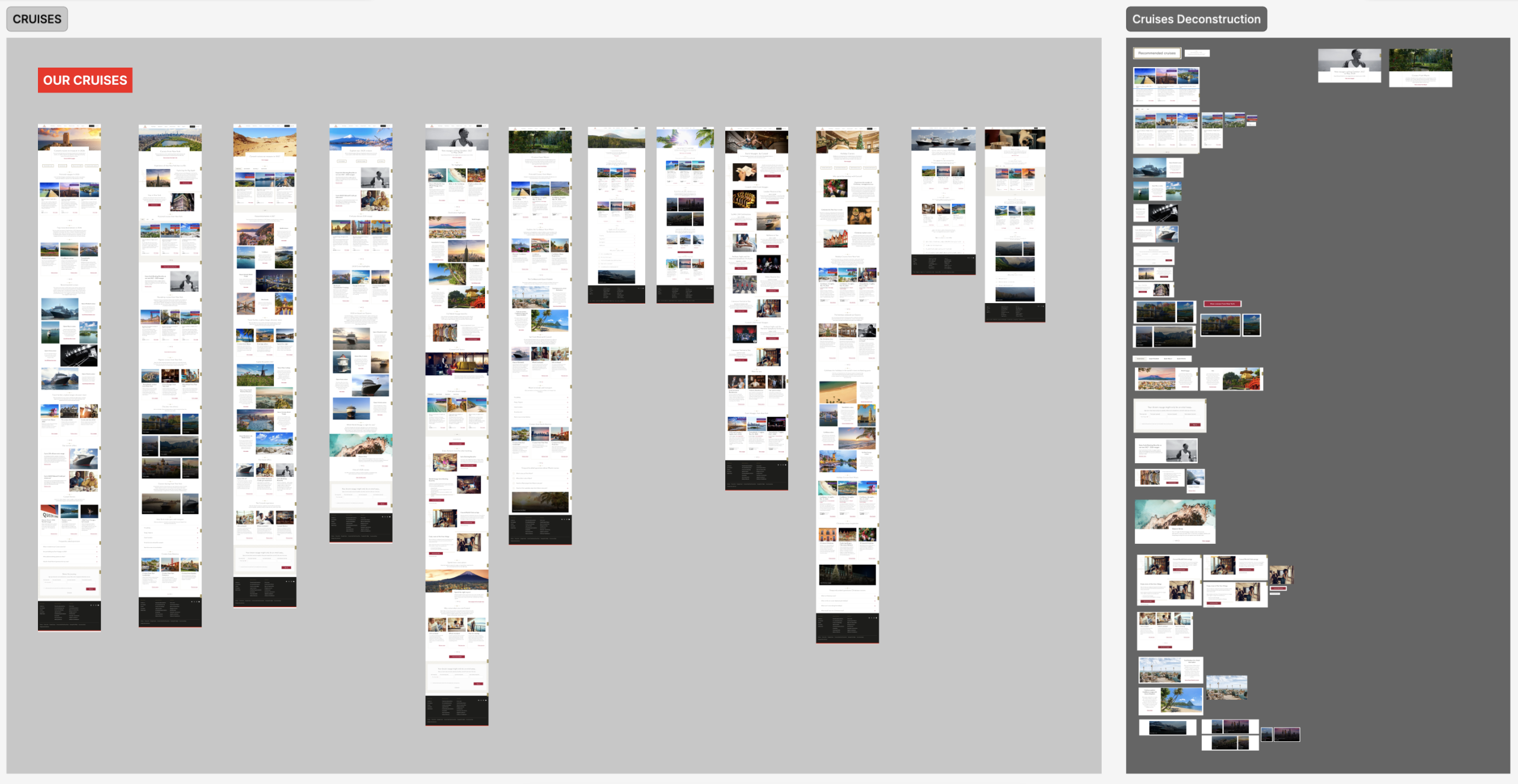
1. Deconstructing & Analyzing Cunard: Taking it Apart Piece by Piece
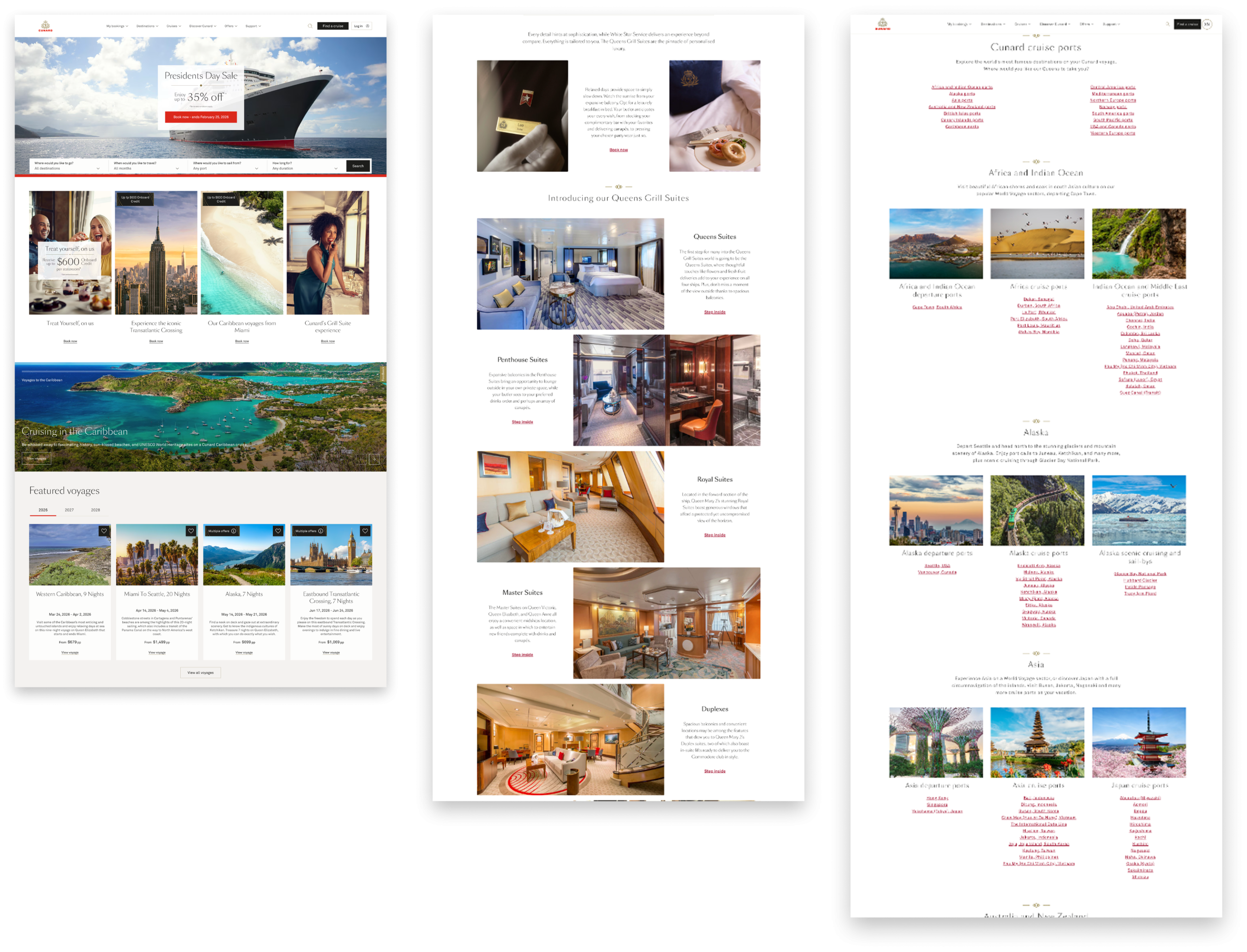
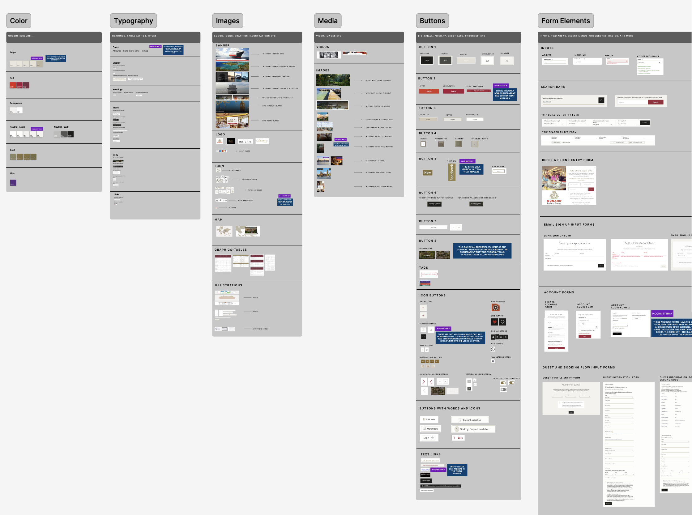
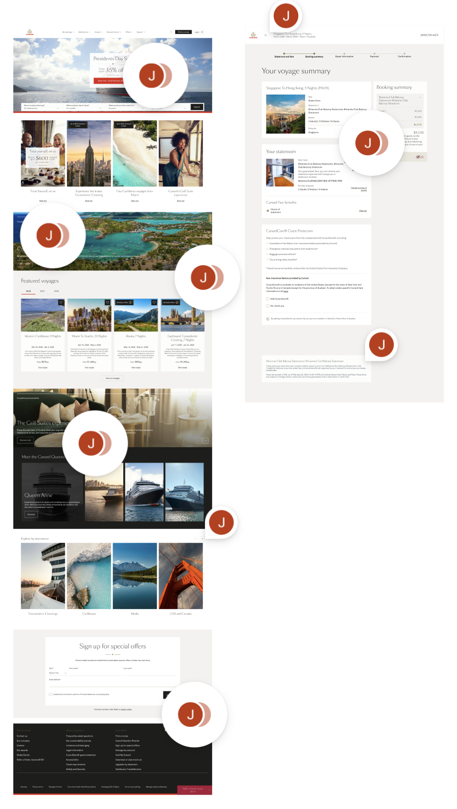
We began by taking apart and analyzing the Cunard website. We looked over ten different sections within the website, such as the home and basic pages, booking pages, destination, cruise pages, offers, support pages, etc. We then broke them down into pieces to analyze the main building blocks that made up the Cunard interfaces. These pieces were then organized into categories such as color, typography, navigation, images, media, buttons, form elements, blocks, icons and sections. We proceeded to find, tag and then annotate any patterns or main issues that popped up within these design elements. We did this to see where the issues within Aquitania’s interfaces existed and which core issues we should focus on as we delve into improving Cunard’s web pages. This process helped us to determine our scope and find the following five insights that determined the rest of our design system’s creation.
Five Insights Help us Navigate and Determine the Scope of Our Design System’s Voyage
After deconstructing the website, we found five main insights, which then helped us determine our scope for our design system.
Insight 1: Typography and Color Variations
The site uses multiple variations of the same color with different hex codes. For instance, there are five different shades of ‘white’ alone, which creates a inconsistency of user experience. Similarly, while Akkurat and Sang Bleu Sans are the primary typefaces, Times New Roman appears randomly in several places. This lack of consistency suggests that the design standards weren’t fully adhered to during development.
Insight 2: Multiple Versions of Components that Have the Same Purpose
The site features multiple versions of components that serve the exact same purpose. For instance, the ‘Log In’ experience is inconsistent: one version uses a container-style input with a red button, while another uses underlined fields with a black button. The issue creates a confusing user experience and lack of brand consistency.
Insight 3: Transparency Inconsistencies Affect WCAG Compliance
Multiple elements use different forms of transparency within the website. This includes one semi transparent red button, transparent icon buttons and multiple white font or white outlined transparent buttons located over images. Often these elements rely on the background image for contrast, which means they will not consistently pass WCAG guidelines. This is a prominent accessibility issue that needs to be addressed.
Insight 4: The System Must Reflect Cunard’s Brand of Luxury Ships & Aesthetics
Cunard is a luxury cruise line, so the website should convey a premium experience. However, inconsistencies, poor image quality, and uneven visual styling in some areas make the site feel less polished and weaken the overall luxury impression.
Insight 5: Confusing Main Navigation Bar and Redundant Pages
The main navigation bar often repeats the same web pages multiple times which can cause the website to look much more overwhelming than it actually is for users. For instance, the “Popular Destinations”, the “Americas” and the “Our Cruises” options all have the same “Transatlantic Crossings” web page as a possible choice. The “The Grill Suite Experience” option also appears twice in the “Our Difference” and the “Grill Suites Experience” sections. The main navigation bar does not need this many sections and can be further simplified.
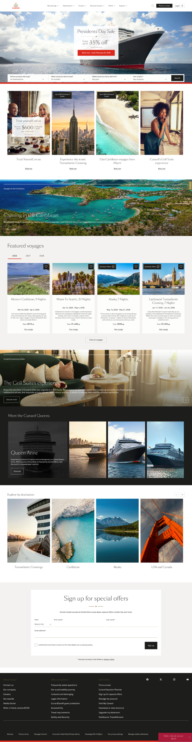
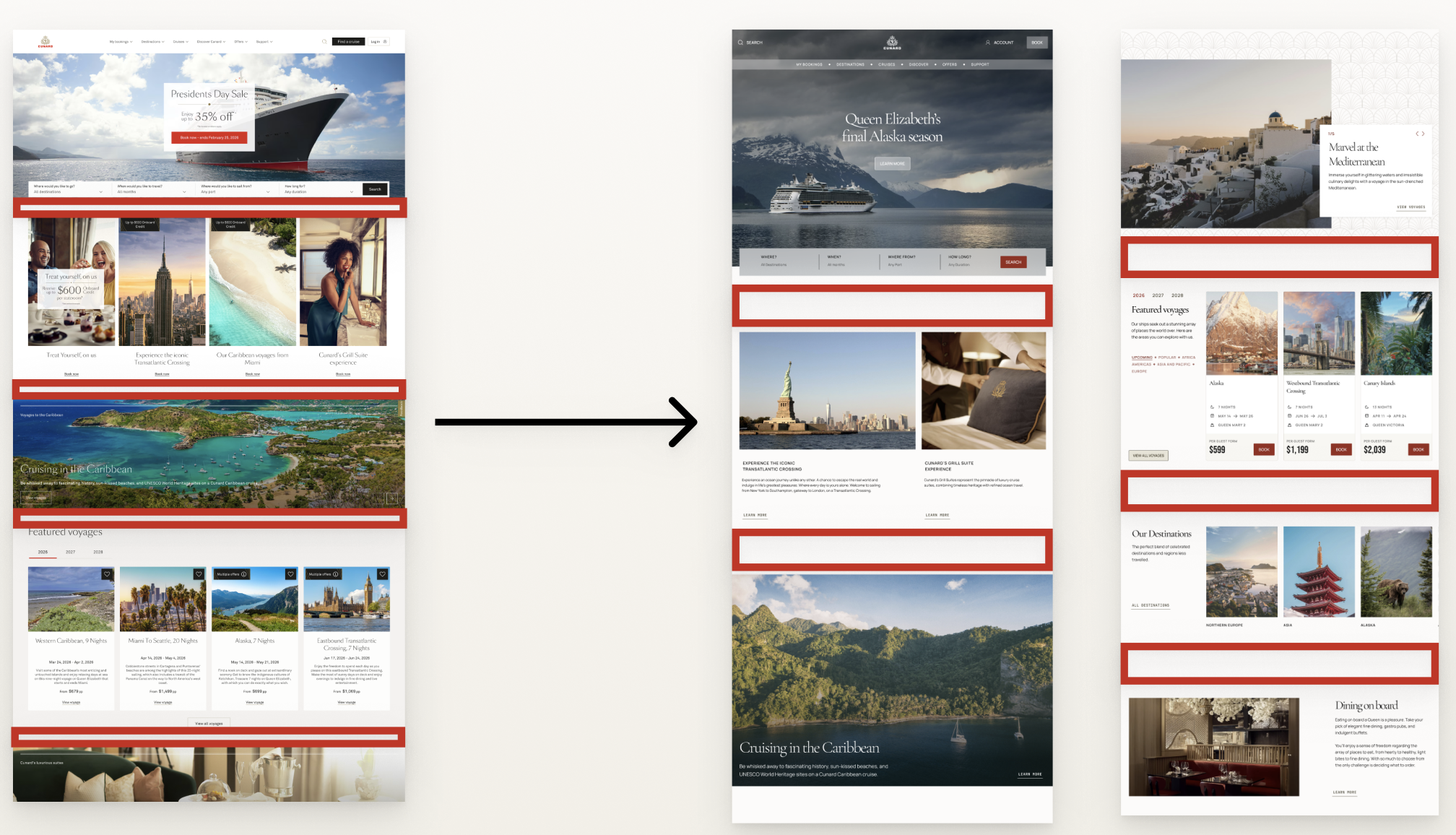
Five Insights Lead us to The Home and Booking Page
When beginning to organize our design system, we chose two main pages to center its construction on. We chose the home page because it contained many of the design elements we found issues with within our deconstruction. This includes the typography and card inconsistencies, carousel’s accessibility and even navigation issues and repetitiveness. We also chose the booking page as we wanted to create more discoverable cards specifically for the booking process.
2. Determining our Four Design Principles for the Cunard Design System
We were able to choose four main principles based on the information found within our deconstruction and five insights. We decided to focus on accessibility first, as the Cunard website already focuses on making the physical experience for their passengers accessible when on a cruise ship. Therefore, we wanted to extend this accessible experience online, too. We also focused on luxury and discoverability to build trust with users and create better readability among different sections within the interfaces. This was a necessity because Cunard, by default, has a lot of information, and communicating this information in a way that is easy to scan is important for users to feel confident with the ocean liners’ services. We also focused on consistency, as many issues revolved around components looking similar, but often having noticeable and unnecessary differences. This often led to Cunard looking unorganized and unprofessional. These principles helped give us direction as we began diving into and building the UI Kit.
Accessible
Accessibility is a core principle within the Aquitania. Cunard prioritizes accessibility for all passengers, whether it be in a physical environment or online.
Luxurious
Cunard is known for its elegant and high-end voyages. Therefore, Aquitania must reflect this type of luxury and grandeur within its components.
Discoverable
Aquitania must promote ease of use. Users should not be struggling to find important information regarding their voyage. Aquitania must demonstrate Cunard’s services in a way that promotes happiness, discovery and adventure.
Consistent
Aquitania promotes refined experiences. Consistency throughout Aquitania is key to ensuring information such as prices and the dates of voyages remain consistent, accurate and up to date at all times.
3. An Accessibility Audit and A Competitive Analysis: Ensuring Luxury, Consistency and Reliability on the Aquitania
An Accessibility Audit Reveals Transparency, Color Contrast, Repetition & Layout Issues
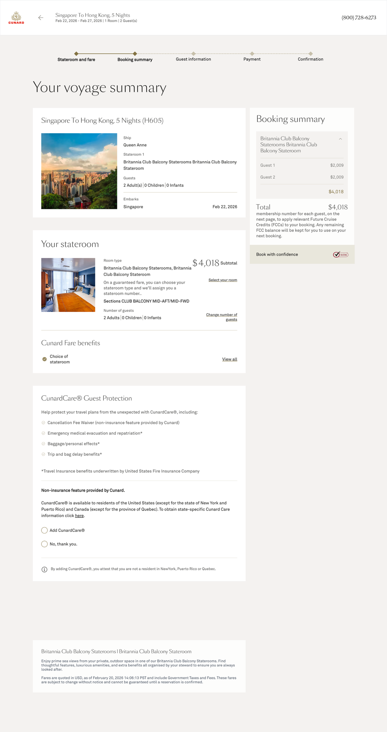
Before delving straight into building the Aquitania, we did an accessibility audit and researched which parts of the interface had major discoverability issues. We found that tabs, carousels, buttons and semi-transparent design elements had the most accessibility and color contrast issues. We also analyzed the booking process cards to see which parts did not stand out or could be labelled more concisely to further help users when scanning over their information. We found that the titles, room labelling repetition, price and editing links could cause potential difficulty for users. This was because this information was often lengthy or hard to find within components. This step helped us learn which parts would need the most of our attention or necessary alterations when beginning our UI Kit.
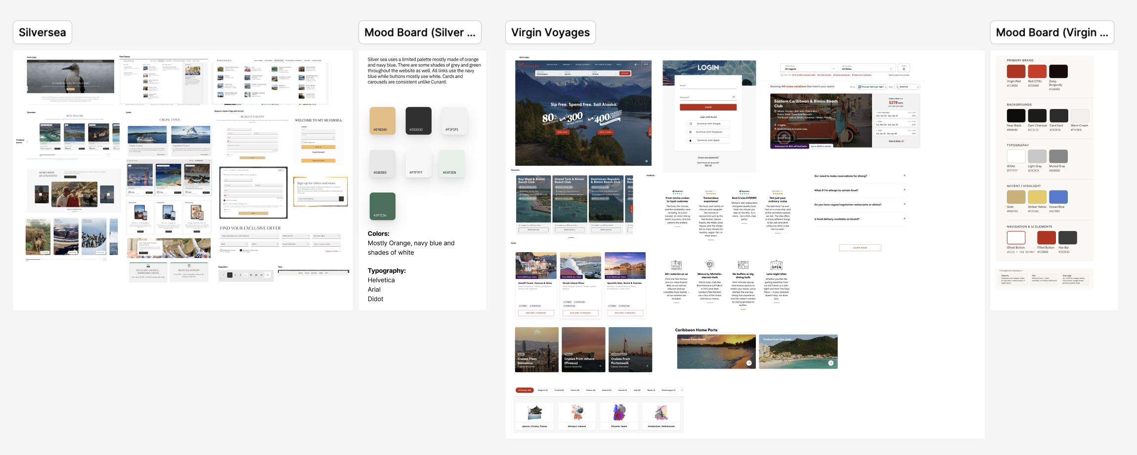
Competitive Analysis & Mood Boards of Luxury Ocean Liners
We also took a look at other luxury companies, such as Silver Sea and Virgin Voyages. We did this to get a sense of how other ocean liners create luxurious and clean interfaces. We found that there were clean text overlays, concise labelling, wider spacing layouts and much more consistent color palettes. We also found that they utilized graphics that felt modern, which would not completely match the Cunard brand due to its heritage. After doing the competitive analysis, we knew that using clean text overlays, concise labelling and wider layouts would be elements we could incorporate within our redesign. However, we still did not know which graphics we could utilize to give Cunard a more luxurious look while still reflecting its rich heritage and history.
4. Every Man overboard!: Realizing a Redesign for the Design System was Imperative to Meet Cunard’s Principles
We wanted to redesign foundations and components only slightly at first, but after the accessibility audit and competitive analysis, we realized we needed to make many more changes than we had initially anticipated if we wanted to represent a premium experience. However, we still did not fully know how to represent luxury with graphics in Cunard just yet and what the best strategies would be to do so at first.
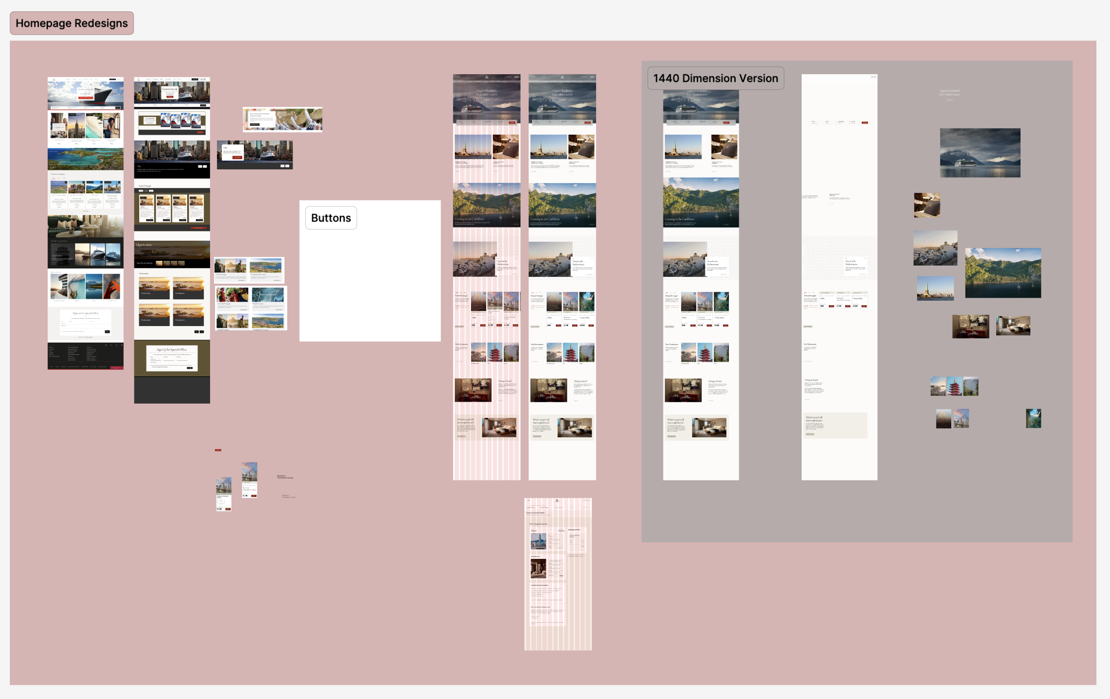
Dividing and Conquering: Redesigning Separately and then Comparing
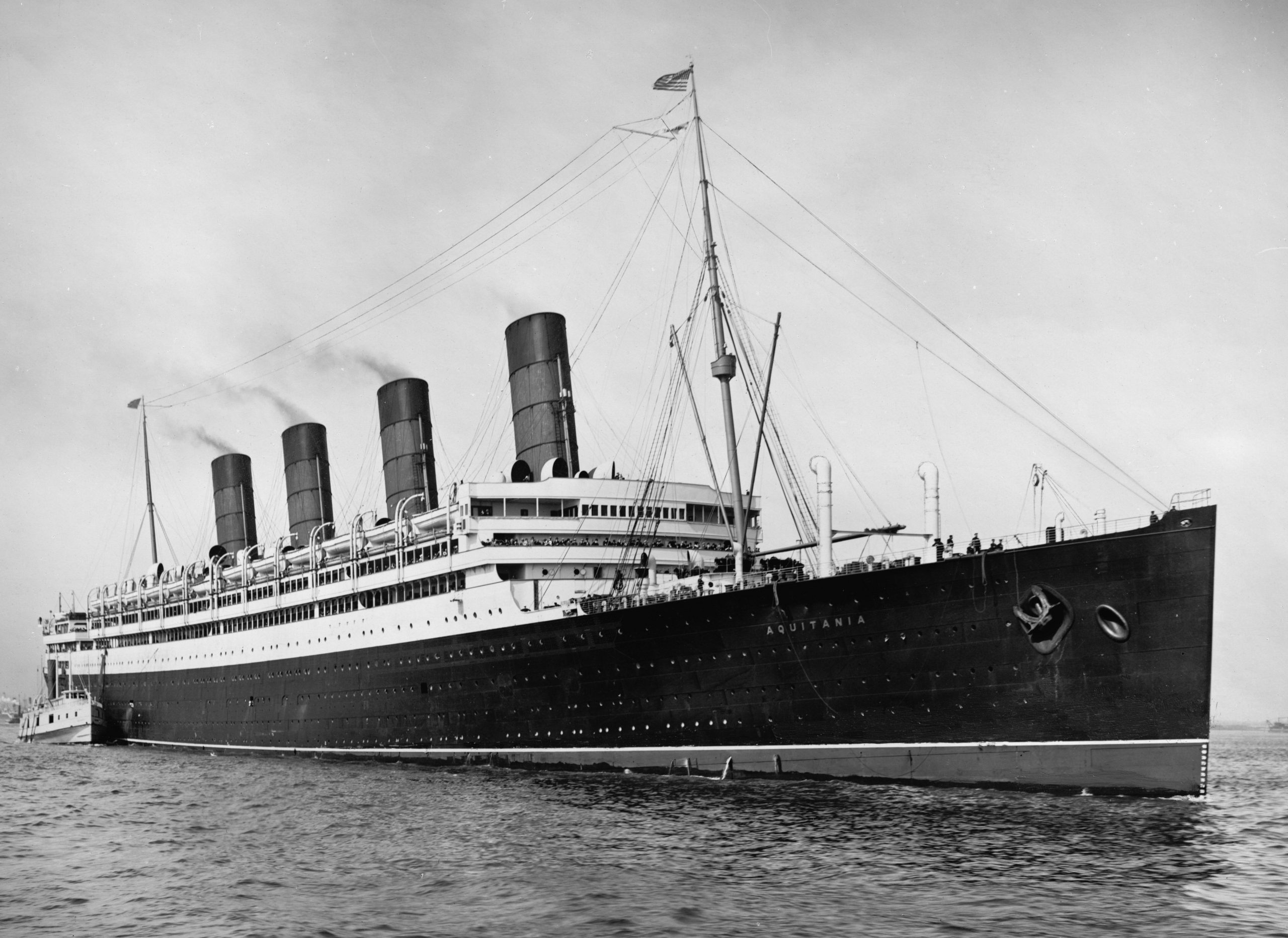
As a team, we decided to make our own redesigns of the main home page separately first. We then revealed our separate designs to each other to help further the brainstorming process. Once we met up, we picked apart each of our designs, selecting specific components we found best promoted the premium experience and putting them back together like a puzzle. Through this strategy, we decided that Art Deco and using graphics of the ship, the RMS Aquitania would be the best way to create a sense of luxury for Cunard within their design system.
The Final Styling Decision: Art Deco and Aquitania Graphics
We settled on using Art Deco due to it being commonly used with luxury services like hotels and other ocean liners. Art Deco is a decorative arts movement that began during the 1910s and 1920s. It was first exhibited in Paris and became popular in the United States during the 1930s, with books like The Great Gatsby pulling inspiration from it. The movement revolves around crafting and stylizing luxurious items. It also provides a sense of sophistication and wealth. Additionally, it is known for its clean and repeating symmetrical geometric shapes which match the luxurious style we wanted to represent. Art Deco was part of our inspiration while creating the system to deliver a luxurious, consistent and clean-cut experience.
The RMS Aquitania was a British Cunard ocean liner that had a successful and long service between 1914 and 1950. It was known for its professional and luxurious style. The Aquitania design system reflects the same luxurious service that this ship brought to Cunard passengers long ago which is why we felt bringing some graphics of the ship may help reinforce the premium experience as well. Both elements derive from the same time period around the 1920s, making them a cohesive match to promote Cunard’s heritage and particular style.
5. The Creation and Publishing of the UI Kit: Determining the Ship’s Foundation and Components
When creating this design system, we followed Brad Frost’s Atomic Design strategy. This meant that our process was split into three main categories: atoms, molecules and then organisms. We followed this structure by creating atoms first. These atoms would then be implemented into our molecules. and, our molecules would then take part in the creation of our organisms. This strategy allowed our design elements to evolve and be updated more easily.
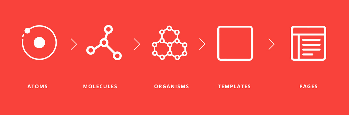
Atoms: Determining our Main Foundations: Colors, Typography and Spacing
We developed many tokens for our foundations, such as colors, shadows, grids, typography, borders, z-index, icons and graphics. However, there were three main foundation elements we focused on and utilized the most as our base for the Aquitania. These foundations were chosen to boost consistency, luxury, accessibility and ease of use. They helped us to create a base and structure for our interfaces and components. These foundations taught us that having a solid set of variables would further set us up to create the luxury interfaces we were aiming to create. It also helped us as a team to remain on the same page when designing more complex elements.
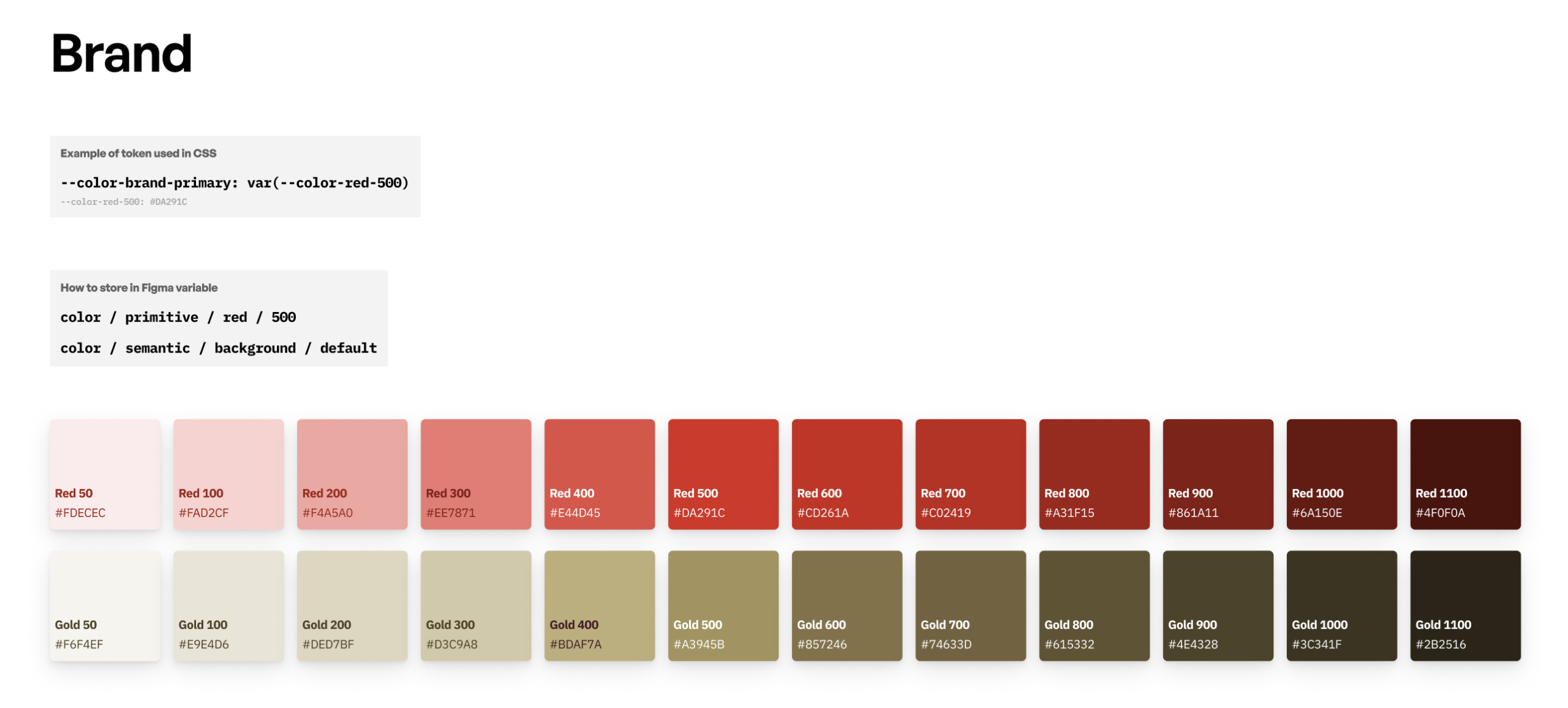
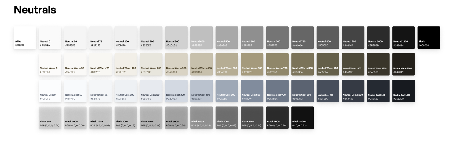
Colors Within Aquitania: A Set of Brand, Neutrals and Palette Colors
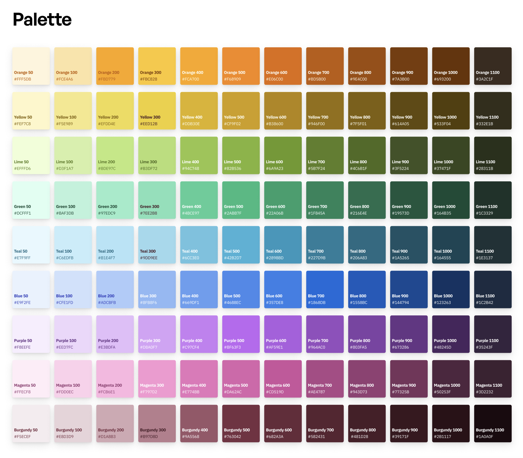
The color primitives are the base and foundational layer of our system. When we delved into Cunard and decided colors for the Aquitania, we knew we had to create a set of brand and neutral colors first. This was due to our deconstruction revealing that multiple colors were inconsistent throughout most of Cunard’s interfaces. Therefore, to create consistency, we made a specific set of red and gold brand colors for designers and developers when using the Aquitania system. While a set of neutrals was made for backgrounds, text and disabled states. We then added a set of palette colors for when a need for an additional color use arises. This includes uses for additional promotional or holiday events.
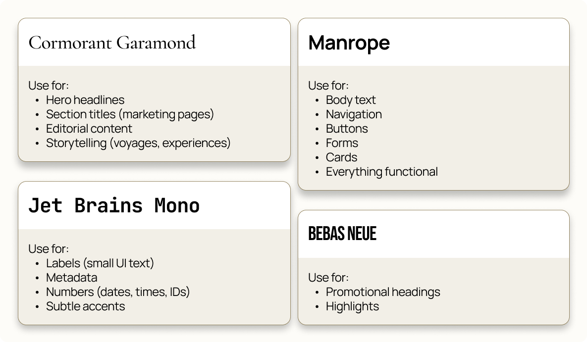
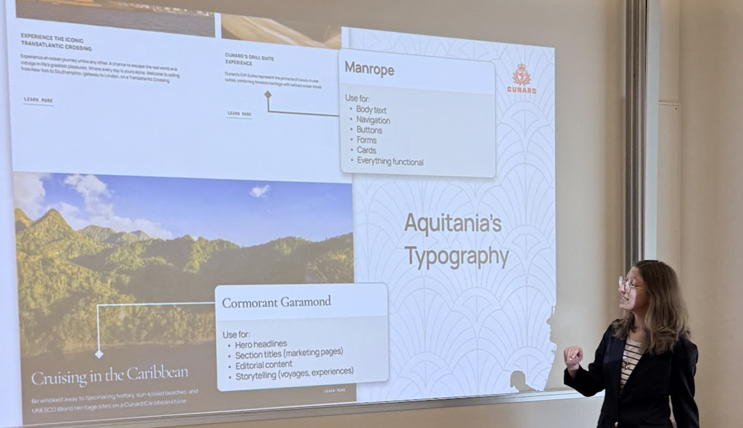
Typography: Stylized Typefaces for a Premium Experience
Aquitania uses these four main open-source typefaces: Cormorant Garamond, Manrope, JetBrains Mono and Bebas Neue. They each have specific uses to create consistency and hierarchy among bigger components such as cards, navigation or input elements. These fonts were chosen for their premium style as well, with Cormorant Garamond and Manrope providing the best balance between readability and a luxurious style. Cinzel Decorative was also used, but only appears rarely for quotes.
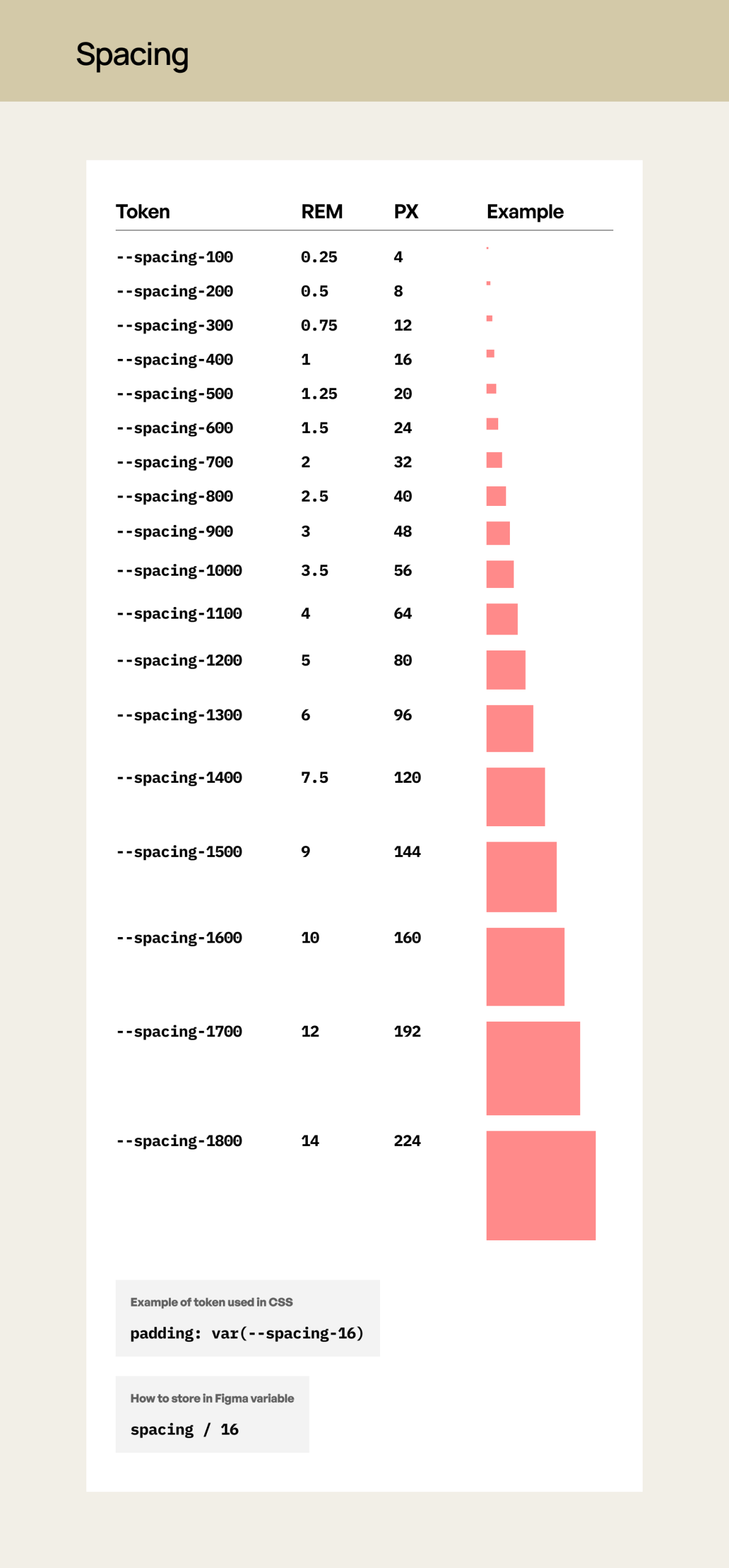
Spacing Tokens: Increasing the Distance between Elements for More Readability and Impact.
Aquitania’s standard spacing guidelines use defined rem and px values. The tokens scale progressively to support various spacing layouts. Spacing was built to be used in coordination with the grid system to create consistent alignment across the Aquitania. Spacing tokens also scales progressively to allow Cunard to increase the readability of its interfaces. Cunard has a lot of information it needs to communicate to its audience, therefore, we chose a wider layout and spacing system to further help with the overcrowded nature Cunard’s interfaces presently face.
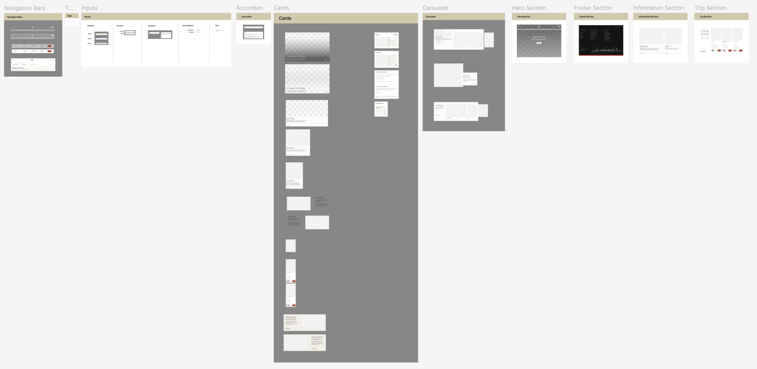
Molecules and Organisms: Determining our Components and their Purposes
After determining our foundations, we then began building our molecules and organisms. These design elements included navigation bars, accordions, tabs, inputs, cards, carousels and sections. We referenced our atoms while building these components out in order to ensure all design elements kept a similar hierarchy, consistent colors, typography and layouts.
6. Making Users Physically Walk the Plank: User Testing Reveals a Lack of Sections and a Card Naming Issue
We conducted a total of four in-person user tests to attempt to pinpoint if there were any components missing. We conducted these tests to ensure that any existing glaring issues within our design system’s UI Kit could be resolved. We assigned each tester the task of recreating the home page and the booking page with the components provided in the kit. Each test revealed two specific issues within the UI Kit, such as three missing sections (Hero, Trip and an Information Section) and a card labelling and naming confusion issue, which we consequently fixed. 2 out of the 4 users also felt confused by the overwhelming amount of information and components found in our UI Kit. They said the system was complicated to read through at first glance and that they wished there were instructions that they could have followed while attempting to build the web page. This led us into the next step of our process, documentation.
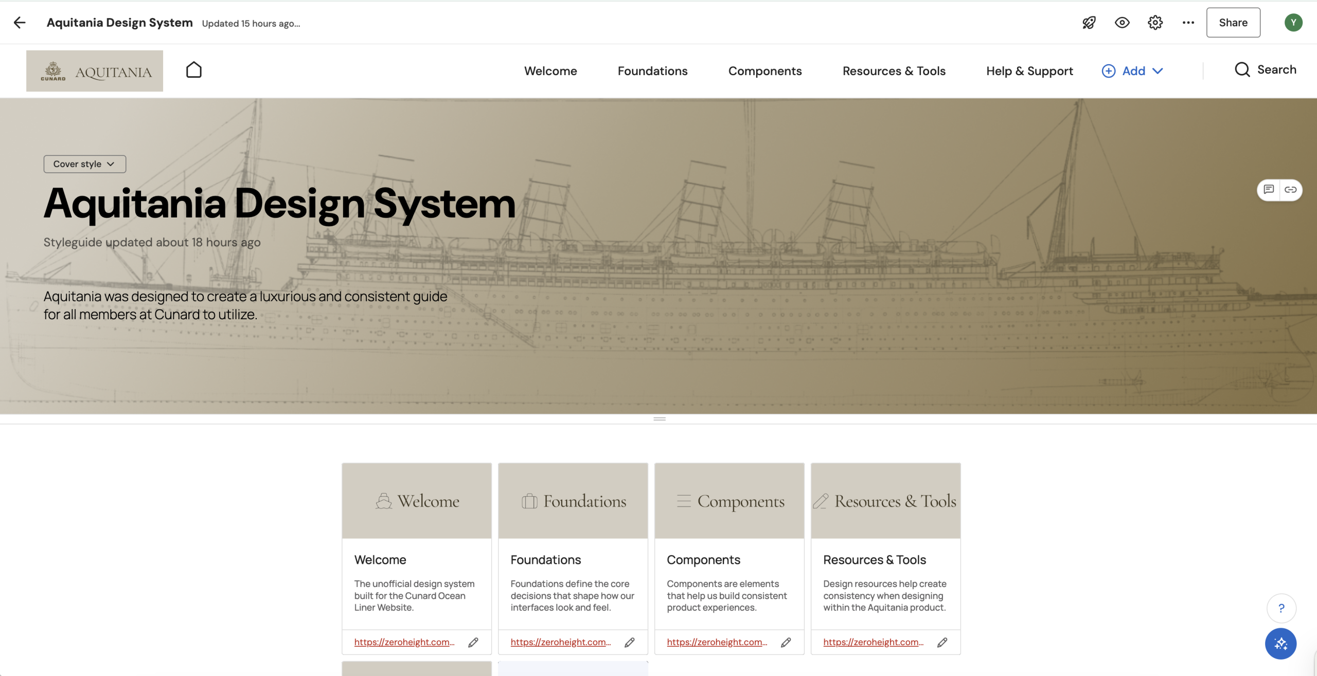
7. Documentation: The Captain’s Ship Log for How to Use the Aquitania
This step required us to document the foundations and components of our UI Kit to allow designers, developers and anybody at Cunard to be able to utilize our kit more efficiently. We documented our design system on ZeroHeight with each component page having a specific structure with guidelines of how to use them, an anatomy section where each component is annotated and an accessibility guidelines page. The documentation also provides resources for the RMS Aquitania and Art Deco graphics, as well as a place to contribute or ask for further guidance. Through this step, we learned that documenting our design elements was the best way to ensure users would feel less overwhelmed when navigating our UI Kit. However, we did face the struggle of balancing our documentation between providing sufficient guidelines and being too inflexible or restricting designers’ creativity.
8. Pitching & Persuading Cunard: Why Should we all Set Sail on the Aquitania?
As a group, we then pitched our design system to showcase Cunard’s issues and Aquitania’s solutions. We demonstrated this by visually showing the problems, solutions and a demo of the new interfaces. We also explained the benefits and strategies on how to integrate the system within the company. We did this to help show the usefulness of having a system and to increase the adoption of the Aquitania within Cunard, since having a design system does not inherently mean it will be adopted within a company. We learned that visually showing the changes was the best way to explain the redesigns. However, we felt we could have explained our spacing and how we avoided overcrowded layouts more extensively within our presentation.
The Solutions: Keeping Cunard Afloat and Ahead of the Current!
The Aquitania was built addressing the consistency, accessibility and layout issues by providing consistent and easy-to-scan components, creating buttons and carousels that pass WCAG guidelines and by increasing spacing between sections in the interface. All these elements contributed to creating a more luxurious experience as a whole within Cunard as well.
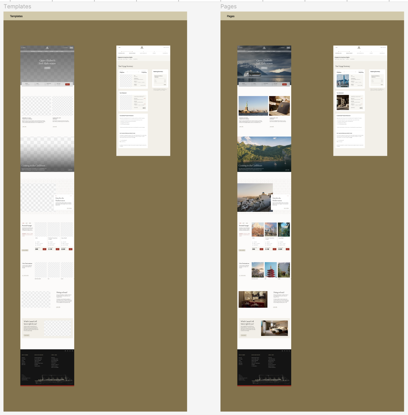
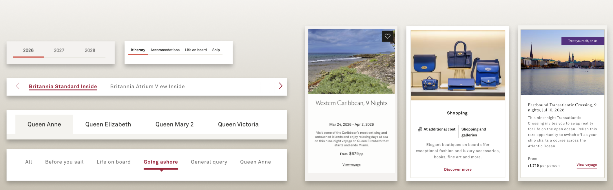
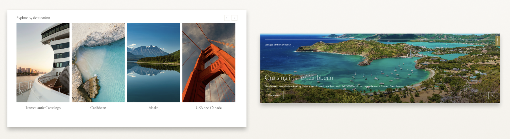
Solution 1: Consistent and Organized Voyage and Booking Cards
Cards were organized between two categories: Voyage and Booking Cards. Voyage cards are for browsing information such as cruises, destinations, trips, ships and suites. While the Booking Cards are for the booking flow and booking process. This was done to help designers save time when creating interfaces. Cards were also each given a specific hierarchy, starting with an image or title, with text aligning towards the left and following consistent typography.
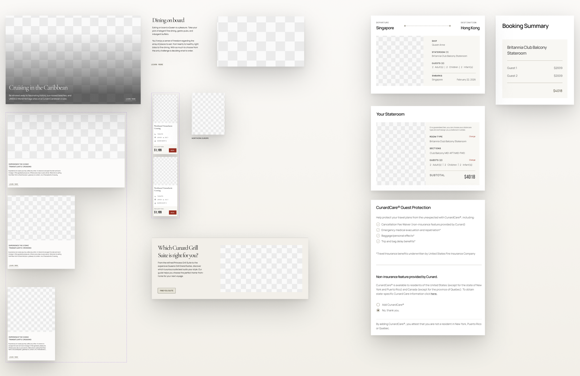
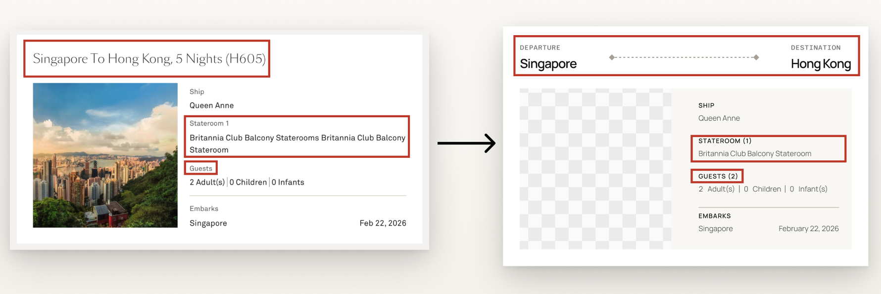
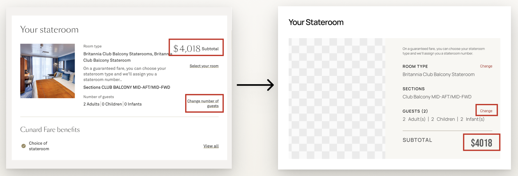
Solution 2: Discoverable Cards Within the Booking Process
The booking cards were specifically redesigned and updated to allow for easier scanning and locating of important information. This was done by using dividers, graphics, removing repetition, and making labels more concise. Examples include adding graphics to the card title to visually communicate the trip itinerary, removing repetition from the staterooms description and providing a number in parentheses for any booked elements. The link labels were also shortened and given a noticeable red font to help it stand out within the card.
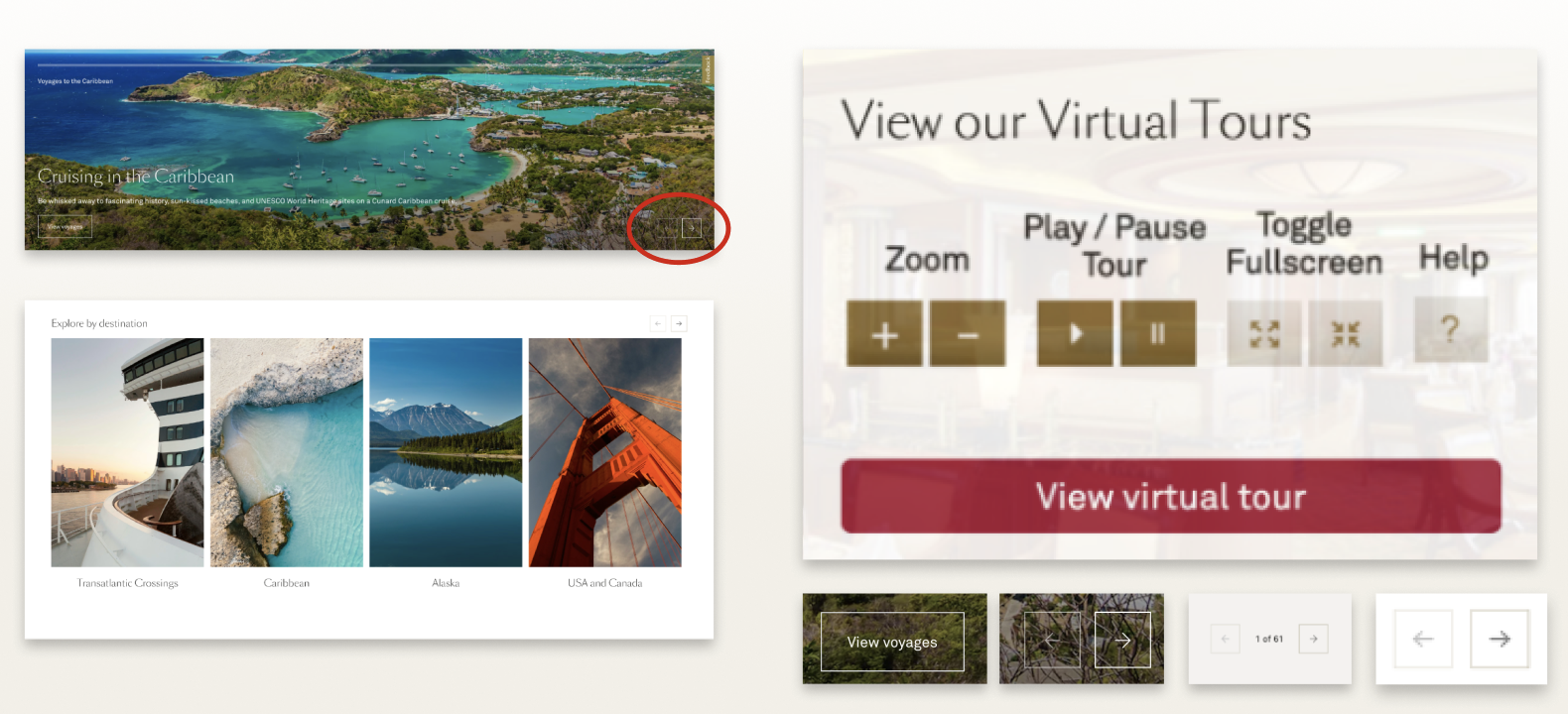
Solution 3: Accessible Buttons, Icon Buttons & Carousel Navigation
Buttons were given structure, which included primary, secondary, tertiary, neutral, inverse, inverse-subtle and ghost buttons. Every button now also passes WCAG Guidelines with proper color contrast, opacity, touch targets and sizes. The Aquitania also provides various states, which include a focus state for users with accessibility needs.
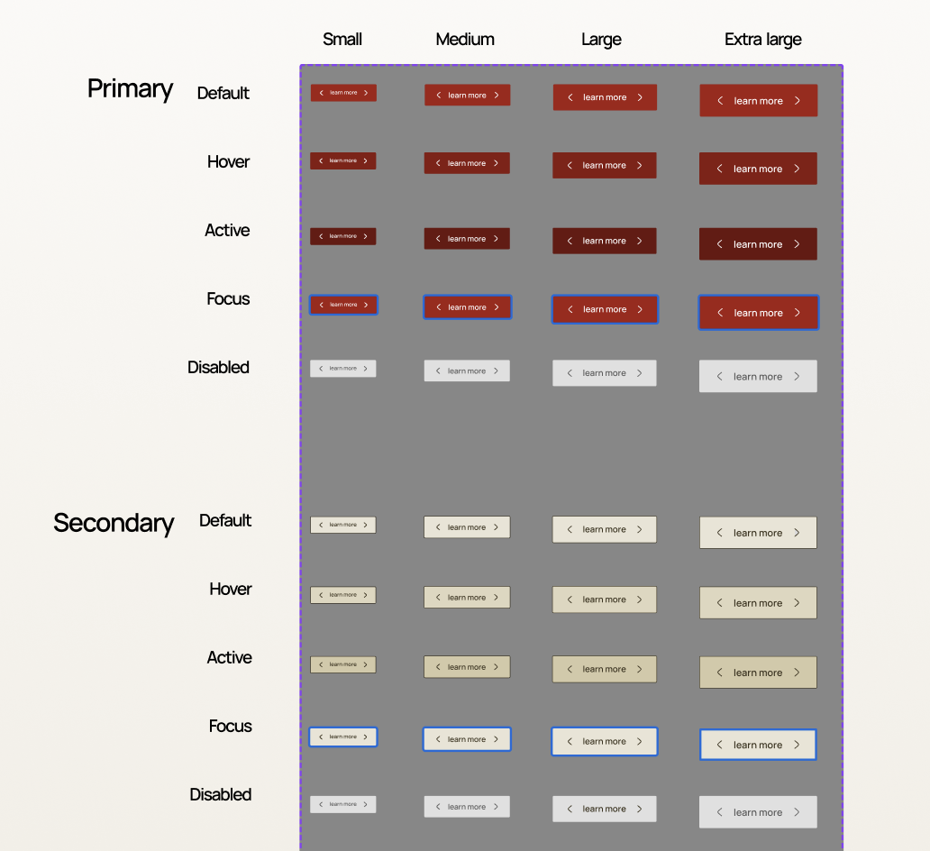
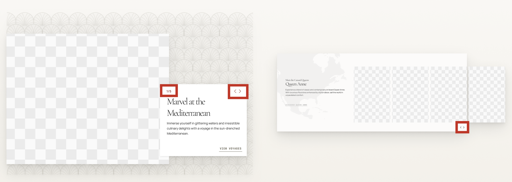
Icon buttons and navigation within the carousels are also no longer transparent and pass WCAG guidelines. Some carousels were also designed with visible page numbers.
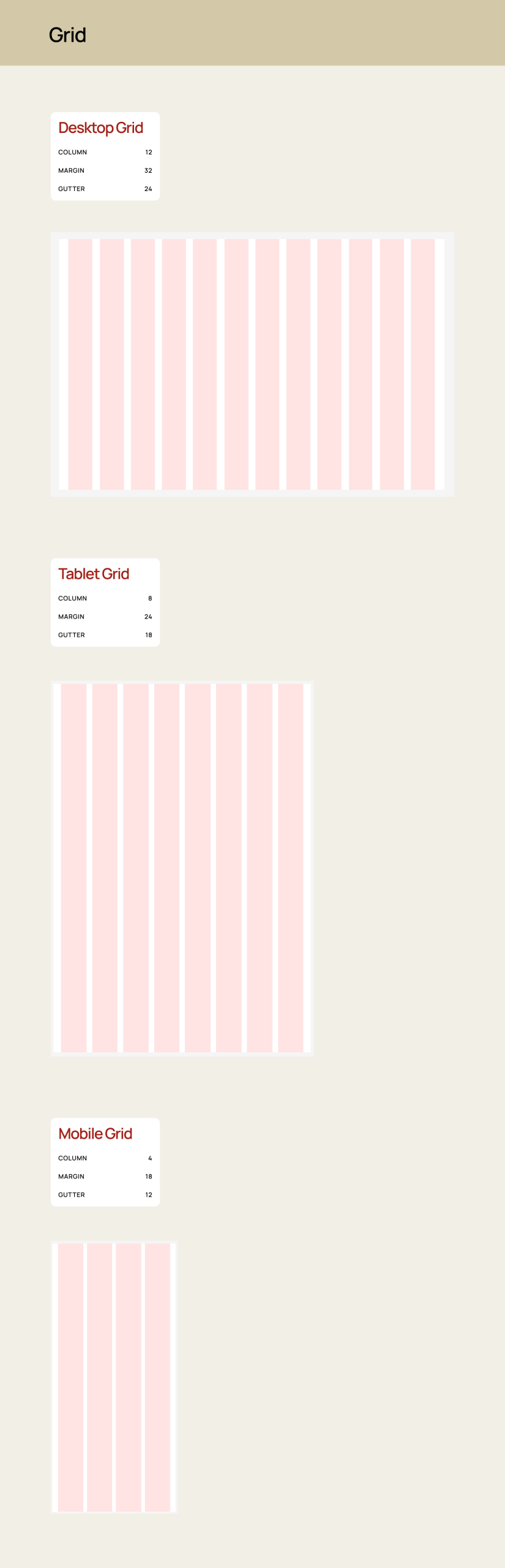
Solution 4: Wider Layouts with More Spacing
A wider layout with more spacing between design elements helped us create more luxurious as well as discoverable interfaces. It allows for better readability between elements and helps users to feel less overwhelmed as they digest the information on Cunard’s pages. It also helps slow down the experience making each part of the interface feel more impactful. It increases trust from out users as an organized and digestible layout allows users to feel confident about the services Cunard provides.
Conclusion & Key Takeaways: Land Ho! Docking the Aquitania, but What’s Next?
Charting Our Voyage and Recording the Lessons Along the Way
Extensive and Detail-Oriented Decisions led to Detail-Oriented Outcomes when Pitching and Creating
After the pitching of the Aquitania, we reflected on ways we could have promoted the Aquitania more, such as providing the demo after the before and after photos or further explaining our spacing tokens within the presentation. A major lesson we learned, though, was that, throughout the process, being detail-oriented in our deconstruction was very useful when creating a system. By being diligent in our deconstruction, we were able to create components that fully reflected Cunard’s and its users’ needs. However, being so conscientious and detail-oriented also contributed to us forgetting certain elements, such as various sections and creating bigger blocks within our UI Kit. Remembering to look at the bigger picture is just as important as the details to create a fulfilling and complete design system.
What’s Next?: Integrating and Growing the Aquitania System’s Next Voyage
Expanding Our Scope Beyond the Home and Booking Pages
The home and booking pages were good starting points when beginning the Aquitania design system, as they contained most of the components used in Cunard’s website. However, the UI Kit can still be expanded to include design elements on webpages that are less utilized within the website. Now that the base of the design system has been developed, we can now expand to include these less utilized areas.
Continuously Improving and Growing the Aquitania
Cunard is a company that will continuously grow its website and include new interfaces. This consequently, means new components are constantly being developed. One of our next goals would be to grow the Aquitania with Cunard and continuously update the items it has within it’s kit and documentation.
Maintaining and Conducting Multiple Accessibility Audits Over Time
Another step includes maintaining the accessibility standards of all of Aquitania’s components. WCAG guidelines are updated every year and with Cunard constantly expanding, this requires us to continuously review these design elements to ensure the accessibility quality of our components do not decline over time.
Feel Free to Check out the UI Kit and Documentation Below!
Aquitania UI Kit:
https://www.figma.com/community/file/1625909499603168655/aquitania-ui-kit
Aquitania Documentation:
https://zeroheight.com/7069a3a57/p/9726e9-aquitania-design-system