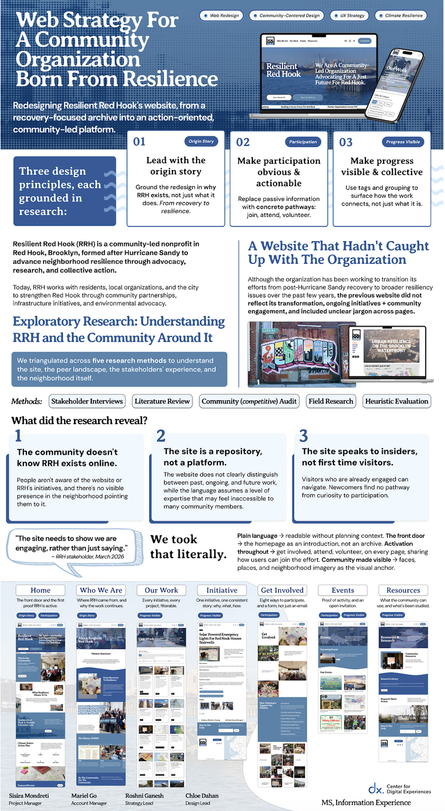
Project Overview
From Recovery Story to Resilience Platform
Resilient Red Hook is a volunteer-led, community-based nonprofit working to advance climate resilience, advocacy, and neighborhood agency in Red Hook, Brooklyn.
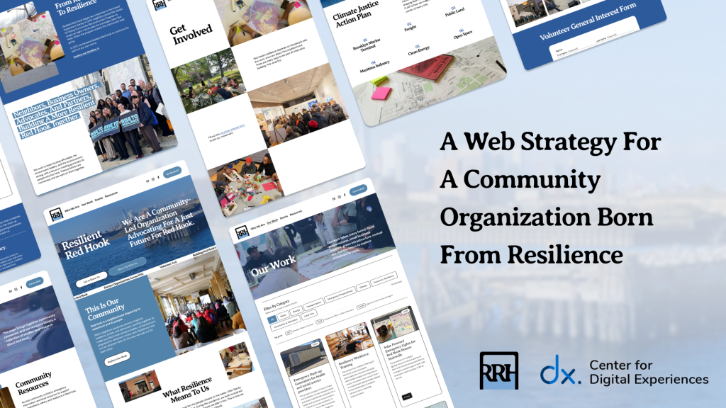
We worked with Resilient Red Hook on a website redesign that would match the organization they’ve evolved into: one no longer solely defined by Hurricane Sandy recovery, but by over a decade of advocacy for a neighborhood facing ongoing climate and social pressures.
Through stakeholder interviews, neighborhood field research, and a community-focused audit of 12 peer climate organizations, we shaped a content strategy and design principles, then used a co-design workshop with volunteers and community members to ground them in community voice. The result is a Squarespace site that reframes Resilient Red Hook not as a recovery effort, but as an ongoing, community-rooted force for resilience, reflecting who they are today and where the organization is headed next.
Client
Resilient Red Hook
Timeline
This project lasted over a span of 14 Weeks
Feb, 2026 – May, 2026
Our Team
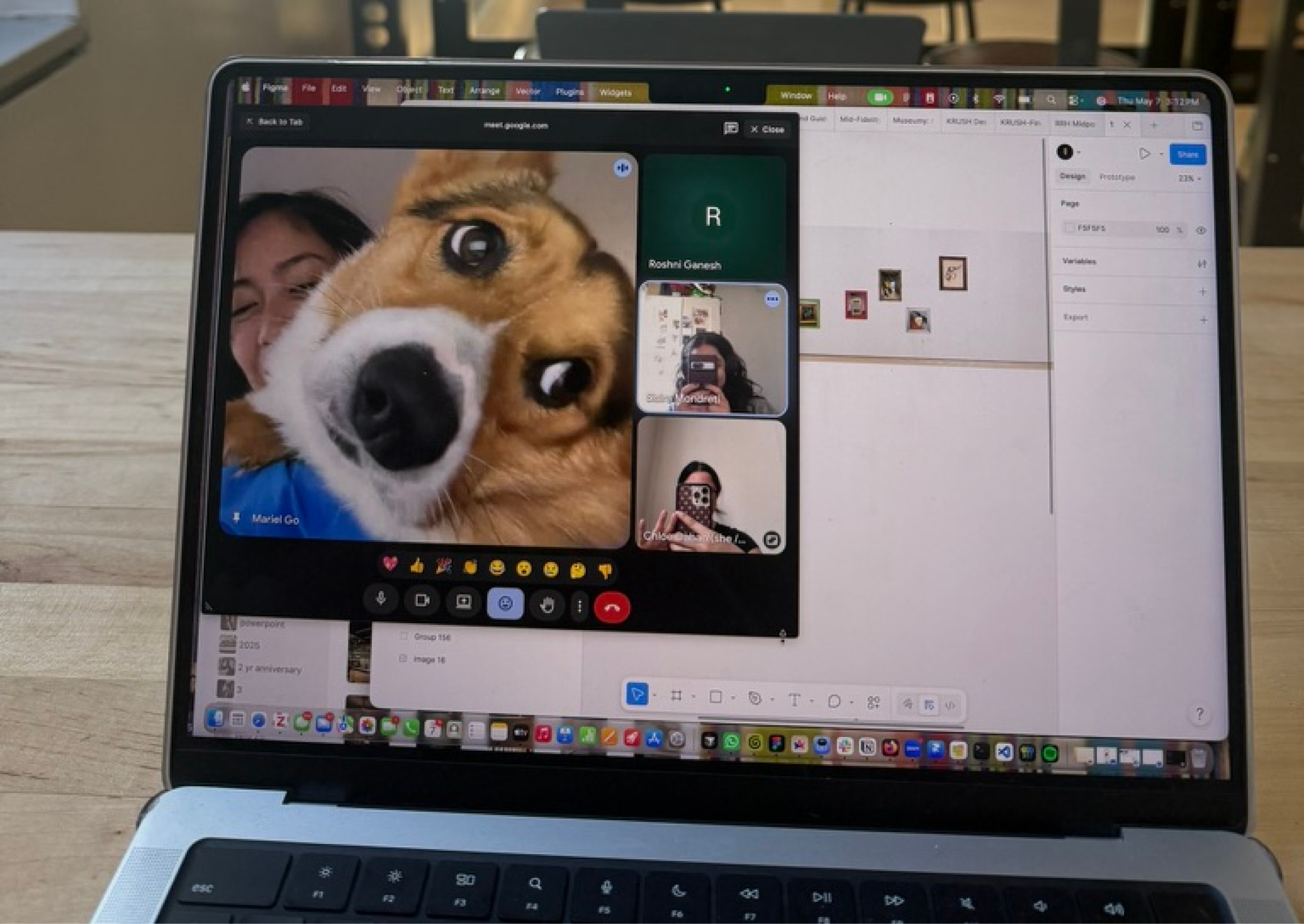
Mariel Go (Account Manager)
Chloe Dahan (Design Lead)
Sisira Mondreti (Project Manager)
Roshni Ganesh (Strategy Lead)
With Mentorship of Professor Rachel Ginsberg
Tools
Squarespace, Figma, Miro
Scope
UX Research · Information Architecture · Content Strategy · Co-Design · Visual Identity · Accessibility · Nonprofit / Community Design
The Client
A Community Organization Born From Resilience
It was originally formed by community members selected by the Governor’s office in response to Hurricane Sandy under the name “New York Rising” to develop resiliency plans. In 2017, the organization transitioned into Resilient Red Hook, expanding its mission beyond state-funded disaster recovery to advocate for and address broader environmental and social vulnerabilities facing the neighborhood.
Despite consistently being at the forefront of advocacy for resiliency efforts in Red Hook, RRH’s contributions have not always been formally recognized or visibly attributed, limiting broader public awareness of its involvement and impact. Beyond its advocacy and project-based work, RRH plays a critical role as a neighborhood convener, fostering partnerships with local community organizations and facilitating collective action. The organization is also actively seeking volunteer engagement and grant funding to support its ongoing and future initiatives.
The Problem
A Website That Felt Abandoned, Even Though The Work Wasn’t
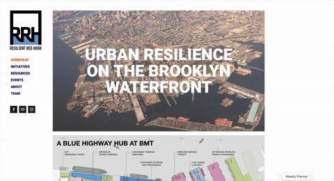
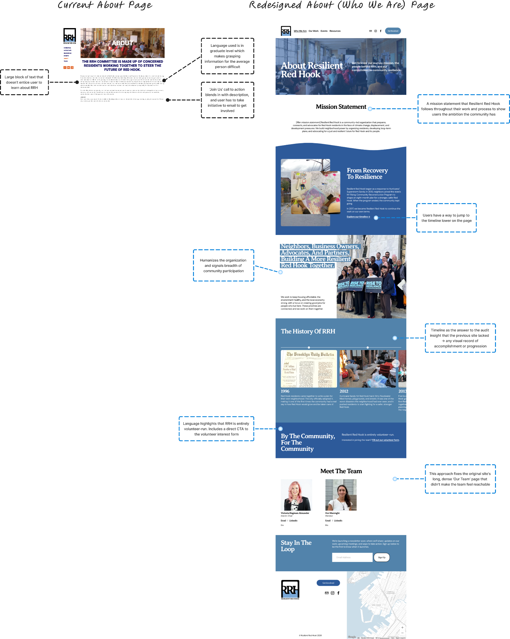
The work hadn’t stopped. The website had. It told visitors what Resilient Red Hook had done, not what the organization was doing effectively, especially on first level pages like the Homepage & About.
Jargon-heavy pages, outdated imagery, and a homepage still anchored to Hurricane Sandy gave the impression that the organization is static outside of occasional event updates. The organizations progress has evolved, but the website just stopped keeping up. That gap was costing Resilient Red Hook on multiple fronts, and every visitor type was leaving with a different version of the same misunderstanding.
Audience Segments
Who the Site Needs to Serve
We identified four core audience segments the redesigned site needed to support, each arriving with different questions, time horizons, and stakes.
Anyone landing on the site.
Should be able to understand what Resilient Red Hook is within seconds, without prior context.
Newcomers to the neighborhood or to the work.
Should find easy, low-stakes pathways to get involved (e.g., events, newsletters, volunteer forms without having to email to ask.
Volunteers and members.
Should have a “living bulletin-board” that publicly holds the organization’s activity and efforts, so the site reflects what they’re already doing rather than asking them to constantly explain it.
Funders and partners.
Should be able to evaluate the organization’s legitimacy, active work, and impact in the three to five minutes they spend before deciding whether to dig deeper or move on.
In all four cases, the site needed to function as RRH’s front door, proving the organization is active, current, and worth engaging with.
Personas
We Built Four Personas Grounded in Our Research
👩🏼🦳 Resident Regina · The Long-Time Neighbor
52, lives in Red Hook 15+ years. Hears about RRH through neighbors and flyers but isn’t clear on what they actually do or whether their work will affect her block. Wants to understand how planning decisions affect her daily life, without decoding jargon-heavy reports.
“Tell me what’s happening in my neighborhood this month.”
👨🏻🦰 Curious Carl · The Newcomer
29, recently moved to Red Hook. Saw a post about the Brooklyn Marine Terminal on Instagram and Googled the organization. Cares about climate and community but has never been involved in local organizing; doesn’t know where to start. Frustrated by sites where he can’t tell if the org is still active, or easy ways to get involved.
“I want to help. I just need someone to tell me how.”
👨🏾🦱 Funder Fred · The Program Officer
44, evaluates community-based organizations for grants. Has three minutes to decide whether RRH is worth a deeper look. Wants to see active work, real partnerships, and clear points of contact, not a brochure.
“I’m not looking for a brochure. I’m looking for proof the work is real and ongoing.”
👩🏻🦱 Member Mary · The RRH Board Volunteer
38, architect, current RRH board member. Knows where everything lives on the existing site but knows it isn’t doing the organization justice. Tired of defending the site to people who say it looks abandoned, and tired of being the human FAQ for “what do you all actually do?”
“I’m tired of being the website. I want the site to speak for us.”
Our Approach
Before We Touched the Design
Listen First, Design Second
To understand RRH’s digital presence, community perception, and engagement challenges, we ran four research streams in parallel (desk research, field research, interviews, and a heuristic evaluation) before synthesizing across all of them.
Literature Review
We pulled from a wide net: peer-reviewed research on community-led organizing and climate communication, local news coverage of Red Hook and RRH’s projects, grant language and funder priorities in the climate resilience space, and RRH’s own internal Google Drive of plans, meeting notes, and reports.
The internal Drive in particular gave us context the public site didn’t: years of advocacy work, partnerships, and convenings that simply weren’t reflected anywhere visitors could see.
Competitive Audit, Reframed as a Community Audit
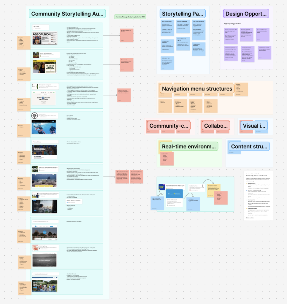
Traditional competitive audits compare features. We needed something different: a look at how peer climate and resilience organizations tell their story. We reviewed 12 websites (community land trusts, climate justice coalitions, neighborhood resilience hubs) and identified four narrative patterns RRH could draw from.
Storytelling, we learned, beats statistics on climate sites. The strongest peer organizations didn’t just publish information; they made visitors feel something about their place in the story.
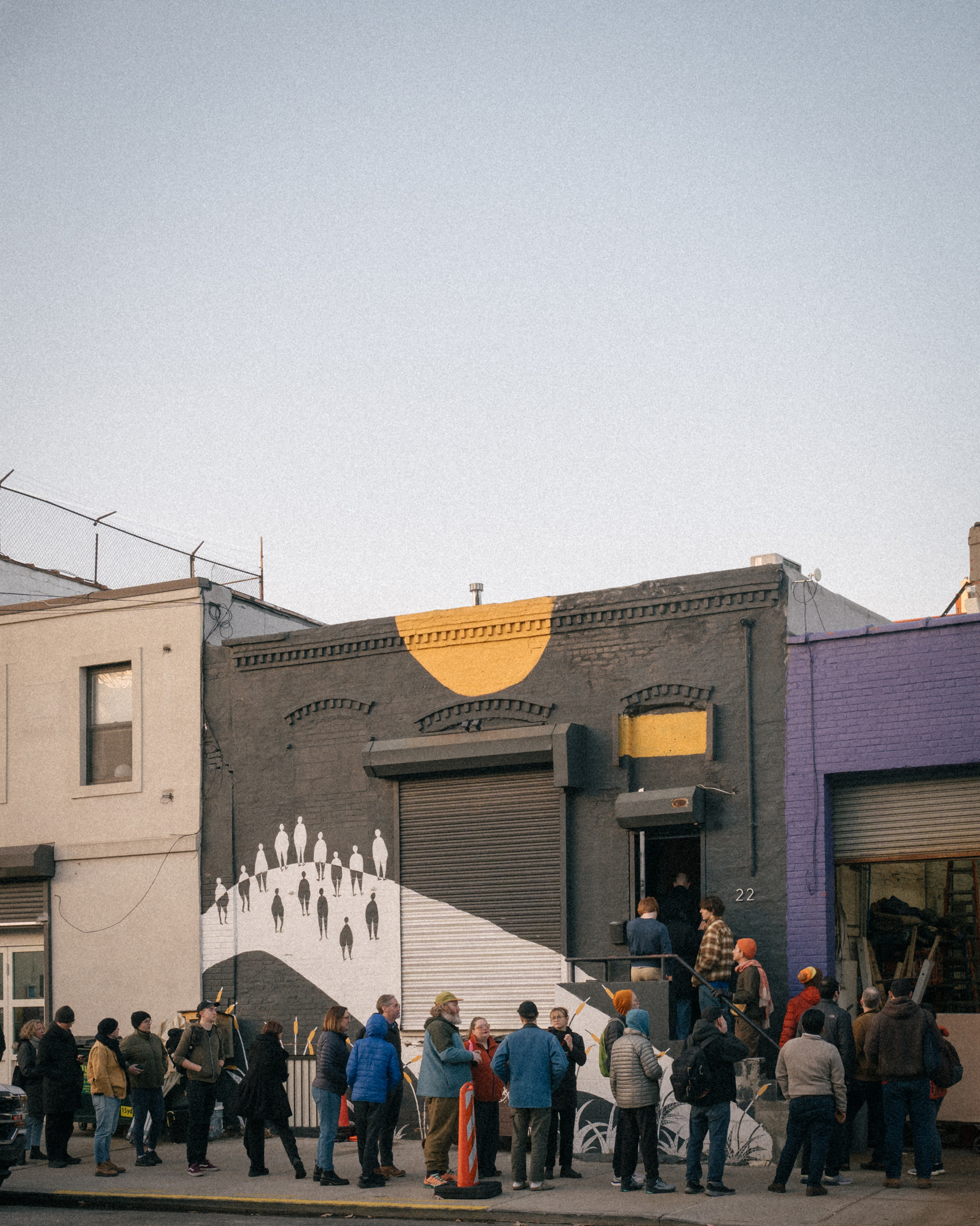
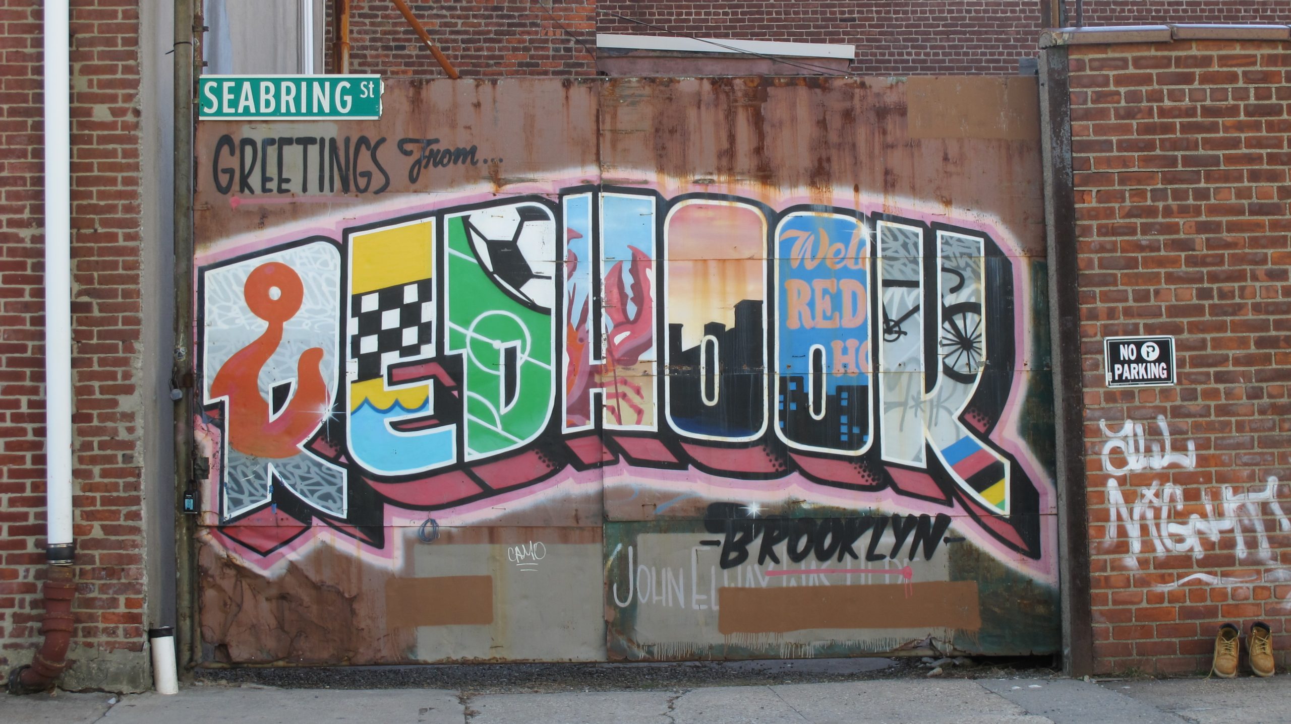
Field Research
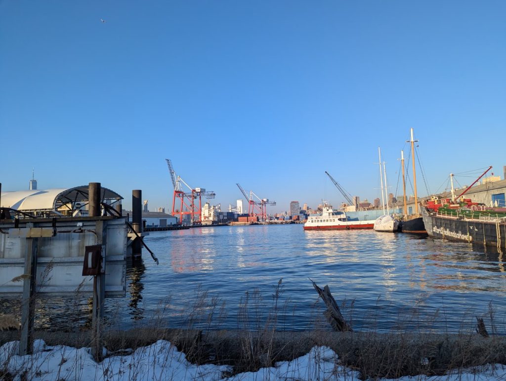
We walked the Red Hook neighborhood: the waterfront, housing, galleries, parks, businesses, etc. to observe the physical, social, and environmental context RRH operates within. We looked for RRH’s visible footprint: flyers, signage, QR codes, any indication that an active resilience organization was present in the places where its work was happening.
We found very little. That gap between the work and its visibility became one of the core insights we carried into design.
Stakeholder Interviews
We conducted 8 semi-structured interviews with residents, RRH members, board members, and partner organizations. The conversations explored how people interpret RRH’s messaging, what information they seek, what they find when they look, and what would actually motivate them to take action through the website.
Heuristic Evaluation
Alongside the qualitative work, we ran a structured heuristic evaluation of the current site, mapping issues against established usability principles and noting where the site failed to support the four audience segments we’d identified. The evaluation surfaced concrete usability problems (broken links, dead-end pages, navigation confusion).
More importantly, it confirmed a pattern: the site’s structure assumed the visitor was already an insider.
Synthesizing Our Exploratory Research
Three Truths The Research Surfaced
We synthesized findings from all four research streams through affinity mapping: clustering interview quotes, audit observations, field notes, and literature themes until patterns emerged. Three insights surfaced that shaped every design decision that followed.
Truth 1: There’s a Significant Gap in Community Awareness
Field research showed no visible presence throughout the neighborhood: no flyers, no QR codes, no signage in places where RRH has direct relevance. Even volunteers currently and/or previously struggled to articulate what RRH does since the organizagion’s scope is open ended by nature. For uninvolved community members who had heard of the organization, most couldn’t distinguish RRH from other neighborhood groups.
“People who are involved with Resilient Red Hook, or who have been on the board, understand, but I don’t think that the general community in Red Hook understands.”
“The homepage needs a one-liner on what this group does.”
“They [RRH] are lowkey… they need to do more tabling events, or more branding, or maybe the social media has to be much more robust and engaged?”
Design Response. The homepage needed to introduce RRH from scratch, every time. We led with a clear value statement and built the entire site to assume the visitor is meeting RRH for the first time. We aimed to do the same on every page, since visitors don’t always land on the homepage.
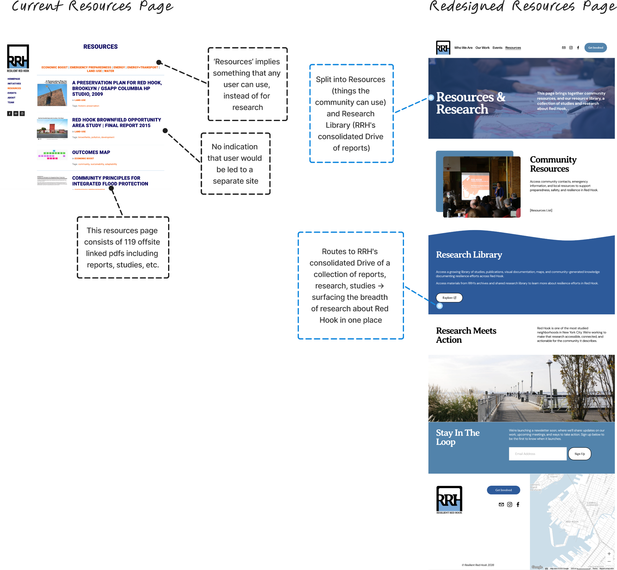
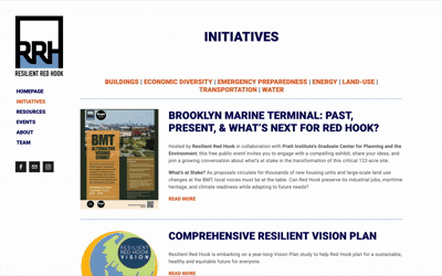
Truth 2: The Site Is a Document Repository, Not a Story
Finding. Resources linked exclusively to off-site PDFs (some broken, almost all hosted on Dropbox) with titles written in planning jargon. There was no summary, no context, no signal of why a resident might care. The site behaved like a Google Drive index. Initiatives were buried in long-form text blocks with no sense of timeline, status, or relationship to one another. The site told visitors what RRH had done but never what RRH was doing.
“I would use it almost just like instead of going to the Google Drive… it was just easier for me to go here and pull up something.”
“It feels like a repository for existing members or someone with context.”
“It should show a trajectory… it doesn’t show all the advocacy.”
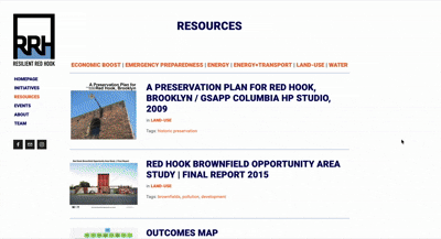
Design Response. We split Resources (things community members can use) from Research Library (the breadth of studies about Red Hook), and built the rest of the site around storytelling structures rather than document lists.
Truth 3: There’s No Front Door for Newcomers
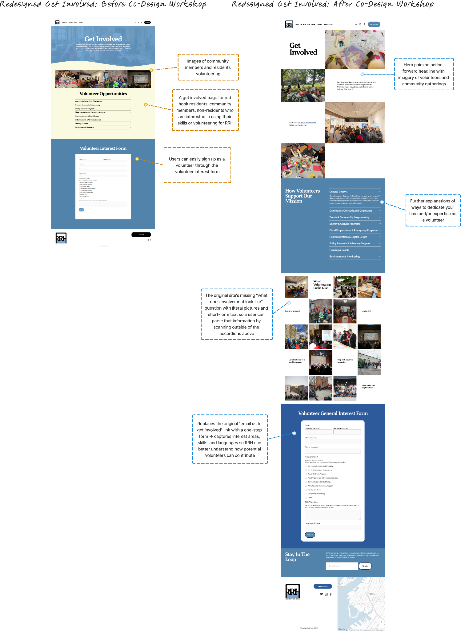
Finding. The site was tailored to people already engaged with RRH. New visitors had no clear entry points and no sense of what membership or volunteering actually looked like. Most members were recruited through meetings or personal networks: which doesn’t scale and leaves funders some visitors without an easy way to evaluate the organization’s legitimacy.
“The site needs to show we are engaging rather than just saying.”
“The site is informational but not mobilizing.”
“What does it look like to be a member? Who do they want? I can’t see that on the website…”
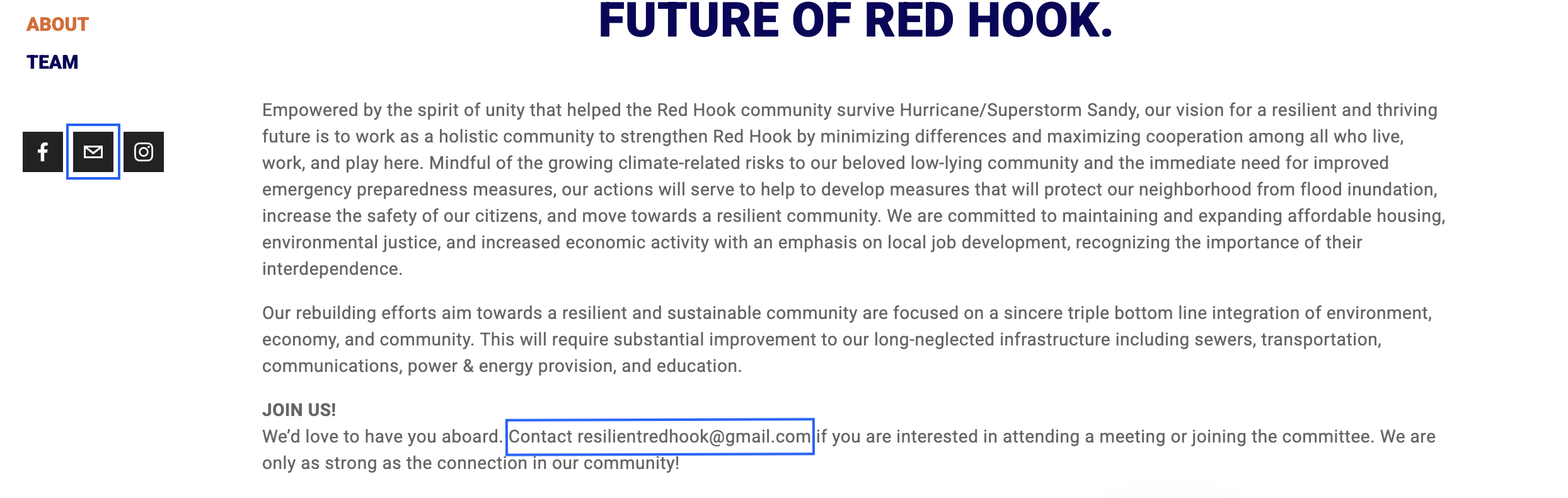
Despite RRH being entirely volunteer-run, the only pathway to get involved on the current website is a non-interactive email buried at the bottom of the About page in dense copy.
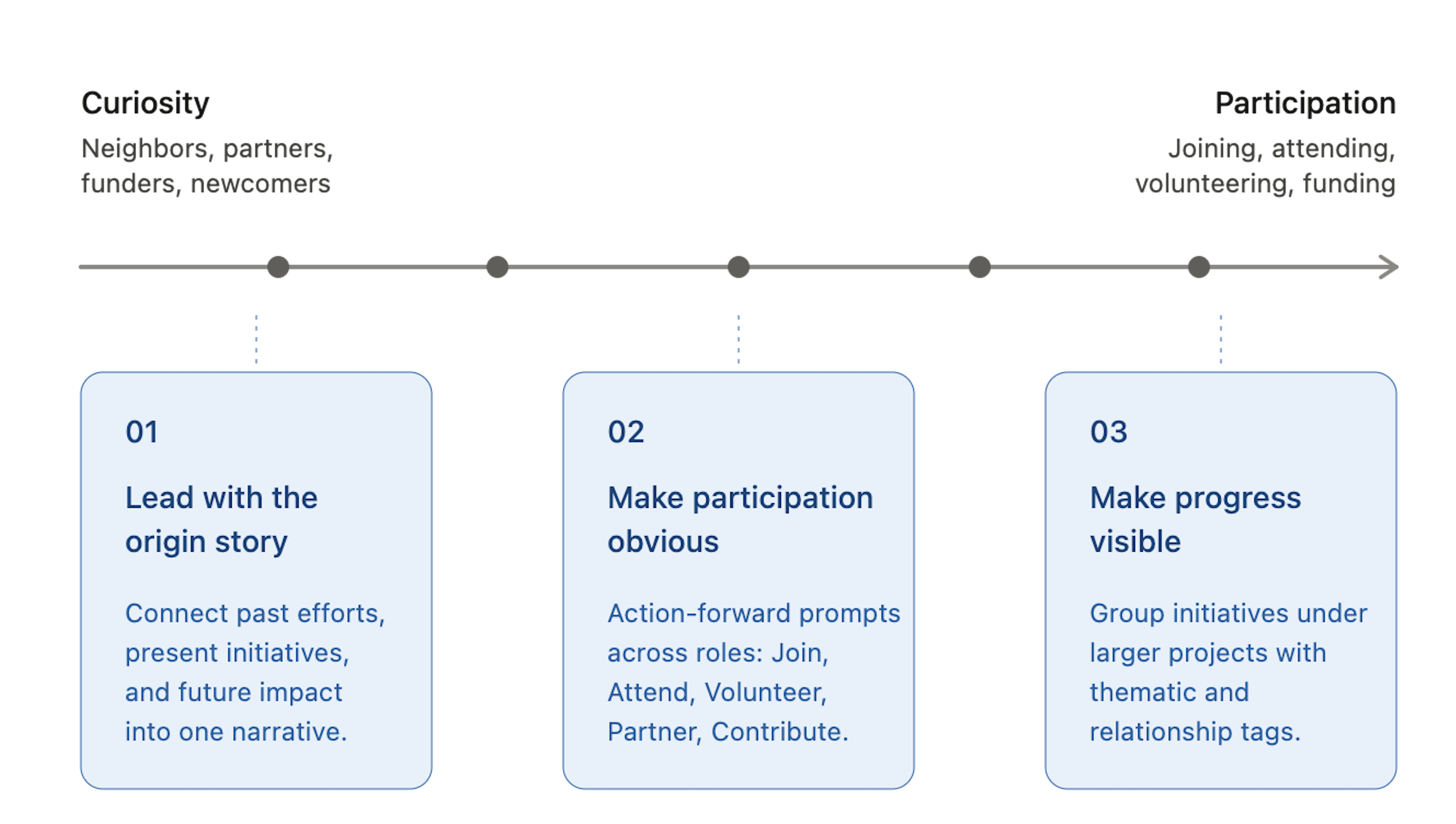
Design Response. We designed multiple, differentiated entry points for different audiences (e.g., neighbors, volunteers, partners, funders) each with its own pathway from curiosity to participation.
Our Strategy
Three Principles for a Community-First Platform
The path to strengthening resilience is through unlocking community engagement through the website.
The redesigned platform becomes a scalable outreach tool, a bridge between curiosity and participation, and a front door into RRH’s work. Three design principles guided every decision:
Strategic Direction
From Strategy to Structure
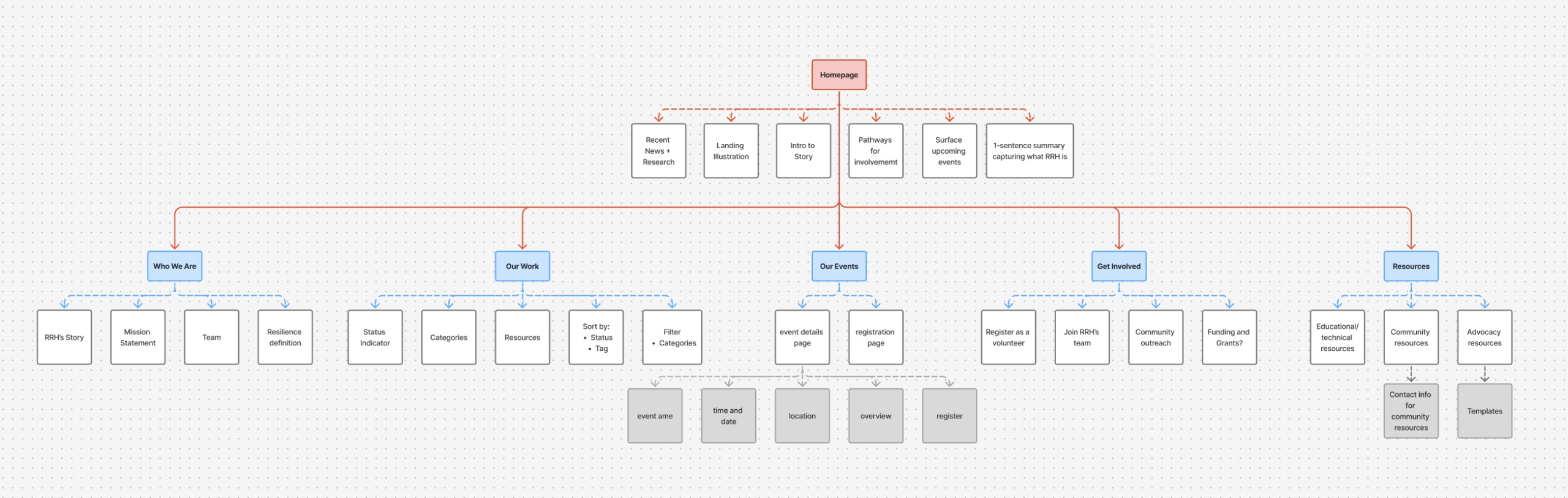
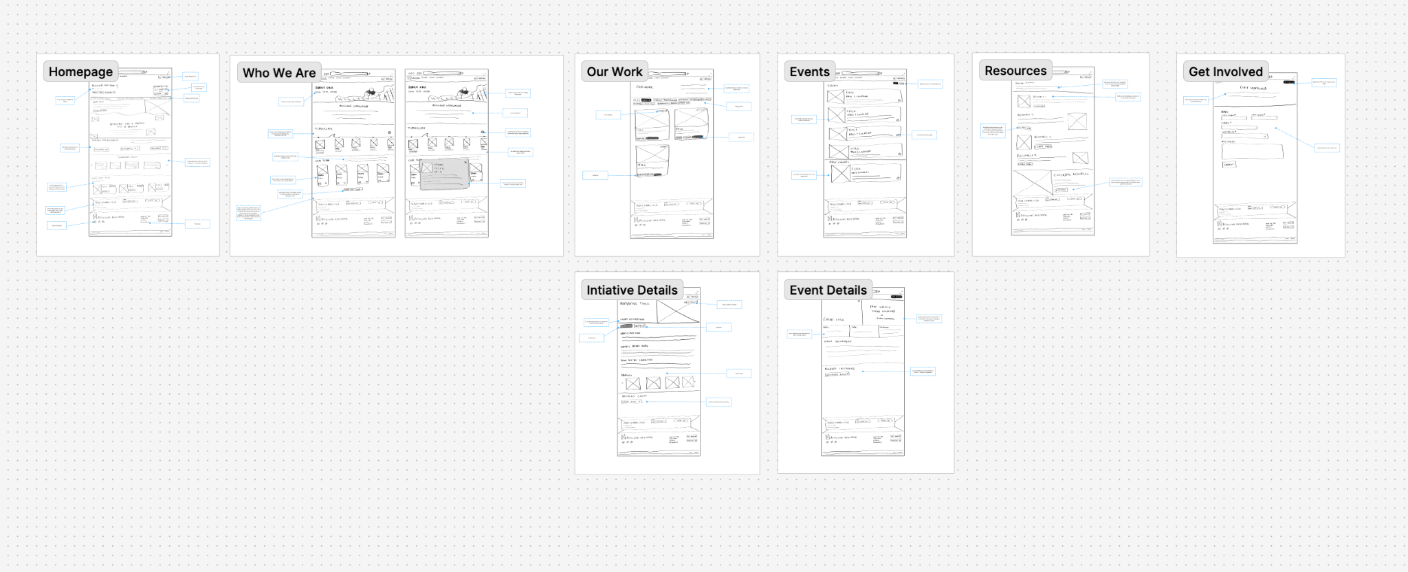
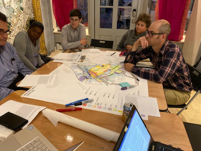
Sitemap
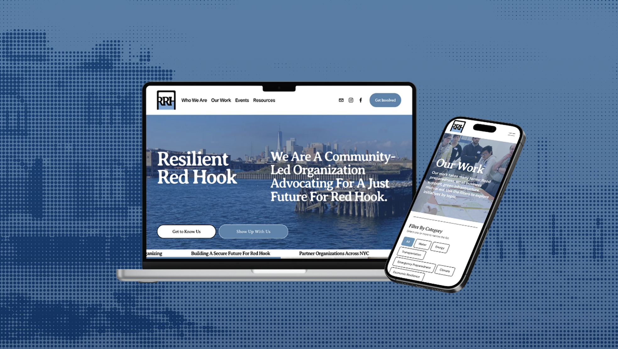
The previous site was organized around documents and past recovery efforts, making it difficult for new visitors to understand what RRH does today. The redesigned sitemap consolidates the site into six primary navigation items: Home, Who We Are, Our Work, Events, Resources, and Get Involved – each anchored to one of the four audience segments we’d identified.
Content Mapping
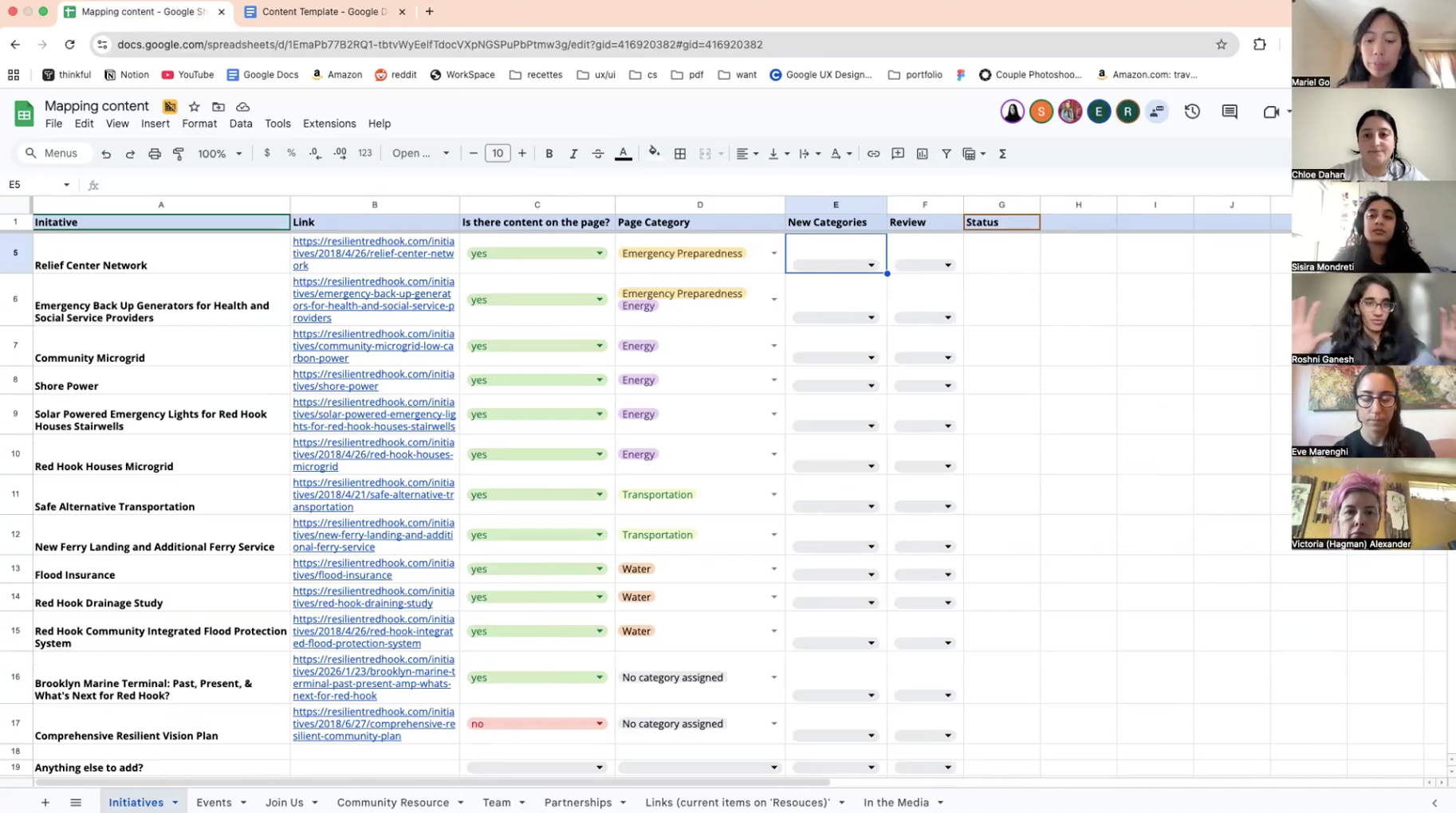
The sitemap told us where pages should live. The content mapping process told us what should live inside them and why.
As a team, we built out a working spreadsheet to map every existing piece of content across the site against the new structure. For each item, we logged where it would live, what tags applied, whether it was still active, and what role it played in the larger narrative. The exercise forced us to articulate the rationale behind what content to carry into our redesign.
Meeting with RRH to map the content together
To get the decisions right, we sat down with RRH for a dedicated content mapping session. The meeting did two things at once:
- It surfaced context we couldn’t have gotten from the site alone, and
- It directly shaped how we approached the design
But content mapping wasn’t just an inventory exercise. It was where we wrestled with how RRH actually wanted to talk about itself, and how to logically build connections across content so a visitor moving from Who We Are to Our Work to Get Involved would experience the site as a single, coherent story rather than a stack of disconnected pages. We sat down with RRH for a dedicated content mapping session to get those connections right. The meeting surfaced context we couldn’t have gotten from the site alone, and reshaped two of our biggest design decisions.
Two Moments That Changed the Design
Resource Means Something Different in Community Context
We came in assuming the 119 offsite Dropbox links on the Resources page were a maintenance problem to solve. Four patterns from our research reframed it as a content strategy problem instead:
Peer organizations use resource not as a synonym for “document,” but as something tangible the community can draw on: services, programs, contacts.
Stakeholders described the existing site as functioning like a Google Drive (“easier than going to the Drive itself”).
The document titles themselves leaned on planning jargon, making the long list even harder to parse for anyone outside that context.
Showing where resources go, what kind of work is happening, and what’s still in progress builds trust.
The content mapping session reframed what we’d been treating as a content problem. The documents weren’t an archive: they were evidence. They reflected how thoroughly Red Hook has been studied.
Rather than fighting these patterns, we leaned into them. The redesigned Resources page covers community resources people can actually use, while a separate Research Library routes visitors to a consolidated Drive of reports and studies. One side answers what can I do? The other answers what’s been studied? Both are legitimate visitor needs, and both deserve their own surface.
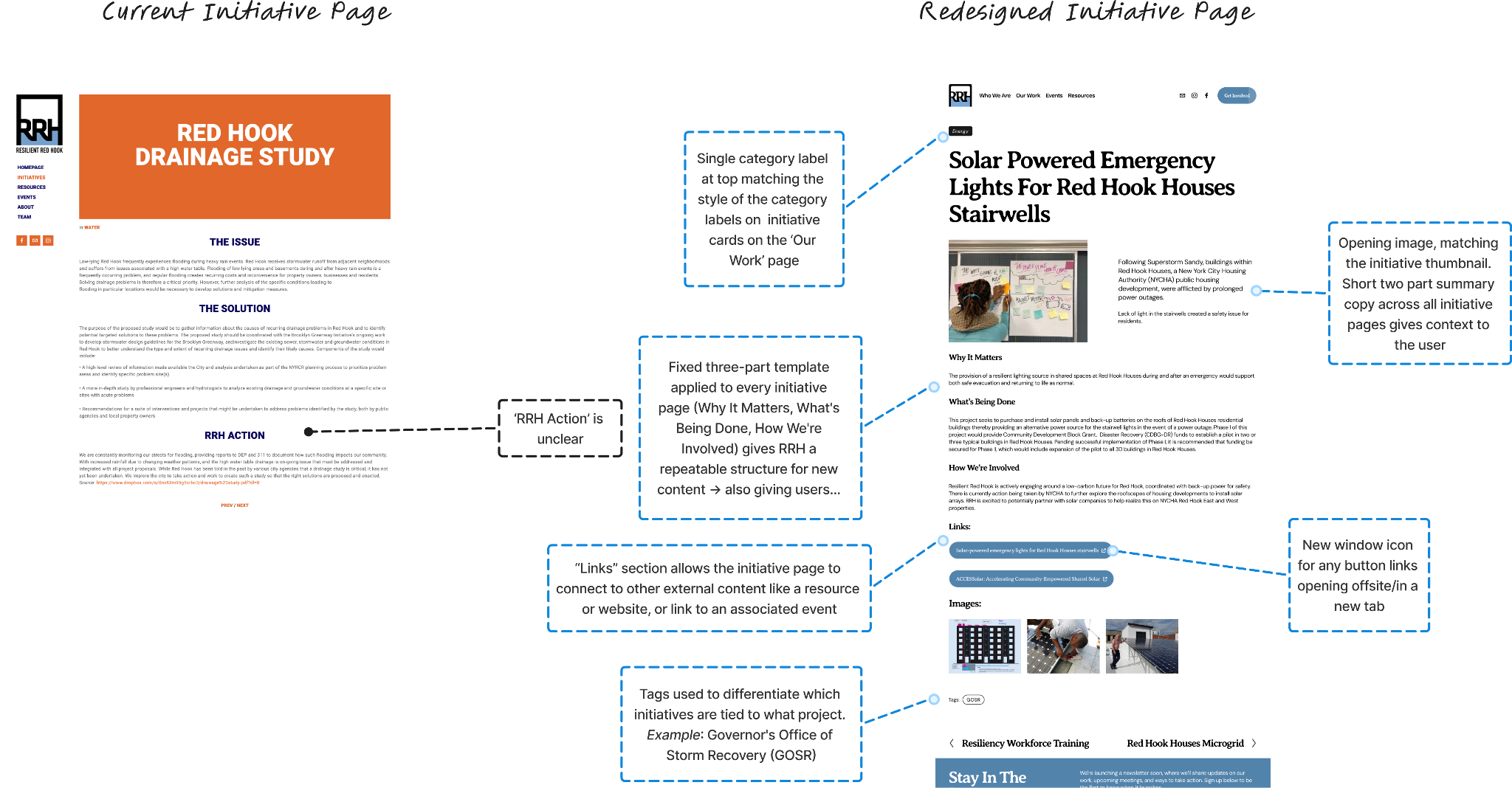
Initiatives Aren’t Sequential, They’re Interconnected
Our initial approach to Our Work used status pills on every initiative card: Concept · In Progress · Completed · Lessons Learned. Logical on the surface, but the content mapping session surfaced a different framing.
- Status felt static. “In Progress” answers is this still happening?, but not the more interesting/relevant question, what is this part of?
- Status couldn’t be applied cleanly. Some initiatives are continuous, ongoing efforts with no end date. Others are time-bound projects with specific deliverables. A single label couldn’t honestly describe either type.
- RRH proposed a different system. Tag each initiative with the larger project it’s tied to: anything related to the Brooklyn Marine Terminal carries a BMT tag, anything tied to the Governor’s Office of Storm Recovery carries a GOSR tag. The tag isn’t a snapshot of progress; it’s a map of relationships.
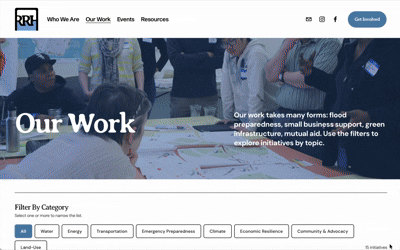
The tagging system became the structural logic behind the final filter system on Our Work, making the relationships between initiatives visible in a way status pills couldn’t. For Funder Fred, this also meant a single page could prove the breadth and connectedness of RRH’s work in under a minute.
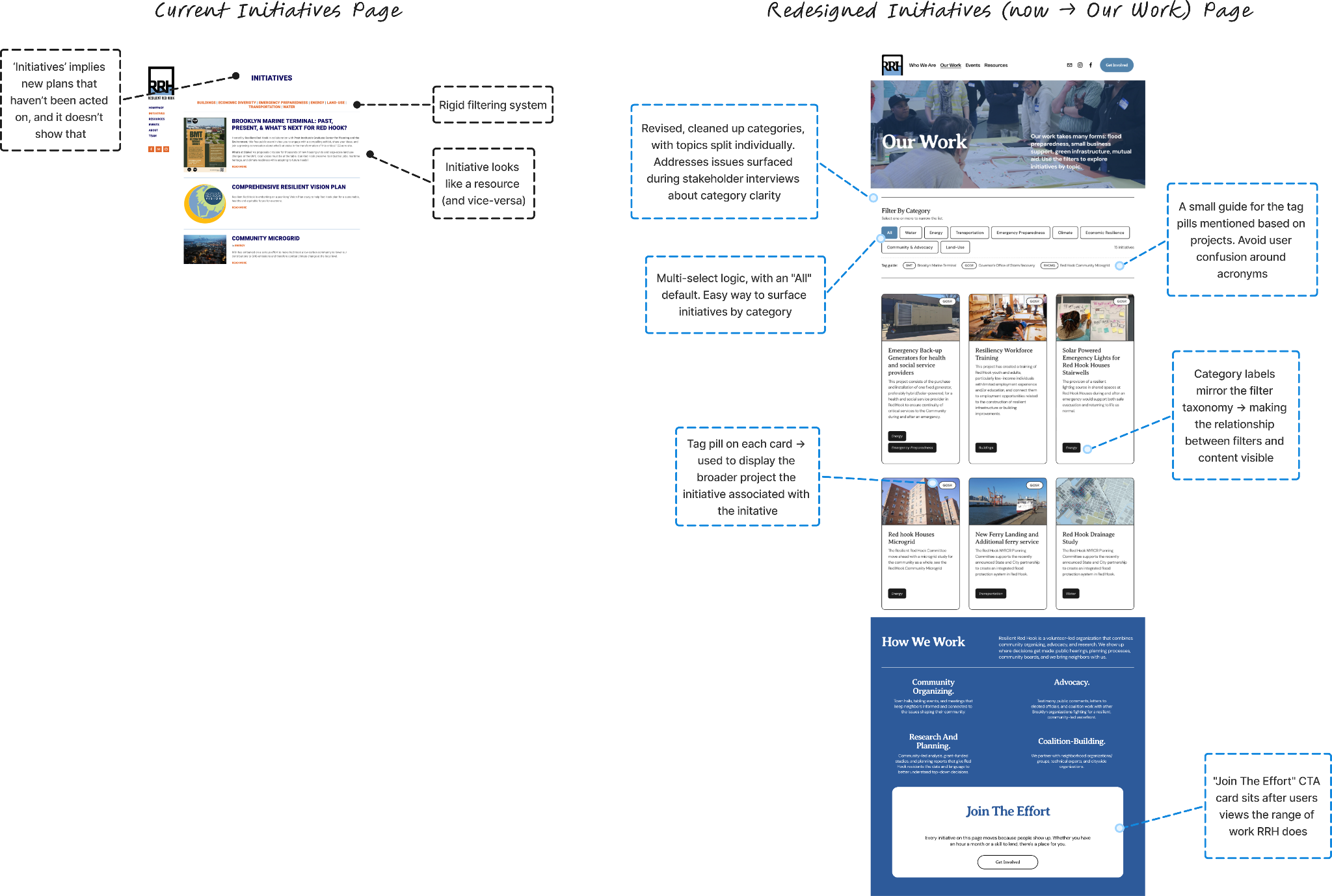
The multi-select filters and tag pills work together, letting users narrow by category, then trace each initiative back to the broader project it belongs to.
Redesigning the Site
Four Approaches, One Consolidated Direction
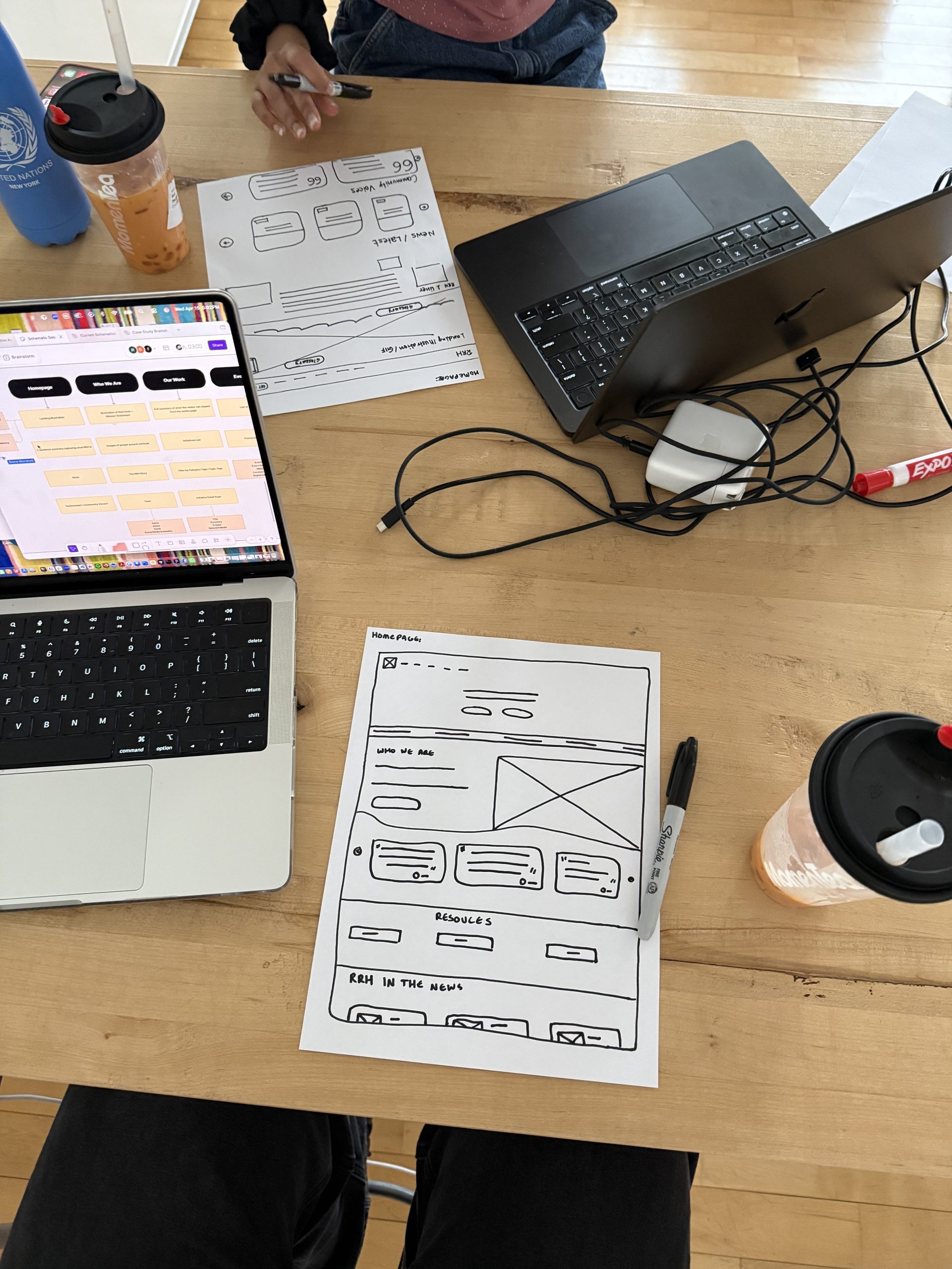
Once the sitemap was set, each team member individually sketched their own approach to every page in the new IA. We then came together, walked through each version, and pulled the strongest moves from each into a single consolidated set of wireframes, one screen per page, ready to test. Working in parallel before converging gave us four different mental models of the same site, which made the final consolidation sharper than any single designer’s draft would have been.
This let us quickly brainstorm each layout against the design principles before committing to any one direction.
Moving to Squarespace
Iterating Through Multiple Rounds of Design
From wireframes, we moved into Squarespace itself, building a working first draft of every page rather than just static mockups, so the team and the client could experience the site as a navigable system. Each round of iteration tightened a different layer:
- Round 1
- Layout and hierarchy. Did each page surface the right information at the right depth?
- Round 2
- Copy and tone. Did the language sound like RRH, or did it sound like consultants writing about RRH?
- Round 3
- Connections across pages. Did a visitor moving from one section to another experience the site as a coherent narrative?
- Round 4
- Visual identity and polish. Did the site feel like a living organization, or did it still feel like a static?
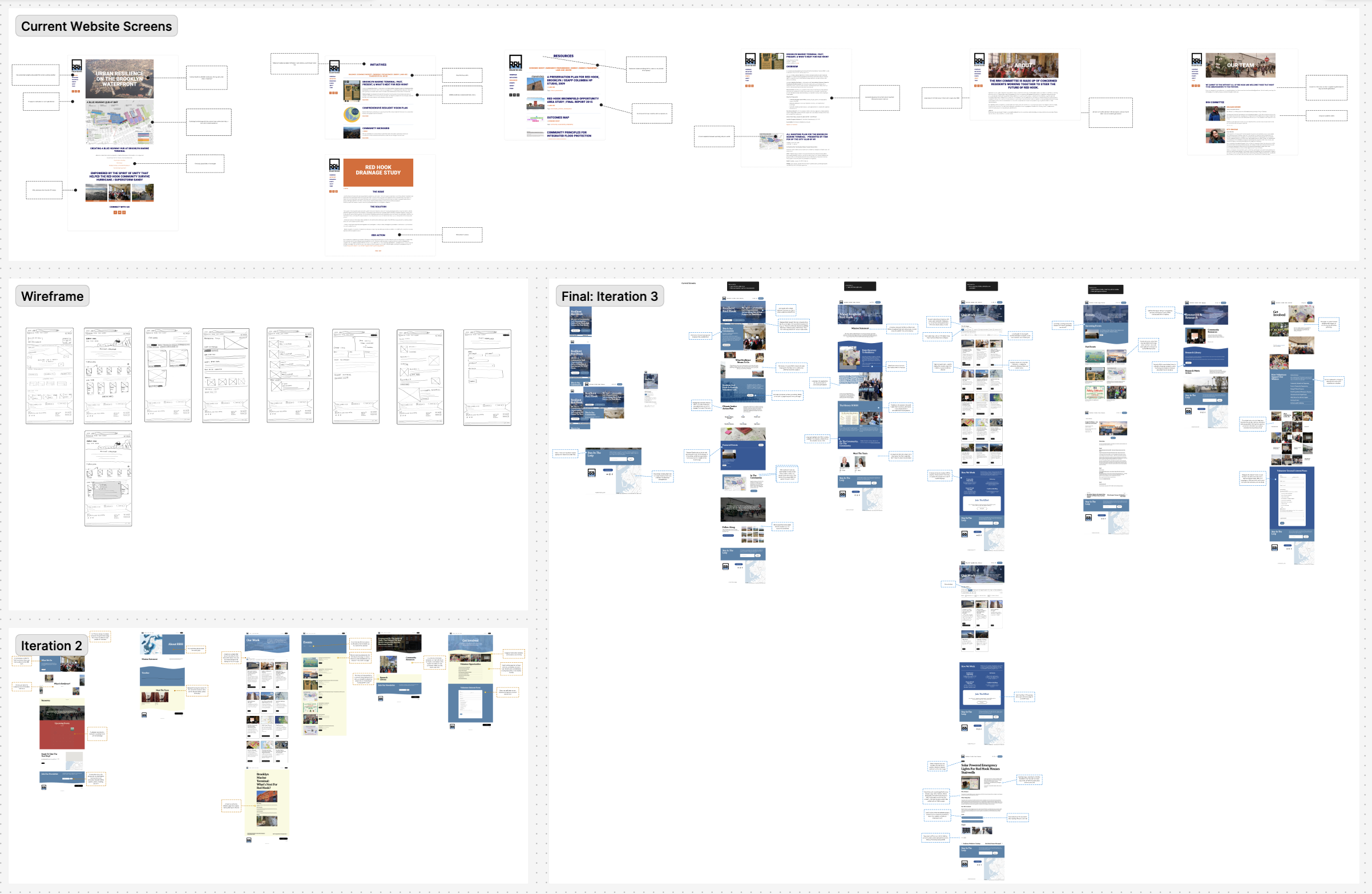
Three rounds of iteration shaped the final design:
- Wireframe sketches established structure
- 1st iteration tested layout, hierarchy, ad content priorities
- The final and second iteration after the co-design workshop refined visual identity, messaging and interaction patterns
Each round produced a version we could put in front of RRH and, eventually, the community.
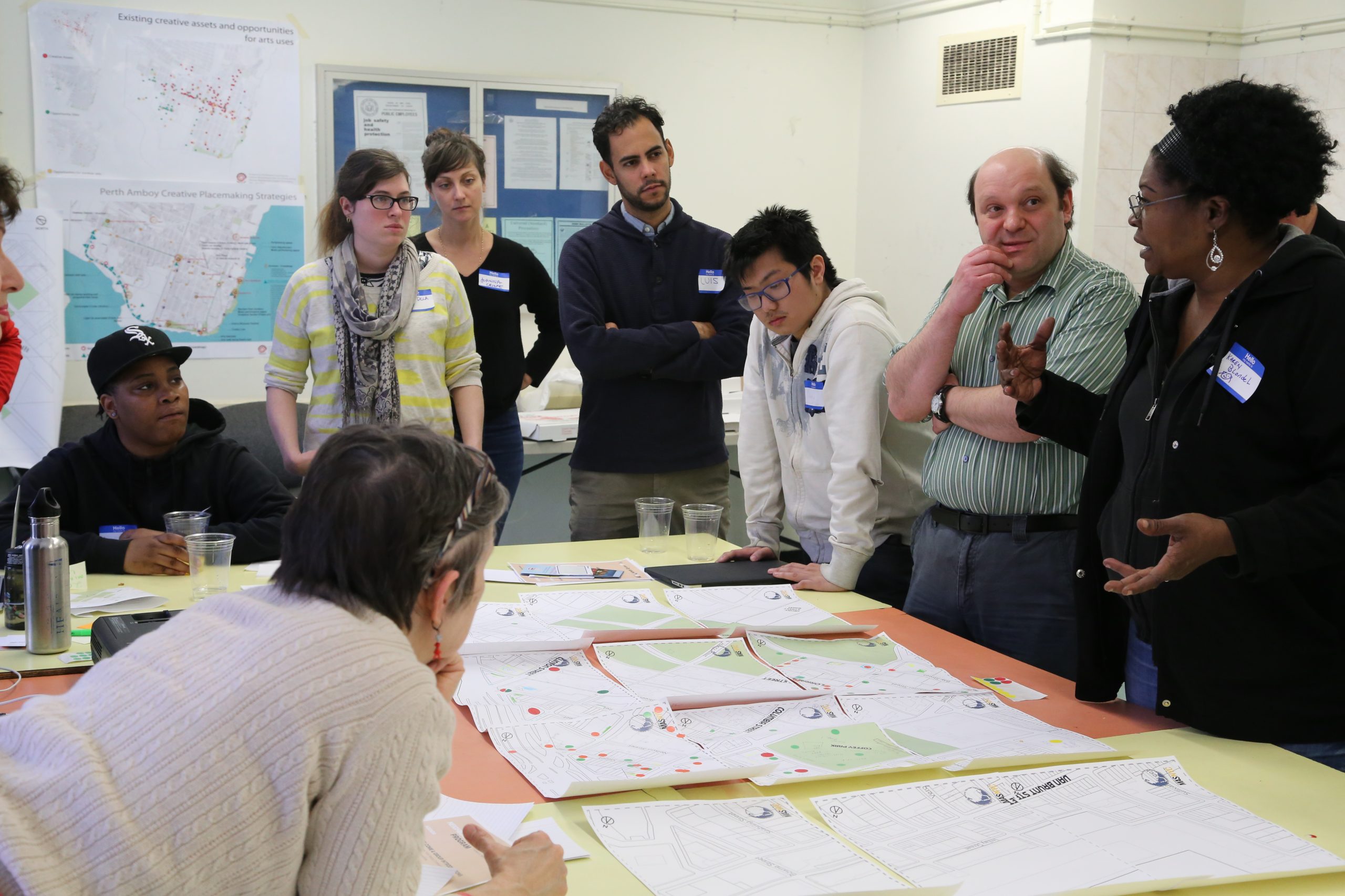
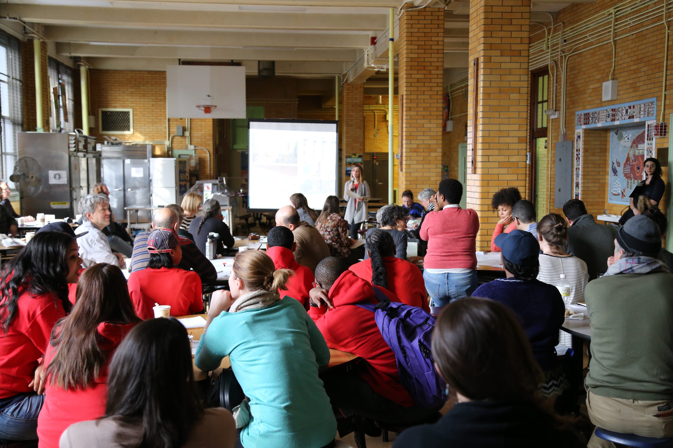
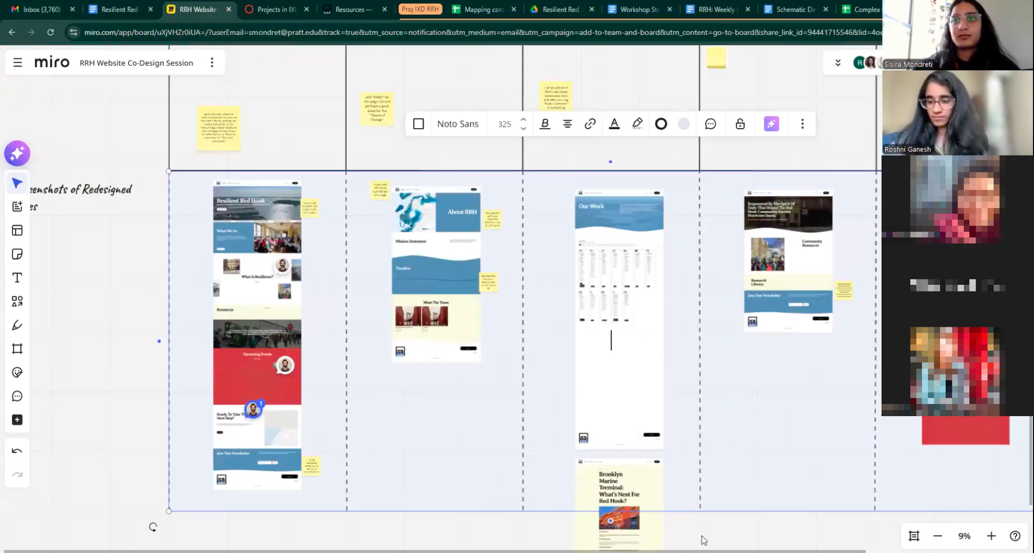
Co-Design Workshop
Bringing RRH & the Community Into The Design Process
With a working draft built in Squarespace, we ran a co-design workshop with RRH volunteers and community members with our basic structure (without most page copy). The goal was to understand how the people closest to the work would describe it themselves: what language they used, what they prioritized, what felt true to RRH, and what felt like consultant-speak.
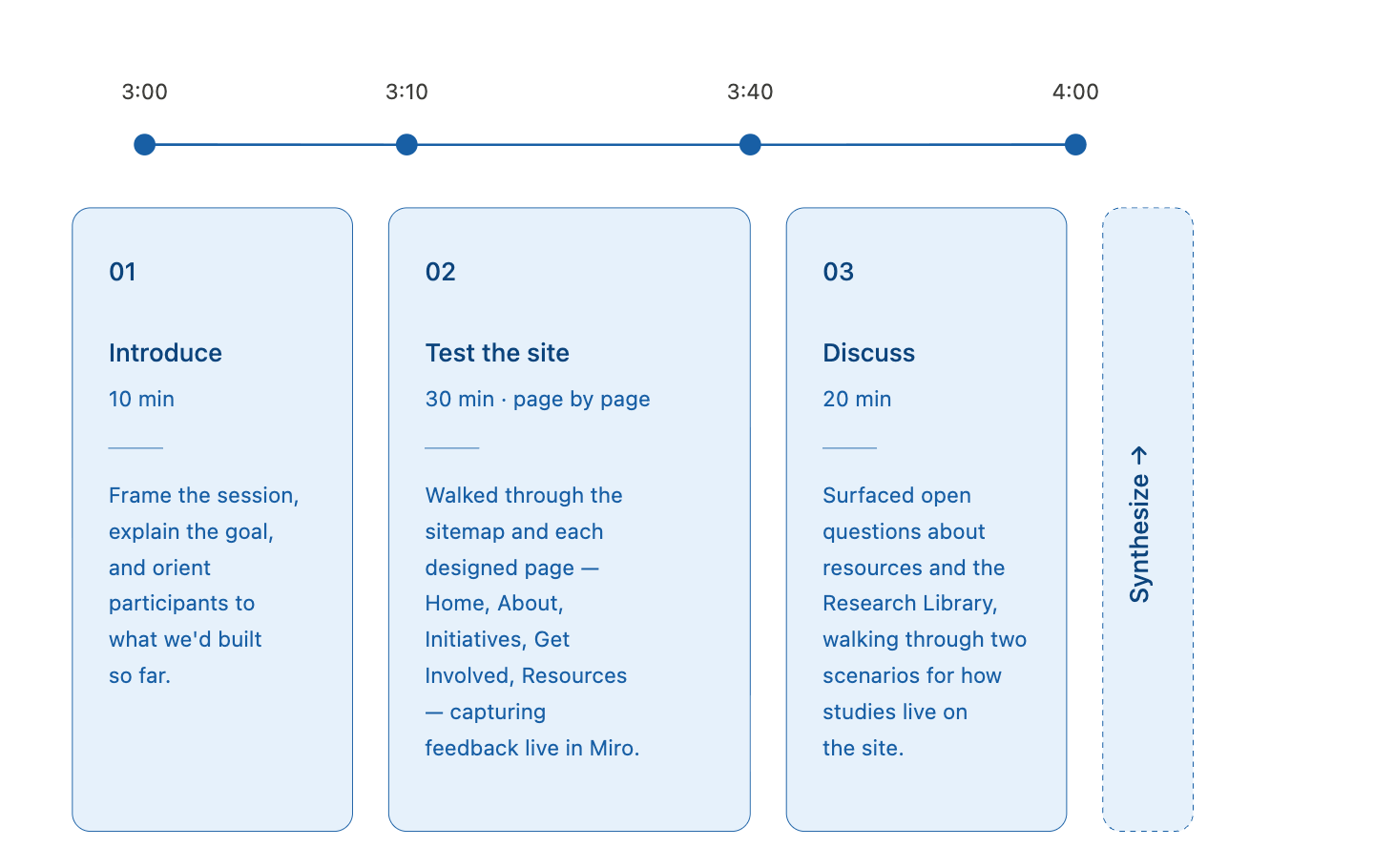
The format was a guided walkthrough of each page with sticky-note exercises around every screen. Participants:
- reacted to language
- worked through prioritizing what should appear first
- identified any missing content
- brainstormed how to maintain page clarity around the different areas of work RRH is involved with
What We Heard
- The “What is Resilience?” framing should be answered by RRH specifically, and moved from the homepage to Who We Are. We reframed the homepage section as “This Is Our Community” making it about people, not concepts.
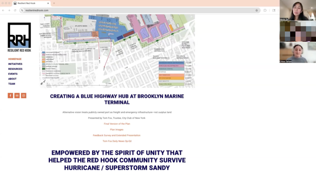
- The Climate Justice Action Plan (a organizational project) needed far more prominence. We added a dedicated homepage section featuring its six focus areas.
- The all-volunteer nature of the team needed to be re-emphasized throughout the site.
- A featured-event section would work better than a full calendar on the homepage.
We iterated based on this feedback with structural changes, not just copy changes, moving sections, restructuring pages, and reframing entire headers to match how RRH actually wanted to be seen.
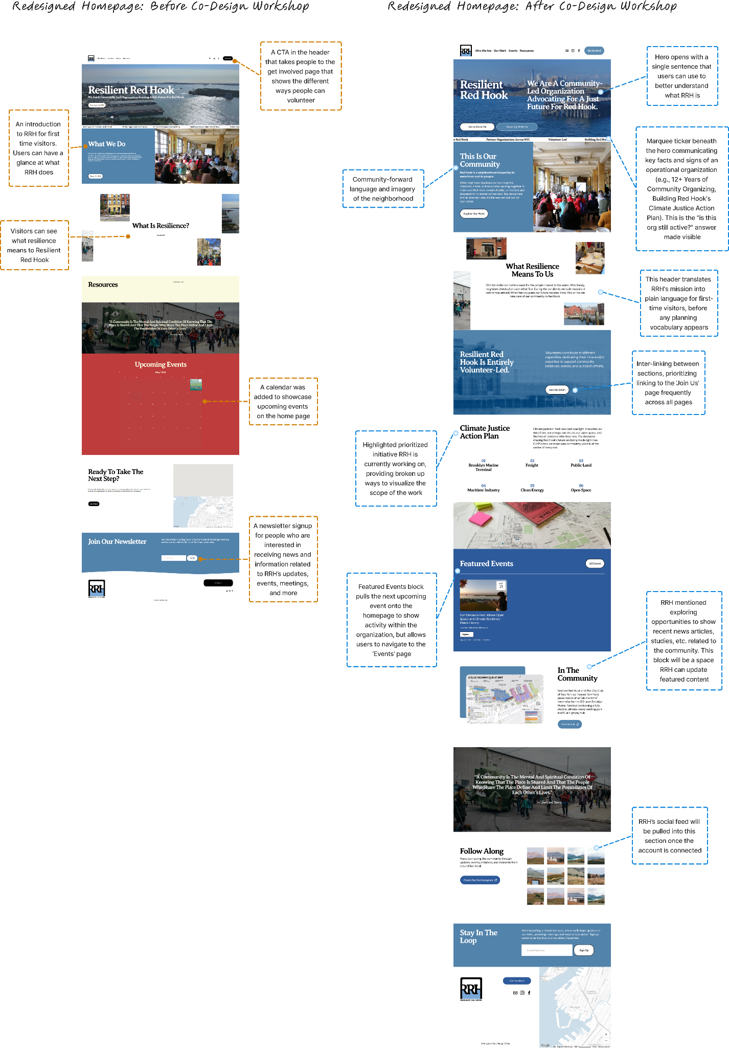
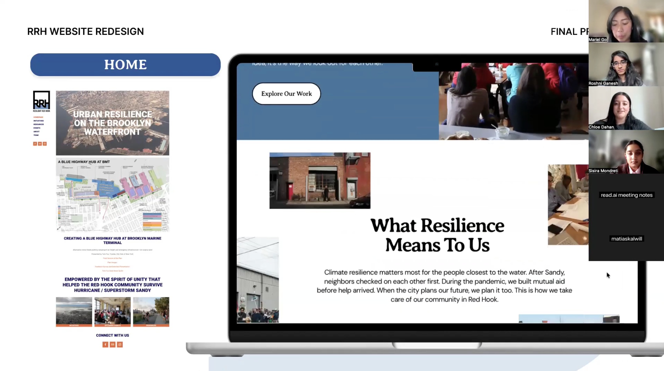
The co-design session made clear that the original homepage didn’t answer the question “is this organization still active?” The revised version foregrounds Resilient Red Hook’s track record, current work, and upcoming events from the moment a visitor lands.
The Redesign
A Website That Reflects an Organization’s Story
Branding Refresh
Alongside the IA and content work, we refreshed RRH’s visual system to match the evolved identity:
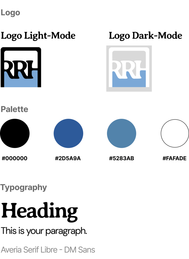
Revised logo
a revised logo that keeps the working-waterfront character
Color palette
a palette of deep blues and warm neutrals drawn from Red Hook’s industrial-maritime landscape
Rounded corners
rounded corners across cards and buttons to soften the previous institutional feel
Typography
a serif/sans-serif type pairing that balances impact with legibility
Imagery
community-led imagery throughout: real people, real events, real Red Hook
Final Designs
Our design strategy started with our design principles:
Principle 1
Lead with the Origin Story
The redesigned Who We Are page centers on the narrative of how RRH began, the mission, and the organization’s evolution over time. Users have more opportunity to be able to leave understanding what the organization is and why it exists.
Principle 2
Make Participation Obvious & Actionable
The new Get Involved page highlights clear pathways across different roles and interests through action-forward prompts, imagery, and descriptions. Those interested in getting involved finds a low-stakes entry point, which does not exist on the current version of the website. Volunteers stops being the human FAQ, relying on the site to help relay important information.
Principle 3
Make Progress Visible, Collective & Actionable
The redesigned initiative page follows a fixed three-part structure: Why It Matters · What’s Being Done · How We’re Involved. A category label connects each initiative back to the broader Our Work page, while project tags (GOSR, BMT) show how the work is tied together. Funders gets the proof of active, connected work in the short time they have.
The Deliverables
Built to Last Beyond the Project
We didn’t want to hand RRH a beautiful site they couldn’t maintain. The final deliverables were built around the reality that RRH is an all-volunteer organization without dedicated design or development capacity.
- A redesigned Squarespace site. Fully built out, populated, and ready to publish.
- A final presentation deck. Walking RRH through the research, strategy, and design decisions in a format they could share with their board and partners.
- Design documentation. A maintenance guide tailored to non-designers, covering how to update events, add new initiatives, tag content correctly, and preserve the visual system over time.
- Content guidelines. A short reference for any web contributors, including the tone shifts we made (away from planning jargon, toward community language) and outstanding decisions
During our final presentation we were handing off not just a redesigned website, but a system the team can maintain and a clear record of why every decision was made.
Impact
What RRH Said
“I just want to tell you guys there was points where you talked and the way you said things made me want to cry, so it really feels so amazing also to be heard and seen and understood in a way that you guys did such a deep dive and understood the challenges, especially as volunteers, were constantly in the thick of the work… you guys did an amazing job understanding from all aspects. And I think that really translated in a lot of parts of the design.”
–RRH’s interim chair, reacting to the final presentation
Throughout the project, stakeholders and community members continuously emphasized that the Red Hook is underserved, overstudied, and fatigued. By acknowledging that throughout our process, members felt heard, and excited to have a refresh that reflected their evolving mission and plans for deeper community engagement.
Final Reflections
Final Reflections From Our Team
Our team was honored to work with an organization that continues to advocate for every part of its community despite the looming fatigue that comes with sustained volunteer work. Every RRH member we spoke with was clearly passionate about the mission, and it was inspiring to learn how much of the neighborhood’s resilience has been carried by people doing this work on their own time.
This project drove home for us the importance of truly understanding the people, the place, and the histories behind the work. We uncovered complicated stories and dynamics we couldn’t necessarily resolve, but it was through those nuances that we were able to imagine a clearer path forward with the redesign. What we could contribute was digital capacity, and we tried to use it in service of the work RRH was already doing.
Designing for Participation, Not Just Information
What we hope the new website does is more than reflect RRH’s evolution. We hope it becomes a tool the organization can actively use to reinvigorate itself: a platform that invites participation, activates new community members, and gives volunteers a public-facing system that holds the weight of the work for them. The site shouldn’t just describe what RRH does. It should help RRH keep doing it.
Recommendations & Reflections
What’s Next
Based on our research, we recommended four next steps to ensure the redesigned site continues to reflect the organization’s mission:
- Continue refining content as the organization’s work evolves.
- Determine a sustainable path forward for site maintenance.
- Audit RRH’s wealth of existing resources to surface the most useful ones.
- Grow RRH’s physical presence in the community alongside the digital one (e.g., flyers, signage, tabling) so the visibility gap closes from both directions.
We’re excited to see the role the redesigned website will play in RRH’s growth and Red Hook’s resilience.
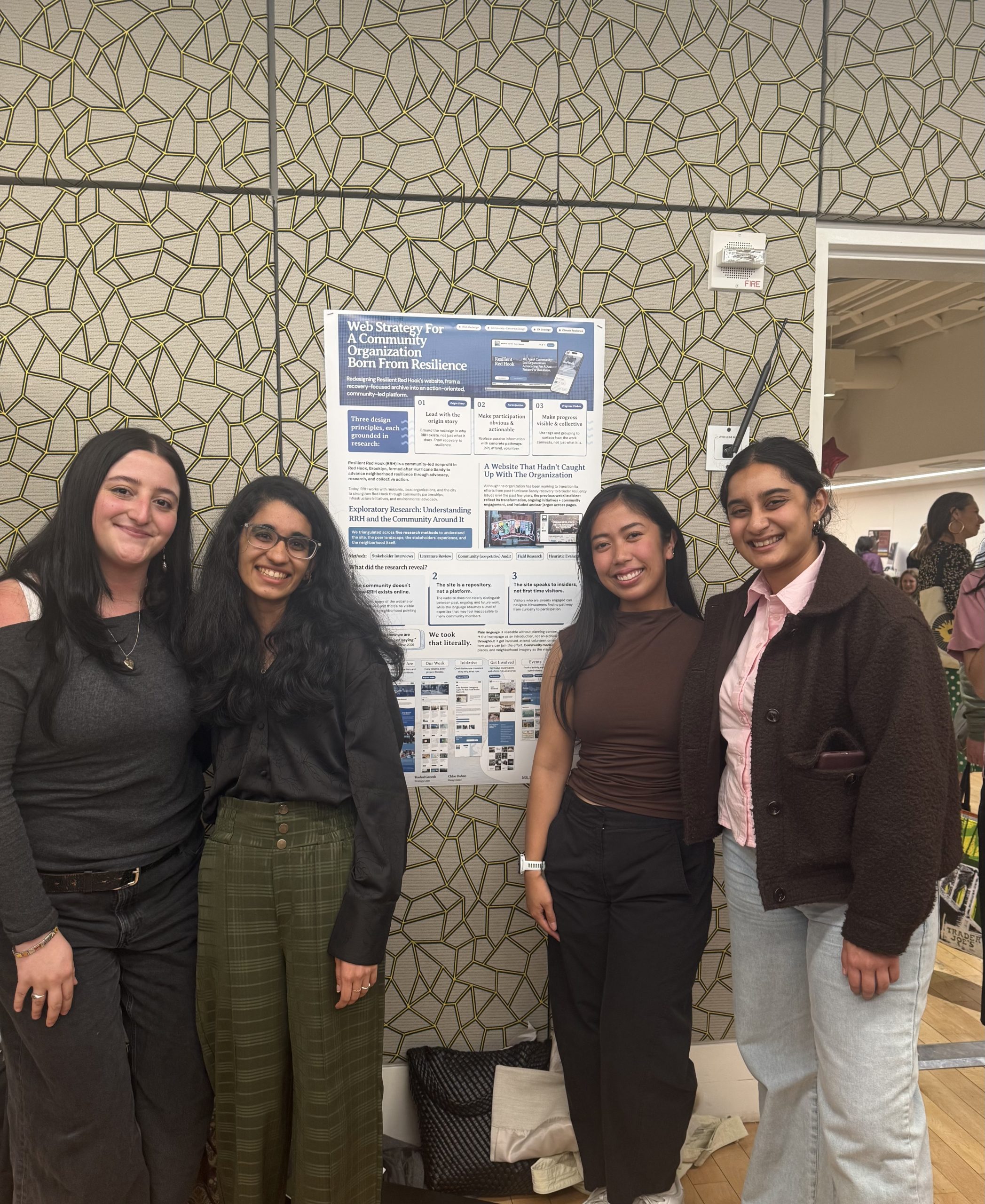
Pratt InfoShow 2026
Sharing the Work at InfoShow 2026
We were honored to present this work at Pratt InfoShow 2026, the Pratt School of Information’s annual showcase of outstanding student work. Being able to walk visitors through RRH’s story (the gap between the work and the website, the moments that changed the design, the principles that grounded the redesign) was a meaningful way to close out the project.
The recognition belongs as much to Resilient Red Hook as it does to our team; the impact of the our work came from the trust the organization placed in us throughout the process.
Long working sessions, shared screens, and the occasional cameo from Mariel’s dog: Stubs