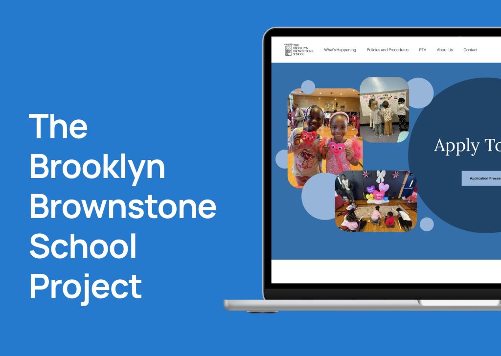
Designing a digital experience that helps families stay informed while reflecting the warmth, creativity, and community of the school.
Academic Group Project for INFO 682-01: Projects in IXD
Duration: January 2026 – May 2026
Team: Avani Chandorkar, Esha Anil Navarkar, Elizabeth Serjantov, Sylvia Xu
Tools: Figma, FigJam, Google Forms, Miro, Zoom
The Problem
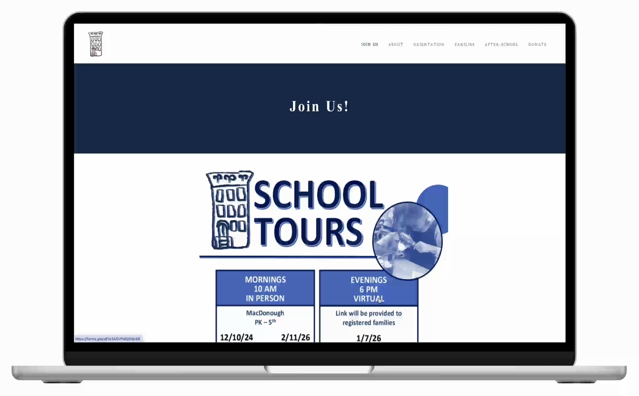
The Brooklyn Brownstone School (16K628) is a public elementary school (PK- 5) and 3K program located in Bedford-Stuyvesant, Brooklyn. The school already has a strong sense of community offline, but its digital experience (http://www.brooklynbrownstoneschool.com) did not fully support how families actually communicate and access information.
Parents often relied on WhatsApp groups, newsletters, emails, Instagram, and ClassDojo to stay updated, while the website itself felt difficult to revisit later when information needed to be found again. Important updates, resources, and logistics existed, but they were spread across multiple platforms and lacked a clear communication structure.
At the same time, the personality of the school felt much stronger in person than online. The warmth, creativity, inclusiveness, and involvement that defined the school community were not being reflected clearly through the website experience, especially for prospective families visiting the platform for the first time.
This led us to define the following strategy statement, and overall goal of this project:
“The website should serve as a catch up platform, community showcase, and trusted source of truth for current and prospective TBBS families.”
Our Approach
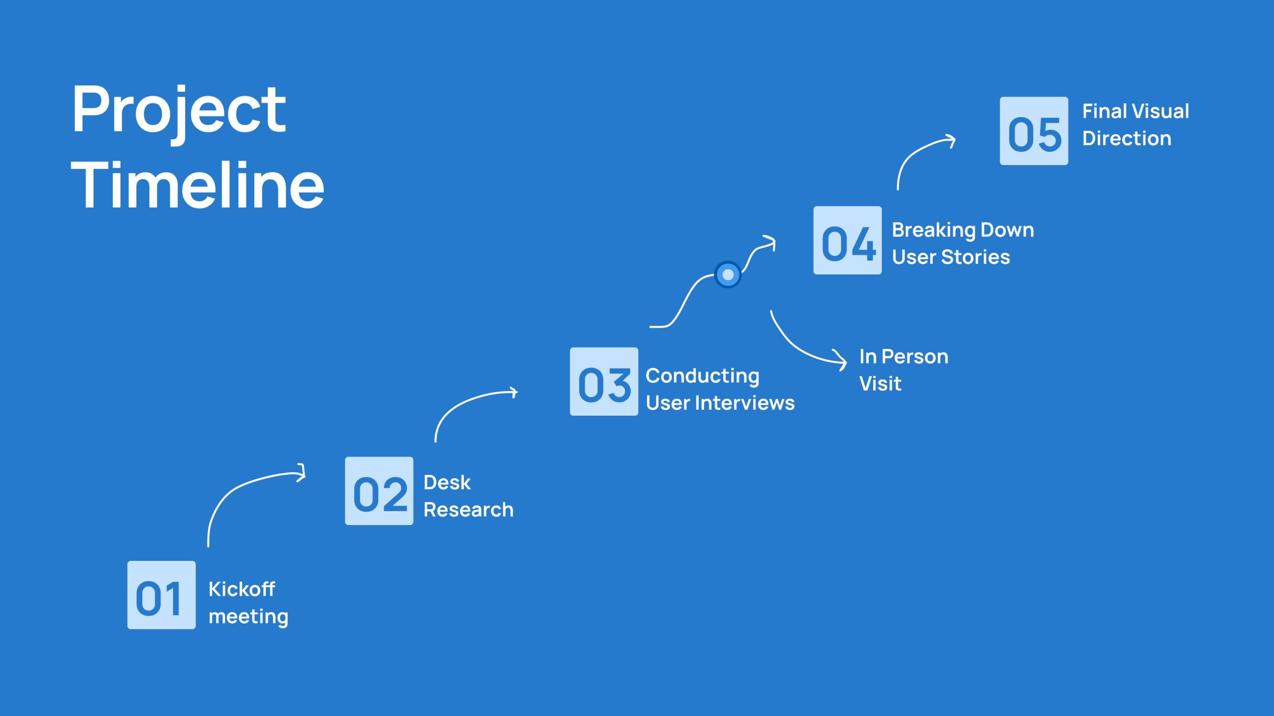
Rather than approaching the redesign as a purely visual problem, we wanted to understand how communication, navigation, and community engagement currently function within the school ecosystem.
Our process combined evaluative, observational, and qualitative research methods to understand both operational pain points and emotional expectations from families and staff.
The structure of the process timeline is presented as a horizontal scroll or carousel to visually communicate the progression of research and synthesis across the semester.
Understanding the Existing Experience
We began by evaluating the current website through a usability and communication lens. While the website already contained meaningful content and institutional knowledge, several structural challenges consistently appeared throughout the experience.
Information hierarchy often feels dense and difficult to scan quickly. Important updates were not immediately visible, and navigation pathways required users to search across multiple sections before finding what they needed. Communication systems also felt fragmented, reinforcing parent dependency on external platforms instead of the website itself.
At the same time, the evaluation revealed an important insight: the issue was not a lack of information, but the difficulty of understanding where information lived and how to revisit it later.
Learning from Other Schools
To better understand how similar schools manage communication and parent engagement digitally, we studied several comparable school websites across Brooklyn and New York.
Instead of searching for direct visual inspiration alone, we focused on understanding how other schools structure information, surface updates, and communicate community identity online.
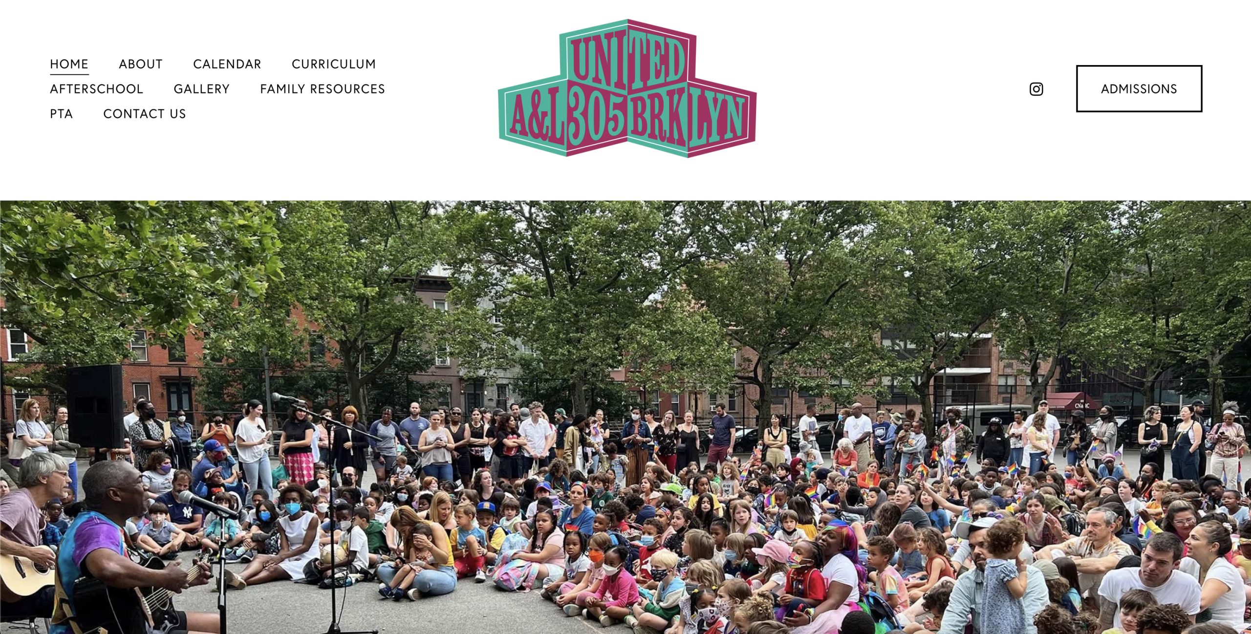
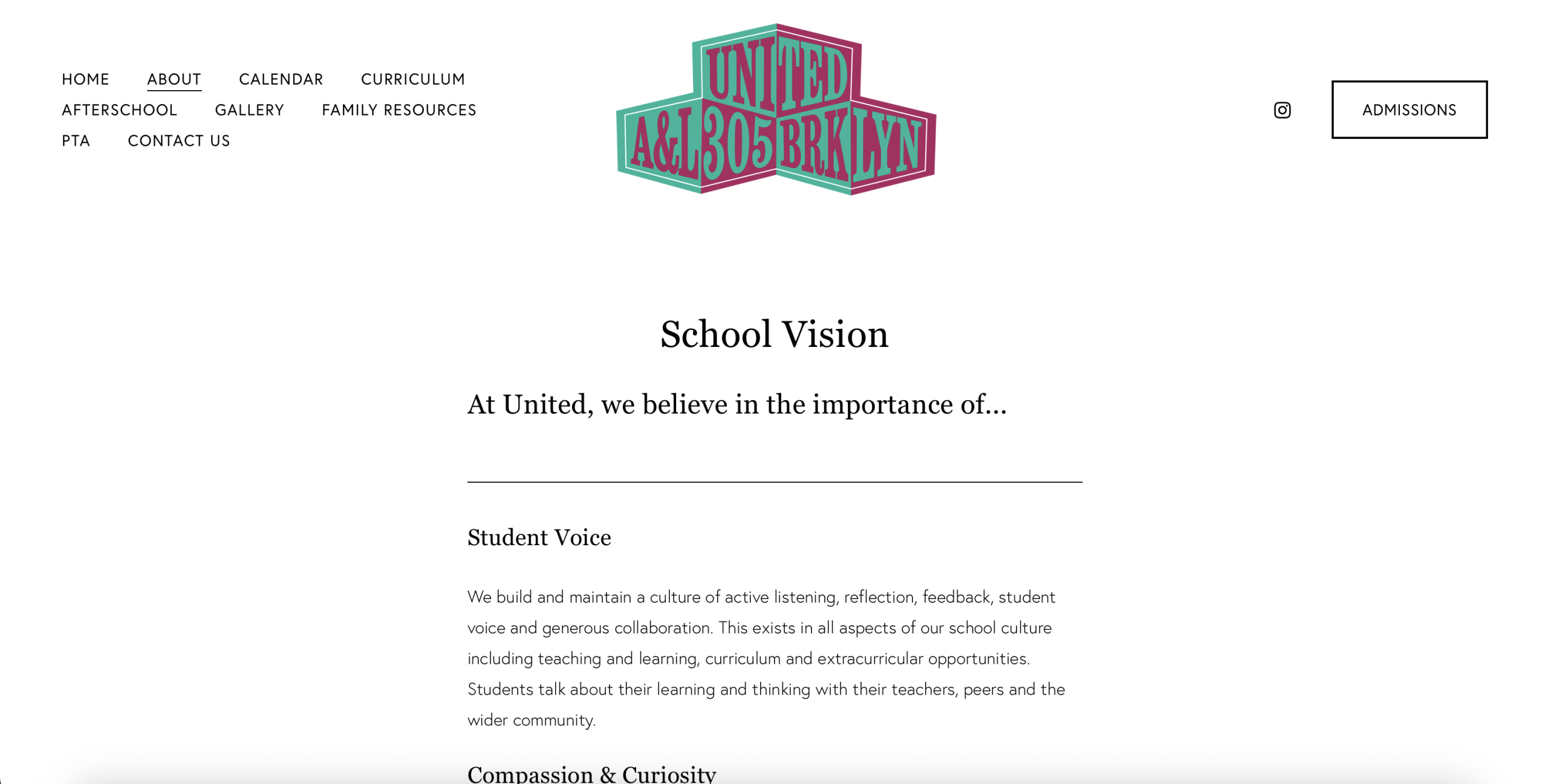
Among the references we studied, United A&L 305 Brooklyn stood out particularly strongly in the way it handled calendars, PTA visibility, downloadable resources, and communication clarity. Upcoming events were highly visible, PTA pathways felt structured rather than hidden, and downloadable resources remained visually integrated into the overall platform instead of feeling detached.
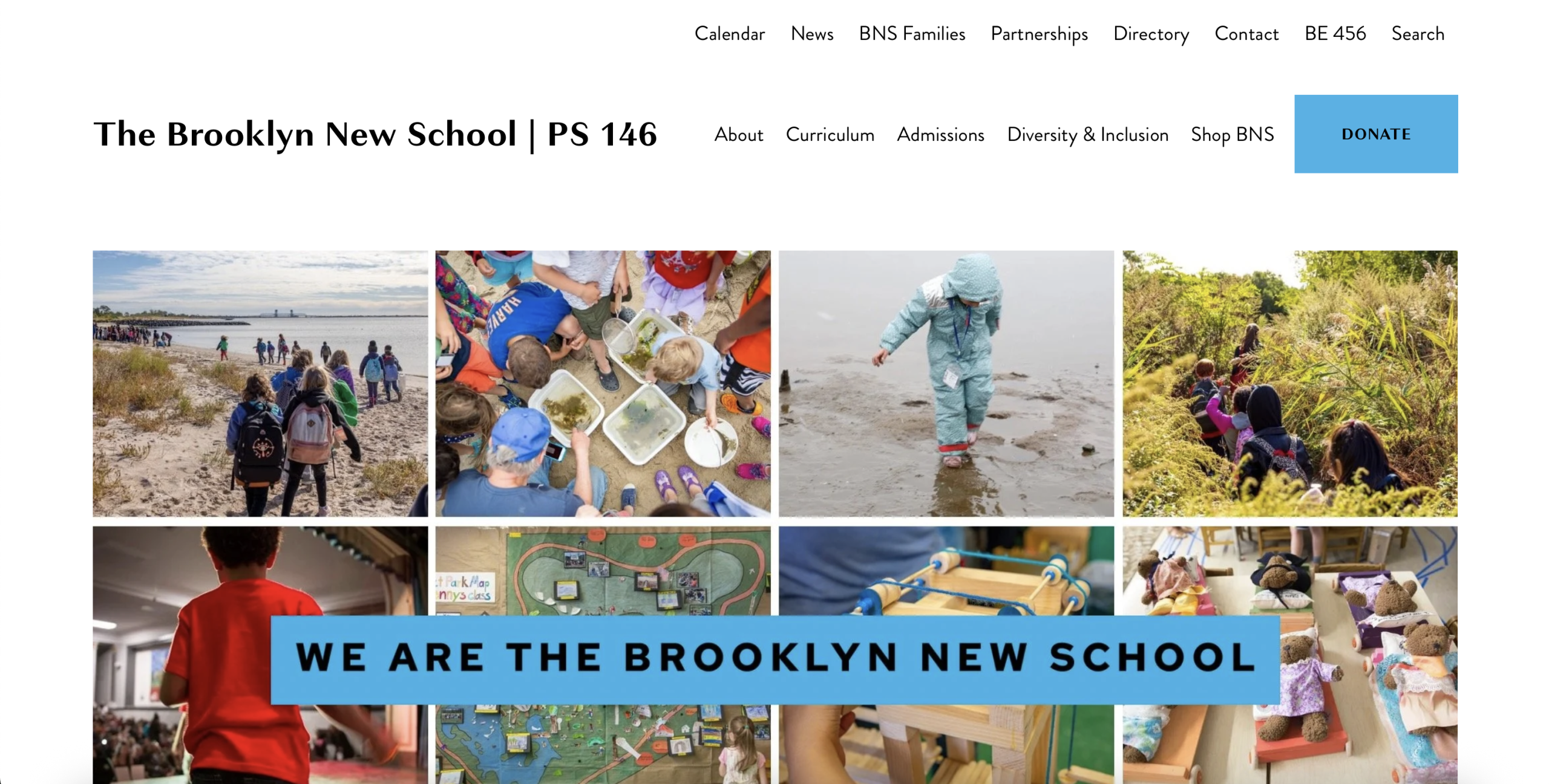
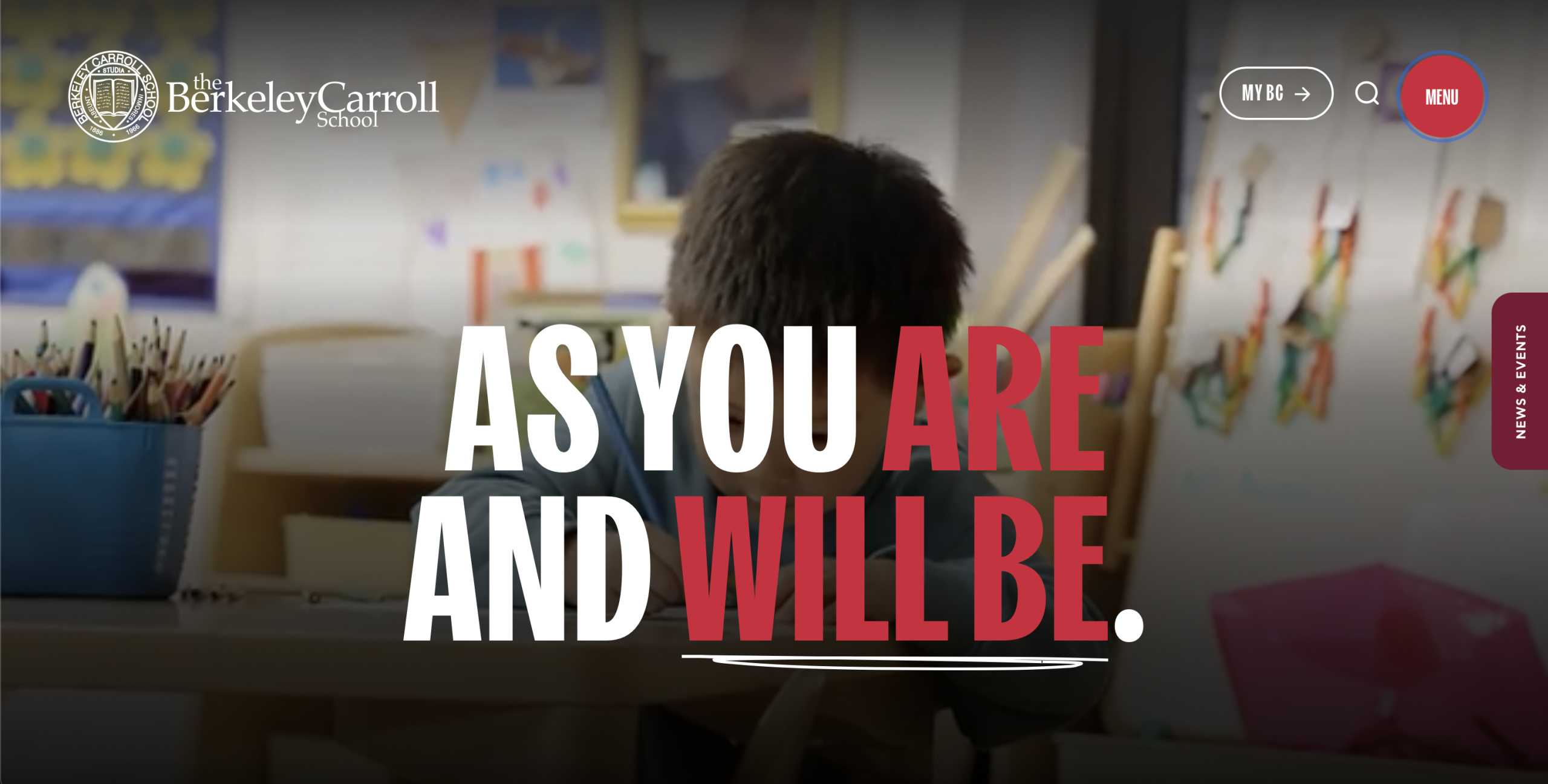
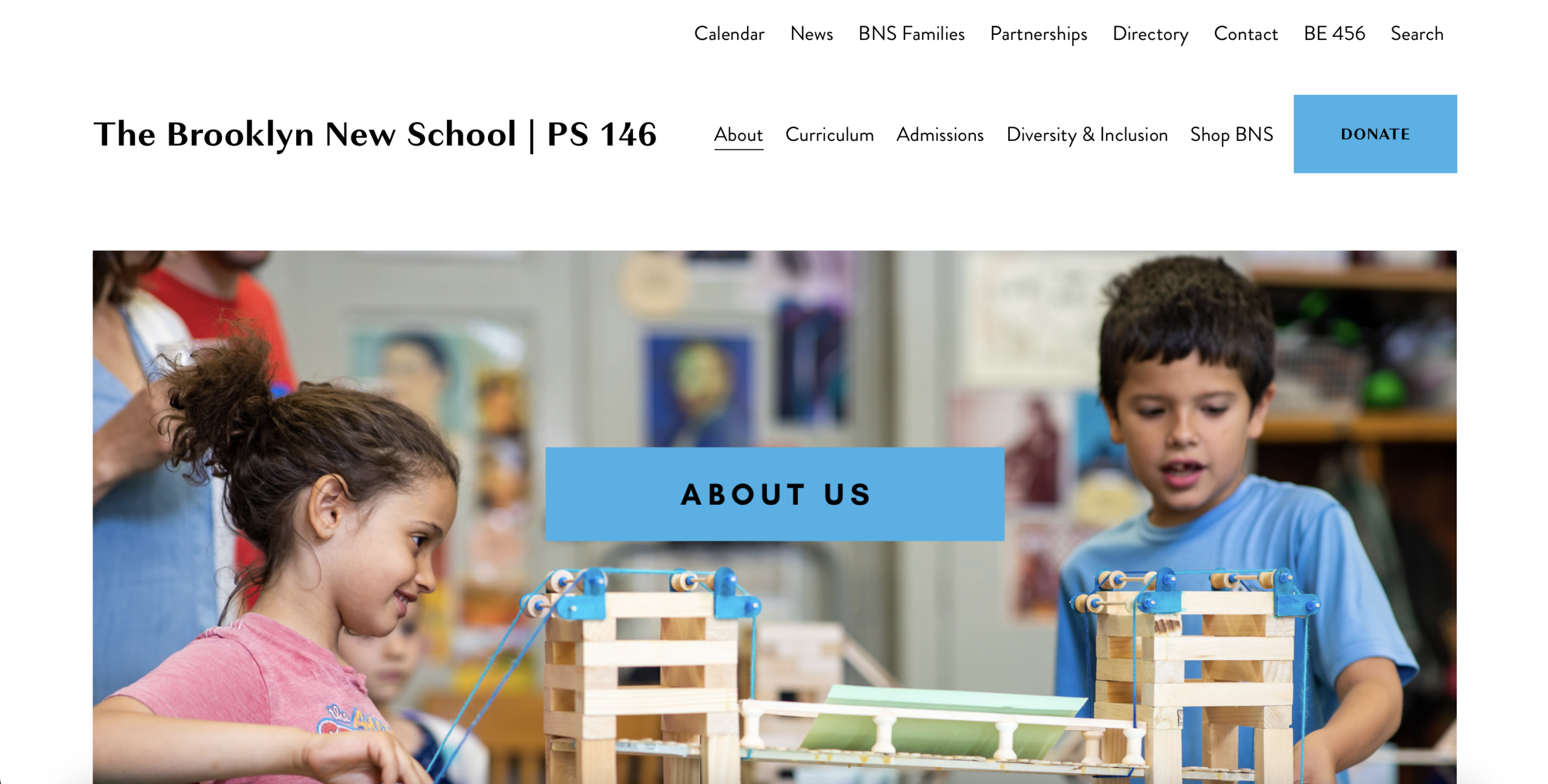
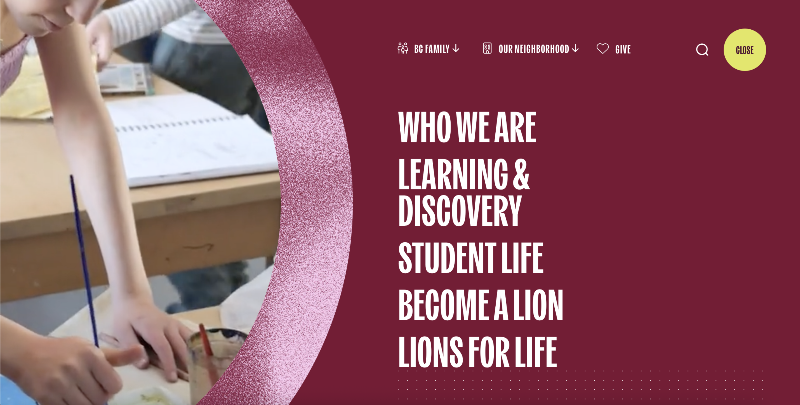
Brooklyn New School surfaced events and announcements directly on the homepage, reducing the need for parents to search across pages for updates. Berkeley Carroll demonstrated how visual language, photography, and tone can immediately communicate the values and atmosphere of a school before users even begin navigating deeper.
Across all the references, one pattern became very clear: the strongest school websites balanced operational clarity with emotional connection.
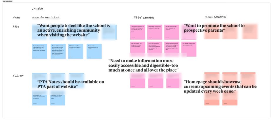
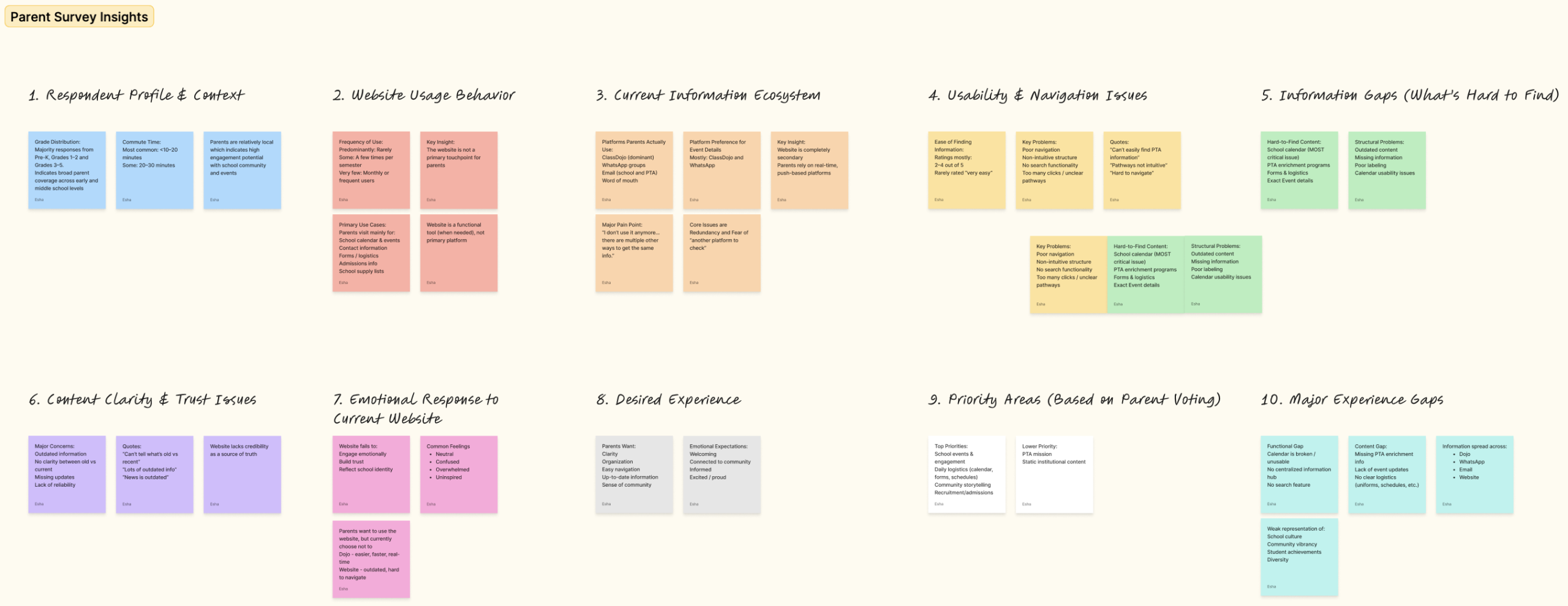
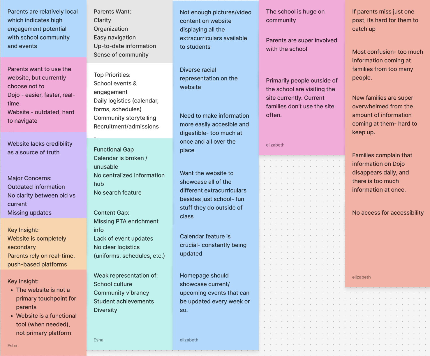
Hearing From Parents & Stakeholders
Parent surveys and stakeholder interviews reinforced many of the same patterns we had already begun noticing through evaluation and competitive analysis.
Families consistently described communication as scattered and difficult to revisit later if something was missed. Parents wanted a clearer place to catch up on events, updates, logistics, and school resources without needing to move across multiple communication channels.
Many respondents also associated the identity of the school much more strongly with its physical environment and community than with its current website experience.
Selected quotes fade between slides to create a more conversational reading experience throughout the case study.
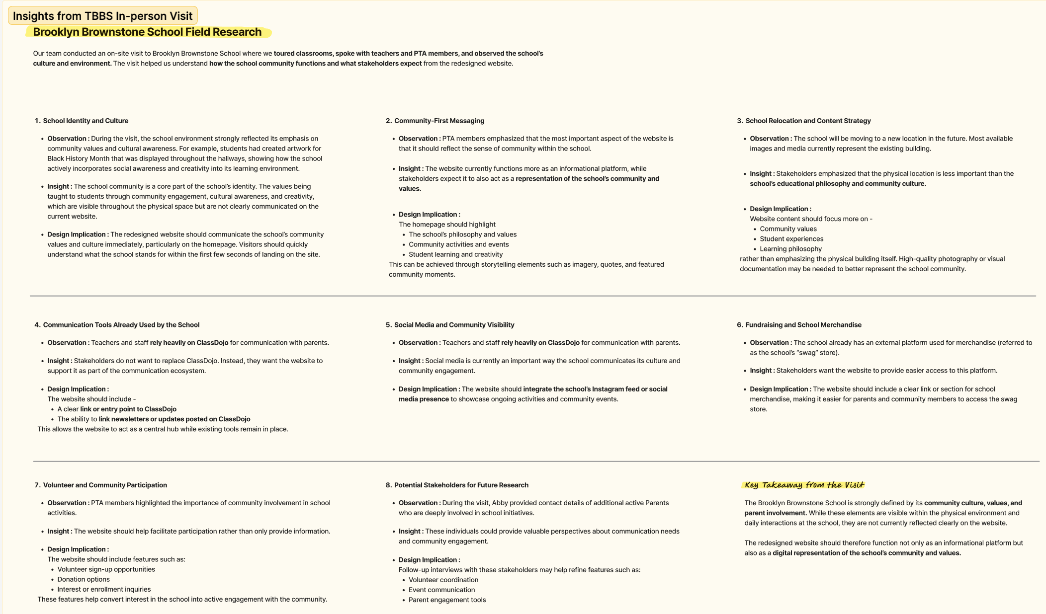
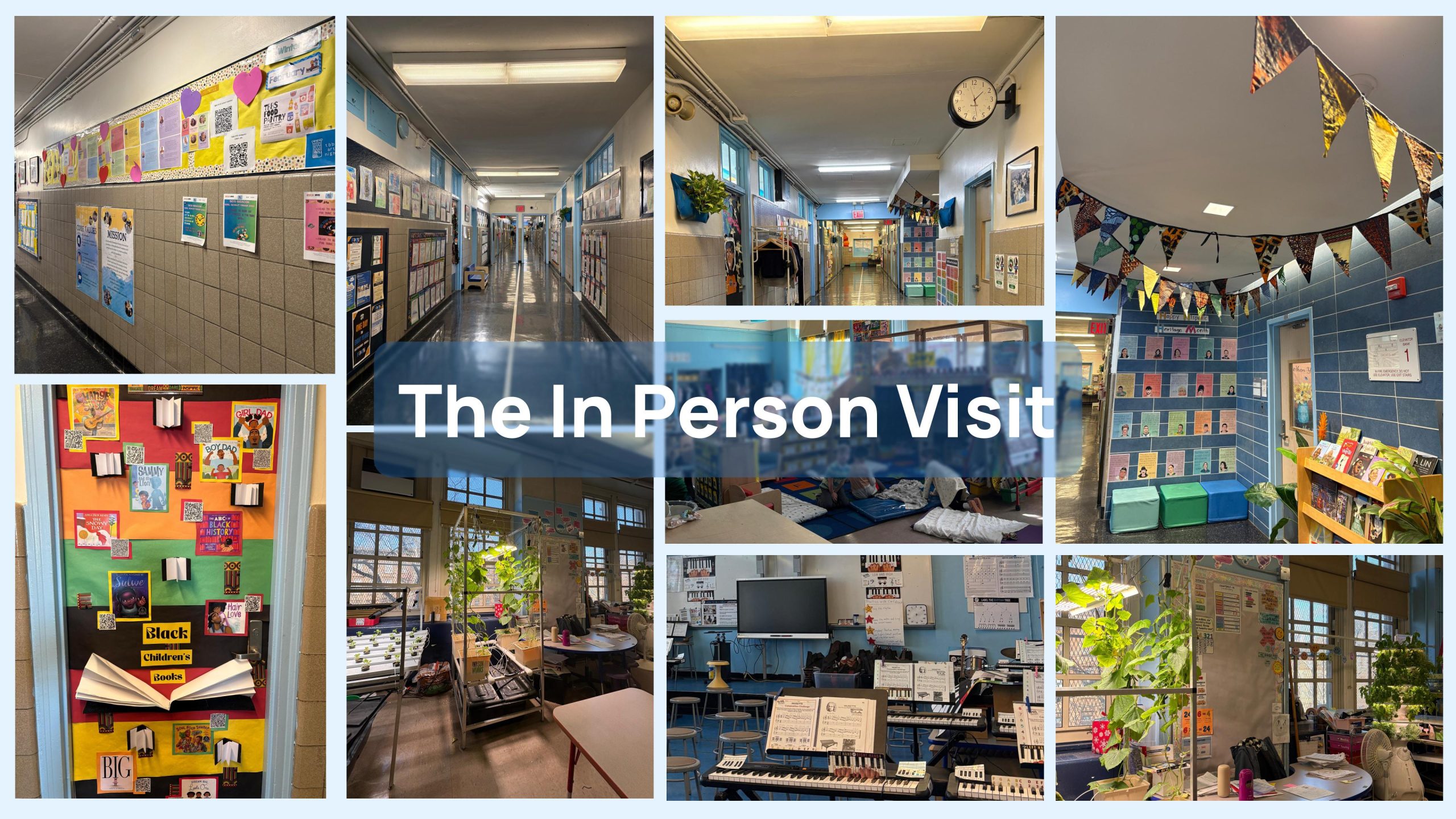
The In-Person Visit Changed Our Understanding
Visiting the school in person completely shifted how we thought about the project.
Until that point, much of our understanding came through interviews, surveys, and digital observations. Experiencing the school physically revealed how much of its identity lived within the environment itself.
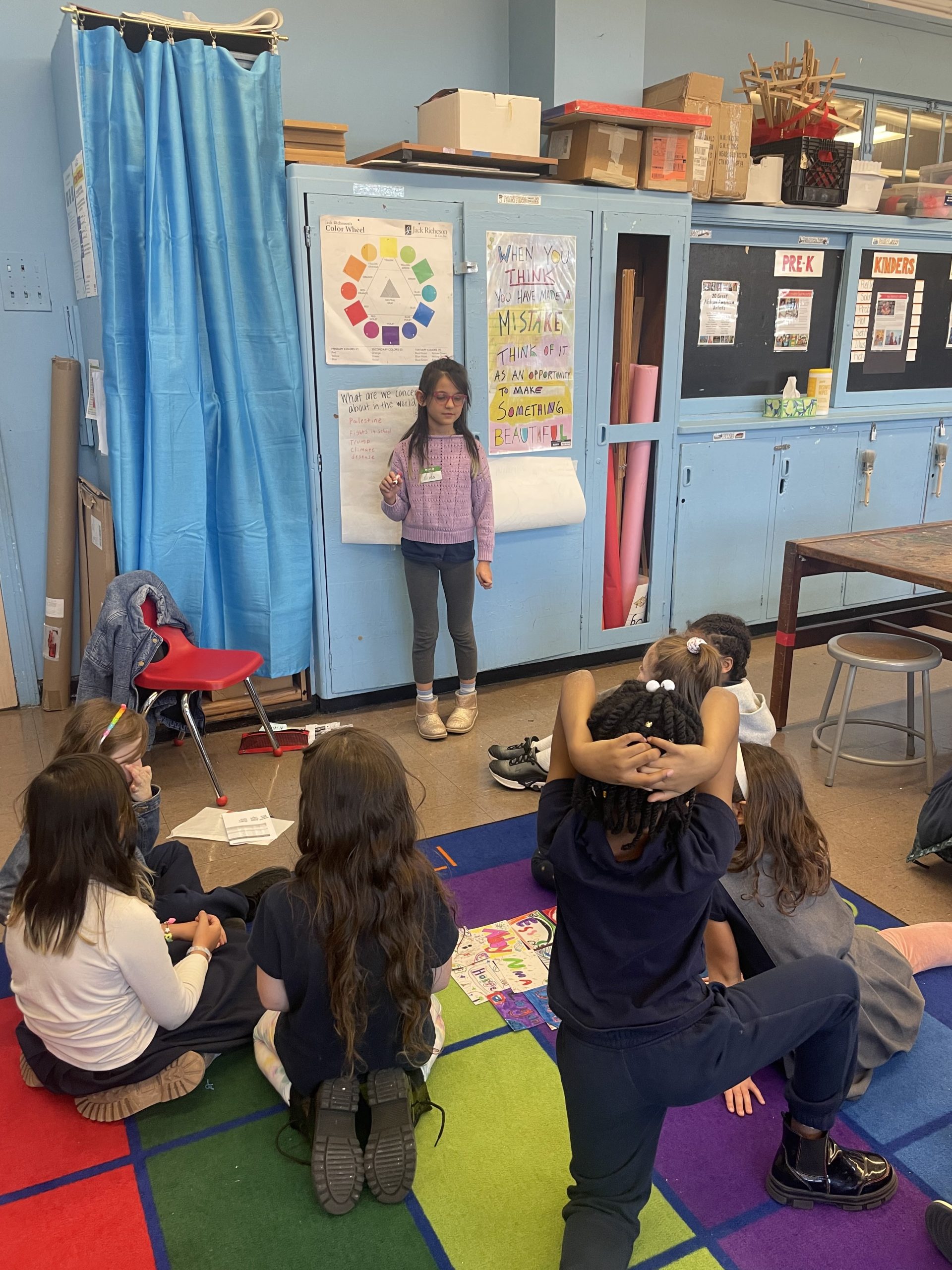
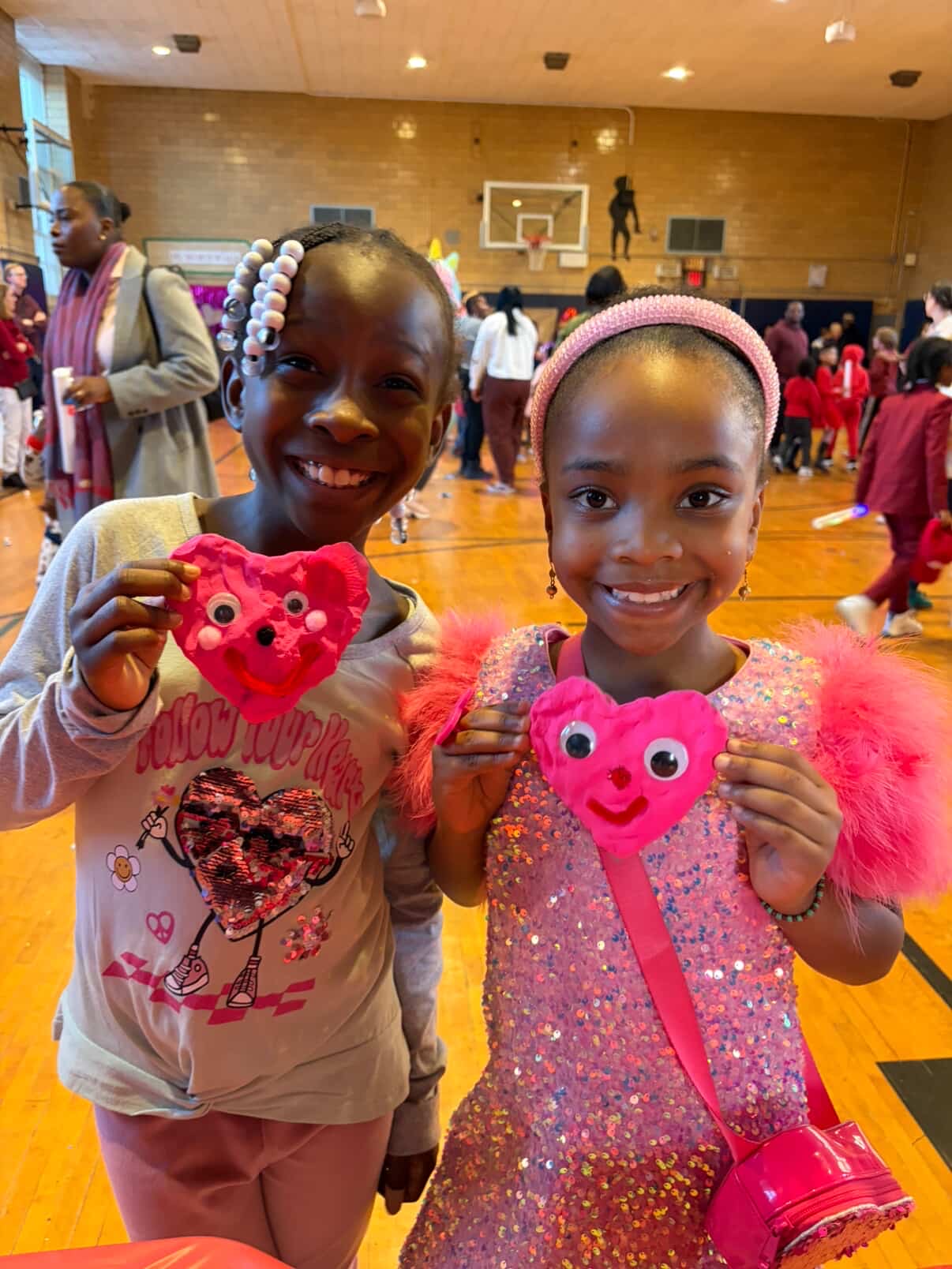
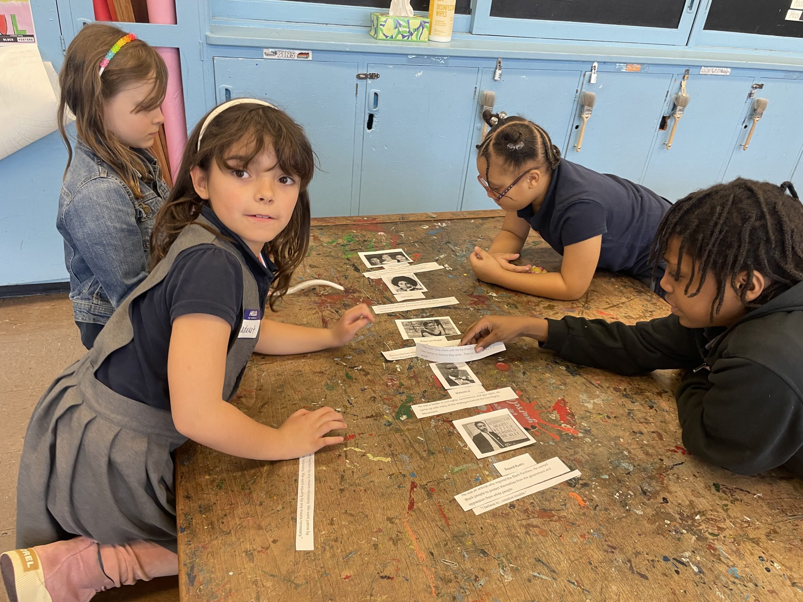
Student artwork filled the hallways. Cultural celebrations were visible throughout classrooms. Teachers, parents, and students interacted closely, creating an atmosphere that felt collaborative, expressive, and deeply community-oriented.
The school felt energetic and alive in ways that the website was not currently communicating.
This became one of the most important turning points in the project. We realized that the redesign was not only about organizing information better, but also about helping prospective families understand what it feels like to be part of the school community before ever stepping into the building.
Instead of static grids, the photography is displayed through layered overlapping visuals to better recreate the energy and density of the physical environment.
Synthesis
As research findings from different methods began overlapping, a few themes consistently emerged.
Communication was fragmented across platforms. Important updates were difficult to revisit later. Parents lacked a predictable system for understanding where information lived. At the same time, the strongest part of the school, its sense of community, was not clearly reflected online.
These themes helped us move away from solving isolated usability problems and toward defining broader experience opportunities.
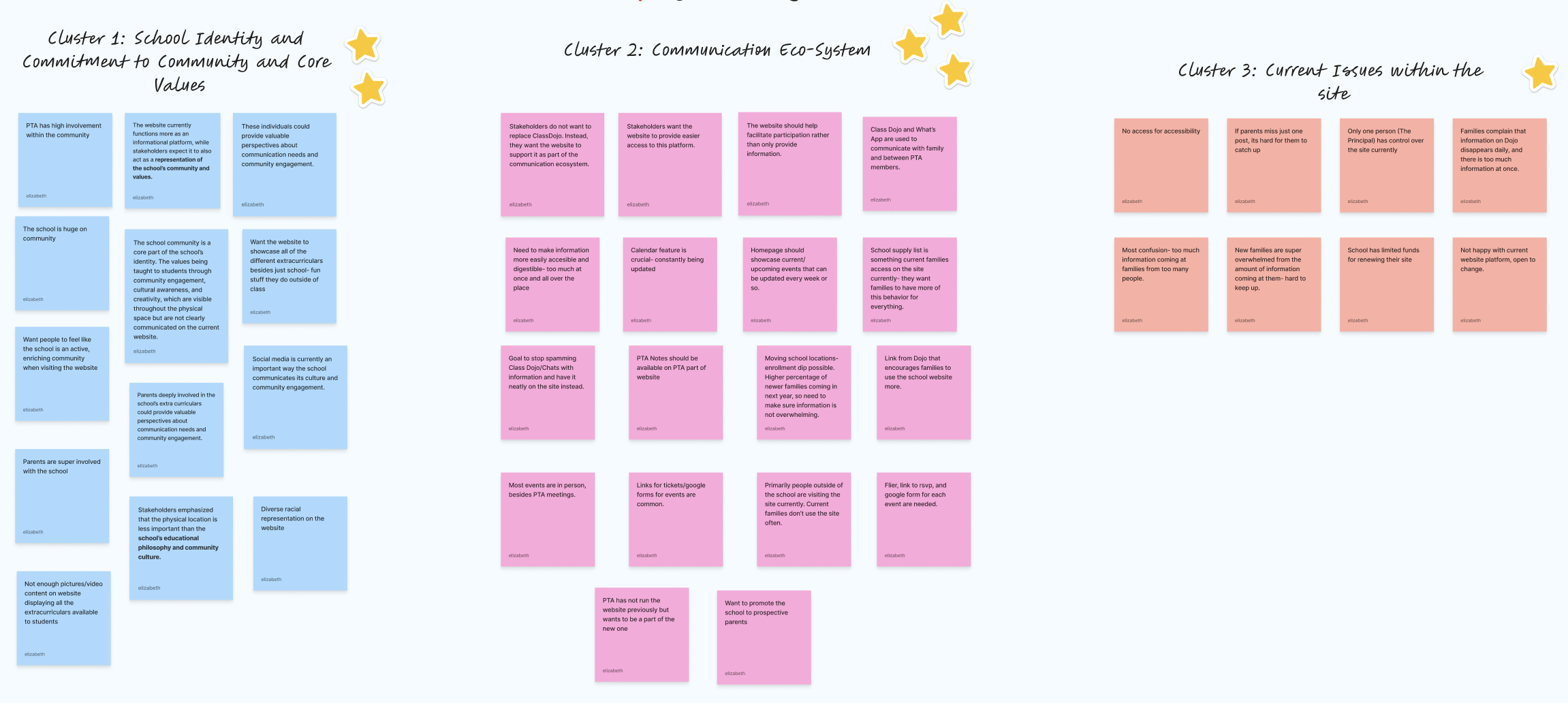
Core Insights from Affinity Diagramming:
- Communication Fragmentation: Gathering all crucial information together, rather than disconnected across multiple platforms.
- Catch-Up Difficulty: Older notifications would be easy to access, eliminating pressure to stay update on all notifications.
- Visibility of Updates: Updates/Events will be updated continuously on a page.
- Community Representation: Better representation of the school’s diversity through photography .
- Prospective Parent Experience: Prospective parents can get a great sense of what the school is like, and what it offers.
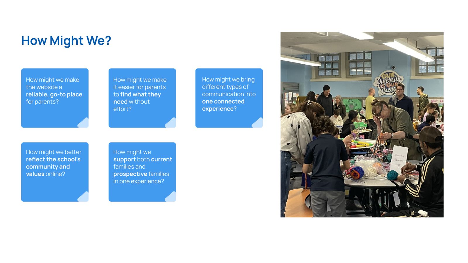
How Might We
Practicing “how might we…” exercises helped us turn research insights into actionable design directions.
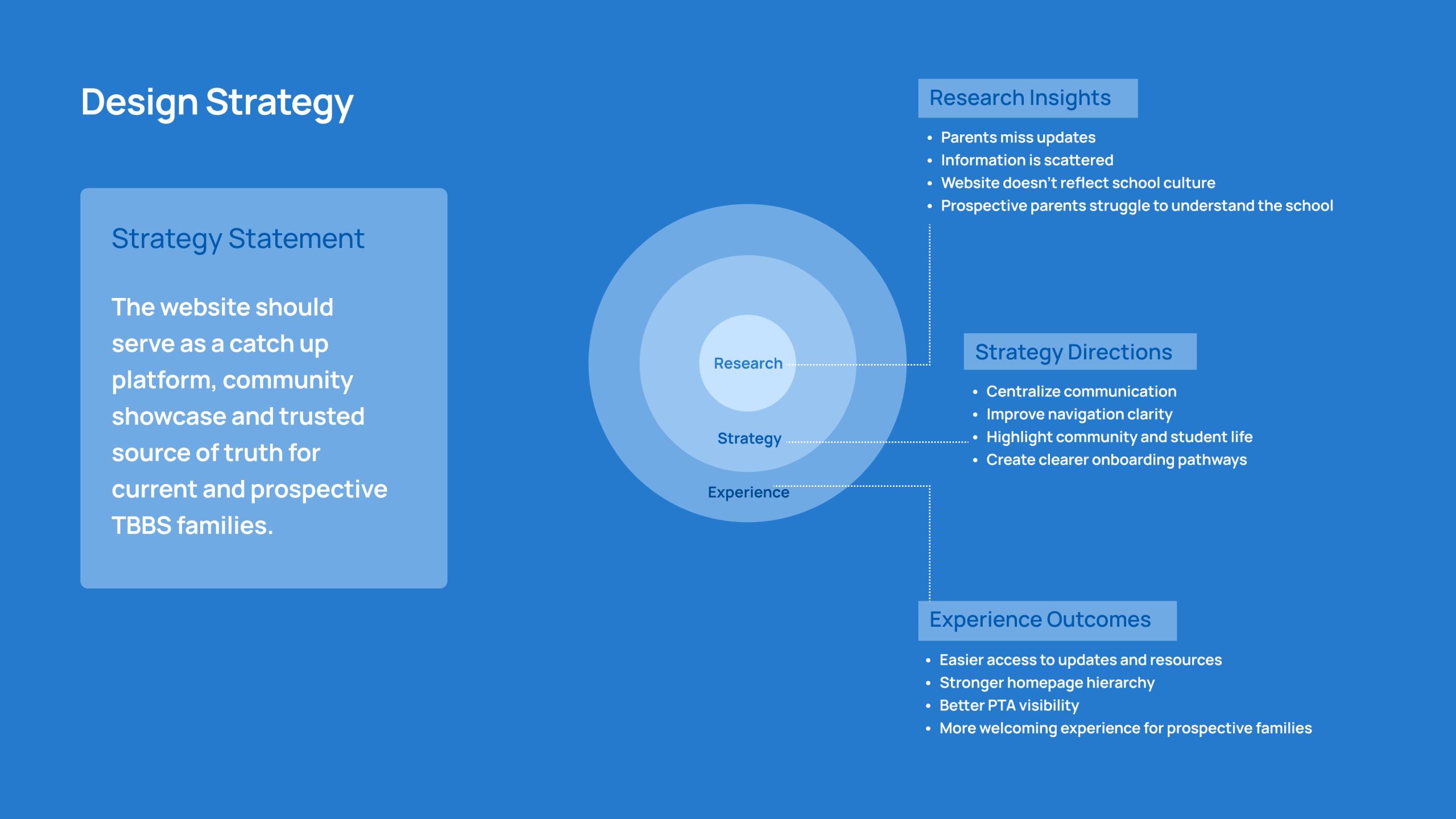
Design Strategy
Our final strategy focused on making the website feel clearer, more dependable, and more reflective of the school itself.
The redesign aimed to create stronger communication visibility, clearer navigation pathways, and a more cohesive experience for both operational and emotional needs.
The website was no longer being treated as a static informational platform. Instead, it became a communication system, a catch-up tool, and a digital representation of the school community.
Design Development
The design phase focused on turning research insights into a clearer and more connected experience for both current and prospective TBBS families.
Rather than treating the redesign as a visual refresh alone, we focused on improving how information is prioritized, accessed, and experienced across the platform.
Our strategy throughout the design process remained consistent:
“The website should serve as a catch up platform, community showcase, and trusted source of truth for current and prospective TBBS families.”
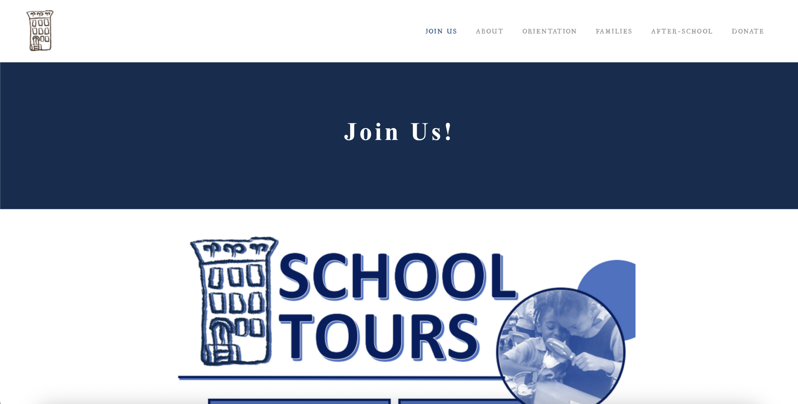
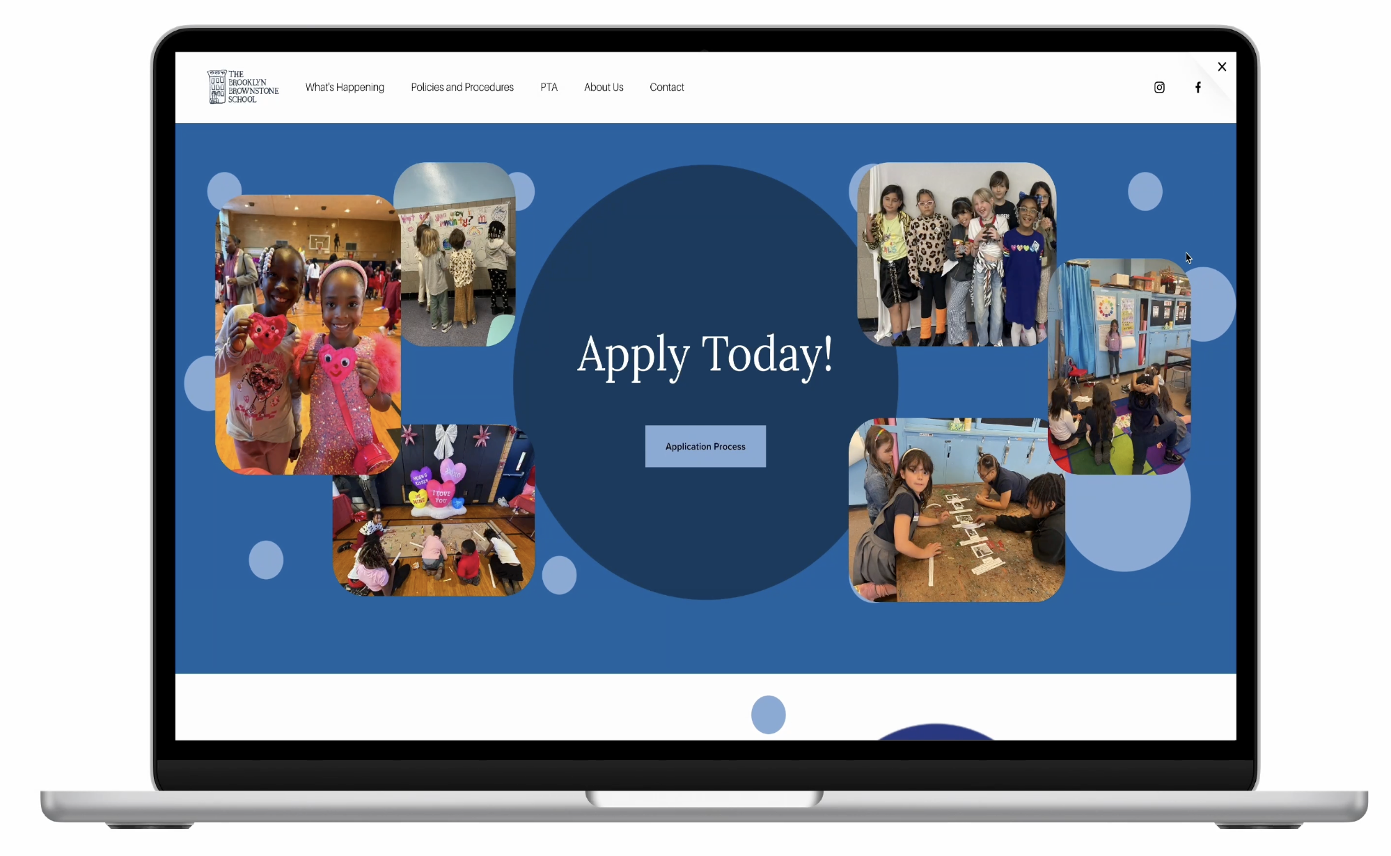
Reworking the Homepage
One of the biggest redesign opportunities was the homepage experience.
The original homepage contained useful information, but important updates, resources, and school identity competed for attention. Parents often had to search through multiple sections before understanding what was relevant to them.
- The redesigned homepage focused on:
- clearer hierarchy,
- faster scanning,
- and stronger communication visibility.
Upcoming events and announcements surfaced much earlier on the page to help parents quickly catch up on important updates without relying entirely on external communication channels.
At the same time, photography, student work, and community-focused messaging were brought forward more intentionally to better reflect the energy and culture of the school.
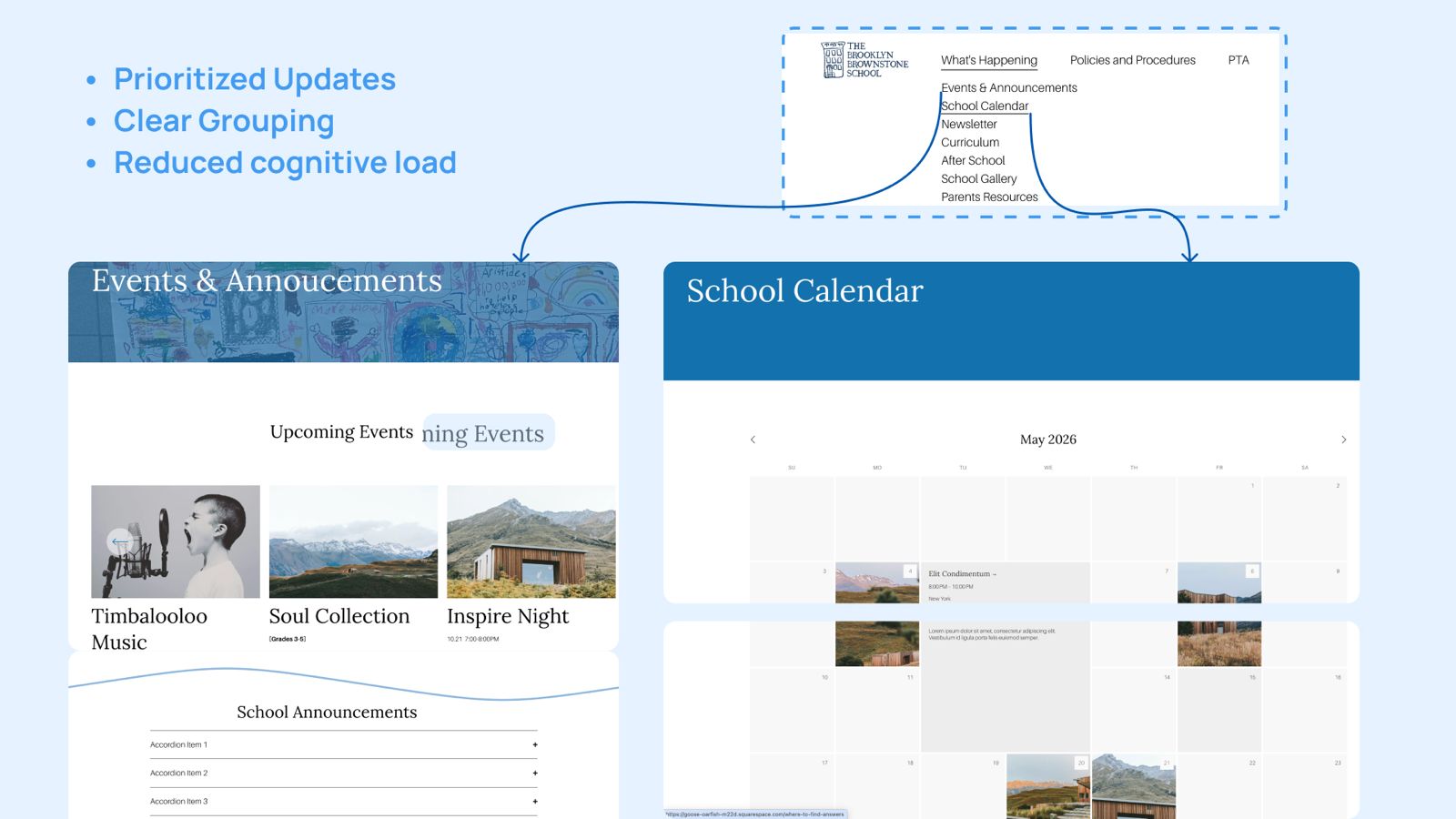
Designing for “Catch Up” Behavior
Research showed that parents often miss information and need a reliable way to revisit updates later.
This shifted our thinking from designing only for discovery to designing for repeated access and quick catch-up.
To support this behavior, the redesign focused on:
- Making updates easier to scan
- Increasing calendar visibility
- And organizing information into clearer sections
The goal was not to reduce information, but to reduce the effort required to process and relocate it later.
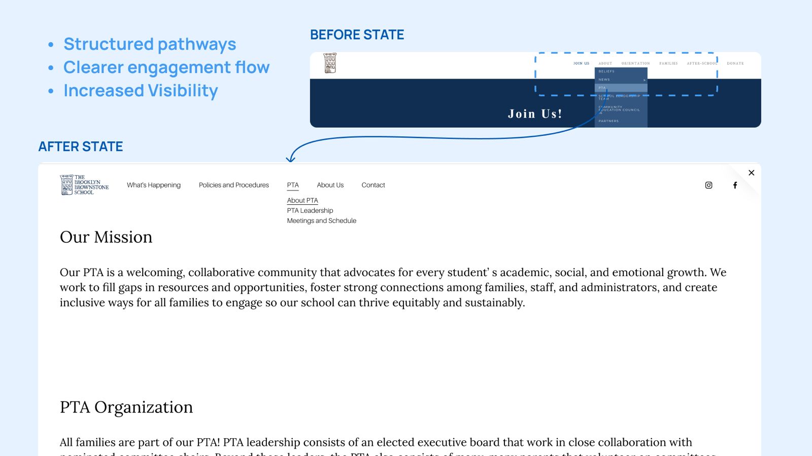
Improving PTA Visibility
The PTA played a major role in school communication and community engagement, but PTA-related information previously felt disconnected from the rest of the platform.
The redesign integrated PTA more intentionally into navigation and content structure, making it easier for parents to:
understand involvement opportunities,
access updates,
and participate in school initiatives.
Rather than functioning as a secondary page, PTA became a more visible and connected part of the website experience.
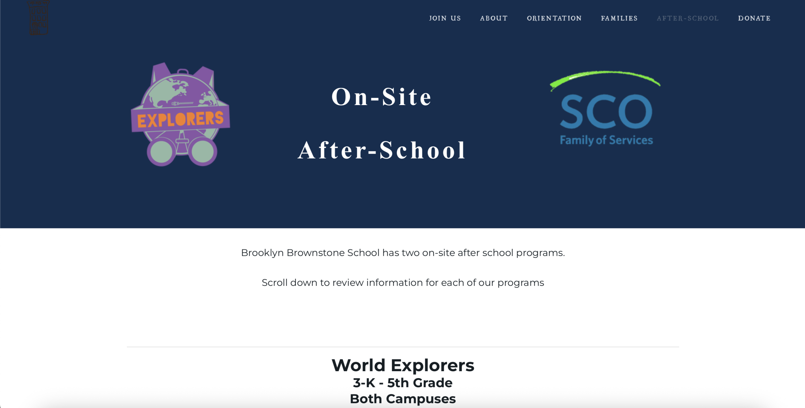
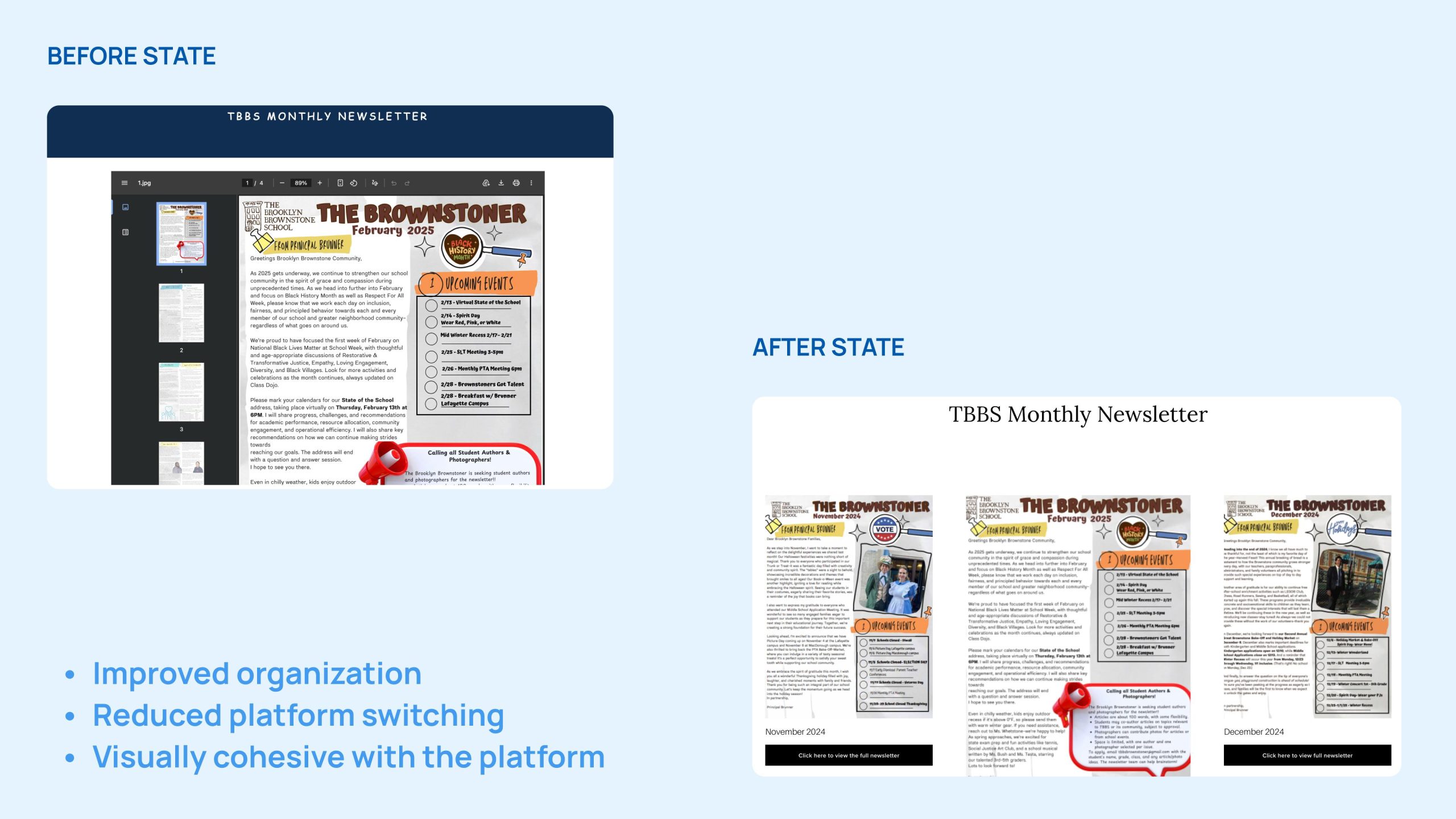
Creating Better Resource Integration
The original platform relied heavily on downloadable documents, which often felt visually disconnected from the website experience.
Instead of removing PDFs entirely, resources were integrated more cohesively into pages while still remaining downloadable when needed.
This helped information feel more organized, connected, and easier to revisit.
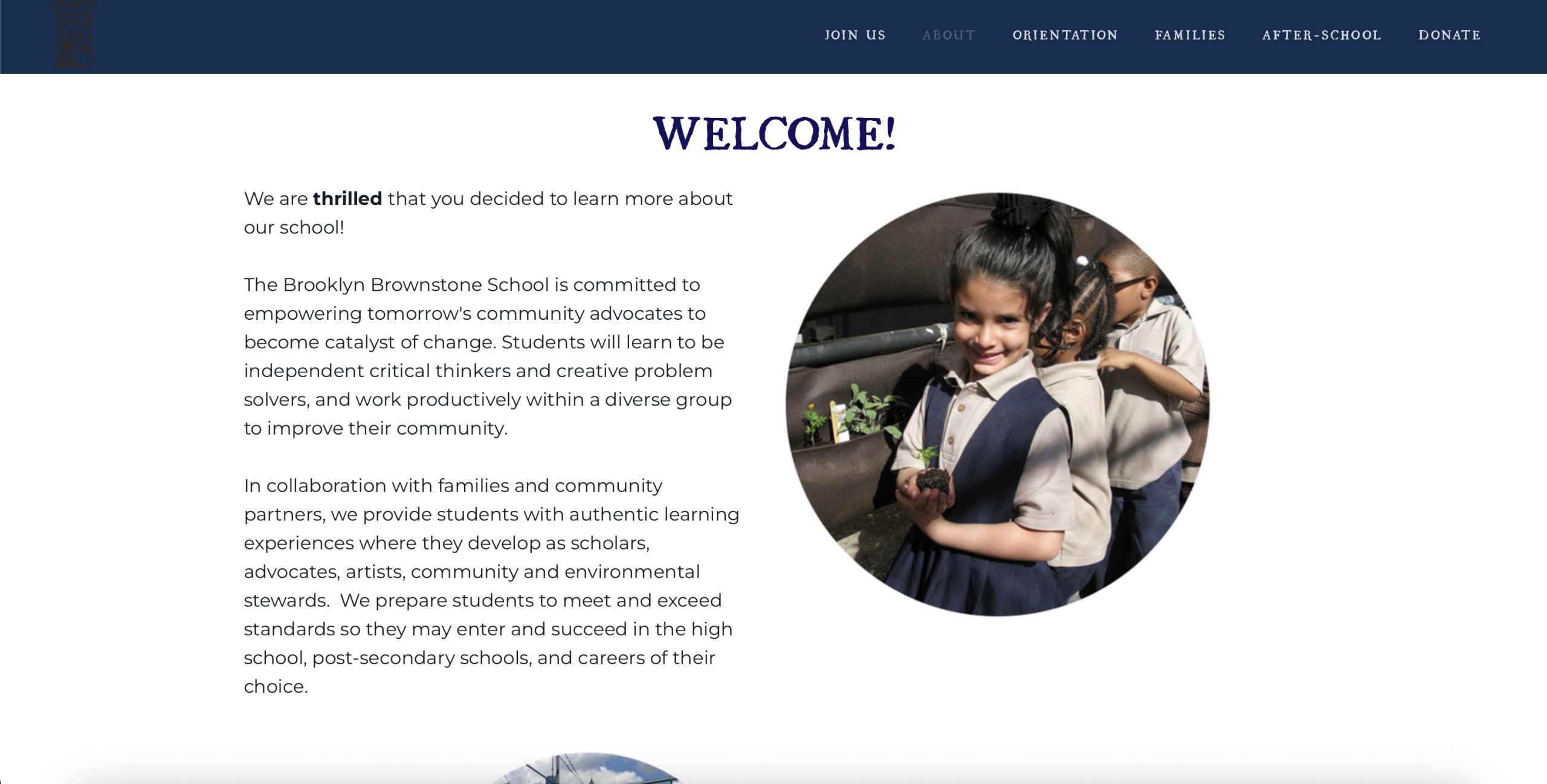
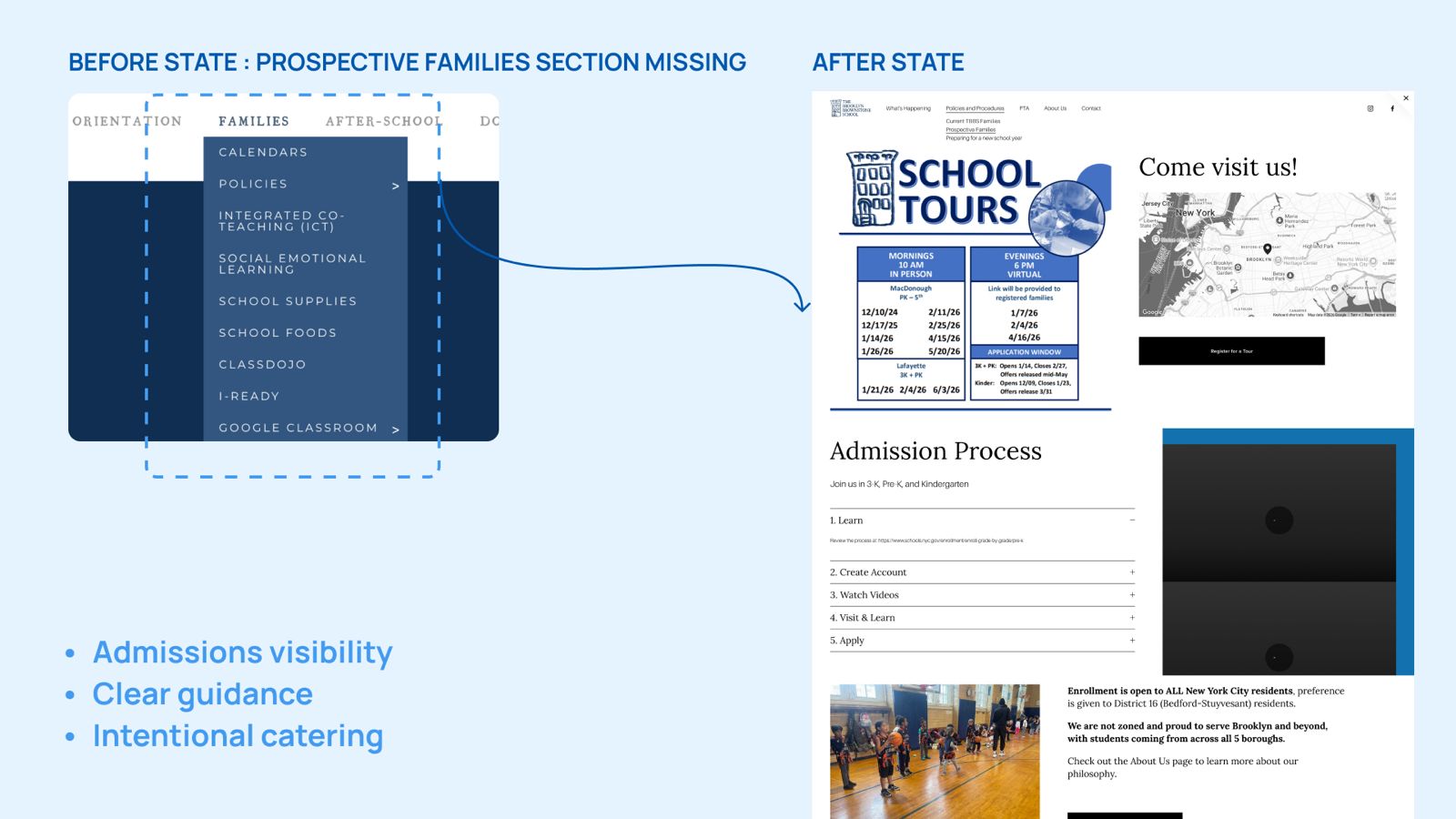
Supporting Prospective Families
Current families and prospective families interacted with the website very differently.
While current parents prioritized updates and logistics, prospective families were trying to understand the school’s values, environment, and community.
To support this, the redesign introduced clearer onboarding pathways, stronger storytelling, and more intentional use of photography and school culture throughout the platform.
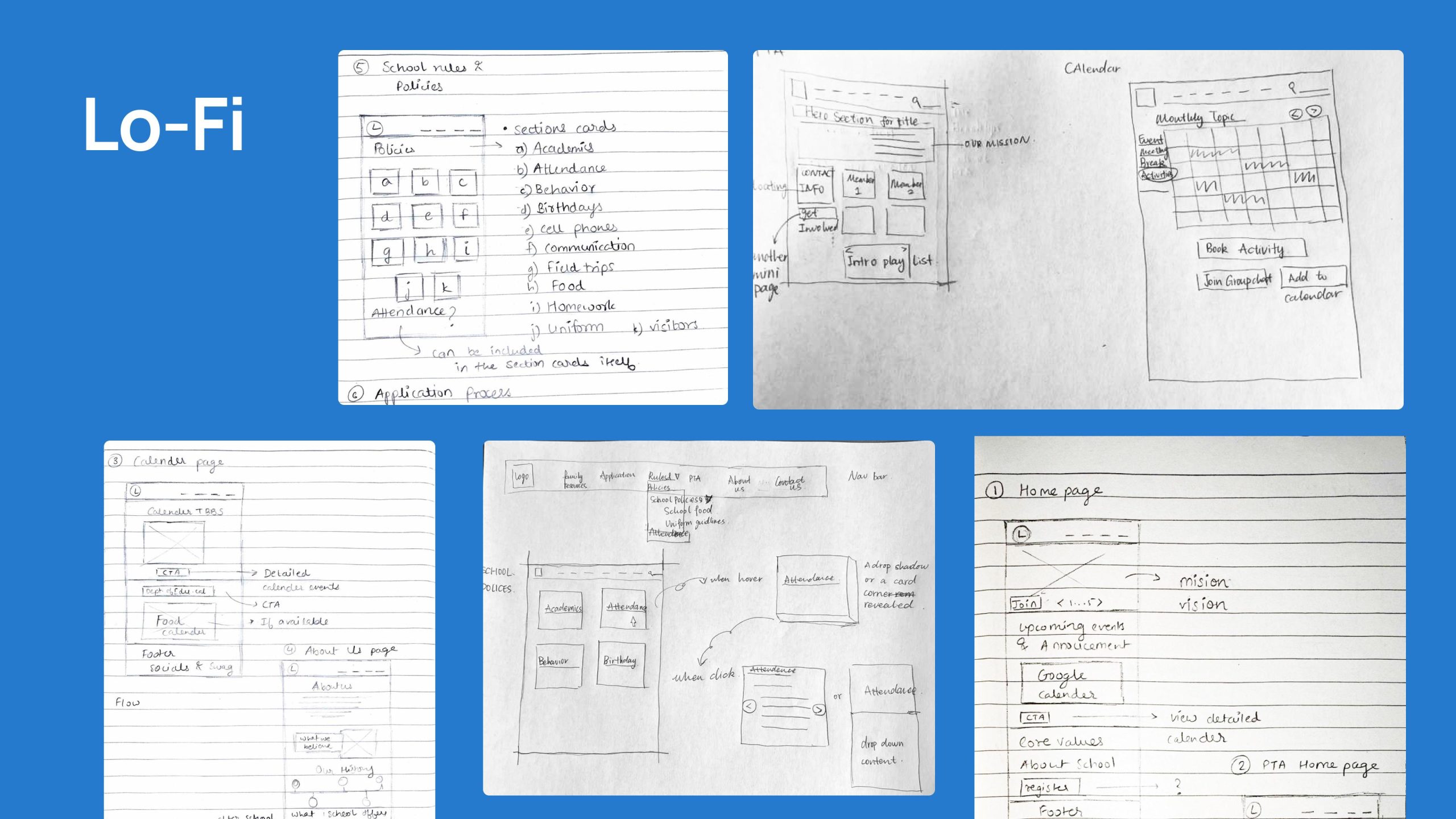
From Structure to Final Experience
The design process moved through multiple iterations, beginning with low-fidelity structural explorations before gradually introducing visual identity and interaction decisions.
This iterative process helped balance usability improvements with emotional storytelling, ensuring the final experience felt both functional and reflective of the school community.
Reflection
This project completely changed the way we think about school websites.
What initially felt like a communication and usability problem became a much larger exploration of trust, visibility, and community identity.
One of the most valuable insights from the semester was understanding how strongly a digital platform shapes a family’s perception of a school before they ever visit it physically.
For Brooklyn Brownstone School, the redesign became an opportunity not just to organize information better, but to create a digital experience that feels much closer to the warmth, energy, and sense of belonging already present within the school community.