Duration
4 Months
(Spring 2026)
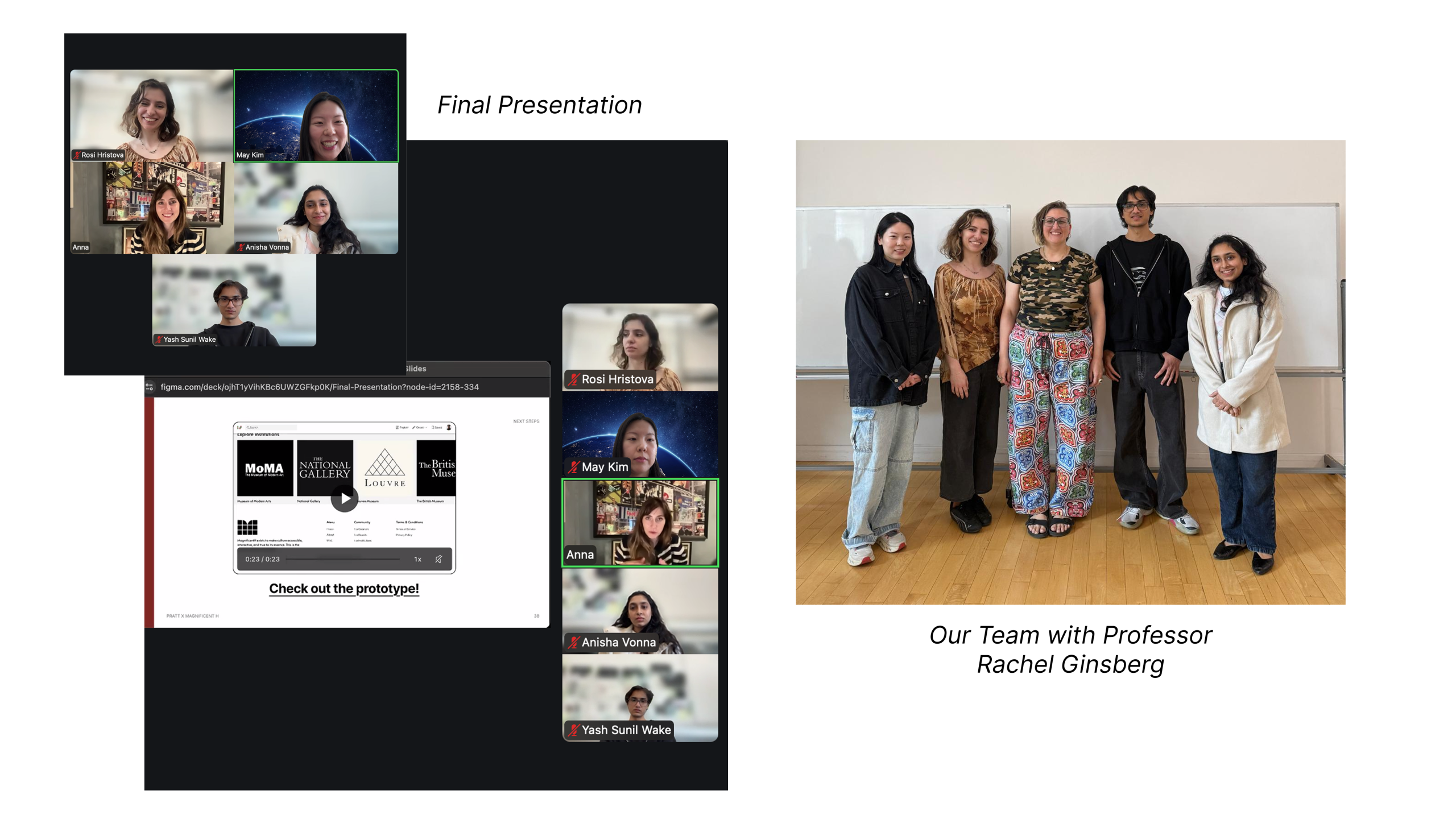
Team
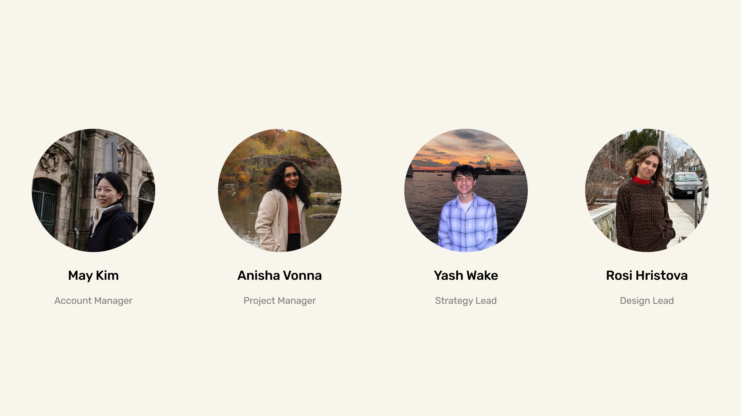
May Kim (Account Manager)
Anisha Vonna (Project Manager)
Yash Wake (Strategy Lead)
Rosi Hristova (Design Lead)
Client
Magnificent-H
Tools
Figma,
Figjam,
Google Workspace,
Zoom
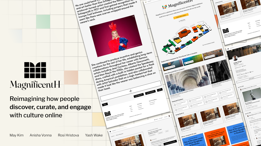
Changing the Traditional Museum Format
Traditional museums can feel intimidating or hard to access, especially for younger audiences, and many of today’s digital platforms are built around fast scrolling, likes, and endless content. Magnificent H is a digital platform looking to disrupt the traditional museum format.
Here, users can create ‘micro museums’, stories that empower creators to share their knowledge about topics they are passionate about. Magnificent H aims to create a place people can come to share, curate, collaborate, and learn without the barriers of visiting a physical museum. Instead, users can simply go online to find meaningful, authentic content created by real people with real substance and context.
Where Does Magnificent H Stand Today, And Where Does It Need To Go?
As the product is still in its early stages, the main issues it faces are expanding the platform’s audience and improving the overall user experience. Magnificent H is also interested in learning if this is a product Gen Z audiences are truly interested in:
- How do they feel about creator-led experiences?
- What are their thoughts on a platform that champions creator-generated content as opposed to AI-generated content?
- Do Gen Z audiences value trust and authenticity?
- Are they tired of current social media formats?
- Are they looking for digital platforms that aren’t as addictive?
- Would they leave other platforms if they found an option they believed was better, such as Magnificent H?
Identifying Our Research Direction
Our goal was to strengthen the Magnificent H experience for both visitors and creators. To focus on making micro-museums easier to find, understand and create, and to support a platform experience built around the answers to the above questions surrounding storytelling, trust and community, we set a few goals to keep in mind as we began the research and design process:
- How do users understand and respond to the idea of a digital micro-museum?
- Which qualities make creator-led content feel trustworthy, authentic, and meaningful?
- How can we improve discovery and navigation to facilitate exploration of micro-museums users are truly interested in?
- Why would creators and curators feel motivated to contribute to the platform, and how can we provide better tools and guidance to the creation workflow?
- How can Magnificent H better support discovery, storytelling, and community connections beyond passive interactions?
View a sneak peak
Check out the prototype!
Methods That Drive Results
To better understand the platform, we utilized a variety of methods that helped us move into our design with an understanding of how to create for our users.
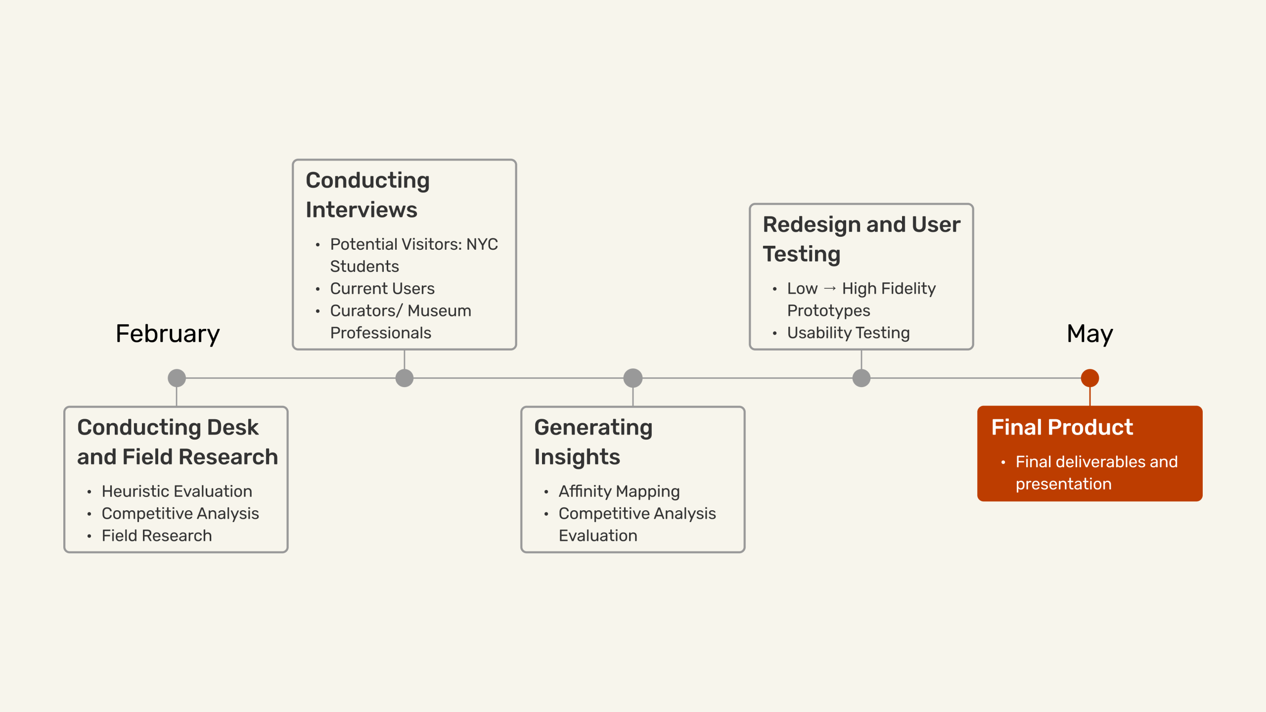
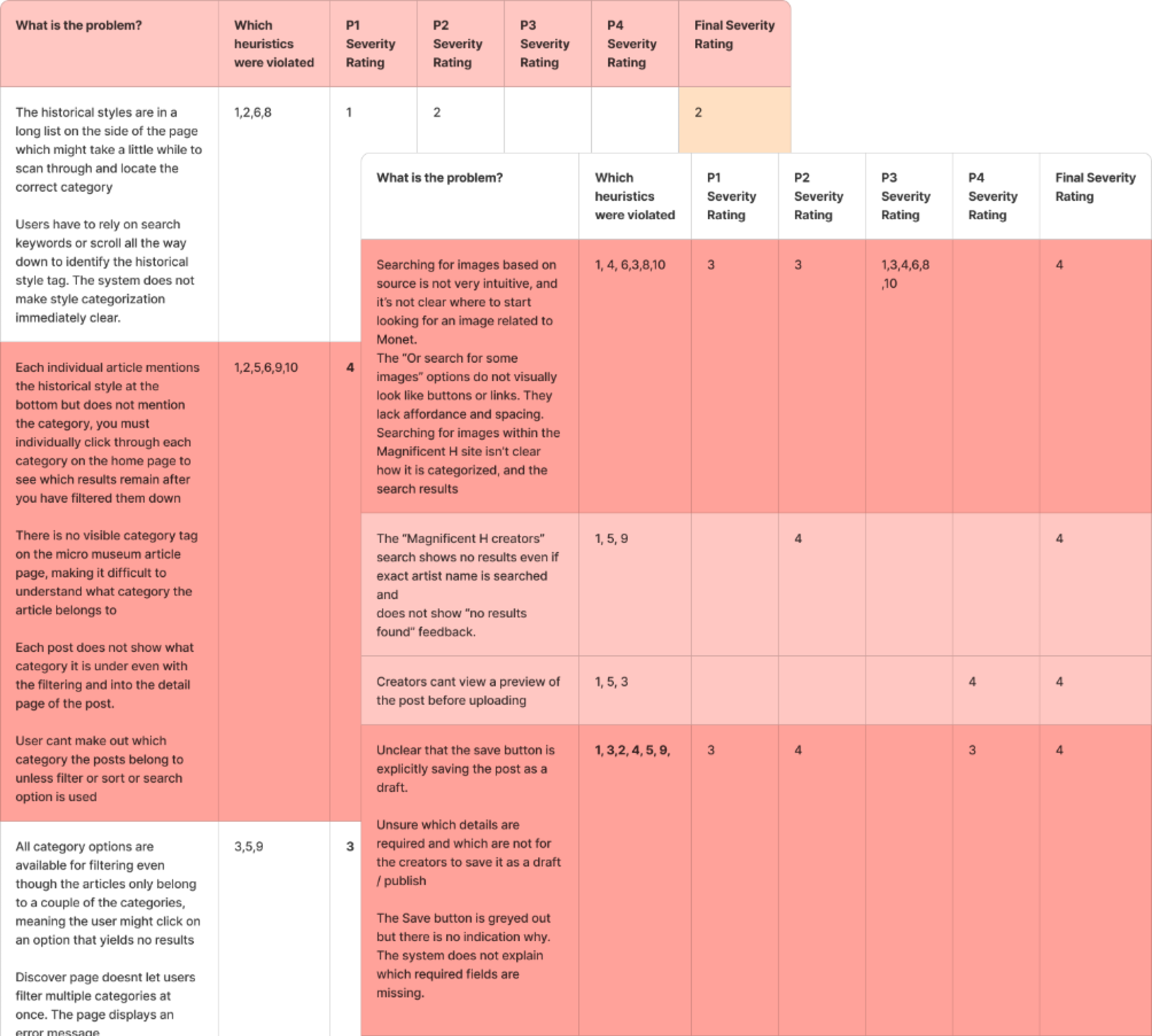
Putting Ourselves in the Shoes of Our Users – A Heuristic Evaluation
We evaluated the existing Magnificent H platform by stepping into the shoes of two distinct user types: a general visitor and a creator. For each, we mapped identified problems against Jakob Nielsen’s 10 Heuristics for User Interface Design and assigned a severity rating from 0 to 4, where 4 represented a critical issue requiring immediate attention and 1 indicated a minor low-priority concern.
As a visitor, we found there was a lack of clarity and system feedback, weak content organization, inefficient navigation and discoverability, limited exploration opportunities, and an overall overwhelming content experience.
As a creator, we found there were weak content organization tools, an unclear creation workflow, a frustrating upload process, no preview before publishing, and a sense of lack of guidance and clear standards.
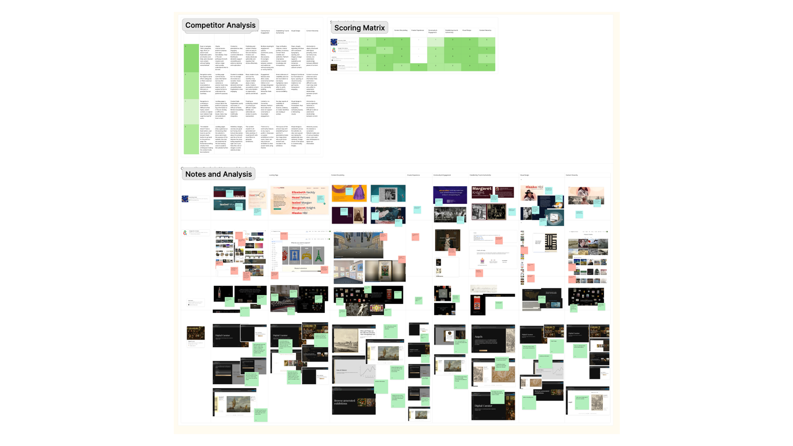
Storytelling in Digital and Physical Spaces – A Competitive Analysis
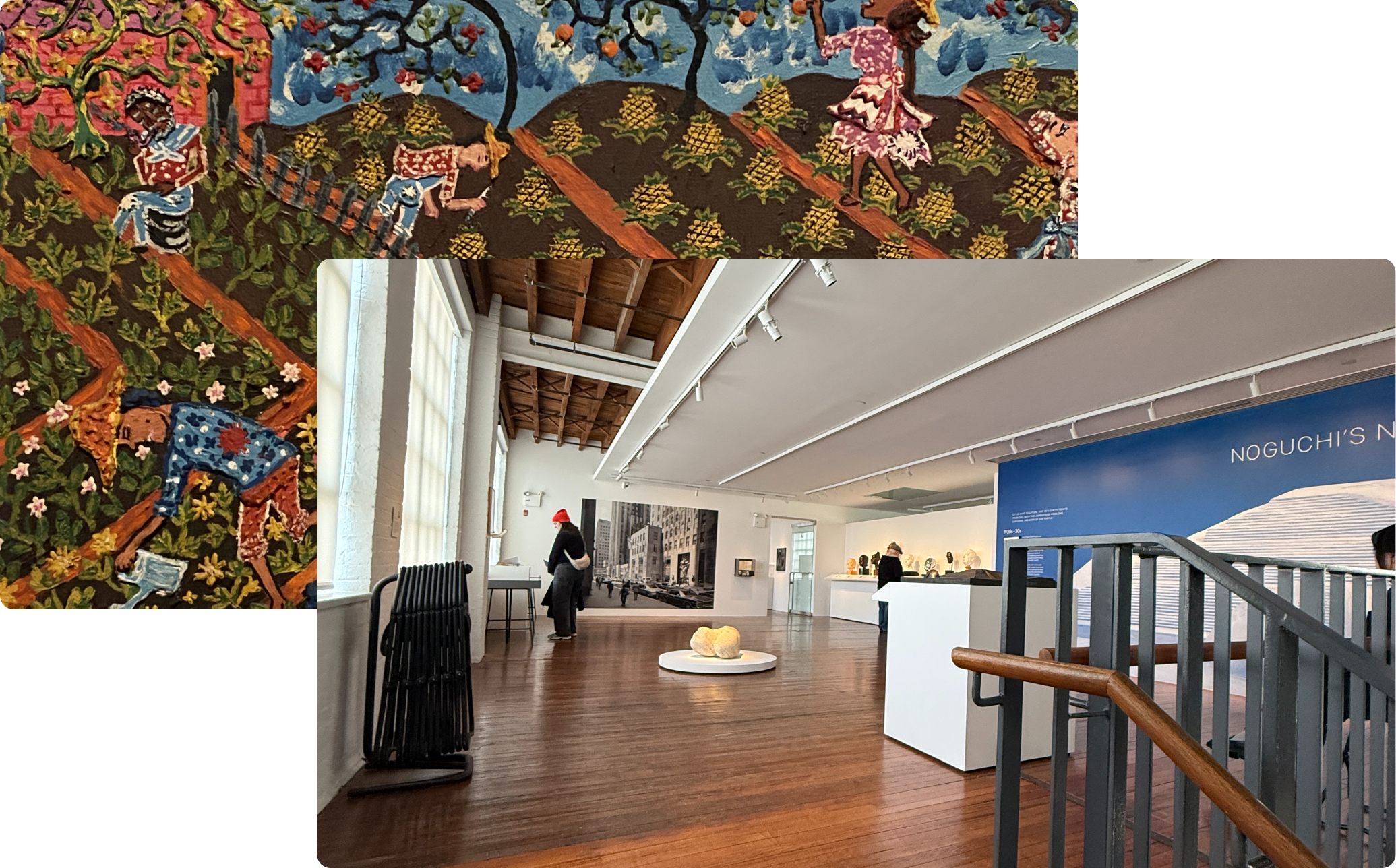
Though there is no platform currently out there that looks exactly like Magnificent H, we selected four existing digital exhibition platforms to conduct a competitive analysis on and scored them across key criteria to identify patterns and gaps. We also visited two physical museums to understand how cultural institutions tell stories in real space, The Boston Museum of Fine Arts and the Noguchi Museum.
After analyzing how storytelling was implemented in both digital and physical spaces, we found the biggest takeaways were that strong platforms communicate their purpose immediately, guide discovery rather than leaving users to search on their own, use multimodal storytelling across text, visuals, and interactive elements, and make content credibility visible at all times.
Looking at the Market and Competitors
Gathering Insights From Key User Groups – User Interviews
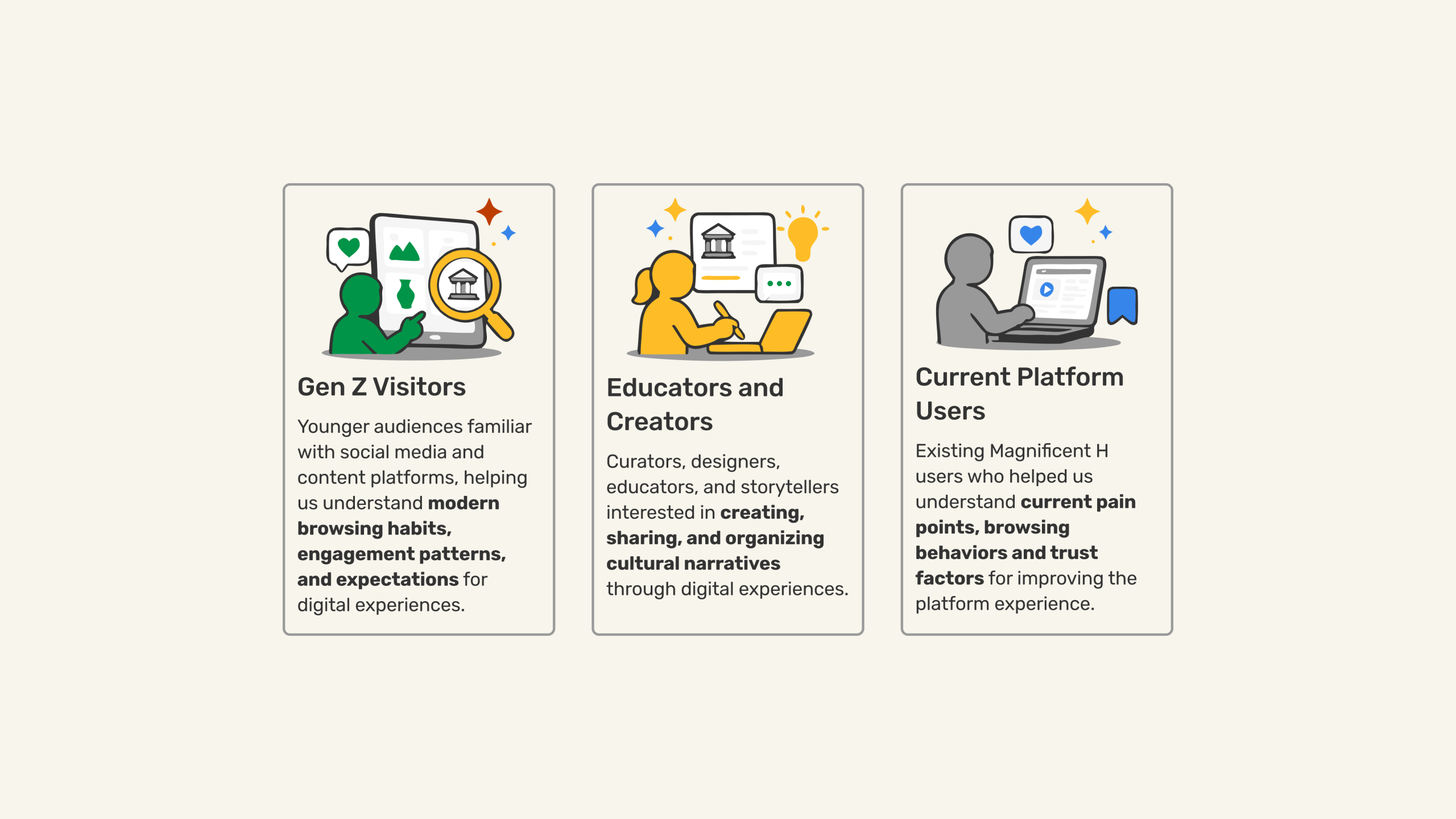
We conducted user interviews with 3 key groups: New York City based students, current users of the platform, and curators/ museums professionals. After speaking to 10 participants spanning these 3 categories, we learned a wealth of information about people’s experiences, motivations, and pain points surrounding information discovery and the current museum experience.
Curators and educators told us that the entry point to an exhibition is the most critical moment in the visitor journey. They also advised that a structured narrative that leads users through the story, while still allowing some flexibility, significantly improves engagement. On top of this, understanding how different audiences interpret content is essential to inform how narratives are structured and presented.
Current users and students told us that clear and intuitive structure and organization are a priority when browsing content online. They also valued thoughtful discussions and exchanges of ideas, and viewed likes and short comments as surface level. They also expressed concern about content misuse and image ownership and as a result, they value institutional content as well as visible credentials and metadata that show credibility for individual creators.
Synthesizing Our Findings Into A Cohesive Direction
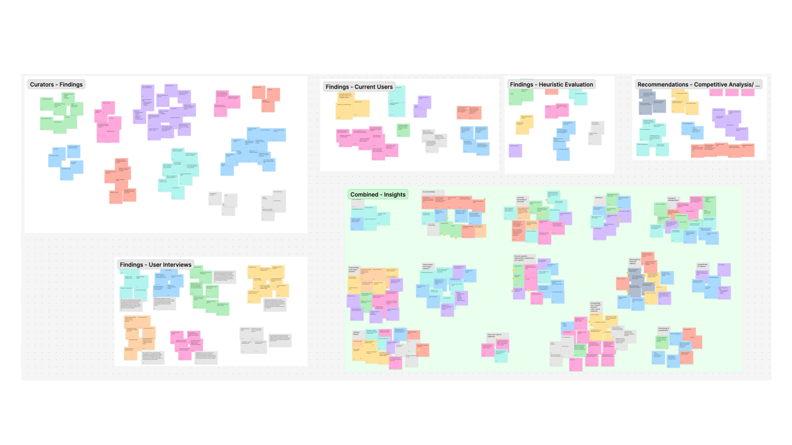
We went through multiple rounds of synthesis after gathering all of our research. At times, it felt disconnected – how do we find meaning from all of these different sources? And how do we connect it back to a platform that is disrupting the current landscape? By taking a step back, grouping findings into categories that made sense, and repeating the process over again, the key insights and patterns began to emerge, and a path forward was beginning to take shape.
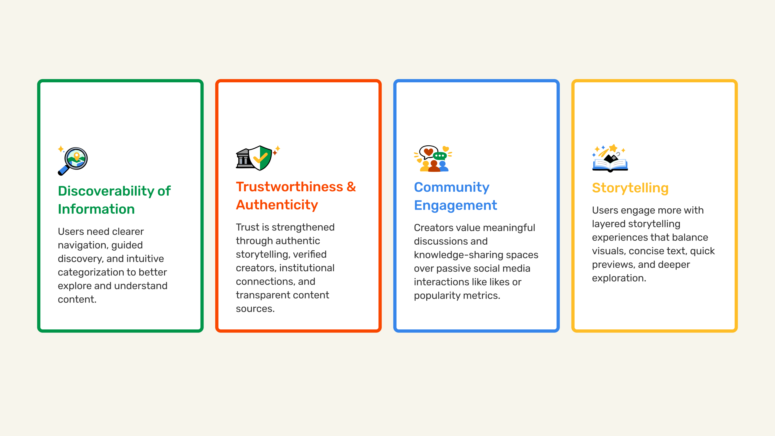
Key Themes We Found That Users Desire
After synthesizing our research, we uncovered some key insights:
Crafting a Content Strategy To Inform Our Strategic Direction
- The research indicates that Magnificent H should prioritize trust and credibility of content over scale and length as users value originality and systems that preserve authorship. As such, we suggest a focus on highlighting authentic storytelling and giving users the freedom to meaningfully explore content at their own pace.
- The current platform has an opportunity to better support community and engagement. Our research shows that users value meaningful connection and shared learning over typical social media interactions. We suggest focusing on building a knowledge-driven community that encourages thoughtful conversations, exchange of ideas, and deeper engagement with content.
What Does This Direction Mean For Our Design Decisions?
With an established strategy backed by conversations with real user groups, we laid out what actionable goals to keep in mind as we shifted from research to design:
- Position Magnificent H as a trusted alternative to social media by emphasizing cultural storytelling, authenticity, and intentional exploration.
- Build trust and credibility through clear authorship, sources, categories, and content details.
- Improve discovery and navigation so users can easily explore micro-museums through categories, tags, filters, search, save, and follow features, increasing user retention and engagement.
- Support higher-quality creator contributions by giving creators the tools and structure to build thoughtful micro-museums that balance visual content, narrative flow, previews, and deeper exploration.
- Encourage meaningful community engagement by supporting discussion and connection beyond passive interactions.
Generating Ideas Through Sketching and Collaboration
Before we touched any design software, we started with paper wireframes. Each of us sketched out 2-3 rough versions of three key screens – the landing page, the create flow, and the micro-museum view. The point wasn’t to get it right on the first try – it was to explore as many different directions as we could before narrowing it down.
After we sketched independently, we came together and picked the strongest ideas. Sometimes that meant taking one person’s layout and combining it with someone else’s interaction. That collaboration is what gave us a shared vision to move forward with, and it became the foundation for everything that was to come.
Establishing A Structure That Makes Sense For Key User Tasks
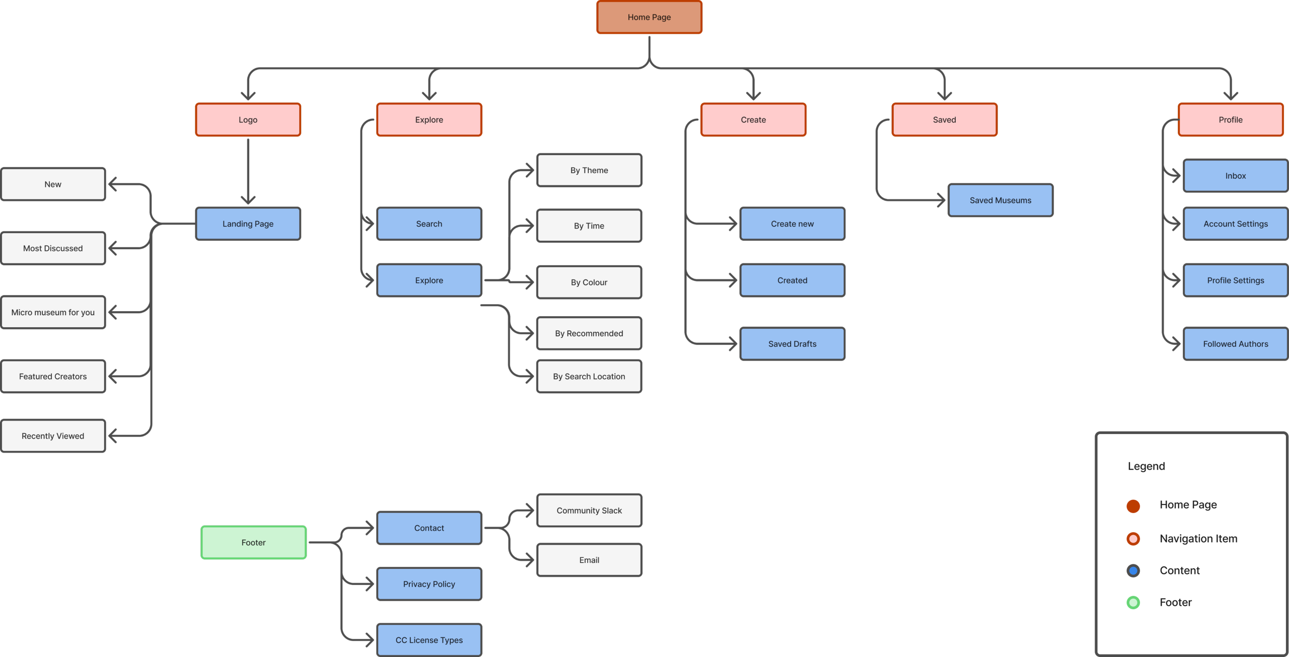
With our initial ideas established, we wanted to organize them in a meaningful way. We took the platform’s current information architecture and improved it to shift the platform from a fragmented navigation system into a clearer, discovery-driven experience centered around exploration, storytelling, and personalization. The original sitemap relied on broad categories and disconnected workflows, making it difficult for visitors to understand how to browse content and view it post saving.
The revised architecture simplified the navigation into five core sections- Home, Explore, Curate, Saved, and Profile – creating a more intuitive mental model for both visitors and creators. The homepage was redesigned from a simple navigation hub into a dynamic entry point featuring multiple exploration pathways such as themes, timelines, and curated categories, supporting both intentional searching and curiosity-driven browsing behaviors.
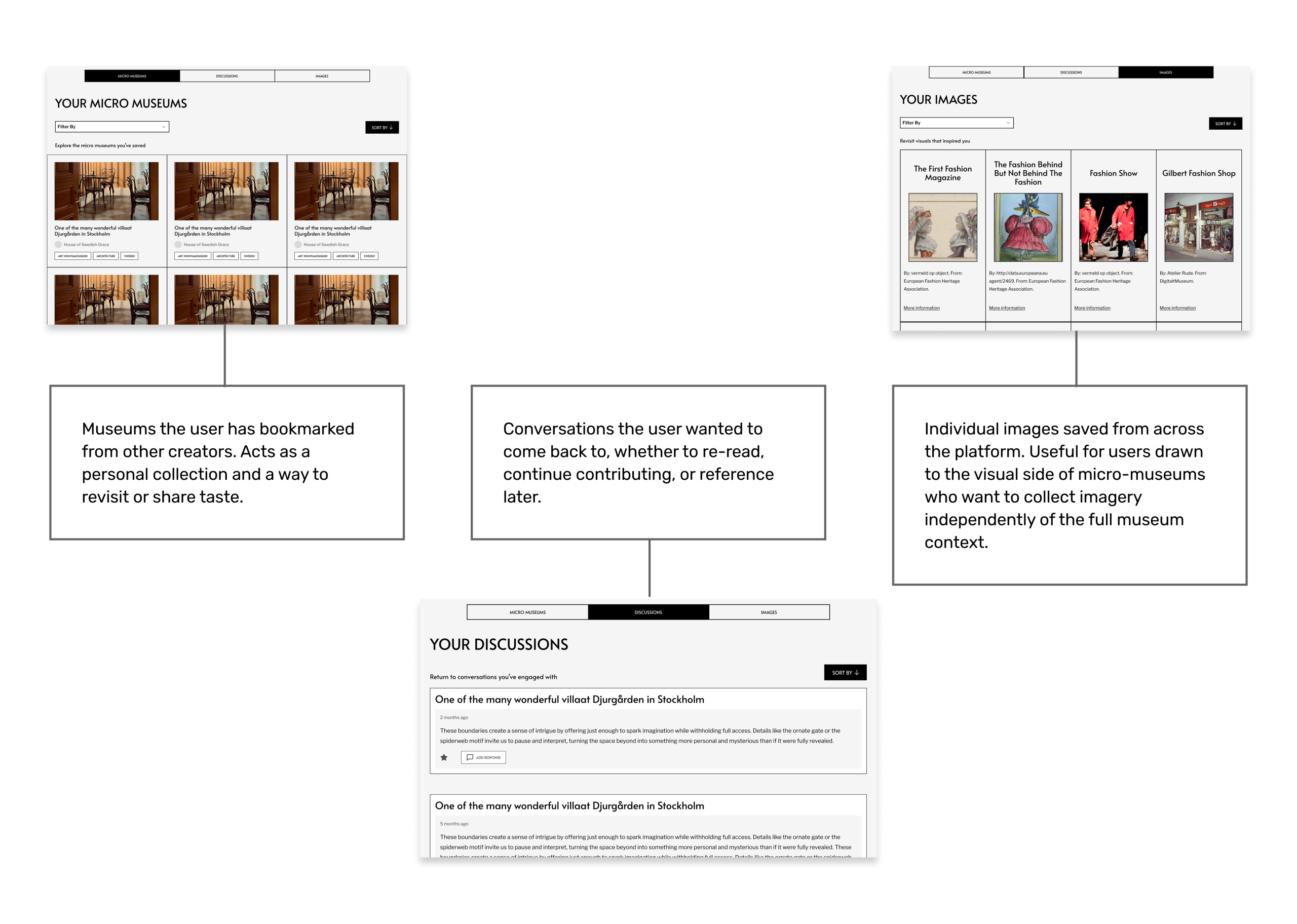
A dedicated Saved section also gave greater visibility to saved museums, images and discussions, allowing users to build ongoing personal collections and return to meaningful content over time.
Overall, the refined architecture reduced cognitive overload, improved content continuity, and better aligned the platform with its goal of becoming a space for authentic cultural storytelling rather than a traditional social media experience.
The Next Layer of Iteration
With a clear direction from the paper wireframes and an established information architecture, we moved into mid-fidelity screens. This stage was about bringing structure and definition to our ideas without getting caught up in visual details yet. We focused on layout, spacing, content hierarchy, and how elements would actually sit on a screen. Mid-fi gave us something concrete enough to evaluate and refine as a team, and realistic enough to put in front of users for usability testing. The feedback we gathered at this stage directly shaped the decisions we made going into the final high-fidelity designs.
Learning About The Real Interactions Users Make
Gathering user feedback didn’t stop in the research phase – by conducting usability testing sessions, we gathered feedback on early design drafts to allow us to improve and iterate toward a better solution.
We performed moderated usability testing with 4 participants after developing our mid-fidelity wireframes to better understand how users navigate key platform experiences such as discovering cultural stories, viewing details, engaging in discussions, and creating their own content. The goal of the test was to observe user behavior, identify usability pain points, and validate whether the redesigned experience supported clearer navigation, meaningful engagement, and authentic storytelling.
The sessions also helped us answer important research questions such as: What makes a micro museum stand out?, Do users find the information trustworthy?, and What type of engagement feels valuable? Additionally, we gathered feedback on newly introduced features such as the museum map, discussion prompts, saved content, and the placement of “creators you follow”.
The testing helped validate many of the redesign decisions while also uncovering areas where users needed more clarity, guidance, and contextual support.
What Went Well, And What Could Be Improved
Users consistently praised the calm visual design, meaningful storytelling, trust-building systems, thoughtful discussions, and multiple exploration pathways. The platform felt more intentional and personal than social media.
The largest recurring issue was lack of clarity around the core concept of the micro-museum, along with unclear terminology, insufficient onboarding, and confusion around trust/authenticity.
Our final refinements focused on strengthening onboarding, simplifying terminology, improving contextual explanations, supporting guided exploration, and reinforcing trust and authenticity across the experience.
The Magnificent H Experience: Reimagined
In our design work, we focused on four essential user tasks: the landing page experience, the browsing process, the creation of a micro museum, the exploration of an individual micro museum page, and the user profile.
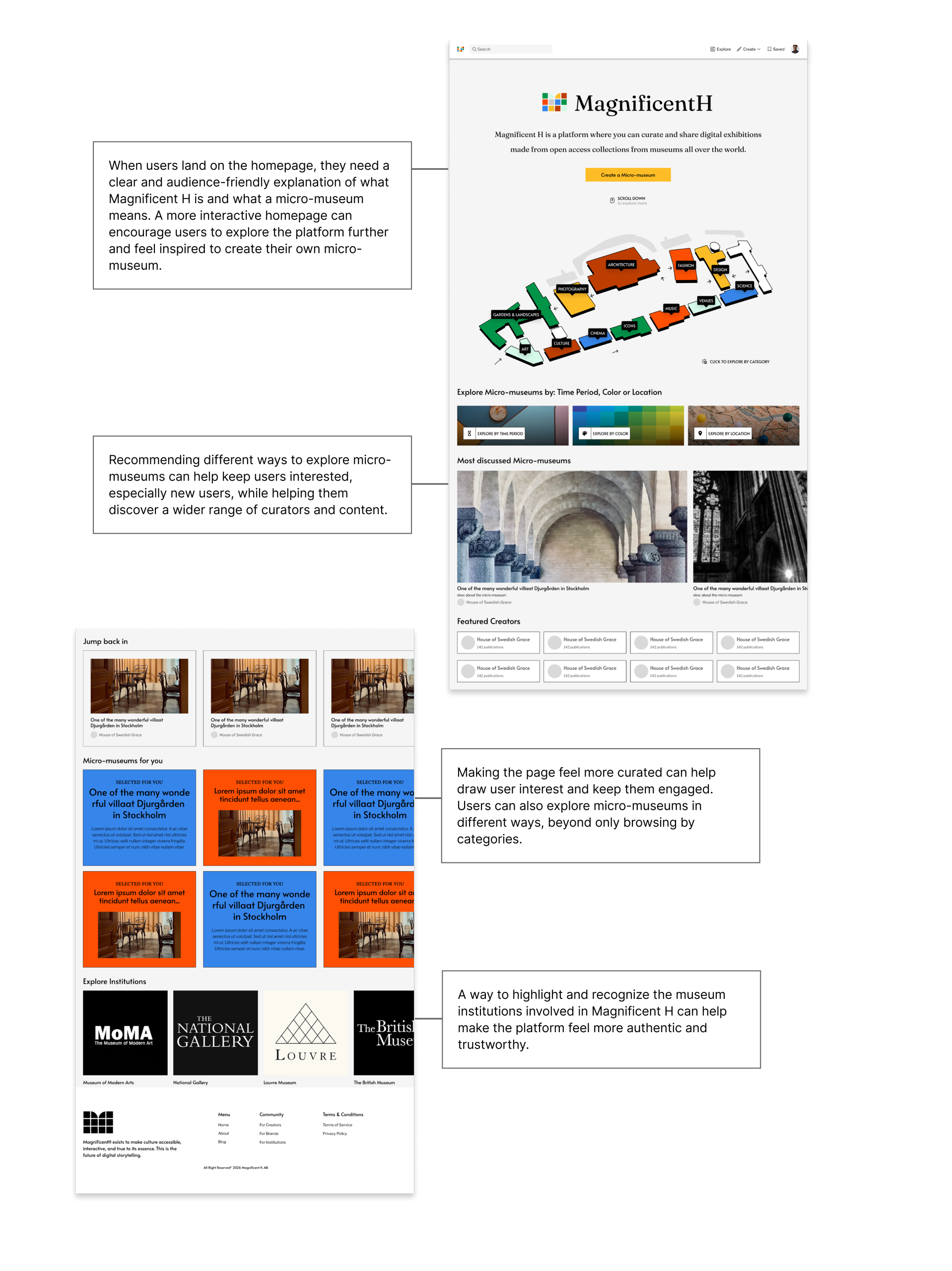
A New Landing Page Catering To Exploration
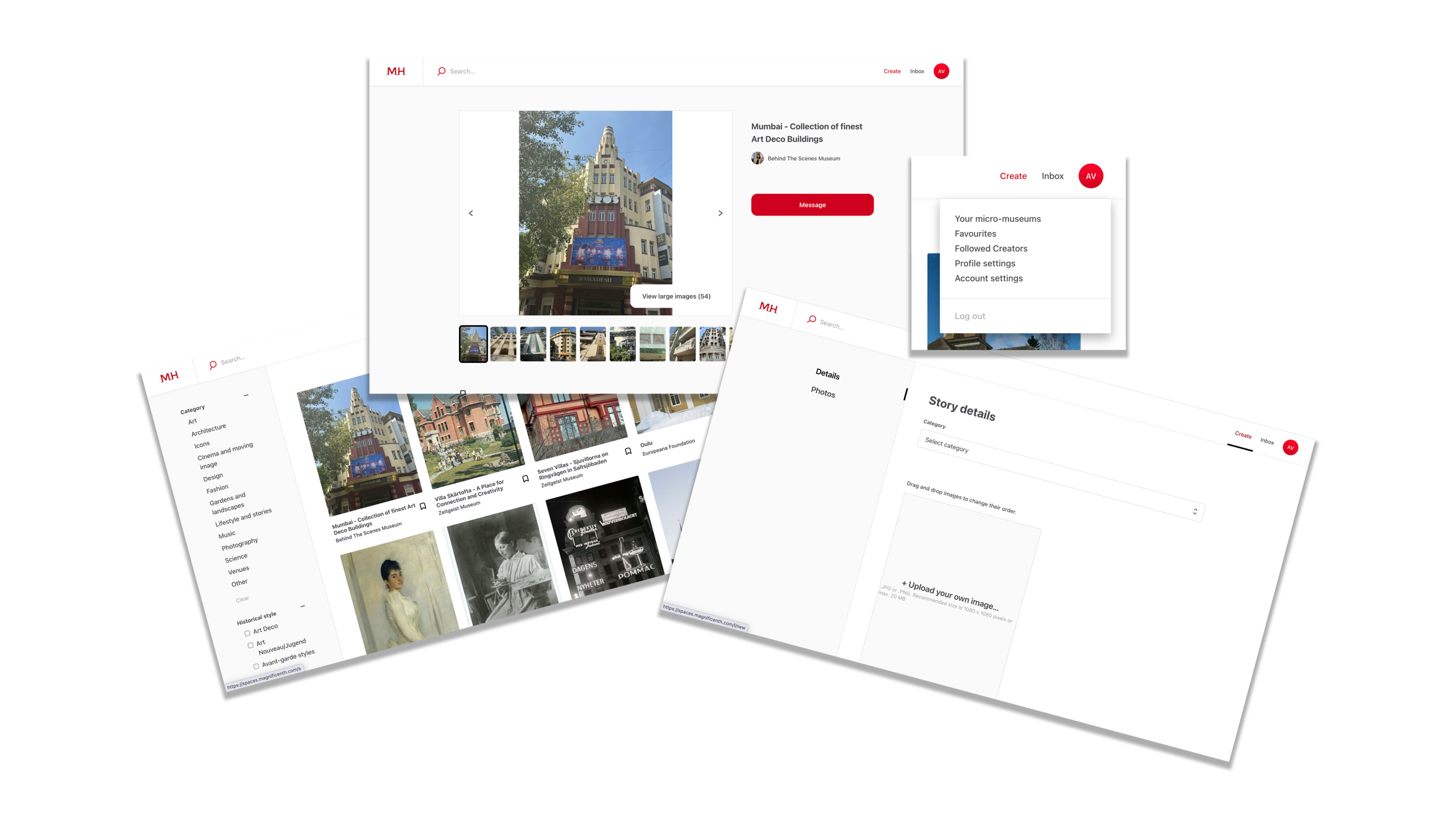
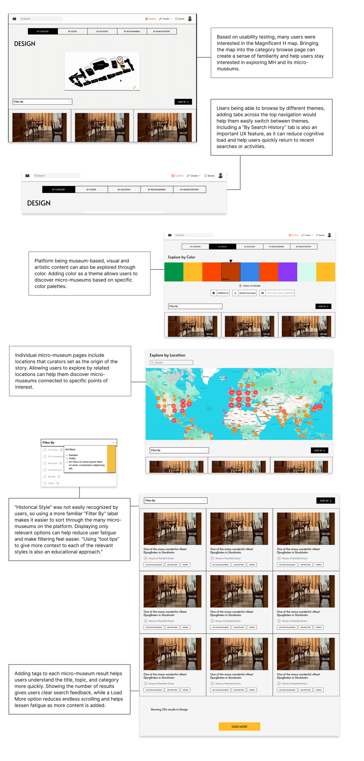
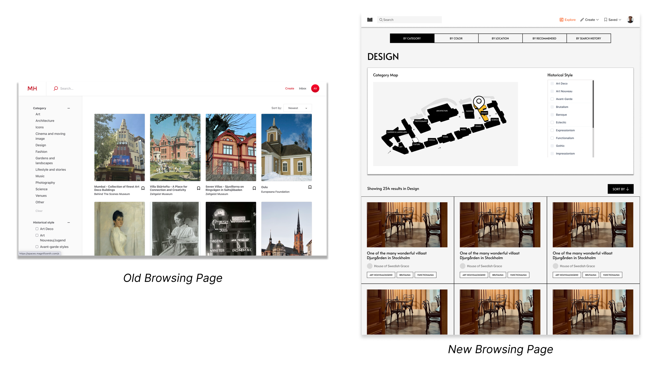
In an effort to make content more discoverable, we wanted to reimagine how users find and filter micro museums on the platform. As a result, we designed an entirely new idea of what the landing page could look like – a place that allows users to find content based on their criteria of interest and shows them meaningful content they might be interested in.
Our landing page already begins the filtering process for users by requiring them to select a category of interest. While browsing, we allow additional options to refine their search by placing historical style filtering here – reducing overwhelm and guiding users through the discovery process.
Explore Through Clearer Browsing
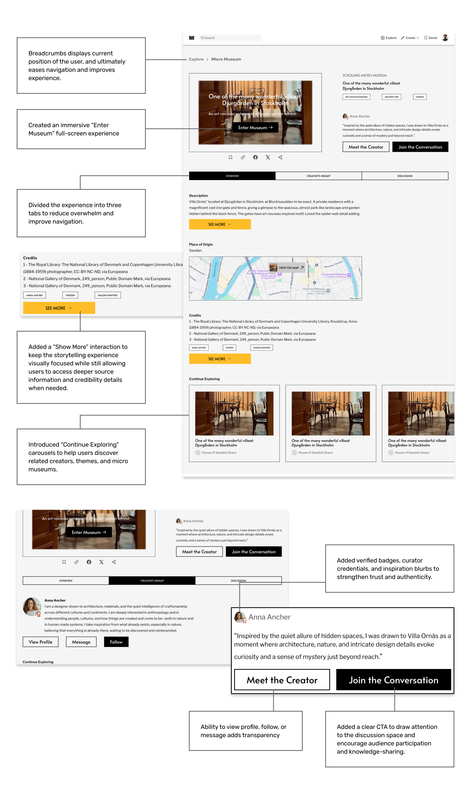
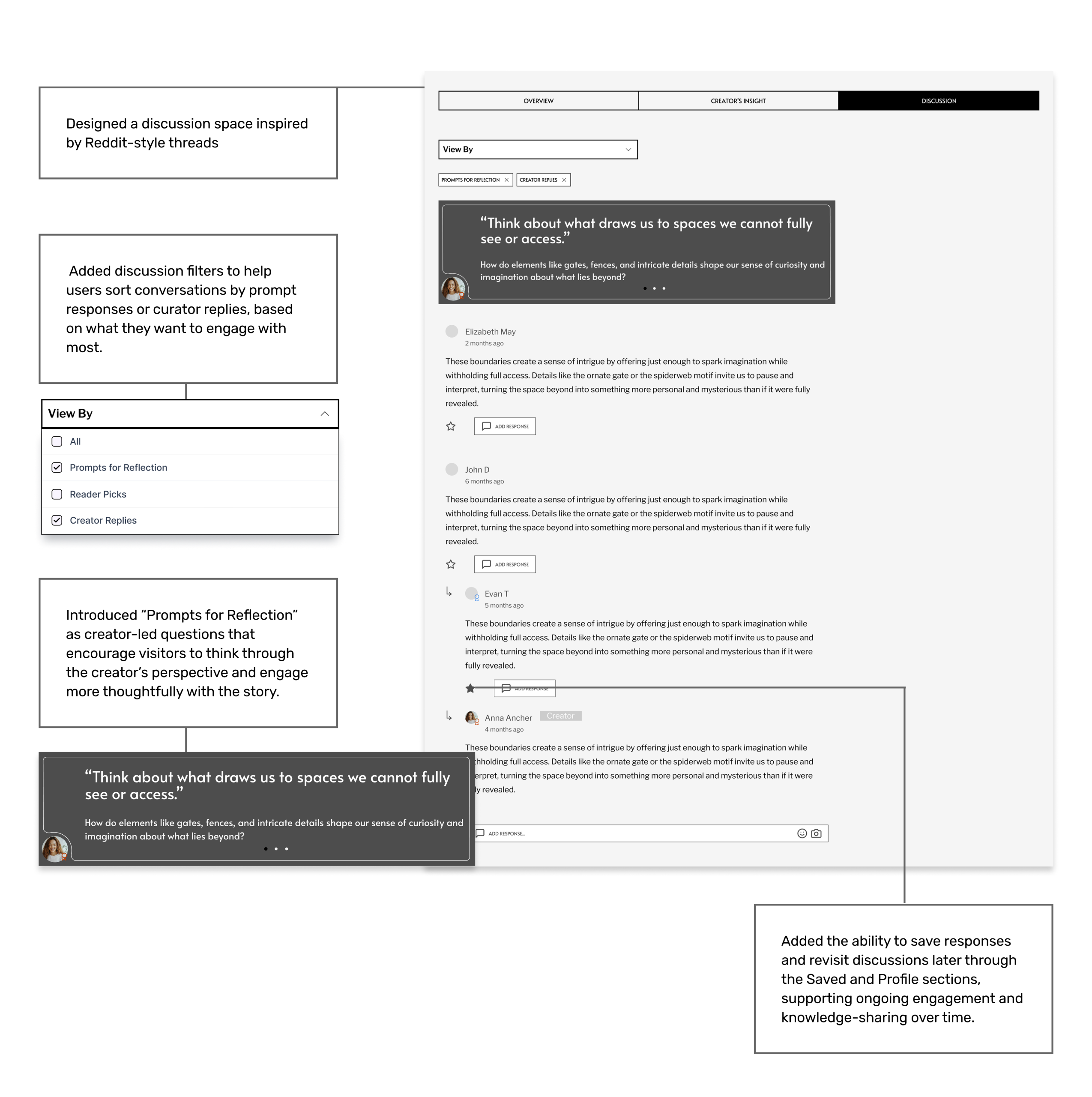
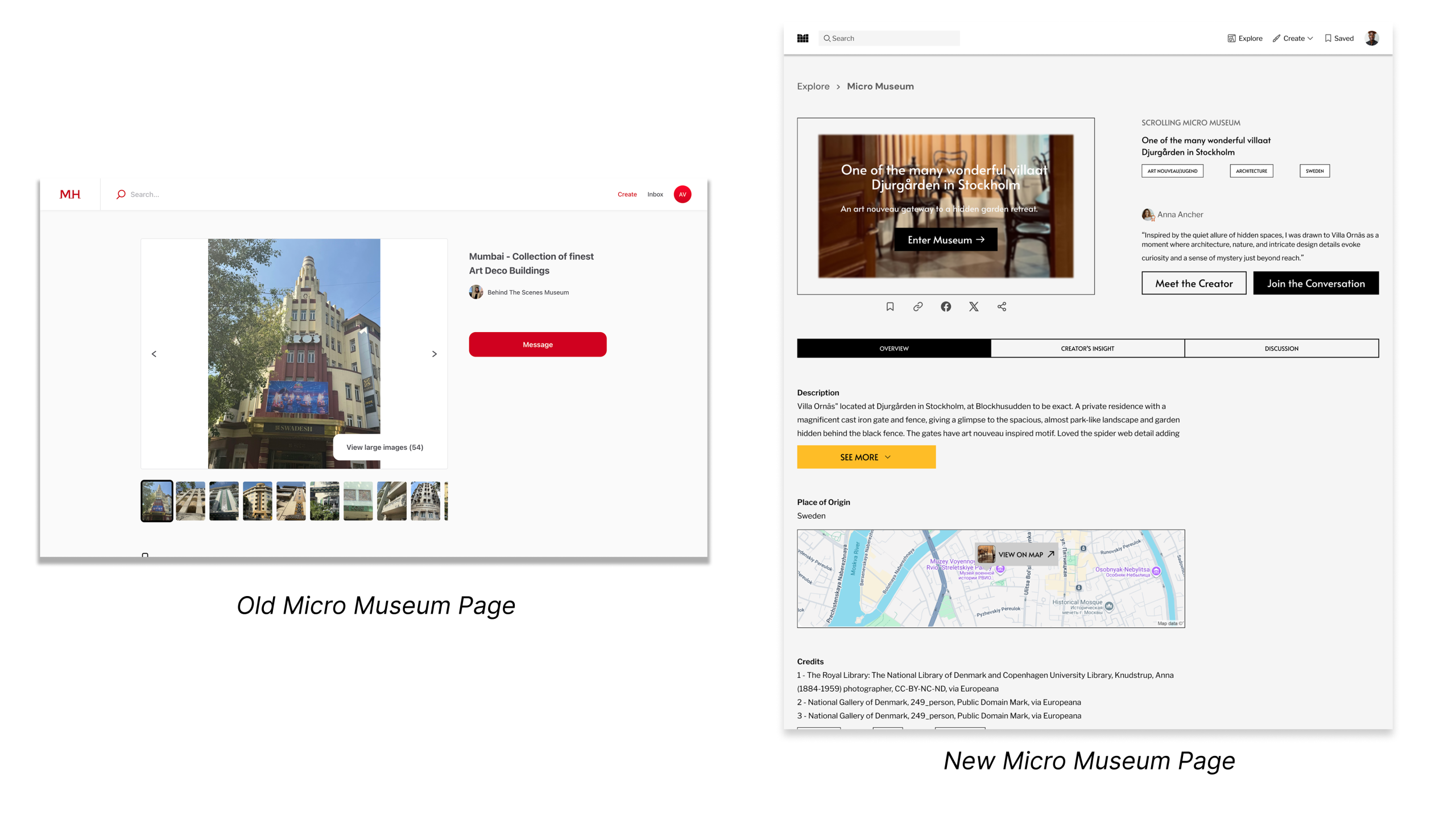
A Micro Museum Page Build For Discussion
The current micro museum page is simply an image carousel and paragraphs of text. We wanted to make the micro museum experience more engaging: we created a new, fresh look to the story being told. But beyond that, we added an essential feature our research showed us was missing – a way to engage and discuss with the Magnificent H community.
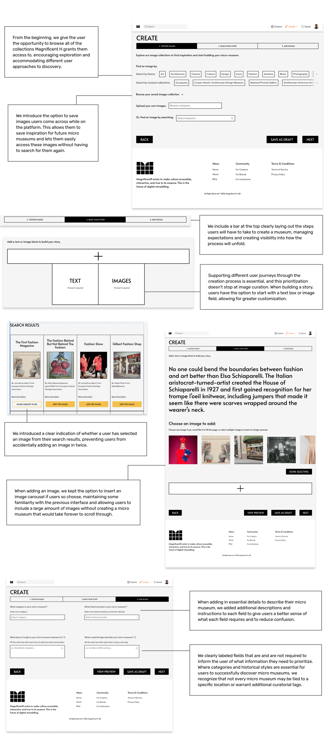
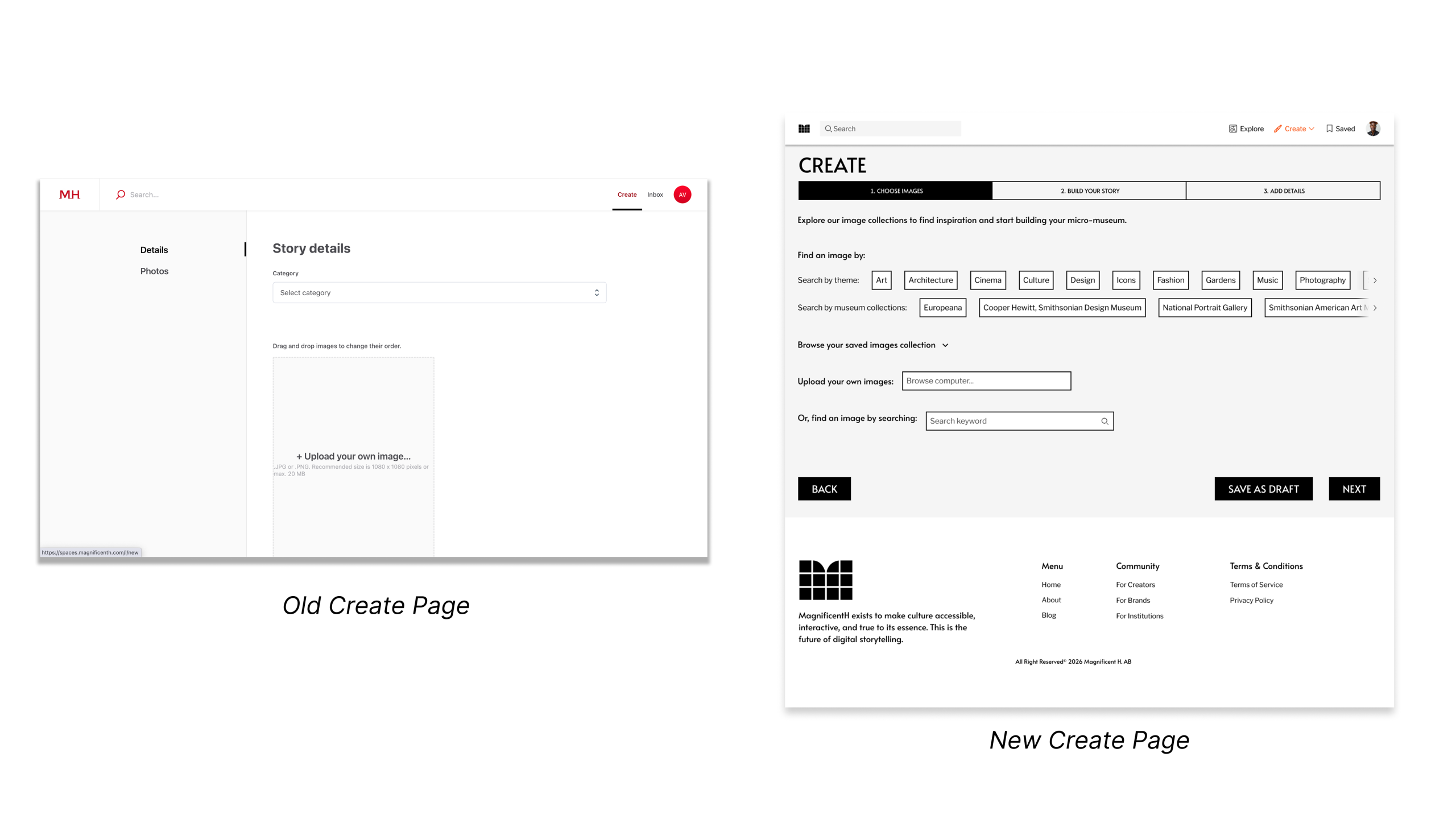
A Creator Flow That Fuels Inspiration and Encourages Discovery
The creator flow is essential to Magnificent H – without an easy way to create micro museums, the platform loses the very users it’s trying to attract. We revised the creation process to highlight Magnificent H’s distinguishing factor – the access to museum’s open-source collections – and placed this at the forefront of the creation process, allowing the creator to explore and become inspired by what they discover.
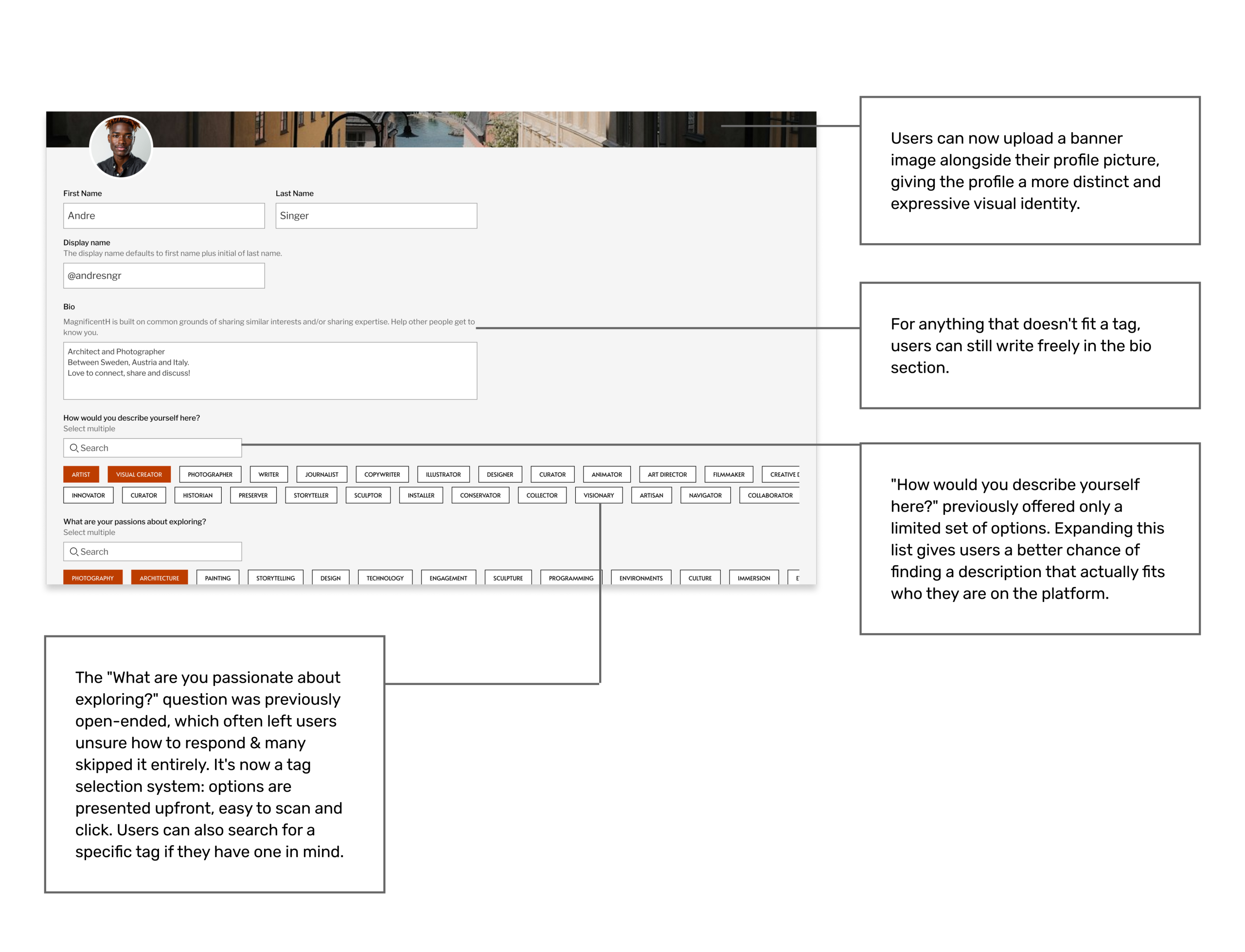
Define Your Profile As Unmistakably You
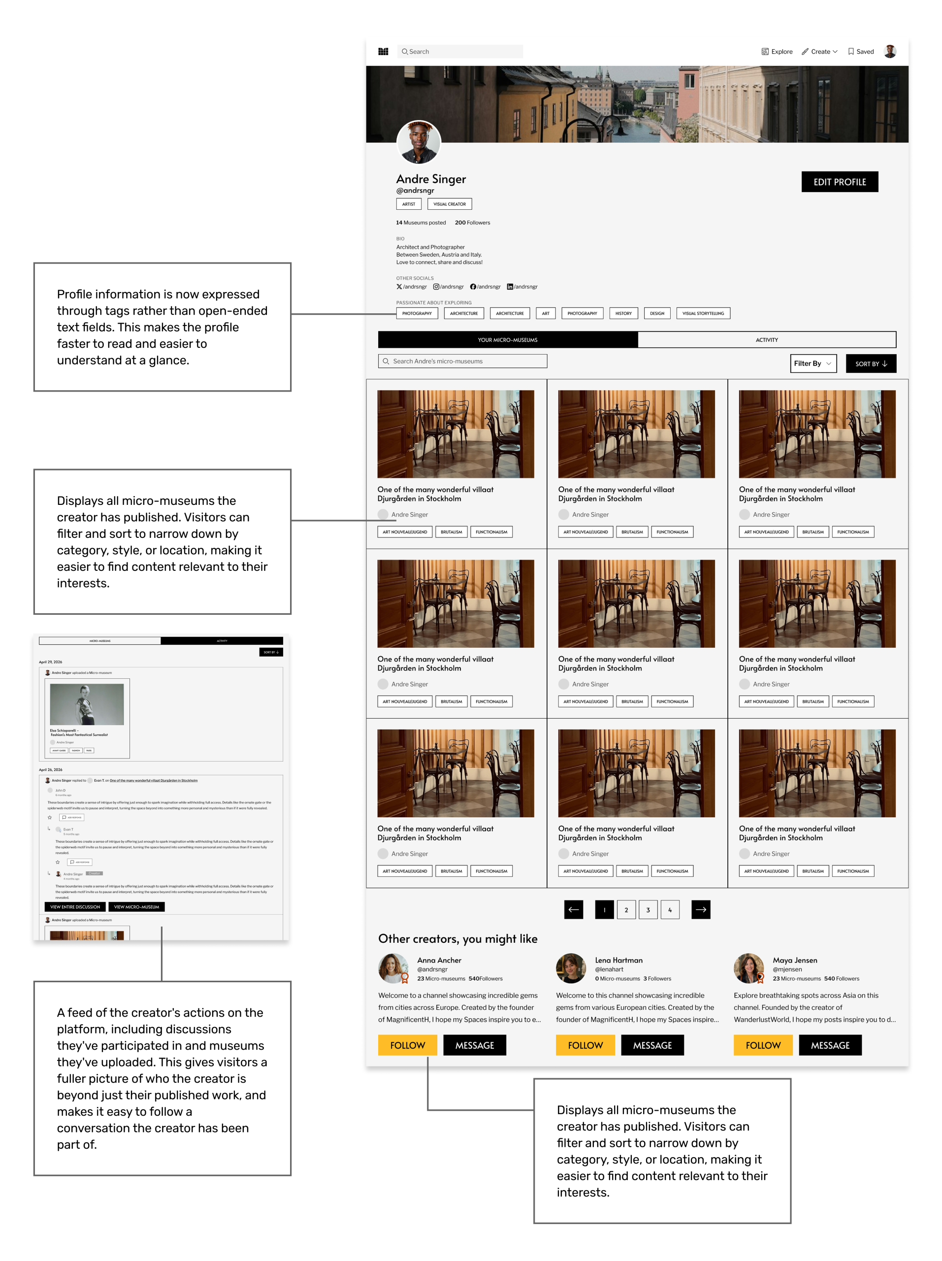
A Corner For All Your Assets
Client Response to the Redesign
After presenting the final redesign to the client from Magnificent H, they shared positive feedback and noted that the prototype addressed several of the platform’s current missing points. They were especially interested in the discussion and comment features, describing the direction as a potential “Reddit for culture.” This reinforced the idea that interaction between creators and audiences could become a key difference between Magnificent H and traditional museum experiences.
The client also responded well to the educational tooltips, especially for terms like “Historical Style,” since users may not always understand museum or art-related language. They appreciated that the redesign considered the full platform ecosystem, including museums, creators, and audiences, through features like attribution, verification badges, and creator blurbs to support trust and authenticity.
While the client saw the prototype as a strong future direction for the platform, they also noted that the team would need to prioritize which features to build first. They also expressed interest in sharing the prototype with physical museums to explore potential participation and encouraged us to include the Magnificent H platform link in our public case study to help bring more creators and users to the beta version.
“Something that you captured so nicely is really the engagement, like, the Reddit. When I speak about the platform, I call it the Reddit for culture. I think that’s going to be a huge differentiator compared to traditional museums”
“Adding that part [historical style tooltips] contributes to creating engagement and the educational part. That’s definitely something that we want to capture and include”
“Not only are you as the creator, the curator of the story, but then even the audience becomes part of that exploration”
“I really like it, and it’s basically now what we are discussing… we know exactly what are the missing points and where we need to improve”
How We Believe Magnificent H Can Continue To Evolve
Although we have introduced a strong foundational direction for Magnificent H, the platform has significant potential to continue evolving as a new kind of cultural digital experience. Magnificent H sits between traditional museums and modern digital platforms, while also balancing the relationship between social media and intentional cultural storytelling. Since there are very few existing platforms that operate within this space, future iterations should continue exploring how visitors and creators can interact more fluidly and meaningfully. As the platform grows, the focus should remain on building a trustworthy, knowledge-driven, and exploration-focused experience that makes cultural storytelling more accessible to both enthusiasts and first-time visitors.
- Further Blur the Line Between Visitor and Creator: Allow visitors to gradually transition into creators through lightweight curation tools, collaborative collections, reflections, and image saving.
- Expand Image-Based Exploration: Make the platform more browsable through standalone cultural images, allowing users to discover, collect, organize, and later build micro museums from saved inspiration.
- Develop More Educational Layers: Introduce contextual learning systems that help users better understand concepts like historical style, architecture, materials, artistic movements, keywords, and locations in a more approachable way.
- Introduce Natural Language Search: Move beyond rigid category-based search by creating a more intuitive search experience that understands conversational language and user intent.Reduce reliance on art or museum knowledge so that beginners can comfortably explore the platform without feeling intimidated or excluded.
- Strengthen Discovery & Recommendation Systems: Continue improving personalized recommendations, related museum pathways, and guided exploration to encourage longer and deeper engagement.
- Expand Community & Discussion Features: Explore more meaningful forms of interaction such as collaborative annotations, where users can respond and reply to a specific image in the scrolling exhibition.
What We Learned
Working on Magnificent H was both challenging and deeply rewarding because it explored a space with very few existing references. The project pushed us to think beyond traditional museum platforms and social media systems, involving experimenting, relooking at research insights, and continuously thinking in terms of the user.
Throughout the project, our team experienced several moments of uncertainty where we struggled to make sense of the research findings and determine the best way forward. However, these challenges ultimately became one of the most valuable parts of the experience, teaching us how to collaborate through uncertainty and make thoughtful design decisions grounded in research.
What made the project especially meaningful was the realization that Magnificent H has the potential to create a new kind of cultural experience online. Presenting and pitching a platform with such a large vision felt incredibly fulfilling, especially knowing that the project still holds significant room for future growth, iteration, and impact as more users engage with it over time.
Look at the details
See the website go live!
View Prototype
Check out the Magnificent H Platform – https://magnificenth.com/