Purrfect Match
A matchmaking app for shelter pets to make adopting feel like a meet-cute
Do you want to adopt a pet? We have the Purrfect Match for you!
Purrfect Match is a mobile app that learns your preferences and surfaces pets currently available in shelters around you. The idea is to cut the time you’d otherwise spend chasing shelter websites and wondering if any of their pets actually fit your life.
The team
I want to start by shouting out the amazing people who worked on this project with me, Jasmin Guerrera and Xin Jiang. Research was a team sport, we ran interviews and synthesis together, fostering strong communication and work ethic within the team. From there I owned the home swipe screen, the pet profile page, and the interactions in the Figma prototype that stitched the flows together. The call to build the app around a matchmaking mechanic was mine, and it shaped how everything else got designed. The team did a wonderful job at all stages of the prototyping process by helping with accessibility compliance and design iterations.
Two sides, one problem…and a scope call
Through an ASPCA study conducted in 2022, they found that there are roughly 6 million animals that enter US shelters each year, and shelters are stretched too thin to give every one of them a fair shot. On the other side, would-be adopters get overwhelmed before they even start. The problem starts when trying to find shelters near them, and develops into understanding the adoption process, or whether the pet they meet will actually fit their life.
We had a real product on both sides. A shelter-facing tool to surface available pets, and an adopter-facing tool to find the right one. In a 13-week project, designing both would have meant doing neither well. We chose the adopter side. That’s where our six interviews gave us the strongest signal, and gave us insight into where the friction was most acute. The shelter side is a real next step for the future development of the project.
Across those six interviews, one thing kept surfacing: people couldn’t figure out where to start. Finding a local shelter was already a friction. The first step of adoption was the hardest one, which is exactly the gap the app needed to close.
The research to sniff out the matches
Affinity mapping gave us five themes, pet experience, medical and behavioral needs, commitment, personal preferences, and shelter experience.
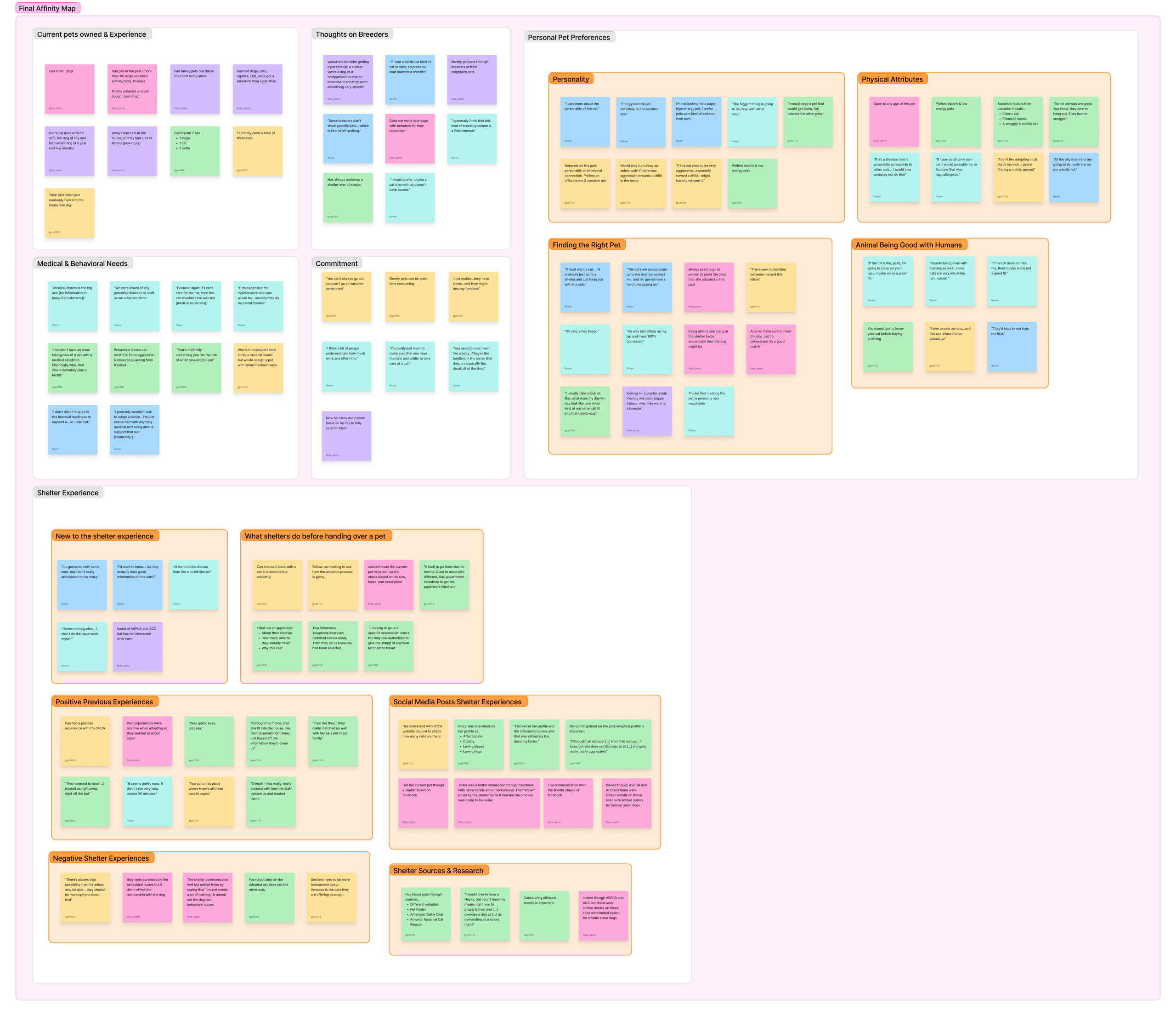
With those in mind, we developed three personas covering pro-shelter adopters, shelter skeptics, and first-time pet owners.
We anchored on Laura. She had the most concerns, the least context, and the most to gain from a well-designed flow. Designing for her meant designing for the user with the lowest tolerance for friction, which made every interface decision important. If it worked for her, it worked for the more experienced adopters, too.
The matchmaking call
The biggest design decision I made on this project was framing the app’s main interaction to align with dating apps, rather than just a search tool
we ran a competitive analysis of the services currently available in the market. When looking at PetFinder, the concept clicked. Most shelter sites work as databases, you filter, you scroll, you compare, all without guidance. That model treats every user the same and dumps the cognitive work on them. For someone like Laura, a first-time adopter, that’s the worst possible experience. Our research kept highlighting how people didn’t want more options, they wanted the right options.
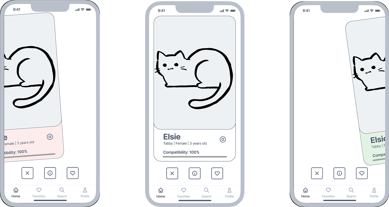
Matchmaking flips it. The app does the filtering using what it learns about the user, and surfaces pets one at a time in a format every dating-app user already knows how to read. The interaction communicates “this one is a potential pet for you.” This is the distinctive tough that we bring to the market.
The team aligned on it fast, now it was up to me to make it actually work in the prototype and make the interaction understandable for those users who have not used a dating app before.
It’s not guesswork, we curate the matches
Matchmaking only works if the matching does. The onboarding questionnaire had to balance information acquisition and friction limitation. Too few questions and matches feel arbitrary, too many, and users drop off before they ever see a pet.
After running several brainstorming sessions guided by methods like MOScW, Scamper, and especially mind mapping, we landed on three things that had surfaced as the strongest predictors of a good fit. Comfort with training, energy level, and living situation. Everything else could be asked later as the app learns more about you. The questionnaire is placed right at the sign-up process, so that users get greeted when they’re most eager to use the service. The shorter and multiple-choice format helps to keep friction at a minimum.
The designs that made the Purffect March possible
I made two decisions that shaped the experience
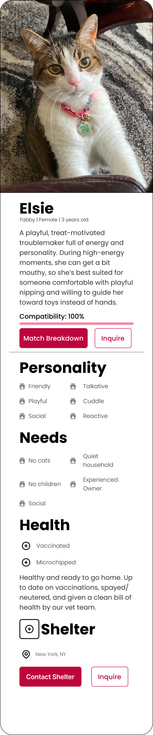
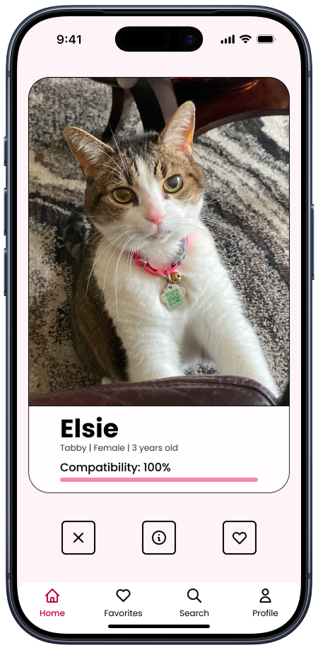
The home page borrows the dating-app swipe, which is widely part of people’s mental model. I applied to a context where compatibility matters. The design showcases the compatibility score as one of the first things you see on each card. That allows the score to be the main information that will guide users on the decision to swipe left or right. After all, this is the core feature of the service.
The pet profile had to balance two things our research flagged as competing. First-timers like Laura wanted exhaustive information ( breed, history, vaccinations, behavior) so they could feel confident, but they also got overwhelmed easily. I structured the page to showcase the essentials first, a simple and direct header with essential information like breed, age, and sex, a short bio provided by the shelter, which would include behavioral information, and the rest of the information is scrollable if wanted. You can read the whole thing or skim the top and still feel informed.
Can users find their Purrfect Match?
We ran six moderated user tests with potential pet owners and found the structural and visual issues of the app.
“What does apply now mean? Why is there two tabs? I’m confused.”
“I think the applications would be better under the profile page.”
“I can’t really see the navigation bar on this page.”
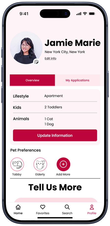
The team had decided to split the application page into “Inquired” and “Applied” tabs. Four out of five testers couldn’t tell them apart. The problem stemmed from the separation into different tabs without a clear explanation. Most thought they’d finished applying when they’d only inquired. That’s the kind of failure you can’t design around with copy tweaks. The information architecture itself was wrong. The color palette also wasn’t meeting WCAG 2.1 AA contrast, and the navigation bar’s transparency made it disappear on busy backgrounds.
We rebuilt. The application flow moved into the user profile under an “Overview” and “My Applications” structure, where each application opens to a progress bar showing exactly where you are in the process. The palette tightened to a higher-contrast pink, and the navigation got opaque so it stops fighting the content underneath.
One little caveat: we didn’t have time for a second round of moderated testing. The v2 fixes are grounded in the v1 feedback, but they’re not validated by retest. If I were continuing this project, that’s the first thing I’d do.
We’re here to help. Let us show you how you, too, can find your Purrfect Match
https://www.figma.com/proto/PurrfectMatch
Where Purrfect Match goes next
Validate the v2 fixes. Retest the prototype with new users to keep building on validated work.
Build the shelter side. Right now, we’ve designed half a marketplace. The supply side needs its own product. We envision a way for shelters to onboard pets quickly, manage applications, and surface urgent cases.
Post-adoption support. The moment a pet goes home is the start of the hardest part for a first-time owner, not the end. There’s a clear product opportunity in keeping the relationship going after the match.
What I take onto future projects
Two things stuck.
The first is that scope is a design decision. Trying to design for two opposing users in 13 weeks would have produced a worse product for both. Choosing to cut the shelter side felt like a retreat at the time. However, looking back on it, it wasn’t. It was the call that made the adopter side actually good.
The second is that picking the right metaphor early changes everything that follows. Once the app was a matchmaker and not a search tool, every other decision, like the questionnaire length, the card layout, and the structure of the pet profile, had a clear principle to be measured against. Once the team and I framed the app as a matchmaker, the rest of the decisions got easier.