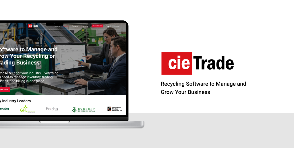
cieTrade is a B2B enterprise software company serving the recycling and commodity trading industry. Their platform helps businesses manage inventory, track trades, handle logistics, and run accounting operations – all in one place. It’s a product built for a specific audience: traders, recycling plant operators, and small business owners who need everything in one place to run their operation.
We partnered with cieTrade through Pratt Institute’s Usability Theory & Practice course to evaluate how well their website was serving that audience, and what more it could do to turn visitors into customers.
Through a moderated usability study conducted at Pratt Institute, our team partnered with cieTrade to evaluate their website and understand what was getting in the way. What started as a conversion problem quickly revealed something deeper: a quiet but consistent breakdown in user trust.
Project: Moderated Usability Testing | Team: Ammara Fatima, Vidhi Patel, Kali Birdsall, Junhao Song | Role: UX Design Consultant
The problem: visitors weren’t converting.
Despite offering a specialized product, cieTrade faced a common problem: visitors were arriving at their website but not converting into demo requests or leads. Analytics data showed the drop-off, but couldn’t explain the why behind it. That’s where our testing came in.
Here’s what we did: Design Process
Understanding Potential Clients: traders, recycling plant operators, and small business owners
Before we could evaluate the website, we needed to understand who actually uses it – or should be using it.
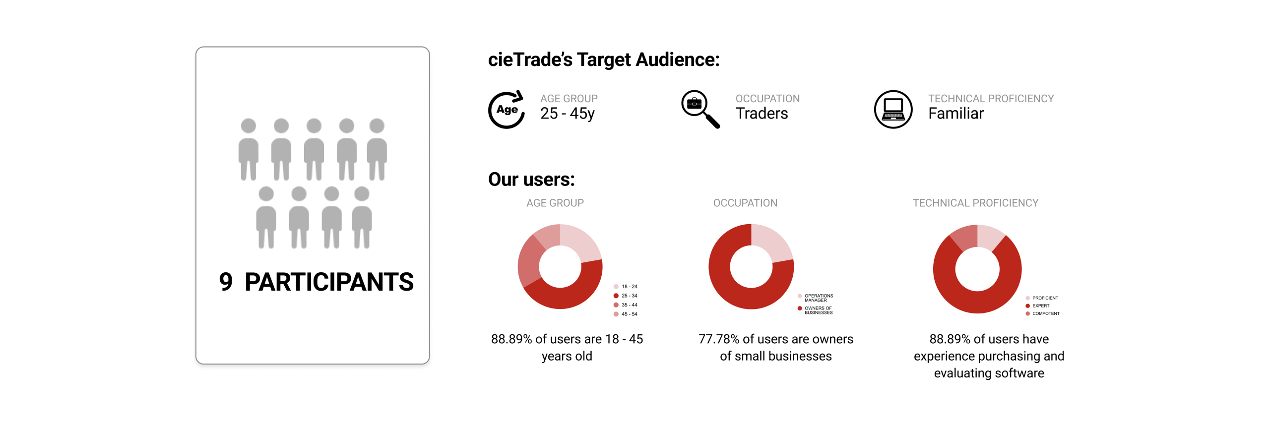
cieTrade’s target audience is relatively narrow: traders, recycling plant operators, and small business owners in the waste and commodities industry, typically aged 25–45, and familiar with business softwares. We recruited 9 participants who closely matched this profile.
How We Found Our Users: Screener Surveys
We began our recruitment with a screener survey designed to filter for relevant users. We asked about professional background, software purchasing experience, and background with trading or recycling operations.
From the responses, we selected 9 participants whose profiles covered a realistic range of cieTrade’s possible customers: small business owners, operations managers, and individuals with hands-on experience evaluating software tools.
Once we had our participants, each session followed a structured six-step process:
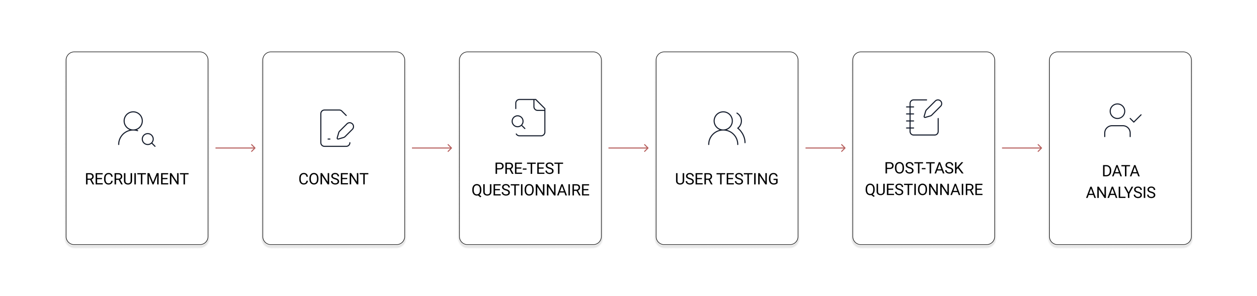
Putting the Website to the Test: Moderated User Testing
Participants were given four tasks that mirrored the real journey a potential client might take.
1. Homepage exploration – browse the homepage freely and form a first impression
2. Industry page review – navigate to the plastic recycling page as if researching for a friend’s company
3. Brochure request – find a way to learn more about what the software offers
4. Demo request – find a way to see the software in action before making a decision
What We Found: A Breakdown in User Trust
What came out of our sessions wasn’t one big problem. It was the same small problem, showing up in multiple places.
Users kept coming across moments of doubt – is the form worth filling out? Does the resource on this page actually exist? Can I trust what I’m seeing? For a B2B product where purchasing decisions are high-stakes, that erosion of trust was killing conversions.
So here’s what we did.
What We Did: Findings and Recommendations
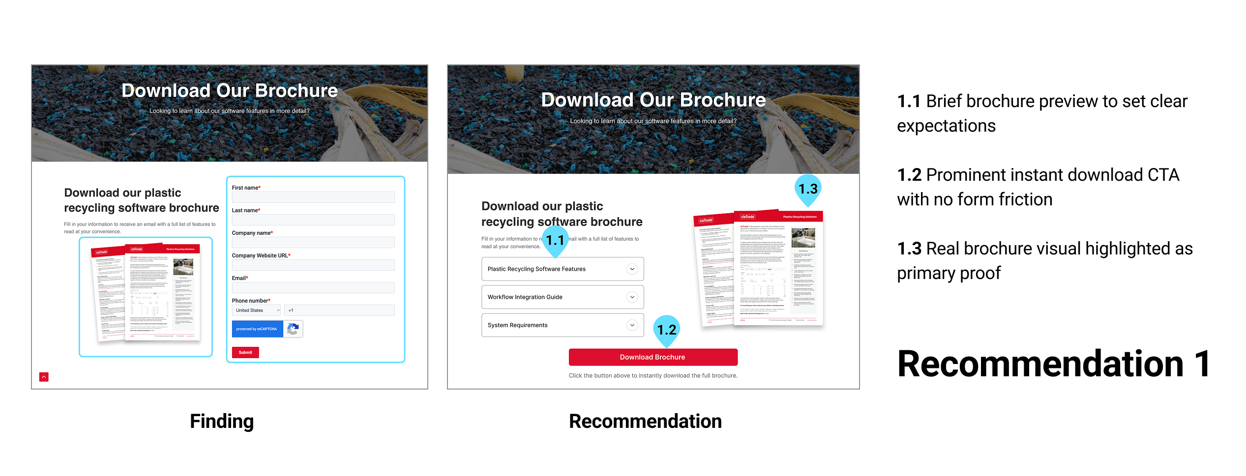
Finding 1: The Brochure Request Felt Like a Sales Trap
The “Download Our Brochure” page asked users to fill out a full contact form before receiving anything in return.
Multiple participants questioned whether the brochure even existed. Faced with a personal data form and no preview of what they’d receive, several users felt the experience felt like a sales trap. Rather than building confidence, it made users more guarded. The result: hesitation, drop-off, and distrust, the opposite of what a resources page should do.
“I want to see what I’m getting before I give you my information.”
– Participant 4
11.1% of participants rated the brochure task as difficult. While that figure sounds small, in a qualified B2B audience it represents a meaningful conversion risk.
Recommendation 1: Simplifying Brochure Access
The friction in the brochure flow stemmed from too much being asked before anything was given. Our primary recommendation was to offer a direct download, either fully open or unlocked after a single email field, paired with a real visual preview of the brochure itself, so users can see what they’re getting before deciding to share their information.
For preserving lead capture, an alternative approach is to require only an email address (not a full company profile) to unlock access. A third option: remove the brochure entirely and consolidate conversion around the demo CTA, which already performs better.
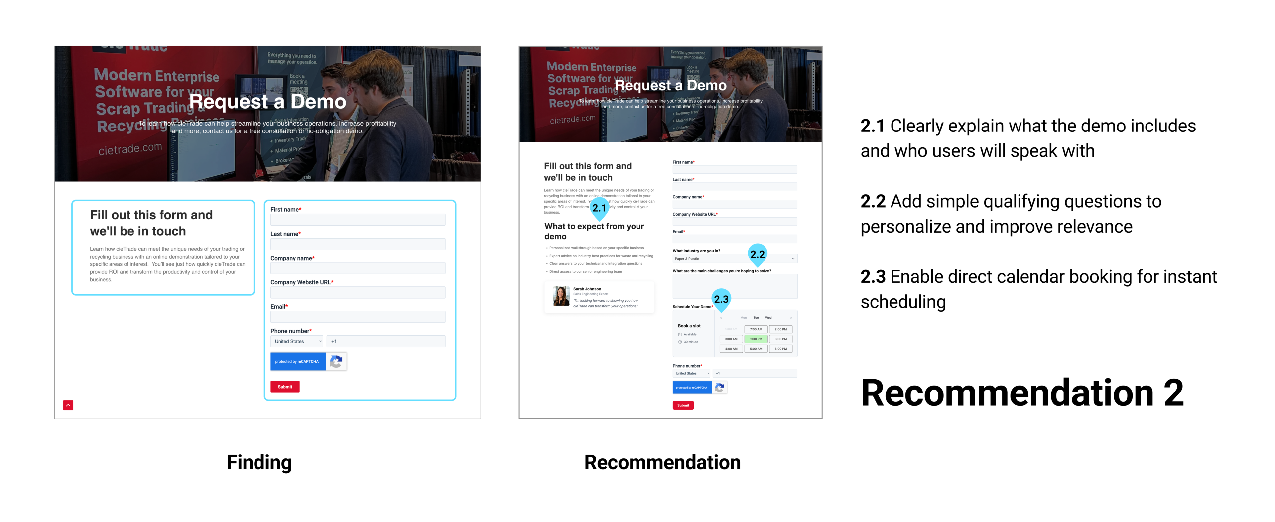
Finding 2: The Demo Request Lacked Context and Personalization
The “Request a Demo” flow was technically functional, 77.8% of participants found it easy to complete, but ease of completion doesn’t equal confidence in the outcome.
The form asked for basic contact information but gave users no sense of what would happen next: who they’d speak with, when, what the demo would cover, or how it would relate to their specific industry. One participant noted the form didn’t ask which industry they were in, which made them uncertain they’d see a demo relevant to their business.
“It doesn’t ask for the industry though. I think that would be better because I know that I’ll be given the product I’m looking for, specific to my business.” – Participant 8
Without that context, completing the form felt like sending a message into a void, which was not reassuring for users.
Recommendation 2: Personalizing the Demo Request Experience
The demo form needed to do more than collect contact details. We recommended adding personalized questions – specifically, industry type and the primary challenge the user is hoping to solve – so users feel the demo will be tailored to them rather than generic.
Beyond the questions, the page should explain what the demo involves: who users will speak with, what the session covers, and how long it takes. A direct calendar booking tool would further reduce friction by giving users a concrete time commitment rather than an indefinite “we’ll be in touch.”
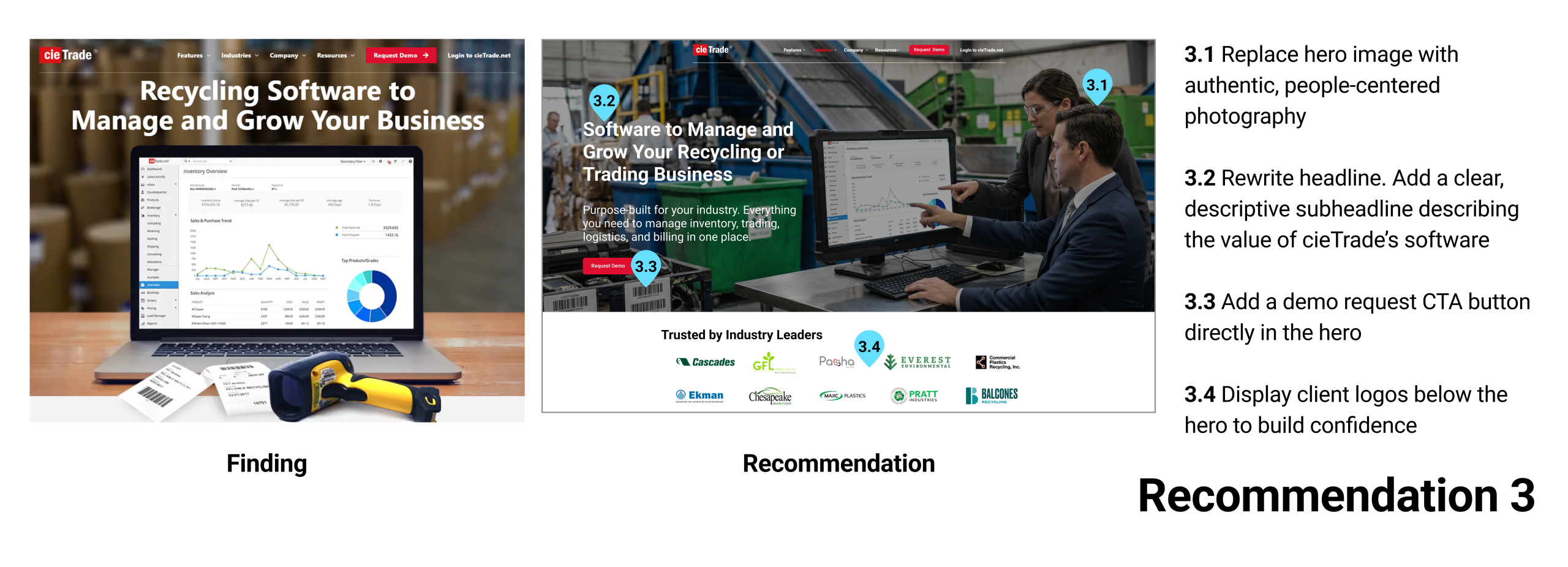
Finding 3: The Homepage Hero Didn’t Hook Visitors
The average time participants spent on the homepage before moving on was just 18 seconds. In that window, the hero section, the first and most important content block, needed to do a lot of work. It didn’t.
The hero image was poorly received by participants, who found it generic and disconnected from the software’s value. The headline (“Recycling Software to Manage and Grow Your Business”) gave some indication of the category but didn’t explain what cieTrade actually does. There was no supporting subheadline, no CTA button embedded in the hero, no human presence, and no client logos or trust signals to establish credibility on arrival.
“The more I read the better I understand who some of the customers are, though I still don’t really know what the product does.”
– Participant 1
Recommendation 3: Strengthening the Homepage’s First Impression
The hero section needed to work harder in those first 18 seconds. We recommended replacing the generic hero image with people-centered photography showing the software in real working environments, rewriting the headline to be more specific, and adding a sub-headline that clearly communicates what cieTrade does. A “Request Demo” CTA button directly in the hero, and client logos needed to appear immediately below it to establish credibility before users even began to scroll.
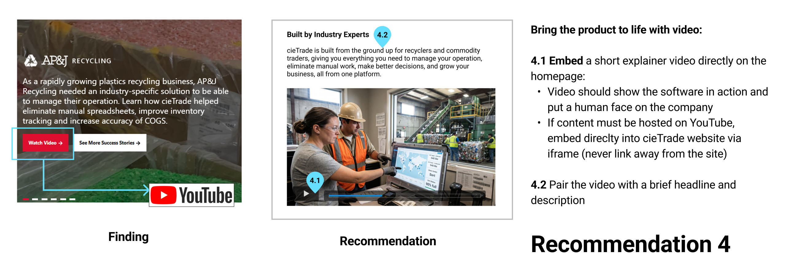
Finding 4: Videos Sent Users Off the Website
The homepage carousel featured case study slides with a “Watch Video” or “Read Case Study” buttons. Clicking “Watch Video” navigated users away from cieTrade’s website entirely, to YouTube. This created a broken user journey.
For a software product, videos are one of the most effective ways to show “what does this actually do?”. Without it, users had to go through dense text to piece together an understanding, and several users finished the homepage still unsure of what cieTrade offered.
Recommendation 4: Embed Videos Directly Onto Website
Embed a short explainer video directly on the page via iframe. If the content lives on YouTube, it can still be embedded, the fix is that clicking should never navigate users away from the site.
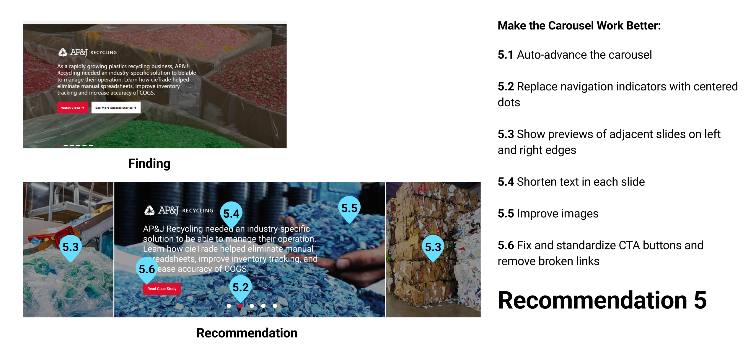
Finding 5: The Case Studies Carousel Was Hidden in Plain Sight
The homepage carousel contained valuable customer stories from companies, the kind of real-world examples that help prospective clients feel confident about a product.
The problem was that almost no one saw them. Most participants didn’t attempt to advance the carousel during testing. The navigation was manual, and the indicators were small and easy to miss. The “Watch Video” button sent users to YouTube. And the “See More Success Stories” CTA linked back to the top of the homepage, not to any actual stories page. Customer stories that could have built confidence were buried behind a UI pattern that did the opposite – broke user trust.
Recommendation 5: Making Customer Stories Visible
We recommended auto-advancing the slides so users wouldn’t have to discover the navigation themselves, replacing the small indicators with centered dots, and showing partial previews of adjacent slides to signal that more content exists.
All CTA buttons standardized to a single consistent label, size, and placement. Broken links, including the “See More Success Stories” button that looped users back to the top of the homepage, needed to be fixed or removed entirely.
What I Learned: Key Takeaways
“Going in, I had no idea what to expect, but watching people’s confusion slowly shape into real solutions for a business I knew nothing about at the start made this one of the most satisfying projects I’ve worked on.”
Starting this project with a client whose industry I knew nothing about made me nervous. But once the insights started forming patterns and the same problems surfaced across multiple users, I realized the core understanding had nothing to do with the product. It was always about the users.
I didn’t expect a usability evaluation to turn into a study about trust. But that’s where the research led us, and it changed how I look at design problems. It also taught me that the best research insights don’t come from what users say, they come from what they do when they’re unsure.
It taught me to look earlier – at the moment a user decides whether they feel comfortable enough to engage with an interface at all. That decision happens fast, and design either supports it or doesn’t. How an experience makes someone feel is often what makes or breaks it.
I intend to keep this learning in mind for my future projects.