A UX Case Study on Navigation, AI Discoverability, and Financial Decision-Making
Project Overview
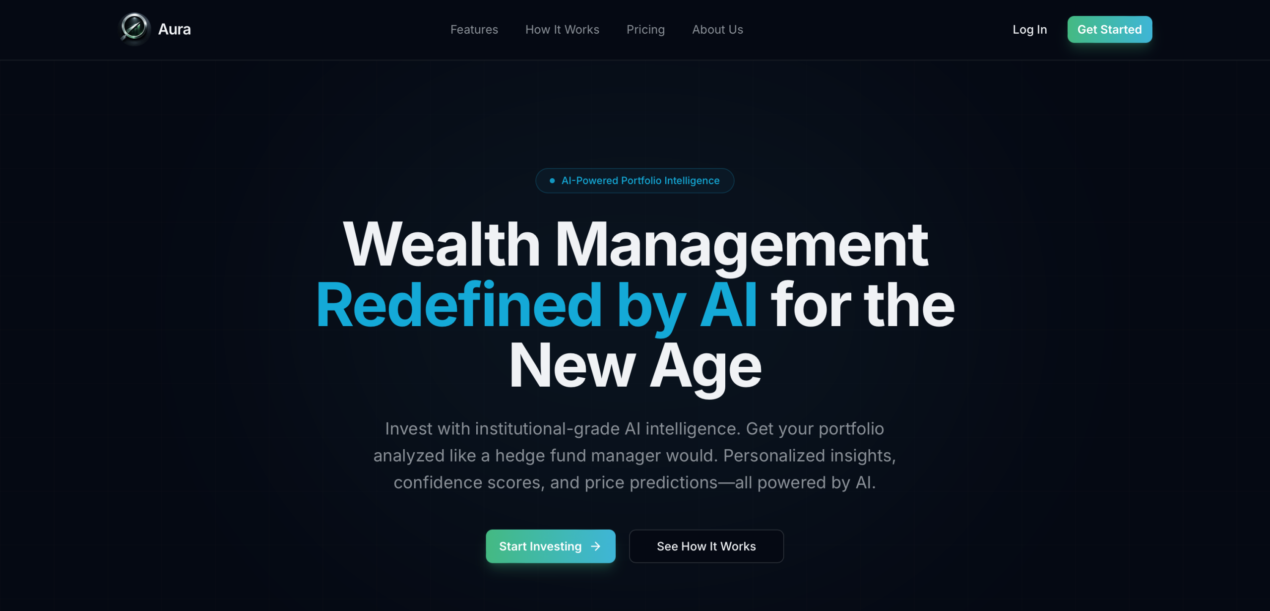
Financial Aura is an AI-powered investment research platform designed to help users analyze portfolios, evaluate stocks, and receive personalized financial insights through conversational AI tools.
Before launch, the Financial Aura team wanted to better understand how real users interacted with the platform. While the product offered advanced AI-driven functionality and a visually polished interface, there were concerns about whether users would fully understand the platform’s purpose, successfully navigate its features, and trust the insights being presented.
As part of a UX research team, I helped conduct a moderated usability study to evaluate the platform’s usability, information hierarchy, AI discoverability, and onboarding clarity.
This case study documents our research process, findings, and recommendations for what Financial Aura can implement in the future. This case study reflects on what I learned and contributed throughout the project.
The Challenge
Financial Aura sits at the intersection of fintech and AI. Unlike traditional investment apps, the platform focuses on research and portfolio analysis over stock trading itself.
The knowledge of that distinction became the central challenge of the project.
In addition, the client wanted to answer several important questions from user insights:
- Would users understand what Financial Aura actually does?
- Could users easily navigate the platform’s core workflows?
- Would users trust and understand AI-generated investment insights?
- Were the platform’s most valuable features easy to discover?
- Could intermediate investors interpret the financial metrics confidently?
The platform already looked polished and modern, but our purpose was to test its usability. Our goal was to evaluate whether the experience actually aligned with user expectations and mental models.
My Role
I worked as a UX Researcher within a collaborative usability testing team. Michael Persson, Zahra Hakani, Vincent Allport and I sectioned responsibilities equitably based on our personal strengths.
My responsibilities included:
- Helping design the research methodology
- Writing and refining usability tasks
- Participating in pilot testing
- Moderating live testing sessions
- Observing user behavior and documenting friction points
- Synthesizing qualitative findings
- Contributing to the final presentation and recommendations
One of the most valuable parts of this role was seeing participants in real time. Watching users hesitate, backtrack, or verbalize confusion revealed usability issues that would have been difficult to identify through analytics alone (or in unmoderated user sessions).
Building the Research Plan
Starting with the Client Kickoff
Our project began with a kickoff discussion focused on understanding the product, the business goals, and the target audience.
During this meeting, we learned that Financial Aura wanted to position itself as an AI-first financial research platform rather than a brokerage app. However, the team suspected users might confuse the platform with traditional trading applications because of its portfolio-management features and investment terminology.
From the kickoff meeting, we made sure to establish four, measurable research goals:
- Evaluate navigation clarity
- Test discoverability of AI-powered features
- Assess comprehension of financial insights
- Identify onboarding and expectation gaps
Designing the Study
Why We Chose Moderated Testing
We selected moderated remote usability testing because we wanted to capture more than task completion rates, and as I mentioned before, there is a lot of value in seeing users move through tasks in real time. Each session was conducted live over Zoom with a moderator and note-taker present.
We wanted to understand:
- Why users made certain decisions
- Where hesitation occurred
- How users emotionally reacted to the interface
- What users expected versus what they experienced
Participants completed five core tasks:
- Locate portfolio holdings
- Add a stock to holdings
- Use Full Portfolio Analysis
- Use the Screener tool
- Interact with AI personas
Pilot Testing & Refining the Experience
Before launching official sessions, our team conducted pilot tests to validate the study structure and task wording. During pilot testing, we discovered that some task instructions unintentionally guided participants toward the correct answer. We revised the language to make the tasks feel more natural and unbiased.
After this informative session, we made sure to adjust:
- Session pacing
- Financial terminology
- Moderator intervention guidelines
- Follow-up questioning techniques
Pilot testing improved the consistency of the study and helped us create a smoother experience for participants.
Meeting the Users
We recruited 10 participants between the ages of 18 and 35 who reflected Financial Aura’s target demographic: tech-savvy users with varying levels of investing experience.
Participants included:
- Intermediate investors
- Experienced traders
- Users familiar with Robinhood and Webull
- Professionals across technology, finance, healthcare, and sales industries
Most participants were located in major metropolitan areas such as Atlanta, New York City, Dallas, and Chicago.
This participant mix gave us insight into how both casual and experienced investors interpreted the platform.
What We Discovered
Insight #1 — Users Mistook Financial Aura for a Brokerage
The most consistent usability issue emerged within the first few minutes of testing.
Many users assumed Financial Aura was a trading platform rather than a research and analysis tool.
Because users expected brokerage functionality, they developed incorrect assumptions about how the platform should behave.
This created confusion around:
- Portfolio management
- Search behavior
- Investment actions
- AI-generated recommendations
Why It Matters
Users form mental models almost immediately. When a product’s purpose is unclear, even well-designed features can feel confusing.
Recommendation
We recommended stronger onboarding and homepage messaging that clearly positions Financial Aura as an AI-powered investment research platform.
Insight #2 — The AI Features Created the Most Excitement
The platform’s strongest differentiator was also its most successful feature set.
Participants consistently praised:
- AI-generated portfolio summaries
- “What’s Good” insights
- “Watch Out For” risk indicators
- Personalized AI personas
Several users described the platform as feeling more intelligent and personalized than traditional investing apps.
One participant compared it to “having a financial analyst built directly into the platform.”
Recommendation
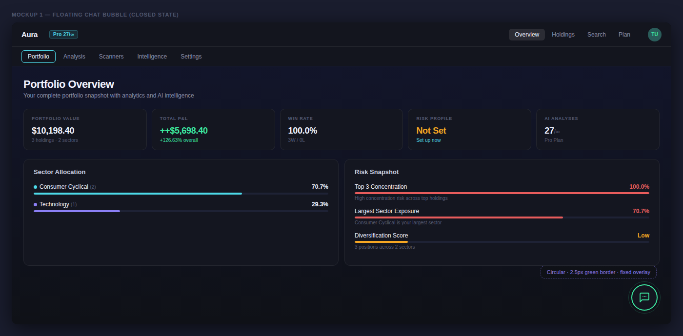
Because the AI tools generated such strong engagement, we recommended increasing their visibility throughout the platform experience rather than hiding them within secondary navigation layers (see bottom right text icon).
Insight #3 — Important Information Was Buried
While users appreciated the analysis tools, they often struggled with the platform’s information hierarchy.
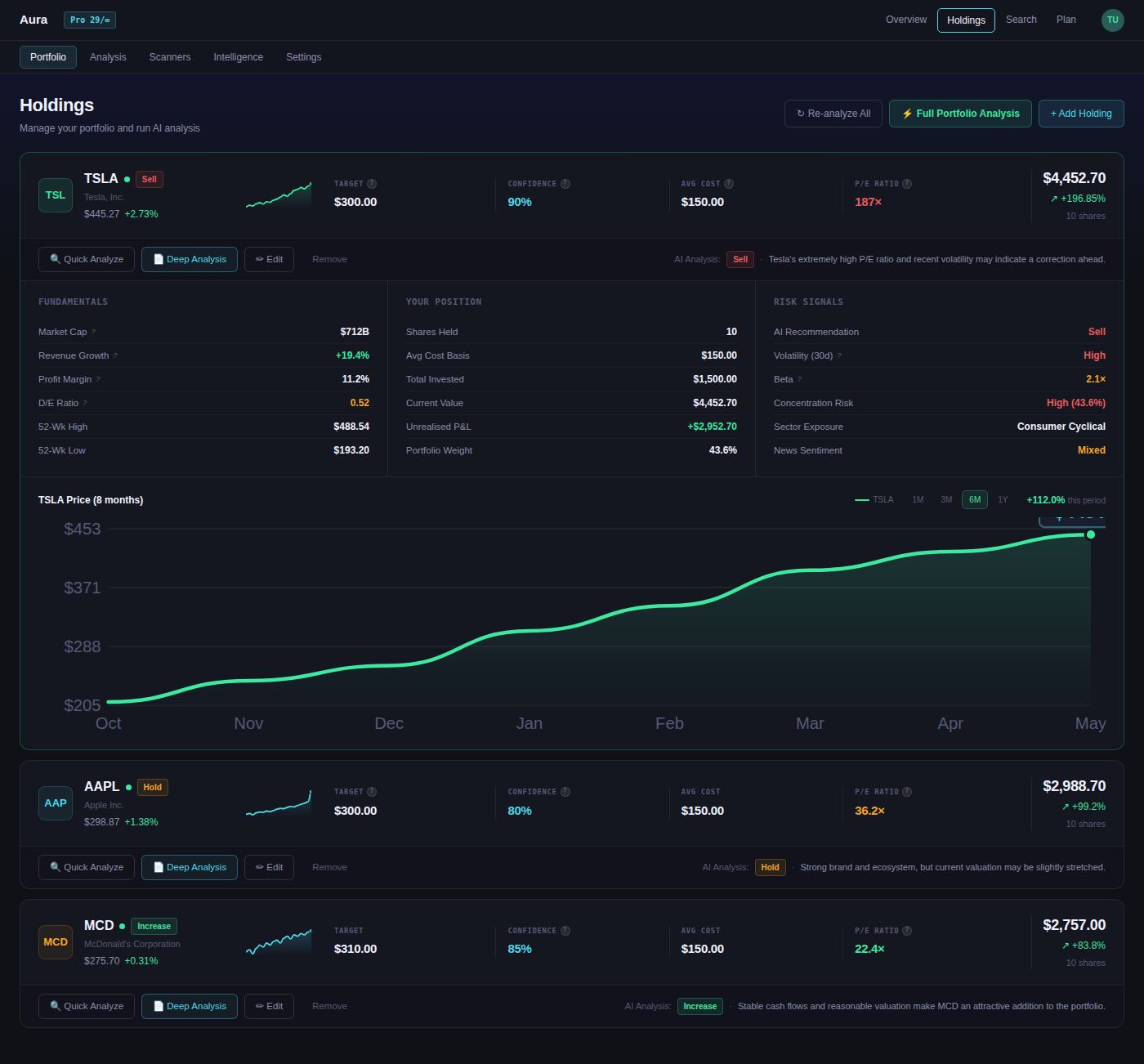
“The Bottom Line” summary repeatedly emerged as the most valuable section — yet it appeared at the bottom of the analysis pages.
Users wanted immediate visibility into:
- Buy/Sell/Hold recommendations
- Risk evaluations
- Portfolio summaries
- Key investment takeaways
Recommendation
We suggested restructuring the analysis pages so that actionable insights appear first, followed by supporting metrics and detailed breakdowns (more visualizations, less textual explaining).
Insight #4 — Financial Metrics Needed More Context
Many users struggled to interpret scores such as:
- Risk Factor
- Diversity Rating
- Portfolio Health indicators
For example, participants saw “Risk Factor 60” but had no context for whether the number represented high or low risk.
Recommendation
We recommended adding:
- Tooltips
- Benchmark scales
- Color-coded indicators
- Plain-language explanations
These additions would improve accessibility without reducing analytical depth.
Final Deliverables
At the conclusion of the project, our team delivered:
- A formal usability report
- A stakeholder presentation
- Prioritized design recommendations
Rather than simply listing usability problems, we focused on translating user behavior into actionable product improvements.
Our recommendations centered on:
- Clarifying onboarding
- Improving AI discoverability
- Simplifying navigation
- Reorganizing information hierarchy
- Adding contextual guidance for financial metrics
Reflection & Takeaways
This project reinforced how critical user testing is for validating assumptions before launch.
Financial Aura already had a polished visual design and impressive AI capabilities, but observing real users revealed several disconnects between the product’s intentions and users’ expectations.
The experience also taught me several important UX research lessons:
- Users form product assumptions almost immediately
- Strong visual design does not guarantee usability
- AI features only succeed if users can easily discover and understand them
- Information hierarchy strongly impacts perceived usefulness
- Moderated testing uncovers emotional reactions and behaviors that analytics alone cannot capture
Most importantly, I learned how usability testing transforms abstract assumptions into concrete, evidence-based design decisions.
If I continued working on this project, I would next explore:
- Iterative testing on revised prototypes
- Mobile responsiveness studies
- First-time onboarding optimization
- Comparative testing against brokerage competitors
Ultimately, this project demonstrated how thoughtful UX research can help shape the entire way users understand and trust a product.