Team: Elizabeth Serjantov, Jasmine Chen, Manvi Tandon, Shaelyn Chen
Duration: 6 weeks (April – May 2026)
Project Type: INFO 651-01: Emotional Design Academic Project
Methods: User Testing, Emotional Design Methodologies, User Interviews,
Tools: Figma, Figjam, Google Meet
Context & Background
Soft Stop is a speculative mobile app that reconsiders digital well-being through the lens of emotional design. Rather than relying on rigid time limits or disruptive alerts, the system introduces subtle, experiential interventions within the interface to support user awareness during moments of habitual phone use.
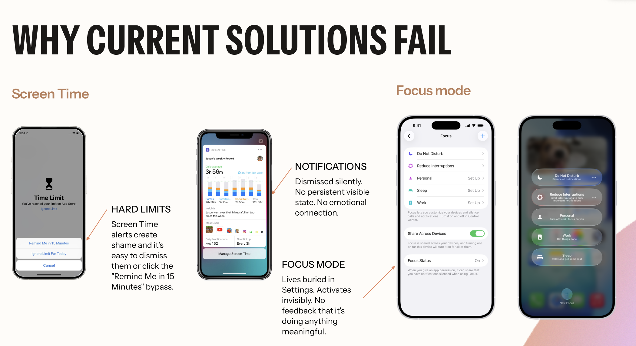
The user flow we analyzed and designed was the current Screen Time tool experience, specifically Apple iOS’s current Screen Time resource. Apple’s Screen Time feature allows users to set time limits for specific mobile applications to reduce time spent on them. Apple reminds users to get off the apps by disrupting their experience with a pop-up that lets them either ignore the reminder for 15 minutes or for the entire day. This was a crucial area to focus on from a design perspective because this experience is more than just receiving a notification in a mobile application. It’s a vulnerable and emotional moment for users as they try to pursue their goals while resisting something they enjoy or are distracted by. The design of this experience should accommodate these unique and diverse feelings, yet the current iOS tool Apple offers lacks design from this emotional perspective.
We know that this is an issue because of the statistics:
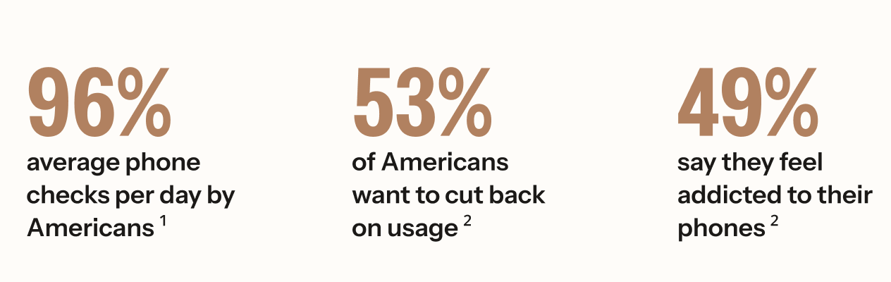
¹ Asurion. (2019). Americans check their phones 96 times a day. PR Newswire.
² Harmony Healthcare IT. (2024). Phone screen time statistics.
Apple’s Screen Time has existed since 2018 — yet screen time keeps rising. The problem isn’t access to tools. It’s that the tools don’t address the emotional reality of why people reach for their phones.
When reviewing the current design choices for Apple’s Screen Time tool, we can see how the designs inflict negative emotional response.
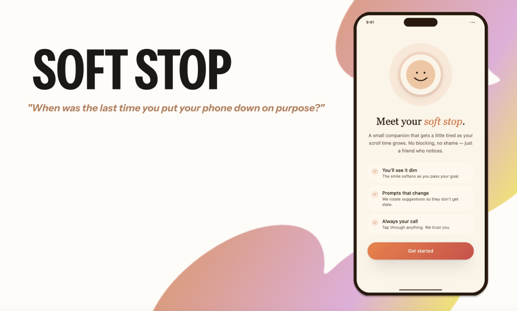
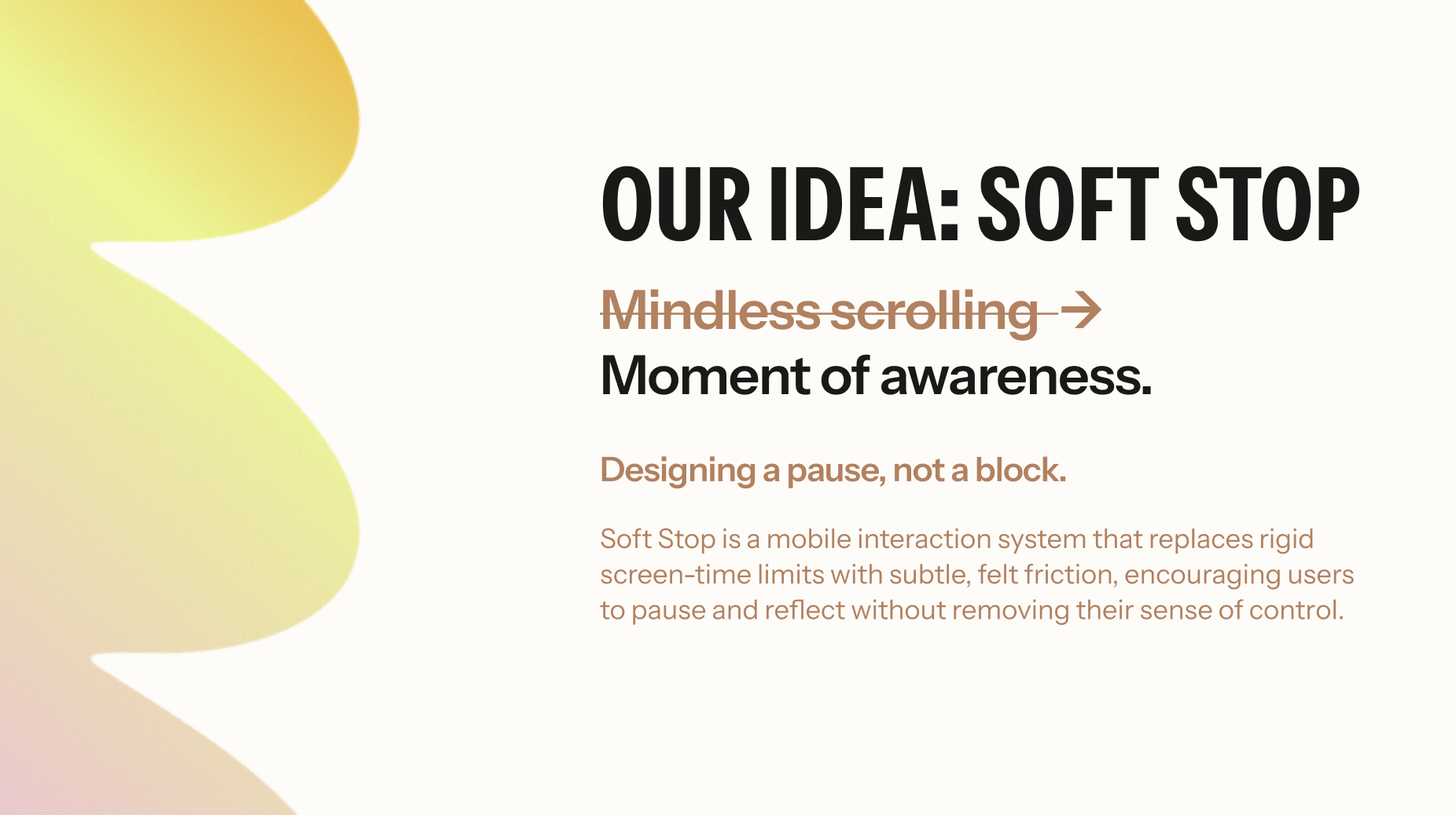
Therefore, the goal of the design is to shift from mindless scrolling to a moment of awareness. We planned to design a plugin that enhances the Screen Time experience. Therefore, this addition will help address unhealthy technology habits, guide and educate users on their behavior, and encourage a better relationship with their phone.
The idea was “Soft Stop,” which was designed for a pause, not a complete block. Soft Stop is a mobile interaction system that replaces rigid screen-time limits with subtle, felt friction, encouraging users to pause and reflect without removing their sense of control.
We grounded this idea with Turkle’s ideas in “Alone Together,” and Schüll’s “Addiction by Design,” theories. Turkle showed us that technology creates complicity and we participate in our own distraction even when we know it’s happening. Schüll’s reading expressed that coercive resistance loses effect over time when it doesn’t address the underlying behavioral loop. Every hard stop users learn to dismiss makes the next one easier to ignore.
Both theorists show that design’s influence on behavior is largely unconscious. Standard usability testing would miss this entirely. Methods must be able to surface what users can’t articulate. Therefore, these theories helped us understand that the goal isn’t to stop users — it’s to make the cost of continuing feel slightly steeper.
My role within this project was to assist with project ideation, user interviews, prototyping, user testing, and slide design. I focused heavily on the emotional design methodology, including the emotional journey mapping method and the development and analysis of inclusive/affective personas. I also took extra care to delegate meetings and schedule them.
Approach
For our Emotional Design Framework, we chose to focus on two methods of emotional design prototyping.
The first method we used was Emotional Journey Mapping, in which we examined users’ pain points with the current Apple iOS Screen Time tool. This mapping uncovered key moments where users’ emotions shifted throughout their experience, from setup to interacting with the various pop-ups encountered when using an app with a time limit.
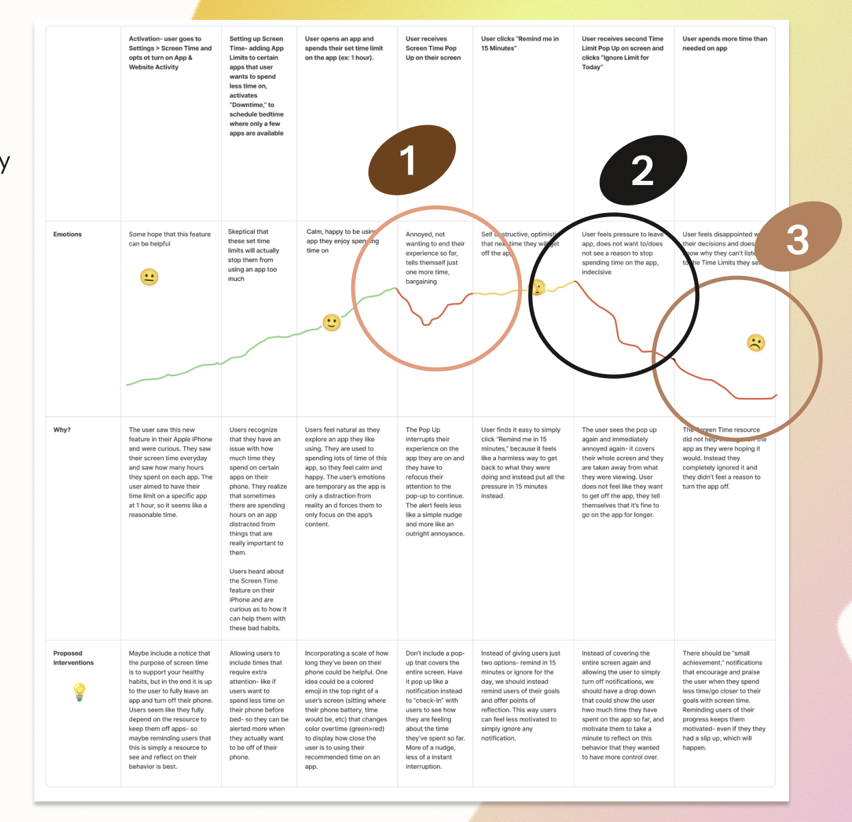
Users’ emotions decline when they see the first pop-up. Frustrated, they often select ‘15 more minutes’ to quickly resume their activity. The second low point is the pop-up after 15 minutes. Users become more annoyed and often choose ‘Ignore for the day’ to stop interruptions, returning to the app feeling discouraged but still using it. Emotions reach their lowest point when users realize they have exceeded their app usage limit. Afterward, they exit with disappointment and question their self-control.
Transitioning from these emotional low points, we used insights from the Emotional Journey Mapping method to better understand user expectations and needs from a screen time resource, without making assumptions:
- Users want more pop-up options: close the app, take a 5-minute break, or choose a self-care prompt (walk, hydrate, etc.).
- Users want reminders that feel supportive and encouraging, not repetitive or easy to ignore.
- Users need a way to reflect or celebrate progress, since current pop-ups do not track daily app usage with detail.
Building on these journey mapping insights, the second method we used was creating and analyzing Inclusive/Affective Personas. Transitioning from journey mapping, we based our persona, Lily L., on our initial interviews to understand what a target user might experience while using Soft Stop. Lily L. represents many younger generations who habitually use their phones at specific times, such as when they wake up, when they’re stressed, or right before bed. Through this persona, we saw that each user has different goals, yet emotional states and constraints that can get in the way. It’s important to take into account how vulnerable and ashamed some users feel about their screen time, and how they already recognize that it’s distracting them from what really matters.
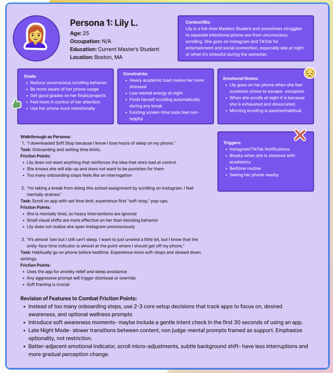
Some key insights we gathered from this method were:
- Users feel tense when receiving feedback, which can discourage or shame them. We should reframe onboarding to better understand how users want to feel and ask directly what support is helpful.
- Adding a prompt asking users to spend 20-30 seconds after opening an app to gauge their intent may raise awareness of why they opened it.
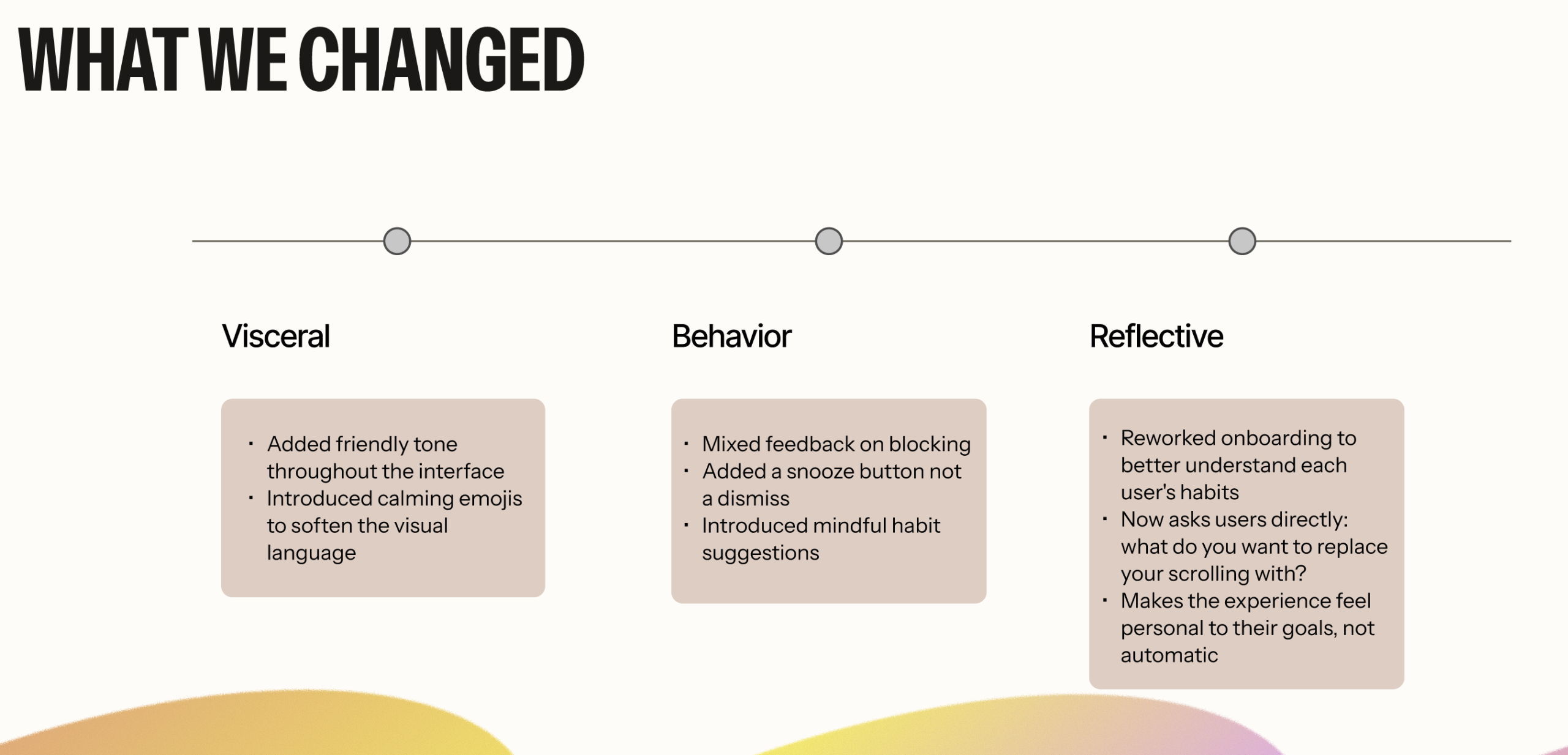
Bringing together insights from both Emotional Journey Mapping and Persona Analysis, we can see Don Norman’s emotional design theory (Norman, 2004) and its three distinct levels reflected throughout our Soft Stop process.
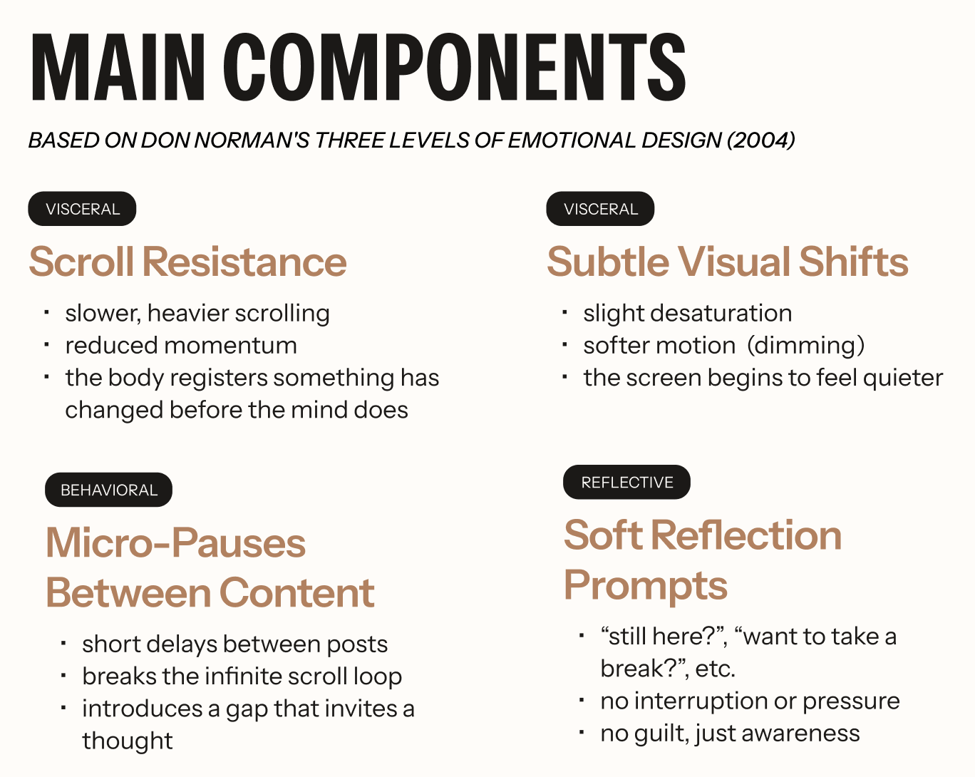
At the Visceral level, we focus on first impressions. Gentle reminders and nudges prompt reflection or breaks. We also plan to dim the screen as users approach their time limit, providing gradual reminders rather than abrupt pop-ups. On the behavioral level, the app helps users understand and manage screen time through reflective prompts and visual indicators that promote awareness. At the reflective level, Soft Stop focuses on long-term perceptions, memories, and positive meaning. We support this by adding reflection throughout the user’s journey, asking about intentions 20-30 seconds after opening an app, prompting reflection on behaviors, or offering weekly and monthly usage insights.
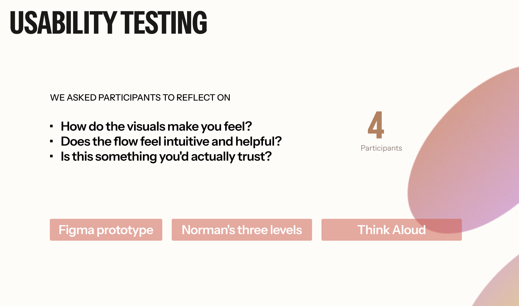
To bridge theory and practice, we next conducted an initial round of user testing on about 4 participants, using our first iteration of the design. We asked users to reflect on how the visuals made them feel, whether the flow felt intuitive and helpful, and whether they found the plugin trustworthy and able to help them achieve their goal of having more control over their screentime.
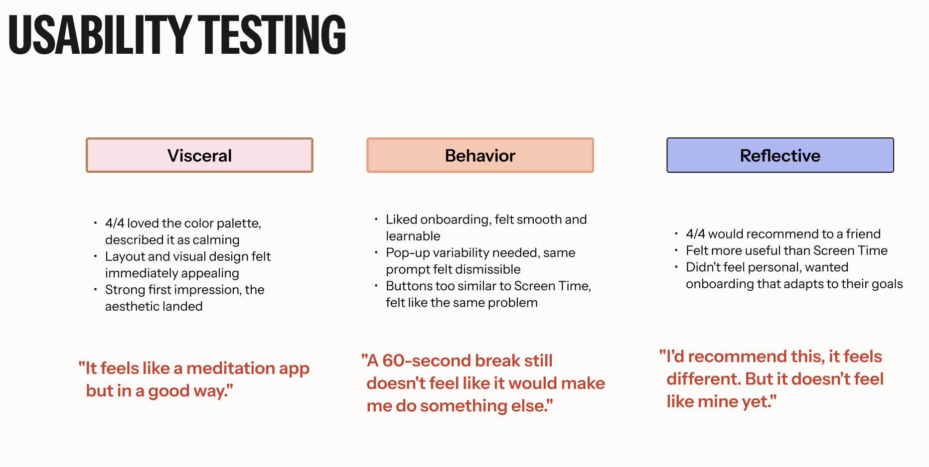
On the visceral level, all 4 participants enjoyed our visual design and praised the calming color choice. They also gave positive feedback on the layout. At the behavioral level, participants had mostly positive responses for task efficiency, learnability, and consistency. They liked the onboarding but wondered about the frequency of the pop-ups after exceeding time limits. At the reflective level, we asked if Soft Stop enabled self-expression, provided high satisfaction, and was recommendable. Participants would recommend it to friends, calling it effective. They did not feel it helped with self-expression and suggested more personalized onboarding questions to better fit individual goals.
From this process, I learned what the intended users might feel and what design choices we can make to enhance their emotional experience. From our emotional design methods, I learned that users need a Screen Time tool that does not judge them, does not make it “easy” to click away, and helps them reflect on their behavior/habits.
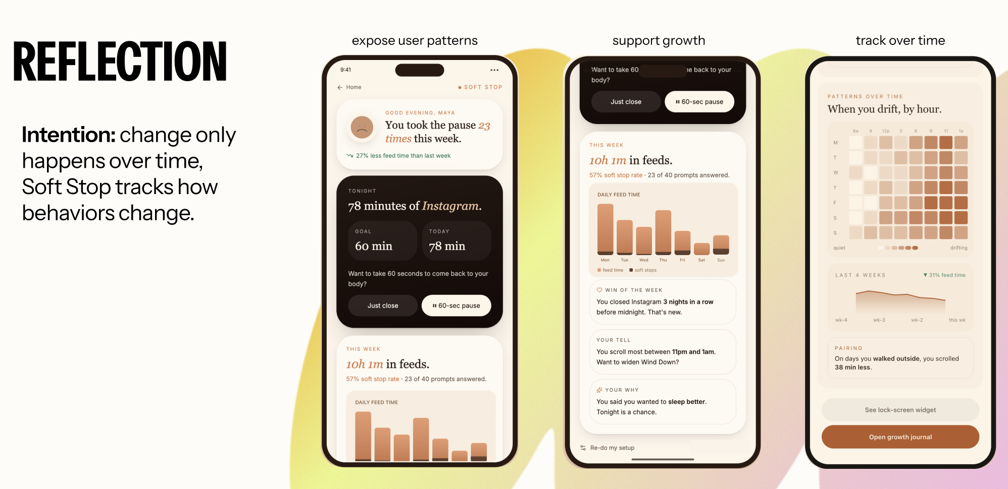
By examining this idea through Don Norman’s emotional design theory, I learned which designs could inhibit a more positive experience. I learned that the design should look visually appealing and calm- no sudden pop-ups, light color choices, and slow but continuous reminders of the user’s time on an application. I found that users need to consciously understand when they receive a pop-up reminding them to get off their phone- repetitive and disruptive pop-ups can make users feel instantly annoyed and unconsciously select to ignore these reminders. Finally, I learned that one of the best ways users can stop bad habits is through reflection. Providing a page that explains metrics and achievements can help users visualize their unhealthy habits and track their progress towards reducing them.
Final Design / Results
To explore how Soft Stop could integrate into users’ existing digital habits without feeling disruptive, we developed and tested two onboarding directions alongside three functional interaction prototypes.
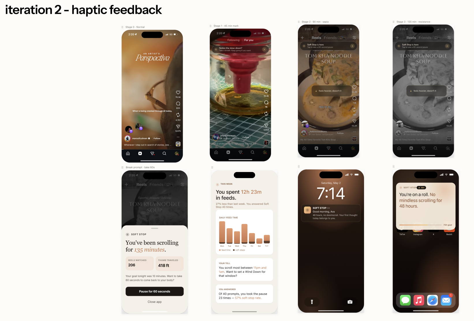
In parallel, we developed three functional interaction prototypes demonstrating how Soft Stop would appear during active use within social media environments such as Instagram. These prototypes explored different forms of intervention, visual feedback, and interaction timing during prolonged scrolling behavior.
The goal of this phase was to evaluate how users perceived:
- Autonomy versus control
- Overall intrusiveness of the system
- Visibility of intervention
- Emotional tone of feedback
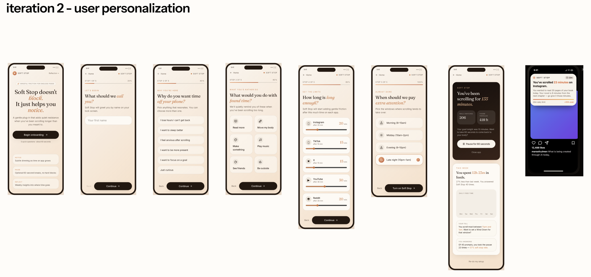
Through user feedback, we found that most participants wanted a tool that could quietly support healthier digital behavior within their existing routines. This reinforced an important design direction: Soft Stop should feel integrated, lightweight, and supportive, rather than like another system asking for attention.
Participants also expressed a strong desire for autonomy. They wanted help developing better screen-time habits, but did not want to feel controlled, judged, or restricted. Based on this feedback, we moved forward with the iOS-integrated onboarding flow, allowing users to set their own limits and preferences in a familiar setting.
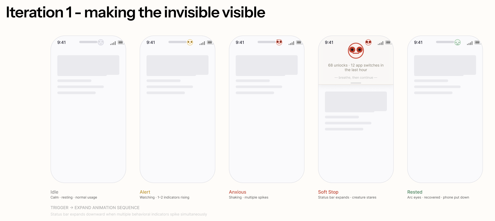
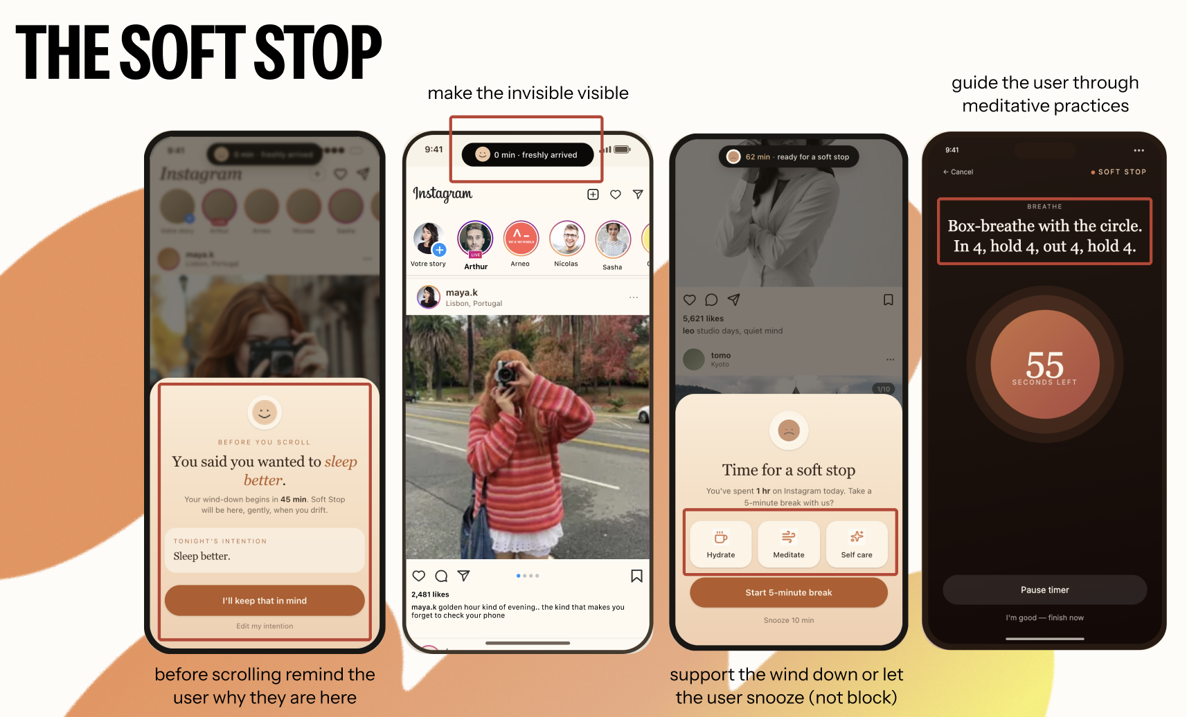
For the final prototype, we also refined how Soft Stop appears during use. Users responded positively to visual indicators because they made overuse feel more visible without relying on guilt-driven alerts. In response, we introduced a floating emoji companion within the Dynamic Island. When users approach or exceed the limit they set for themselves, the emoji subtly appears as a gentle awareness cue. Rather than acting as a warning or punishment, it makes the invisible state of overuse visible and felt.
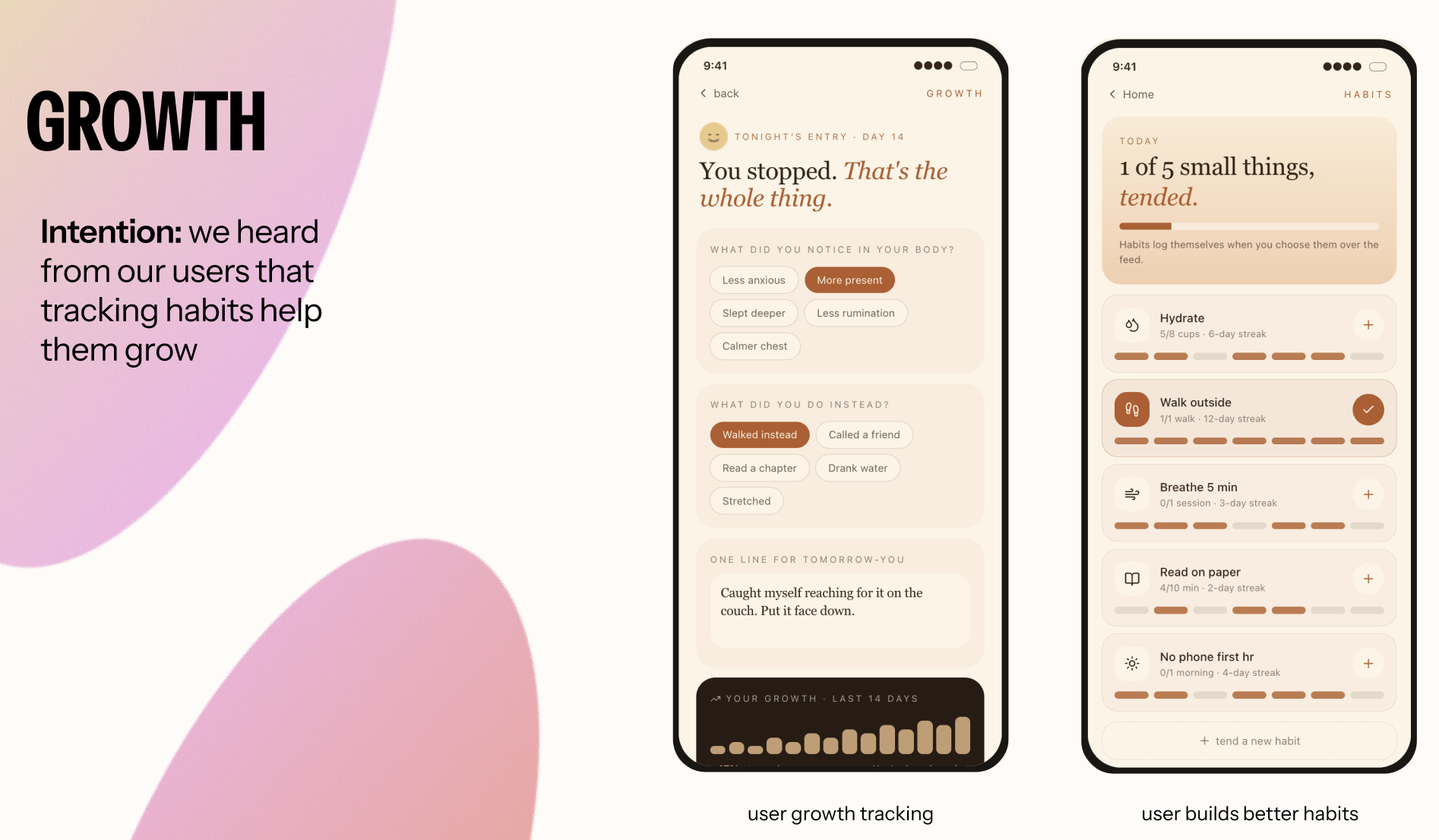
We also expanded the reflection experience beyond a usage summary. In the final prototype, Soft Stop offers mindful practice suggestions, such as taking a walk, drinking water, or stretching. This makes the experience feel less like a hard “stop” and more like an actionable pause. By offering small, supportive next steps, the system encourages users to reflect on their behavior and reconnect with their physical state.
Overall, the final prototype shifts Soft Stop from a screen-time limiting tool into a gentle awareness system. It supports users in noticing their behavior, making intentional choices, and building healthier digital habits without removing their sense of control.
The Final Prototype:
(Check out live demo here:https://calm-intent-companion.lovable.app/)
Reflection
I learned that many modern systems and tools should be examined through an emotional design lens. I never thought we could improve Apple iOS’ Screen Time by taking time to analyze it through an emotional design methodology and user testing.
I have now found myself thinking about emotional design methods when designing. For example, I recently worked on a website for a school in Brooklyn, New York, focusing on creating an experience for new families entering the school and seeking information. As I was designing a few pages that were intended for these families, I started to think about how I would feel if I were in their position. I started thinking about the pages as I thought when I was analyzing an Emotional Journey Map- I wanted to make sure I was tackling all their questions and worries about the new year for their child, and designing pages that made them more confident and informed about the school’s policies, procedures, and events. I think this way of thinking will stick with me when I design anything now- I did not realize the power that emotional design holds over a user’s experience. It’s not just about understanding their goals, but also about their emotional states at that moment and tailoring your design to address them.
Therefore, I came into this course thinking I already knew how to design a positive experience for users. What I learned is that it is so much more than just designing a flow that’s understandable and usable. It’s taking the extra step to understand your users on a different level, a level that can really make your designs a better emotional experience.