
Introduction
A usability testing case study for CUNY City Tech’s OpenLab platform
OpenLab is CUNY City Tech’s open-source digital platform where students and faculty of the college can connect and network. User’s are able to share courses, clubs, portfolios, and projects, and more. OpenLab is also built off and is the source of a template hosted on Commons in a Box, the open-source version of the software which can be used by other institutions, emphasizing OpenLab’s impact. This post details the work that a team of four Pratt IXD students took on for OpenLab to conduct a usability study of the OpenLab website on mobile devices.

The Scope
After meeting with our client the problem we chose to focus on became clear. OpenLab has a strong idea of what a user’s goals and behavior was like on the site , but, required additional understanding of what that experience was like on mobile devices. With this in mind along with the knowledge that mobile device usage is incredibly common among student populations, we decided to limit the scope of our study to focus on the mobile experience
Methodology
For our study our team decided to utilize moderated user testing method so we could observe and inquire directly with participants. Moderated user testing is considered the gold standard when it comes to finding usability issues, as research shows just five sessions can reveal the majority of problems on a site (Rubin & Chisnell, 2011, p. 126).
We recruited participants through a screener questionnaire hosted on Private Panels and distributed via the Pratt iSchool listserv and within City Tech. Our reasoning for doing so was to ensure our participants matched the target user, which would be currently enrolled in higher education, or have finished a degree within the last one to two years.
In total we conducted nine moderated user testing sessions both in person and over Zoom. Two team-members participated in each session to either interview or take notes.
Of our nine participants, eight were not City Tech students and one was a City Tech student who has prior experience with OpenLab. Having newer students for our study would work in our favor, as these participants would bring the perspective of a student experiencing the site for the first time
Tasks
During the testing sessions participants were prompted to complete four tasks:
- Imagine you’re a first year student and you’re exploring OpenLab for the first time. You land on the OpenLab Homepage. Take a moment to explore, then click on a link that intrigues you
- As a second semester technology and design student you are interested in sites students have created to showcase their work. Show us how you find and explore these sites.
- Imagine you are a technology and design student who is interested in architecture and you want to get involved with a student organization on campus, how would you do so?
- Imagine you are a first semester student taking an introductory English class and want to learn more about the class. Show us how you would find information related to that class.
Each task allowed us to gain a deeper understanding of key flows on a mobile experience. Tasks 1 and 4 would give us an idea of key flows of a first time user, and tasks 2 and 3 would give us an idea of a more advanced students experience.
What We Found
Problem 1: Listing Cards Felt Full
Course and club listing cards displayed a lot of information: thumbnail images, titles, instructor names, course codes, semester info, descriptions, status badges, and links. The lack of visual hierarchy on the page made it difficult to know which pieces of information were actionable. Participants scanned the same card multiple times before committing to a tap. Several tried the “Open” or “Cloneable” badges, which looked like buttons but did nothing. Others missed the “Visit Site” text link entirely, even though it was the primary way to enter a course or club.
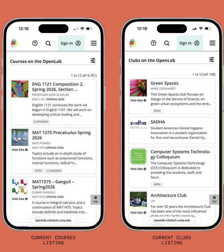
“Yeah, I think I expected to tap on the whole card and for it to open”
-Testing Participant
Although the cards contained the required information for next steps, users required clarity about what to do with it. Additionally, what made this finding especially significant was that the listing card pattern isn’t isolated to courses and clubs. It’s used across resources, portfolios, and projects
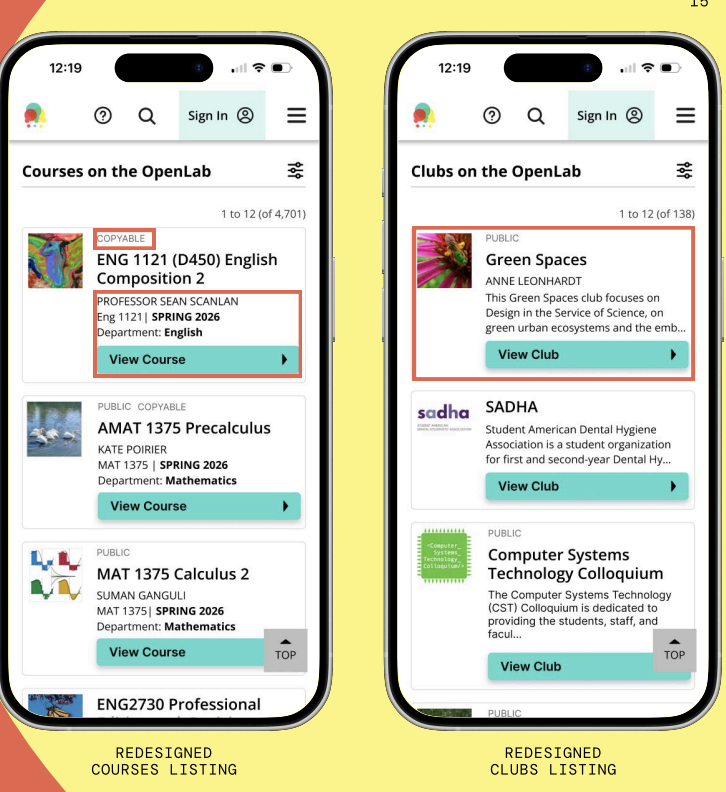
What we recommended: Replace the text link with a single full-width button, “View Course” or “View Club”, styled with high contrast and positioned clearly beneath the title. Reframe status tags like “Open” as lighter labels above the title, which becomes visually distinct from interactive elements. For courses, the shorter previews make scanning faster. However, for clubs the descriptions stay because clubs need to pitch themselves, and without context, they all look the same.
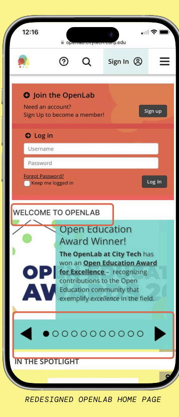
Problem 2: The Carousel Confused
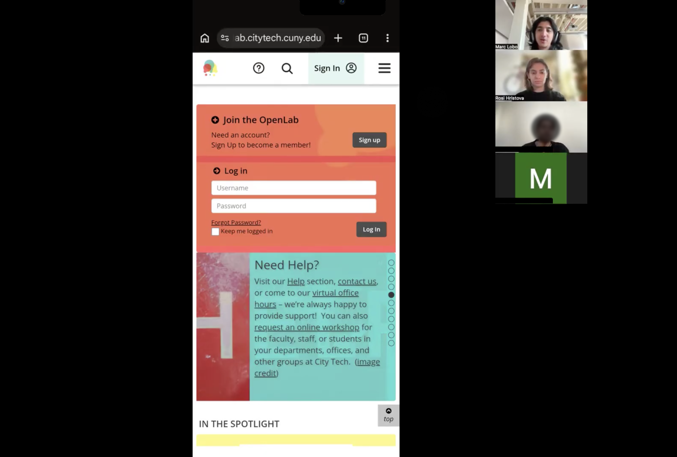
About half our participants reached the homepage carousel and couldn’t tell what it was. They were unsure if it was autoscrolling or if they could tap through. The small dot indicators stacked vertically along the side gave almost no feedback when tapped. Several participants tried twice and got nothing they could detect, which made them scroll past. The homepage also felt dense where the login form and carousel pressed together made the page feel like one undifferentiated block.
“Way too much happening here, I’m not able to read much in this section.” “I don’t know if it automatically changes or not.”
-Testing Participant
The carousel wasn’t failing because the content was bad. It was failing because users couldn’t tell they were allowed to interact with it
What we recommended: Move the page indicators to the bottom of the carousel, increase their size, and add left and right arrow buttons large enough to tap comfortably on a phone. Add a brief section header, “Welcome to OpenLab”, to orient users. Introduce whitespace between the login module and carousel so the page reads as having distinct sections. This ensures users have a clear differentiation between elements and can easily interact with the carousel.
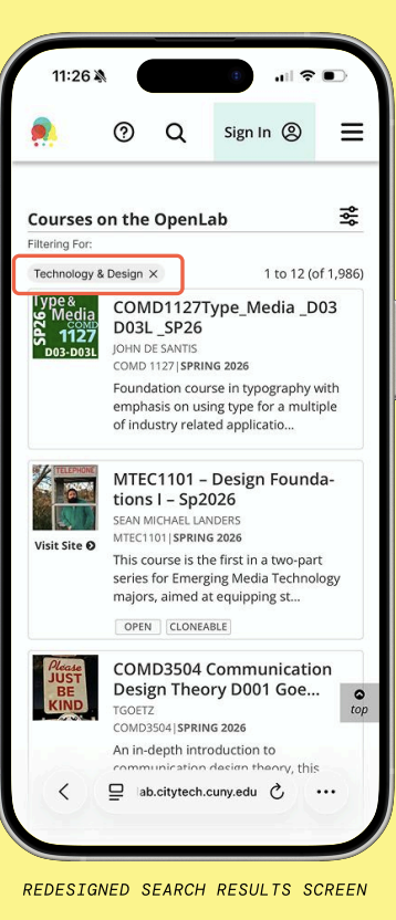
Problem 3: Filtering had no Feedback
OpenLab’s search filter lives in a pop-up panel where you set your criteria, hit submit, and the panel closes. You’re returned to your results — but there’s no indication of what filter is active, or whether it worked at all. If you’re new to the platform and don’t know what filtered results should look like, you have no way to verify that anything changed. Furthermore, on mobile, you also can’t see the filter panel and results simultaneously. So there’s no way to watch results respond as you adjust criteria.
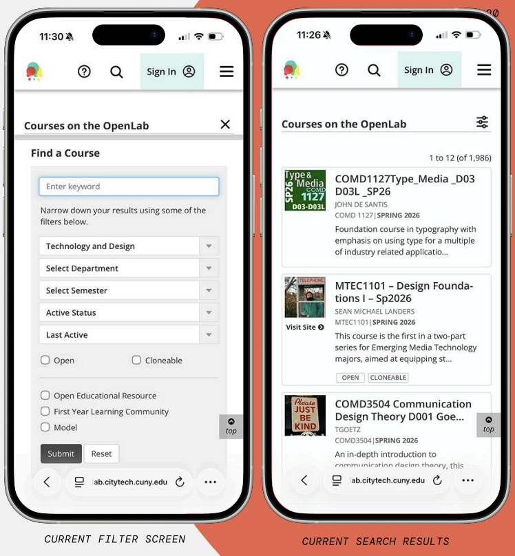
“The filter didn’t show that I selected English as a department. So I’m not sure what was going on there… lack of feedback with that.”
-Testing Participant
The filter had worked but the participant just didn’t know it.
What we recommended: After applying a filter, display a labeled chip at the top of results, “Filtering For: Technology & Design “, confirming what’s active and allowing users to remove it without reopening the panel. This small addition provides adequate feedback to users which makes filtering and searching easier.
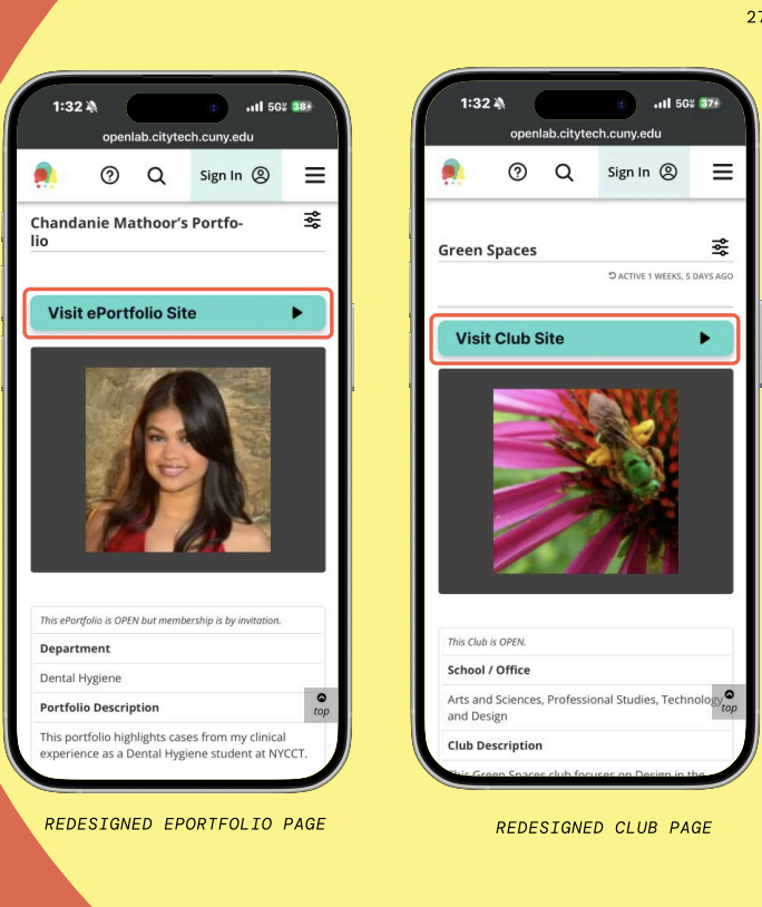
Problem 4: Important Buttons were Easily Missed
On individual portfolio and club pages, the button to visit the associated external site was styled as a plain text link with low-contrast and placed above the main image before the fold. Multiple participants scrolled straight past it. Several then tapped an “OPEN” badge overlaid on the profile image, assuming it was a link to the site.
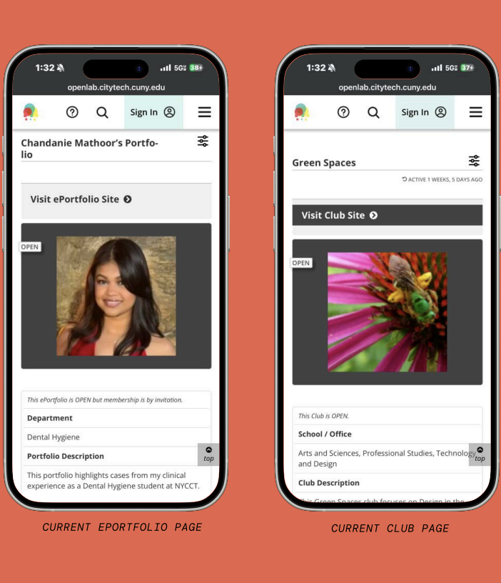
“I actually missed this whole section up here; visit e-portfolio. I missed that completely. I didn’t even notice that was a thing up there.”
-Testing Participant
They were on the right page the whole time but the path forward was just invisible.
What we recommended: Replace the text link with a bold, full-width button in OpenLab’s teal brand color making it hard to miss at the top of the page. Remove the “OPEN” badge from the main image; the same information already exists in the info table below, so the badge was redundant and actively creating confusion.
Presenting our Findings
We presented our findings and mockups to the OpenLab team at the end of the project.
Several of the issues we raised were already on their radar. The “Open” tag, for instance, had been the subject of internal debate where the team had gone back and forth between “Open,” “Public,” and other labels without a clear resolution. Overall our clients appreciated the feasibility of our recommendations and felt excited to implement them going forward.
Their response to the recommendations as a whole:
“Really great, productive solutions that seem very actionable. We can just imagine taking these and implementing them in our next cycle.”
“It’s very exciting that these things seem very doable. So it’s not something we have to put off super far in advance to-do list. Hopefully we can implement these soon.”
Conclusion
Next Steps
The immediate next step is validation running new moderated sessions with interactive prototypes of the redesigned screens. Conducting moderated user sessions would allow for the most effective data collection, however, unmoderated sessions could also be useful to compare against the original sessions from this report. Additionally, testing these changes across the CBox platform from different institutions would be valuable for data collection as well.
Takeaways
It was incredibly rewarding getting to work on this project, as it seems each of our recommendations are feasible enough for the OpenLab team to implement in the future. On this project I learned that usability issues were not about missing information, they were about missing feedback. Users weren’t lost because OpenLab lacked functionality, they were lost because the interface didn’t confirm what was interactive or what had changed. This allowed us to clearly define our changes and future directions for the OpenLab.
References
- Rubin, J., & Chisnell, D. (2011). Handbook of Usability Testing: How to Plan, Design,
and Conduct Effective Tests (2nd ed.). Indianapolis, IN: John Wiley & Sons, Inc.