Introduction
Amazon Shopping is the mobile app for Amazon’s online store. It offers products ranging from everyday essentials to electronics and home goods. Customers can shop and manage orders on their phones. The critique examines both helpful features and frustrating parts of the iOS app.
1. Finding Product Categories
The Amazon Shopping iOS app home page gives a lot of space to promotions and recommended products. Under the search bar is a horizontal row with options such as “Prime Video”, “Grocery”, and “Luxury”… When I wanted to browse products by category, the way to reach the full list was not immediately clear. The “see all” button appears only after swiping to the end of this row. The three line icon in the bottom navigation also opens the category page, but there is no label explaining that this is where the categories are.
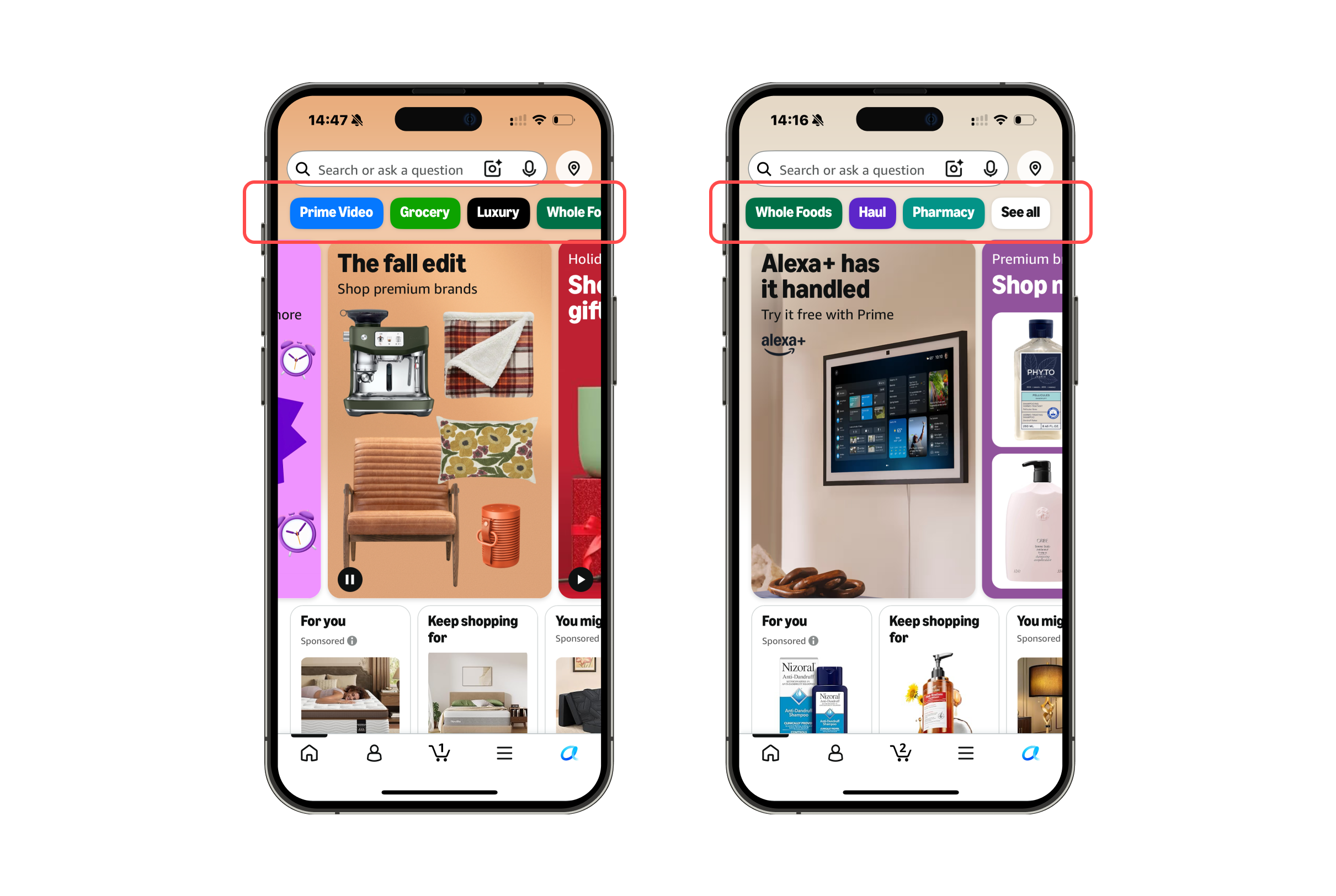
Norman’s idea of discoverability asks whether people can tell what actions are possible. The icon acts as a signifier for a menu, but gives little clue that categories are inside it. “See all” is another weak signifier because it does not say what it includes. These unclear paths create a gulf of execution: the goal of browsing categories is simple, but choosing an action takes extra searching.
Solution: Add a “Shop by category” button below the search bar. “See all” could also be changed to “See all categories”, these clearer signifiers would make the action visible and its destination easier to predict.
2. The Category Page
Once opened Amazon Shopping iOS app, the category page is clear. It starts with a “Shop by Category” heading, and each row has an image, a category name, and a downward arrow. For example the “Pets” row includes a dog, while “Home, Garden & Tools” Includes furniture. The text makes each category specific, and the images make the long list quicker to scan. The arrows suggest that tapping a row will expand it.
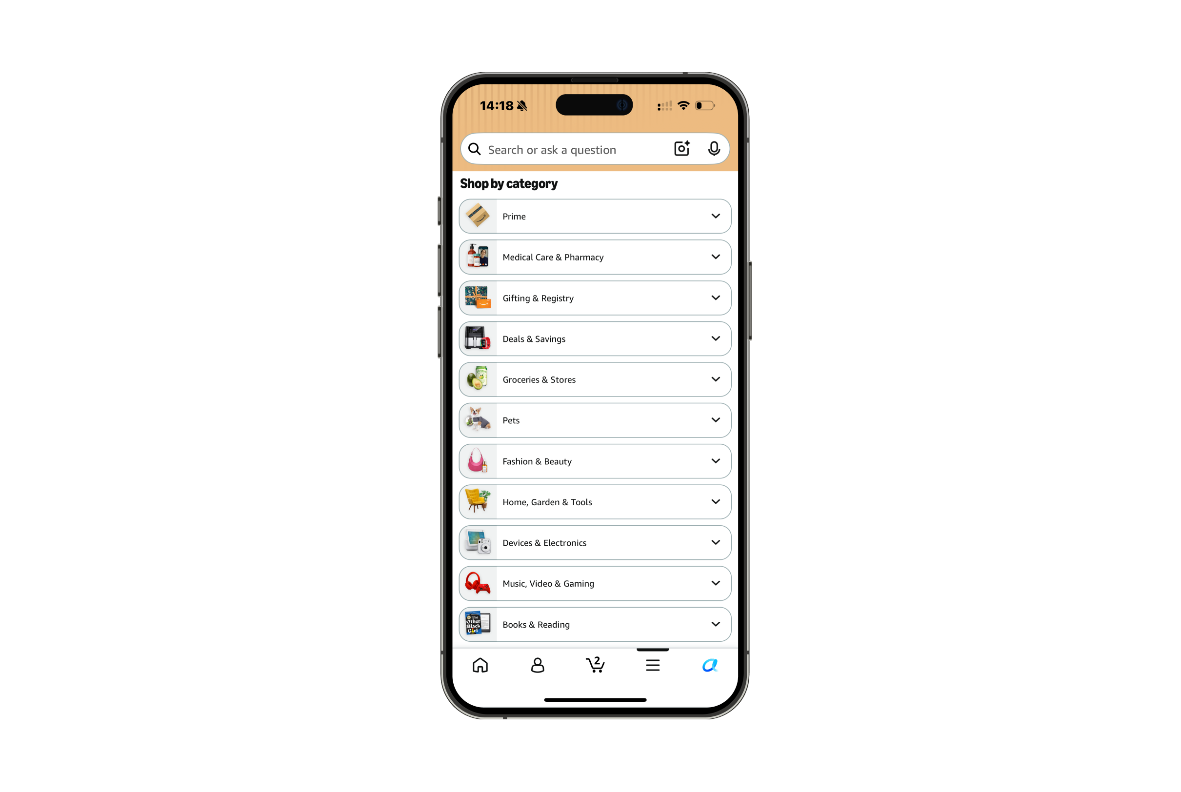
Norman calls useful information placed in an interface knowledge in the world. For someone looking for a lamp, the “Home, Garden & Tools” label provides a starting point at the moment it is needed. The arrow is also a signifier for the next action, it suggests opening a smaller set of choices within that category. Together, these details make both the available options and the next step understandable.
3. Adding Product To Cart
The search results handle an action more clearly. Before an item is added, its listing has a yellow “Add to cart” button. An added listing shows “1 in cart” with controls to remove the item or increase its quantity. The bottom cart icon also shows an updated count.
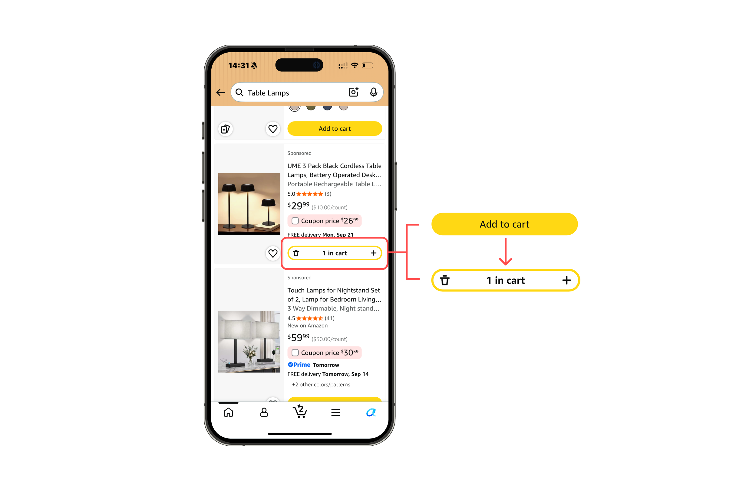
This is effective feedback, the listing changes at the place where the action was taken. The button state and cart count help users evaluate whether the item was added. The plus and remove controls act as signifiers for editing the cart, so a mistaken addition can be corrected on the search page. The result is immediately visible, making the evaluation stage of Norman’s action cycle easier.
4. Checking A Past Order
When I checked a floor lamp in my purchase history, I wanted to see its purchase date and price. The order was easy to find, but tapping it opened a page focused on “Buy it again,” support, returns, and reviews. A delivery date was visible, the purchase date and price were not. “View order details” appeared farther down under “Order info”.
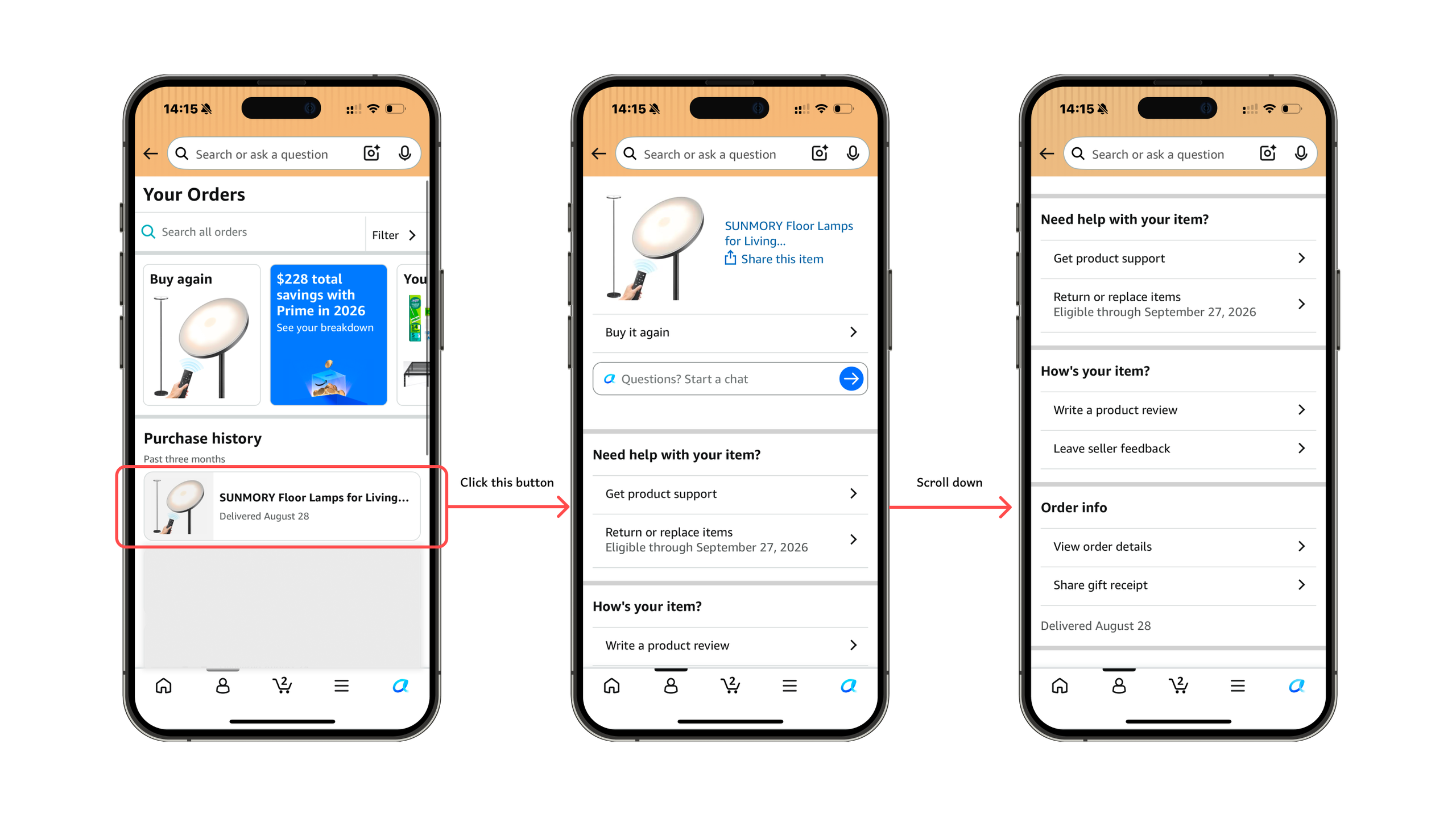
My conceptual model of an order page is a record of the purchase, so I expected those details near the top. Norman’s gulf of execution appears when the link to that record is buried: I know what I want to find, but the action needed to reach it is hard to spot. The missing price and order date also widen the gulf of evaluation, because I cannot check the transaction from the information the page first shows me.
Solution: Move “View order details” directly below the product summary. Show the original order date and item price there as well. Making those historical values visible would let shoppers check the purchase without searching through other actions.
Conclusion
Amazon Shopping makes it convenient to explore products and keep track of what has been added to the cart. The clear category page and immediate cart feedback work especially well. A few changes to how information is presented could make the overall shopping experience even smoother.