Introduction
English Planet is a vocabulary-learning app designed to strengthen vocabulary memorization. It blends game elements to reduce the burden of memorizing vocabulary. The user’s goal is to identify unfamiliar words and add them to their word list. The following critique analyzes the app using design concepts from Don Norman’s The Design of Everyday Things.
As the app is designed for non-native English speakers, some necessary interface instructions and buttons may be difficult for readers to understand. Therefore, I have translated some of them into English to help readers understand the interface.
Level Navigation
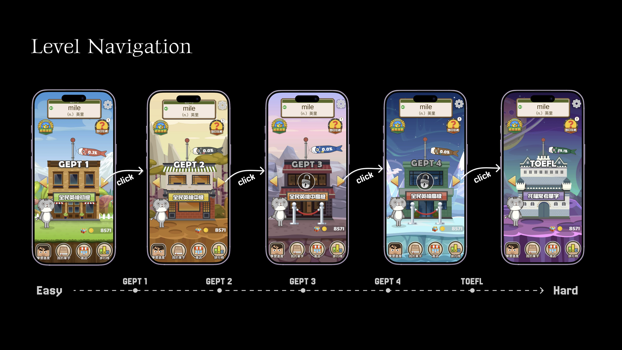
The levels are arranged from lower to greater difficulty, corresponding to the gradual increase in English proficiency and exam difficulty in the real world. Therefore, users can easily understand that the levels become more difficult as they progress, creating a natural mapping.
Vocabulary Review
Users may want to directly view words that they have already identified as unfamiliar and add them to their vocabulary list. However, after entering the relevant page, there is no clear option for adding the word to the list.
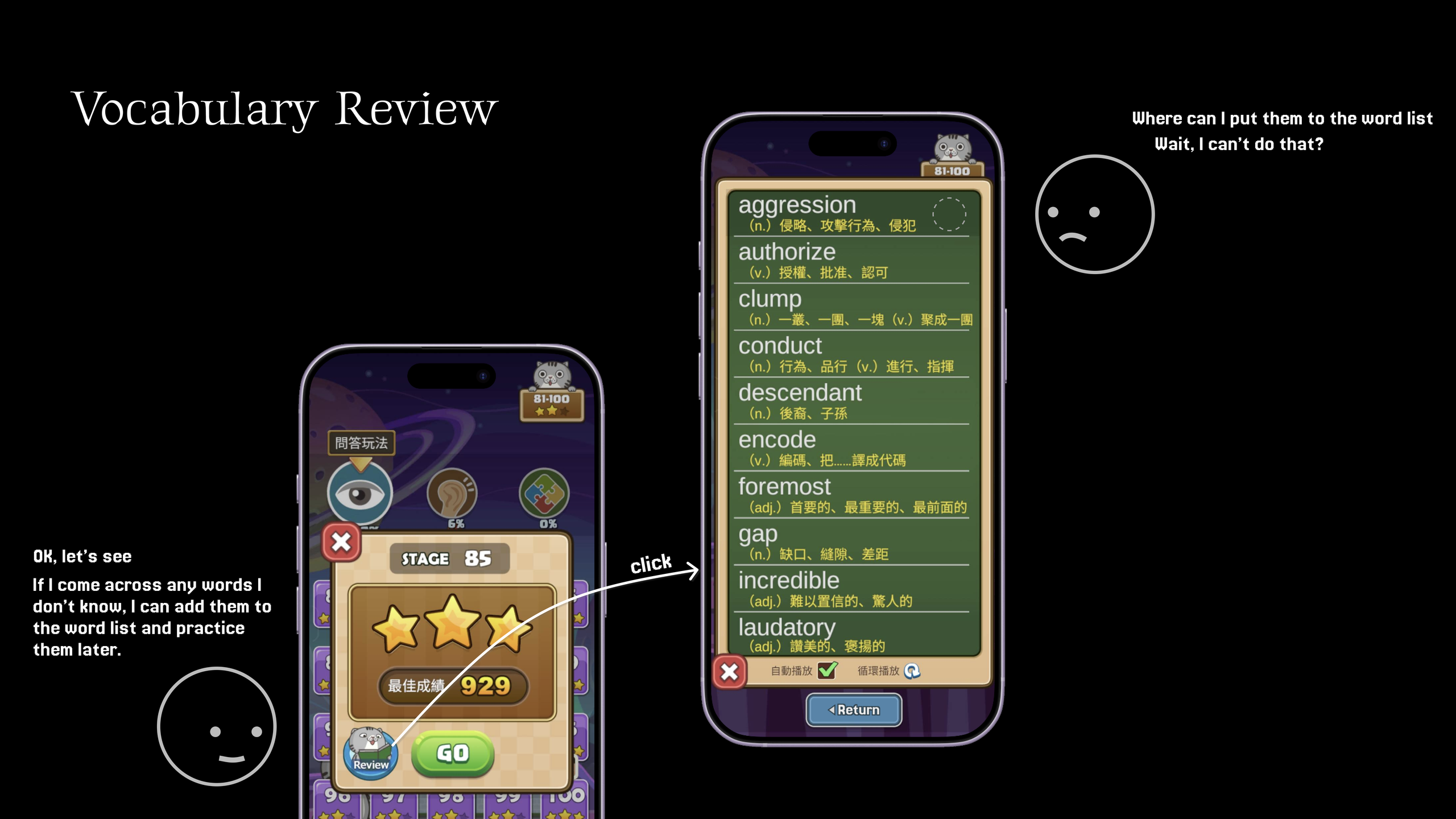
This is inconsistent with the user’s existing conceptual model. Users may expect that after entering a word list, they should be able to save words or add them to their own list. However, the interface does not provide an apparent way to perform this action.
The back or close control also presents another issue. Its position is inconsistent with common interface conventions, requiring users to reconsider which control is intended to navigate back or close the current page.
In addition, there is a back button at the bottom of the screen that appears to belong to the current page, but actually belongs to the previous layer of the interface. Because the visual separation between the previous page and the current page is not sufficiently clear, the button is too obvious, which may cause users to interpret it as a control belonging to the current page.
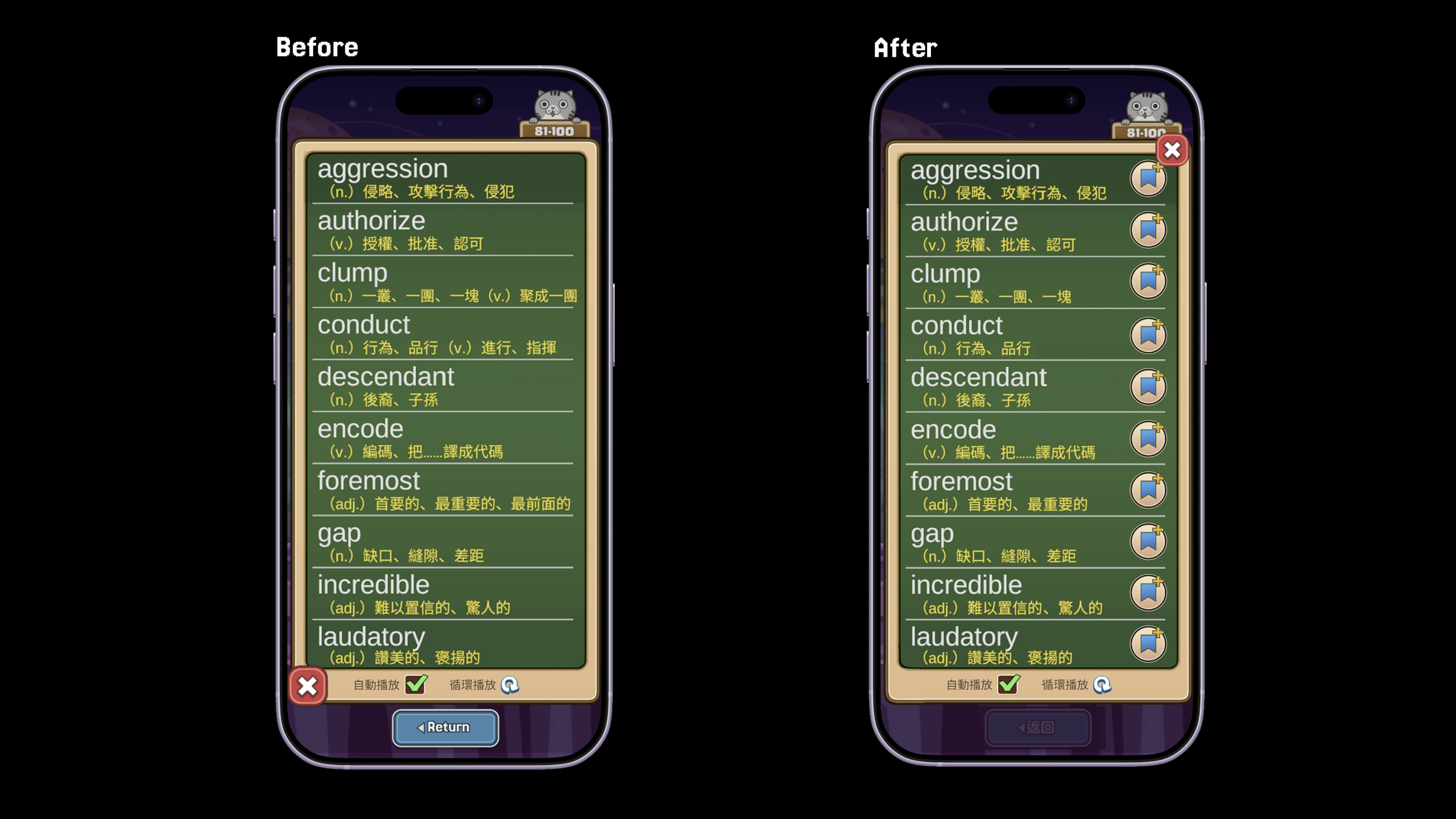
For this issue, a better adjustment would be to add the bookmark on the side of the word list and move the exit button to a more familiar location. The return button at the bottom of the page should also be made darker to make it less noticeable.
In the Stage
Although this section could be removed to keep the article concise and avoid making it feel like a play-by-play, it would be like a pizza without cheese—just a bit weird.
The buttons and text are displayed at a large size, making the options easier to identify and interact with while reducing accidental taps. The larger targets allow users to position their fingers more easily over the intended option, reducing the likelihood of slips.
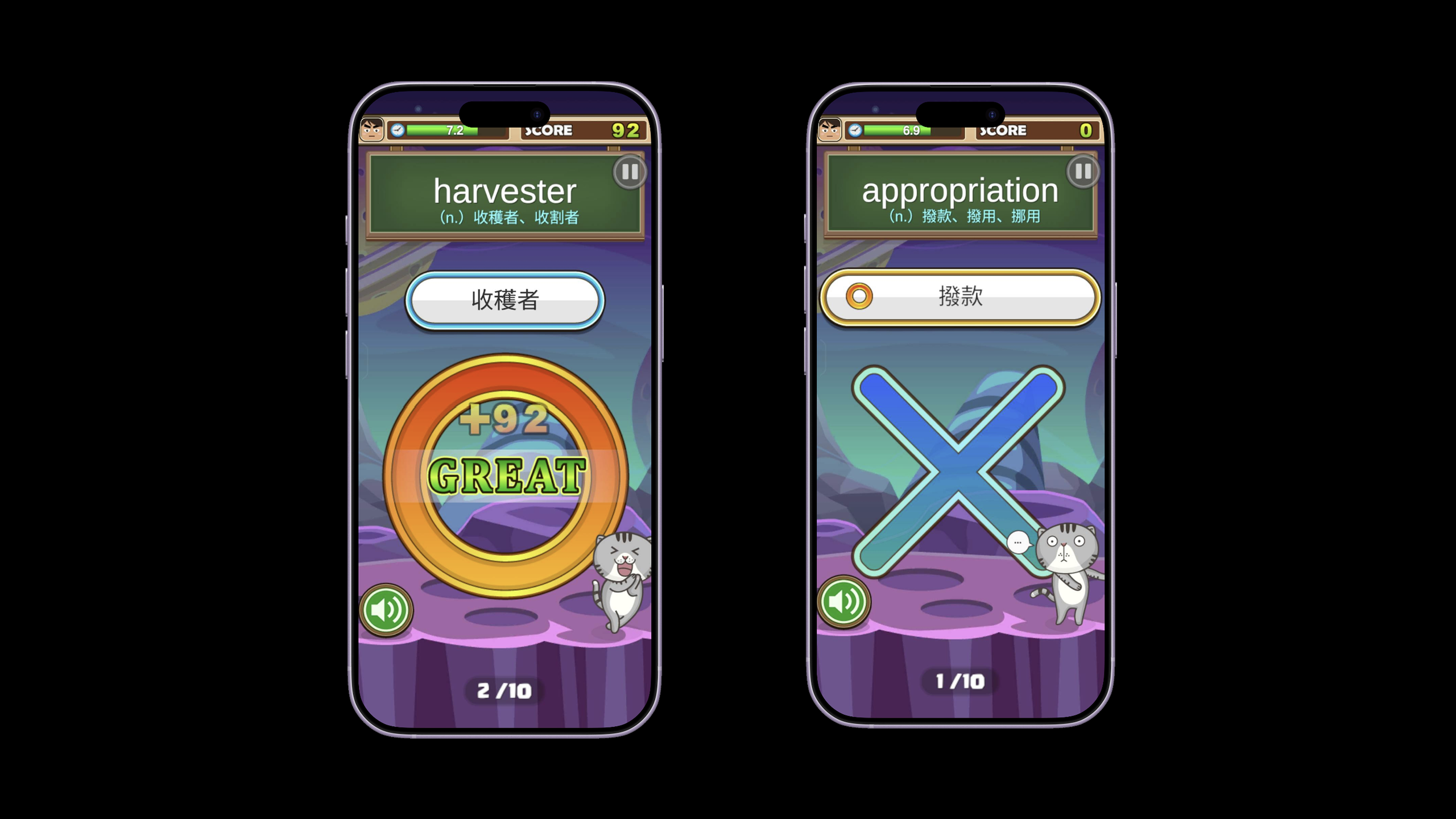
The system also provides immediate and clear feedback, allowing users to recognize whether their answer is correct. When an answer is incorrect, the correct answer is displayed immediately.
After Completing a Stage
After completing a stage, users can click the heart icon to add a word they want to review to “My Favorites.”
In this context, the heart icon functions as a signifier, suggesting that the control is associated with saving or favoriting a word. After the user clicks it, the interface immediately displays a change in the saved state, providing clear feedback and allowing the user to confirm that the action was successful.
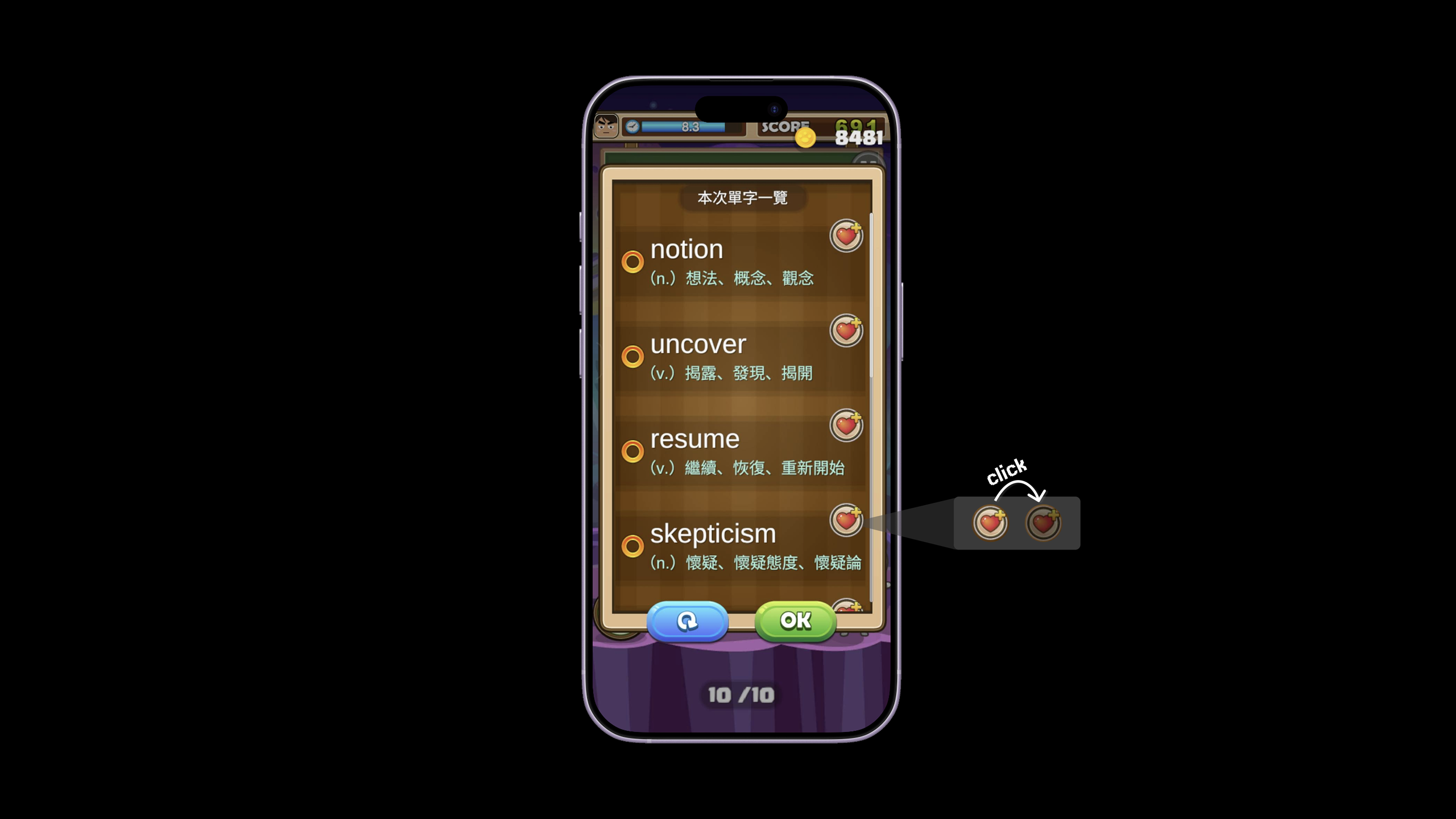
At this point, users have developed a conceptual model:
Heart icon → Save/Favorite word
Therefore, when returning to the home screen to look for the words they have saved, users are likely to rely on this previously established association.
Find the Saved/Favorite Words
After returning to the home screen, “My Words” is likely to be the option users choose to find the words they have just saved. However, this function uses a book-related icon rather than the heart icon that was previously associated with saving words.
In the previous step, the heart icon established a visual association with saving words. Therefore, users may expect to see a similar visual cue on the home screen. If the home screen used a visually consistent icon, such as a heart, users could more easily recognize where their saved words are without having to remember the association between “My Words” and the words they previously saved.
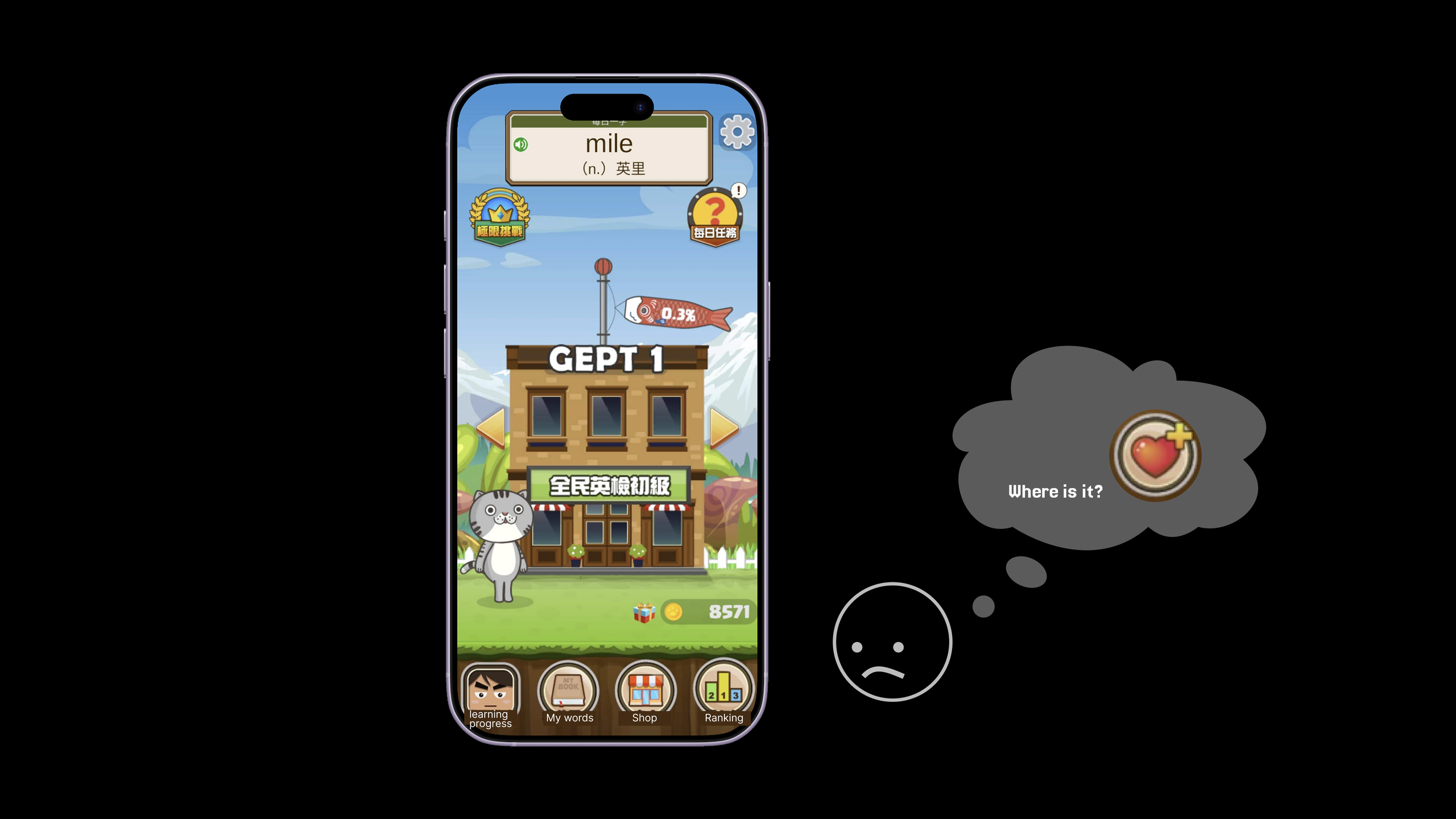
The current icon lacks visual continuity with the previous interaction. As a result, users may think:
“Where did the words I just saved go? Where should I go to find them?”
At this point, users know what they want to accomplish but are uncertain which interface element will allow them to achieve that goal. This creates a gulf of execution.
However, once users enter “My Words,” the heart icon is used again as a signifier, allowing them to confirm that they have selected the correct location and successfully find the words they previously saved.
Summary
English Planet offers an engaging approach to English learning, with clear and immediate feedback during the stages. However, the process of adding vocabulary to a word list is not clearly communicated, which may make the feature difficult for beginners to discover.