
Introduction
Apple Music is a subscription-based music streaming platform created by Apple, offering access to over 100 million songs alongside curated playlists, personalized recommendations, and offline listening. I have been an active Apple Music user since 2020. Though the majority of the time I am satisfied with the interface, there are some features that I am often confused about.
Onboarding
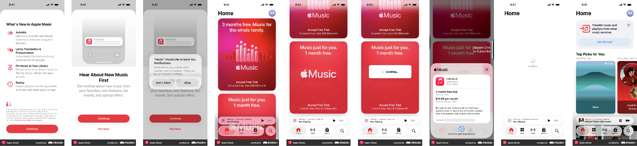
The onboarding process of Apple Music for first-time users is intuitive. The red buttons are visually emphasized enough to allow users to move forward. The pop-up window for payment instructions also allows users to confirm their option to prevent the slip of choosing the wrong plan.
Library
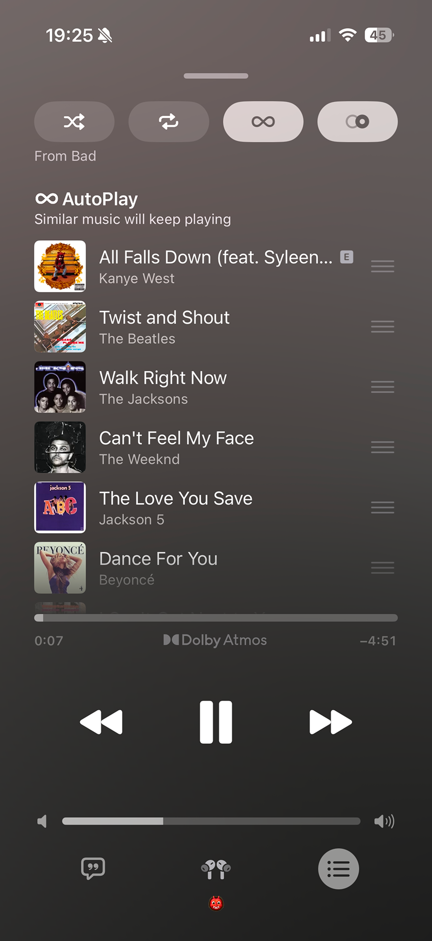
Poor Discoverability: Apple Music’s library has a good mental model where users can easily find the albums that they recently added, music they downloaded, and look through the curation in alphabetical order. However, it often sacrifices discoverability to achieve minimalist screens. First of all, plenty of the icons used in the app are ineffective signifiers. The list of icons in the main menu, Home, New, Radio, Library, and Search, is relatively memorable and efficient, as most of them have labels underneath to indicate what they are or are commonly used in other software that users can rely on this knowledge in the world. Nevertheless, the icons in the music queue can be quite confusing for first-time users. For example, the infinite sign could be interpreted as repeating the playlist for infinite times where in fact it means autoplay similar music. This definition is not clear to users unless scrolling through the queue. Another example would be the auto mix button. Its two overlapping circles are difficult to understand from the symbol alone. Apple explains the feature through its “What’s New” pop-up, but once that explanation disappears, the user must remember what the icon means or otherwise look it up themselves.
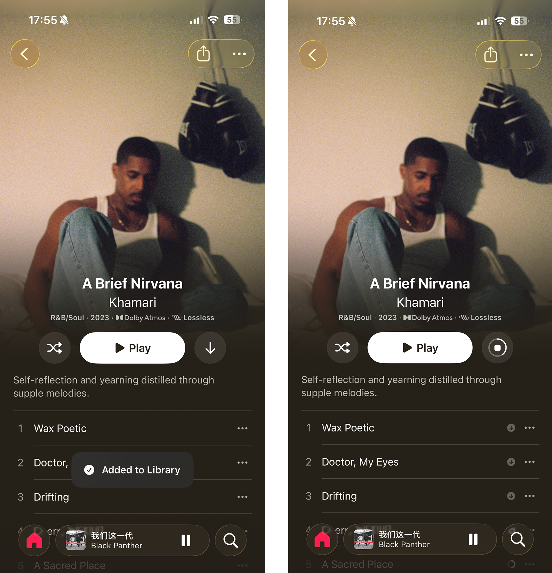
Feedback: Despite poor discoverability, Apple Music does provide immediate feedback when users add an album to their library, download the music to local storage, as well as when manipulating the order of the playlist. For instance, the pop-up windows stating “added to library,” along with one short vibration to validate to users that the particular album is saved to the library page, whereas the progress bar and the small downloaded icons will appear once the user downloads the music to their local storage.
When listening to music
Good conceptual model: Users can replay the same track by hitting the back button once as long as the song has been played for a couple of seconds. To go back to the previous track, users need to click the back button twice or press it within a couple of seconds of the current track. This conceptual model can be traced back to the 1980s, when the buttons on CD players needed to have maximum functionality.
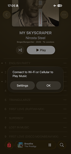
Effective use of logical constraints: Apple Music uses a combination of logical constraints and feedback when the device is offline. Music must be downloaded to the device before it can be played without an internet connection. In my experience, undownloaded music becomes visually unavailable when I am offline, and attempting to play it produces a message explaining that an internet connection is required. The greyed-out appearance acts as a signifier that the action is currently unavailable, while the pop-up explains why.
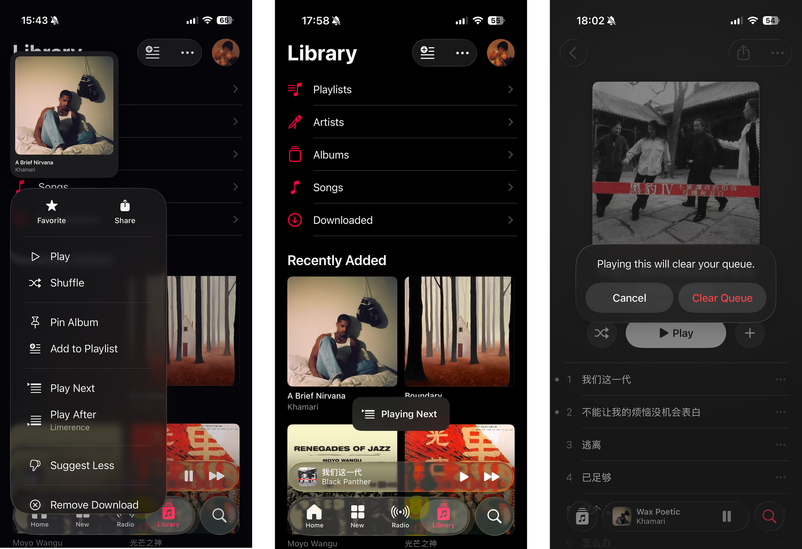
Effective use of forcing functions: Apple Music provides multiple paths to the same actions. Users can open an album and tap the More button, or touch and hold a song, album, or playlist to reveal a shortcut menu containing options such as Play Next. The shortcut improves efficiency for experienced users, but the touch-and-hold gesture has relatively low discoverability and, in my experience, can be too sensitive and often trigger unintentionally while tapping or scrolling, producing slips. Apple uses an effective forcing function when an action could replace the user’s existing queue. If a user attempts to play music that is not already part of the queue, Apple Music presents the option to Clear Queue was presented to the user.
Conclusion
Overall, Apple Music is a useful app where users can easily navigate through the interfaces with enjoyable visual aesthetics. By improving the discoverability and adding more signifiers for first-time users, Apple Music can become a more memorable and accessible experience.