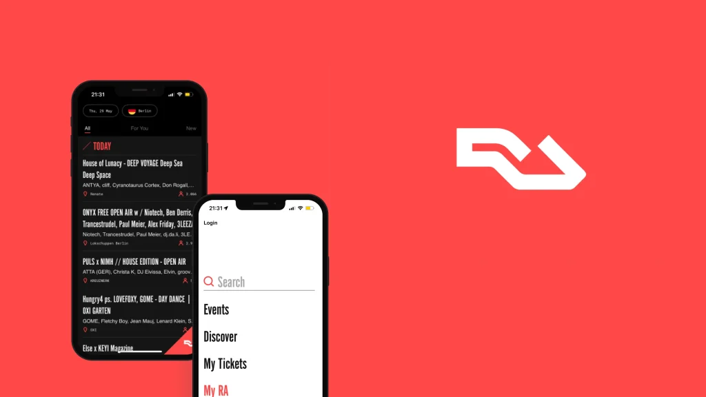
RA Guide is a Resident Advisor’s mobile app for discovering electronic music events, venues, and artists. Users can browse and filter nightlife listings by date and city, follow artists, promoters, and venues, and buy and display tickets in-app. This critique examines RA Guide’s browsing, filtering, and ticketing design using concepts from Don Norman’s The Design of Everyday Things.
Browsing the event listings
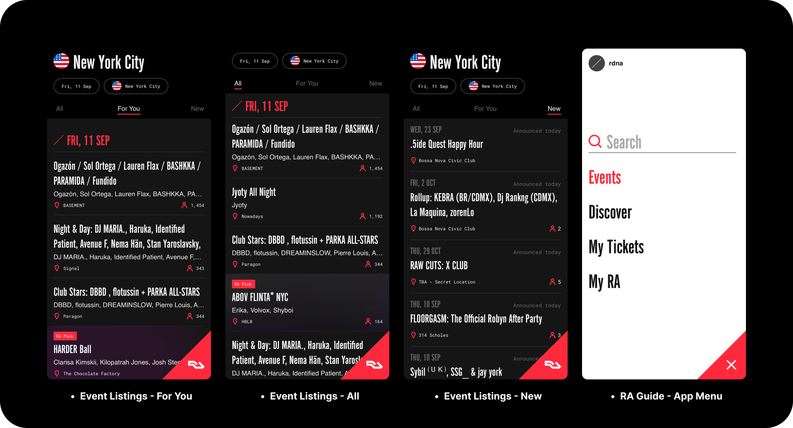
The app opens to an event feed for the selected city, defaulting to the user’s current location, with the date and location controls shaping the first screen and reinforcing discoverability. Each event card shows the title, venue, lineup, and “Interested” count, placing key information for judging an event as knowledge in the world rather than in the head.
The date and location chips are visibly outlined, differentiated signifiers that afford filtering the event feed. Both give immediate feedback when tapped, turning gray and opening a calendar or location selection window.
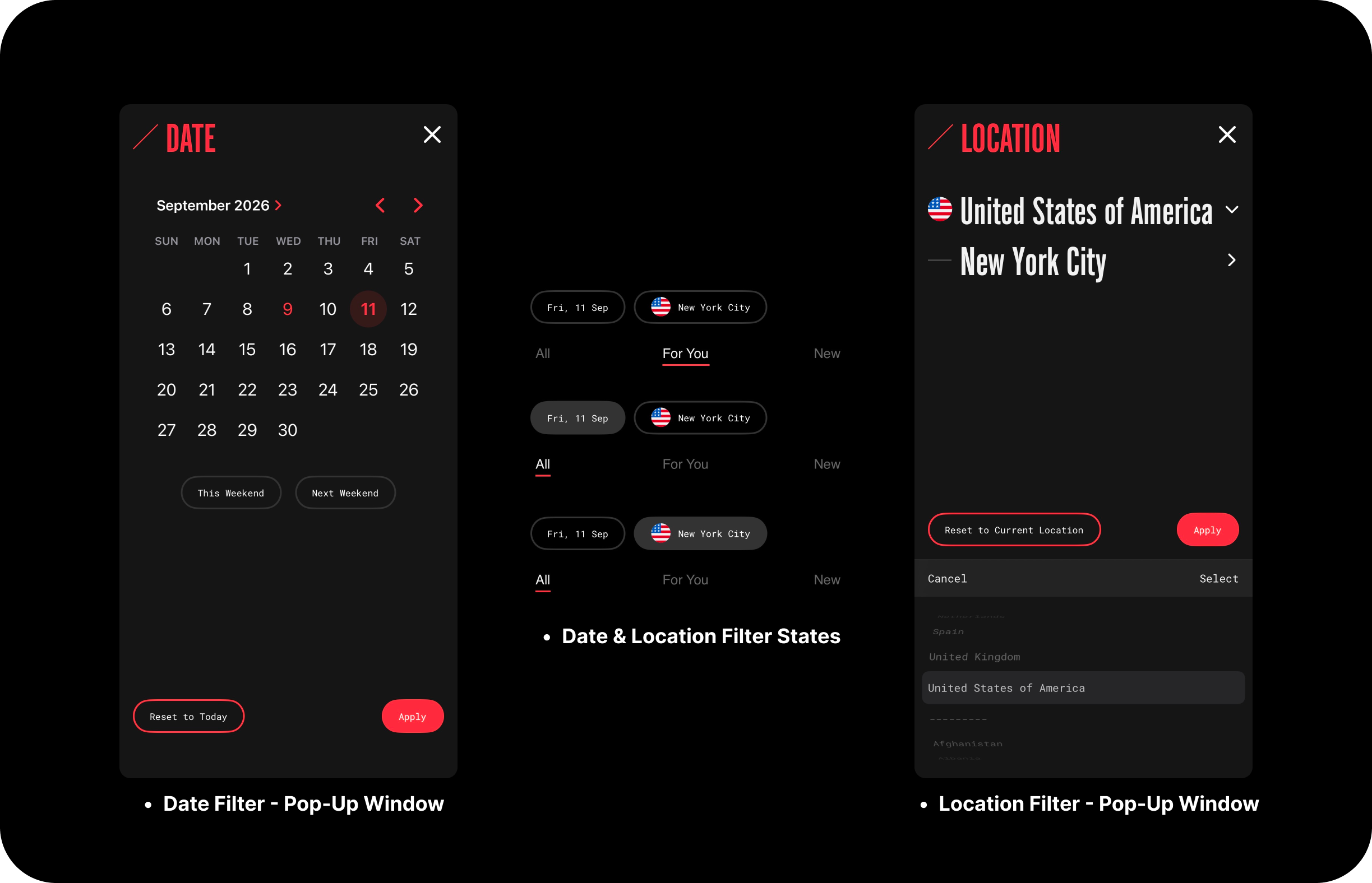
The month grid uses natural mapping, laying out days in a seven-column grid, a familiar cultural constraint, utilizing knowledge in the world. Today’s date appears in red; the selected date gets wrapped in a red bubble, and the system image reflects the selection before the feed reloads. “Apply” button acts as a forcing function, requiring confirmation before making any changes, and shortcut chips like “This weekend” and “Next weekend” reduce common user goals to single taps.
The date chip and the feed
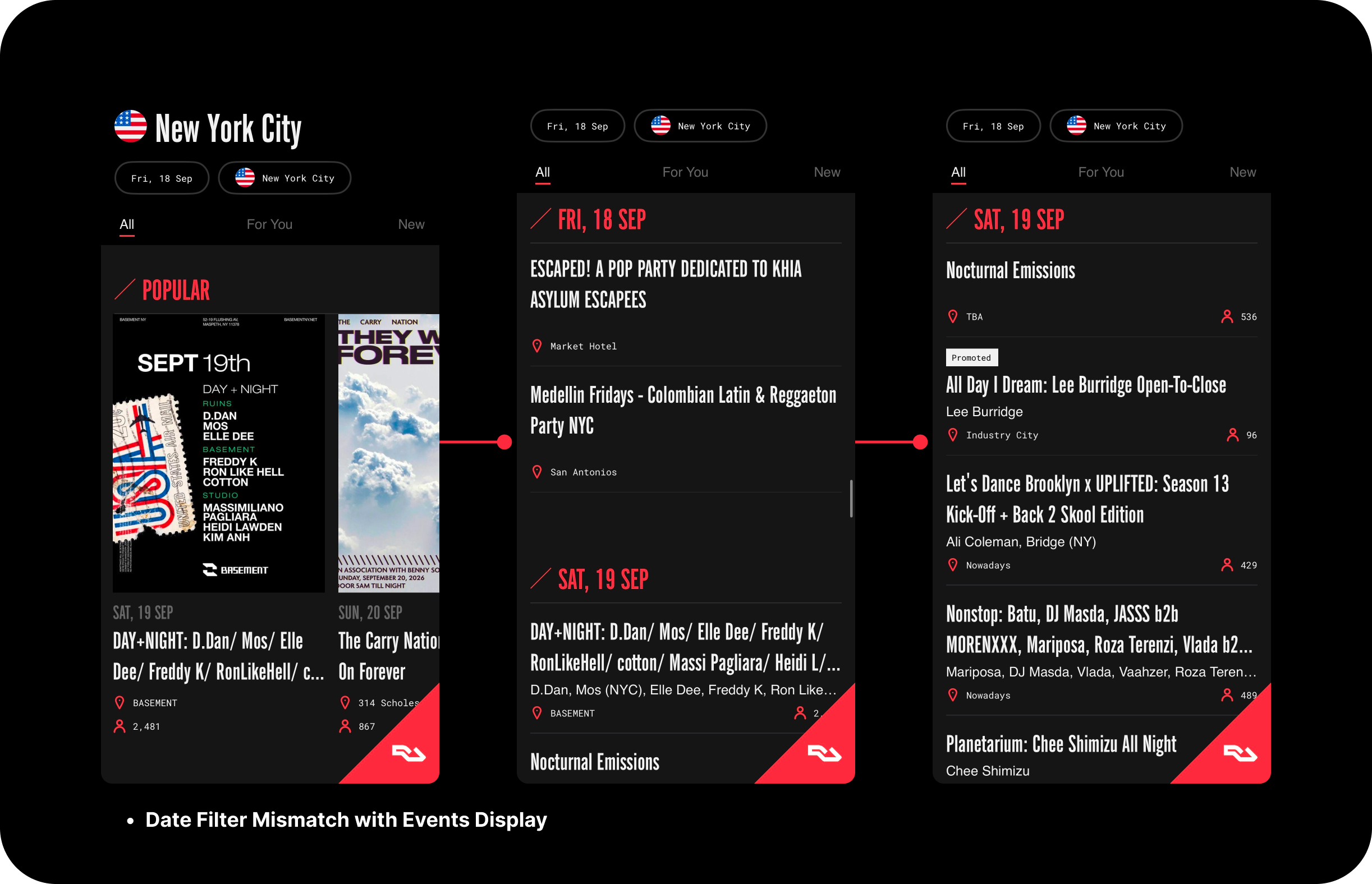
When a date filter (e.g., September 18) is applied, the feed lists that day’s events but continues into later dates, even though the chip still reads September 18. This breaks the logical constraint signified by the chip, as the system image presents a continuous list of date headers, no longer matching the conceptual model the user had built through available filters. The mismatch between the date filter and feed creates a gulf of evaluation; users can easily misread later events as belonging to the selected date. The error follows from an incorrect conceptual model rather than a mis-executed action, making it a mistake, not a slip. The “Popular” row also ignores the date filter.
Within each day, the listings are ranked by RA Guide’s combined ticket sales from events together with the number of “interested” – rather than start time, as one would expect from initially inferred natural mapping, with no signifier disclosing either ordering rule to improve the user’s understanding of the system.
- Solution: End the events feed at the selected date and add a “Show Sat, Sep 19” button below the last listing. This keeps the system image in sync with the chip’s logical constraint. Filter the “Popular” row to the selected date, and add a “Sort: popular / start time” toggle to make the ordering rule visible and part of the user’s knowledge in the world.
Purchasing and retrieving tickets
Ticket checkout applies logical constraints that operate as forcing functions: sold-out tiers are greyed out and no longer afford selection, and past event tickets cannot be purchased, so the interface does not permit users to attempt an impossible action during ticket purchase.
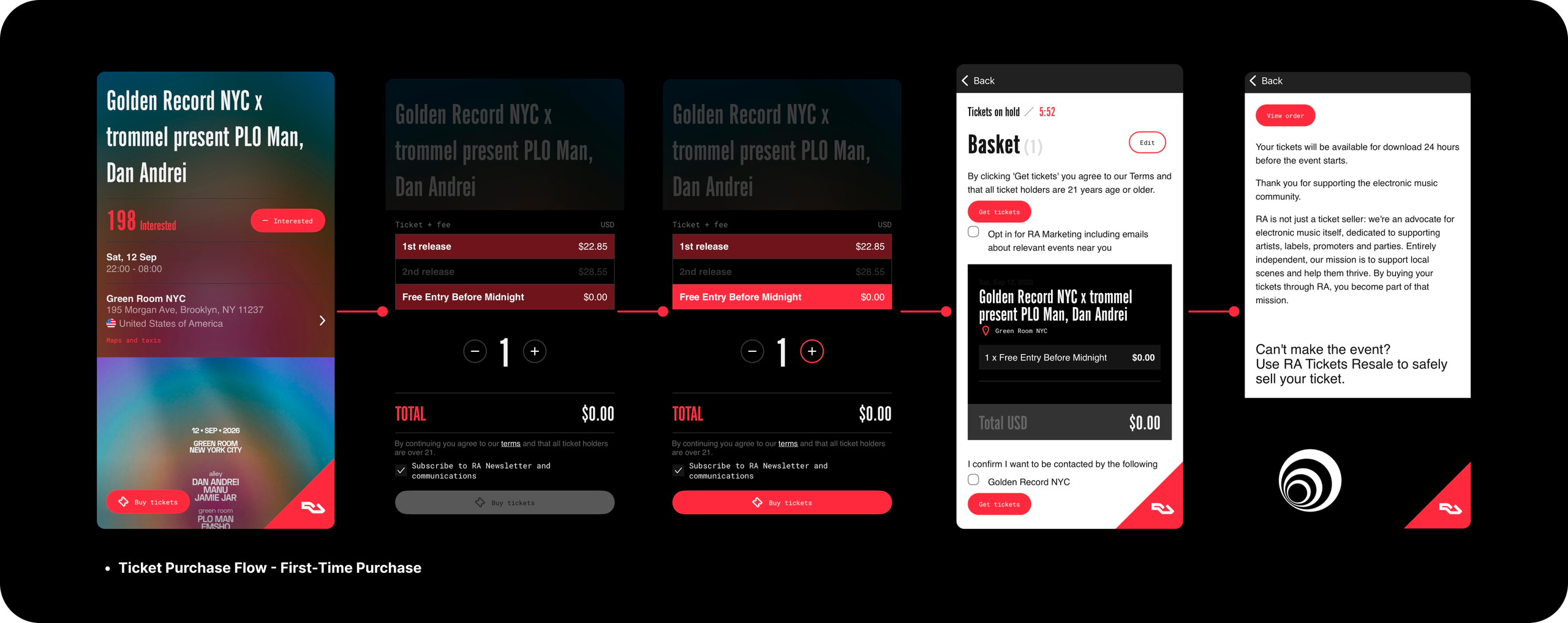
The ticket screen lacks a visible back control. Users who want to re-check the lineup before committing to purchase the ticket face a gulf of execution, as there’s no clear back arrow or close button, with the lack of a signifier leaving them to abandon the current flow. After purchase, returning to the event page reopens ticket selection, and the system image shows no immediate record of purchase, inviting a memory-lapse slip, such as buying a second ticket.
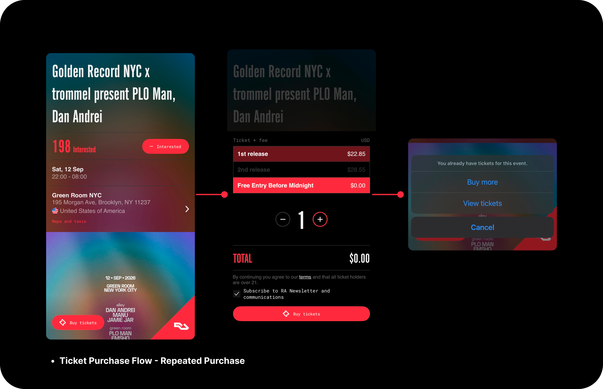
The app catches this slip and triggers a sensibility check by prompting “Buy more” or “View tickets” if a user tries to purchase again. Purchased tickets are under the profile tab, which uses RA’s logo, an icon that doesn’t map clearly to “My Tickets,” relying on the user’s knowledge in the head. Tapping “View tickets” and then back takes users to the My Tickets page, not the event listing, which can cause behavioral frustration during the process and, over time, learned helplessness regarding the app’s navigation logic.
- Solution: Add a persistent back control to the ticket screen. After purchase, replace the primary button with “View your tickets” and show a “Ticket purchased” banner to close the gulf of evaluation. The back control should return users to the event listing they navigated from.
Conclusion
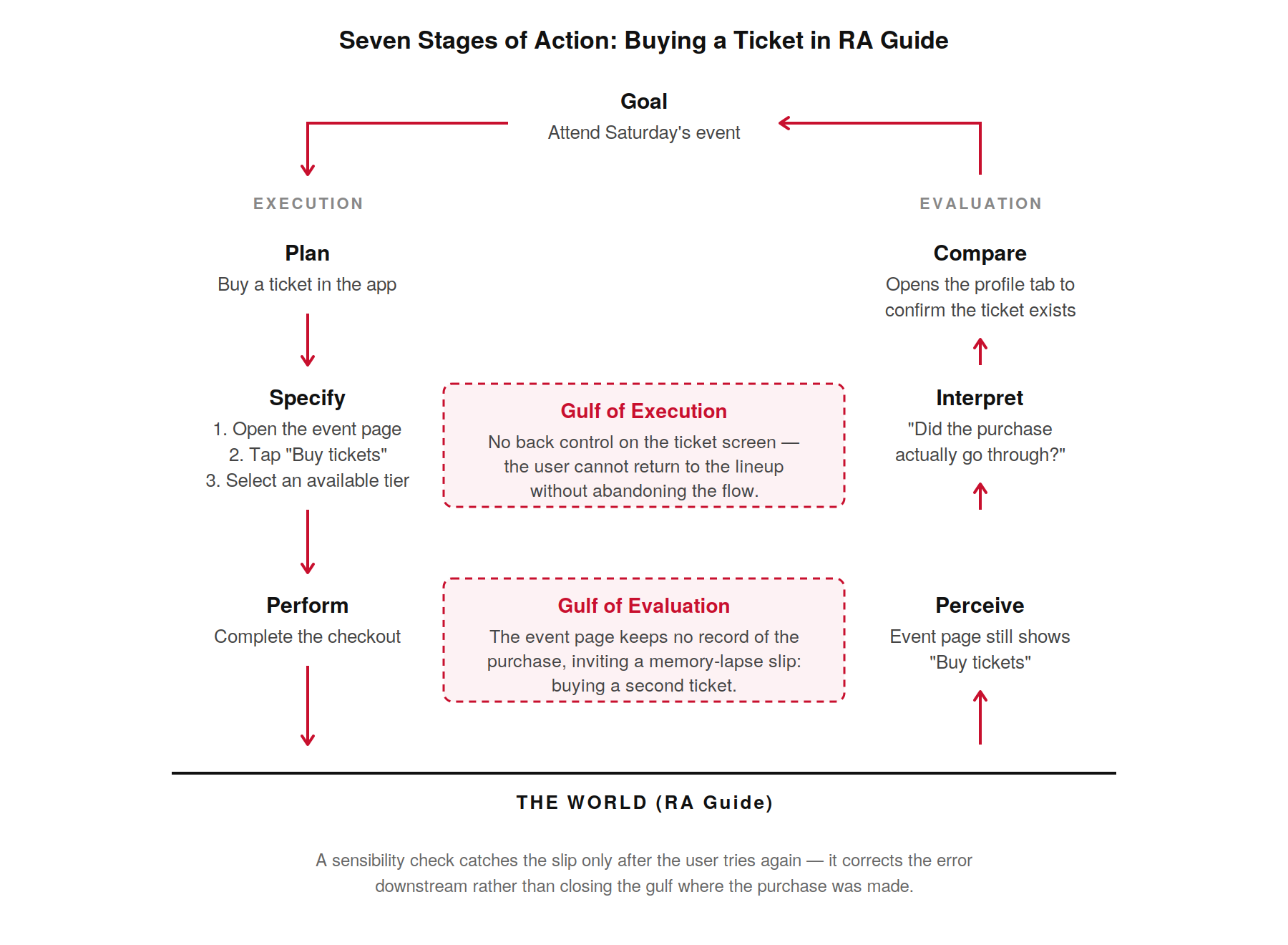
RA Guide’s browsing and ticketing design places knowledge in the world and provides users with feedback, achieving much of what good design should for discovering nightlife events, buying, and managing tickets. However, event filtering and ticket purchase processes reveal gaps in both execution and evaluation behind the current app’s design and user experience. The proposed changes in this critique are minimal but critical for helping users accomplish their goals with better back controls and navigation logic.