Procreate is a digital illustration and painting software designed for the iPad. It has several key features for digital artwork including custom brushes and tools, a layer system, drawing guides, and more. It is popular due to its one time payment fee, and the way that it is specifically engineered for the Apple Pencil with optimization of pressure sensitivity and tilt angles. It is known for its intuitive interface and gestures, and it often sacrifices aspects such as discoverability to achieve this.
Layer Tools
Many digital designers and artists are familiar with and have the conceptual model of layers. A layer, in this context, is like a singular sheet of the canvas that exists independently of the others. Typically, a layer has the affordance of non-destructive editing as the objects exist independently. The way that they are stacked on top of each other vertically is an example of mapping, where transparent layers overlap in the order that they are placed in. This feature is prominent in programs such as Photoshop, Figma, and Illustrator.
In Procreate, the layer options are not immediately visible, which is an example of poor discoverability. If the user wants to discover basic functions such as “lock,” “delete” or “duplicate” they have to slide to the left to make these three options appear. There is no signifier for this option and they only appear upon swiping. Furthermore, when the user tries to swipe to the right, it bounces back without displaying any further options. At first, it might seem that this a constraint showing that there are no other options. However, if you tap and hold the layer card, a whole new menu appears, directly on the left. This is an example of poor mapping, to the point that the constraint displays the false idea of there not being another menu.
Users can experience the gulf of execution, knowing that surely these basic options are possible, but upon being unable to find them might resort to try trial and error until they find the options they are looking for. Users who are less familiar may not realise these functions exist at all. A potential solution for the layer cards to have clear, unambiguous buttons that signify the functions. For instance, there can be an arrow icon for swiping, and a menu icon to see the layer options. The checkmark can be replaced by an eye to clearly communicate visibility.
Undo/Redo Function
The undo/redo function is extremely vital, and typically users should be able to do it quickly. On desktop programs, users typically find keyboard shortcuts (such as Ctrl+Z) to help them, but it does not translate to touchscreen. At first, users see common signifiers, arrows, for undo and redo on the left side of the screen. When they tap on it, they receive feedback in the form of flashing messages like “Undo Erase Stroke,” as well as seeing their last stroke disappear immediately. From this, the user can assume that there is only one way to undo. However, a huge part of Procreate’s design is incorporating touchscreen gestures, and a double tap can also undo. This drastically improves and quickens the user’s workflow, especially since they then only need one hand to draw and undo.
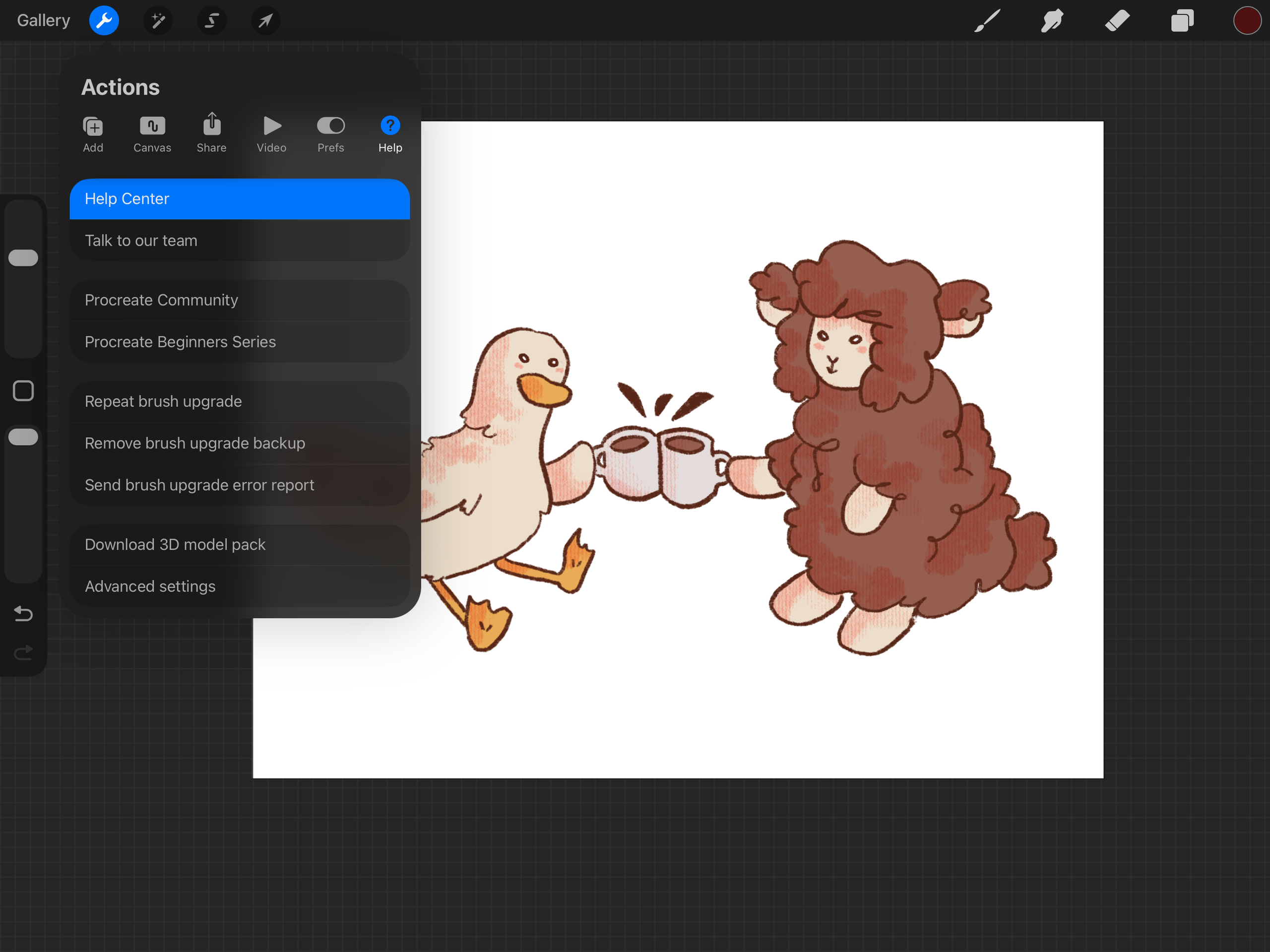
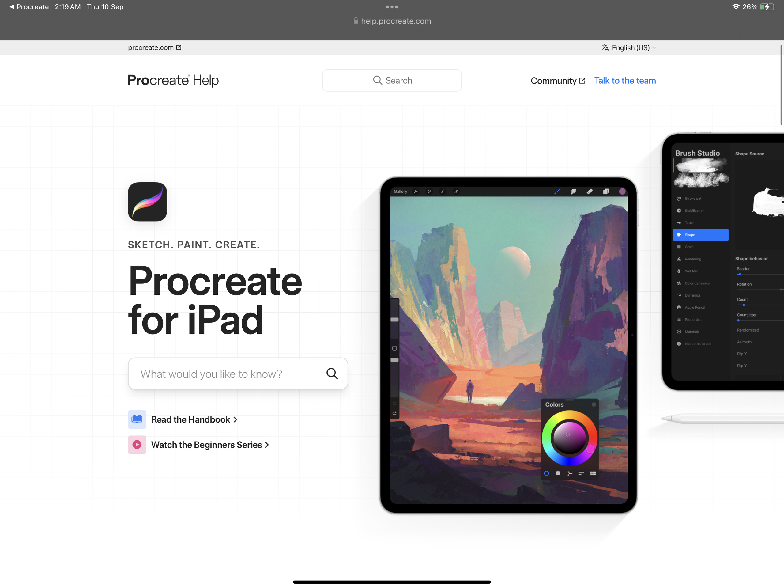
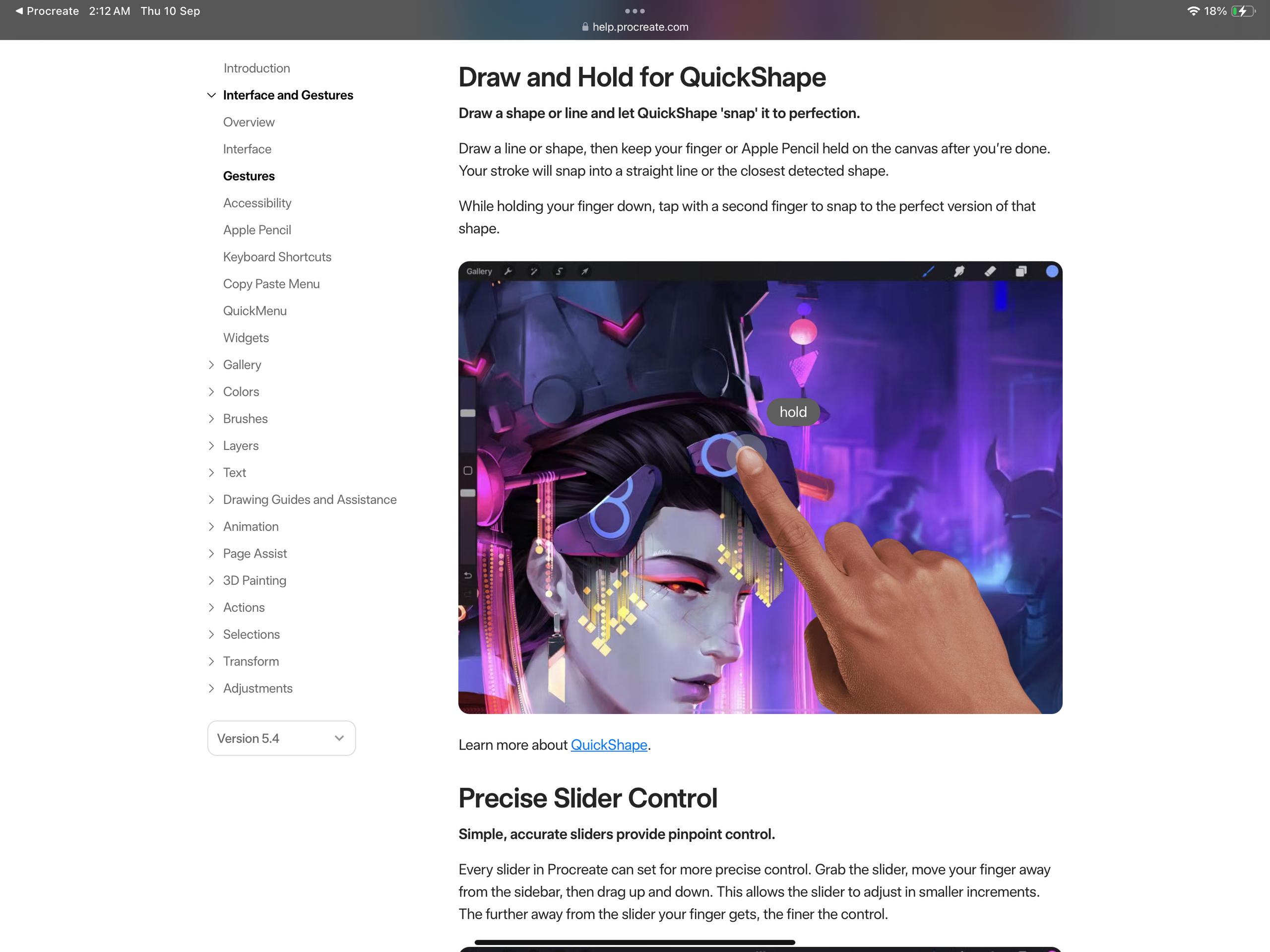
It would be difficult for a user to find this solution on their own, as the interface does not allow for discoverability for gestures. However, the gestures themselves are good design as they take advantage of the touchscreen’s affordances of detecting different types of movement. Users then have to increase their knowledge in the head. In the app, is is technically possible to navigate from the help centre into the main website that happens to have a handbook, which then leads to an article on gestures. A solution could be to have the guide to gestures be much easier to access in a menu directly within in the app, with common ones indicated in text instructions (eg. double tap or swipe flashing on the screen as feedback.) The initial tutorial should have a more comprehensive overview of gestures.
In conclusion, a tool such as this one has hundreds of functions that need to be arranged together in a usable manner. Therefore, it should be expected for it to have a learning curve, and once the users are familiar enough with the program to combine knowledge in the head with the abundant and immediate feedback, it becomes much easier to use. There are also trade-offs: the poor discoverability that takes some time to adjust to at the beginning can later feel like a positive as the interface is clean and uncluttered, making it far easier to focus on the canvas. However, there are many solutions that can reach a stronger balance between the two. Norman discusses the design of “everyday” objects, so an app that requires some subject expertise and specialised conceptual models may not need to comply to the same standards.