Strava is a popular fitness and social app that allows users to track their progress, stay consistent and motivated while also connecting with the fitness community. Users are able to record workouts, share their achievements, follow friends and track their progress as well. Overall, Strava uses a similar interface to other popular applications such as Instagram, Facebook and even the camera application on our phones. Strava has a bold yet simple theme followed by minimalistic but strong signifiers that creates a smooth and accessible experience for users.
Getting Started
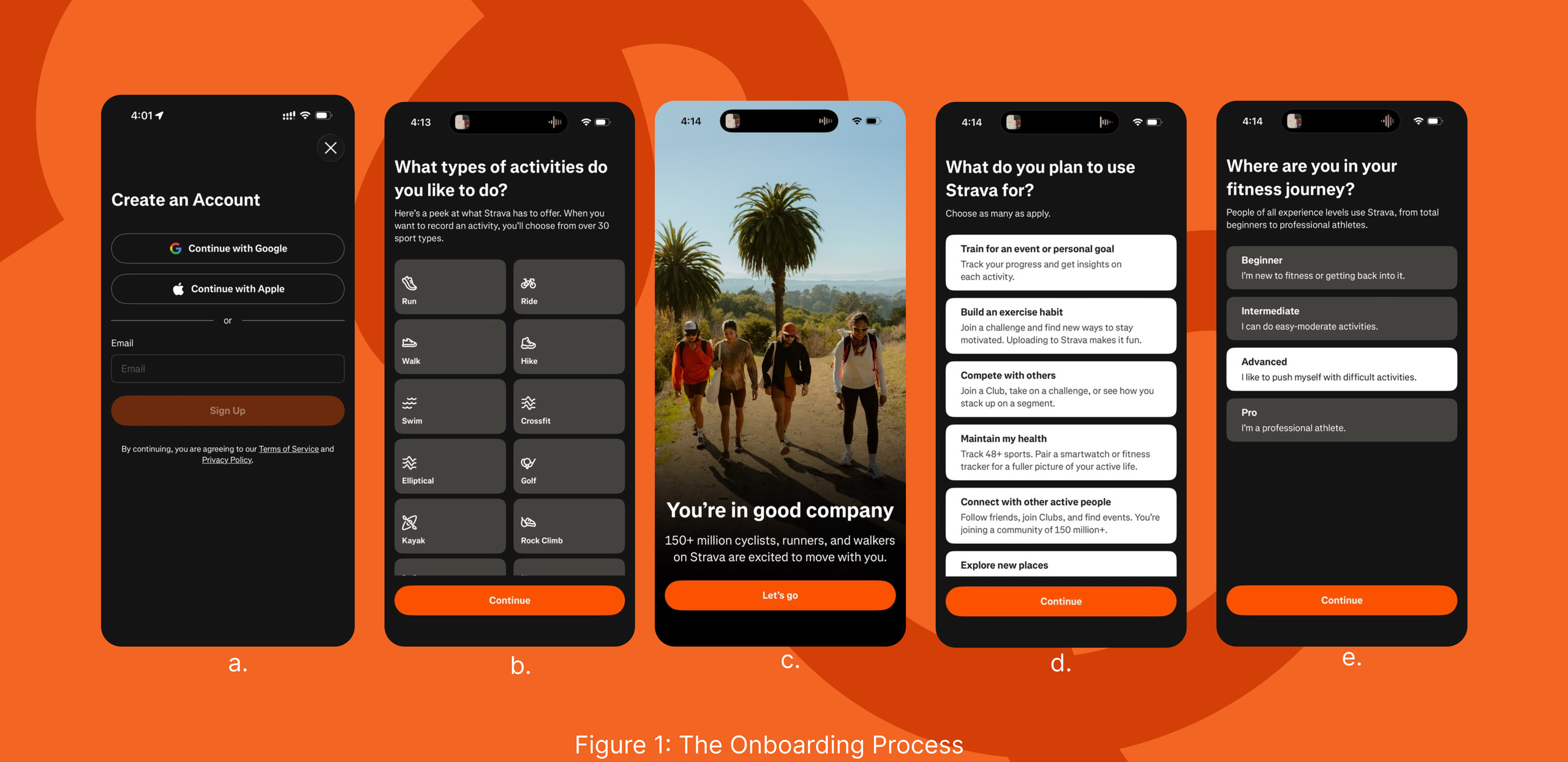
The onboarding process was relatively easy and followed a similar conceptual model to most applications. Users are able to create an account using Google, Apple or email, giving the user multiple commonly used options. The onboarding process is followed by a survey, gauging the users’ interests, activity levels and goals.
Referring to Figure 1b, the activity-selection page was the most effective page of the survey pages. It contained minimal information and used icons as key signifiers, such as a water symbol for swimming and a dumbbell for workouts. These familiar visual cues make the selection highly discoverable as it relies on knowledge in the world. The icons create clear affordances, making it immediately understandable that users can select an activity by interacting with the corresponding symbol.
However, Figure 1d, the page asking, “What do you plan to use Strava for?”, is less effective. Each goal includes a lengthy description of what the application will offer the user in order to execute their goals. From the stakeholders’ perspective, they are showing the user the range of the applications’ features but may lead to an increased cognitive load in users. There are no signifiers present on this page either for users to shortcut the information in their heads. The information may be slightly unnecessary at this stage of the onboarding process as users are yet to see the interface of the application. So the explanations to execute each goal may be quickly forgotten. Shorter descriptions followed by visual cues or examples of actual features the application would follow would be a better feature to support the users conceptual model.
Homepage and Community
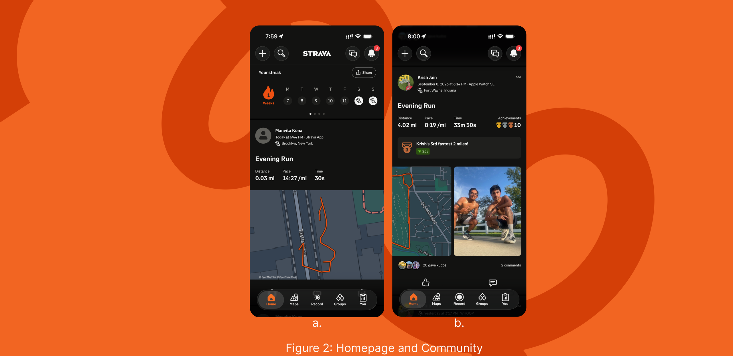
The initial homepage (Figure 2) seems clean and organized. On the top of the homepage we can clearly see a magnifying glass, symbolizing the search icon which has become almost a universal icon across different applications, websites and platforms. On the top right corner, we see an activity icon and messaging icon. This is also immediately recognizable as it follows the conceptual model many social media applications such as Instagram and Facebook use. This application makes it easy for users to search for their friends, follow them and stay up to date with their posts. Strava’s social feature relies on familiar models of social media applications. Users are able to interact with other users’ posts through comments and “Kudos” which is equivalent to Instagram’s “Likes” feature. These recognizable patterns reduce the knowledge users need to learn, making the application feel more intuitive.
Also displayed on the home page is a progress tracker that displays “Streaks”. This common concept used by Snapchat and Duolingo motivates users to revisit the application and maintain their progress. Along with streaks, Strava awards users with badges and medals when new personal records or goals have been met. This gamification of the app encourages users to keep up with goals and break their past records.
Recording an Activity
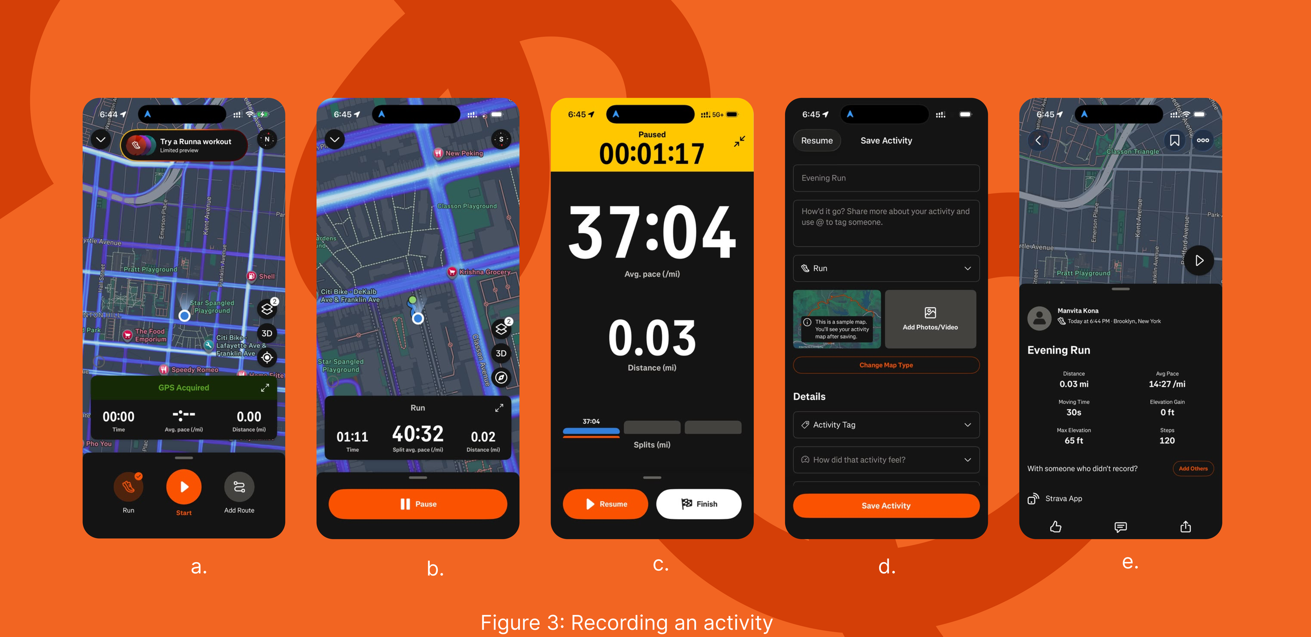
The “Record” button (Figure 2a) is centrally positioned which feels very intuitive as it follows a familiar conceptual model established by camera or voice-recording applications. Once the “Start” button (Figure 3a) is hit, time elapses, the pace and distance is immediately displayed. This feature is also displayed on the users lock screen and provides immediate feedback that the activity is being recorded, allowing users to track their progress in real time.
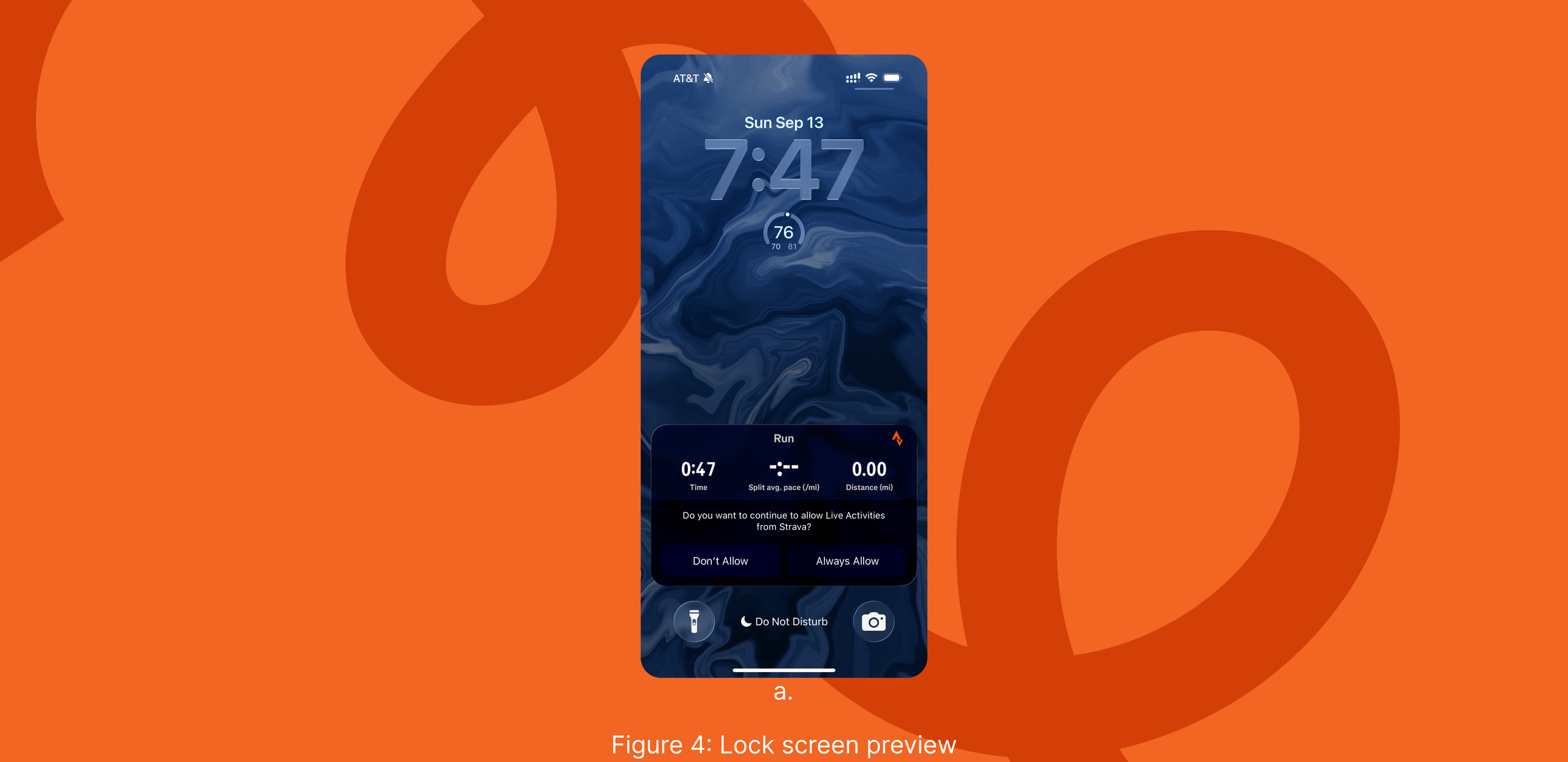
One limitation is the “Pause” and “Finish” controls are not available directly on the lock screen (Figure 4) while the activity is ongoing. Users must stop and unlock their phone and navigate back to the application, which can be tedious during a run. Adding these controls to the lock screen would reduce unnecessary steps and improve usability. This demonstrates a small Gulf of Execution when pausing an activity mid-run. Furthermore, selecting the pause button, users are presented with two options: Resume or Finish, where there is a small possibility the user may accidentally select “Finish” instead of “Resume”. But Strava is quite forgiving of this potential error as, before the activity is saved, users are presented with a separate page where they can save their progress, label the run, and customize the activity before selecting the “Save Activity” button at the bottom of the screen. This additional step promotes user control and freedom by allowing the user to recover from an error and return to the previous state using the “Resume” button, rather than committing them to an unintended action.
Conclusion
Overall, Strava is a convenient application to use daily. Its minimalistic design choices make elements recognizable and easy to navigate while features such as medals, badges and streaks that gamify the user’s experience, making the user feel motivated and more likely to engage with the application consistently. Although the onboarding process asked several personalized questions, there seemed to be no personalization in the interface of the application, in hindsight, making the onboarding process feel unnecessary and lengthy without apparent reasoning. Despite minor usability issues, users seem to prefer using Strava to track their activities and meet their fitness goals. It manages to create an experience that feels approachable for beginners while being motivating and engaging for individuals as they go about their fitness journey. Strava successfully combines individual fitness goals with community building, allowing the user to strengthen both aspects of their lives at the same time.