When you move away from traditional cable, switching to a web-based live TV service should feel simple and intuitive. For YouTube TV, a good desktop experience should make it easy to find and play a channel while clearly showing what’s playing or recording. YouTube TV brings familiar TV conventions into a clean digital interface, but a few design choices make basic actions more difficult than they need to be.
1. Live Channel Grid
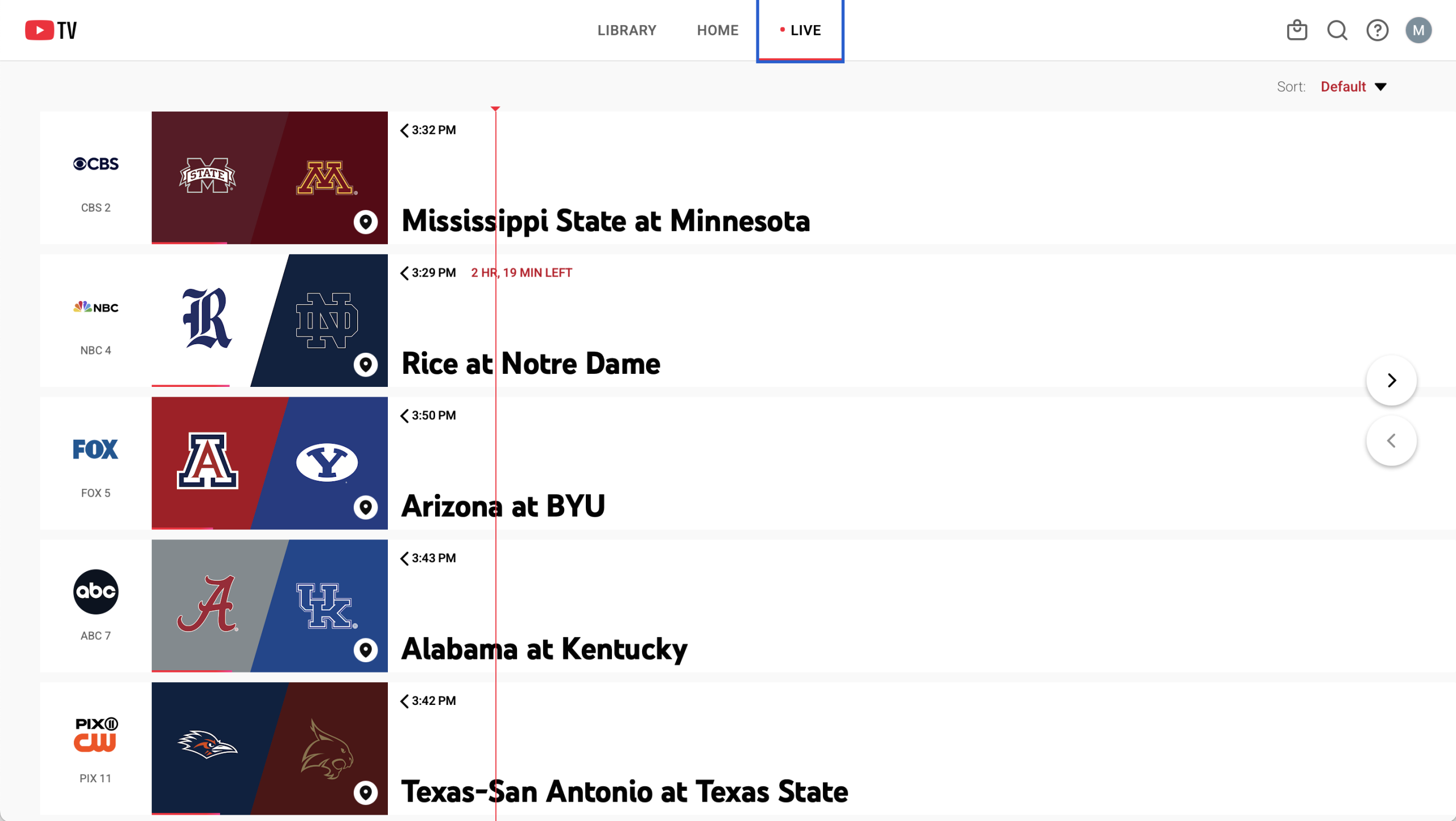
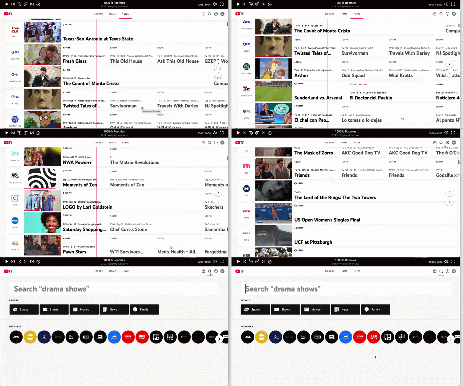
Clicking the “Live” tab opens a guide where channels are listed vertically and time moves horizontally from left to right.
This is an example of natural mapping because the layout matches how we normally visualize the progression of time. A thin red line also shows the current time and playback progress, giving users feedforward about where they are in relation to each program before clicking. Instead of remembering when a show started or how much time is left, the information is visible in the interface.
The guide also creates a familiar conceptual model for YouTube TV. It resembles traditional TV guides, with channels organized in rows and programs arranged by time. Because the interface builds on this existing model, users don’t have to learn an entirely new way of navigating live television.
2. One-Click DVR Recording
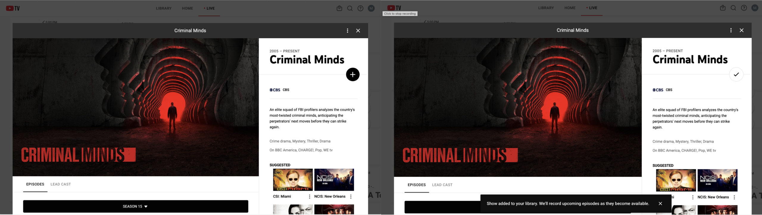
Recording a show or sports event to your cloud DVR takes one click on the plus sign (“+”) next to the title.
The plus sign works as a clear signifier because it shows users where they can interact and suggests that clicking it will add something. It also communicates an affordance because its appearance and placement indicate that it can be selected.
After clicking it, the plus sign changes to a checkmark and a message confirms that the show was added to the Library. This is effective feedback because users immediately know their action worked. They don’t need to open their Library to confirm that the recording was saved.
3. The Missing “Last Channel” Flip
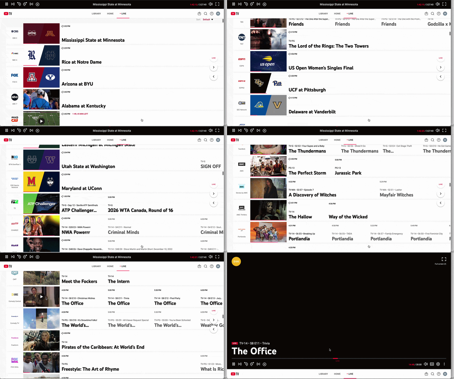
One feature missing from YouTube TV is a quick way to switch back to the last channel. On a traditional TV remote, the “Last” or “Return” button makes it easy to switch between two channels, especially when watching two live sports games. YouTube TV has no equivalent button on the main viewing screen.
Instead, users have to open the live guide, scroll through channels, or search for the station again. This breaks a familiar cultural convention learned from traditional television. It also widens the Gulf of Execution because an action that once took one button now requires several steps.
Without a visible “last channel” option, users have to rely on knowledge in the head by remembering where the other channel was rather than having that information available as knowledge in the world.
YouTube TV could improve this by adding a visible “Previous Channel” button or keyboard shortcut, restoring a familiar interaction and making channel switching faster.
4. Lack of Channel Numbers
Another familiar part of traditional television that YouTube TV leaves out is channel numbers. For decades, viewers have been able to type a channel number into a remote to immediately jump to a station. On YouTube TV, users instead have to scroll through the guide or search by name.
By removing channel numbers, YouTube TV moves away from an established cultural convention. What was once a quick action now requires more navigation, widening the Gulf of Execution.
It also removes a simple mapping between an input and an outcome. On a traditional remote, pressing “5,” for example, directly maps to channel 5. YouTube TV replaces this direct relationship with scrolling or searching, adding more steps between the user’s intention and the result.
One solution would be to allow keyboard numbers to jump to channels or let users create their own shortcuts. This would use an interaction many TV viewers already understand and create a more direct mapping between the user’s action and the desired channel.
YouTube TV provides a fairly smooth live TV experience. Its guide is easy to understand, its feedback is clear, and many interactions build on conventions users already know. However, the missing “Last Channel” function and channel numbers show how removing familiar interactions can make a digital interface less intuitive. Keeping certain familiar behaviors could make the transition from cable to streaming more seamless.
Sources:
Norman, D. (2013). The Design of Everyday Things: Revised and Expanded Edition. New York, NY: Basic Books.