The Pudding is a digital publication established in 2017 that explores popular cultural debates in a visual format. In their own words, “visual storytelling makes ideas more accessible” and they represent stories and data in an interactive and data-driven format across highly debated topics in music, sports, politics, and more. Because they are a smaller non-traditional collective, creators at The Pudding are not tied to news events or deadlines and experiment much more frequently with the art of experiential storytelling.
The typical visitor likely lands on the site after seeing a shared essay online or via a link, and stays out of curiosity for the format and explores other publishings. It is a compelling business model however, this critique focuses on the desktop experience and pulls from the lens of Don Norman and his book, The Design of Everyday Things. The structure of The Pudding can be both a strength and a source of usability friction since the users may interact with written pieces on different topics slightly differently.
To see my exploration as a first-time visitor – click here. I landed on the homepage and opened a single essay to interact with its visualizations without any instructions or prior knowledge.
Landing
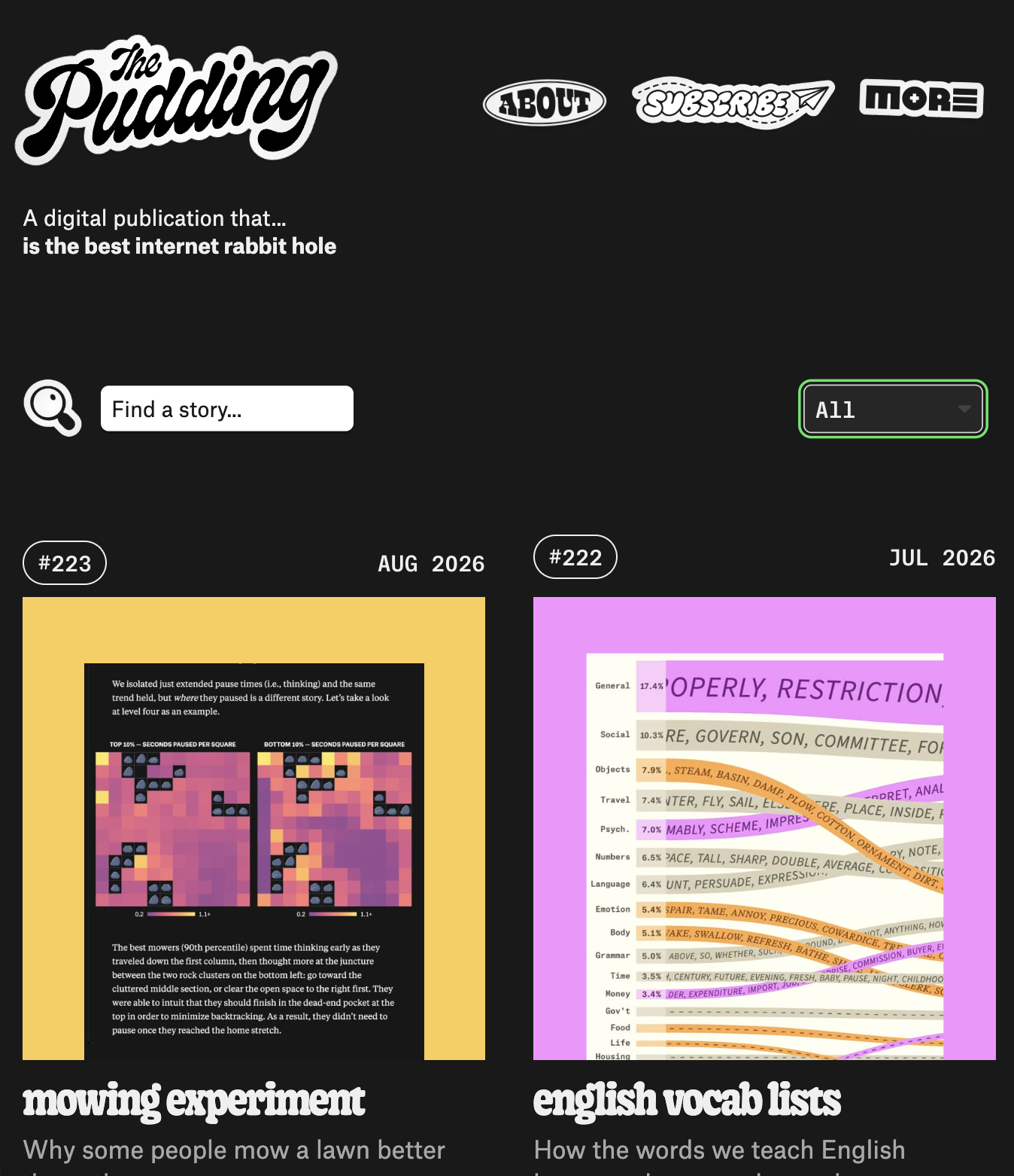
The landing page of The Pudding’s website does a great job at inviting a new user to explore their pieces. Hovering over elements enlarges them whether it’s their sticker-style icons for the about page and subscription or search functions, or the images and text associated with the article. In Norman’s terms, the enlargement provides feedback since the user interface responds to hovering over it. The cards afford clicking, but the enlargement acts as a signifier by providing a cue that these elements are interactive or clickable which a static image would not. It is done really well and even from the perspective of Nielsen’s heuristics, each article card is laid out in an aesthetic and minimalistic design. They include only the essentials: an article title, publication date and a short description and image pair that informs the user what the story is about. One critique is that the tiles are default ordered in reverse-chronological order, or newest first so users can intuitively scroll for older postings as they explore. While this is the convention and mental model for most blogs and publications, The Pudding says their work is not tied to deadlines and current events. So, this ordering sorts the essays by a quality that doesn’t matter to their typical reader. Other sorting methods include “our faves”, “popular”, and filtering for video/audio which offers more customizability for readers to explore.
Shared DNA in Music
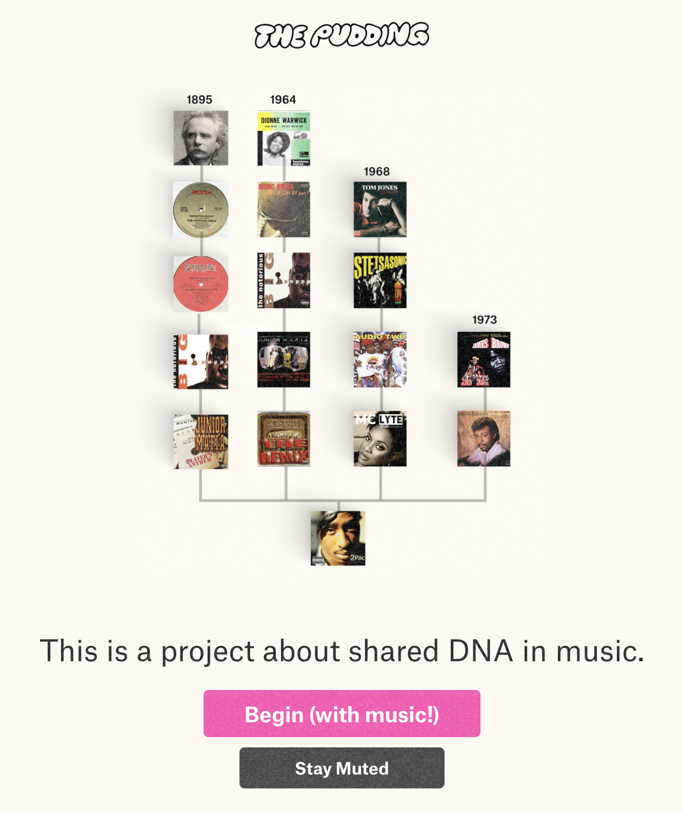
I focus on the piece “Music DNA Legacies” in this critique. Unlike the landing page, the only way to interact is by scrolling. When the user selects this article, the first screen offers two buttons “Begin (with music!)” or “stay muted” – and after making a selection, the article automatically scrolls to the starting point. By demonstrating the interaction model upfront and moving the page for the user rather than explicitly stating it, this acts as a feedforward. As the user scrolls through, each album cover enlarges to represent which song is currently playing and includes a video of the waveform of the audio clip. In Norman’s terms, this is continuous feedback that keeps the current system status visible and maps the scroll position to the music.
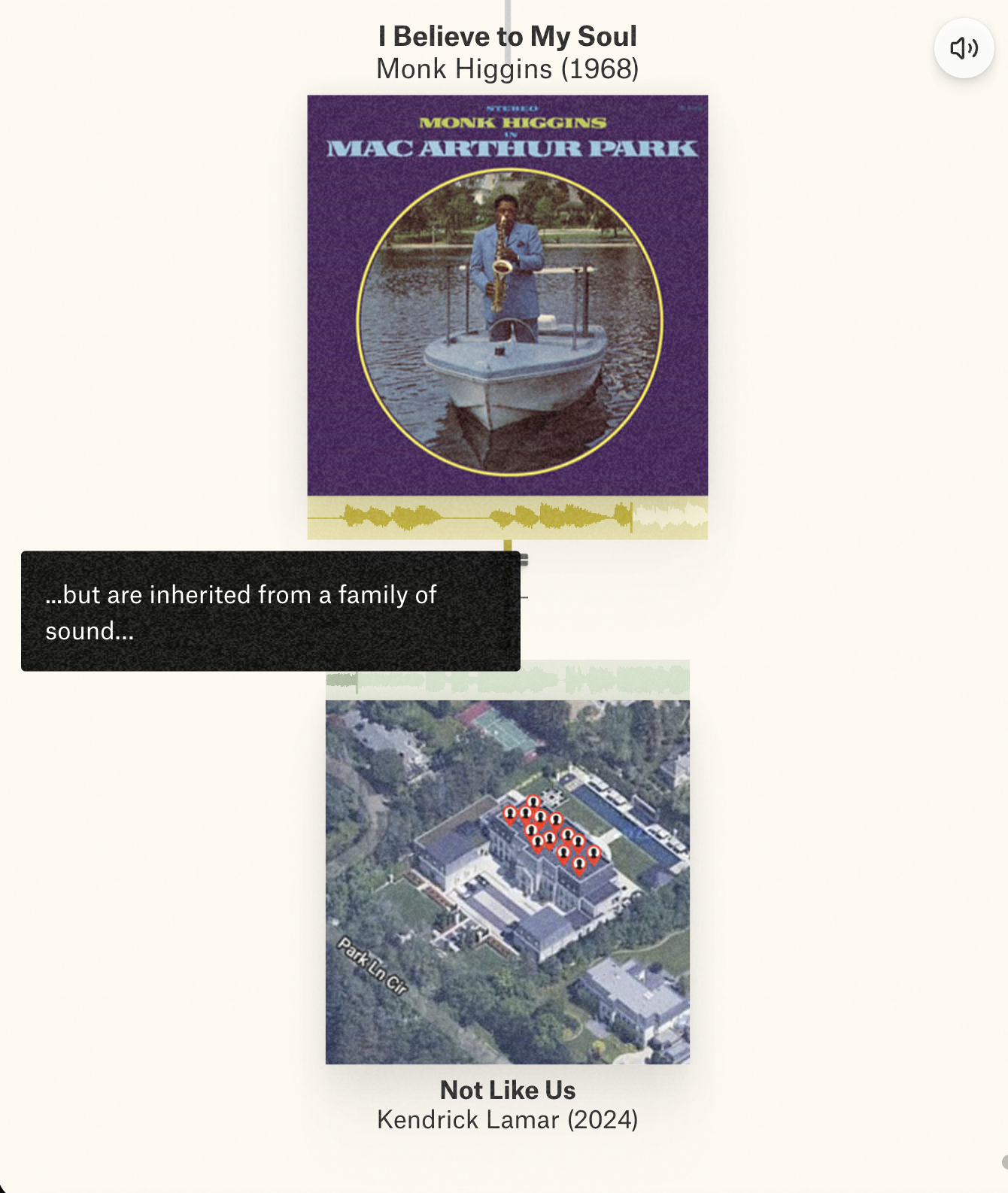
However, the experience is constrained entirely to scrolling and there is no way to click to pause, replay, or control where within the clip the audio begins. While this is not misleading since there is nothing that appears clickable when hovering, replaying an audio clip is a natural way users would interact with this piece since the waveform brings a mental model of interacting with audio playback (by playing pausing and scrubbing in other media players they use). The lack of these controls creates a gulf of execution for a natural goal and the only way to replay a section is to scroll back up to an unmarked point.
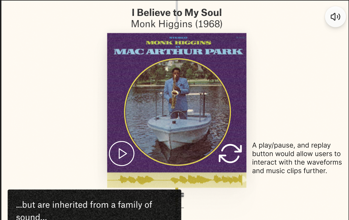
To fix this issue, I recommend adding minimal audio control. Allowing the user to play, pause, or replay by clicking would allow them to revisit a moment without scrolling back and replaying the entire clip.
Navigation
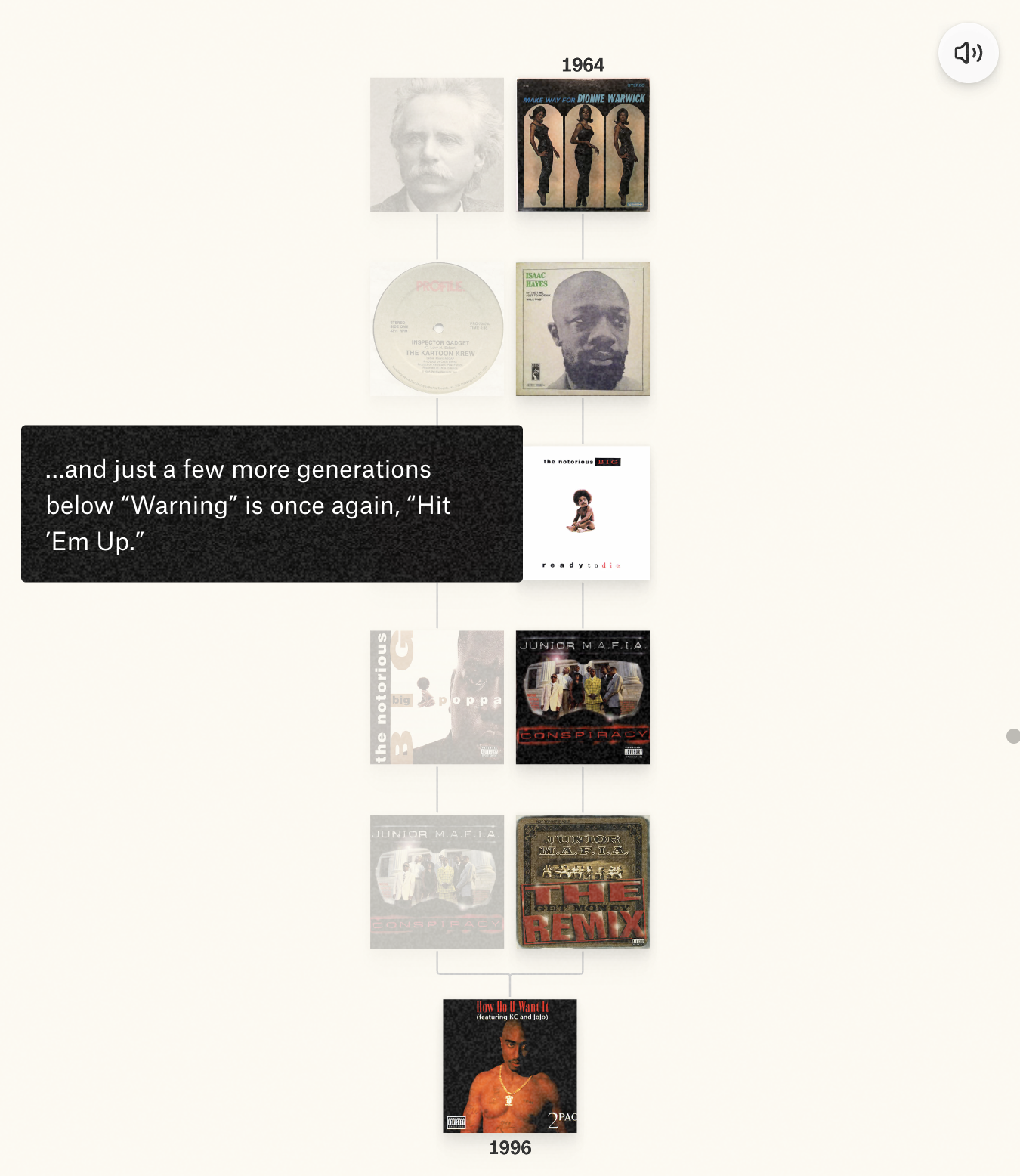
Navigating within an article is where The Pudding struggles because interacting with each piece relies exclusively on the user scrolling. While the user can use arrow keys to navigate, nothing signifies that this shortcut exists and thus it is a useful affordance that stays hidden. Once the user is mid-article, the hamburger menu disappears and doesn’t offer a way to jump between major sections or headers. This creates a gulf of execution for a natural goal, since the only way to return and compare pieces of music is to manually scroll through everything in between without a clear reference point of where you are in the article. Beyond this, there is the issue of discoverability since no way to get back to the landing page unless the user scrolls all the way to the end of the article. Even then, the site first links to other popular publications before finally showing the Pudding icon, which the user can click to reach the landing page. Universal convention is that clicking a site’s logo, typically located at the top of the site, takes you home. Without that, users have little control to leave a piece on their own terms. To fix this issue, I recommend a persistent minimalistic table of contents or progress menu so users can jump between major parts of the piece rather than only scrolling.
Conclusion
The Pudding is consistent in their mission of relying on scrolling to move a user through a visual story with data and interactive elements. However, because the range of content is so wide, the publication doesn’t capture every mental model a user might have through these pieces. Based on How Artifacts Afford, the site strongly encourages linear scrolling and forward or backward movement, while discouraging pausing, or getting distracted during the piece. It is designed for a default reader who is immersed in a singular story they begin through to the end.
References to Don Norman’s The Design of Everyday Things (2013) and Jenny L. Davis’s How Artifacts Afford (2020).