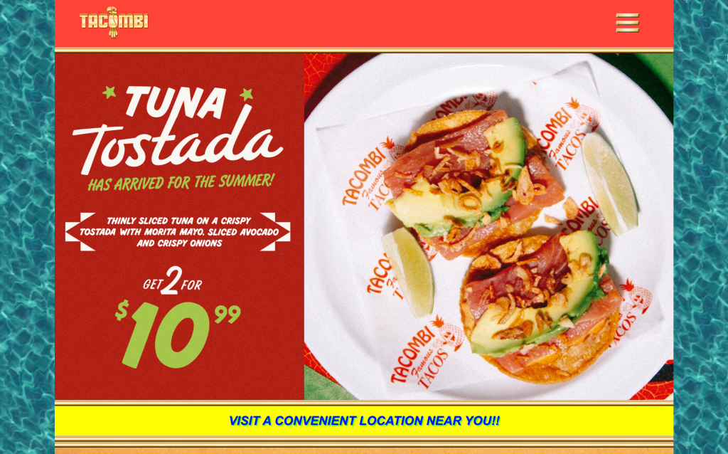
Tacombi is a Mexican taqueria chain I visit often, and I check tacombi.com on my phone right before I go, mainly for the menu or a reservation. Using Don Norman’s The Design of Everyday Things as a lens, the site’s ideas are mostly good: a bold graphic identity, a persistent header, even an accessibility widget. What keeps failing is the execution.
A Strong Visual Identity and a Header That Stays Put
Tacombi’s site commits to one graphic language everywhere, the same reds, yellows, and hand lettered type that show up on the napkins and menus at the actual restaurant. That consistency builds a clear conceptual model of the brand before you have even opened the menu. The red header carries that identity while staying fixed at the top of every page as you scroll, which Norman would call a strong signifier, a visible cue that controls live right there before you need them. It shrinks the gulf of execution, the gap between wanting to do something and knowing how, since you never scroll back up to find your way.
The Accessibility Widget: Designing for More Than the Average User
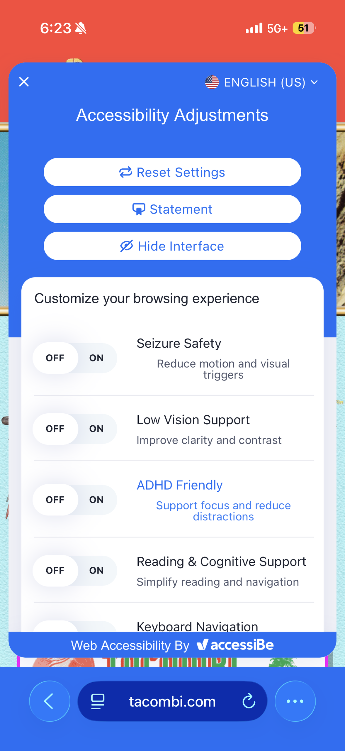
Tapping the small blue icon in the corner of the page opens a panel with real accessibility options, Seizure Safety, Low Vision Support, ADHD Friendly, Reading and Cognitive Support, Keyboard Navigation. Norman spends a good part of the book arguing that good design has to account for a wide range of people, not just an imagined average user, and building actual controls for seizure safety or low vision support into a taco website is exactly that kind of design. The icon staying in the same corner on every page is also a strong signifier, so someone who actually needs one of these settings never has to hunt for it, it is always exactly where they left it.
The Photographed Menu: A Mismatched Conceptual Model
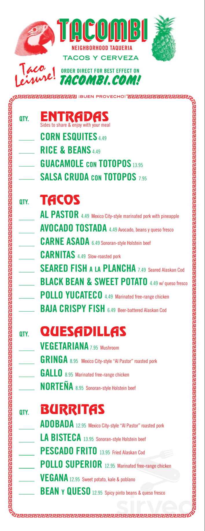
Tap “View Our Menu” and instead of that same clean graphic language, you get an actual photograph of a printed paper menu, front and back, dropped in as a plain image. On a phone that means pinching and dragging just to read a price. There is no real images or descriptions, so the page gives no usable feedback about what dietary restrictions exists or portion sizes, breaking Norman’s conceptual model that a webpage should represent its content.
Fix: Type the menu in as real text, the way the Locations and Catering pages already do.
No Way to Reserve: A Failure of Discoverability
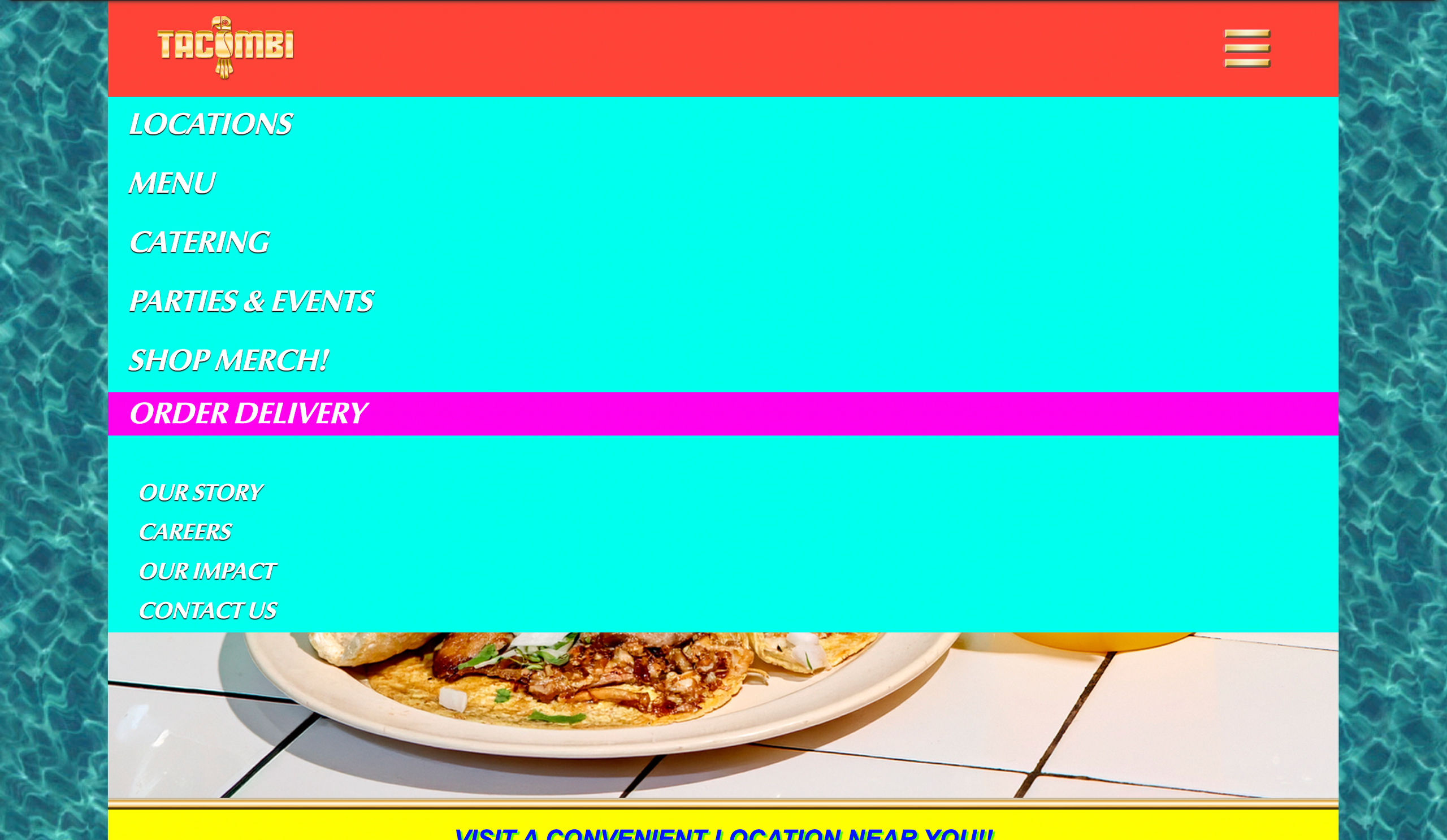
Open the site’s main menu, the one shown here, and count the options: Locations, Menu, Catering, Parties and Events, Shop Merch, and Order Delivery, plus four more links at the bottom for Our Story, Careers, Our Impact, and Contact Us. Ten links, and the word reservation is not one of them. Norman would call this a failure of discoverability, a customer trying to book a table has no clue where to even start. It turns out reservations are buried inside the Locations page, where every address does have a Book A Table button. I tapped one once, hoping to grab a table before a wait formed. Nothing happened, because the button links to a placeholder that goes nowhere. So the one path to a reservation is both hidden and broken.
Fix: Add a visible Reservations link directly in the main menu instead of hiding the function inside Locations, and connect the Book A Table buttons to an actual booking platform so the path that does exist actually works.
Overall:
Tacombi’s site gets some real things right: a strong, consistent look, a header that never gets in your way, and actual accessibility options built in for people who need them. But the two things I actually come to the site to do, read the menu and book a table, both fail. The menu is a blurry photograph instead of real text, and reservations are hidden behind a button that does not even work. Half of this site understands its users. The other half forgot why they showed up.
3 out of 5 stars.
Design concepts referenced are drawn from Don Norman’s The Design of Everyday Things (2013).