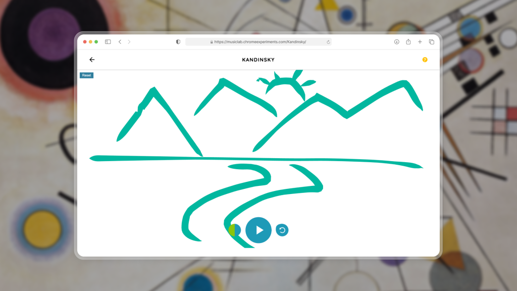
"Colour is the keyboard, the eyes are the harmony, the soul is the piano with many strings. The artist is the hand which plays, touching one key or another, to cause vibrations in the soul."
~ Wassily Kandinsky
What if you could listen to art?
Kandinsky explored the relationship between painting and music throughout his work. Inspired by his ideas, this experiment by Chrome Music Lab lets you turn your drawings into sound. I’m using ideas from Norman’s The Design of Everyday Things and Davis’s How Artifacts Afford to understand how it works and where it doesn’t.
There are a few reasons why you might end up here. To experiment with music composition, get a simpler understanding of how music works, draw something and see what happens, or even joke around? (check out what people made). But whatever brings you here, as a first-time user, you explore the interface, figure out how it works and eventually hope to create something that sounds good.
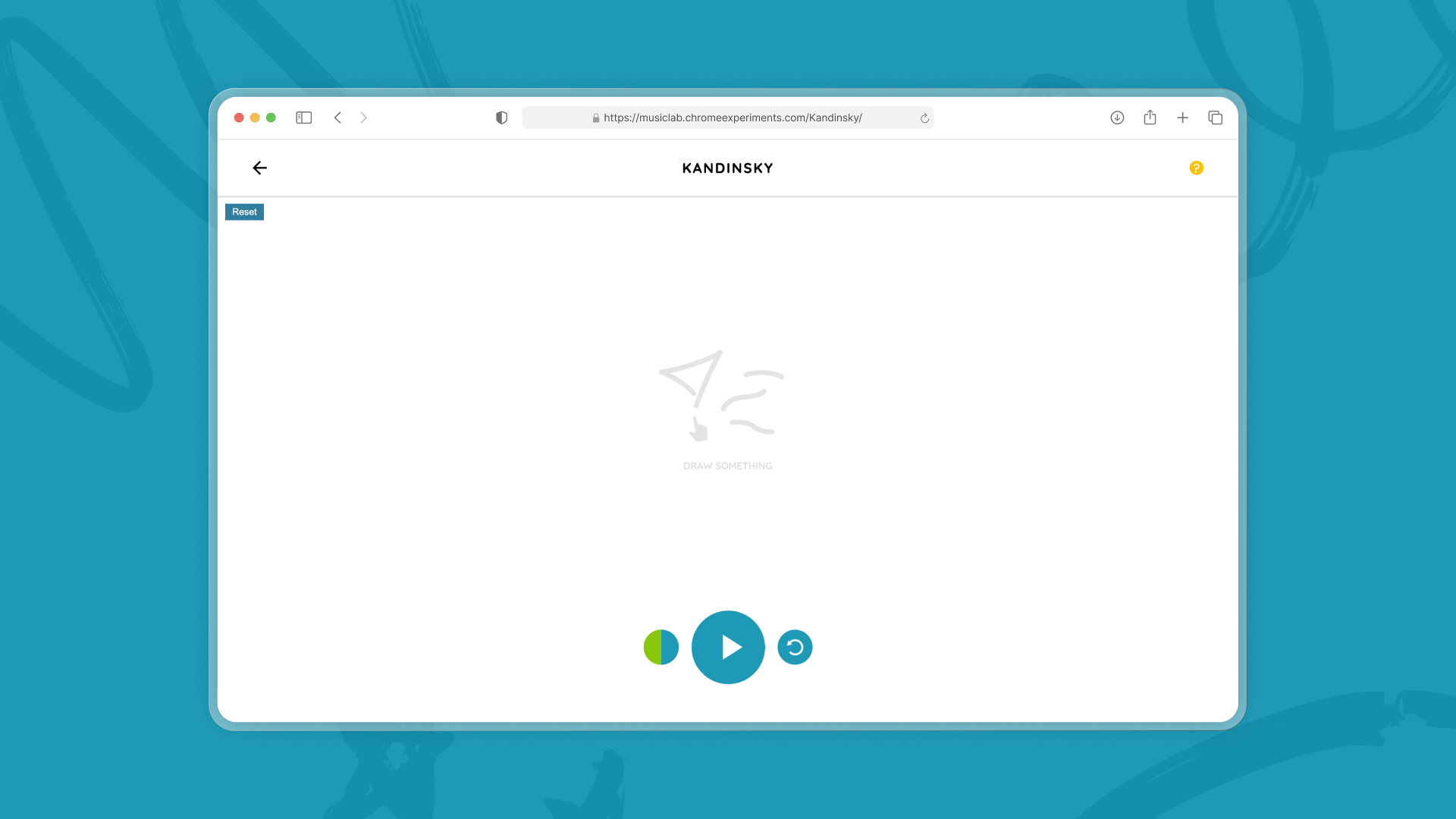
Simple, right? It is. Honestly, at first glance, I wasn’t sure what I could critique. I opened the website, waited for it to load and saw a blank canvas with a few buttons. Here is my first impression.
Why did I do that?
A blank canvas is intimidating, but I intuitively started drawing. Why did I do that? Most designers would probably say that the canvas “affords” drawing, but I believe there is more to it. In her book, Jenny Davis builds on the idea of affordances by saying that artifacts can request actions from us. In this case, the blank canvas not only affords drawing, it requests it. I could ignore it, but with no other obvious action to perform, I feel encouraged to make a mark.
However, an invitation is not necessarily an instruction. I knew I could draw, but I didn’t know that I was supposed to. I had seen a short animation while the site loaded: a cursor drawing lines and shapes. This tiny interaction had already told me what I was supposed to do. In Norman’s terms, the animation is a signifier; it communicates that you need to draw on the canvas. Even though the canvas itself affords drawing, the small cue helped me understand what I was meant to do.
But the animation is so brief that it is easy to miss. Once it disappears, there is nothing else on the page telling me what I’m supposed to do. The problem becomes even bigger when the website is opened after it has already loaded in the background. The signifier is gone before the user even sees it.
A simple solution: make the signifier persistent. Maybe having some version of this animation stay on the screen until a user performs the intended actions would help guide them. It could act as a subtle prompt and then disappear once the user starts drawing. This way, the user can still figure out what to do even if they miss the animation.
Learning by exploring
As the interface expected from me, I drew a line, and it made a sound. The interface gave me immediate feedback. I could instantly hear the effect of my action. According to Norman, good feedback is “full and continuous information about the results of actions and the current state of the product or service.” The platform does this beautifully; I don’t have to wait, press any buttons or keep wondering what happened.
But before I started drawing, I saw a huge play button. I was so tempted by how big it was that I clicked it. Nothing happened. I clicked it again, and nothing happened again. I let it go, assuming that it would work if there is something drawn on the canvas.
Here is where I think the platform should introduce some kind of constraint. As Norman suggests, some constraints can help guide the user by essentially cutting out the noise or distraction. On this interface, all the buttons at the bottom are useless until the user has drawn something. So why not show them only after the user has drawn?
When the mapping just makes sense
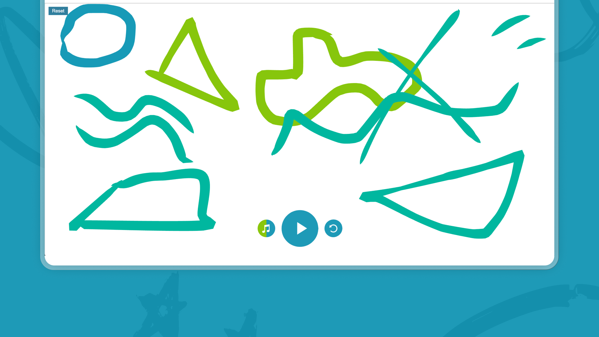
By this point, I was starting to understand what the platform was about. So, naturally, I wanted to explore more. I tried creating different kinds of lines, expecting they would sound different, and they did. As I kept experimenting, I figured out that shapes create different sounds too. Closed shapes get assigned eyes and they look like little faces. If I make something by mistake, it still sounds good. The platform manages to make my errors also sound good. Isn’t that every creative’s dream? To never mess up? The way this platform works, everything you do encourages you to explore more.
As I drew all over the canvas, I noticed that the higher I drew, the higher the pitch became. For me this was such a satisfying moment.Norman defines mapping as a relationship between a control, its actions and their result. Good mapping makes this relationship obvious. This mapping feels particularly natural. We already associate “up” with higher pitch and “down” with lower. This provides a simple visual way to understand pitch for someone curious about music.
When I created my masterpiece, I finally clicked the play button. I already expected my drawings to play from left to right. We read, write and even represent music from left to right. So my expectation came from familiarity. The interface uses existing mental models rather than making me learn something entirely new.
I was expecting something horrendous to play with all the random lines and faces I had made, but it surprisingly sounds good. I didn’t need to understand how music works but I only needed to understand how this platform works. Norman describes a conceptual model as the user’s understanding of how a system works. The conceptual model in my head is extremely simple: draw something → hear something. This platform takes something complex like creating music and simplifies it to something as approachable as doodling. My conceptual model need not match the system’s architecture for me to effectively use it.
Wait, what does this button do?
Now that I had fully explored the canvas, I was checking every corner of the website. I noticed a button showing the colours of my doodles. From past experience, I assumed it was to change the theme of the site and my doodles. I clicked it, and I was right? Sort of. It changed the colours of my doodles, but when I drew something new, I noticed that the sound had changed too. The button didn’t just change the theme, it changed the set of instruments creating the sound. When the instruments change, the whole vibe changes.
The button felt a bit misleading for me and lacked enough context. Visually, it communicated colours and not sound. Maybe adding iconography or some other signifier there would help users discover its full function.
Who needs music theory anyway?
Despite the small hiccups here and there, I think simplicity is both the biggest strength and weakness of this platform. It helped me when I first started using the platform, however I think it would make intentional composition difficult. But maybe that’s the point?
The platform lets anyone, musical expertise or not, to create something unique every time. It encourages exploration. It eliminates the complexity of the technical aspects of music. It doesn’t teach me everything about music, but it gives me just enough to spark my curiosity.