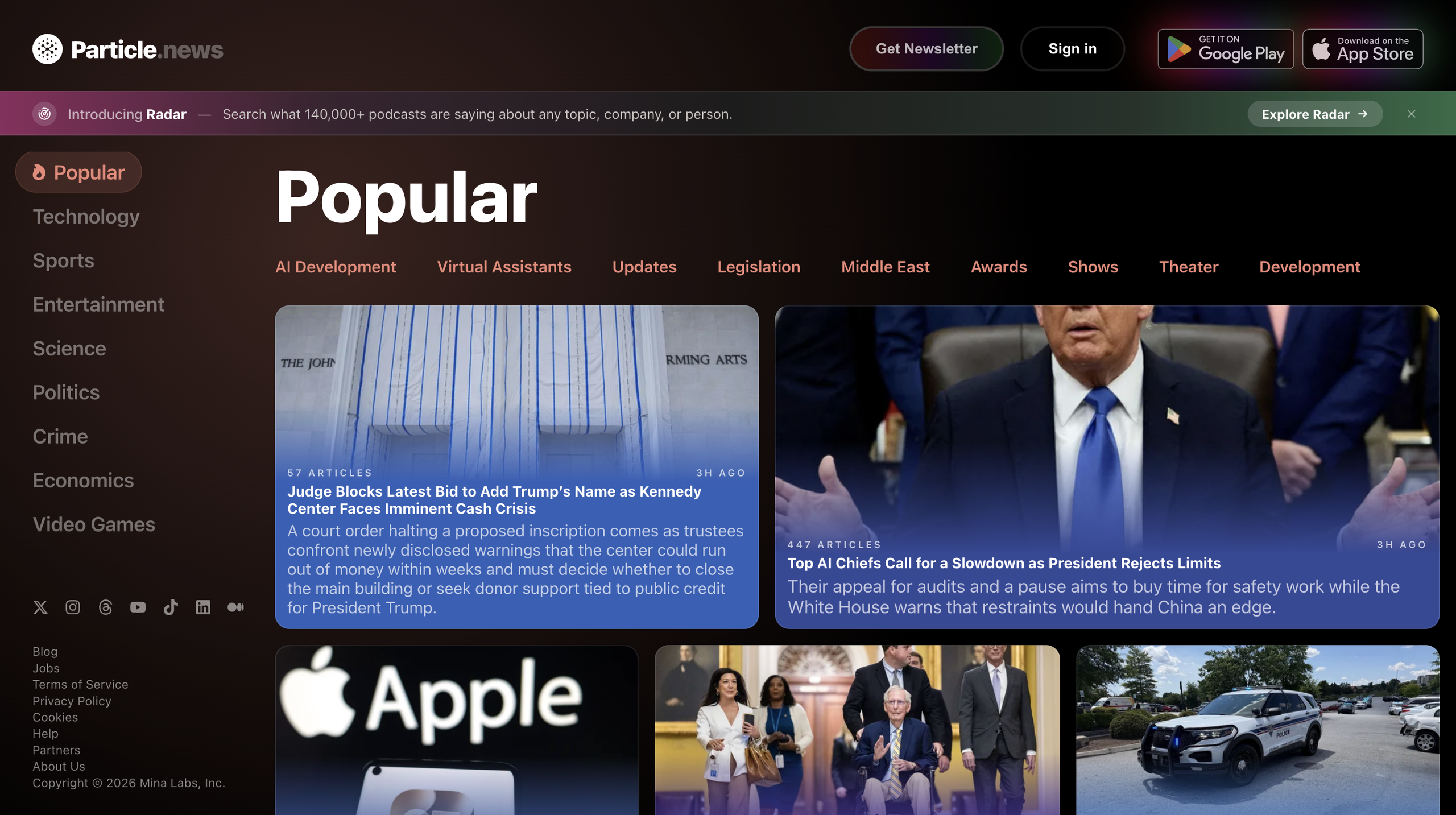
Particle News is a news aggregator that synthesizes coverage from hundreds of outlets into a single AI-generated summary per story. Rather than directing users to one publication’s perspective, the platform aggregates reporting across multiple sources and presents a unified overview, allowing readers to explore individual outlets as needed. This critique examines how effectively Particle News applies design principles from Don Norman’s The Design of Everyday Things to support user trust and understanding. The evaluation focuses on whether the interface clearly communicates the system’s model of aggregated news to first-time users.
The evaluation was conducted by approaching the site as a first-time visitor without prior context. The initial interaction included reviewing the homepage, exploring a news story in detail, and testing the category navigation system. These tasks provided a framework for assessing how Particle’s design supports user mental models and the formation of conceptual models that build trust for first-time users.
Effective Use of Conceptual Model
Norman describes the conceptual model as the mental representation a user builds of how a system works. When this internal model aligns with the system’s actual operation, users can navigate confidently. Particle News strongly demonstrates this alignment on its article pages. Each story displays three interconnected elements: a synthesized summary, the number of contributing sources, and a scrollable list of outlet logos. This design layout makes the underlying system logic immediately visible to the user.
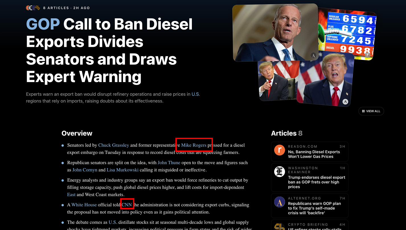
The visual proximity of summary, source amount, and outlet list with article names tells the user immediately that this isn’t one outlet story; it’s a summary of many. The synthesis is never separated from its source attribution, which removes ambiguity about the summary’s origin. If a user distrusts a summary, they can scan over to discover the sources it came from. The conceptual model the interface implies is the model the system actually follows underneath. This design layout directly supports Norman’s concept of mapping between designer intent and user understanding.
The header section also uses color as a signifier. Linked entities like company names, individuals, and places appear in a different color than regular text, matching the color of the news topic card on the home page. No other page elements use this color, making it a clear visual affordance indicating for users to interact. Clicking these terms navigates to their related page with additional information. This consistency creates a learnable pattern for users: after one or two interactions, users recognize the signifier and can navigate confidently without hesitation.
Visual Clarity and Information Hierarchy in Category Navigation
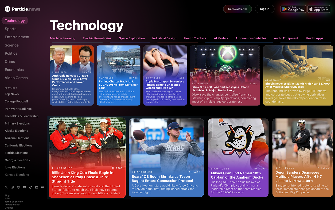
Two distinct problems emerged when navigating Particle News. The first occurs when scrolling through the home page. The homepage discovery feed cycles through multiple news categories: Popular, Technology, Sports, Entertainment, Science, Politics, Crime, Economics, and Video Games. As users scroll vertically through story cards within each category, the interface signals category transitions through label changes, subtitle color changes, and updates to the topic pill navigation. However, it provides no visual spacing between category sections. Story cards transition sequentially from one category to the next without any spatial spacing or boundary dividers.
This design violates Norman’s principle distinguishing between knowledge in the world and knowledge in the head. Distinguishing categories through label and color changes alone requires users to maintain active cognitive awareness of which category they’re viewing through label recognition. Users must remember the previous category’s label to recognize when a transition occurs and interpret which category’s stories they are currently viewing. This cognitive demand only increases with the number of different categories presented.
Additionally, the continuous card stream design violates the principle of affordance and consistency through constraints. Users expect distinct content categories to be visually separated through spatial boundaries, a learned pattern from most digital information structures. The card stream and lack of spacing undermine this expectation, leaving users unsure whether they’ve already scrolled to a new section or are still within the current one. This is compounded by the high information density: nine categories with multiple stories, all presented with minimal visual spacing. This creates cognitive overload for users during discovery browsing.
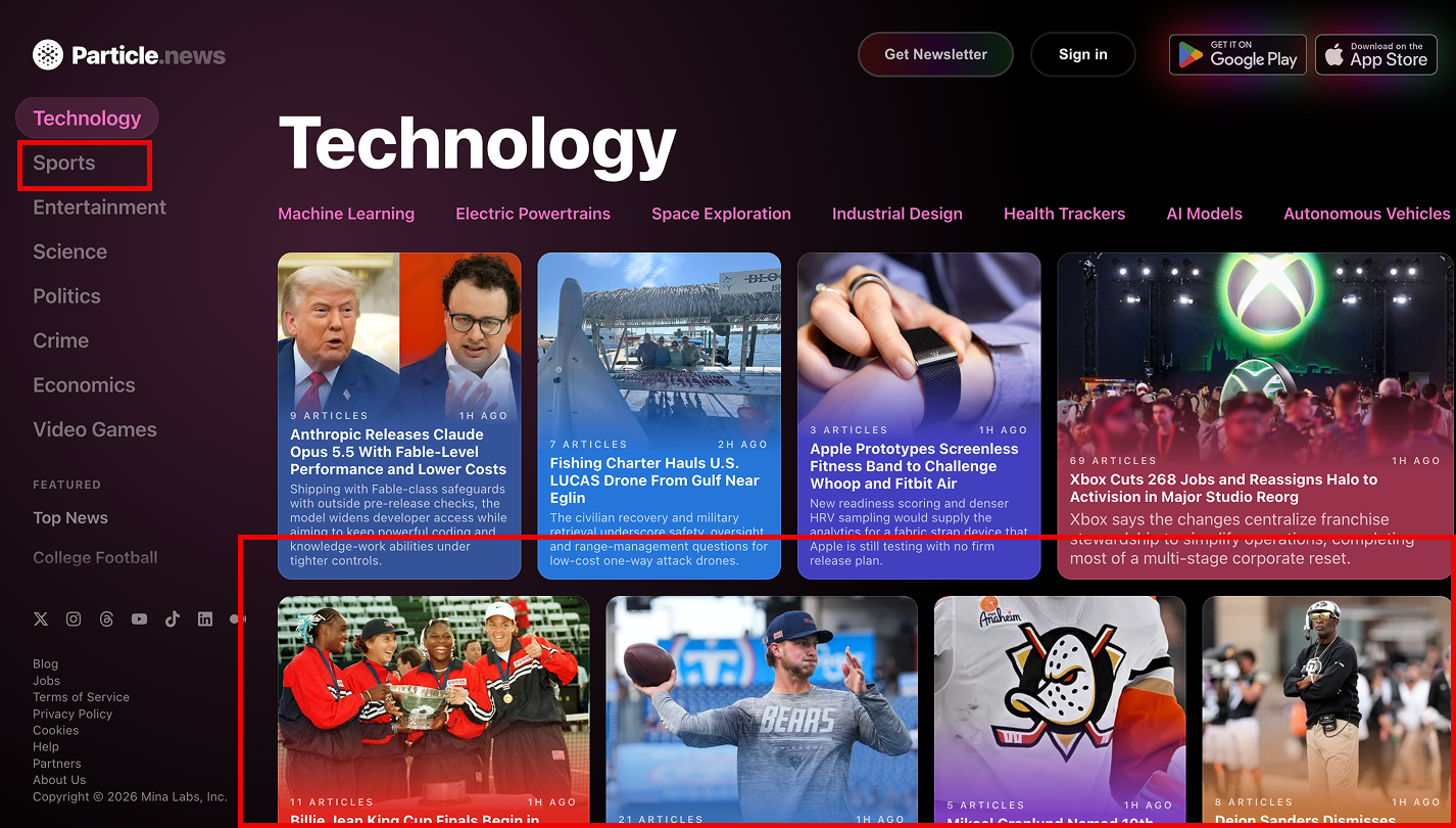
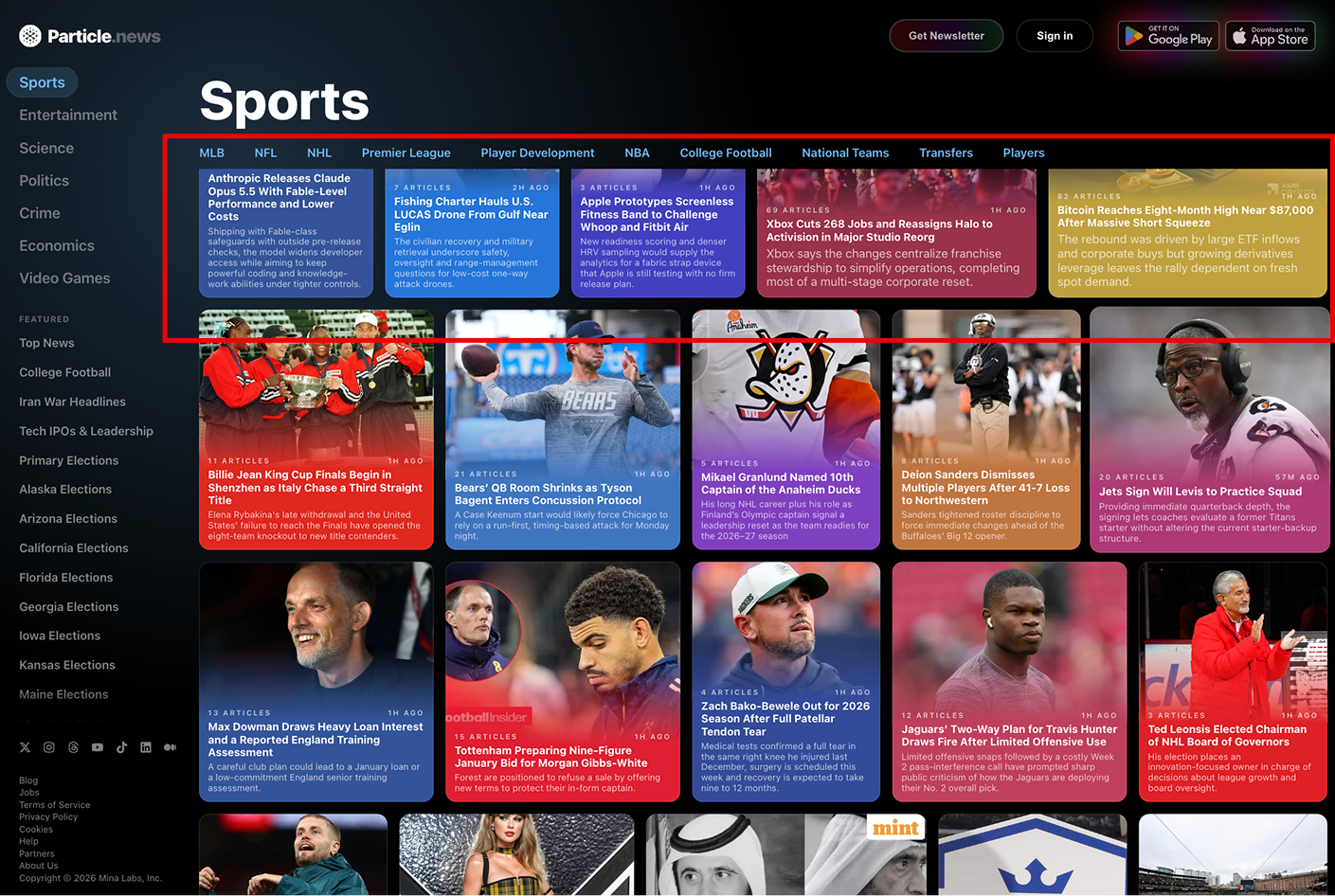
The solution is straightforward: adding spatial spacing or a visual divider between category sections would make transitions immediately apparent without requiring active cognitive processing. Combined with existing label and color differentiation, spatial separation would align the interface’s visual structure with established user mental models and distribute information density more effectively throughout the discovery experience.
Conclusion
Particle News demonstrates strong design principles in communicating its core functionality. The article page layout effectively establishes a conceptual model that aligns with the system’s actual operation through the visual hierarchy, source attribution, and color-coded affordances. Users understand at a glance that they’re reading an aggregated synthesis, not a single outlet’s perspective. This alignment between what the interface shows and what the system actually does builds user confidence during primary interactions and reduces reliance on prior knowledge.
However, the homepage discovery experience can create unnecessary cognitive friction through the information architecture choice. The lack of spatial separation between category sections forces users to rely on active memory rather than the interface’s visual cues. Combined with the high content density across nine categories, this design choice creates overload as users explore and discover content. But it’s important to note that these challenges reflect deliberate design decisions, not technical limitations. The article page demonstrates that Particle News understands Norman’s principles about visibility and mapping between user and system models. Introducing spatial spacing or visual dividers between category sections on the discovery page would bring the same attention to visual organization. This refinement would reduce cognitive load and strengthen user confidence throughout their entire experience with the platform.