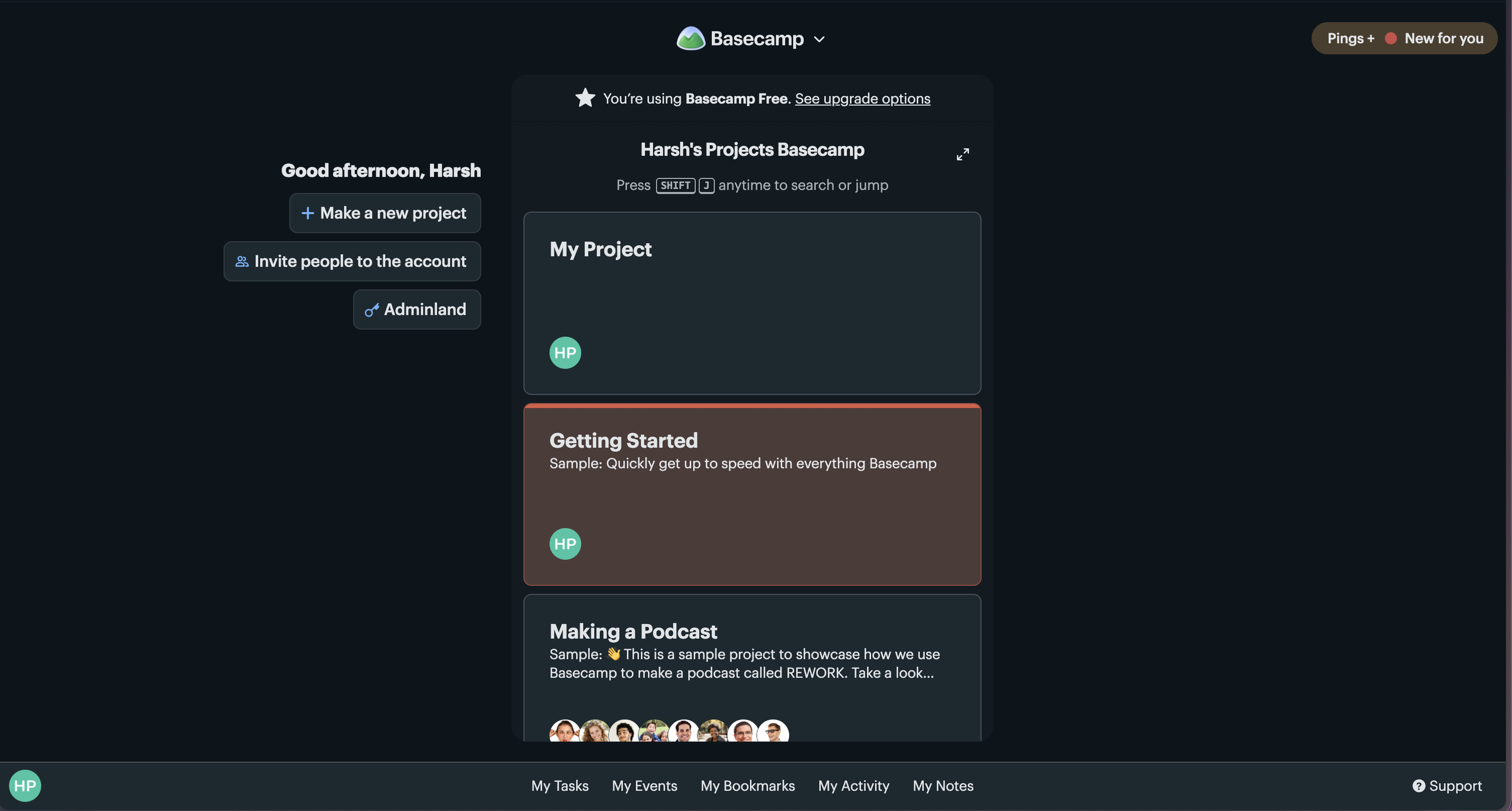
Basecamp is a project management and collaboration tool designed to help teams organize their work in one place. It has features such as messaging, task lists, schedules, and basically anything that would allow team members to coordinate projects and communicate without relying on multiple separate tools. The latest version of this software is Basecamp 5.
Basecamp is mainly used by small to medium sized businesses to coordinate all their activities in one place. Basecamp is a high-touch point and high frequency product where its users use it multiple times a day and across different stages of the company’s lifecycle. These were my initial impressions while first using the product. But for this critique, I am going to scope this down a little bit and focus on 3 parts of the interface – Onboarding, Inviting a Team Member and Navigation.
Onboarding
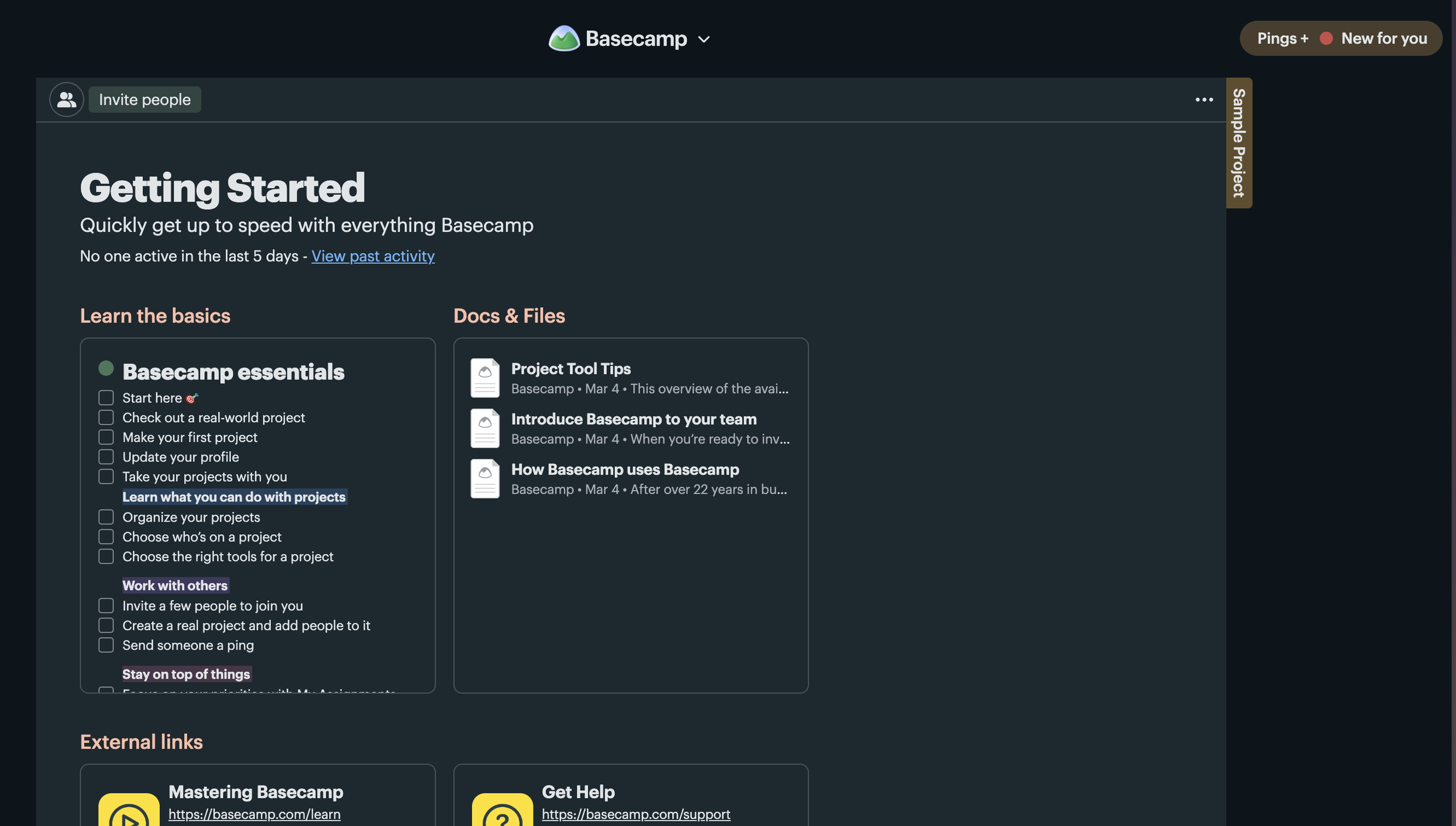
After creating an account, a new user is presented with two ways to learn Basecamp. They can click Get Started and read through simple instructions, or explore a sample project showing how a fictional team uses different features. The number of instructions do feel overwhelming to go through and there is no direct mapping of each feature tied to every instruction. The instructions still do a good job getting a sense of the first few things I should do and so always feel suggestive and helpful.
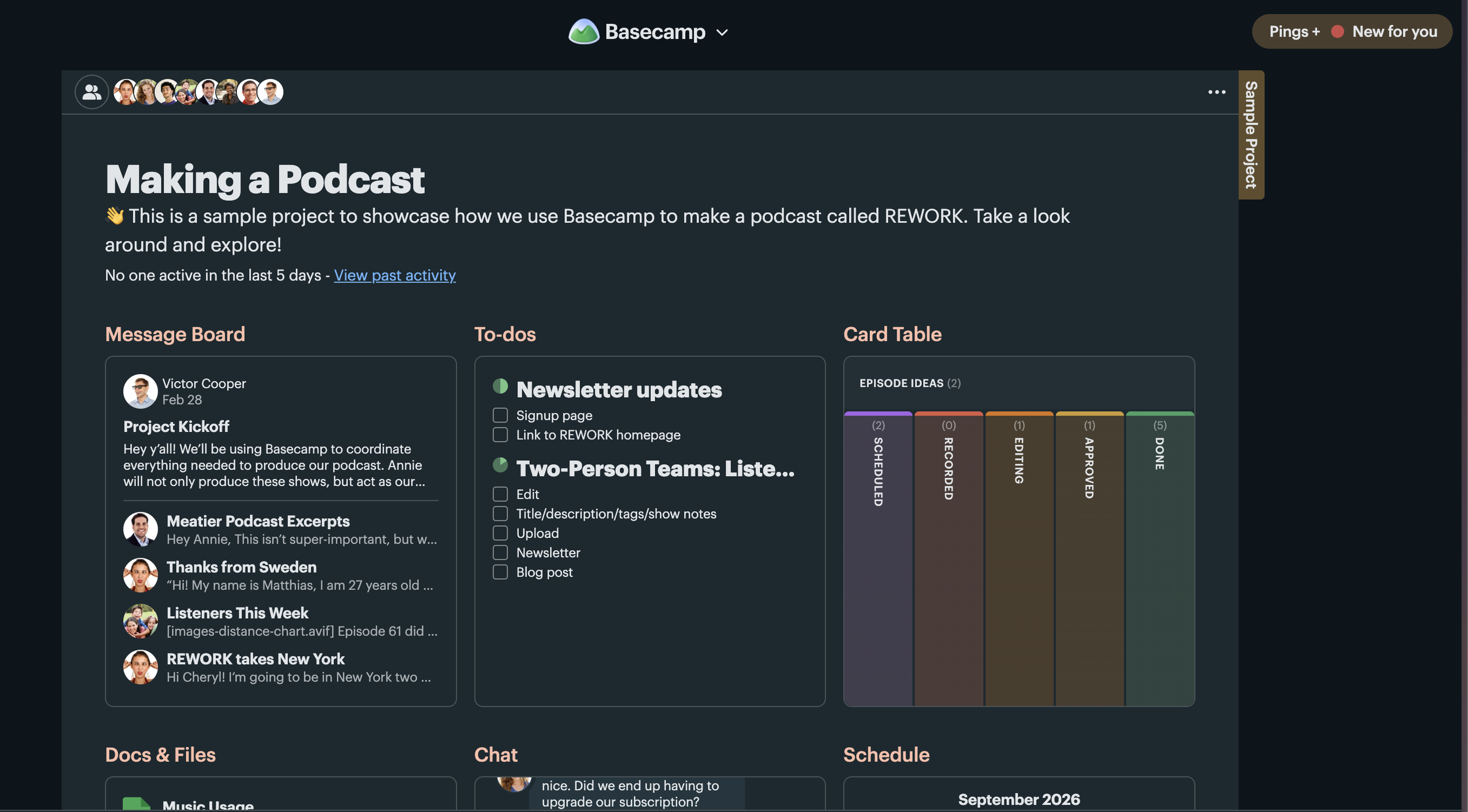
The sample project is especially effective because, rather than simply explaining how Basecamp works, it lets users learn by exploring a realistic example. This helps users develop a more accurate conceptual model of the system very early on. The structure or features they see during onboarding exactly match the one they will use for their own projects, reducing the gap of execution.
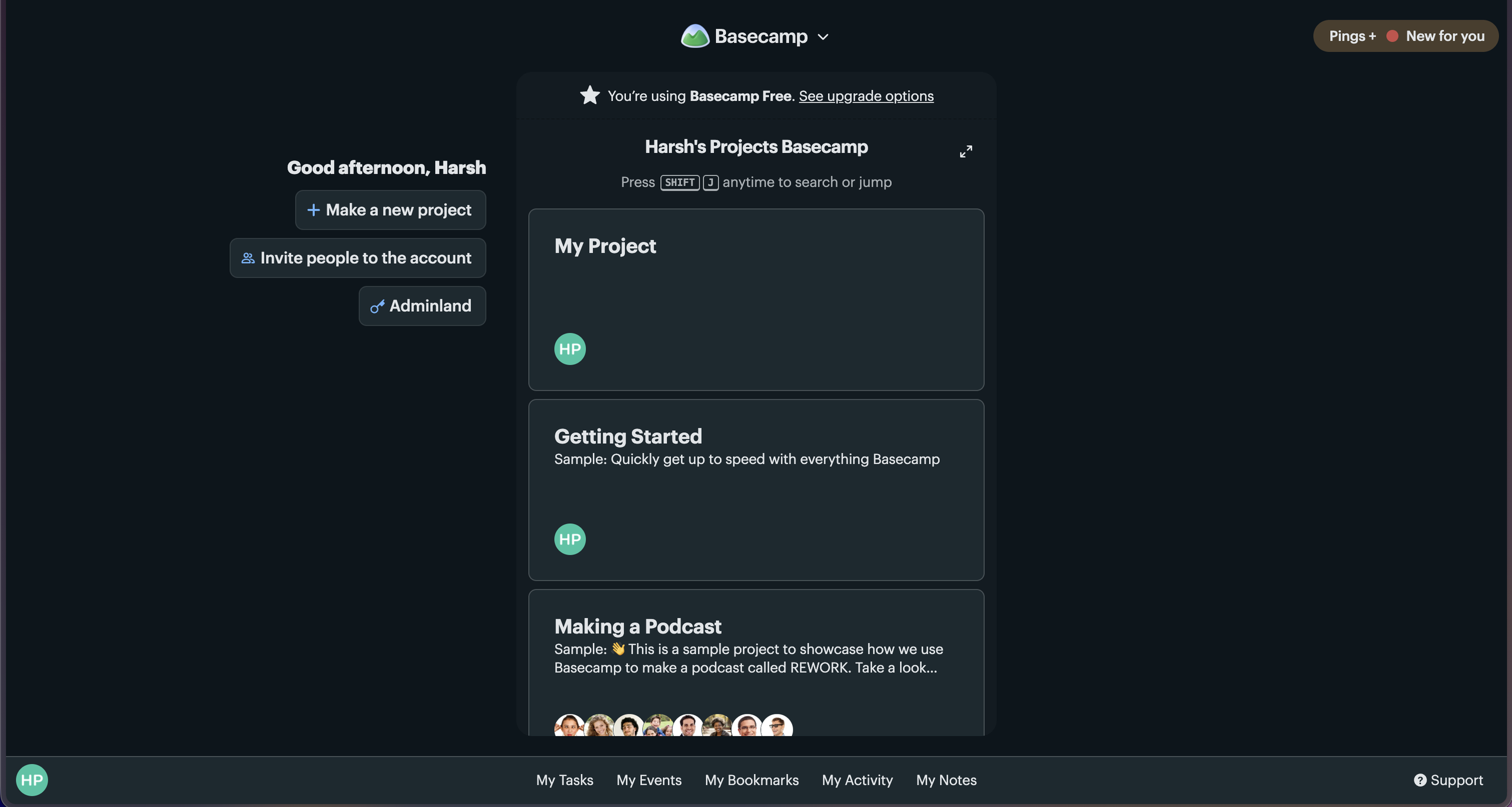
The one drawback, though, of dropping a new user on the home page is the lack of clarity around what these big cards above are. There is no obvious label, tooltip, or other signifier explaining their purpose. I had to click around before realizing this and that lack of discoverability matters even more for free-tier users, since one of these cards is a mere example that counts towards my three-project limit. I would argue that there should also be a way to take action on these projects/cards from the home page via a simple three dot menu that shows a popup menu, for example. This would also reinforce the idea that these cards are mutable and not fixtures of the interface.
Inviting a team mate
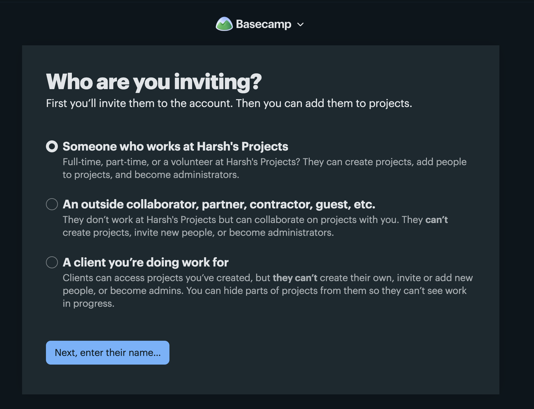
Basecamp handles inviting teammates well enough through its use of semantic and logical constraints. Each of the three invite categories explains exactly what that role can and cannot do just when a user has to make a decision. This applies Norman’s idea of constraints effectively because the system narrows the available choices while also explaining their meaning before the user commits to one choice. The button label “Next, enter their name” is also a small but effective signifier. Rather than using just “Next,” it tells the user exactly what action is next. Even at this focussed level, this reduces the Gulf of Execution because the user does not have to guess what will happen after clicking the button.
However, the screen also places a heavy burden on working memory without clearly explaining what will happen if we select one or the other. Each role is explained in a dense paragraph, so comparing them requires the user to mentally hold three different sets of permissions at once. Rather than making those differences immediately visible in the interface, Basecamp puts more of the burden on knowledge in the head. It could have instead relied on some version of progressive disclosure or reduced the choices available, through a table showing the comparative permissions available. Below are two possible solutions around this cognitive overload.
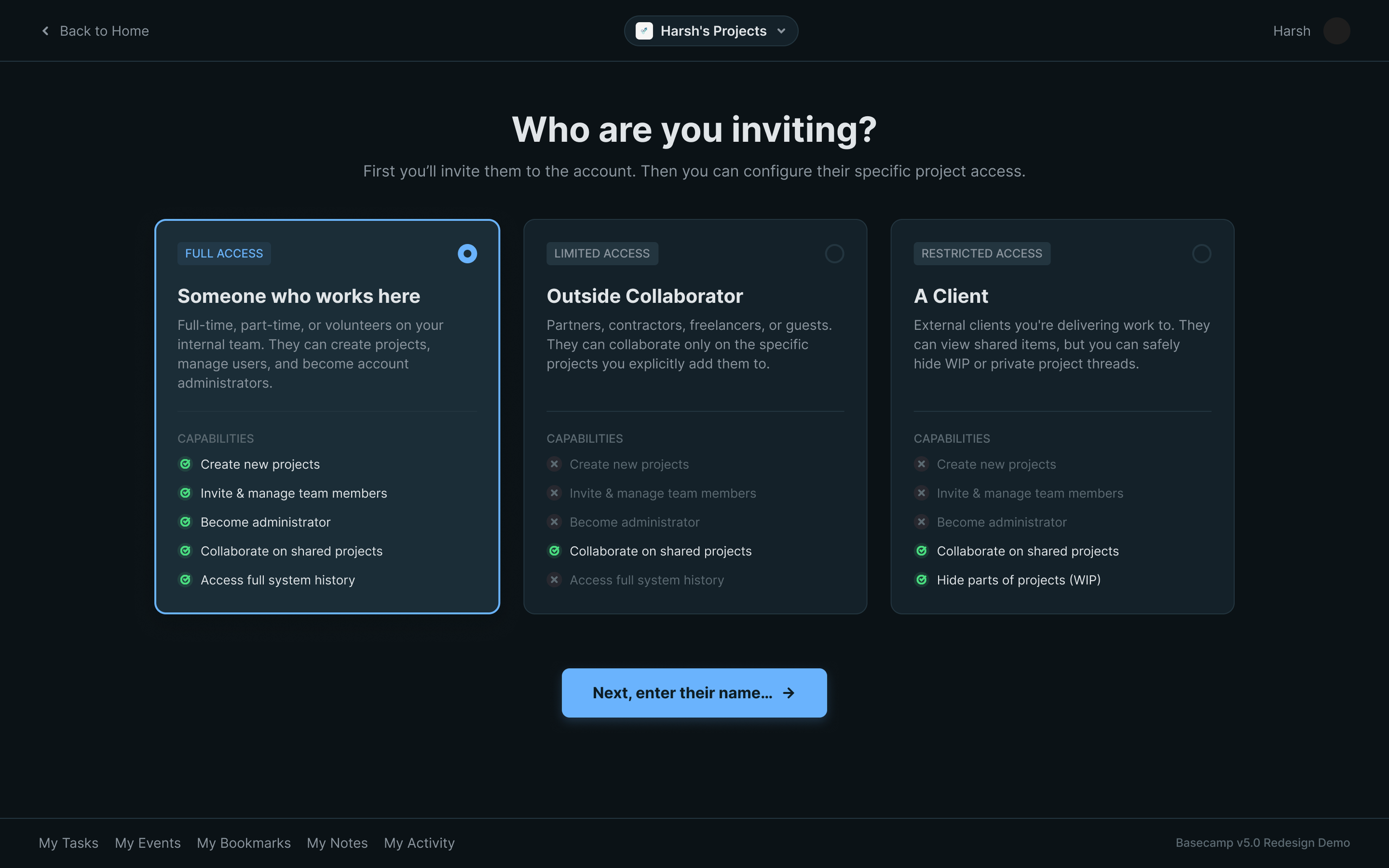
The first idea is to make permissions clear and easily comparable. This feels like a more important aspect to understand than whether someone is a client or not, as my intended permissions may not clearly map onto Basecamp’s stricter permissions mapping.
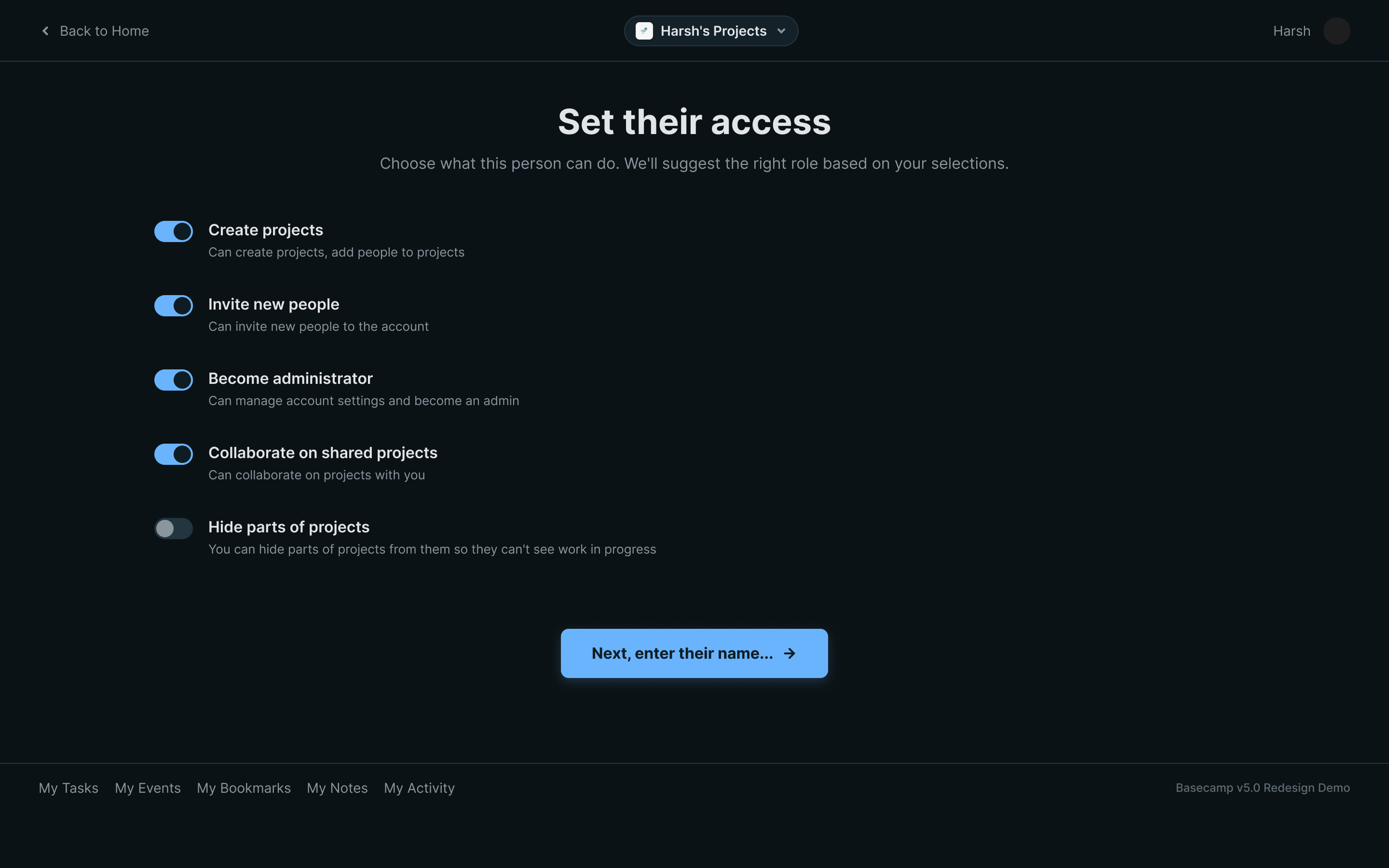
Taking the above idea further, we can just show permissions instead. More like a buffet style invite flow where you customize your permissions set for every invitee.
Navigating Basecamp

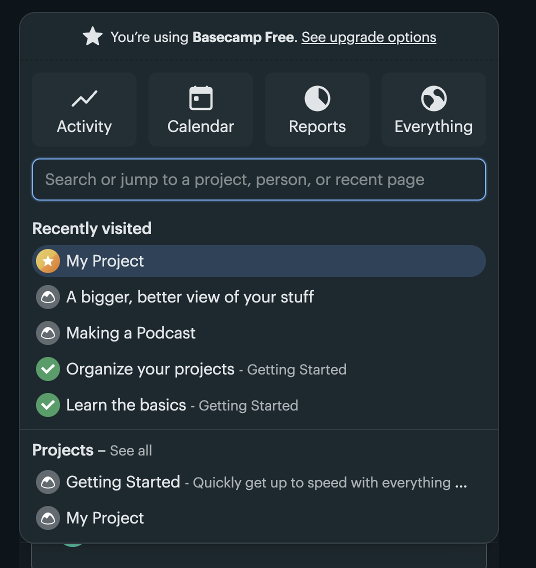
Now onto the structural underpinning of Basecamp – it’s navigation system. Basecamp’s navigation creates a weaker conceptual model by presenting two overlapping systems. The bottom bar includes My Tasks, My Events, and My Activity, while the logo menu includes Activity, Calendar, Reports, and Everything. These ideas sound closely related, but the interface does not clearly communicate how they differ or whether they are simply different views of the same information. Because that relationship or explanation is not clear, users have to learn it through trial and error. The system image does not communicate a clear enough conceptual model of how navigation is organized. I would argue for a simple navigation surface rather than having 2 separate persistent surfaces.
In all, Basecamp’s interface feels like a powerful, functional productivity suite that they have tried to simplify down in friendlier albeit slightly confusing ways.