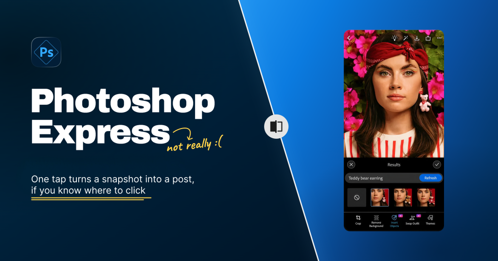
Photoshop Express is a mobile photo editor by Adobe. It’s a lightweight version of Photoshop made for quick edits on your phone. The main functions of the app are its one tap editing/adjustment tools and its AI features, like Remove Background, Swap Outfit, and Insert Objects.
Most of us edit our photos. It’s such a normal part of the process that we barely think of it as editing anymore. A small group of users spend a lot of time editing photos using professional softwares. The rest of us want something much simpler and faster. Brighten, straighten, crop, remove the distraction in the background, and post it. A few minutes at most.
Where the app gets it right ?
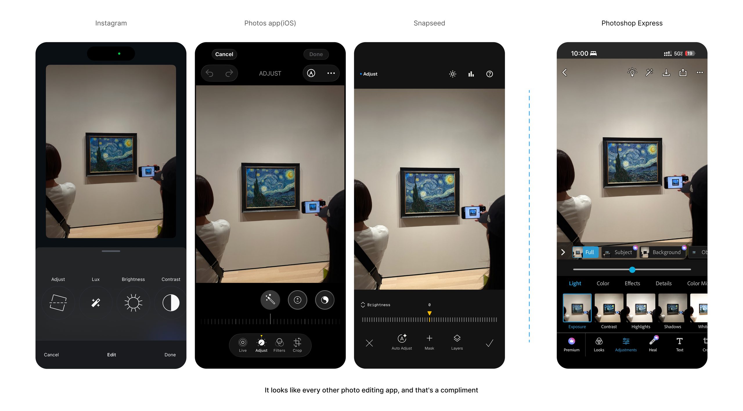
When the user opens the app, the layout is instantly familiar. Photo at the top, tools along the bottom, a slider to adjust the effects right above the tools. You’ve seen this in Instagram, Photos app(iOS) and snapseed, so you already know how it works before you’ve tapped anything. Norman calls this a cultural constraint. We carry mental scripts for common situations, picked up from experience rather than instruction. It’s why you can walk into a restaurant you’ve never been to and still know how to order. Mobile photo editing has built its own script, and Express follows it. No tutorial needed, because the user is familiar with the layout already.
Every icon in the bottom row comes with a word under it. Crop, Remove Background, Insert Objects, Swap Outfit, Themes. The AI powered ones get a small purple badge, so you know before you tap that this tool will generate something rather than adjust something.
These are signifiers, the things that tell you where the action goes. A labelled icon does that. A bare icon doesn’t.
This matters most for users who don’t know photo editing. Without it, they’d have to tap each tool just to find out what it does, and change their photo in ways they didn’t intend.
Drag the brightness slider and the photo changes under your finger in real time, with the value updating as you move.
That works because of natural mapping. Right is more, left is less, a spatial analogy people already hold. The control also sits directly under the photo, which is the second level of natural mapping.
The reason it feels good is the behavioural level of processing. You expect the photo to brighten as you drag, it does, and registers as satisfaction.
Every edit in Express is reversible. Undo and redo cycle you through your changes, sliders drag both ways, and the original file stays untouched until you export. There’s also a compare gesture, press and hold on the photo and it shows the unedited version, then snaps back when you let go.
It uses the forgiveness principle. Norman’s rule is to assume every error will happen, then make each one either preventable or cheap to reverse. Undo brings the cost of a wrong move to nearly zero, which turns editing into exploration rather than commitment. The hold gesture gives you a baseline so you can tell whether the edit actually improved the photo or made it worse.
Where it falls apart ?
The top of the screen is a guessing game
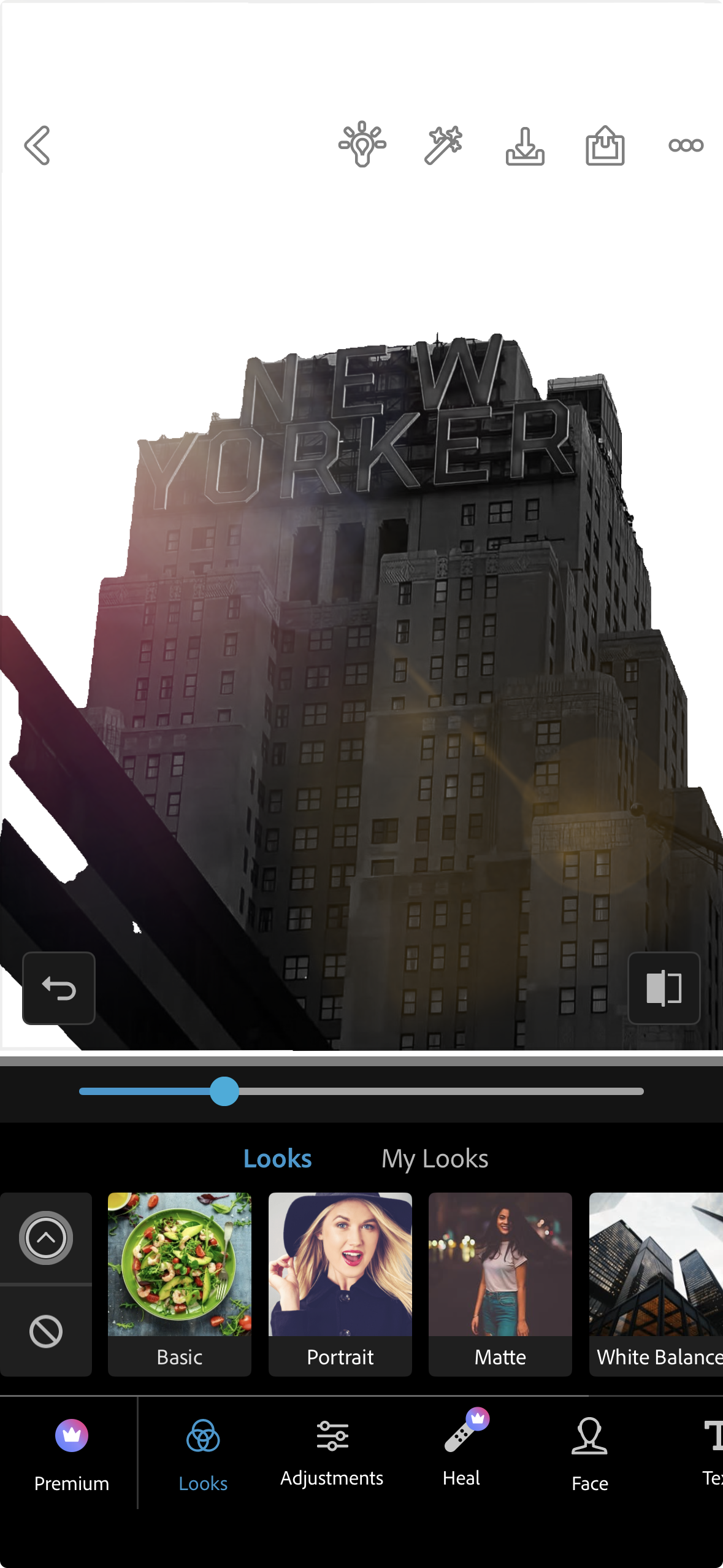
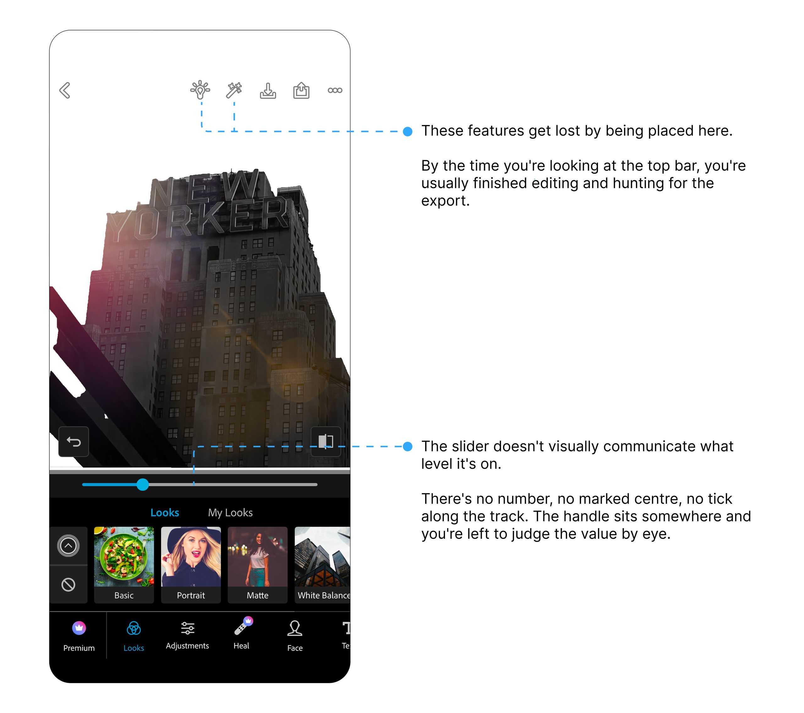
Five icons across the top bar, none of them labelled. A lightbulb, a wand, a download arrow, a share icon and three dots. You cannot tell what actions are available or what any of them will do without tapping and finding out.
This is a discoverability failure, and it opens up what Norman calls the gulf of execution, the gap between knowing what you want and knowing how to make it happen.
When nothing happens
Adjustments and filters share the same slider, but they mean different things by zero.
For exposure or contrast, zero sits in the middle and means no change. The slider runs both ways, negative and positive. But there is nothing visually telling the user the slider is at zero. It makes the user wonder why nothing is happening or what to do next for a second. That’s a feedback failure. Norman’s point is that when an action produces no visible result, people assume it didn’t and try again.
The Solution
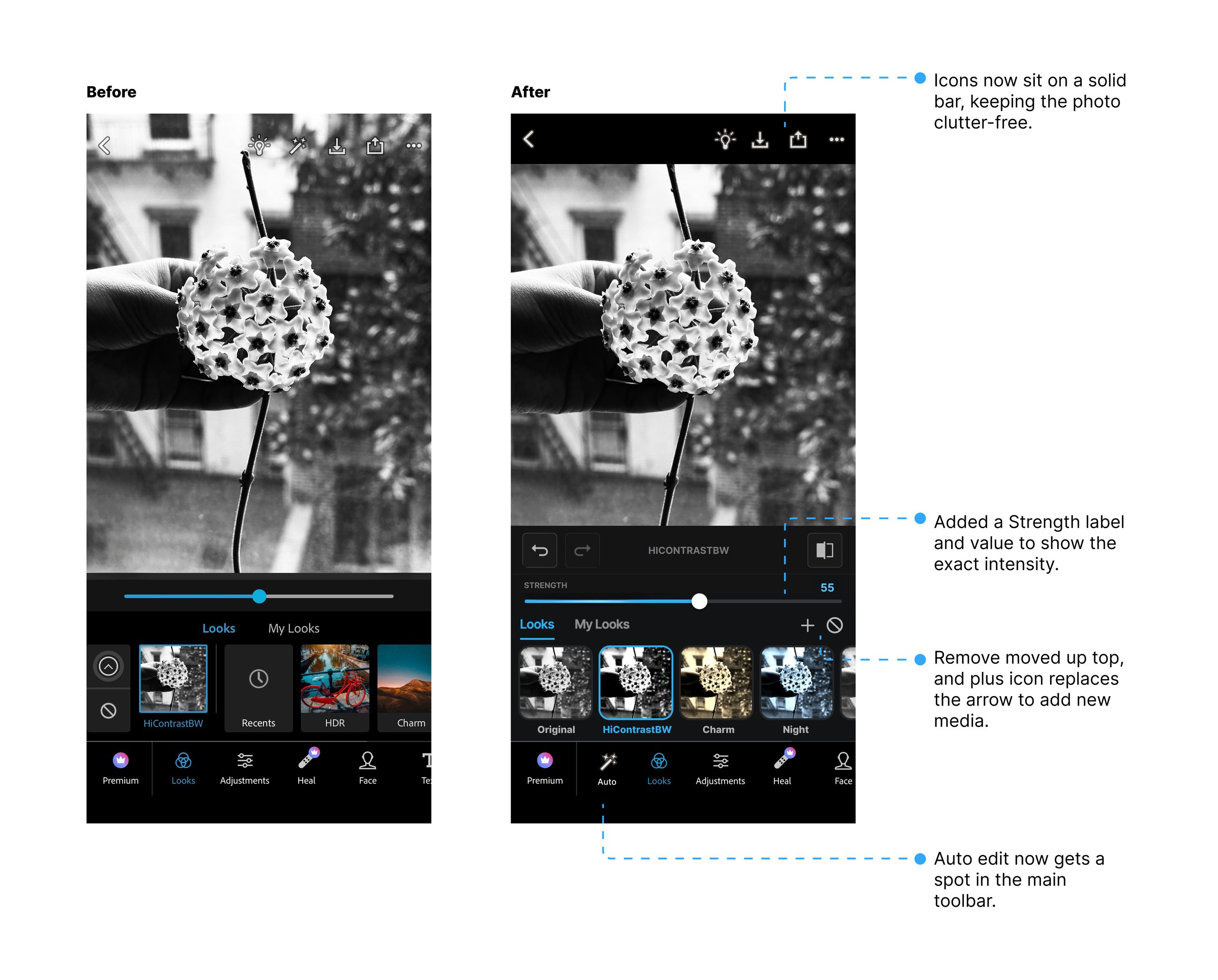
The redesign keeps the photo clutter-free by moving the top icons onto a solid bar so they no longer overlap the image. The Auto edit feature gets more visibility as its own tab in the main toolbar. The slider now shows a “Strength” label with a numeric intensity value, so users know exactly what level they’re on. The remove icon has moved up beside the Looks tabs, and the arrow icon is replaced with a plus, which more clearly signals uploading new media.
So, is it really “Express”?
Partly. The editing itself is quick, and a lot of the app is well designed. It follows conventions people already know, keeps the controls close to what they affect, and makes almost everything reversible, so you can experiment freely.
What lets it down is communication and discoverability. The app is good at doing things and less good at communicating what it can do, which means a fair share of the time you save on the edit goes back into working out where things are and what just happened.
Where I’d take this next ?
Right now undo is linear and blind, you tap, tap, tap and hope you land on the right state, which is sometimes frustrating.
I’d like to build a new ‘Undo Rewind’ feature that is similar to Chrome’s back button: a quick tap still undoes one step, but long-pressing opens a popup showing your edit history as a scrollable stack of thumbnail previews. You see exactly what each state looked like, tap the one you want, and jump straight to it.