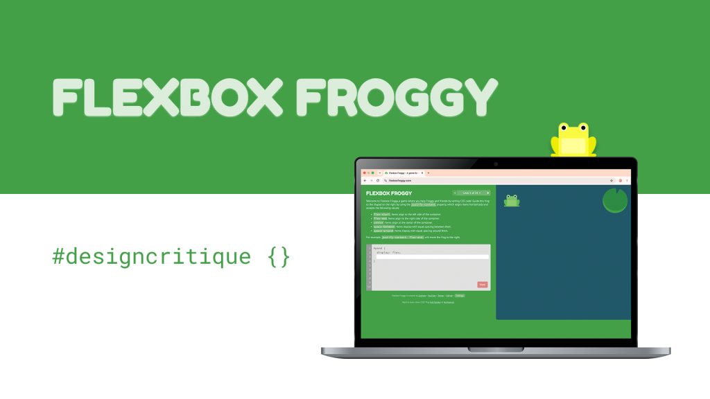
Can learning to code actually be kind of fun? Flexbox Froggy is a website that teaches CSS Flexbox through gameplay across 24 levels. The task is to move the frogs to their corresponding lilypads using CSS properties. As levels progress, it gets more challenging, from using one property per level to combining up to four in the last level. Users can choose between different difficulty settings. There are two types of users who might land on this website:: Beginners learning CSS and experienced users looking to practice or explore. This design critique focuses on the beginner user group and uses the Beginner difficulty setting.
I’m new to CSS myself and have always found coding quite intimidating, but I genuinely enjoyed exploring Flexbox Froggy. It was very satisfying to complete all 24 levels. According to Reddit, it’s apparently the best way to learn Flexbox! I’d recommend giving it a try if you’re looking for a more interactive way to practice CSS.
View my first impression here
What works
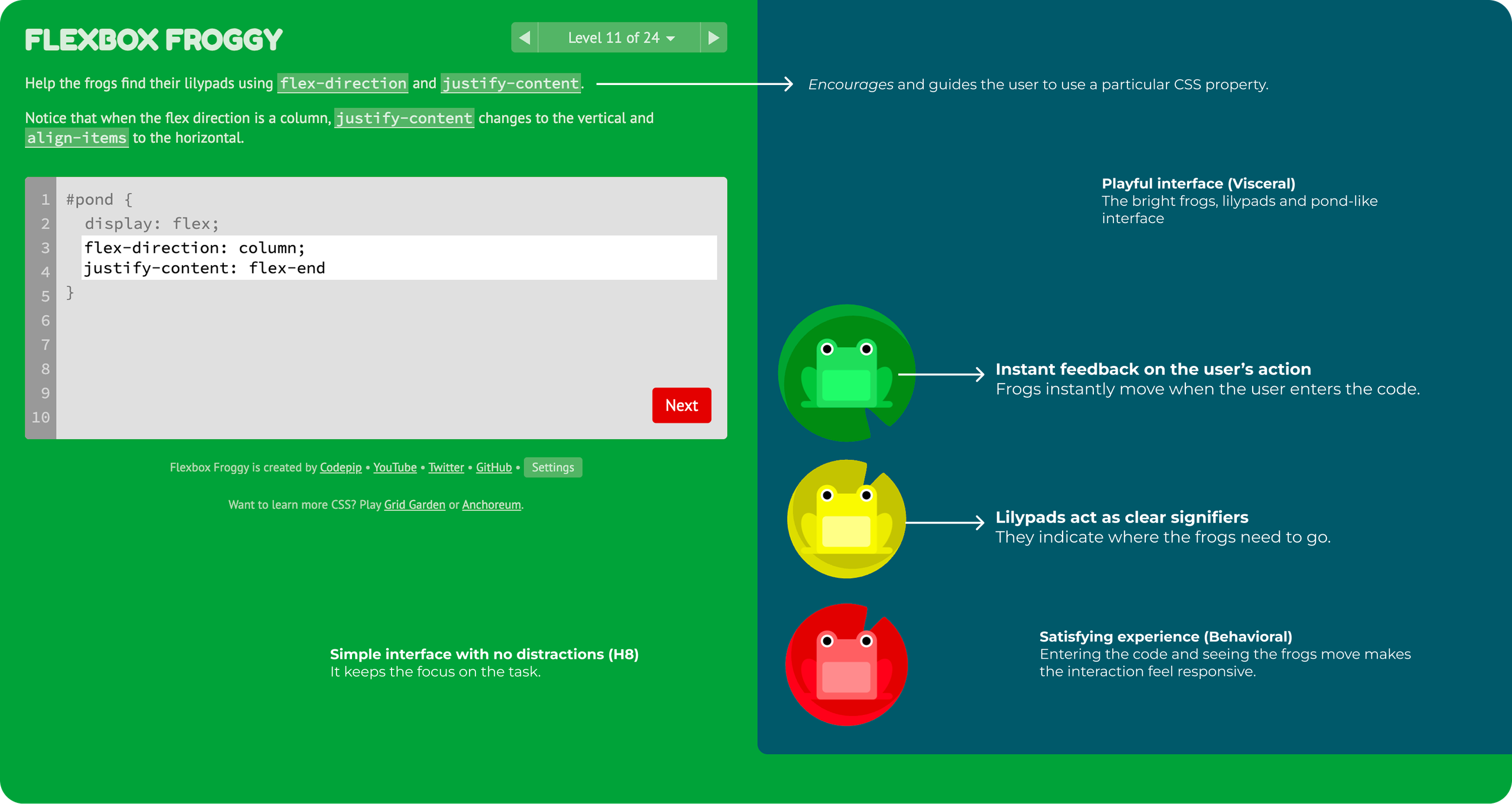
Instant feedback on the user’s action
When the user enters the CSS code, the frogs move accordingly, whether the code is right or wrong. The feedback is continuous and instant. The user can immediately see what happened and tell whether the code worked based on the frogs’ placement, bridging the Gulf of Evaluation.
Lilypads act as clear signifiers
When the user opens the website, they see a frog and a lilypad. It’s intuitive that the aim of the game is to place the frog on the lilypad just by looking at the board, even before reading the instructions.
What could be improved
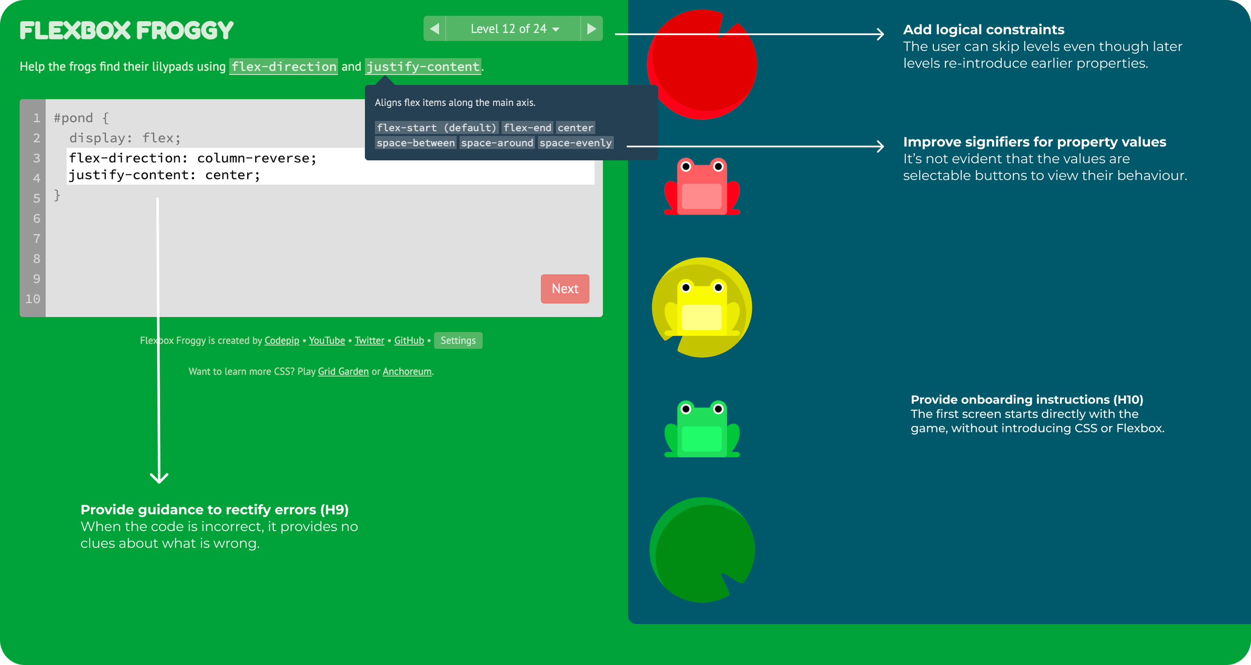
Improve signifiers for property values
In every level, the interface suggests which properties can be used to solve it. Selecting a property opens a popup which explains its function and the values it accepts. However, the popup looks like a description, so it’s not obvious that the values are selectable buttons and that choosing one will show its behavior. This makes the interaction less discoverable. The button design may have been a deliberate choice to keep the visual language consistent with actual CSS syntax. However, I would design them to look like buttons while maintaining the same font.

Provide feedforward: The user also has to select each value individually to see its effect. I would add a hover effect that would allow the user to preview a value’s behavior before selecting it.
Provide guidance to rectify errors (H9)
When the user enters an incorrect code, there’s instant feedback because the frogs are not on their lilypads; the “Next” CTA button also remains disabled. However, there’s no guidance on which property needs to be fixed. I would add an exclamation mark beside the relevant property’s line to indicate what needs correction; the user can then use the property values popup to resolve the error.
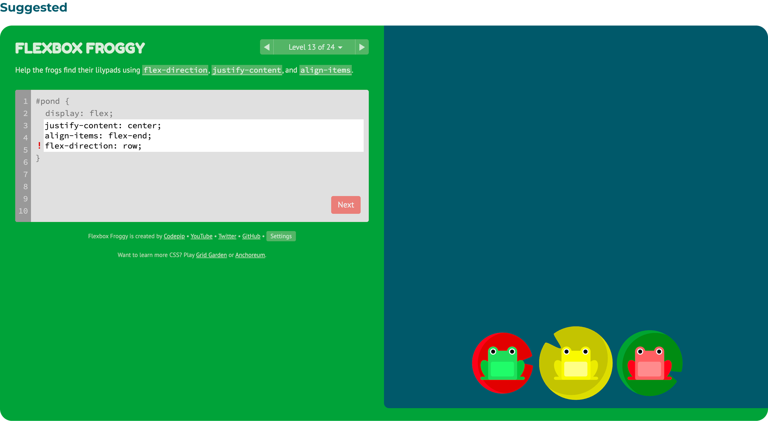
Add logical constraints
The interface allows users to skip through levels. As the levels progress, the tasks get more complex and later levels re-introduce previously learned properties. This suggests that the game is structured to be completed progressively, level by level. I would add a logical constraint that restricts users from advancing until the current level is completed.
Provide onboarding instructions (H10)
The interface opens directly into the game with a short introductory paragraph. Although the task is clear, it does not explain the concepts of CSS or Flexbox. For a user who’s completely new to CSS, it may feel abrupt and make them question if they have entered the website correctly. The sequel to Flexbox Froggy, Grid Garden, provides an introductory screen with learning objectives and a video. The design rationale for skipping it for Flexbox Froggy may be that Flexbox is a relatively straightforward concept to learn through gameplay. However, I would add an onboarding screen to give beginners some context and help them start with a clearer conceptual model.
Conclusion
Flexbox Froggy is a fun way to learn CSS Flexbox. I personally like the different difficulty settings that adapt the experience according to the level of CSS familiarity. I also found the colourblind mode to be a useful accessibility feature.
Users often have to rely on trial and error to test different property values when they do not remember how a value behaves, which reduces feedforward. However, since the feedback is instant, this friction enables learning.
As Norman notes, discoverability and understanding are integral to good design. With improvements like clear signifiers and error guidance, the website can better support beginners.