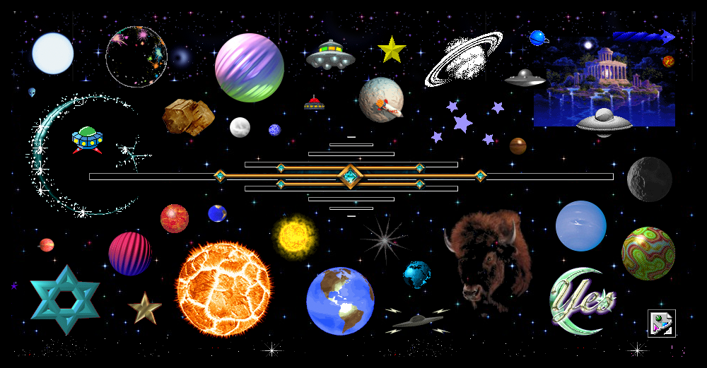
Cameron’s World, often referred to as “A love letter to the internet of old,” is a web collage of GeoCities pages, filled with neon colors, animation, hyperlinks, text, and images from 1994–2009. The creator, Cameron Askin, wanted to capture how websites used to look back in that era. It was a time when a website could still be “under construction,” and that would be perfectly acceptable. It’s a stark contrast to how the development of websites is approached today, where many websites are heavily branded, follow certain guidelines, and adhere to UX rules. Cameron’s World functions as a sort of time machine, where websites were allowed to be messy, personal, and distinctly human.
At first glance, the user is met with a space interface. Then, upon scrolling down, different themed sections and colors begin to reveal themselves. One of the site’s main design elements is its usage of thematic sections/blocks as a way to group differing themes and aesthetics together. I later discovered that the grouping of aesthetics was an intentional design choice on Askin’s part, where he organized sections according to recurring themes he saw popping up in old GeoCities neighborhoods.
Norman’s Design Principles
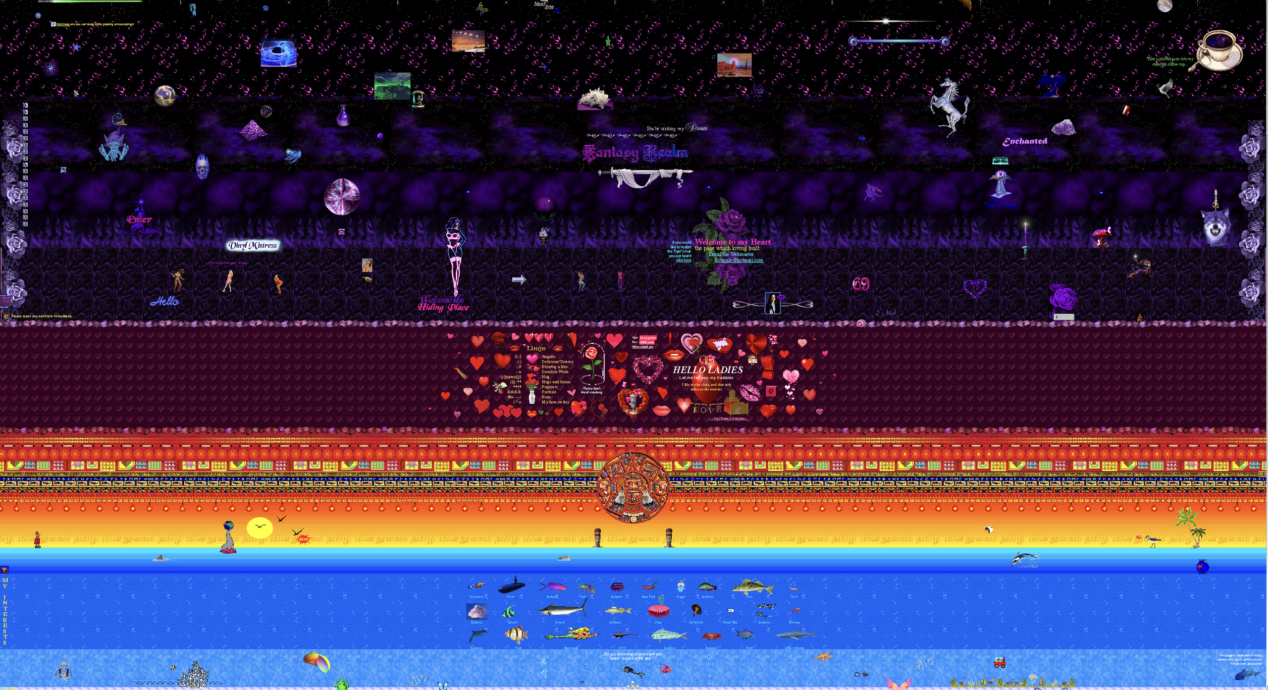
Cameron’s World is a good example of Norman’s conceptual modeling. The website reveals how the system works because a pattern starts to emerge when scrolling through the website. There are different sections and themes, such as a space section, a “sleazy” section, a love section, and more. The user cannot predict what can be shown next, but can reasonably predict how that content will be organized.
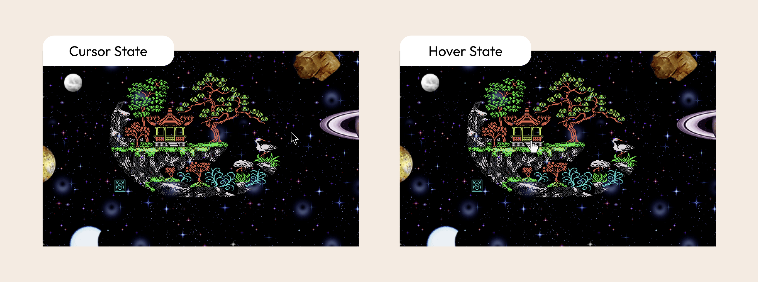
Moreover, the website has thousands of links to planets, fish, houses, figures, and more. For instance, when hovering on an element, the cursor changes to a pointer, signifying to the user that the element is clickable. This is a classic example of Norman’s signifier.
Usability & Accessibility
Despite the many good uses of Norman’s concepts, Cameron’s World is not without faults. In my experience, when first using the website, my understanding of it was weak, especially when having to use it without context. At first, I was unsure of what to do and what the website meant. I would consider discoverability low, as it was not clear what the site was intended for, nor what the user was expected to do. It was not until I noticed the cursor turned into a pointer that I knew that the website was interactive. After some exploring, I clicked on a planet that unexpectedly provided a brief description of the website before scrolling down, which helped my understanding.
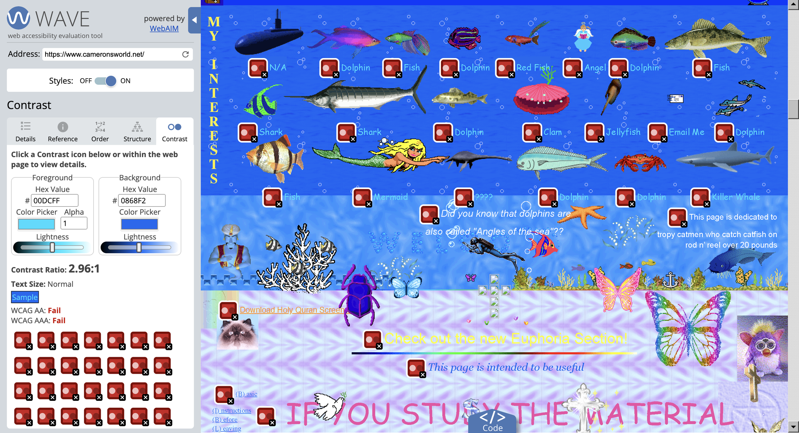
For a first-time user, the visual hierarchy may feel overwhelming, as there are many things competing for the user’s attention. The website presents problems for accessibility as well. For instance, the text may be difficult to read for some users. WAVE measured that light blue text against the blue background at 2.96:1, when WCAG Success Criterion 1.4.3 requires normal-sized text to reach a minimum of 4.5:1. This is one particular criterion of WCAG that Cameron’s World fails.
An additional problem I ran into was when clicking on some elements, the music began playing unexpectedly, without clicking on the volume button. This demonstrates poor feedforward, as the user is not able to anticipate that the music will play after clicking on an unrelated element. (The video attached above shows the problem.)
Design Solution
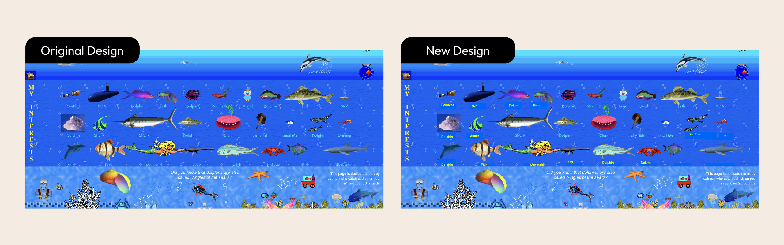
Despite Cameron’s World’s poor design choices, they do not inherently make it a bad website. The chaos and randomness of the site are what make it uniquely Cameron’s World. It is not meant to be structured perfectly or adhere to UX standards. But taking that into consideration, I found myself asking the question: how do I design a solution to a design problem when the experience was intentionally designed to be chaotic? I did not want to design something that, in effect, made it lose the essence of what the site was supposed to be.
This led me to redesign the color of the text. Instead of the light blue text against the blue background, I decided to change the text to yellow, staying within the theme of the section but optimizing for readability.
Conclusion
Cameron’s World is a chaotic website and displays weak points of Norman’s concepts, such as understanding, discoverability, feedforward, and more. However, the site also displayed good uses, such as signifying and conceptual modeling, which were harder to identify, but undoubtedly there. This site was interesting in the sense that the problems of the site were also fundamental to its identity. This was a great site to critique, as it allowed me to discuss specific problems the site had while still acknowledging those problems are what made Cameron’s World, Cameron’s World.