By Sofia Harmon
Using Don Norman’s design principles and concepts from his book The Design of Everyday Things I evaluated the digital interface of Citi Bike’s app, a popular app for bike and e-bike rentals in NYC. Although overall this app is very user friendly and well-designed, there are a few issues that can cause a bad experience for users according to Norman’s standards.
Support Center Icon
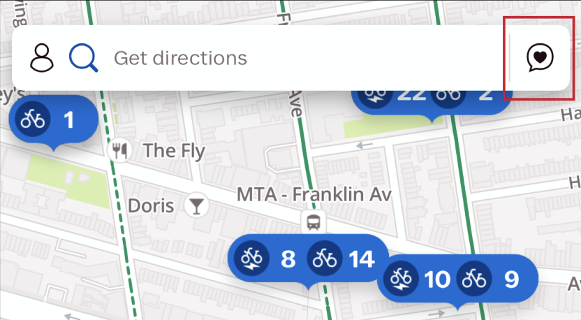
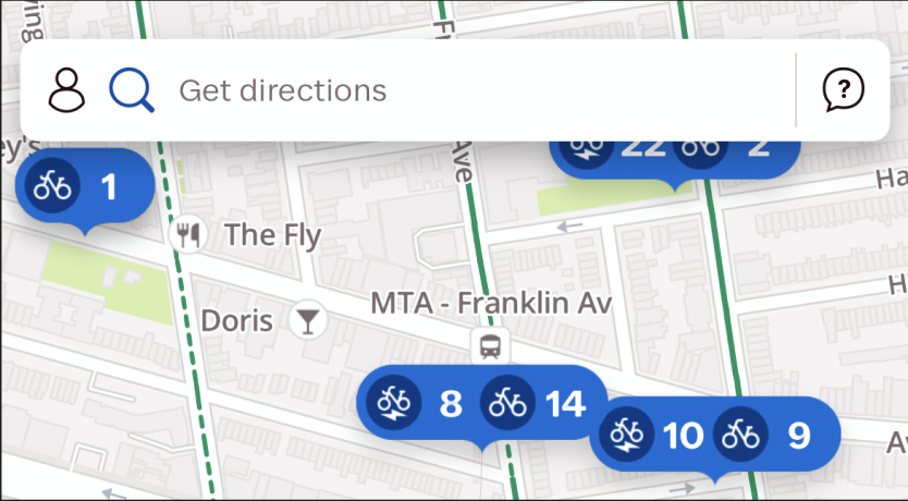
The support button for Citi Bike does not have the correct affordance makingit difficult to know how to find where the customer support lives. The button instead looks like something that would house notification in a social media app, potentially creating confusion for users who have experience with social apps. To avoid this confusion, they can simply replace the heart with a question mark in the chat bubble to represent that this is where you can ask for help.
This design requires depending on knowledge in the user’s head because they first need to click the button to learn its function and then store that knowledge in their head for future use. Assuming that contacting customer service is not an action frequently performed by one user, this can be tasking for the user to remember across multiple sessions creating confusion down the line when needing to find help.
‘Refer a friend’ Icon
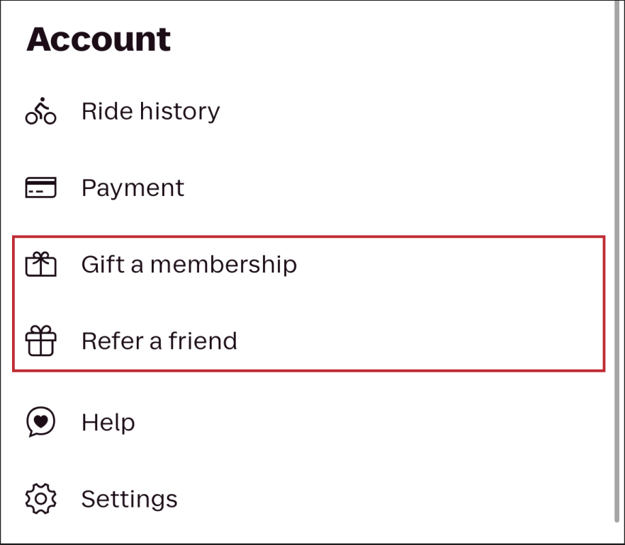
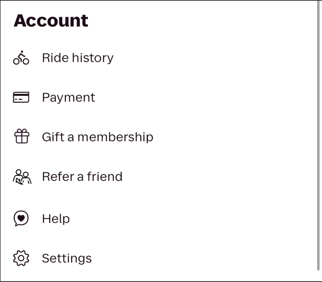
Under the account the menu, users are required to rely on the label to understand the meaning of the option ‘Refer a friend’ because the current icon (a gift box) doesn’t imply there is a referral action. If the label was not present, the user would assume this was an option for receiving of giving a gift. To add to the confusion, the option above is labeled ‘Gift a membership’ but the icon is less recognizable as a present than the one for referrals. To make this clearer, they can simply use the gift box icon for gifting a membership and choose a new icon for referrals that better represents the action of sharing with another user.
The visceral reaction to the gift icon in a typical user is to think they are receiving or giving a gift. Typically for receiving a gift the user does not expect string attached (like free promotional coupons). Therefore, on the behavioral level, when the user’s gift is gated behind the action of referring a friend, the user will experience confusion in not correctly predicting what the terms were going to be. Only on the reflective level does it make sense to a user that the gift icon represents the end goal and does not show the process of getting there.
Route Constraints
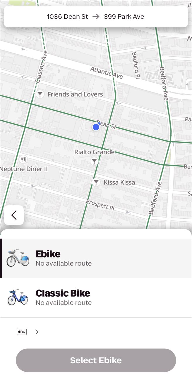
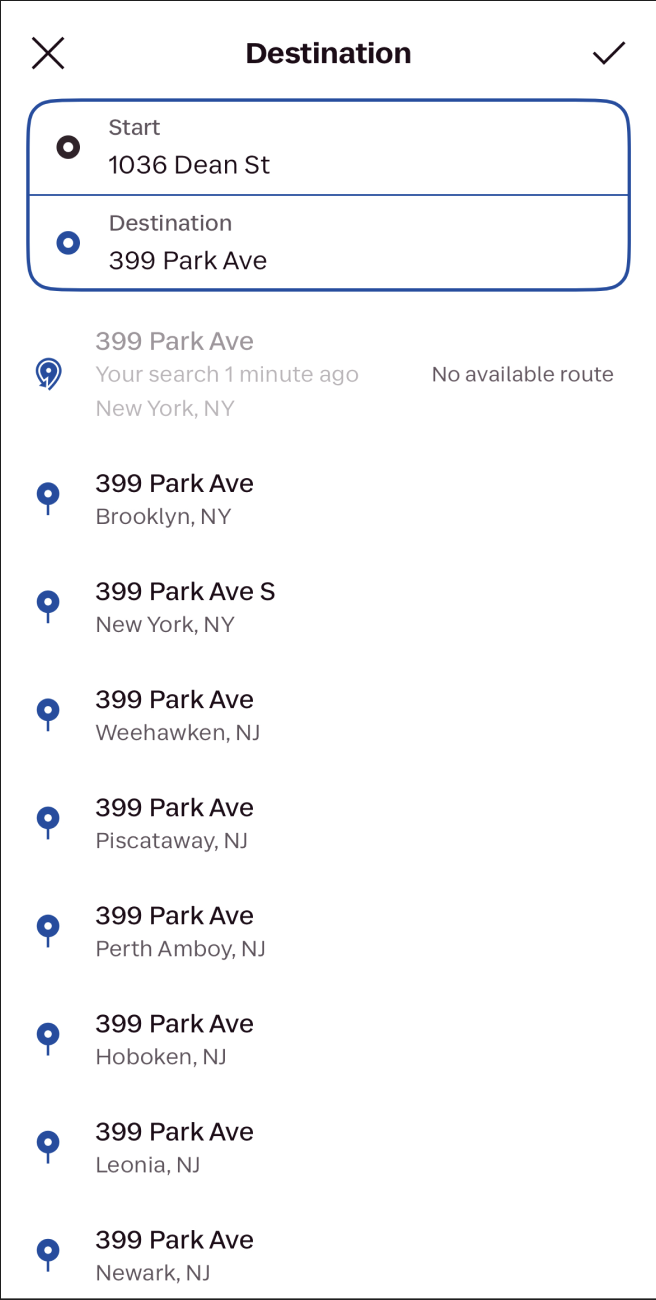
When routes are unavailable, users hit a dead end by searching and then finding a page that says no route available with no path forward except to go back and try a new search. To avoid this dead end, the app should either give a new option forward like search driving directions with an option to open a rideshare app (considering it is owned by Lyft) or integrate with MTA information to give public transportation routes. Another option would be to show the user that the route is unavailable before clicking into their search, so they never hit a dead end.
According to Norman’s seven stages of action, the app currently supports the goal, plan, specify actions but then fails to support the stage of perform for all use cases. In order to properly support all stages, the app should promote alternate routes or modes of transportation so a user is still able to perform their intended action (finding a route to a destination).