
Oura is a hardware and software company dedicated to making health a daily practice. The Oura Ring uses health sensors to capture round-the-clock physiological signals, offering personalized insights on physical health and well-being via their mobile app. Oura aims to help users understand their bodies better and confidently take action in everyday life.
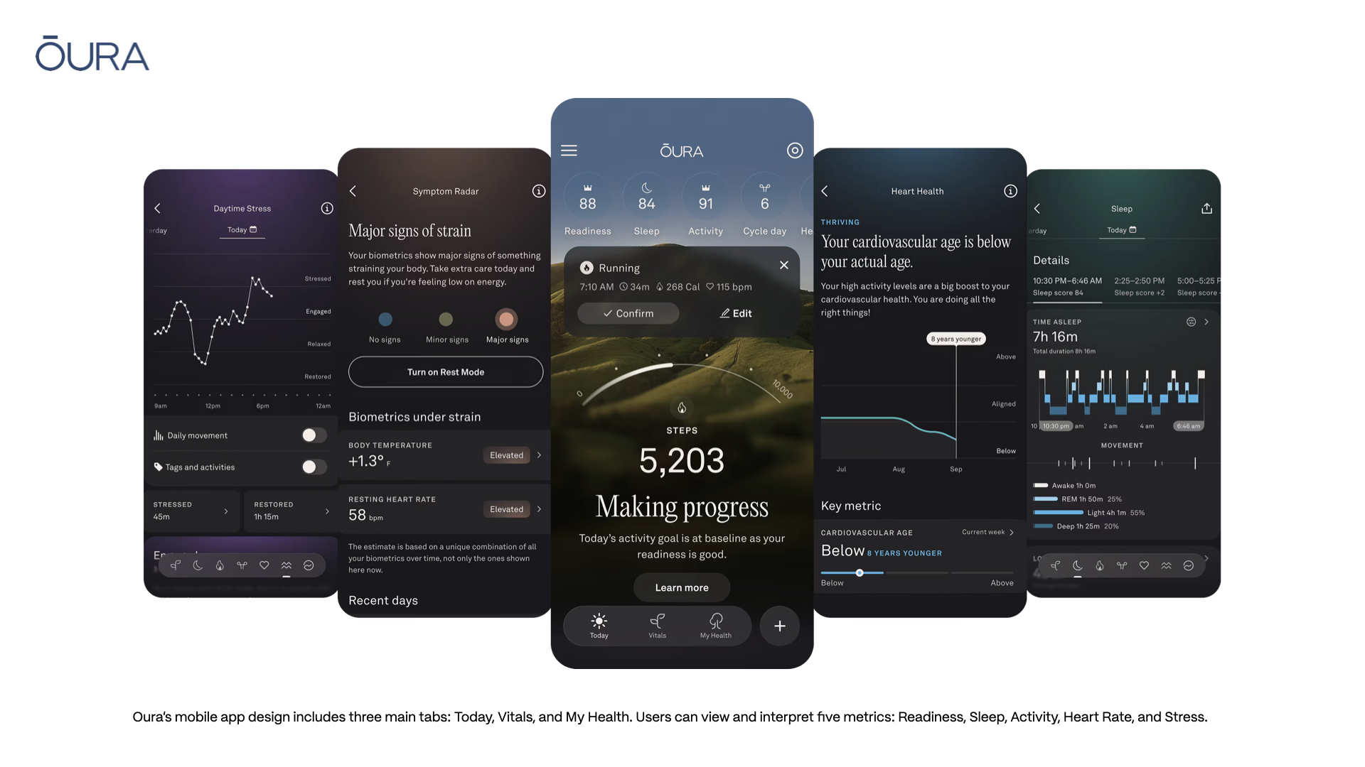
The app design includes three main tabs: Today, Vitals, and My Health. Users can view and interpret five metrics: Readiness, Sleep, Activity, Heart Rate, and Stress. Oura’s design system uses nature and body iconography and assigns numerical scales to each metric. The Today View displays a grouping of Shortcuts at the top, providing a quick glance at the five key metrics and the ability to dive deeper. Selecting a metric expands the view and provides more contributing factors. Tapping a metric shifts the group from the top of the screen to the bottom with the mapping in the exact same order. Strong visual feedback captures the user’s attention almost immediately and presents information quickly.
These signifiers create visual distinction between the three tabs and ensure consistency across the five metrics. This icon system fails with the use of a crown symbol, which indicates that a metric is within optimal range. This can be replaced with a star icon to maintain consistency with the nature theme. Oura’s simple conceptual model facilitates learning, discoverability, and quick navigation by leveraging the user’s knowledge in the world.
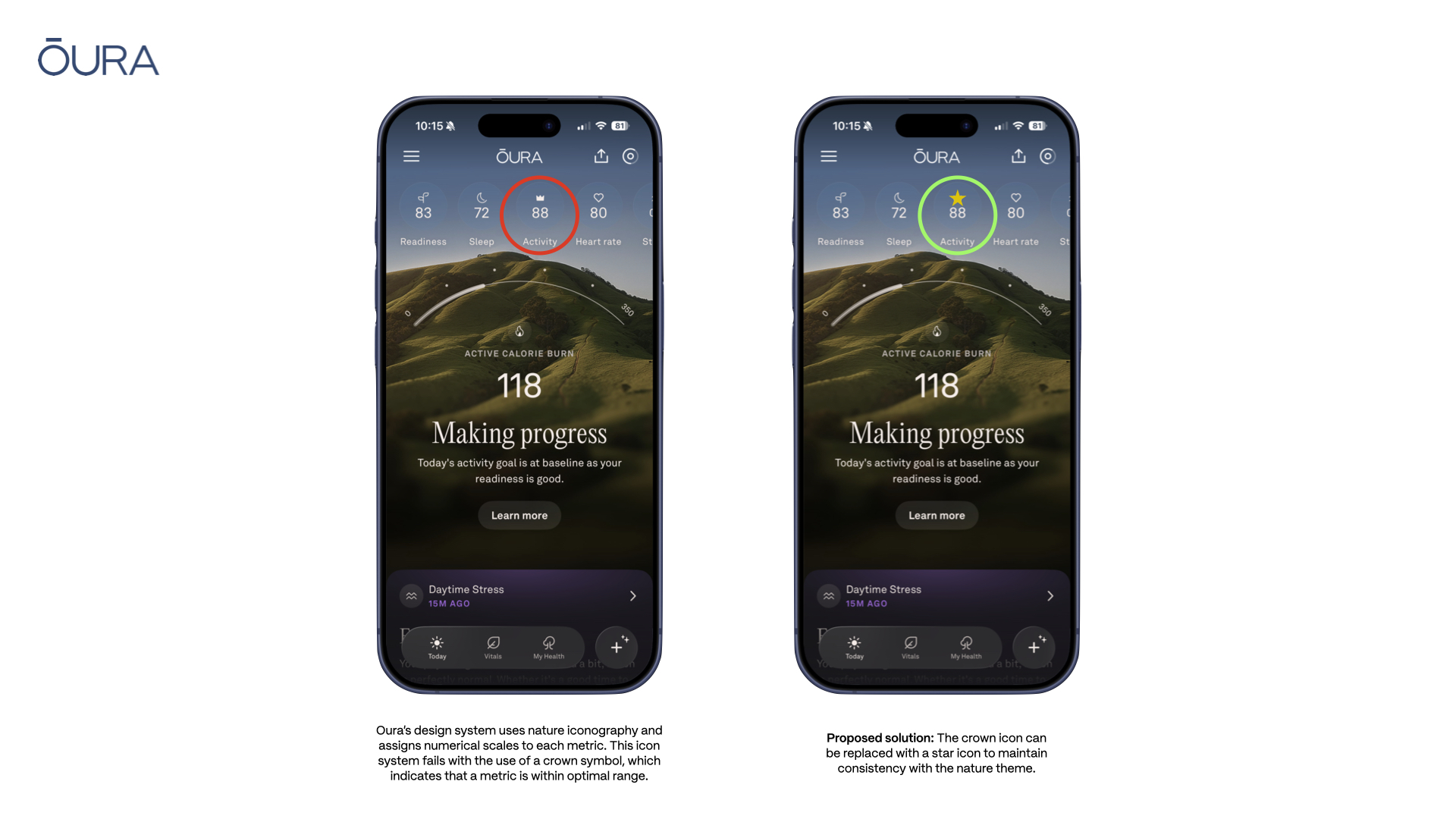
As the Today View dynamically shifts through nature scenes that map to the time of day, important health data with colorful feedback indicates whether a metric is within optimal range or not. The color palette used for Readiness, Sleep, and Activity is visually consistent, while the Heart Rate and Stress adopt slightly different views to better serve these data points.
Heart Rate and Stress emphasize a chronological graph that displays daily movement, and with the stress metric, the user has the ability to add tags. These tags don’t appear to have any effect on data evaluation or ratings, but they give the user the ability to provide additional context. This design decision can be viewed as an elegant solution by Oura to incorporate the reflective stage found within three levels of processing, and to empower users to reflect on how their emotional health can affect their physical health.
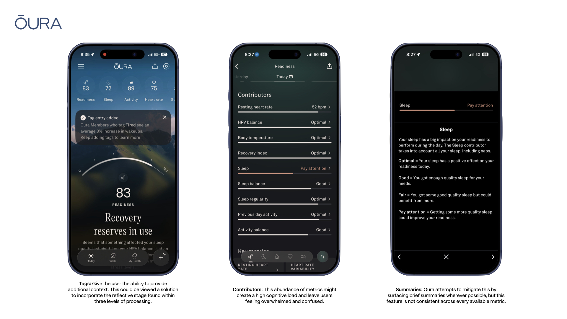
Despite Oura’s strong conceptual model, the overall design is unbalanced. With a strong usage of signifiers, groupings, mappings, the gulf of execution for users is narrow; the app is mostly designed in a passive way where the user is selecting and viewing different data points. While the system is providing the user with these data points with ease, the gulf of evaluation remains quite wide. As the user attempts to discover more about the five key metrics, they will discover that each metric has even more granular metrics that contribute to the score.
This abundance of metrics might create a high cognitive load and leave users feeling overwhelmed and confused. How do users know they’ve found the data they want or what to do with it? If they’re consistently in the optimal range, why continue using the product? How can users know which data points to take action with if their metric is consistently in a less-than-ideal range? Oura attempts to mitigate this by surfacing brief summaries wherever possible, but this feature is not consistent across every available metric.
How do users make sense of discoverable information in actionable ways? In Norman’s The Design of Everyday Things, he references studies on the human brain’s short-term memory and how it can hold five to seven items in a given moment, sometimes less if the user encounters distractions. How can Oura provide meaningful structure to these granular data points in a way that enhances the conceptual model already in place? Reducing the cognitive load and narrowing the gulf of evaluation are two areas where Oura has an opportunity for improvement. Creating a design system that better surfaces the already built in summaries and color palettes could help users figure out what to prioritize and how they can take action, and in turn, continue to maintain their optimal health and wellness.
Works Cited
[1] https://ouraring.com/about-us
[2] Norman, Don. The Design of Everyday Things: Revised and Expanded Edition. New York, NY. Basic Books. 2013.