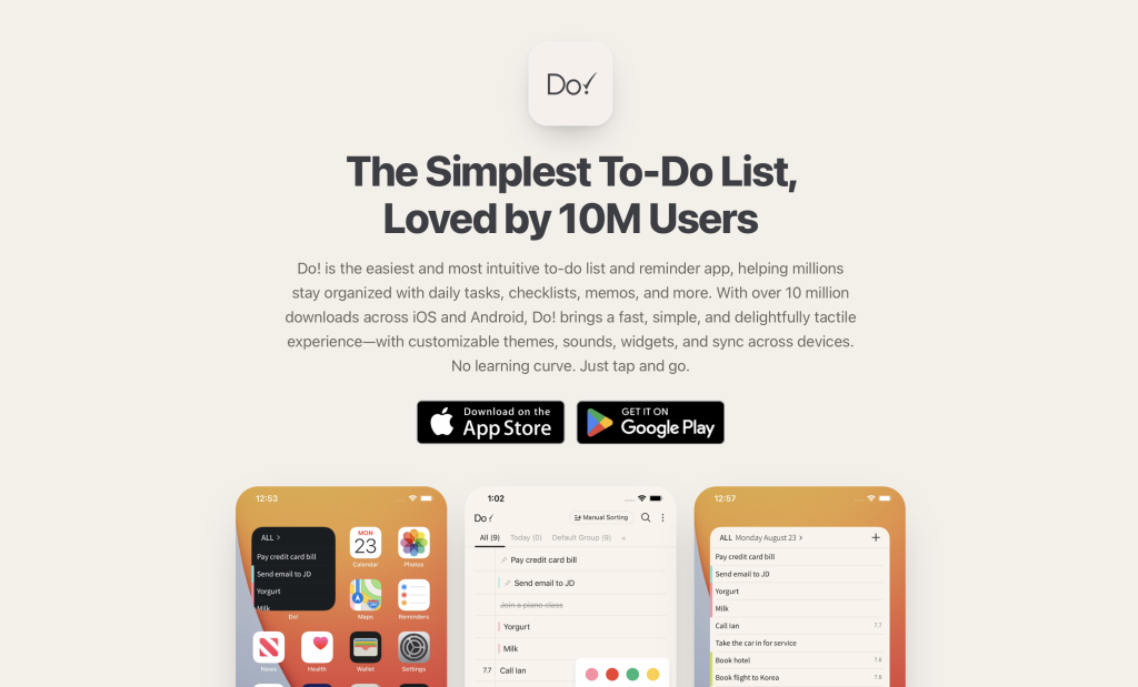
Do! is a free to-do and reminder app advertised for its intuitive interface. It allows users to create different to-do lists where each task can be assigned a category, date and order. The draw to this app is its simple, fast and delightful design that gives users a tool that requires minimal learning and an overall straight forward experience just like if they were to make a list on paper.
Adding a Task
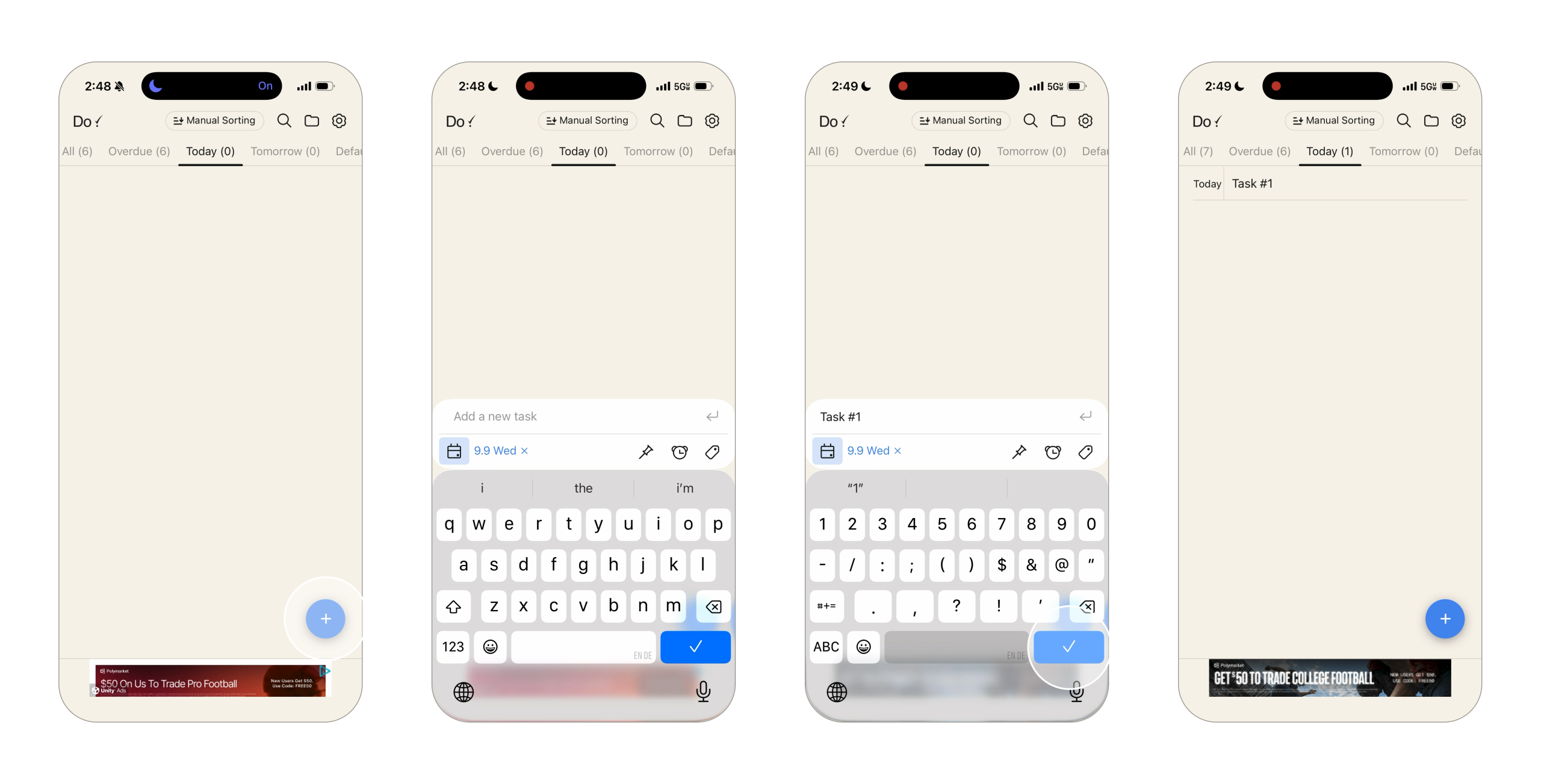
When users open the app, they are presented with a blank list with a large blue add button in the bottom right corner which acts as a strong signifier to the user that this is where they go to add a new task. The “+” icon in the circle also plays to the knowledge in the head since it is an icon we were taught to associate with adding information. When the button is clicked, a text box slides up from the bottom allowing them to add their task and adjust the settings.
The button’s size, color and placement makes it easily discoverable within the page. This design reduces the gulf of execution making the time it takes for a user to add a task minimal. Once the task is typed in and submitted to the list, the user can see it immediately show up which is the feedback showing that their action was completed successfully.
Checking-Off and Reordering Task
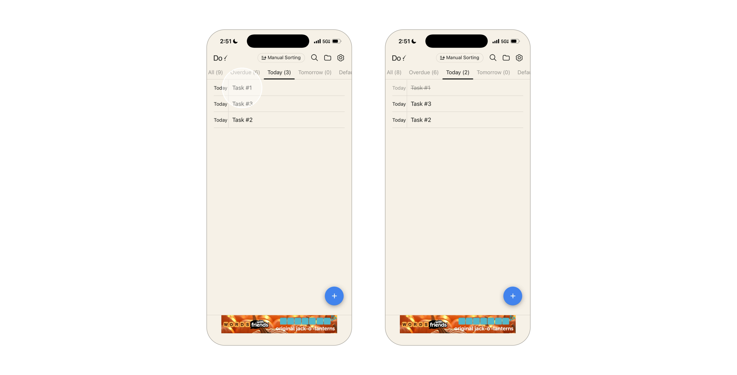
Once the user’s list is filled, they can now check off tasks, edit them and even reorder their lists. To check things off, users simply press the title of the task which follows a familiar cultural convention that many other to-do and listing apps follow. Since users have had similar interactions, they can apply their existing knowledge rather than having to memorize something new, which is one of Do!’s goals.
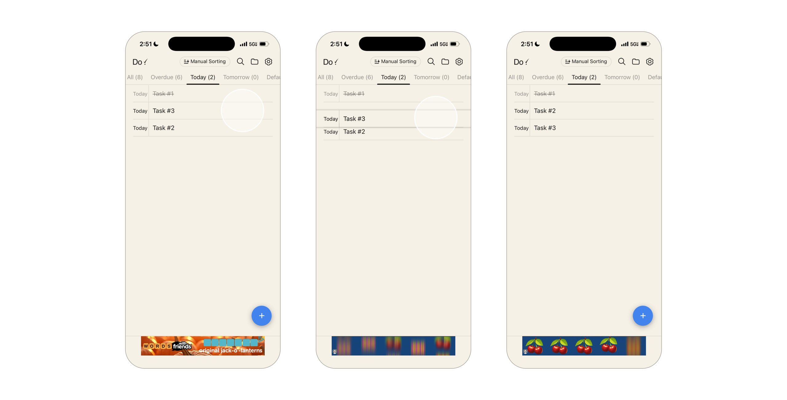
Reordering tasks is a great use of natural mapping since users can simply select and drag their tasks to their desired locations while watching it change in relation to the others. Both reordering and checking off tasks is a great example of immediate feedback since they both have visual cues showing that the system took into account their actions.
These features play a large role when it comes to the app’s overall goals of being simple, fast and delightful. Because of these design choices, there is little guess work when it comes to adding tasks and navigating lists making the experience quick and intuitive while keeping the interface clean.
Do! Lacks Transparency and User Control
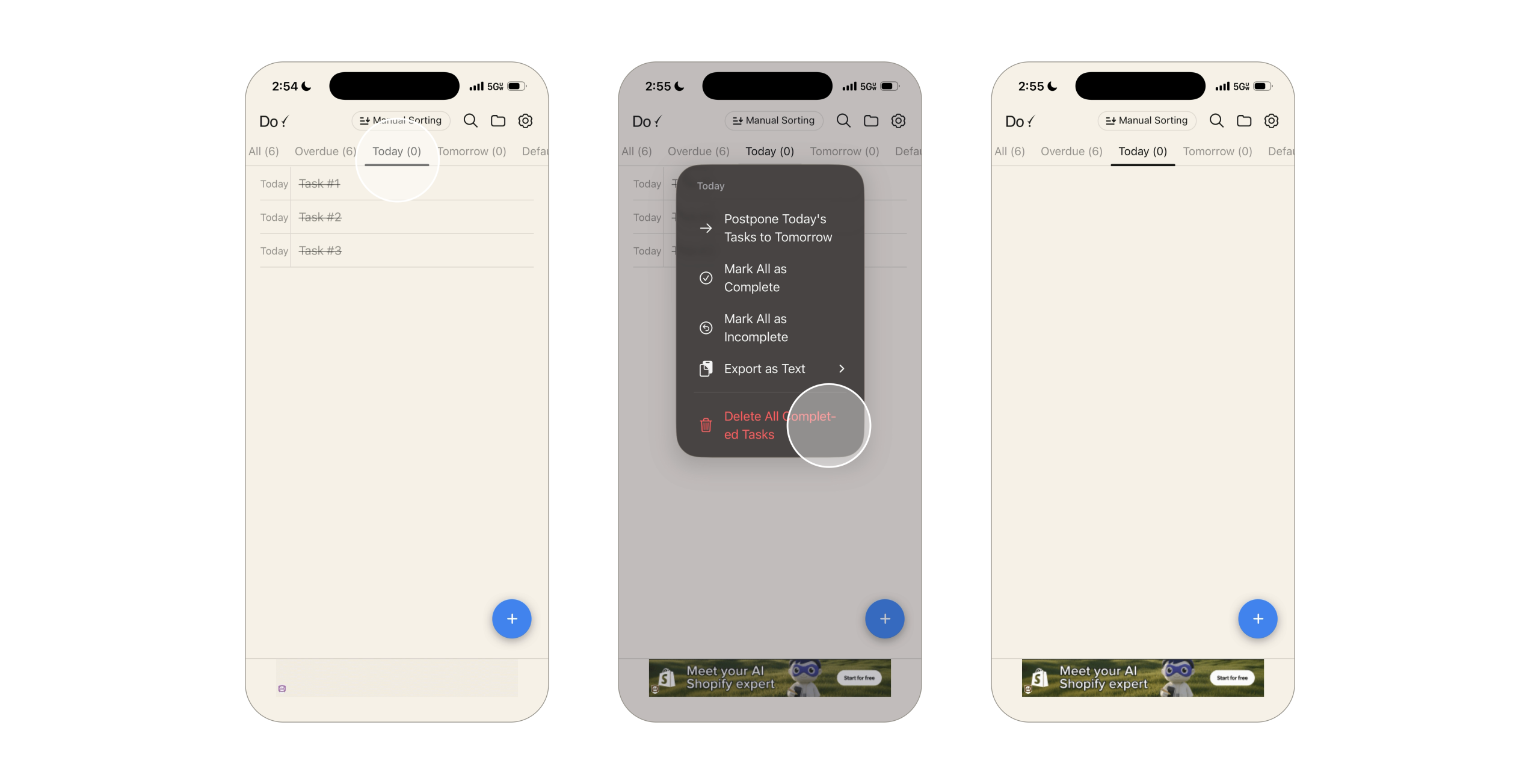
Although most simple actions are well displayed, many of the other features and settings remain hidden which leads to poor discoverability for the user. For example, there are no signifiers to share that you can mass delete tasks by pressing and holding the title of the specific list in the top bar. This makes the gulf of execution relatively wide because if users want to delete all completed tasks within the list, they will think to swipe and delete one by one rather than knowing the shortcut of pressing and holding.
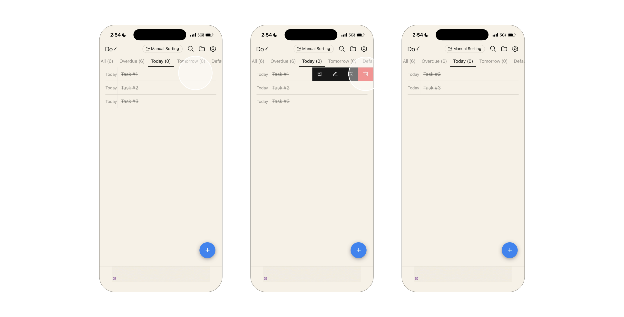
One way this could be fixed is by adding an edit button somewhere that implies that it edits the tasks under a list. It could either go in a section above the first task or in the bottom left across from the add task button signifying that it edits and belongs to the tasks rather than the whole list.
To Summarize…
Do! Describes itself as “the easiest and most intuitive to-do list and reminder app.” with the goal of being a fast, simple and delightfully tactile experience. Although the primary actions of creating lists and tasks are simple, many of the other features that set them apart from competitors are hidden and not as straightforward. Do! is a great app for someone looking for a simple way to keep lists, however they would have to give up some of their minimalist design if they want their other features to be more intuitive.