Introduction
YouTube Music is a music streaming application that allows users to search for and play songs, albums, playlists, and music videos. Drawing on about five years of experience as a YouTube and YouTube Music subscriber, I will examine both the strengths and usability problems of the YouTube Music mobile interface.
Youtube Music Home Screen
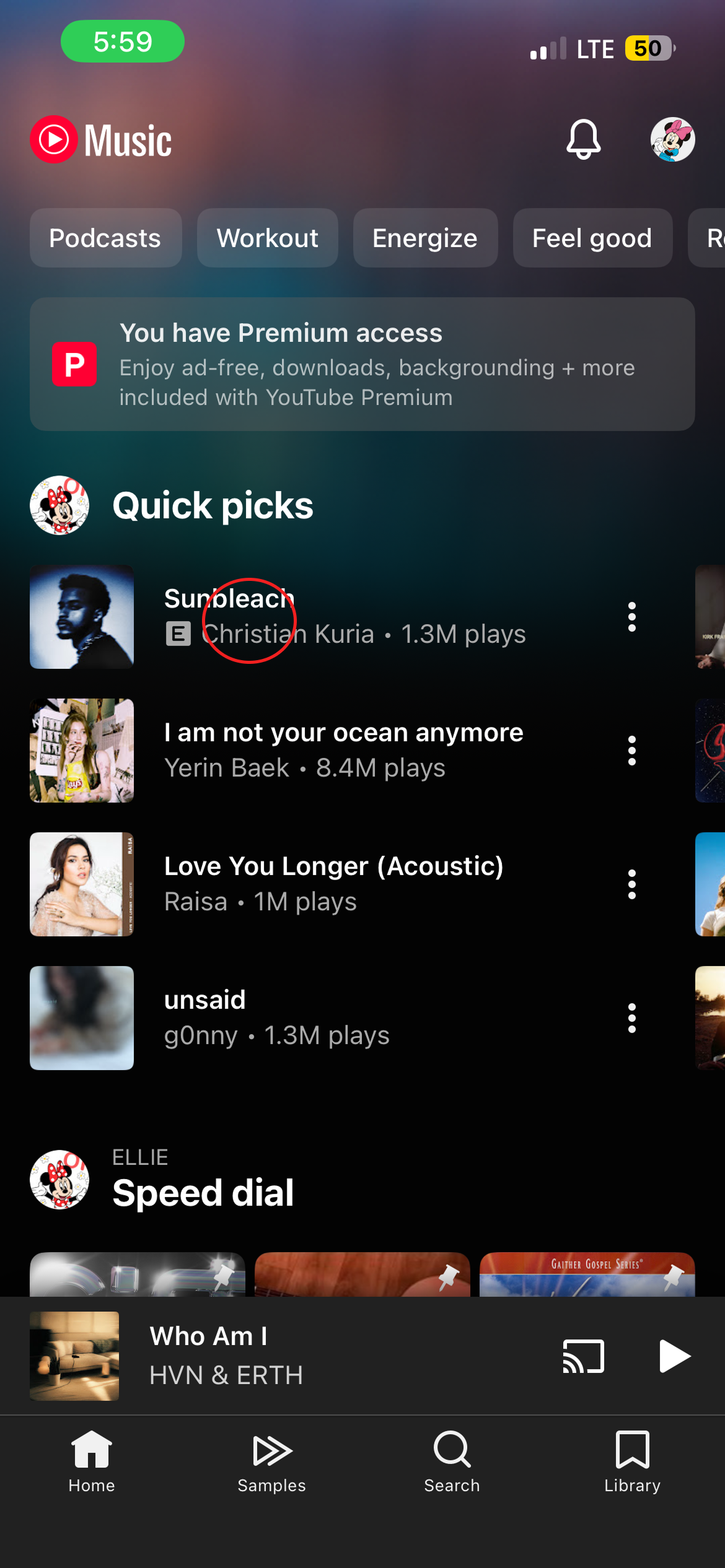
One of YouTube Music’s best features is its personalized home screen. When I open the app, the “Quick picks” section immediately shows songs that I like or frequently listen to.
Sections such as “Albums for you” and “New releases” also make recommended music easy to discover. The album covers, song titles, and artist names provide clear knowledge in the world, so users do not have to remember or search for every song.
These visual elements also support recognition, since users can identify familiar music through album artwork. As a result, the home screen reduces the user’s memory load and makes music discovery simple and convenient.
Easy Access to Personalized Albums
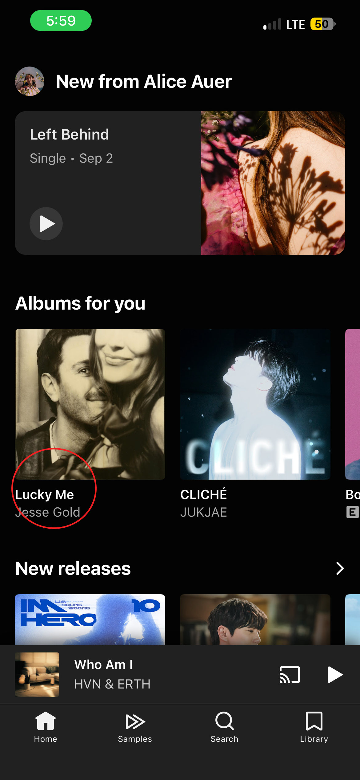
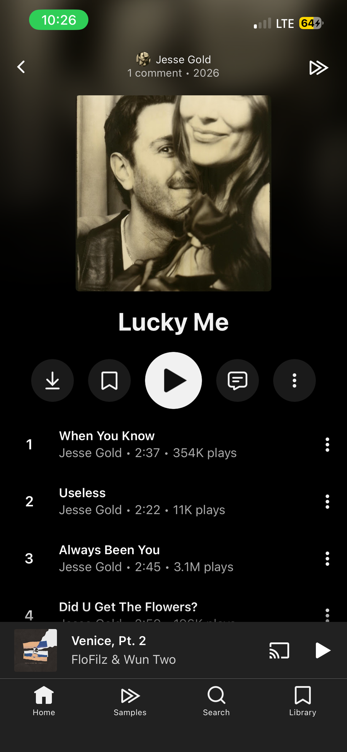
As users scroll down the home screen, the “Albums for you” section provides personalized album recommendations based on their listening history. The album cover, title, and artist name serve as clear signifiers that help users recognize each recommendation.
When a user taps a recommended album, the app immediately opens the album page and displays its full track list. This direct connection between the album shown on the home screen and the resulting page creates clear mapping and reduces the gulf of execution.
Users can access the entire album with only one tap instead of searching for the artist or album separately. The large play button on the album page also makes the main action easy to discover.
Adding a Song to a Playlist
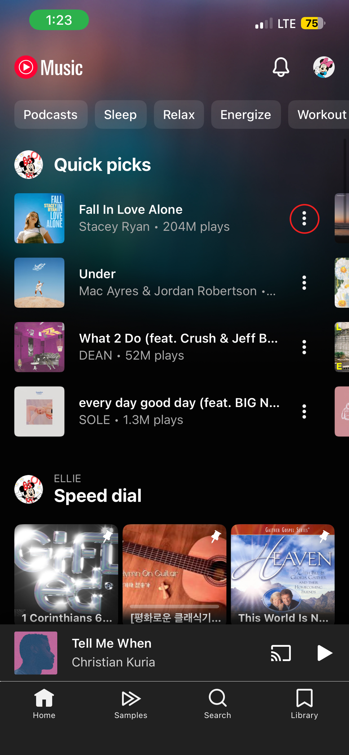
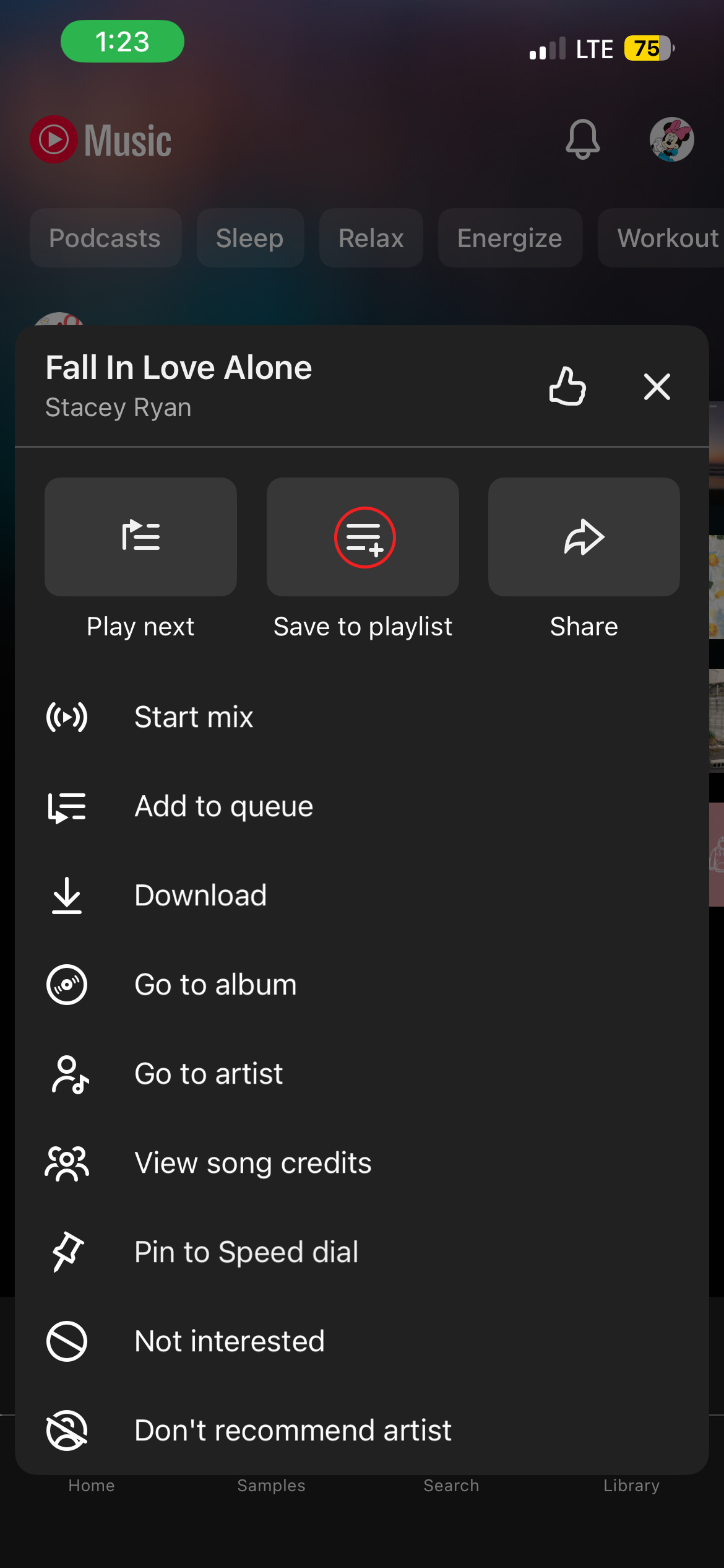
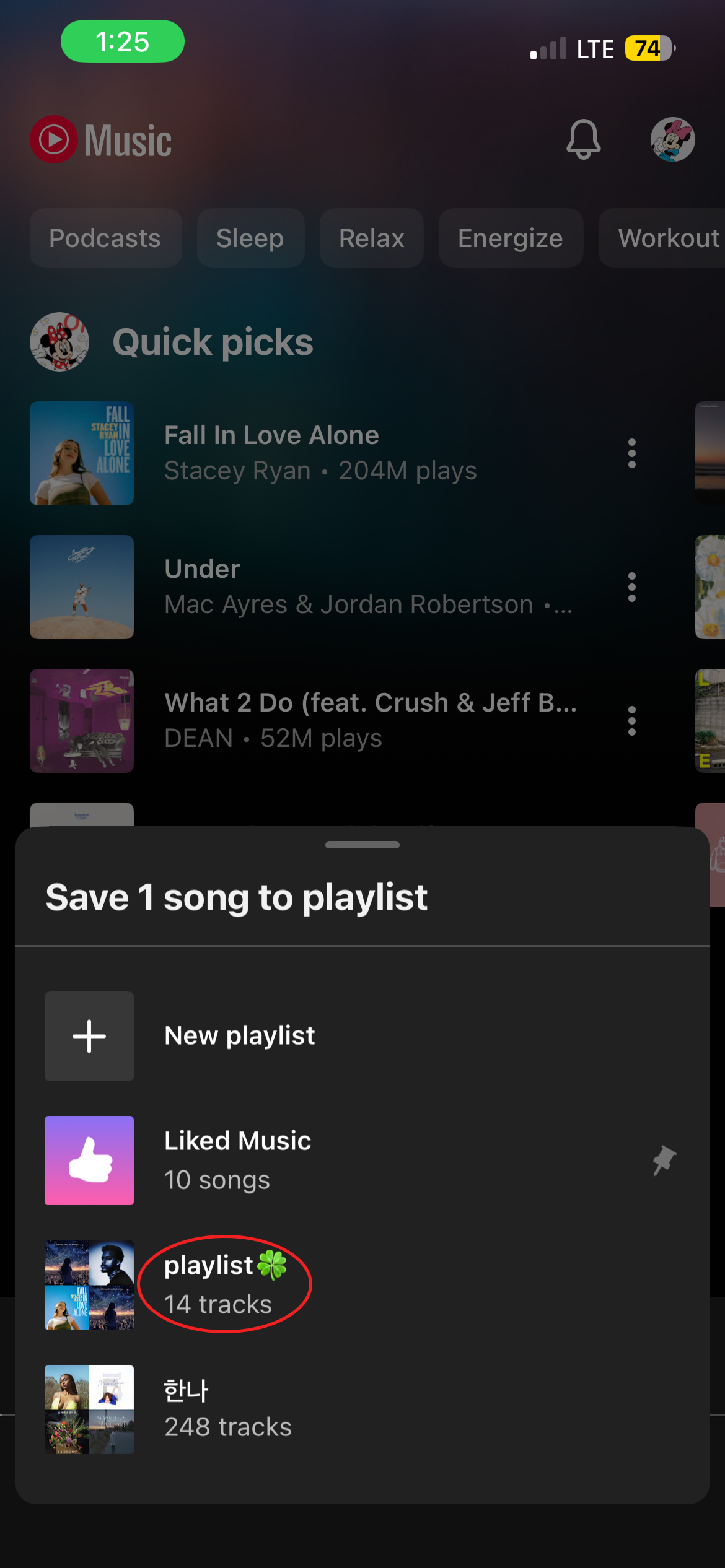
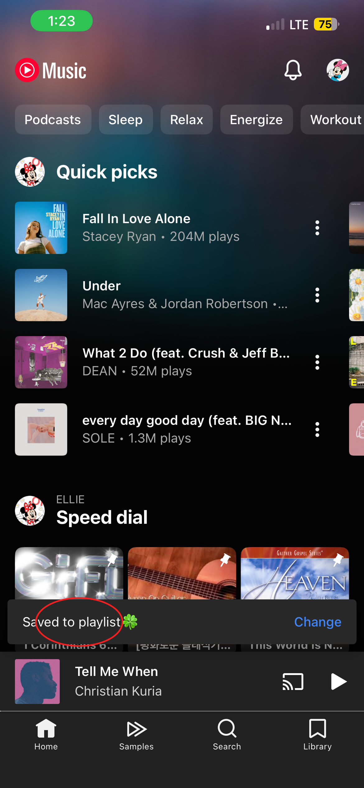
Adding a song to a playlist is not simple or intuitive because users must go through four different stages.
First, they must find and tap the small three-dot icon next to a song. Second, they must find “Save to playlist” among many menu options. Third, they must choose a specific playlist from another screen. Finally, they return to the home screen and receive a small “Saved to playlist” message. This long process creates a gulf of execution between the user’s simple goal and the actions required to complete it.
In my experience, it felt so inconvenient that I sometimes gave up creating a playlist. Although the final message provides feedback, it does not let users open the saved playlist.
To simplify this process, YouTube Music should place a small “Add to playlist” icon next to each song. This would improve discoverability because users could find the function without opening the three-dot menu. It would also reduce the gulf of execution by removing one unnecessary step between the user’s goal and action. After a song is saved, the confirmation message should include a “View Playlist” button. This would provide more useful feedback and allow users to check the playlist immediately instead of searching for it in the Library.
Unclear Organization of Albums and Releases
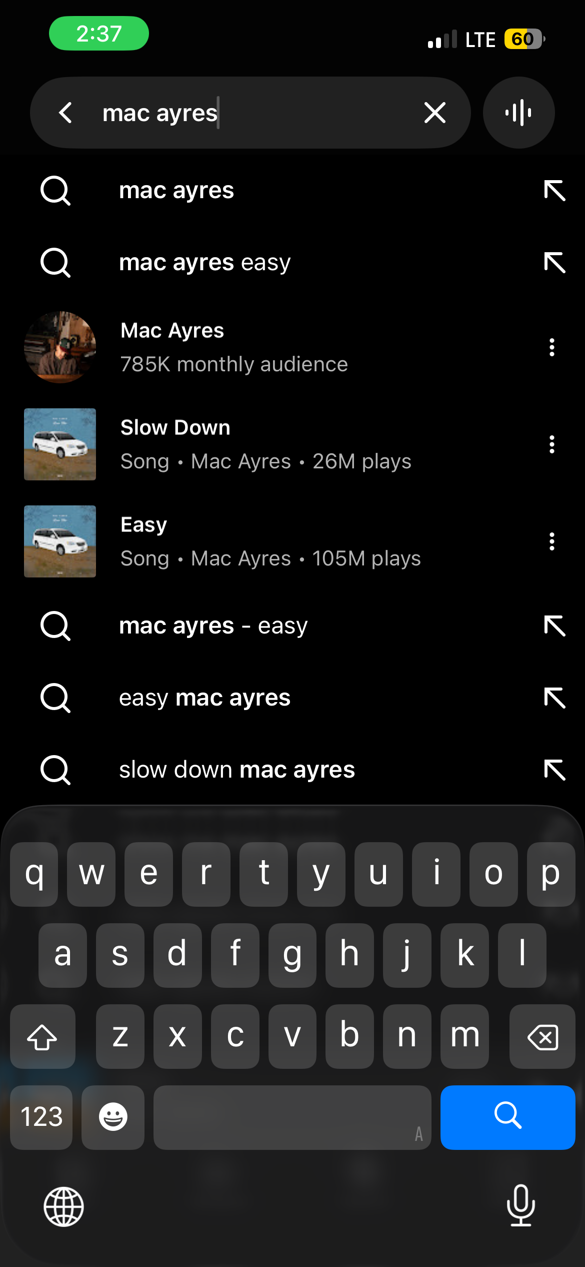
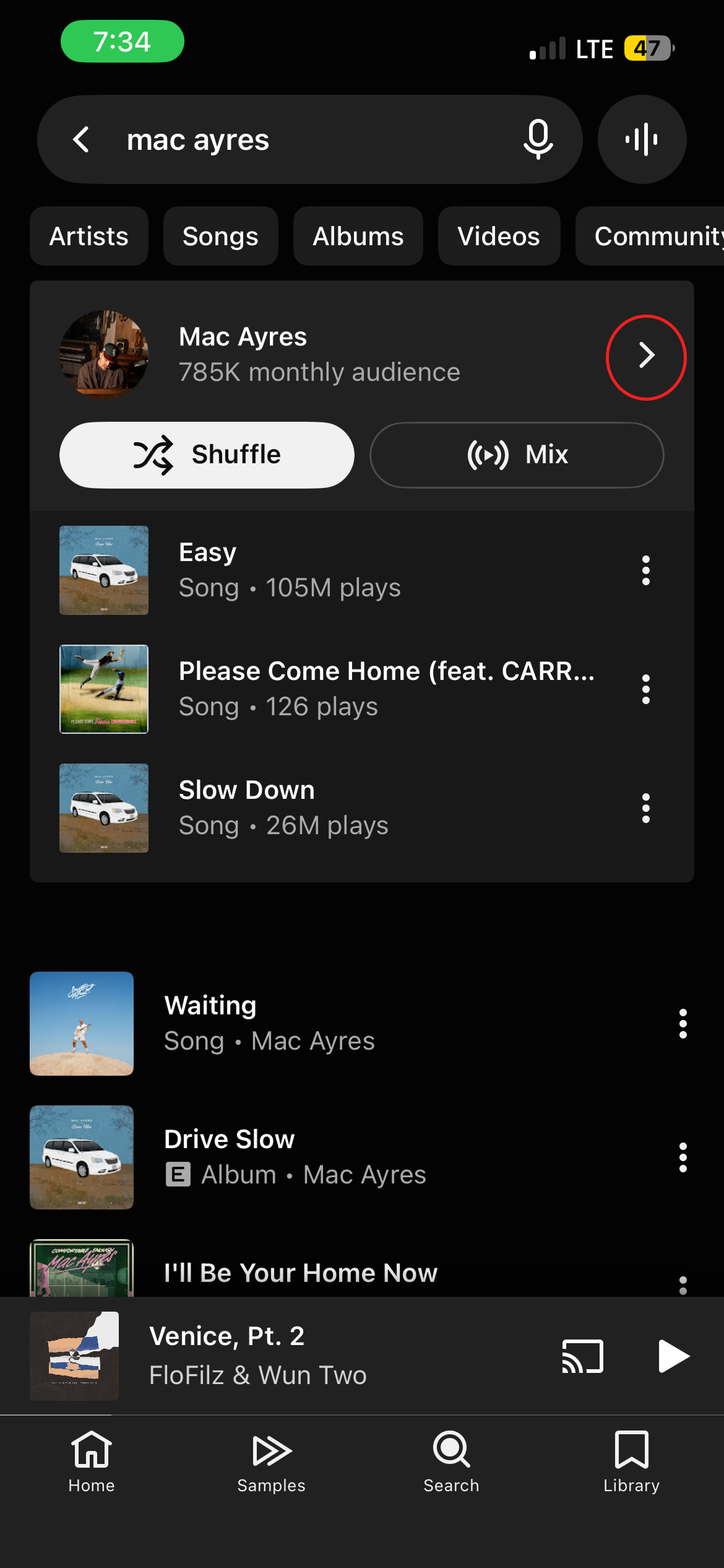
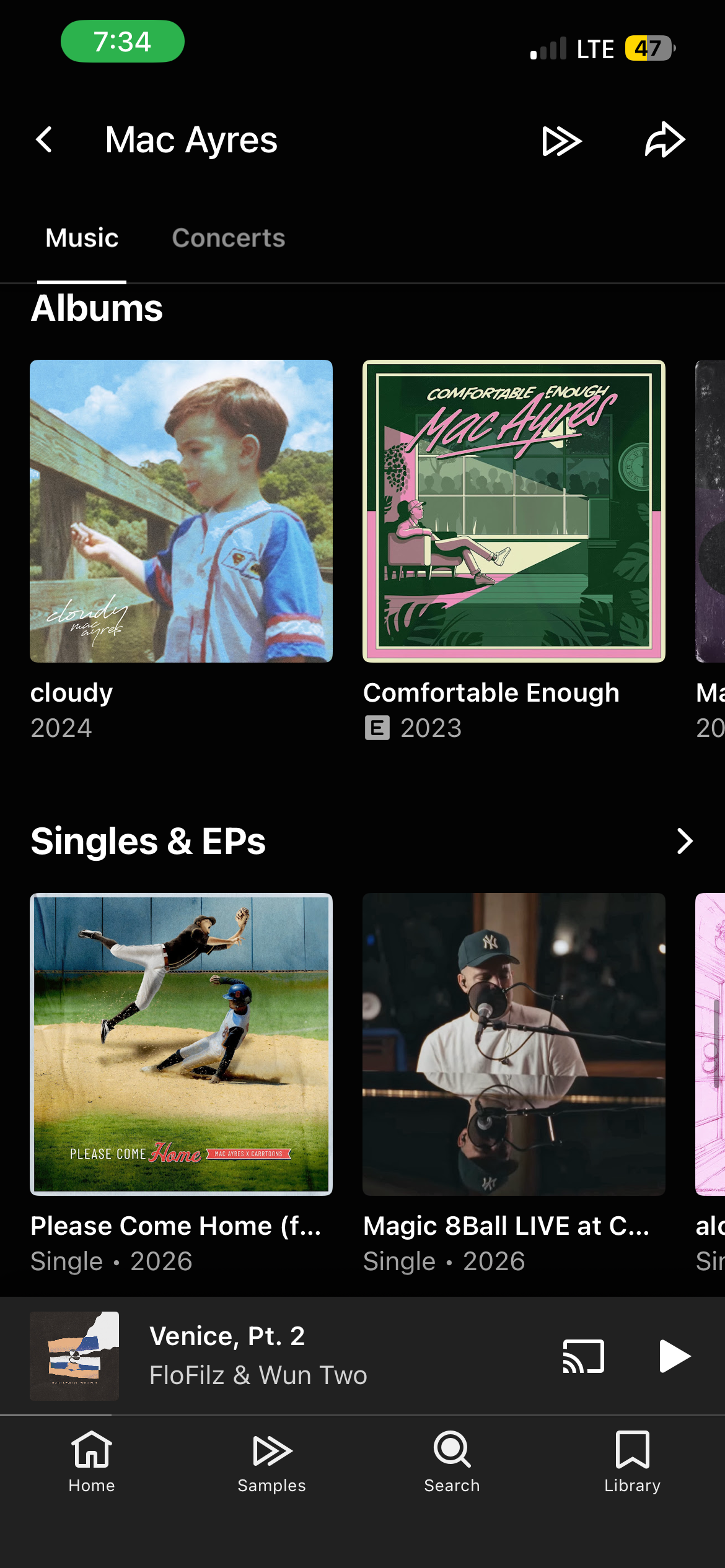
The organization of music on an artist’s page is not clear. After users search for an artist, YouTube Music shows a list of popular songs before showing the artist’s albums. However, this order does not clearly show which songs are new and which are older.
Full albums are also separated from “Singles & EPs,” so users cannot view the artist’s releases in one chronological list. This structure makes it difficult to understand when each song was released and which album or single it belongs to. It does not provide enough knowledge in the world and may not match the user’s conceptual model of an artist’s discography.
YouTube Music should combine albums, singles, and EPs in one section and organize them from newest to oldest. Each release should also display its year. This would make it much easier for users to understand when the artist began making music and when they released their most recent album.
Conclusion
From my experience, YouTube Music understands that listening to music is not only about searching for a specific song, but also about discovering music with little effort. Personalized recommendations, direct access to albums, and clear playback feedback make listening simple and convenient.
However, through this critique, I became more aware that the complicated playlist process and unclear organization of releases make the experience less intuitive when users want to organize or explore music more deeply. A truly user-friendly music app should not only make songs easy to play, but also help users create their own collections and enjoy music anytime without unnecessary complexity. To create this kind of experience, designers should always consider the user’s perspective, pay attention to moments of frustration, and continue improving the problems users actually experience.