
Partiful is a social event-planning platform that helps people create, organize, and join events. It also allows users to discover public events, connect with friends, and see what others are attending. Its playful and visually engaging interface makes event discovery and social interaction a central part of the experience.
📍Feature Navigation
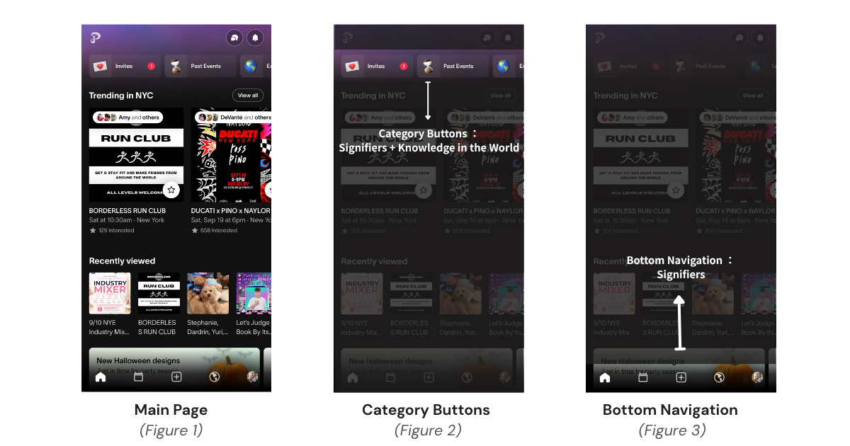
On the main screen, there are several Signifiers that indicate where users can interact with the interface, including the Category Buttons (Figure 2) and the Navigation Bar (Figure 3).
First, the Category Buttons (Figure 2) demonstrate both Signifiers and Knowledge in the World. They combine emojis, text labels, and button-like containers to demonstrate their functions. The emojis visually match the functions they represent, while labels such as “Invites” and “Past Events” provide knowledge in the world, allowing users to recognize each function rather than having to remember what each category represents.
This is also similar to #6: Recognition Rather Than Recall in Jakob Nielsen’s 10 Usability.
Second, the Navigation Bar (Figure 3) is another example of Signifiers. Familiar icons such as Home, Create (+), and Profile provide clear clues about the available actions.
However, the Calendar and Globe icons are less explicit, so users may need to explore them to understand what functions they represent.
📍Host Event Management Page
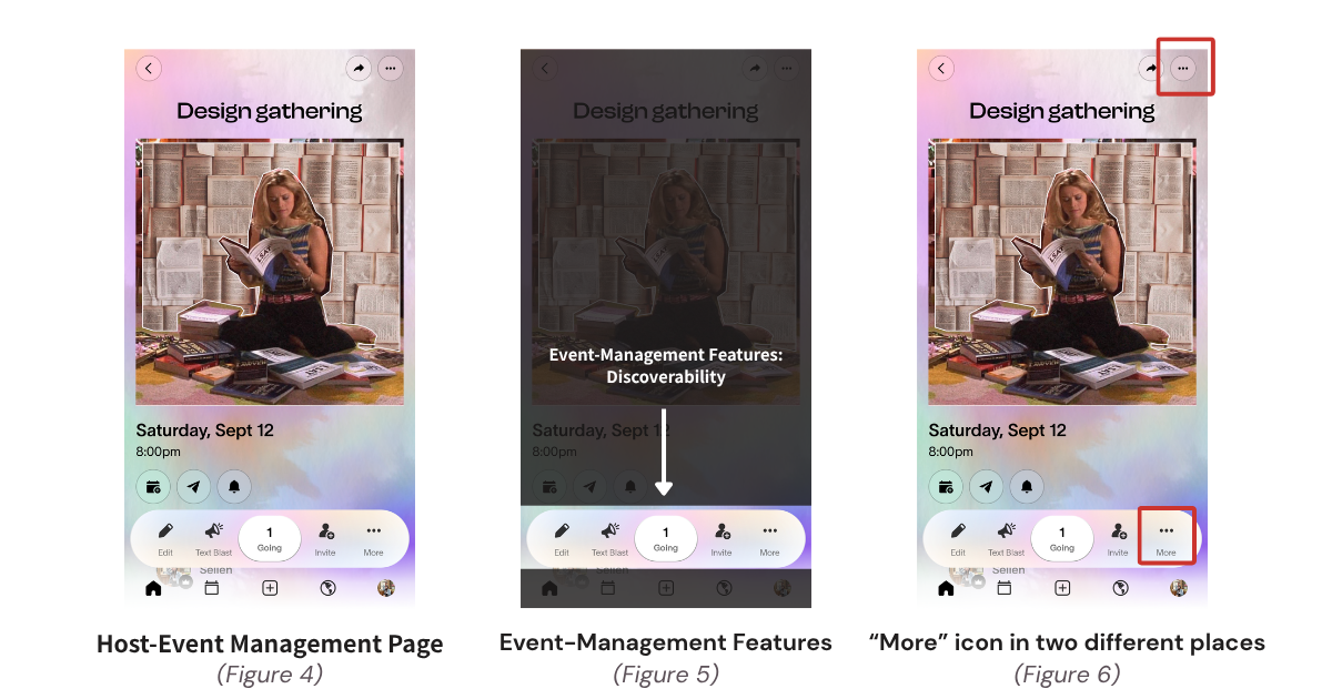
In the Host Event Management Page (Figure 4), a feature bar at the bottom displays key Event-Management functions (Figure 5), such as editing, inviting guests, and viewing the number of attendees, these main actions are clearly visible.
This improves Discoverability, as hosts do not need to enter a separate management page to know that these actions are available.
Also, most icons are familiar and easy to understand.
However, the page uses the same three-dot “More icon” in two different places for different sets of actions(figure 6). This may create confusion because the same visual signifier suggests the same function, which also conflicts with Nielsen’s #4: Consistency and Standards.
For example, if a host wants to delete the event, it is unclear which “More icon” they should select. The identical signifiers lead to different sets of actions, increasing the Gulf of Execution and creating a Consistency issue.
📍Event Page
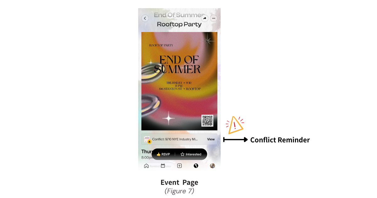
Before users RSVP, Partiful displays a Conflict Reminder when another event is scheduled for the same day. This provides knowledge in the world, so users do not need to remember their existing plans. It also supports Nielsen’s #5: Error Prevention by warning users about a potential scheduling conflict before they make a decision.
📍RSVP Selection:
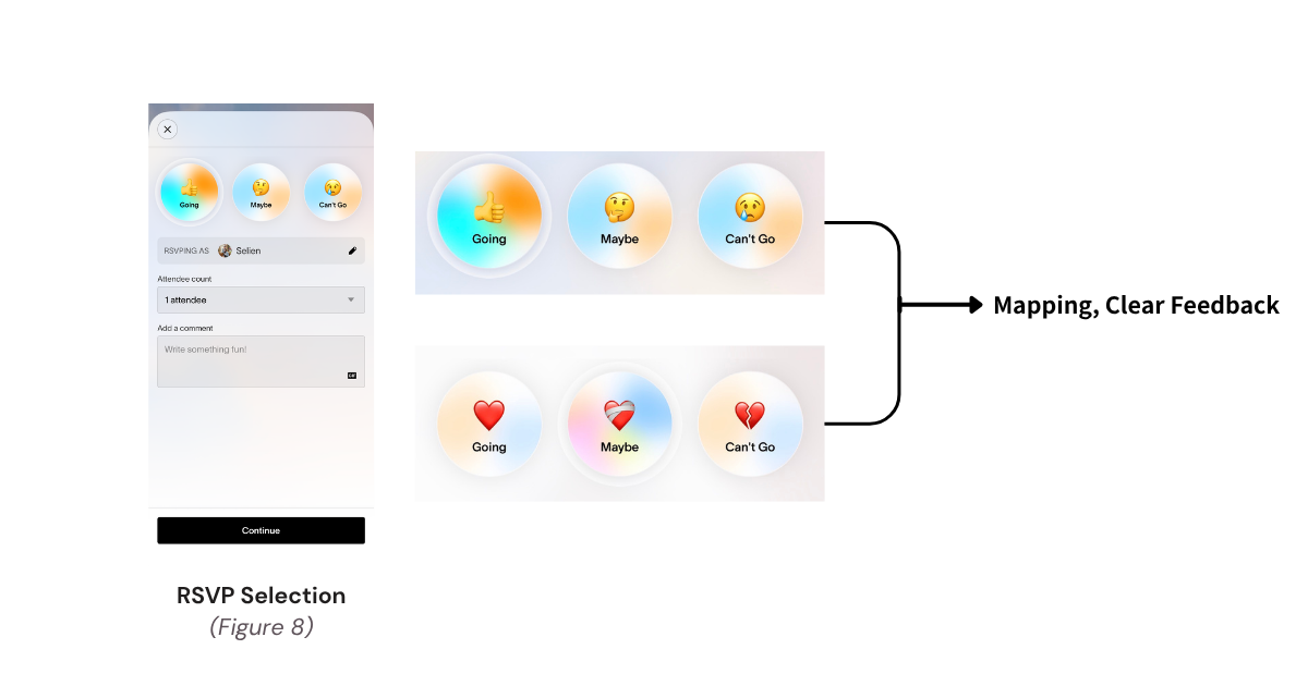
The RSVP Selection use clear labels and emojis: 👍 Going, 🤔 Maybe, and 🥲 Can’t Go, which are intuitive and familiar expressions in everyday life. They help users easily understand each choice and its outcome. This provides clear Signifiers and Mapping, while also supporting Nielsen’s #2: Match Between the System and the Real World.
After the user selects “Going”, the button immediately changes its visual appearance. This provides clear Feedback, confirming the user’s selection, while also supporting visibility of system status by making the current RSVP status visible.
Conclusion
Overall, Partiful is an intuitive and engaging app. Many of the ways we experience information are first shaped by the visual elements of interfaces (Ko, 2023), and Partiful presents information through clear visual cues, familiar icons, and straightforward interactions, making most tasks easy to understand and complete.
I consider Partiful a user-centered app because its interface provides clear guidance and feedback without requiring users to spend much time learning how the system works. However, there are still some areas for improvement, such as some ambiguous icons and inconsistent controls. Addressing these issues could reduce confusion and make the overall experience even more intuitive and consistent.