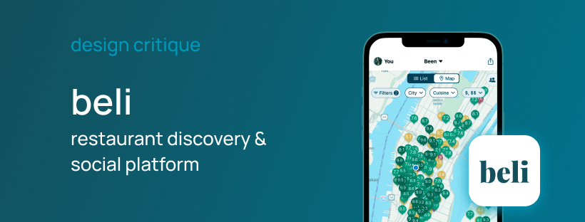
Beli is a restaurant discovery and social platform where users can track restaurants that they have tried, places that they want to visit, tag friends, and rank/review food. Beli’s design is modern and contains plentiful features for users not actively searching or reviewing food which makes it engaging. However, Don Norman’s The Design of Everyday Things explains elements of design that makes apps like Beli easy to use or leave users feeling uncertain how to use.
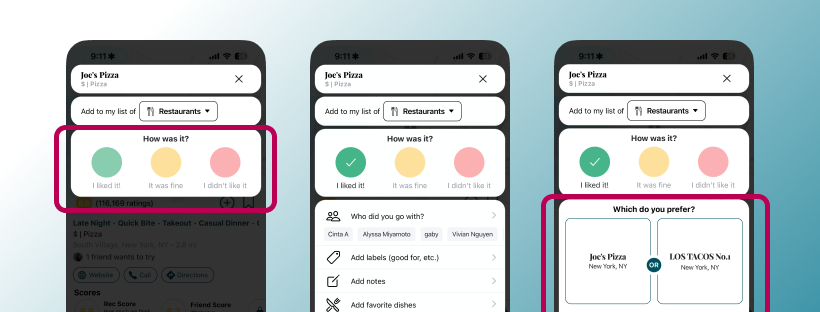
[Figure 1: Joe’s Pizza review on Beli, highlighting 3 reactions and swipe in comparison]
Restaurant Rating
The main feature for Beli is the restaurant rating. The ranking system is maintained by “adding” the restaurant, which is an effective signifier, as a plus icon visually represents that you are adding a rank to the restaurant. Then selecting between 3 reactions of how the user feels about the restaurant, followed by swiping if it was better than previously ranked restaurants. This is a good method of mapping, swiping a restaurant on the review scale higher than a restaurant they have rated in the past means the user has a better opinion. This means the restaurant is higher on the list of places that the users have tried.
The rating system builds Beli’s conceptual model as every review, restaurant save, and personal note supports a personal restaurant tracking system. Although, for unfamiliar users it may seem confusing figuring out how each restaurant compares to each other despite it not belonging to the same sub category. Beli could add filters by sub-categories, for example, users might rank cheap eats higher than a fancy restaurant based on price point. Constraints like ‘casual dining,’ ‘cheap eats,’ and ‘fine dining’ might build a better conceptual model of personal ranking system than broad labels like ‘restaurants’ and ‘bakery.’
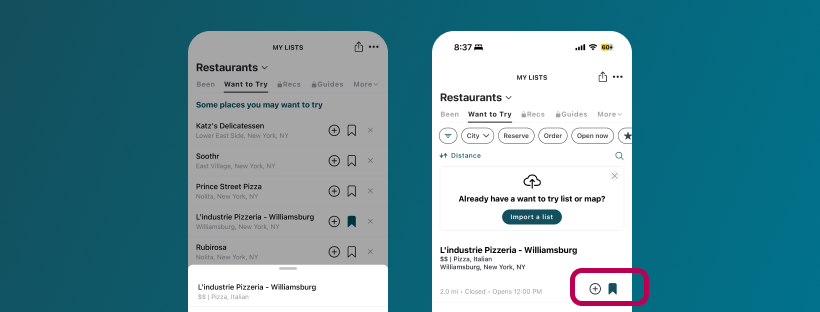
[Figure 2: L’Industrie Pizzeria save on Beli, highlighting bookmark icon]
Restaurant Lists
Another integral feature for Beli is the “restaurant list” view, adding a restaurant to the “want to try” section of the list gives a sense of control rather than the user relying on a list from memory. The save to “want to try” section icon is a bookmark that turns blue when activated, which is a form of affordance. Upon seeing the icon, the user expects that when tapped it will be saved into this list rather than making a review. However, there can be confusion on the user’s end as there are many buttons with icons on the same row, even opening a dropdown with more options to edit a review/rank. Adding a text button might be a better design as unfamiliar users can read the label “Save to list” to make a choice, rather than memorizing the difference between each icon.
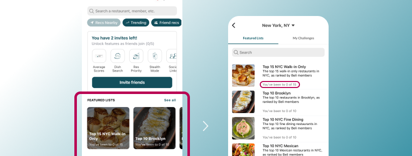
[Figure 3: Featured List on Beli: highlighting “You’ve been to 0 out of 15”]
Featured Lists
“Featured lists” is a feature that is often overlooked but a great place for expanding the discoverability of new restaurants to try without leaving the app to find inspiration, by including a prominent search bar at the top. Labels like “Top 10 Brooklyn” and “Top 10 NYC Mexican” filter choices by type of food or popular restaurants. The text label underneath the lists “You’ve been to 0 of 15,” this is effective feedback. Users can evaluate the progress that they are making on the interface, reducing the Gulf of Evaluation. However, this discernment might be difficult to find as it is on the main feed page, and might miss the expanded view of this page with a small icon “See all” button label. A better design might be to change the label to “Explore Featured Lists” and a caret icon on the side of the row to signify expanded view for the list.
Overall, Beli uses a strong sense of mapping, signifiers, and feedback to build the user’s conceptual model of their restaurant ranking system. A clear, more intuitive ranking system with the support of labelled restaurant/list actions would make Beli app users understand the interface better.